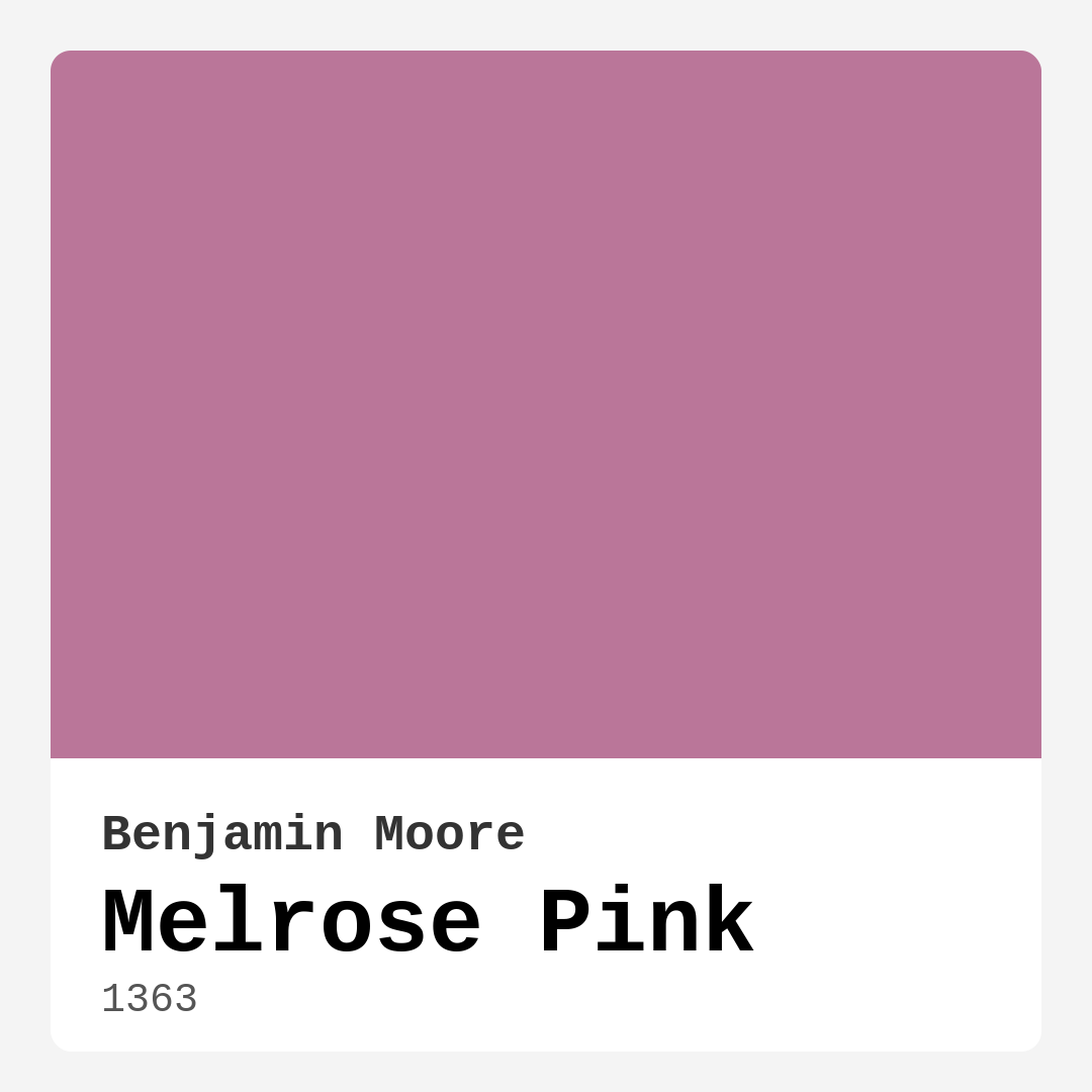
Color Preview & Key Details
| HEX Code | #BA7699 |
| RGB | 186, 118, 153 |
| LRV | 26.46% |
| Undertone | Red |
| Finish Options | Eggshell, Matte, Satin |
Imagine stepping into a room where the walls envelop you in a warm embrace, making you feel instantly at home. That’s the magic of Melrose Pink, a captivating hue from Benjamin Moore that transforms ordinary spaces into serene retreats. This isn’t just another shade of pink; Melrose Pink brings a sense of warmth, charm, and sophistication that can elevate any room’s energy.
Melrose Pink (Color Code: 1363) strikes a beautiful balance between playful and elegant. With its soft, inviting tone, this color radiates a cozy vibe while still feeling fresh and contemporary. It’s a wonderful choice for those of you who want to infuse your home with a bit of personality without overwhelming your space.
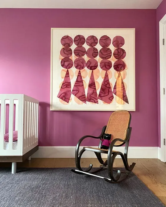
What’s truly remarkable about Melrose Pink is its versatility. This warm pink works beautifully in a variety of rooms, whether it’s a tranquil bedroom, a cheerful nursery, or an inviting living room. You can also use it in home offices or dining rooms, where its gentle warmth can create an environment conducive to relaxation and creativity. Imagine hosting friends in a dining room painted Melrose Pink; the atmosphere would be both stylish and inviting, setting the perfect backdrop for memorable conversations.
One of the standout features of Melrose Pink is its adaptability across different decor styles. Are you a fan of modern aesthetics? Pair it with sleek furniture and minimalistic decor for a fresh, airy feel. Maybe you lean towards the bohemian or eclectic vibe? Melrose Pink complements rich textures and patterns beautifully, adding a layer of sophistication to your curated space. For vintage enthusiasts, this color can evoke nostalgia while still feeling relevant, making it a timeless choice.
When considering paint colors, we often overlook how they interact with light. Melrose Pink excels in various lighting conditions, reflecting light beautifully during the day to enhance its soft charm. As the sun sets, this color takes on a warm glow, creating an intimate atmosphere perfect for unwinding after a long day. The Light Reflectance Value (LRV) of Melrose Pink is 26.46%, placing it in the medium color category, which means it reflects a good amount of light while still offering depth and richness.
The undertone of Melrose Pink is where its character truly shines. Leaning towards a subtle red undertone, it adds complexity and warmth. This can be particularly important when considering how it interacts with your existing furnishings and decor. For example, if you have a gray with a blue undertone, it may create a cooler contrast. However, pair it with warmer elements, and you’ll see how effortlessly it harmonizes, creating a cohesive look. Testing this color in your space is essential; observe it at different times of day to see how those undertones reveal themselves.
Now, let’s talk about practicality. One of the best things about Melrose Pink is its ease of application. It’s beginner-friendly, roller-ready, and brush smooth, making it an excellent choice for DIY projects. You’ll find that it covers well with only one or two coats, and when it comes to touch-ups, it’s a dream. Plus, its low VOC and ultra-low VOC formulations mean you can paint your space with minimal odor, making it a healthier choice for your home.
While Melrose Pink is a fantastic option for many areas of your home, there are a few considerations. In small spaces, it can appear darker, which might not be the effect you’re going for. If you’re thinking about high-traffic areas like hallways or children’s playrooms, keep in mind that Melrose Pink might not be the most durable choice. To preserve its beauty in such spaces, consider applying a protective topcoat. This will help resist wear and tear while keeping the color vibrant.
When it comes to pairing colors, Melrose Pink opens up a world of possibilities. For a fresh, bright look, whites like White Dove or Simply White make excellent companions, enhancing the warmth of the pink. If you’re feeling bold, try contrasting it with rich greens or navy blues for a striking visual appeal. Warm neutrals also work well, creating a harmonious palette that invites relaxation.
Imagine this scenario: you’ve just painted your living room with Melrose Pink. You’ve accented it with brass fixtures, which beautifully complements the warmth of the color. You’ve also chosen a soft white trim, which provides a crisp contrast, making the pink pop without overpowering the space. You can almost feel how cozy and inviting this setup would be, perfect for curling up with a good book or hosting friends for a casual gathering.
The mood that Melrose Pink creates is undeniably cozy and inviting. It fosters a restful environment, making it ideal for bedrooms and nurseries, where comfort is key. When you walk into a space adorned in this hue, it feels like a warm hug, a reminder that home is a sanctuary.
For those of you with an eye for design, Melrose Pink is not just a color; it’s an experience. Its gentle presence can bring together various elements in your home, allowing you to express your style while maintaining a sense of balance and harmony. Whether you’re decorating a small nook or an expansive open concept area, Melrose Pink adapts beautifully, becoming a backdrop for your life’s most cherished moments.
If you’re ready to take the plunge, don’t forget to sample it first. Painting a small swatch on your wall will give you a good sense of how Melrose Pink interacts with your lighting and decor. This small step can save you from potential headaches down the road and ensure you’re thrilled with your choice.
In the end, Melrose Pink by Benjamin Moore is more than just paint. It’s a warm invitation to create a space that feels uniquely yours. Whether you’re sprucing up a single room or embarking on a full home makeover, this color can help you achieve a beautiful balance of warmth, charm, and sophistication. Embrace the journey of transforming your space, and let Melrose Pink guide you toward a home that feels like a true reflection of your style and spirit.
Real Room Photo of Melrose Pink 1363
Undertones of Melrose Pink ?
The undertones of Melrose Pink are a key aspect of its character, leaning towards Red. These subtle underlying hues are what give the color its depth and complexity. For example, a gray with a blue undertone will feel cooler and more modern, while one with a brown undertone will feel warmer and more traditional. It’s essential to test this paint in your home and observe it next to your existing furniture, flooring, and decor to see how these undertones interact and reveal themselves throughout the day.
HEX value: #BA7699
RGB code: 186, 118, 153
Is Melrose Pink Cool or Warm?
Melrose Pink is considered a warm paint color. This characteristic plays a huge role in the overall feel of a room. Warm colors, like this one, tend to create a cozy, inviting, and energetic atmosphere, making them great for social spaces like living rooms and dining rooms. In contrast, cool colors often evoke a sense of calm and serenity, which is why they are popular in bedrooms and bathrooms. The warmth of Melrose Pink means it will pair beautifully with corresponding decor elements.
Understanding Color Properties and Interior Design Tips
Hue refers to a specific position on the color wheel, measured in degrees from 0 to 360. Each degree represents a different pure color:
- 0° represents red
- 120° represents green
- 240° represents blue
Saturation describes the intensity or purity of a color and is expressed as a percentage:
- At 0%, the color appears completely desaturated—essentially a shade of gray
- At 100%, the color is at its most vivid and vibrant
Lightness indicates how light or dark a color is, also expressed as a percentage:
- 0% lightness results in black
- 100% lightness results in white
Using Warm Colors in Interior Design
Warm hues—such as reds, oranges, yellows, warm beiges, and greiges—are excellent choices for creating inviting and energetic spaces. These colors are particularly well-suited for:
- Kitchens, living rooms, and bathrooms, where warmth enhances comfort and sociability
- Large rooms, where warm tones can help reduce the sense of emptiness and make the space feel more intimate
For example:
- Warm beige shades provide a cozy, inviting atmosphere, ideal for living rooms, bedrooms, and hallways.
- Warm greige (a mix of beige and gray) offers the warmth of beige with the modern appeal of gray, making it a versatile backdrop for dining areas, bedrooms, and living spaces.
However, be mindful when using warm light tones in rooms with limited natural light. These shades may appear muted or even take on an unpleasant yellowish tint. To avoid a dull or flat appearance:
- Add depth by incorporating richer tones like deep greens, charcoal, or chocolate brown
- Use textured elements such as curtains, rugs, or cushions to bring dimension to the space
Pro Tip: Achieving Harmony with Warm and Cool Color Balance
To create a well-balanced and visually interesting interior, mix warm and cool tones strategically. This contrast adds depth and harmony to your design.
- If your walls feature warm hues, introduce cool-colored accents such as blue or green furniture, artwork, or accessories to create contrast.
- For a polished look, consider using a complementary color scheme, which pairs colors opposite each other on the color wheel (e.g., red with green, orange with blue).
This thoughtful mix not only enhances visual appeal but also creates a space that feels both dynamic and cohesive.
Light Temperature Affects on Melrose Pink
Natural Light
Natural daylight changes in color temperature as the sun moves across the sky. At sunrise and sunset, the light tends to have a warm, golden tone with a color temperature around 2000 Kelvin (K). As the day progresses and the sun rises higher, the light becomes cooler and more neutral. Around midday, especially when the sky is clear, natural light typically reaches its peak brightness and shifts to a cooler tone, ranging from 5500 to 6500 Kelvin. This midday light is close to what we perceive as pure white or daylight-balanced light.
These shifts in natural light can significantly influence how colors appear in a space, which is why designers often consider both the time of day and the orientation of windows when planning interior color schemes.
Artificial Light
When choosing artificial lighting, pay close attention to the color temperature, measured in Kelvin (K). This determines how warm or cool the light will appear. Lower temperatures, around 2700K, give off a warm, yellow glow often used in living rooms or bedrooms. Higher temperatures, above 5000K, create a cool, bluish light similar to daylight, commonly used in kitchens, offices, or task areas.
Use the slider to see how lighting temperature can affect the appearance of a surface or color throughout a space.


4800K
LRV of Melrose Pink
The Light Reflectance Value (LRV) of Melrose Pink is 26.46%, which places it in the Medium colors category. This means it reflect a lot of light. Understanding a paint’s LRV is crucial for predicting how it will look in your space. A higher LRV indicates a lighter color that reflects more light, making rooms feel larger and brighter. A lower LRV signifies a darker color that absorbs more light, creating a cozier, more intimate atmosphere. Always consider the natural and artificial lighting in your room when selecting a paint color based on its LRV.
Detailed Review of Melrose Pink
Additional Paint Characteristics
Ideal Rooms
Bedroom, Dining Room, Home Office, Living Room, Nursery
Decor Styles
Bohemian, Eclectic, Minimalist, Modern, Vintage
Coverage
Good (1–2 Coats), Touch-Up Friendly
Ease of Application
Beginner Friendly, Brush Smooth, Roller-Ready
Washability
Washable, Wipeable
VOC Level
Low VOC, Ultra Low VOC
Best Use
Accent Wall, Furniture, Interior Walls
Room Suitability
Bedroom, Dining Room, Home Office, Living Room, Nursery
Tone Tag
Muted, Pastel, Warm
Finish Type
Eggshell, Matte, Satin
Paint Performance
Easy Touch-Up, High Coverage, Low Odor
Use Cases
Best for Open Concept, Best for Small Spaces, Designer Favorite
Mood
Cozy, Inviting, Restful
Trim Pairing
Complements Brass Fixtures, Pairs with White Dove, Works with Warm Trim
Melrose Pink is more than just a color; it’s an experience that transforms your space into a serene retreat. Its soft yet vibrant nature brings a sense of comfort and relaxation, ideal for areas where you unwind. When applied, it delivers a smooth, even finish that enhances the room’s natural light, making spaces feel airy and uplifting. Whether you’re looking to create a cozy bedroom or a playful nursery, this versatile paint provides adequate coverage without requiring multiple coats. Its ability to adapt to various decor styles—from modern to vintage—makes it a favorite among homeowners and designers alike. Overall, Melrose Pink is a reliable choice for those looking to infuse warmth and elegance into their home.
Pros & Cons of 1363 Melrose Pink
Pros
Cons
Colors that go with Benjamin Moore Melrose Pink
FAQ on 1363 Melrose Pink
Can Melrose Pink be used in high-traffic areas?
While Melrose Pink is a stunning choice for many rooms, it’s worth noting that it may not be the best option for high-traffic areas like hallways or children’s playrooms without additional protection. To ensure durability, consider applying a protective topcoat to preserve its beauty and resist wear and tear.
What colors pair well with Melrose Pink?
Melrose Pink pairs beautifully with a range of colors. For a fresh look, consider whites like White Dove or Simply White, which brighten and elevate the pink. For a bolder contrast, rich greens or navy blues can create a striking visual appeal. Additionally, warm neutrals work well to create a harmonious and inviting palette.
Comparisons Melrose Pink with other colors
Melrose Pink 1363 vs Realist Beige SW 6078
| Attribute | Melrose Pink 1363 | Realist Beige SW 6078 |
|---|---|---|
| Color Name | Melrose Pink 1363 | Realist Beige SW 6078 |
| Color | ||
| Hue | Pink | Pink |
| Brightness | Medium | Medium |
| RGB | 186, 118, 153 | 211, 200, 189 |
| LRV | 26.46% | 34% |
| Finish Type | Eggshell, Matte, Satin | Eggshell, Matte, Satin |
| Finish Options | Eggshell, Matte, Satin | Eggshell, Matte, Satin |
| Ideal Rooms | Bedroom, Dining Room, Home Office, Living Room, Nursery | Bedroom, Dining Room, Entryway, Home Office, Kitchen, Living Room |
| Decor Styles | Bohemian, Eclectic, Minimalist, Modern, Vintage | Contemporary, Minimalist, Modern Farmhouse, Rustic, Traditional |
| Coverage | Good (1–2 Coats), Touch-Up Friendly | Good (1–2 Coats), Touch-Up Friendly |
| Ease of Application | Beginner Friendly, Brush Smooth, Roller-Ready | Beginner Friendly, Brush Smooth, Fast-Drying, Roller-Ready |
| Washability | Washable, Wipeable | Washable, Wipeable |
| Room Suitability | Bedroom, Dining Room, Home Office, Living Room, Nursery | Bedroom, Dining Room, Home Office, Kitchen, Living Room |
| Tone | Muted, Pastel, Warm | Earthy, Neutral, Warm |
| Paint Performance | Easy Touch-Up, High Coverage, Low Odor | High Coverage, Low Odor, Quick Drying |
Melrose Pink 1363 vs Rosaline Pearl SW 9077
| Attribute | Melrose Pink 1363 | Rosaline Pearl SW 9077 |
|---|---|---|
| Color Name | Melrose Pink 1363 | Rosaline Pearl SW 9077 |
| Color | ||
| Hue | Pink | Pink |
| Brightness | Medium | Medium |
| RGB | 186, 118, 153 | 163, 136, 135 |
| LRV | 26.46% | 69% |
| Finish Type | Eggshell, Matte, Satin | Eggshell, Matte |
| Finish Options | Eggshell, Matte, Satin | Eggshell, Matte, Satin |
| Ideal Rooms | Bedroom, Dining Room, Home Office, Living Room, Nursery | Bedroom, Dining Room, Home Office, Living Room |
| Decor Styles | Bohemian, Eclectic, Minimalist, Modern, Vintage | Bohemian, Contemporary, Modern, Transitional |
| Coverage | Good (1–2 Coats), Touch-Up Friendly | Good (1–2 Coats) |
| Ease of Application | Beginner Friendly, Brush Smooth, Roller-Ready | Beginner Friendly, Brush Smooth, Fast-Drying, Roller-Ready |
| Washability | Washable, Wipeable | Washable, Wipeable |
| Room Suitability | Bedroom, Dining Room, Home Office, Living Room, Nursery | Bedroom, Dining Room, Home Office, Living Room |
| Tone | Muted, Pastel, Warm | Dusty, Muted, Warm |
| Paint Performance | Easy Touch-Up, High Coverage, Low Odor | Easy Touch-Up, Fade Resistant, Low Odor |
Melrose Pink 1363 vs Cabbage Rose SW 0003
| Attribute | Melrose Pink 1363 | Cabbage Rose SW 0003 |
|---|---|---|
| Color Name | Melrose Pink 1363 | Cabbage Rose SW 0003 |
| Color | ||
| Hue | Pink | Pink |
| Brightness | Medium | Medium |
| RGB | 186, 118, 153 | 197, 159, 145 |
| LRV | 26.46% | 15% |
| Finish Type | Eggshell, Matte, Satin | Eggshell, Matte, Satin |
| Finish Options | Eggshell, Matte, Satin | Eggshell, Matte, Satin |
| Ideal Rooms | Bedroom, Dining Room, Home Office, Living Room, Nursery | Bedroom, Dining Room, Hallway, Living Room, Nursery |
| Decor Styles | Bohemian, Eclectic, Minimalist, Modern, Vintage | Cottage, Modern Farmhouse, Romantic, Shabby Chic, Vintage |
| Coverage | Good (1–2 Coats), Touch-Up Friendly | Good (1–2 Coats), Touch-Up Friendly |
| Ease of Application | Beginner Friendly, Brush Smooth, Roller-Ready | Beginner Friendly, Brush Smooth, Roller-Ready |
| Washability | Washable, Wipeable | Washable, Wipeable |
| Room Suitability | Bedroom, Dining Room, Home Office, Living Room, Nursery | Bedroom, Dining Room, Hallway, Living Room, Nursery |
| Tone | Muted, Pastel, Warm | Earthy, Muted, Warm |
| Paint Performance | Easy Touch-Up, High Coverage, Low Odor | Easy Touch-Up, Low Odor |
Melrose Pink 1363 vs Sashay Sand SW 6051
| Attribute | Melrose Pink 1363 | Sashay Sand SW 6051 |
|---|---|---|
| Color Name | Melrose Pink 1363 | Sashay Sand SW 6051 |
| Color | ||
| Hue | Pink | Pink |
| Brightness | Medium | Medium |
| RGB | 186, 118, 153 | 207, 180, 168 |
| LRV | 26.46% | 64% |
| Finish Type | Eggshell, Matte, Satin | Eggshell, Matte, Satin |
| Finish Options | Eggshell, Matte, Satin | Eggshell, Matte, Satin |
| Ideal Rooms | Bedroom, Dining Room, Home Office, Living Room, Nursery | Bedroom, Dining Room, Home Office, Kitchen, Living Room |
| Decor Styles | Bohemian, Eclectic, Minimalist, Modern, Vintage | Bohemian, Contemporary, Modern Farmhouse, Scandinavian, Transitional |
| Coverage | Good (1–2 Coats), Touch-Up Friendly | Good (1–2 Coats), Touch-Up Friendly |
| Ease of Application | Beginner Friendly, Brush Smooth, Roller-Ready | Beginner Friendly, Fast-Drying, Roller-Ready |
| Washability | Washable, Wipeable | Highly Washable, Washable |
| Room Suitability | Bedroom, Dining Room, Home Office, Living Room, Nursery | Bedroom, Dining Room, Home Office, Kitchen, Living Room |
| Tone | Muted, Pastel, Warm | Earthy, Muted, Warm |
| Paint Performance | Easy Touch-Up, High Coverage, Low Odor | Easy Touch-Up, Low Odor, Quick Drying, Scuff Resistant |
Melrose Pink 1363 vs Touch of Sand SW 9085
| Attribute | Melrose Pink 1363 | Touch of Sand SW 9085 |
|---|---|---|
| Color Name | Melrose Pink 1363 | Touch of Sand SW 9085 |
| Color | ||
| Hue | Pink | Pink |
| Brightness | Medium | Medium |
| RGB | 186, 118, 153 | 213, 199, 186 |
| LRV | 26.46% | 66% |
| Finish Type | Eggshell, Matte, Satin | Eggshell, Matte, Satin |
| Finish Options | Eggshell, Matte, Satin | Eggshell, Matte, Satin |
| Ideal Rooms | Bedroom, Dining Room, Home Office, Living Room, Nursery | Bathroom, Bedroom, Dining Room, Home Office, Kitchen, Living Room |
| Decor Styles | Bohemian, Eclectic, Minimalist, Modern, Vintage | Bohemian, Coastal, Contemporary, Modern Farmhouse, Rustic |
| Coverage | Good (1–2 Coats), Touch-Up Friendly | Good (1–2 Coats), Touch-Up Friendly |
| Ease of Application | Beginner Friendly, Brush Smooth, Roller-Ready | Beginner Friendly, Brush Smooth, Fast-Drying, Roller-Ready |
| Washability | Washable, Wipeable | Washable, Wipeable |
| Room Suitability | Bedroom, Dining Room, Home Office, Living Room, Nursery | Bathroom, Bedroom, Dining Room, Home Office, Kitchen, Living Room |
| Tone | Muted, Pastel, Warm | Earthy, Muted, Neutral, Warm |
| Paint Performance | Easy Touch-Up, High Coverage, Low Odor | Easy Touch-Up, Low Odor, Quick Drying, Scuff Resistant |
Melrose Pink 1363 vs Pink Shadow SW 0070
| Attribute | Melrose Pink 1363 | Pink Shadow SW 0070 |
|---|---|---|
| Color Name | Melrose Pink 1363 | Pink Shadow SW 0070 |
| Color | ||
| Hue | Pink | Pink |
| Brightness | Medium | Medium |
| RGB | 186, 118, 153 | 222, 195, 185 |
| LRV | 26.46% | 45% |
| Finish Type | Eggshell, Matte, Satin | Eggshell, Matte, Satin |
| Finish Options | Eggshell, Matte, Satin | Eggshell, Matte, Satin |
| Ideal Rooms | Bedroom, Dining Room, Home Office, Living Room, Nursery | Bedroom, Dining Room, Home Office, Living Room, Nursery |
| Decor Styles | Bohemian, Eclectic, Minimalist, Modern, Vintage | Bohemian, Minimalist, Modern Farmhouse, Scandinavian, Traditional |
| Coverage | Good (1–2 Coats), Touch-Up Friendly | Good (1–2 Coats) |
| Ease of Application | Beginner Friendly, Brush Smooth, Roller-Ready | Beginner Friendly, Brush Smooth, Fast-Drying, Roller-Ready |
| Washability | Washable, Wipeable | Washable, Wipeable |
| Room Suitability | Bedroom, Dining Room, Home Office, Living Room, Nursery | Bedroom, Dining Room, Living Room, Nursery |
| Tone | Muted, Pastel, Warm | Muted, Pastel, Warm |
| Paint Performance | Easy Touch-Up, High Coverage, Low Odor | Easy Touch-Up, High Coverage, Low Odor |
Melrose Pink 1363 vs Hushed Auburn SW 9080
| Attribute | Melrose Pink 1363 | Hushed Auburn SW 9080 |
|---|---|---|
| Color Name | Melrose Pink 1363 | Hushed Auburn SW 9080 |
| Color | ||
| Hue | Pink | Pink |
| Brightness | Medium | Medium |
| RGB | 186, 118, 153 | 168, 133, 122 |
| LRV | 26.46% | 12% |
| Finish Type | Eggshell, Matte, Satin | Eggshell, Matte, Satin |
| Finish Options | Eggshell, Matte, Satin | Eggshell, Matte, Satin |
| Ideal Rooms | Bedroom, Dining Room, Home Office, Living Room, Nursery | Bedroom, Dining Room, Home Office, Living Room |
| Decor Styles | Bohemian, Eclectic, Minimalist, Modern, Vintage | Contemporary, Modern Farmhouse, Rustic, Transitional |
| Coverage | Good (1–2 Coats), Touch-Up Friendly | Good (1–2 Coats), Touch-Up Friendly |
| Ease of Application | Beginner Friendly, Brush Smooth, Roller-Ready | Beginner Friendly, Brush Smooth, Fast-Drying, Roller-Ready |
| Washability | Washable, Wipeable | Washable, Wipeable |
| Room Suitability | Bedroom, Dining Room, Home Office, Living Room, Nursery | Bedroom, Dining Room, Home Office, Living Room |
| Tone | Muted, Pastel, Warm | Earthy, Muted, Warm |
| Paint Performance | Easy Touch-Up, High Coverage, Low Odor | Easy Touch-Up, High Coverage, Low Odor |
Melrose Pink 1363 vs Likeable Sand SW 6058
| Attribute | Melrose Pink 1363 | Likeable Sand SW 6058 |
|---|---|---|
| Color Name | Melrose Pink 1363 | Likeable Sand SW 6058 |
| Color | ||
| Hue | Pink | Pink |
| Brightness | Medium | Medium |
| RGB | 186, 118, 153 | 209, 183, 168 |
| LRV | 26.46% | 61% |
| Finish Type | Eggshell, Matte, Satin | Eggshell, Matte, Satin |
| Finish Options | Eggshell, Matte, Satin | Eggshell, Matte, Satin |
| Ideal Rooms | Bedroom, Dining Room, Home Office, Living Room, Nursery | Bedroom, Dining Room, Home Office, Kitchen, Living Room |
| Decor Styles | Bohemian, Eclectic, Minimalist, Modern, Vintage | Bohemian, Coastal, Contemporary, Modern Farmhouse, Rustic |
| Coverage | Good (1–2 Coats), Touch-Up Friendly | Good (1–2 Coats), Touch-Up Friendly |
| Ease of Application | Beginner Friendly, Brush Smooth, Roller-Ready | Beginner Friendly, Brush Smooth, Fast-Drying, Roller-Ready |
| Washability | Washable, Wipeable | Washable, Wipeable |
| Room Suitability | Bedroom, Dining Room, Home Office, Living Room, Nursery | Bedroom, Dining Room, Home Office, Kitchen, Living Room |
| Tone | Muted, Pastel, Warm | Earthy, Muted, Warm |
| Paint Performance | Easy Touch-Up, High Coverage, Low Odor | Easy Touch-Up, Low Odor, Quick Drying |
Melrose Pink 1363 vs Glamour SW 6031
| Attribute | Melrose Pink 1363 | Glamour SW 6031 |
|---|---|---|
| Color Name | Melrose Pink 1363 | Glamour SW 6031 |
| Color | ||
| Hue | Pink | Pink |
| Brightness | Medium | Medium |
| RGB | 186, 118, 153 | 182, 160, 154 |
| LRV | 26.46% | 30% |
| Finish Type | Eggshell, Matte, Satin | Eggshell, Matte, Satin |
| Finish Options | Eggshell, Matte, Satin | Eggshell, Matte, Satin |
| Ideal Rooms | Bedroom, Dining Room, Home Office, Living Room, Nursery | Bedroom, Dining Room, Home Office, Living Room |
| Decor Styles | Bohemian, Eclectic, Minimalist, Modern, Vintage | Bohemian, Classic, Modern, Transitional |
| Coverage | Good (1–2 Coats), Touch-Up Friendly | Good (1–2 Coats) |
| Ease of Application | Beginner Friendly, Brush Smooth, Roller-Ready | Beginner Friendly, Brush Smooth, Fast-Drying, Roller-Ready |
| Washability | Washable, Wipeable | Scrubbable, Washable |
| Room Suitability | Bedroom, Dining Room, Home Office, Living Room, Nursery | Bedroom, Dining Room, Home Office, Living Room |
| Tone | Muted, Pastel, Warm | Balanced, Neutral, Warm |
| Paint Performance | Easy Touch-Up, High Coverage, Low Odor | Easy Touch-Up, Low Odor, Quick Drying |
Melrose Pink 1363 vs Temperate Taupe SW 6037
| Attribute | Melrose Pink 1363 | Temperate Taupe SW 6037 |
|---|---|---|
| Color Name | Melrose Pink 1363 | Temperate Taupe SW 6037 |
| Color | ||
| Hue | Pink | Pink |
| Brightness | Medium | Medium |
| RGB | 186, 118, 153 | 191, 177, 170 |
| LRV | 26.46% | 34% |
| Finish Type | Eggshell, Matte, Satin | Eggshell, Matte, Satin |
| Finish Options | Eggshell, Matte, Satin | Eggshell, Matte, Satin |
| Ideal Rooms | Bedroom, Dining Room, Home Office, Living Room, Nursery | Bedroom, Dining Room, Home Office, Kitchen, Living Room |
| Decor Styles | Bohemian, Eclectic, Minimalist, Modern, Vintage | Bohemian, Modern Farmhouse, Rustic, Transitional |
| Coverage | Good (1–2 Coats), Touch-Up Friendly | Good (1–2 Coats), Touch-Up Friendly |
| Ease of Application | Beginner Friendly, Brush Smooth, Roller-Ready | Beginner Friendly, Brush Smooth, Fast-Drying, Roller-Ready |
| Washability | Washable, Wipeable | Highly Washable, Washable |
| Room Suitability | Bedroom, Dining Room, Home Office, Living Room, Nursery | Bedroom, Dining Room, Home Office, Living Room |
| Tone | Muted, Pastel, Warm | Earthy, Neutral, Warm |
| Paint Performance | Easy Touch-Up, High Coverage, Low Odor | Long Lasting, Low Odor, Quick Drying, Scuff Resistant |
Official Page of Benjamin Moore Melrose Pink 1363