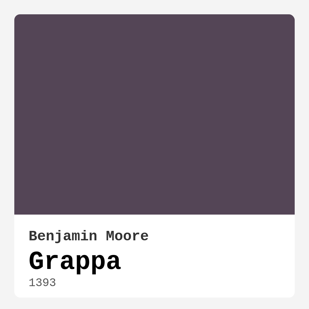
Color Preview & Key Details
| HEX Code | #544556 |
| RGB | 84, 69, 86 |
| LRV | 8.66% |
| Undertone | Purple |
| Finish Options | Eggshell, Matte, Satin |
If you’re looking for a paint color that exudes sophistication and depth, Benjamin Moore’s Grappa (1393) might just be your perfect match. This deep, moody purple with subtle gray undertones is the kind of shade that instantly elevates a space, giving it a luxurious yet modern feel. Whether you’re aiming for a cozy bedroom retreat, a dramatic dining room, or a stylish living room, Grappa has the versatility to make it happen. Let’s dive into everything you need to know about this stunning color—so you can decide if it’s right for your home.
First, let’s talk about the color itself. Grappa sits firmly in the dark purple family, with an LRV (Light Reflectance Value) of just 8.66%, meaning it absorbs light rather than reflecting it. This makes it an excellent choice for creating intimate, grounded spaces. But don’t let the darkness intimidate you—Grappa’s gray undertones keep it from feeling too bold or overwhelming. Instead, it strikes a perfect balance between richness and subtlety, making it a favorite among designers who want to add depth without sacrificing elegance.
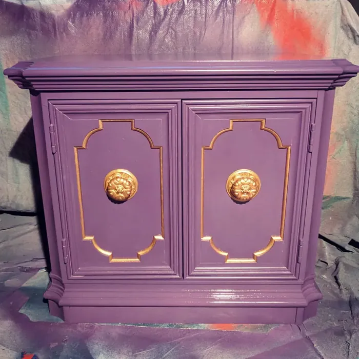
One of the best things about Grappa is how adaptable it is. It plays well with a variety of decor styles, from modern and contemporary to eclectic and glam. If you love a minimalist aesthetic, pair it with crisp white trim (Benjamin Moore’s Simply White is a fantastic choice) and sleek metallic accents for a polished look. Prefer something cozier? Layer it with warm wood tones and plush textiles to create a space that feels inviting and lived-in. And if you’re all about drama, use Grappa on an accent wall in a room with high ceilings and statement lighting—it’ll make a jaw-dropping impact.
Now, let’s address the elephant in the room: can you use Grappa in a small space? The short answer is yes, but with some strategic planning. Dark colors can make small rooms feel even smaller if not balanced properly. To avoid this, maximize natural light with sheer curtains or keep artificial lighting bright and layered. Mirrors are your best friend here—they’ll bounce light around and create the illusion of more space. Another trick? Paint the trim and ceiling in a lighter shade to keep the room from feeling too enclosed. Grappa can absolutely work in a small room; it just needs the right supporting cast.
When it comes to pairing Grappa with other colors, the possibilities are endless. Its cool undertones make it a natural match for other muted, sophisticated hues. For a timeless look, pair it with soft creams or warm grays. If you want to lean into its regal side, try combining it with deep jewel tones like emerald green or sapphire blue. And because purple and yellow are complementary colors on the color wheel, a touch of mustard yellow or gold can add a striking contrast that feels both bold and balanced. Just remember to test your color combinations in different lighting before committing—Grappa can shift slightly depending on the time of day.
Application-wise, Grappa is a dream to work with. Benjamin Moore’s formula is roller-ready, low-splatter, and thick enough to provide excellent coverage in just one or two coats. Plus, it’s self-priming, so you can skip that extra step if you’re painting over a similar color. The finish options—matte, eggshell, or satin—give you flexibility depending on the room’s function. Matte is great for low-traffic areas where you want a velvety look, while eggshell and satin are more durable for spaces like living rooms or bedrooms where you might need a bit more washability.
Speaking of durability, Grappa doesn’t just look good—it performs well, too. It’s scrubbable, stain-resistant, and fade-resistant, making it a practical choice for busy households. And because it’s low-VOC and eco-certified, you won’t have to worry about harsh fumes during or after painting. It’s a win-win for both style and sustainability.
So, where does Grappa shine the brightest? It’s ideal for rooms where you want to create a sense of intimacy and sophistication. A bedroom painted in Grappa feels like a luxurious retreat, especially when paired with soft bedding and warm lighting. In a dining room, it sets the stage for elegant dinners and lively conversations. And in a home office, it fosters focus and creativity—just balance it with plenty of task lighting to keep the space functional.
If you’re still on the fence, here’s the bottom line: Grappa is a color that rewards boldness. It’s not for every room or every homeowner, but if you’re drawn to its rich, moody vibe, it’s worth taking the plunge. Test a sample on your walls, observe it at different times of day, and imagine how it’ll interact with your furniture and decor. When done right, Grappa doesn’t just color your walls—it transforms your space into something truly special. So go ahead, embrace the depth, and let this stunning shade work its magic.
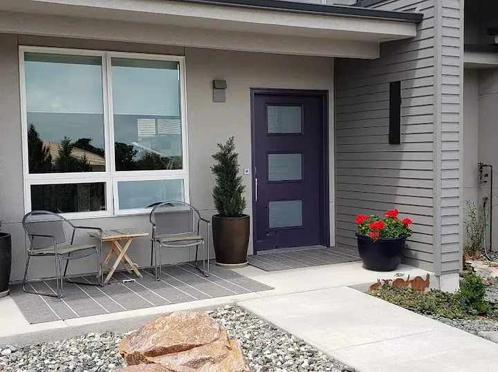
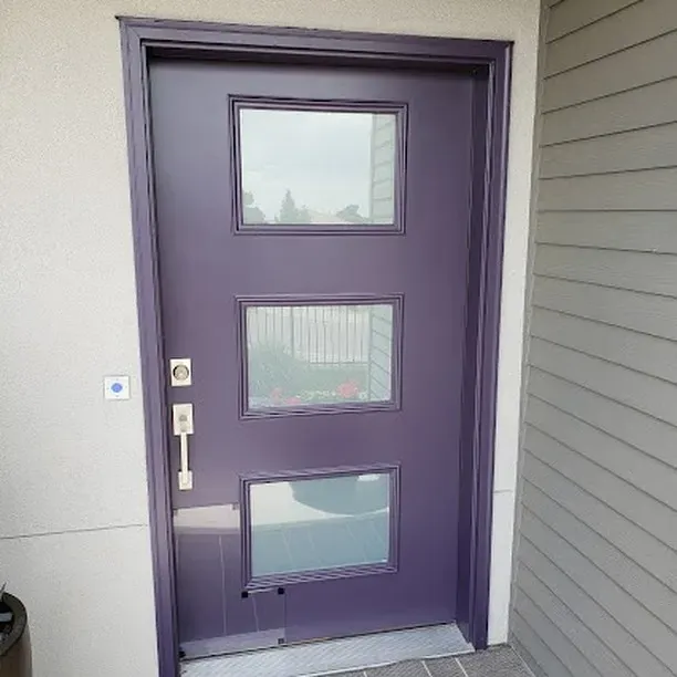
Real Room Photo of Grappa 1393
Undertones of Grappa ?
The undertones of Grappa are a key aspect of its character, leaning towards Purple. These subtle underlying hues are what give the color its depth and complexity. For example, a gray with a blue undertone will feel cooler and more modern, while one with a brown undertone will feel warmer and more traditional. It’s essential to test this paint in your home and observe it next to your existing furniture, flooring, and decor to see how these undertones interact and reveal themselves throughout the day.
HEX value: #544556
RGB code: 84, 69, 86
Is Grappa Cool or Warm?
Grappa is a cool color, thanks to its purple base and gray undertones. This coolness makes it ideal for creating a calming and serene environment, especially when paired with other cool tones or white accents.
Understanding Color Properties and Interior Design Tips
Hue refers to a specific position on the color wheel, measured in degrees from 0 to 360. Each degree represents a different pure color:
- 0° represents red
- 120° represents green
- 240° represents blue
Saturation describes the intensity or purity of a color and is expressed as a percentage:
- At 0%, the color appears completely desaturated—essentially a shade of gray
- At 100%, the color is at its most vivid and vibrant
Lightness indicates how light or dark a color is, also expressed as a percentage:
- 0% lightness results in black
- 100% lightness results in white
Using Warm Colors in Interior Design
Warm hues—such as reds, oranges, yellows, warm beiges, and greiges—are excellent choices for creating inviting and energetic spaces. These colors are particularly well-suited for:
- Kitchens, living rooms, and bathrooms, where warmth enhances comfort and sociability
- Large rooms, where warm tones can help reduce the sense of emptiness and make the space feel more intimate
For example:
- Warm beige shades provide a cozy, inviting atmosphere, ideal for living rooms, bedrooms, and hallways.
- Warm greige (a mix of beige and gray) offers the warmth of beige with the modern appeal of gray, making it a versatile backdrop for dining areas, bedrooms, and living spaces.
However, be mindful when using warm light tones in rooms with limited natural light. These shades may appear muted or even take on an unpleasant yellowish tint. To avoid a dull or flat appearance:
- Add depth by incorporating richer tones like deep greens, charcoal, or chocolate brown
- Use textured elements such as curtains, rugs, or cushions to bring dimension to the space
Pro Tip: Achieving Harmony with Warm and Cool Color Balance
To create a well-balanced and visually interesting interior, mix warm and cool tones strategically. This contrast adds depth and harmony to your design.
- If your walls feature warm hues, introduce cool-colored accents such as blue or green furniture, artwork, or accessories to create contrast.
- For a polished look, consider using a complementary color scheme, which pairs colors opposite each other on the color wheel (e.g., red with green, orange with blue).
This thoughtful mix not only enhances visual appeal but also creates a space that feels both dynamic and cohesive.
Light Temperature Affects on Grappa
Natural Light
Natural daylight changes in color temperature as the sun moves across the sky. At sunrise and sunset, the light tends to have a warm, golden tone with a color temperature around 2000 Kelvin (K). As the day progresses and the sun rises higher, the light becomes cooler and more neutral. Around midday, especially when the sky is clear, natural light typically reaches its peak brightness and shifts to a cooler tone, ranging from 5500 to 6500 Kelvin. This midday light is close to what we perceive as pure white or daylight-balanced light.
These shifts in natural light can significantly influence how colors appear in a space, which is why designers often consider both the time of day and the orientation of windows when planning interior color schemes.
Artificial Light
When choosing artificial lighting, pay close attention to the color temperature, measured in Kelvin (K). This determines how warm or cool the light will appear. Lower temperatures, around 2700K, give off a warm, yellow glow often used in living rooms or bedrooms. Higher temperatures, above 5000K, create a cool, bluish light similar to daylight, commonly used in kitchens, offices, or task areas.
Use the slider to see how lighting temperature can affect the appearance of a surface or color throughout a space.


4800K
LRV of Grappa
The Light Reflectance Value (LRV) of Grappa is 8.66%, which places it in the Dark colors category. This means it does not reflect light. Understanding a paint’s LRV is crucial for predicting how it will look in your space. A higher LRV indicates a lighter color that reflects more light, making rooms feel larger and brighter. A lower LRV signifies a darker color that absorbs more light, creating a cozier, more intimate atmosphere. Always consider the natural and artificial lighting in your room when selecting a paint color based on its LRV.
Detailed Review of Grappa
Additional Paint Characteristics
Ideal Rooms
Bedroom, Dining Room, Home Office, Living Room
Decor Styles
Contemporary, Eclectic, Glam, Modern
Coverage
Good (1–2 Coats), High Hide, Self-Priming
Ease of Application
Brush Smooth, Low Splatter, Roller-Ready, Thick Formula
Washability
Scrubbable, Stain Resistant, Washable
VOC Level
Eco-Certified, Low VOC
Best Use
Accent Wall, Furniture, Interior Walls, Trim
Room Suitability
Bedroom, Dining Room, Living Room
Tone Tag
Cool, Deep, Moody, Sophisticated
Finish Type
Eggshell, Matte, Satin
Paint Performance
Fade Resistant, High Coverage, Low Odor, Scuff Resistant
Use Cases
Best for Low Light Rooms, Best for Modern Farmhouse, Designer Favorite
Mood
Cozy, Grounding, Sophisticated
Trim Pairing
Complements Cool Trim, Good with Wood Trim, Pairs with Simply White
Grappa is a remarkable shade that brings a sense of depth and mystery to any room. This deep, muted purple isn’t just another dark color; it has an intriguing complexity that makes it both bold and versatile. Whether you’re looking to create a cozy reading nook or a dramatic dining room, Grappa will deliver. Its unique undertones allow it to pair beautifully with a variety of colors and finishes, making it a versatile choice for both modern and traditional decor. The paint applies smoothly and evenly, providing excellent coverage with just one or two coats. Plus, its self-priming formula means you can skip the primer, saving you time and effort.
Pros & Cons of 1393 Grappa
Pros
Cons
Colors that go with Benjamin Moore Grappa
FAQ on 1393 Grappa
Can Grappa be used in a small room?
Absolutely, Grappa can be used in small rooms, but there are some considerations to keep in mind. Because it’s a dark and rich color, it can make a small space feel even smaller if not balanced correctly. To avoid this, ensure the room has ample lighting, either through natural sources or well-placed fixtures. Additionally, pairing Grappa with lighter trim or accents can help open up the space and prevent it from feeling too enclosed. Reflective surfaces like mirrors or metallic elements can also add depth and dimension, making the room seem larger than it is.
What’s the best way to pair Grappa with other colors?
Grappa pairs beautifully with a variety of colors thanks to its versatile undertones. For a classic look, combine it with crisp whites or soft creams, which will highlight its rich tones and create a striking contrast. If you’re aiming for a more modern vibe, consider pairing it with metallics like silver or gold, which will add a touch of glamour and sophistication. For a bold and dramatic effect, use Grappa alongside other deep jewel tones like emerald green or navy blue. These combinations can create a luxurious and cohesive color scheme that feels both trendy and timeless.
Comparisons Grappa with other colors
Grappa 1393 vs Exclusive Plum SW 6263
| Attribute | Grappa 1393 | Exclusive Plum SW 6263 |
|---|---|---|
| Color Name | Grappa 1393 | Exclusive Plum SW 6263 |
| Color | ||
| Hue | Purple | Purple |
| Brightness | Dark | Dark |
| RGB | 84, 69, 86 | 115, 111, 120 |
| LRV | 8.66% | 15% |
| Finish Type | Eggshell, Matte, Satin | Eggshell, Matte, Satin |
| Finish Options | Eggshell, Matte, Satin | Eggshell, Matte, Satin |
| Ideal Rooms | Bedroom, Dining Room, Home Office, Living Room | Bedroom, Dining Room, Home Office, Living Room |
| Decor Styles | Contemporary, Eclectic, Glam, Modern | Contemporary, Eclectic, Modern, Traditional |
| Coverage | Good (1–2 Coats), High Hide, Self-Priming | Good (1–2 Coats), Touch-Up Friendly |
| Ease of Application | Brush Smooth, Low Splatter, Roller-Ready, Thick Formula | Beginner Friendly, Brush Smooth, Fast-Drying, Roller-Ready |
| Washability | Scrubbable, Stain Resistant, Washable | Washable, Wipeable |
| Room Suitability | Bedroom, Dining Room, Living Room | Bedroom, Dining Room, Home Office, Living Room |
| Tone | Cool, Deep, Moody, Sophisticated | Deep, Dusty, Warm |
| Paint Performance | Fade Resistant, High Coverage, Low Odor, Scuff Resistant | Easy Touch-Up, High Coverage, Low Odor |
Grappa 1393 vs Blackberry SW 7577
| Attribute | Grappa 1393 | Blackberry SW 7577 |
|---|---|---|
| Color Name | Grappa 1393 | Blackberry SW 7577 |
| Color | ||
| Hue | Purple | Purple |
| Brightness | Dark | Dark |
| RGB | 84, 69, 86 | 83, 54, 64 |
| LRV | 8.66% | 5% |
| Finish Type | Eggshell, Matte, Satin | Eggshell, Matte |
| Finish Options | Eggshell, Matte, Satin | Eggshell, Matte, Satin |
| Ideal Rooms | Bedroom, Dining Room, Home Office, Living Room | Bedroom, Dining Room, Home Office, Living Room |
| Decor Styles | Contemporary, Eclectic, Glam, Modern | Bohemian, Contemporary, Modern, Rustic |
| Coverage | Good (1–2 Coats), High Hide, Self-Priming | Good (1–2 Coats), Touch-Up Friendly |
| Ease of Application | Brush Smooth, Low Splatter, Roller-Ready, Thick Formula | Beginner Friendly, Brush Smooth, Roller-Ready |
| Washability | Scrubbable, Stain Resistant, Washable | Washable, Wipeable |
| Room Suitability | Bedroom, Dining Room, Living Room | Bedroom, Dining Room, Home Office, Living Room |
| Tone | Cool, Deep, Moody, Sophisticated | Deep, Moody, Warm |
| Paint Performance | Fade Resistant, High Coverage, Low Odor, Scuff Resistant | Easy Touch-Up, High Coverage, Low Odor |
Grappa 1393 vs Expressive Plum SW 6271
| Attribute | Grappa 1393 | Expressive Plum SW 6271 |
|---|---|---|
| Color Name | Grappa 1393 | Expressive Plum SW 6271 |
| Color | ||
| Hue | Purple | Purple |
| Brightness | Dark | Dark |
| RGB | 84, 69, 86 | 105, 92, 98 |
| LRV | 8.66% | 15% |
| Finish Type | Eggshell, Matte, Satin | Eggshell, Matte, Satin |
| Finish Options | Eggshell, Matte, Satin | Eggshell, Matte, Satin |
| Ideal Rooms | Bedroom, Dining Room, Home Office, Living Room | Bedroom, Dining Room, Home Office, Living Room |
| Decor Styles | Contemporary, Eclectic, Glam, Modern | Eclectic, Modern, Traditional, Transitional |
| Coverage | Good (1–2 Coats), High Hide, Self-Priming | Good (1–2 Coats) |
| Ease of Application | Brush Smooth, Low Splatter, Roller-Ready, Thick Formula | Beginner Friendly, Brush Smooth, Roller-Ready |
| Washability | Scrubbable, Stain Resistant, Washable | Washable, Wipeable |
| Room Suitability | Bedroom, Dining Room, Living Room | Bedroom, Dining Room, Home Office, Living Room |
| Tone | Cool, Deep, Moody, Sophisticated | Deep, Muted, Warm |
| Paint Performance | Fade Resistant, High Coverage, Low Odor, Scuff Resistant | Easy Touch-Up, High Coverage, Low Odor |
Grappa 1393 vs Plum Brown SW 6272
| Attribute | Grappa 1393 | Plum Brown SW 6272 |
|---|---|---|
| Color Name | Grappa 1393 | Plum Brown SW 6272 |
| Color | ||
| Hue | Purple | Purple |
| Brightness | Dark | Dark |
| RGB | 84, 69, 86 | 78, 66, 71 |
| LRV | 8.66% | 6% |
| Finish Type | Eggshell, Matte, Satin | Eggshell, Matte, Satin |
| Finish Options | Eggshell, Matte, Satin | Eggshell, Matte, Satin |
| Ideal Rooms | Bedroom, Dining Room, Home Office, Living Room | Bedroom, Dining Room, Home Office, Living Room |
| Decor Styles | Contemporary, Eclectic, Glam, Modern | Eclectic, Modern, Rustic, Traditional |
| Coverage | Good (1–2 Coats), High Hide, Self-Priming | Good (1–2 Coats), Touch-Up Friendly |
| Ease of Application | Brush Smooth, Low Splatter, Roller-Ready, Thick Formula | Beginner Friendly, Brush Smooth, Roller-Ready |
| Washability | Scrubbable, Stain Resistant, Washable | Washable, Wipeable |
| Room Suitability | Bedroom, Dining Room, Living Room | Bedroom, Dining Room, Home Office, Living Room |
| Tone | Cool, Deep, Moody, Sophisticated | Deep, Earthy, Warm |
| Paint Performance | Fade Resistant, High Coverage, Low Odor, Scuff Resistant | Easy Touch-Up, High Coverage, Low Odor |
Grappa 1393 vs Soulmate SW 6270
| Attribute | Grappa 1393 | Soulmate SW 6270 |
|---|---|---|
| Color Name | Grappa 1393 | Soulmate SW 6270 |
| Color | ||
| Hue | Purple | Purple |
| Brightness | Dark | Dark |
| RGB | 84, 69, 86 | 133, 119, 123 |
| LRV | 8.66% | 24% |
| Finish Type | Eggshell, Matte, Satin | Eggshell, Matte, Satin |
| Finish Options | Eggshell, Matte, Satin | Eggshell, Matte, Satin |
| Ideal Rooms | Bedroom, Dining Room, Home Office, Living Room | Bedroom, Hallway, Home Office, Living Room |
| Decor Styles | Contemporary, Eclectic, Glam, Modern | Bohemian, Modern, Rustic, Transitional |
| Coverage | Good (1–2 Coats), High Hide, Self-Priming | Good (1–2 Coats), Touch-Up Friendly |
| Ease of Application | Brush Smooth, Low Splatter, Roller-Ready, Thick Formula | Beginner Friendly, Brush Smooth, Roller-Ready |
| Washability | Scrubbable, Stain Resistant, Washable | Washable, Wipeable |
| Room Suitability | Bedroom, Dining Room, Living Room | Bedroom, Hallway, Home Office, Living Room |
| Tone | Cool, Deep, Moody, Sophisticated | Earthy, Muted, Warm |
| Paint Performance | Fade Resistant, High Coverage, Low Odor, Scuff Resistant | Easy Touch-Up, Low Odor, Quick Drying |
Grappa 1393 vs Quixotic Plum SW 6265
| Attribute | Grappa 1393 | Quixotic Plum SW 6265 |
|---|---|---|
| Color Name | Grappa 1393 | Quixotic Plum SW 6265 |
| Color | ||
| Hue | Purple | Purple |
| Brightness | Dark | Dark |
| RGB | 84, 69, 86 | 74, 70, 83 |
| LRV | 8.66% | 12% |
| Finish Type | Eggshell, Matte, Satin | Eggshell, Matte, Satin |
| Finish Options | Eggshell, Matte, Satin | Eggshell, Matte, Satin |
| Ideal Rooms | Bedroom, Dining Room, Home Office, Living Room | Bedroom, Dining Room, Home Office, Living Room |
| Decor Styles | Contemporary, Eclectic, Glam, Modern | Bohemian, Contemporary, Eclectic, Modern, Traditional |
| Coverage | Good (1–2 Coats), High Hide, Self-Priming | Good (1–2 Coats), Touch-Up Friendly |
| Ease of Application | Brush Smooth, Low Splatter, Roller-Ready, Thick Formula | Brush Smooth, Fast-Drying, Roller-Ready |
| Washability | Scrubbable, Stain Resistant, Washable | Highly Washable, Washable |
| Room Suitability | Bedroom, Dining Room, Living Room | Bedroom, Dining Room, Home Office, Living Room |
| Tone | Cool, Deep, Moody, Sophisticated | Deep, Moody, Warm |
| Paint Performance | Fade Resistant, High Coverage, Low Odor, Scuff Resistant | High Coverage, Low Odor, Scuff Resistant |
Grappa 1393 vs Midnight SW 6264
| Attribute | Grappa 1393 | Midnight SW 6264 |
|---|---|---|
| Color Name | Grappa 1393 | Midnight SW 6264 |
| Color | ||
| Hue | Purple | Purple |
| Brightness | Dark | Dark |
| RGB | 84, 69, 86 | 93, 89, 98 |
| LRV | 8.66% | 6% |
| Finish Type | Eggshell, Matte, Satin | Eggshell, Matte, Satin |
| Finish Options | Eggshell, Matte, Satin | Eggshell, Matte, Satin |
| Ideal Rooms | Bedroom, Dining Room, Home Office, Living Room | Bedroom, Dining Room, Hallway, Home Office, Living Room |
| Decor Styles | Contemporary, Eclectic, Glam, Modern | Bohemian, Contemporary, Industrial, Modern |
| Coverage | Good (1–2 Coats), High Hide, Self-Priming | Good (1–2 Coats), High Hide, Touch-Up Friendly |
| Ease of Application | Brush Smooth, Low Splatter, Roller-Ready, Thick Formula | Beginner Friendly, Brush Smooth, Roller-Ready |
| Washability | Scrubbable, Stain Resistant, Washable | Scrubbable, Stain Resistant, Washable |
| Room Suitability | Bedroom, Dining Room, Living Room | Bedroom, Dining Room, Home Office, Living Room |
| Tone | Cool, Deep, Moody, Sophisticated | Balanced, Deep, Moody |
| Paint Performance | Fade Resistant, High Coverage, Low Odor, Scuff Resistant | Easy Touch-Up, Long Lasting, Low Odor, Scuff Resistant |
Grappa 1393 vs Framboise SW 6566
| Attribute | Grappa 1393 | Framboise SW 6566 |
|---|---|---|
| Color Name | Grappa 1393 | Framboise SW 6566 |
| Color | ||
| Hue | Purple | Purple |
| Brightness | Dark | Dark |
| RGB | 84, 69, 86 | 124, 54, 85 |
| LRV | 8.66% | 6% |
| Finish Type | Eggshell, Matte, Satin | Matte, Satin, Semi-Gloss |
| Finish Options | Eggshell, Matte, Satin | Matte, Satin, Semi-Gloss |
| Ideal Rooms | Bedroom, Dining Room, Home Office, Living Room | Bedroom, Dining Room, Home Office, Living Room |
| Decor Styles | Contemporary, Eclectic, Glam, Modern | Bohemian, Contemporary, Eclectic, Modern |
| Coverage | Good (1–2 Coats), High Hide, Self-Priming | Good (1–2 Coats), Touch-Up Friendly |
| Ease of Application | Brush Smooth, Low Splatter, Roller-Ready, Thick Formula | Beginner Friendly, Brush Smooth, Fast-Drying, Roller-Ready |
| Washability | Scrubbable, Stain Resistant, Washable | Highly Washable, Washable |
| Room Suitability | Bedroom, Dining Room, Living Room | Bedroom, Dining Room, Home Office, Living Room |
| Tone | Cool, Deep, Moody, Sophisticated | Bold, Deep, Warm |
| Paint Performance | Fade Resistant, High Coverage, Low Odor, Scuff Resistant | Easy Touch-Up, High Coverage, Low Odor, Quick Drying |
Grappa 1393 vs Poetry Plum SW 6019
| Attribute | Grappa 1393 | Poetry Plum SW 6019 |
|---|---|---|
| Color Name | Grappa 1393 | Poetry Plum SW 6019 |
| Color | ||
| Hue | Purple | Purple |
| Brightness | Dark | Dark |
| RGB | 84, 69, 86 | 111, 92, 95 |
| LRV | 8.66% | 10% |
| Finish Type | Eggshell, Matte, Satin | Eggshell, Matte, Satin |
| Finish Options | Eggshell, Matte, Satin | Eggshell, Matte, Satin |
| Ideal Rooms | Bedroom, Dining Room, Home Office, Living Room | Bedroom, Dining Room, Home Office, Living Room |
| Decor Styles | Contemporary, Eclectic, Glam, Modern | Bohemian, Modern, Rustic, Transitional |
| Coverage | Good (1–2 Coats), High Hide, Self-Priming | Good (1–2 Coats), Touch-Up Friendly |
| Ease of Application | Brush Smooth, Low Splatter, Roller-Ready, Thick Formula | Beginner Friendly, Brush Smooth, Roller-Ready |
| Washability | Scrubbable, Stain Resistant, Washable | Highly Washable, Washable |
| Room Suitability | Bedroom, Dining Room, Living Room | Bedroom, Dining Room, Home Office, Living Room |
| Tone | Cool, Deep, Moody, Sophisticated | Deep, Muted, Warm |
| Paint Performance | Fade Resistant, High Coverage, Low Odor, Scuff Resistant | Easy Touch-Up, High Coverage, Low Odor |
Grappa 1393 vs Mature Grape SW 6286
| Attribute | Grappa 1393 | Mature Grape SW 6286 |
|---|---|---|
| Color Name | Grappa 1393 | Mature Grape SW 6286 |
| Color | ||
| Hue | Purple | Purple |
| Brightness | Dark | Dark |
| RGB | 84, 69, 86 | 95, 63, 84 |
| LRV | 8.66% | 15% |
| Finish Type | Eggshell, Matte, Satin | Eggshell, Matte, Satin |
| Finish Options | Eggshell, Matte, Satin | Eggshell, Matte, Satin |
| Ideal Rooms | Bedroom, Dining Room, Home Office, Living Room | Bedroom, Dining Room, Home Office, Living Room |
| Decor Styles | Contemporary, Eclectic, Glam, Modern | Art Deco, Bohemian, Modern, Rustic |
| Coverage | Good (1–2 Coats), High Hide, Self-Priming | Good (1–2 Coats), Touch-Up Friendly |
| Ease of Application | Brush Smooth, Low Splatter, Roller-Ready, Thick Formula | Brush Smooth, Fast-Drying, Roller-Ready |
| Washability | Scrubbable, Stain Resistant, Washable | Stain Resistant, Washable, Wipeable |
| Room Suitability | Bedroom, Dining Room, Living Room | Bedroom, Dining Room, Home Office, Living Room |
| Tone | Cool, Deep, Moody, Sophisticated | Deep, Earthy, Warm |
| Paint Performance | Fade Resistant, High Coverage, Low Odor, Scuff Resistant | Easy Touch-Up, Low Odor, Stain Resistant |
Official Page of Benjamin Moore Grappa 1393