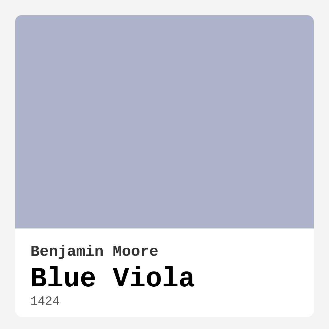
Color Preview & Key Details
| HEX Code | #ACB3CA |
| RGB | 172, 179, 202 |
| LRV | 46.21% |
| Undertone | Blue |
| Finish Options | Eggshell, Matte, Satin |
Imagine walking into a room that instantly feels like a breath of fresh air. Where the walls whisper elegance and tranquility, wrapping you in a comforting embrace. That’s the magic of Blue Viola, a stunning paint color from Benjamin Moore that finds the sweet spot between sophistication and warmth.
This soft, muted blue—with its gentle gray undertones—creates a serene atmosphere perfect for those who appreciate subtle elegance. Whether you’re reimagining your living room, crafting a cozy nursery, or setting up a serene home office, Blue Viola can be your go-to choice. Its versatility shines through various decor styles, making it a standout selection for both traditional and contemporary settings.
One of the first things you’ll notice about Blue Viola is its calming quality. It’s not just a color; it’s a mood. This hue effortlessly radiates tranquility, making spaces feel inviting. It’s a fantastic option for areas where you want to unwind, like your bedroom or a cozy reading nook. The soothing tone of Blue Viola invites relaxation, making it ideal for a nursery or any space dedicated to rest and rejuvenation.
When it comes to decor styles, Blue Viola is incredibly adaptable. It works beautifully in modern and Scandinavian designs, where clean lines and minimalism reign supreme. Pair it with natural woods and plants for a fresh, airy feel. If you lean towards a coastal aesthetic, imagine Blue Viola as your backdrop, complemented by nautical decor and light furnishings. Its versatility also makes it suitable for transitional spaces where traditional meets contemporary.
Now, let’s talk about application. You’ll love how Blue Viola glides on the walls, thanks to its smooth consistency. Whether you’re a seasoned DIYer or just starting, this paint is beginner-friendly and roller-ready. Typically, you’ll find that one or two coats are sufficient for full coverage, making it a practical choice for your next project. Plus, it’s highly washable, which is a significant advantage in high-traffic areas. You won’t have to worry about scuffs or stains ruining your beautiful walls.
Speaking of durability, Blue Viola’s low VOC formulation is another attractive feature. It’s eco-certified, meaning you can breathe easy while transforming your space. This paint not only looks good but feels good for your home and the environment. The low odor and quick-drying properties also make it a win for any homeowner looking to refresh their space without the hassle of lingering smells.
One thing to keep in mind is that Blue Viola can appear cooler in low-light conditions. It’s always a good idea to test it in your space at different times of day. Observe how it interacts with your existing furniture and decor as the light changes. This color has a beautiful way of revealing its depth and complexity, thanks to its blue undertones.
When it comes to pairing with other colors, the options are plentiful. For trim, White Dove or Simply White creates a crisp contrast that brightens the space and emphasizes the tranquility of the blue. If you want to introduce some warmth, wood trim can add depth and character. Alternatively, for a modern touch, consider pairing it with black windows or cool trim finishes. The interplay between Blue Viola and other colors can create a stunning visual impact.
Now, envision the spaces you could create. As an accent wall in your living room, Blue Viola can serve as a focal point that draws the eye and calms the soul. In a bedroom, it can act as a backdrop for a serene retreat, complemented by soft linens and natural textures. If you’re considering a home office, think about how this color can motivate creativity while keeping you grounded—ideal for long hours of work.
And don’t forget about the nursery! Blue Viola makes a lovely choice for a child’s room, fostering a soothing environment that feels safe and nurturing. It’s a color that can grow with the child, transitioning beautifully as they move from infancy to toddlerhood and beyond.
When deciding on your paint project, consider the lighting in your space. The Light Reflectance Value (LRV) of Blue Viola is 46.21%, meaning it reflects about half of the incident light. This characteristic allows it to adapt to various environments, creating a bright yet cozy atmosphere that feels open during the day and inviting in the evening.
In terms of upkeep, you’ll appreciate that Blue Viola is touch-up friendly. If you have a busy household, this paint can handle the wear and tear of daily life while still looking fresh. Its washability ensures that scuffs and dirt can be easily wiped away, maintaining the elegance of your walls with minimal effort.
As you think about your home decor, remember that the right color can make all the difference. Blue Viola isn’t just a paint color; it’s an invitation to create a space that feels like home—a place where you can relax, entertain, and enjoy life’s moments.
So, are you ready to bring a touch of calm sophistication into your home? With Blue Viola, you’re not just choosing a color; you’re choosing an experience that enhances your space and reflects your personal style. Embrace the tranquility and elegance of this remarkable hue, and let it transform your home into a beautiful sanctuary you’ll cherish for years to come.
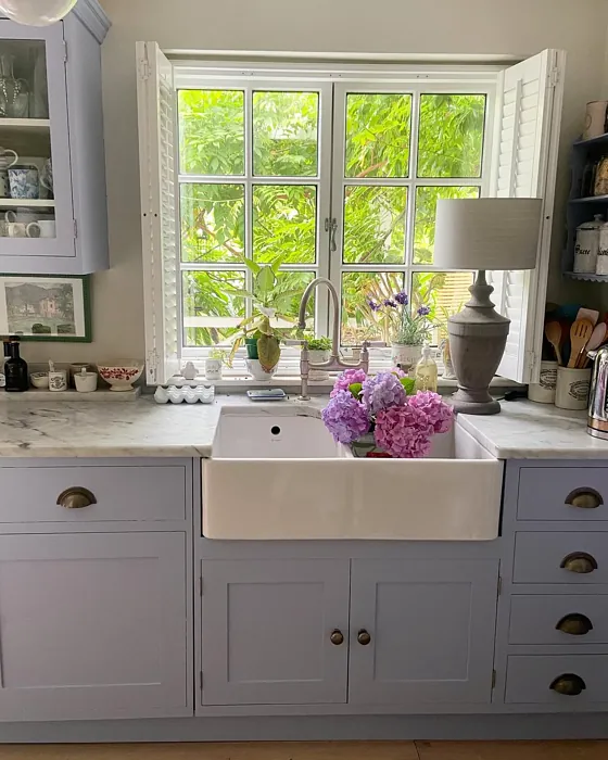
Real Room Photo of Blue Viola 1424
Undertones of Blue Viola ?
The undertones of Blue Viola are a key aspect of its character, leaning towards Blue. These subtle underlying hues are what give the color its depth and complexity. For example, a gray with a blue undertone will feel cooler and more modern, while one with a brown undertone will feel warmer and more traditional. It’s essential to test this paint in your home and observe it next to your existing furniture, flooring, and decor to see how these undertones interact and reveal themselves throughout the day.
HEX value: #ACB3CA
RGB code: 172, 179, 202
Is Blue Viola Cool or Warm?
Blue Viola is considered a cool paint color. This characteristic plays a huge role in the overall feel of a room. Cool colors, like this one, tend to create a cozy, inviting, and energetic atmosphere, making them great for social spaces like living rooms and dining rooms. In contrast, warm colors often evoke a sense of calm and serenity, which is why they are popular in bedrooms and bathrooms. The coolth of Blue Viola means it will pair beautifully with corresponding decor elements.
Understanding Color Properties and Interior Design Tips
Hue refers to a specific position on the color wheel, measured in degrees from 0 to 360. Each degree represents a different pure color:
- 0° represents red
- 120° represents green
- 240° represents blue
Saturation describes the intensity or purity of a color and is expressed as a percentage:
- At 0%, the color appears completely desaturated—essentially a shade of gray
- At 100%, the color is at its most vivid and vibrant
Lightness indicates how light or dark a color is, also expressed as a percentage:
- 0% lightness results in black
- 100% lightness results in white
Using Warm Colors in Interior Design
Warm hues—such as reds, oranges, yellows, warm beiges, and greiges—are excellent choices for creating inviting and energetic spaces. These colors are particularly well-suited for:
- Kitchens, living rooms, and bathrooms, where warmth enhances comfort and sociability
- Large rooms, where warm tones can help reduce the sense of emptiness and make the space feel more intimate
For example:
- Warm beige shades provide a cozy, inviting atmosphere, ideal for living rooms, bedrooms, and hallways.
- Warm greige (a mix of beige and gray) offers the warmth of beige with the modern appeal of gray, making it a versatile backdrop for dining areas, bedrooms, and living spaces.
However, be mindful when using warm light tones in rooms with limited natural light. These shades may appear muted or even take on an unpleasant yellowish tint. To avoid a dull or flat appearance:
- Add depth by incorporating richer tones like deep greens, charcoal, or chocolate brown
- Use textured elements such as curtains, rugs, or cushions to bring dimension to the space
Pro Tip: Achieving Harmony with Warm and Cool Color Balance
To create a well-balanced and visually interesting interior, mix warm and cool tones strategically. This contrast adds depth and harmony to your design.
- If your walls feature warm hues, introduce cool-colored accents such as blue or green furniture, artwork, or accessories to create contrast.
- For a polished look, consider using a complementary color scheme, which pairs colors opposite each other on the color wheel (e.g., red with green, orange with blue).
This thoughtful mix not only enhances visual appeal but also creates a space that feels both dynamic and cohesive.
Light Temperature Affects on Blue Viola
Natural Light
Natural daylight changes in color temperature as the sun moves across the sky. At sunrise and sunset, the light tends to have a warm, golden tone with a color temperature around 2000 Kelvin (K). As the day progresses and the sun rises higher, the light becomes cooler and more neutral. Around midday, especially when the sky is clear, natural light typically reaches its peak brightness and shifts to a cooler tone, ranging from 5500 to 6500 Kelvin. This midday light is close to what we perceive as pure white or daylight-balanced light.
These shifts in natural light can significantly influence how colors appear in a space, which is why designers often consider both the time of day and the orientation of windows when planning interior color schemes.
Artificial Light
When choosing artificial lighting, pay close attention to the color temperature, measured in Kelvin (K). This determines how warm or cool the light will appear. Lower temperatures, around 2700K, give off a warm, yellow glow often used in living rooms or bedrooms. Higher temperatures, above 5000K, create a cool, bluish light similar to daylight, commonly used in kitchens, offices, or task areas.
Use the slider to see how lighting temperature can affect the appearance of a surface or color throughout a space.


4800K
LRV of Blue Viola
The Light Reflectance Value (LRV) of Blue Viola is 46.21%, which places it in the Light Medium colors category. This means it reflect half of the incident light. Understanding a paint’s LRV is crucial for predicting how it will look in your space. A higher LRV indicates a lighter color that reflects more light, making rooms feel larger and brighter. A lower LRV signifies a darker color that absorbs more light, creating a cozier, more intimate atmosphere. Always consider the natural and artificial lighting in your room when selecting a paint color based on its LRV.
Detailed Review of Blue Viola
Additional Paint Characteristics
Ideal Rooms
Bedroom, Home Office, Kitchen, Living Room, Nursery
Decor Styles
Coastal, Modern, Scandinavian, Transitional
Coverage
Good (1–2 Coats), Touch-Up Friendly
Ease of Application
Beginner Friendly, Brush Smooth, Fast-Drying, Roller-Ready
Washability
Highly Washable, Washable
VOC Level
Eco-Certified, Low VOC
Best Use
Accent Wall, Interior Walls
Room Suitability
Bedroom, Home Office, Living Room, Nursery
Tone Tag
Balanced, Cool, Muted
Finish Type
Eggshell, Matte, Satin
Paint Performance
Easy Touch-Up, Fade Resistant, Low Odor, Quick Drying
Use Cases
Best for Open Concept, Best for Rentals, Best for Small Spaces, Designer Favorite
Mood
Calm, Inviting, Restful
Trim Pairing
Complements Cool Trim, Good with Wood Trim, Pairs with White Dove
Applying Blue Viola is a delightful experience. The paint glides on smoothly, making it beginner-friendly while also being suitable for professional applications. Its creamy consistency ensures excellent coverage with just one or two coats, which saves you time and effort. Blue Viola’s muted tone adjusts beautifully under different lighting conditions; it feels airy during the day and cozy in the evenings. This color complements a wide range of furnishings and decor styles, making it an excellent choice for those looking to refresh their home. Whether you’re painting a single accent wall or an entire room, Blue Viola delivers a calming and polished finish that’s hard to resist.
Pros & Cons of 1424 Blue Viola
Pros
Cons
Colors that go with Benjamin Moore Blue Viola
FAQ on 1424 Blue Viola
Can Blue Viola be used in high-traffic areas?
Absolutely! Blue Viola is a highly washable paint, making it suitable for high-traffic areas where scuffs and stains may occur. With its durable finish, it holds up well against wear and tear, ensuring your walls stay looking fresh and vibrant longer.
What trim colors work best with Blue Viola?
Blue Viola pairs beautifully with a variety of trim colors. White Dove or Simply White offer a crisp contrast that brightens the space, while wood trim can add warmth and depth. For a more modern look, consider matching it with black windows or cool trim finishes.
Comparisons Blue Viola with other colors
Blue Viola 1424 vs Dusty Heather SW 9073
| Attribute | Blue Viola 1424 | Dusty Heather SW 9073 |
|---|---|---|
| Color Name | Blue Viola 1424 | Dusty Heather SW 9073 |
| Color | ||
| Hue | Purple | Purple |
| Brightness | Medium | Medium |
| RGB | 172, 179, 202 | 137, 144, 163 |
| LRV | 46.21% | 30% |
| Finish Type | Eggshell, Matte, Satin | Eggshell, Matte, Satin |
| Finish Options | Eggshell, Matte, Satin | Eggshell, Matte, Satin |
| Ideal Rooms | Bedroom, Home Office, Kitchen, Living Room, Nursery | Bedroom, Home Office, Living Room, Nursery |
| Decor Styles | Coastal, Modern, Scandinavian, Transitional | Modern, Rustic, Scandinavian, Transitional |
| Coverage | Good (1–2 Coats), Touch-Up Friendly | Good (1–2 Coats), Touch-Up Friendly |
| Ease of Application | Beginner Friendly, Brush Smooth, Fast-Drying, Roller-Ready | Beginner Friendly, Brush Smooth, Roller-Ready |
| Washability | Highly Washable, Washable | Washable, Wipeable |
| Room Suitability | Bedroom, Home Office, Living Room, Nursery | Bedroom, Home Office, Living Room, Nursery |
| Tone | Balanced, Cool, Muted | Cool, Dusty, Muted |
| Paint Performance | Easy Touch-Up, Fade Resistant, Low Odor, Quick Drying | Easy Touch-Up, High Coverage, Low Odor |
Blue Viola 1424 vs Chaise Mauve SW 6016
| Attribute | Blue Viola 1424 | Chaise Mauve SW 6016 |
|---|---|---|
| Color Name | Blue Viola 1424 | Chaise Mauve SW 6016 |
| Color | ||
| Hue | Purple | Purple |
| Brightness | Medium | Medium |
| RGB | 172, 179, 202 | 193, 178, 179 |
| LRV | 46.21% | 24% |
| Finish Type | Eggshell, Matte, Satin | Eggshell, Matte, Satin |
| Finish Options | Eggshell, Matte, Satin | Eggshell, Matte, Satin |
| Ideal Rooms | Bedroom, Home Office, Kitchen, Living Room, Nursery | Bedroom, Dining Room, Home Office, Living Room, Nursery |
| Decor Styles | Coastal, Modern, Scandinavian, Transitional | Eclectic, Minimalist, Modern, Transitional, Vintage |
| Coverage | Good (1–2 Coats), Touch-Up Friendly | Good (1–2 Coats) |
| Ease of Application | Beginner Friendly, Brush Smooth, Fast-Drying, Roller-Ready | Beginner Friendly, Brush Smooth, Fast-Drying, Roller-Ready |
| Washability | Highly Washable, Washable | Highly Washable, Washable, Wipeable |
| Room Suitability | Bedroom, Home Office, Living Room, Nursery | Bedroom, Dining Room, Home Office, Living Room, Nursery |
| Tone | Balanced, Cool, Muted | Balanced, Dusty, Muted, Warm |
| Paint Performance | Easy Touch-Up, Fade Resistant, Low Odor, Quick Drying | Easy Touch-Up, Fade Resistant, Low Odor, Quick Drying |
Blue Viola 1424 vs Vesper Violet SW 6542
| Attribute | Blue Viola 1424 | Vesper Violet SW 6542 |
|---|---|---|
| Color Name | Blue Viola 1424 | Vesper Violet SW 6542 |
| Color | ||
| Hue | Purple | Purple |
| Brightness | Medium | Medium |
| RGB | 172, 179, 202 | 153, 160, 178 |
| LRV | 46.21% | 24% |
| Finish Type | Eggshell, Matte, Satin | Eggshell, Satin |
| Finish Options | Eggshell, Matte, Satin | Eggshell, Flat, Satin |
| Ideal Rooms | Bedroom, Home Office, Kitchen, Living Room, Nursery | Bedroom, Home Office, Living Room, Nursery |
| Decor Styles | Coastal, Modern, Scandinavian, Transitional | Bohemian, Modern, Scandinavian, Transitional |
| Coverage | Good (1–2 Coats), Touch-Up Friendly | Good (1–2 Coats), Touch-Up Friendly |
| Ease of Application | Beginner Friendly, Brush Smooth, Fast-Drying, Roller-Ready | Beginner Friendly, Brush Smooth, Roller-Ready |
| Washability | Highly Washable, Washable | Stain Resistant, Washable |
| Room Suitability | Bedroom, Home Office, Living Room, Nursery | Bedroom, Home Office, Living Room, Nursery |
| Tone | Balanced, Cool, Muted | Cool, Dusty, Muted |
| Paint Performance | Easy Touch-Up, Fade Resistant, Low Odor, Quick Drying | Easy Touch-Up, Fade Resistant, Low Odor |
Blue Viola 1424 vs Moonlit Orchid SW 9153
| Attribute | Blue Viola 1424 | Moonlit Orchid SW 9153 |
|---|---|---|
| Color Name | Blue Viola 1424 | Moonlit Orchid SW 9153 |
| Color | ||
| Hue | Purple | Purple |
| Brightness | Medium | Medium |
| RGB | 172, 179, 202 | 148, 145, 148 |
| LRV | 46.21% | 15% |
| Finish Type | Eggshell, Matte, Satin | Eggshell, Matte |
| Finish Options | Eggshell, Matte, Satin | Eggshell, Matte, Satin |
| Ideal Rooms | Bedroom, Home Office, Kitchen, Living Room, Nursery | Bedroom, Home Office, Living Room, Nursery |
| Decor Styles | Coastal, Modern, Scandinavian, Transitional | Bohemian, Minimalist, Modern, Transitional |
| Coverage | Good (1–2 Coats), Touch-Up Friendly | Good (1–2 Coats), Touch-Up Friendly |
| Ease of Application | Beginner Friendly, Brush Smooth, Fast-Drying, Roller-Ready | Beginner Friendly, Brush Smooth, Roller-Ready |
| Washability | Highly Washable, Washable | Spot Clean Only, Washable |
| Room Suitability | Bedroom, Home Office, Living Room, Nursery | Bedroom, Home Office, Living Room, Nursery |
| Tone | Balanced, Cool, Muted | Balanced, Cool, Muted |
| Paint Performance | Easy Touch-Up, Fade Resistant, Low Odor, Quick Drying | Easy Touch-Up, High Coverage, Low Odor |
Blue Viola 1424 vs Thistle SW 6283
| Attribute | Blue Viola 1424 | Thistle SW 6283 |
|---|---|---|
| Color Name | Blue Viola 1424 | Thistle SW 6283 |
| Color | ||
| Hue | Purple | Purple |
| Brightness | Medium | Medium |
| RGB | 172, 179, 202 | 170, 142, 154 |
| LRV | 46.21% | 66% |
| Finish Type | Eggshell, Matte, Satin | Eggshell, Matte, Satin |
| Finish Options | Eggshell, Matte, Satin | Eggshell, Matte, Satin |
| Ideal Rooms | Bedroom, Home Office, Kitchen, Living Room, Nursery | Bedroom, Dining Room, Home Office, Living Room, Nursery |
| Decor Styles | Coastal, Modern, Scandinavian, Transitional | Bohemian, Modern, Scandinavian, Vintage |
| Coverage | Good (1–2 Coats), Touch-Up Friendly | Good (1–2 Coats), Touch-Up Friendly |
| Ease of Application | Beginner Friendly, Brush Smooth, Fast-Drying, Roller-Ready | Beginner Friendly, Brush Smooth, Fast-Drying, Roller-Ready |
| Washability | Highly Washable, Washable | Spot Clean Only, Washable, Wipeable |
| Room Suitability | Bedroom, Home Office, Living Room, Nursery | Bedroom, Home Office, Living Room, Nursery |
| Tone | Balanced, Cool, Muted | Dusty, Muted, Warm |
| Paint Performance | Easy Touch-Up, Fade Resistant, Low Odor, Quick Drying | Easy Touch-Up, Fade Resistant, Long Lasting, Low Odor |
Blue Viola 1424 vs Grape Mist SW 6548
| Attribute | Blue Viola 1424 | Grape Mist SW 6548 |
|---|---|---|
| Color Name | Blue Viola 1424 | Grape Mist SW 6548 |
| Color | ||
| Hue | Purple | Purple |
| Brightness | Medium | Medium |
| RGB | 172, 179, 202 | 197, 192, 201 |
| LRV | 46.21% | 24% |
| Finish Type | Eggshell, Matte, Satin | Eggshell, Matte |
| Finish Options | Eggshell, Matte, Satin | Eggshell, Matte, Satin |
| Ideal Rooms | Bedroom, Home Office, Kitchen, Living Room, Nursery | Bedroom, Home Office, Living Room, Nursery |
| Decor Styles | Coastal, Modern, Scandinavian, Transitional | Modern, Rustic, Scandinavian, Transitional |
| Coverage | Good (1–2 Coats), Touch-Up Friendly | Good (1–2 Coats), Touch-Up Friendly |
| Ease of Application | Beginner Friendly, Brush Smooth, Fast-Drying, Roller-Ready | Beginner Friendly, Brush Smooth, Roller-Ready |
| Washability | Highly Washable, Washable | Washable, Wipeable |
| Room Suitability | Bedroom, Home Office, Living Room, Nursery | Bedroom, Home Office, Living Room, Nursery |
| Tone | Balanced, Cool, Muted | Cool, Muted, Pastel |
| Paint Performance | Easy Touch-Up, Fade Resistant, Low Odor, Quick Drying | Easy Touch-Up, Fade Resistant, Low Odor |
Blue Viola 1424 vs Agapanthus SW 9066
| Attribute | Blue Viola 1424 | Agapanthus SW 9066 |
|---|---|---|
| Color Name | Blue Viola 1424 | Agapanthus SW 9066 |
| Color | ||
| Hue | Purple | Purple |
| Brightness | Medium | Medium |
| RGB | 172, 179, 202 | 187, 197, 222 |
| LRV | 46.21% | 15% |
| Finish Type | Eggshell, Matte, Satin | Eggshell, Matte, Satin |
| Finish Options | Eggshell, Matte, Satin | Eggshell, Matte, Satin |
| Ideal Rooms | Bedroom, Home Office, Kitchen, Living Room, Nursery | Bedroom, Hallway, Home Office, Living Room, Nursery |
| Decor Styles | Coastal, Modern, Scandinavian, Transitional | Coastal, Minimalist, Modern, Scandinavian |
| Coverage | Good (1–2 Coats), Touch-Up Friendly | Good (1–2 Coats), Touch-Up Friendly |
| Ease of Application | Beginner Friendly, Brush Smooth, Fast-Drying, Roller-Ready | Beginner Friendly, Brush Smooth, Roller-Ready |
| Washability | Highly Washable, Washable | Washable, Wipeable |
| Room Suitability | Bedroom, Home Office, Living Room, Nursery | Bedroom, Home Office, Living Room, Nursery |
| Tone | Balanced, Cool, Muted | Airy, Cool, Muted |
| Paint Performance | Easy Touch-Up, Fade Resistant, Low Odor, Quick Drying | Easy Touch-Up, Fade Resistant, Low Odor, Quick Drying |
Blue Viola 1424 vs Intuitive SW 6017
| Attribute | Blue Viola 1424 | Intuitive SW 6017 |
|---|---|---|
| Color Name | Blue Viola 1424 | Intuitive SW 6017 |
| Color | ||
| Hue | Purple | Purple |
| Brightness | Medium | Medium |
| RGB | 172, 179, 202 | 179, 163, 165 |
| LRV | 46.21% | 30% |
| Finish Type | Eggshell, Matte, Satin | Eggshell, Matte, Satin |
| Finish Options | Eggshell, Matte, Satin | Eggshell, Matte, Satin |
| Ideal Rooms | Bedroom, Home Office, Kitchen, Living Room, Nursery | Bedroom, Dining Room, Home Office, Living Room, Nursery |
| Decor Styles | Coastal, Modern, Scandinavian, Transitional | Minimalist, Modern, Scandinavian, Transitional |
| Coverage | Good (1–2 Coats), Touch-Up Friendly | Good (1–2 Coats) |
| Ease of Application | Beginner Friendly, Brush Smooth, Fast-Drying, Roller-Ready | Beginner Friendly, Brush Smooth, Roller-Ready |
| Washability | Highly Washable, Washable | Washable, Wipeable |
| Room Suitability | Bedroom, Home Office, Living Room, Nursery | Bedroom, Dining Room, Home Office, Living Room |
| Tone | Balanced, Cool, Muted | Balanced, Muted, Warm |
| Paint Performance | Easy Touch-Up, Fade Resistant, Low Odor, Quick Drying | Easy Touch-Up, Low Odor, Quick Drying |
Blue Viola 1424 vs Veiled Violet SW 6268
| Attribute | Blue Viola 1424 | Veiled Violet SW 6268 |
|---|---|---|
| Color Name | Blue Viola 1424 | Veiled Violet SW 6268 |
| Color | ||
| Hue | Purple | Purple |
| Brightness | Medium | Medium |
| RGB | 172, 179, 202 | 189, 181, 185 |
| LRV | 46.21% | 24% |
| Finish Type | Eggshell, Matte, Satin | Eggshell, Matte, Satin |
| Finish Options | Eggshell, Matte, Satin | Eggshell, Matte, Satin |
| Ideal Rooms | Bedroom, Home Office, Kitchen, Living Room, Nursery | Bedroom, Home Office, Living Room, Nursery |
| Decor Styles | Coastal, Modern, Scandinavian, Transitional | Bohemian, Minimalist, Modern, Transitional |
| Coverage | Good (1–2 Coats), Touch-Up Friendly | Good (1–2 Coats), Touch-Up Friendly |
| Ease of Application | Beginner Friendly, Brush Smooth, Fast-Drying, Roller-Ready | Beginner Friendly, Brush Smooth, Fast-Drying, Roller-Ready |
| Washability | Highly Washable, Washable | Highly Washable, Washable |
| Room Suitability | Bedroom, Home Office, Living Room, Nursery | Bedroom, Home Office, Living Room, Nursery |
| Tone | Balanced, Cool, Muted | Airy, Cool, Dusty, Muted |
| Paint Performance | Easy Touch-Up, Fade Resistant, Low Odor, Quick Drying | Easy Touch-Up, Fade Resistant, Low Odor, Quick Drying |
Blue Viola 1424 vs Gris Morado SW 9156
| Attribute | Blue Viola 1424 | Gris Morado SW 9156 |
|---|---|---|
| Color Name | Blue Viola 1424 | Gris Morado SW 9156 |
| Color | ||
| Hue | Purple | Purple |
| Brightness | Medium | Medium |
| RGB | 172, 179, 202 | 143, 138, 145 |
| LRV | 46.21% | 20% |
| Finish Type | Eggshell, Matte, Satin | Eggshell, Matte, Satin |
| Finish Options | Eggshell, Matte, Satin | Eggshell, Matte, Satin |
| Ideal Rooms | Bedroom, Home Office, Kitchen, Living Room, Nursery | Bedroom, Dining Room, Home Office, Living Room |
| Decor Styles | Coastal, Modern, Scandinavian, Transitional | Contemporary, Minimalist, Modern, Scandinavian |
| Coverage | Good (1–2 Coats), Touch-Up Friendly | Good (1–2 Coats), Touch-Up Friendly |
| Ease of Application | Beginner Friendly, Brush Smooth, Fast-Drying, Roller-Ready | Beginner Friendly, Brush Smooth, Fast-Drying, Roller-Ready |
| Washability | Highly Washable, Washable | Washable, Wipeable |
| Room Suitability | Bedroom, Home Office, Living Room, Nursery | Bedroom, Dining Room, Home Office, Living Room |
| Tone | Balanced, Cool, Muted | Cool, Muted, Sophisticated |
| Paint Performance | Easy Touch-Up, Fade Resistant, Low Odor, Quick Drying | Easy Touch-Up, Fade Resistant, Low Odor |
Official Page of Benjamin Moore Blue Viola 1424