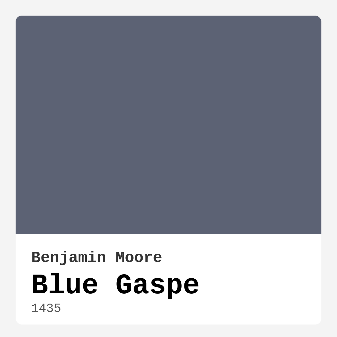
Color Preview & Key Details
| HEX Code | #5C6274 |
| RGB | 92, 98, 116 |
| LRV | 13.90% |
| Undertone | Blue |
| Finish Options | Eggshell, Matte, Satin |
If you’re searching for a paint color that effortlessly blends sophistication with tranquility, Benjamin Moore’s Blue Gaspe (1435) might just be your perfect match. This stunning blue-gray hue captures the essence of serene coastal waters, offering a calming yet deeply stylish presence in any room. Whether you’re refreshing a bedroom, revamping a home office, or giving your living room a modern edge, this shade has the versatility to adapt to your vision. Let’s dive into what makes Blue Gaspe so special and how you can make it work in your space.
One of the standout qualities of Blue Gaspe is its ability to shift with the light. In bright, natural daylight, the blue undertones come alive, giving the color a fresh, almost airy feel. As the light fades, it softens into a more muted, cozy gray, making it ideal for rooms where you want both daytime energy and evening relaxation. With a Light Reflectance Value (LRV) of 13.90%, it sits in the medium-dark range, meaning it absorbs more light than it reflects. This makes it a great choice if you’re aiming for a snug, intimate atmosphere—think bedrooms or reading nooks—but it can also hold its own in well-lit spaces without feeling overwhelming.
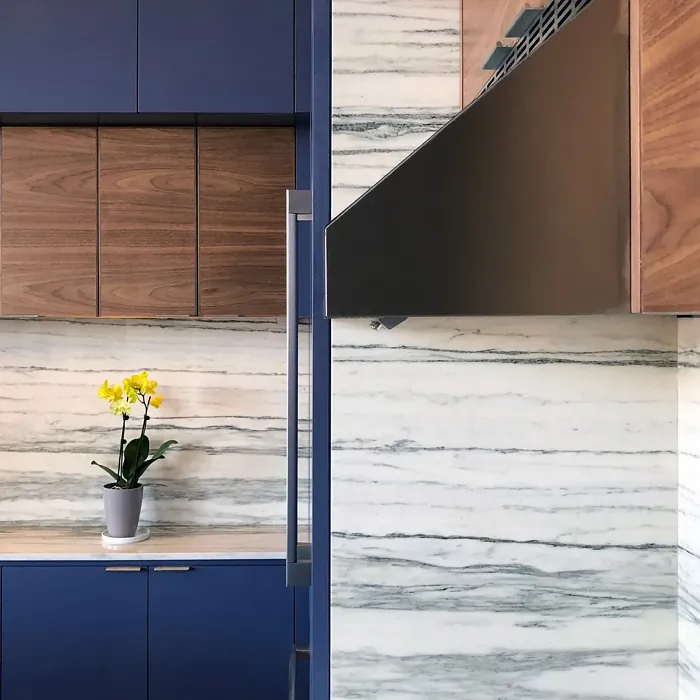
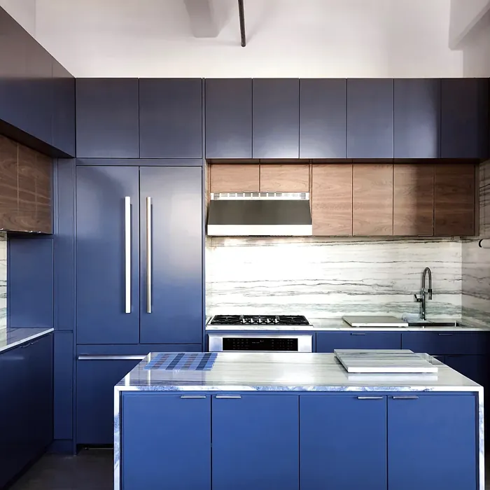
When it comes to decor styles, Blue Gaspe is a chameleon. Its cool, balanced undertones make it a natural fit for coastal-inspired spaces, where it mimics the misty hues of ocean horizons. But don’t let that limit you—it’s equally at home in modern, transitional, or even Scandinavian interiors. Pair it with crisp white trim for a clean, classic look, or warm it up with natural wood finishes for a touch of organic contrast. If you’re feeling bold, try it alongside accents in its complementary color, orange, for a dynamic yet harmonious pop. Think burnt-orange throw pillows, terracotta pots, or even a rust-colored accent chair to create visual interest.
Application is a breeze with Blue Gaspe. It’s beginner-friendly, dries quickly, and typically only needs one or two coats for full, even coverage. The finish options—matte, eggshell, or satin—give you flexibility depending on the room’s function. Eggshell and satin are excellent for high-traffic areas like living rooms or kitchens, offering a slight sheen that’s easy to wipe clean. Matte, on the other hand, is perfect for bedrooms or home offices where you want a velvety, non-reflective surface that enhances the color’s depth.
Worried about small rooms? Don’t be. Blue Gaspe’s cool undertones can actually make compact spaces feel more open and airy. If you’re painting a small bedroom or a narrow hallway, this shade can create the illusion of more space while still keeping the vibe cozy. Just be mindful of lighting—since it reflects very little light, adding ample artificial or natural light sources will prevent it from feeling too dark. Mirrors, light-colored furniture, and sheer curtains can all help balance the effect.
For those who love to experiment, Blue Gaspe is a fantastic choice for an accent wall. Its rich, moody tone adds instant drama without overwhelming the room. Try it behind a bed in a bedroom or as a backdrop for a gallery wall in the living room. If you’re feeling adventurous, consider using it on furniture—a dresser, bookshelf, or even kitchen cabinets in this shade can make a striking statement.
Maintenance is straightforward, too. Thanks to its washability, you won’t have to stress about scuffs or stains, especially if you opt for a satin or eggshell finish. And because it’s low-VOC, it’s a healthier choice for indoor air quality, making it ideal for homes with kids, pets, or anyone sensitive to strong paint odors.
So, is Blue Gaspe right for your project? If you’re drawn to colors that are both calming and chic, with just enough depth to feel intentional, then yes. It’s a shade that plays well with others, whether you’re pairing it with crisp whites, warm woods, or even bold complementary hues. Test it out in your space first—paint a large swatch and observe it at different times of day to see how the light transforms it. You might just find that it’s the missing piece in your home’s color story.
At the end of the day, Blue Gaspe is more than just a paint color—it’s a mood. It’s the quiet confidence of a well-designed room, the soothing retreat after a long day, the backdrop to countless memories. Whether you’re a seasoned designer or a first-time painter, this shade offers the perfect balance of versatility and personality. So grab a brush, trust your instincts, and let Blue Gaspe work its magic in your home.
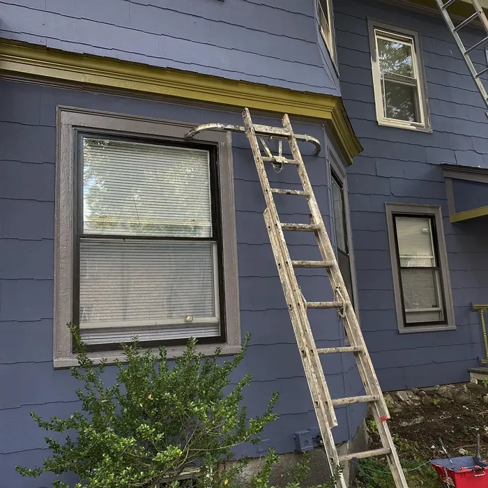
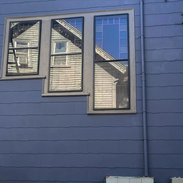
Real Room Photo of Blue Gaspe 1435
Undertones of Blue Gaspe ?
The undertones of Blue Gaspe are a key aspect of its character, leaning towards Blue. These subtle underlying hues are what give the color its depth and complexity. For example, a gray with a blue undertone will feel cooler and more modern, while one with a brown undertone will feel warmer and more traditional. It’s essential to test this paint in your home and observe it next to your existing furniture, flooring, and decor to see how these undertones interact and reveal themselves throughout the day.
HEX value: #5C6274
RGB code: 92, 98, 116
Is Blue Gaspe Cool or Warm?
Blue Gaspe is primarily a cool color, perfect for creating a refreshing atmosphere. Its coolness helps to visually expand smaller spaces, making it ideal for areas that need a touch of openness.
Understanding Color Properties and Interior Design Tips
Hue refers to a specific position on the color wheel, measured in degrees from 0 to 360. Each degree represents a different pure color:
- 0° represents red
- 120° represents green
- 240° represents blue
Saturation describes the intensity or purity of a color and is expressed as a percentage:
- At 0%, the color appears completely desaturated—essentially a shade of gray
- At 100%, the color is at its most vivid and vibrant
Lightness indicates how light or dark a color is, also expressed as a percentage:
- 0% lightness results in black
- 100% lightness results in white
Using Warm Colors in Interior Design
Warm hues—such as reds, oranges, yellows, warm beiges, and greiges—are excellent choices for creating inviting and energetic spaces. These colors are particularly well-suited for:
- Kitchens, living rooms, and bathrooms, where warmth enhances comfort and sociability
- Large rooms, where warm tones can help reduce the sense of emptiness and make the space feel more intimate
For example:
- Warm beige shades provide a cozy, inviting atmosphere, ideal for living rooms, bedrooms, and hallways.
- Warm greige (a mix of beige and gray) offers the warmth of beige with the modern appeal of gray, making it a versatile backdrop for dining areas, bedrooms, and living spaces.
However, be mindful when using warm light tones in rooms with limited natural light. These shades may appear muted or even take on an unpleasant yellowish tint. To avoid a dull or flat appearance:
- Add depth by incorporating richer tones like deep greens, charcoal, or chocolate brown
- Use textured elements such as curtains, rugs, or cushions to bring dimension to the space
Pro Tip: Achieving Harmony with Warm and Cool Color Balance
To create a well-balanced and visually interesting interior, mix warm and cool tones strategically. This contrast adds depth and harmony to your design.
- If your walls feature warm hues, introduce cool-colored accents such as blue or green furniture, artwork, or accessories to create contrast.
- For a polished look, consider using a complementary color scheme, which pairs colors opposite each other on the color wheel (e.g., red with green, orange with blue).
This thoughtful mix not only enhances visual appeal but also creates a space that feels both dynamic and cohesive.
Light Temperature Affects on Blue Gaspe
Natural Light
Natural daylight changes in color temperature as the sun moves across the sky. At sunrise and sunset, the light tends to have a warm, golden tone with a color temperature around 2000 Kelvin (K). As the day progresses and the sun rises higher, the light becomes cooler and more neutral. Around midday, especially when the sky is clear, natural light typically reaches its peak brightness and shifts to a cooler tone, ranging from 5500 to 6500 Kelvin. This midday light is close to what we perceive as pure white or daylight-balanced light.
These shifts in natural light can significantly influence how colors appear in a space, which is why designers often consider both the time of day and the orientation of windows when planning interior color schemes.
Artificial Light
When choosing artificial lighting, pay close attention to the color temperature, measured in Kelvin (K). This determines how warm or cool the light will appear. Lower temperatures, around 2700K, give off a warm, yellow glow often used in living rooms or bedrooms. Higher temperatures, above 5000K, create a cool, bluish light similar to daylight, commonly used in kitchens, offices, or task areas.
Use the slider to see how lighting temperature can affect the appearance of a surface or color throughout a space.


4800K
LRV of Blue Gaspe
The Light Reflectance Value (LRV) of Blue Gaspe is 13.90%, which places it in the Medium Dark category. This means it reflects very little light. Understanding a paint’s LRV is crucial for predicting how it will look in your space. A higher LRV indicates a lighter color that reflects more light, making rooms feel larger and brighter. A lower LRV signifies a darker color that absorbs more light, creating a cozier, more intimate atmosphere. Always consider the natural and artificial lighting in your room when selecting a paint color based on its LRV.
Detailed Review of Blue Gaspe
Additional Paint Characteristics
Ideal Rooms
Bedroom, Dining Room, Home Office, Kitchen, Living Room
Decor Styles
Coastal, Modern, Scandinavian, Transitional
Coverage
Good (1–2 Coats)
Ease of Application
Beginner Friendly, Brush Smooth, Fast-Drying, Roller-Ready
Washability
Washable, Wipeable
VOC Level
Low VOC
Best Use
Accent Wall, Furniture, Interior Walls
Room Suitability
Bedroom, Dining Room, Home Office, Living Room
Tone Tag
Balanced, Cool, Muted
Finish Type
Eggshell, Matte, Satin
Paint Performance
Easy Touch-Up, High Coverage, Low Odor, Quick Drying
Use Cases
Best for Low Light Rooms, Best for Rentals, Designer Favorite
Mood
Calm, Inviting, Restful
Trim Pairing
Complements Wood Trim, Matches Pure White, Pairs with White Dove
Blue Gaspe stands out for its versatility and charm. This color adapts beautifully to different lighting conditions, offering a tranquil ambiance during the day and a cozy feel at night. It pairs wonderfully with both warm and cool accents, making it suitable for a variety of decor styles. Whether you’re looking to refresh a bedroom or create a serene home office, this shade works effortlessly to enhance any room. Its subtle complexity helps to create a relaxing space that feels both inviting and sophisticated. Overall, if you’re aiming for a peaceful retreat at home, Blue Gaspe is a fantastic choice.
Pros & Cons of 1435 Blue Gaspe
Pros
Cons
Colors that go with Benjamin Moore Blue Gaspe
FAQ on 1435 Blue Gaspe
Can Blue Gaspe be used in small rooms?
Absolutely! Blue Gaspe’s cool undertones can help make small spaces feel larger and more open. When applied to walls, it creates an airy atmosphere, making it an excellent choice for bedrooms, bathrooms, or even hallways.
How does Blue Gaspe pair with trim colors?
Blue Gaspe pairs beautifully with a variety of trim colors. For a classic look, consider pairing it with bright whites like Pure White or Simply White. If you’re looking for something warmer, wood trim can also complement this color nicely, adding warmth to the overall aesthetic.
Comparisons Blue Gaspe with other colors
Blue Gaspe 1435 vs Naval SW 6244
| Attribute | Blue Gaspe 1435 | Naval SW 6244 |
|---|---|---|
| Color Name | Blue Gaspe 1435 | Naval SW 6244 |
| Color | ||
| Hue | Blue | Blue |
| Brightness | Dark | Dark |
| RGB | 92, 98, 116 | 47, 61, 76 |
| LRV | 13.90% | 4% |
| Finish Type | Eggshell, Matte, Satin | Matte, Satin, Semi-Gloss |
| Finish Options | Eggshell, Matte, Satin | Matte, Satin, Semi-Gloss |
| Ideal Rooms | Bedroom, Dining Room, Home Office, Kitchen, Living Room | Bedroom, Dining Room, Hallway, Home Office, Living Room |
| Decor Styles | Coastal, Modern, Scandinavian, Transitional | Coastal, Industrial, Minimalist, Modern, Traditional |
| Coverage | Good (1–2 Coats) | Good (1–2 Coats), Self-Priming |
| Ease of Application | Beginner Friendly, Brush Smooth, Fast-Drying, Roller-Ready | Beginner Friendly, Brush Smooth, Roller-Ready |
| Washability | Washable, Wipeable | Highly Washable, Washable |
| Room Suitability | Bedroom, Dining Room, Home Office, Living Room | Bedroom, Dining Room, Entryway, Home Office, Living Room |
| Tone | Balanced, Cool, Muted | Cool, Deep, Moody |
| Paint Performance | Easy Touch-Up, High Coverage, Low Odor, Quick Drying | Easy Touch-Up, High Coverage, Low Odor, Scuff Resistant |
Blue Gaspe 1435 vs Sea Serpent SW 7615
| Attribute | Blue Gaspe 1435 | Sea Serpent SW 7615 |
|---|---|---|
| Color Name | Blue Gaspe 1435 | Sea Serpent SW 7615 |
| Color | ||
| Hue | Blue | Blue |
| Brightness | Dark | Dark |
| RGB | 92, 98, 116 | 62, 75, 84 |
| LRV | 13.90% | 12% |
| Finish Type | Eggshell, Matte, Satin | Eggshell, Matte, Satin |
| Finish Options | Eggshell, Matte, Satin | Eggshell, Matte, Satin |
| Ideal Rooms | Bedroom, Dining Room, Home Office, Kitchen, Living Room | Bathroom, Bedroom, Home Office, Living Room |
| Decor Styles | Coastal, Modern, Scandinavian, Transitional | Coastal, Farmhouse, Industrial, Modern |
| Coverage | Good (1–2 Coats) | Good (1–2 Coats), Touch-Up Friendly |
| Ease of Application | Beginner Friendly, Brush Smooth, Fast-Drying, Roller-Ready | Beginner Friendly, Brush Smooth, Roller-Ready |
| Washability | Washable, Wipeable | Highly Washable, Washable |
| Room Suitability | Bedroom, Dining Room, Home Office, Living Room | Bathroom, Bedroom, Home Office, Living Room |
| Tone | Balanced, Cool, Muted | Cool, Deep, Moody |
| Paint Performance | Easy Touch-Up, High Coverage, Low Odor, Quick Drying | Easy Touch-Up, High Coverage, Low Odor |
Blue Gaspe 1435 vs Rain Cloud SW 9639
| Attribute | Blue Gaspe 1435 | Rain Cloud SW 9639 |
|---|---|---|
| Color Name | Blue Gaspe 1435 | Rain Cloud SW 9639 |
| Color | ||
| Hue | Blue | Blue |
| Brightness | Dark | Dark |
| RGB | 92, 98, 116 | 83, 97, 104 |
| LRV | 13.90% | 30% |
| Finish Type | Eggshell, Matte, Satin | Eggshell, Matte, Satin |
| Finish Options | Eggshell, Matte, Satin | Eggshell, Matte, Satin |
| Ideal Rooms | Bedroom, Dining Room, Home Office, Kitchen, Living Room | Bedroom, Dining Room, Home Office, Living Room |
| Decor Styles | Coastal, Modern, Scandinavian, Transitional | Coastal, Contemporary, Minimalist, Scandinavian |
| Coverage | Good (1–2 Coats) | Good (1–2 Coats), Touch-Up Friendly |
| Ease of Application | Beginner Friendly, Brush Smooth, Fast-Drying, Roller-Ready | Beginner Friendly, Brush Smooth, Roller-Ready |
| Washability | Washable, Wipeable | Highly Washable, Washable |
| Room Suitability | Bedroom, Dining Room, Home Office, Living Room | Bedroom, Home Office, Living Room |
| Tone | Balanced, Cool, Muted | Balanced, Cool, Muted |
| Paint Performance | Easy Touch-Up, High Coverage, Low Odor, Quick Drying | Easy Touch-Up, Fade Resistant, Low Odor |
Blue Gaspe 1435 vs Indigo Batik SW 7602
| Attribute | Blue Gaspe 1435 | Indigo Batik SW 7602 |
|---|---|---|
| Color Name | Blue Gaspe 1435 | Indigo Batik SW 7602 |
| Color | ||
| Hue | Blue | Blue |
| Brightness | Dark | Dark |
| RGB | 92, 98, 116 | 62, 80, 99 |
| LRV | 13.90% | 10% |
| Finish Type | Eggshell, Matte, Satin | Matte, Satin |
| Finish Options | Eggshell, Matte, Satin | Eggshell, Flat, Matte, Satin |
| Ideal Rooms | Bedroom, Dining Room, Home Office, Kitchen, Living Room | Bedroom, Dining Room, Home Office, Living Room |
| Decor Styles | Coastal, Modern, Scandinavian, Transitional | Bohemian, Coastal, Contemporary, Modern |
| Coverage | Good (1–2 Coats) | Good (1–2 Coats), Touch-Up Friendly |
| Ease of Application | Beginner Friendly, Brush Smooth, Fast-Drying, Roller-Ready | Brush Smooth, Fast-Drying, Roller-Ready |
| Washability | Washable, Wipeable | Scrubbable, Washable, Wipeable |
| Room Suitability | Bedroom, Dining Room, Home Office, Living Room | Bedroom, Dining Room, Home Office, Living Room |
| Tone | Balanced, Cool, Muted | Cool, Deep, Moody |
| Paint Performance | Easy Touch-Up, High Coverage, Low Odor, Quick Drying | Easy Touch-Up, High Coverage, Low Odor, Quick Drying |
Blue Gaspe 1435 vs Sea Mariner SW 9640
| Attribute | Blue Gaspe 1435 | Sea Mariner SW 9640 |
|---|---|---|
| Color Name | Blue Gaspe 1435 | Sea Mariner SW 9640 |
| Color | ||
| Hue | Blue | Blue |
| Brightness | Dark | Dark |
| RGB | 92, 98, 116 | 67, 74, 84 |
| LRV | 13.90% | 6% |
| Finish Type | Eggshell, Matte, Satin | Eggshell, Matte, Satin |
| Finish Options | Eggshell, Matte, Satin | Eggshell, Matte, Satin |
| Ideal Rooms | Bedroom, Dining Room, Home Office, Kitchen, Living Room | Bedroom, Dining Room, Hallway, Home Office, Living Room |
| Decor Styles | Coastal, Modern, Scandinavian, Transitional | Coastal, Industrial, Minimalist, Modern |
| Coverage | Good (1–2 Coats) | Good (1–2 Coats) |
| Ease of Application | Beginner Friendly, Brush Smooth, Fast-Drying, Roller-Ready | Beginner Friendly, Brush Smooth, Roller-Ready |
| Washability | Washable, Wipeable | Scrubbable, Washable |
| Room Suitability | Bedroom, Dining Room, Home Office, Living Room | Bedroom, Dining Room, Home Office, Living Room |
| Tone | Balanced, Cool, Muted | Cool, Deep, Moody |
| Paint Performance | Easy Touch-Up, High Coverage, Low Odor, Quick Drying | Easy Touch-Up, Low Odor, Quick Drying |
Blue Gaspe 1435 vs Still Water SW 6223
| Attribute | Blue Gaspe 1435 | Still Water SW 6223 |
|---|---|---|
| Color Name | Blue Gaspe 1435 | Still Water SW 6223 |
| Color | ||
| Hue | Blue | Blue |
| Brightness | Dark | Dark |
| RGB | 92, 98, 116 | 74, 93, 95 |
| LRV | 13.90% | 48% |
| Finish Type | Eggshell, Matte, Satin | Eggshell, Matte, Satin |
| Finish Options | Eggshell, Matte, Satin | Eggshell, Matte, Satin |
| Ideal Rooms | Bedroom, Dining Room, Home Office, Kitchen, Living Room | Bedroom, Dining Room, Home Office, Living Room, Nursery |
| Decor Styles | Coastal, Modern, Scandinavian, Transitional | Coastal, Contemporary, Farmhouse, Modern, Rustic |
| Coverage | Good (1–2 Coats) | Good (1–2 Coats), Touch-Up Friendly |
| Ease of Application | Beginner Friendly, Brush Smooth, Fast-Drying, Roller-Ready | Beginner Friendly, Brush Smooth, Roller-Ready |
| Washability | Washable, Wipeable | Highly Washable, Washable |
| Room Suitability | Bedroom, Dining Room, Home Office, Living Room | Bedroom, Dining Room, Home Office, Living Room |
| Tone | Balanced, Cool, Muted | Cool, Earthy, Muted |
| Paint Performance | Easy Touch-Up, High Coverage, Low Odor, Quick Drying | Easy Touch-Up, Fade Resistant, Low Odor |
Blue Gaspe 1435 vs Waterloo SW 9141
| Attribute | Blue Gaspe 1435 | Waterloo SW 9141 |
|---|---|---|
| Color Name | Blue Gaspe 1435 | Waterloo SW 9141 |
| Color | ||
| Hue | Blue | Blue |
| Brightness | Dark | Dark |
| RGB | 92, 98, 116 | 83, 104, 114 |
| LRV | 13.90% | 12% |
| Finish Type | Eggshell, Matte, Satin | Matte, Satin |
| Finish Options | Eggshell, Matte, Satin | Matte, Satin, Semi-Gloss |
| Ideal Rooms | Bedroom, Dining Room, Home Office, Kitchen, Living Room | Bedroom, Dining Room, Hallway, Home Office, Living Room |
| Decor Styles | Coastal, Modern, Scandinavian, Transitional | Coastal, Industrial, Modern, Rustic |
| Coverage | Good (1–2 Coats) | Good (1–2 Coats), Touch-Up Friendly |
| Ease of Application | Beginner Friendly, Brush Smooth, Fast-Drying, Roller-Ready | Brush Smooth, Fast-Drying, Roller-Ready |
| Washability | Washable, Wipeable | Scrubbable, Washable |
| Room Suitability | Bedroom, Dining Room, Home Office, Living Room | Bedroom, Dining Room, Home Office, Living Room |
| Tone | Balanced, Cool, Muted | Balanced, Cool, Muted |
| Paint Performance | Easy Touch-Up, High Coverage, Low Odor, Quick Drying | Easy Touch-Up, Fade Resistant, Low Odor, Quick Drying |
Blue Gaspe 1435 vs Smoky Blue SW 7604
| Attribute | Blue Gaspe 1435 | Smoky Blue SW 7604 |
|---|---|---|
| Color Name | Blue Gaspe 1435 | Smoky Blue SW 7604 |
| Color | ||
| Hue | Blue | Blue |
| Brightness | Dark | Dark |
| RGB | 92, 98, 116 | 89, 110, 121 |
| LRV | 13.90% | 15% |
| Finish Type | Eggshell, Matte, Satin | Eggshell, Matte, Satin |
| Finish Options | Eggshell, Matte, Satin | Eggshell, Matte, Satin |
| Ideal Rooms | Bedroom, Dining Room, Home Office, Kitchen, Living Room | Bathroom, Bedroom, Home Office, Kitchen, Living Room |
| Decor Styles | Coastal, Modern, Scandinavian, Transitional | Coastal, Modern, Scandinavian, Transitional |
| Coverage | Good (1–2 Coats) | Good (1–2 Coats), Touch-Up Friendly |
| Ease of Application | Beginner Friendly, Brush Smooth, Fast-Drying, Roller-Ready | Beginner Friendly, Brush Smooth, Roller-Ready |
| Washability | Washable, Wipeable | Highly Washable, Washable |
| Room Suitability | Bedroom, Dining Room, Home Office, Living Room | Bathroom, Bedroom, Home Office, Living Room |
| Tone | Balanced, Cool, Muted | Cool, Dusty, Muted |
| Paint Performance | Easy Touch-Up, High Coverage, Low Odor, Quick Drying | High Coverage, Low Odor, Quick Drying |
Blue Gaspe 1435 vs Needlepoint Navy SW 0032
| Attribute | Blue Gaspe 1435 | Needlepoint Navy SW 0032 |
|---|---|---|
| Color Name | Blue Gaspe 1435 | Needlepoint Navy SW 0032 |
| Color | ||
| Hue | Blue | Blue |
| Brightness | Dark | Dark |
| RGB | 92, 98, 116 | 84, 102, 112 |
| LRV | 13.90% | 4% |
| Finish Type | Eggshell, Matte, Satin | Matte, Satin, Semi-Gloss |
| Finish Options | Eggshell, Matte, Satin | Matte, Satin, Semi-Gloss |
| Ideal Rooms | Bedroom, Dining Room, Home Office, Kitchen, Living Room | Bedroom, Dining Room, Entryway, Home Office, Living Room |
| Decor Styles | Coastal, Modern, Scandinavian, Transitional | Coastal, Contemporary, Modern Farmhouse, Nautical, Traditional |
| Coverage | Good (1–2 Coats) | Good (1–2 Coats), Touch-Up Friendly |
| Ease of Application | Beginner Friendly, Brush Smooth, Fast-Drying, Roller-Ready | Beginner Friendly, Brush Smooth, Fast-Drying, Roller-Ready |
| Washability | Washable, Wipeable | Scrubbable, Washable |
| Room Suitability | Bedroom, Dining Room, Home Office, Living Room | Bedroom, Dining Room, Home Office, Living Room |
| Tone | Balanced, Cool, Muted | Cool, Deep, Muted |
| Paint Performance | Easy Touch-Up, High Coverage, Low Odor, Quick Drying | Easy Touch-Up, High Coverage, Low Odor, Quick Drying, Stain Resistant |
Blue Gaspe 1435 vs Riverway SW 6222
| Attribute | Blue Gaspe 1435 | Riverway SW 6222 |
|---|---|---|
| Color Name | Blue Gaspe 1435 | Riverway SW 6222 |
| Color | ||
| Hue | Blue | Blue |
| Brightness | Dark | Dark |
| RGB | 92, 98, 116 | 93, 114, 116 |
| LRV | 13.90% | 24% |
| Finish Type | Eggshell, Matte, Satin | Eggshell, Satin |
| Finish Options | Eggshell, Matte, Satin | Eggshell, Matte, Satin |
| Ideal Rooms | Bedroom, Dining Room, Home Office, Kitchen, Living Room | Bathroom, Bedroom, Dining Room, Home Office, Living Room |
| Decor Styles | Coastal, Modern, Scandinavian, Transitional | Coastal, Contemporary, Eclectic, Modern, Rustic |
| Coverage | Good (1–2 Coats) | Good (1–2 Coats), Touch-Up Friendly |
| Ease of Application | Beginner Friendly, Brush Smooth, Fast-Drying, Roller-Ready | Beginner Friendly, Brush Smooth, Fast-Drying, Low Splatter, Roller-Ready |
| Washability | Washable, Wipeable | Highly Washable, Washable |
| Room Suitability | Bedroom, Dining Room, Home Office, Living Room | Bathroom, Bedroom, Home Office, Living Room |
| Tone | Balanced, Cool, Muted | Balanced, Cool, Muted |
| Paint Performance | Easy Touch-Up, High Coverage, Low Odor, Quick Drying | Easy Touch-Up, High Coverage, Low Odor, Quick Drying |
Official Page of Benjamin Moore Blue Gaspe 1435