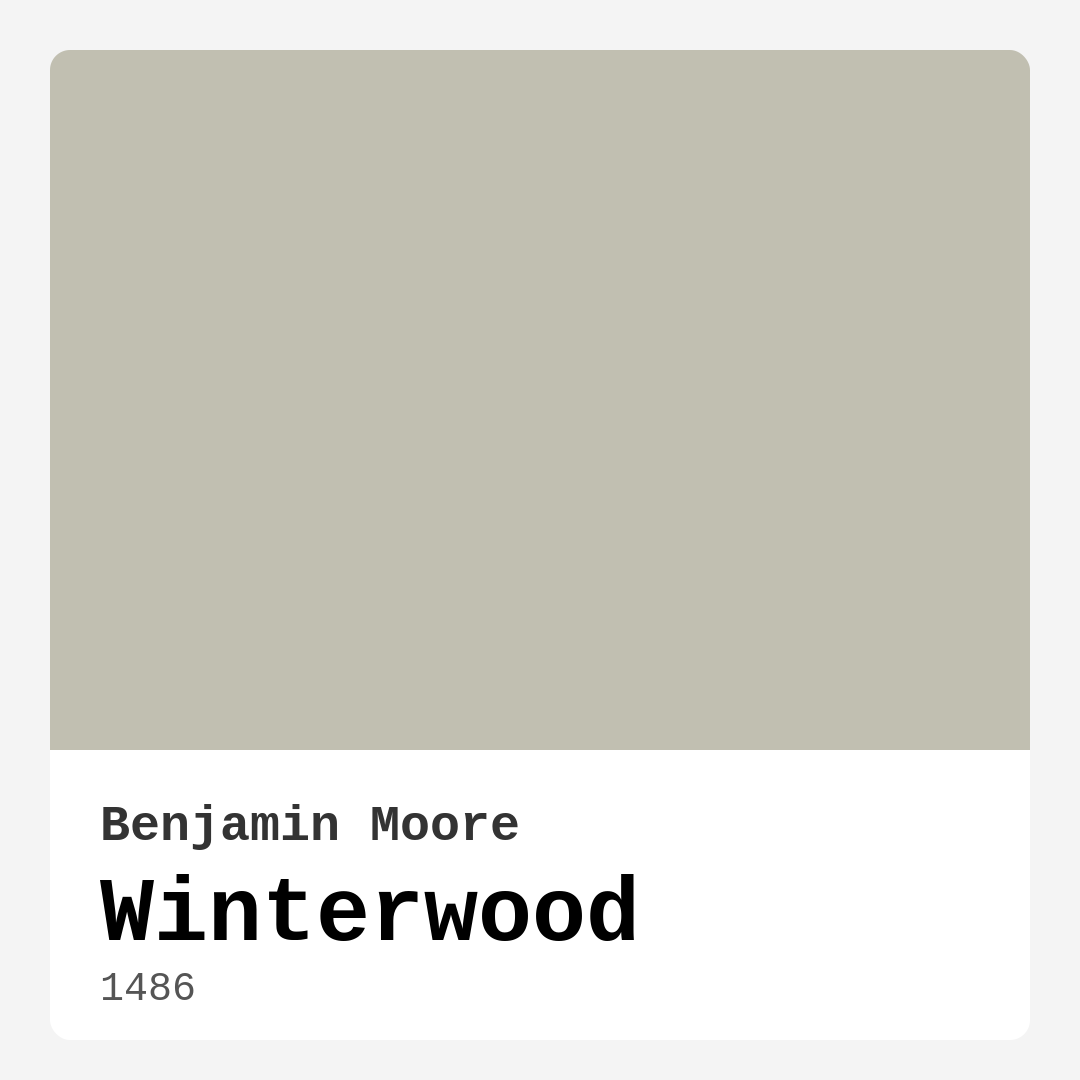
Color Preview & Key Details
| HEX Code | #C1BFB1 |
| RGB | 193, 191, 177 |
| LRV | 50.95% |
| Undertone | Yellow |
| Finish Options | Eggshell, Matte, Satin |
Imagine stepping into a room that instantly feels like a warm embrace. You know the kind – where the walls seem to invite you in, making you want to curl up with a good book or share laughter with friends over a cozy dinner. Wouldn’t you love to create that atmosphere in your home? Let me introduce you to Winterwood, a paint color from Benjamin Moore that can transform your space into just that.
Winterwood, with its charming hue of soft, earthy beige, evokes the serene tranquility of a snowy landscape. It’s the kind of color that speaks to your senses, bridging the gap between cozy comfort and modern elegance. You might think beige is beige, but Winterwood has a personality all its own. Its gentle yellow undertones give it a warmth that can brighten your living space while retaining an inviting feel that greets you as soon as you walk in.
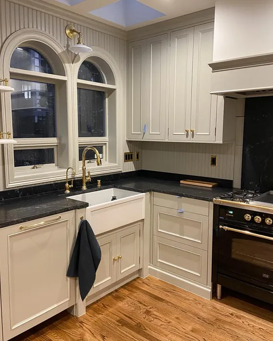
The versatility of Winterwood is one of its standout features. It works beautifully in a variety of rooms, whether you’re looking to refresh your living room, bedroom, kitchen, or even your home office. This color fits seamlessly into decor styles ranging from modern farmhouse and Scandinavian to transitional and rustic. It’s like a chameleon, adapting to your design vision and enhancing the overall ambiance of your home.
One of the most appealing aspects of Winterwood is its excellent coverage. With just one or two coats, you can achieve a beautiful finish that doesn’t require endless touch-ups. This is a game-changer, especially for those of us who may not have the time or inclination to spend days painting. Plus, it’s easy to apply – whether you’re using a roller or a brush, you’ll find that it goes on smoothly and evenly, making it beginner-friendly.
What really sets Winterwood apart is its washability. Life happens, and walls can get scuffed or marked, especially in high-traffic areas. With Winterwood, you can breathe easy knowing that its highly washable finish allows for easy cleanup without damaging the beauty of the color. Just be aware that in such spaces, scuffs might show a bit more prominently, so pairing it with the right accessories and accents can help maintain its pristine look.
Now, let’s talk about light. The Light Reflectance Value (LRV) for Winterwood sits at around 50.95%. This means it reflects about half of the incident light, making it suitable for both bright, sunny rooms and those that might not have as much natural light. In well-lit spaces, the color shines with a soft glow that highlights its comforting beige tones. In dimmer settings, it takes on a more muted shade, creating a calming effect that’s perfect for winding down after a hectic day.
Pairing Winterwood with the right accents and furnishings is crucial, especially to avoid any clashes. Since it leans warm, think about complementing it with cooler tones or contrasting hues to create balance. For instance, icy blues and soft greys can work beautifully together, providing a gentle contrast that enhances both colors. If you’re drawn to a more rustic look, consider pairing Winterwood with wood tones or brass fixtures, which can further amplify its warmth and charm.
Decorating small rooms? Winterwood is an excellent choice. Its light, warm tones can make tight spaces feel larger and more inviting. When combined with lighter furniture, it allows the space to breathe, avoiding that cramped feel many small rooms can have. Just remember to incorporate adequate lighting or brighter decorative elements to keep the space feeling airy.
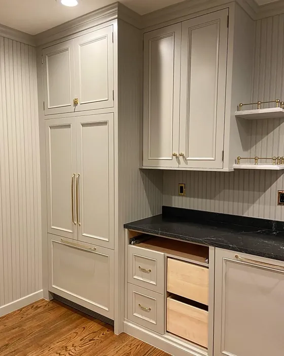
As you think about where to use Winterwood, consider its ideal applications. It works wonders on interior walls, accent walls, trim, and even furniture pieces. If you’re looking to create a cohesive look throughout your home, using Winterwood as a unifying color can be an effective strategy. It can tie together different rooms, creating that serene flow that makes a home feel complete.
One thing to keep in mind is that Winterwood’s nature might require a little thought when it comes to color pairings. While it’s versatile, careful selection is necessary to maintain harmony in your decor. Darker shades can appear more dominant when paired with this hue, so it’s essential to carefully consider where and how you’ll introduce them.
If you’re seeking a timeless feel, match Winterwood with whites – think White Dove for trim and moldings – to keep a clean and elegant look. For a bolder approach, consider incorporating accent pieces in rich jewel tones or deep greens, which can create a stunning contrast against the warmth of Winterwood.
When it comes to finishes, you have several options that can enhance the overall look of the color. A matte finish offers a soft and subtle appearance, while eggshell provides a slight sheen that’s perfect for those who want a touch of elegance. Satin finishes can bring an added layer of sophistication, particularly in dining or living areas where you might want to make a statement.
So, is Winterwood the right choice for your home? If you’re after a color that fosters warmth, tranquility, and versatility, it’s hard to go wrong with this lovely hue. It’s not just about painting walls; it’s about creating an environment that feels good, that resonates with who you are and how you want to live. Winterwood can help you achieve that, offering a serene backdrop that enhances your personal style and invites comfort into your daily life.
In the end, don’t shy away from experimenting with this remarkable color. Take the time to sample it in your space, observe how it interacts with your furniture, lighting, and decor. It may just be the secret ingredient to crafting the home you’ve always wanted – a place that feels as inviting as a warm hug, every time you step through the door.
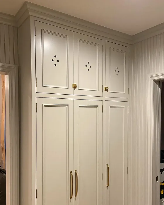
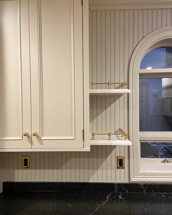
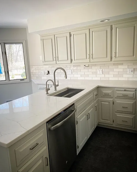
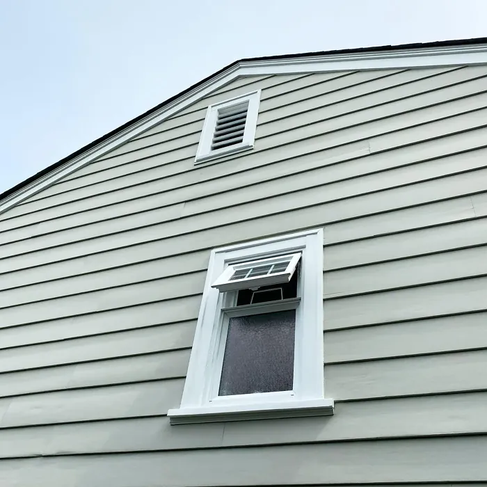
Real Room Photo of Winterwood 1486

Undertones of Winterwood ?
With a whisper of green undertones, Winterwood captures the essence of nature, enhancing the overall ambiance of your space. This subtle undertone gives it a unique character that shifts with the light, ensuring it never feels flat or dull.
HEX value: #C1BFB1
RGB code: 193, 191, 177
Is Winterwood Cool or Warm?
Winterwood leans towards a warm beige, making it a great choice for spaces that require a comforting and welcoming feel. Its warmth invites you in and offers a cozy retreat, perfect for relaxing after a long day.
Understanding Color Properties and Interior Design Tips
Hue refers to a specific position on the color wheel, measured in degrees from 0 to 360. Each degree represents a different pure color:
- 0° represents red
- 120° represents green
- 240° represents blue
Saturation describes the intensity or purity of a color and is expressed as a percentage:
- At 0%, the color appears completely desaturated—essentially a shade of gray
- At 100%, the color is at its most vivid and vibrant
Lightness indicates how light or dark a color is, also expressed as a percentage:
- 0% lightness results in black
- 100% lightness results in white
Using Warm Colors in Interior Design
Warm hues—such as reds, oranges, yellows, warm beiges, and greiges—are excellent choices for creating inviting and energetic spaces. These colors are particularly well-suited for:
- Kitchens, living rooms, and bathrooms, where warmth enhances comfort and sociability
- Large rooms, where warm tones can help reduce the sense of emptiness and make the space feel more intimate
For example:
- Warm beige shades provide a cozy, inviting atmosphere, ideal for living rooms, bedrooms, and hallways.
- Warm greige (a mix of beige and gray) offers the warmth of beige with the modern appeal of gray, making it a versatile backdrop for dining areas, bedrooms, and living spaces.
However, be mindful when using warm light tones in rooms with limited natural light. These shades may appear muted or even take on an unpleasant yellowish tint. To avoid a dull or flat appearance:
- Add depth by incorporating richer tones like deep greens, charcoal, or chocolate brown
- Use textured elements such as curtains, rugs, or cushions to bring dimension to the space
Pro Tip: Achieving Harmony with Warm and Cool Color Balance
To create a well-balanced and visually interesting interior, mix warm and cool tones strategically. This contrast adds depth and harmony to your design.
- If your walls feature warm hues, introduce cool-colored accents such as blue or green furniture, artwork, or accessories to create contrast.
- For a polished look, consider using a complementary color scheme, which pairs colors opposite each other on the color wheel (e.g., red with green, orange with blue).
This thoughtful mix not only enhances visual appeal but also creates a space that feels both dynamic and cohesive.
Light Temperature Affects on Winterwood
Natural Light
Natural daylight changes in color temperature as the sun moves across the sky. At sunrise and sunset, the light tends to have a warm, golden tone with a color temperature around 2000 Kelvin (K). As the day progresses and the sun rises higher, the light becomes cooler and more neutral. Around midday, especially when the sky is clear, natural light typically reaches its peak brightness and shifts to a cooler tone, ranging from 5500 to 6500 Kelvin. This midday light is close to what we perceive as pure white or daylight-balanced light.
These shifts in natural light can significantly influence how colors appear in a space, which is why designers often consider both the time of day and the orientation of windows when planning interior color schemes.
Artificial Light
When choosing artificial lighting, pay close attention to the color temperature, measured in Kelvin (K). This determines how warm or cool the light will appear. Lower temperatures, around 2700K, give off a warm, yellow glow often used in living rooms or bedrooms. Higher temperatures, above 5000K, create a cool, bluish light similar to daylight, commonly used in kitchens, offices, or task areas.
Use the slider to see how lighting temperature can affect the appearance of a surface or color throughout a space.


4800K
LRV of Winterwood
The Light Reflectance Value (LRV) of Winterwood is around 58, indicating it reflects a good amount of light while still maintaining its depth. This makes it suitable for both well-lit and darker spaces.
Detailed Review of Winterwood
Additional Paint Characteristics
Ideal Rooms
Bathroom, Bedroom, Entryway, Home Office, Kitchen, Living Room
Decor Styles
Coastal, Modern Farmhouse, Rustic, Scandinavian, Transitional
Coverage
Good (1–2 Coats), Touch-Up Friendly
Ease of Application
Beginner Friendly, Brush Smooth, Roller-Ready
Washability
Highly Washable, Washable
VOC Level
Eco-Certified, Low VOC
Best Use
Accent Wall, Furniture, Interior Walls, Trim
Room Suitability
Bedroom, Dining Room, Home Office, Kitchen, Living Room
Tone Tag
Earthy, Neutral, Warm
Finish Type
Eggshell, Matte, Satin
Paint Performance
Easy Touch-Up, Fade Resistant, High Coverage, Low Odor
Use Cases
Best for Open Concept, Best for Small Spaces, Classic Favorite
Mood
Calm, Cozy, Inviting
Trim Pairing
Complements Brass Fixtures, Good with Wood Trim, Pairs with White Dove
Winterwood is a remarkable choice for those looking to create a serene and inviting atmosphere in their home. The soft beige tone works beautifully in natural light, making spaces feel larger and airier. Whether you’re painting an accent wall or an entire room, it provides excellent coverage and blends seamlessly with various decor styles. This paint’s subtle nature means it pairs effortlessly with bolder colors or can stand alone as a comforting neutral. It’s particularly effective in living areas and bedrooms, where a calming vibe is desired. However, be mindful that darker accents may require more careful placement to maintain harmony. Overall, Winterwood is a solid option for anyone seeking warmth and versatility in their home decor.
Pros & Cons of 1486 Winterwood
Pros
Cons
Colors that go with Benjamin Moore Winterwood
FAQ on 1486 Winterwood
What type of finish works best with Winterwood?
Winterwood pairs beautifully with various finishes, but for a soft and subtle look, consider using a matte or eggshell finish. If you’re looking for a bit of sheen, satin can provide a touch of elegance while still maintaining its warm charm. Each finish brings out different nuances in the color, so choose based on your space’s lighting and desired effect.
Is Winterwood suitable for small rooms?
Absolutely! Winterwood’s light and warm tones can make small spaces feel larger and more inviting. Its neutral base allows it to work well in tight quarters, especially when paired with lighter furniture and decor. Just be sure to balance it with brighter accents or adequate lighting to maximize its airy feel.
Comparisons Winterwood with other colors
Winterwood 1486 vs Repose Gray SW 7015
| Attribute | Winterwood 1486 | Repose Gray SW 7015 |
|---|---|---|
| Color Name | Winterwood 1486 | Repose Gray SW 7015 |
| Color | ||
| Hue | Grey | Grey |
| Brightness | Medium | Medium |
| RGB | 193, 191, 177 | 204, 201, 192 |
| LRV | 50.95% | 58% |
| Finish Type | Eggshell, Matte, Satin | Eggshell, Matte, Satin |
| Finish Options | Eggshell, Matte, Satin | Eggshell, Matte, Satin |
| Ideal Rooms | Bathroom, Bedroom, Entryway, Home Office, Kitchen, Living Room | Bedroom, Dining Room, Hallway, Home Office, Living Room |
| Decor Styles | Coastal, Modern Farmhouse, Rustic, Scandinavian, Transitional | Contemporary, Farmhouse, Minimalist, Modern, Transitional |
| Coverage | Good (1–2 Coats), Touch-Up Friendly | Good (1–2 Coats), Touch-Up Friendly |
| Ease of Application | Beginner Friendly, Brush Smooth, Roller-Ready | Beginner Friendly, Brush Smooth, Fast-Drying, Roller-Ready |
| Washability | Highly Washable, Washable | Highly Washable, Washable |
| Room Suitability | Bedroom, Dining Room, Home Office, Kitchen, Living Room | Bedroom, Dining Room, Hallway, Home Office, Living Room |
| Tone | Earthy, Neutral, Warm | Muted, Neutral, Warm |
| Paint Performance | Easy Touch-Up, Fade Resistant, High Coverage, Low Odor | Low Odor, Quick Drying, Scuff Resistant |
Winterwood 1486 vs Light French Gray SW 0055
| Attribute | Winterwood 1486 | Light French Gray SW 0055 |
|---|---|---|
| Color Name | Winterwood 1486 | Light French Gray SW 0055 |
| Color | ||
| Hue | Grey | Grey |
| Brightness | Medium | Medium |
| RGB | 193, 191, 177 | 194, 192, 187 |
| LRV | 50.95% | 53% |
| Finish Type | Eggshell, Matte, Satin | Eggshell, Matte, Satin |
| Finish Options | Eggshell, Matte, Satin | Eggshell, Matte, Satin |
| Ideal Rooms | Bathroom, Bedroom, Entryway, Home Office, Kitchen, Living Room | Bedroom, Dining Room, Home Office, Kitchen, Living Room |
| Decor Styles | Coastal, Modern Farmhouse, Rustic, Scandinavian, Transitional | Contemporary, Farmhouse, Modern, Scandinavian, Transitional |
| Coverage | Good (1–2 Coats), Touch-Up Friendly | Good (1–2 Coats), Touch-Up Friendly |
| Ease of Application | Beginner Friendly, Brush Smooth, Roller-Ready | Beginner Friendly, Brush Smooth, Roller-Ready |
| Washability | Highly Washable, Washable | Highly Washable, Washable |
| Room Suitability | Bedroom, Dining Room, Home Office, Kitchen, Living Room | Bedroom, Dining Room, Home Office, Kitchen, Living Room |
| Tone | Earthy, Neutral, Warm | Balanced, Muted, Neutral, Warm |
| Paint Performance | Easy Touch-Up, Fade Resistant, High Coverage, Low Odor | Easy Touch-Up, High Coverage, Low Odor |
Winterwood 1486 vs Wordly Gray SW 7043
| Attribute | Winterwood 1486 | Wordly Gray SW 7043 |
|---|---|---|
| Color Name | Winterwood 1486 | Wordly Gray SW 7043 |
| Color | ||
| Hue | Grey | Grey |
| Brightness | Medium | Medium |
| RGB | 193, 191, 177 | 206, 198, 187 |
| LRV | 50.95% | 58% |
| Finish Type | Eggshell, Matte, Satin | Eggshell, Satin |
| Finish Options | Eggshell, Matte, Satin | Eggshell, Flat, Satin |
| Ideal Rooms | Bathroom, Bedroom, Entryway, Home Office, Kitchen, Living Room | Bedroom, Home Office, Kitchen, Living Room |
| Decor Styles | Coastal, Modern Farmhouse, Rustic, Scandinavian, Transitional | Minimalist, Modern, Scandi, Transitional |
| Coverage | Good (1–2 Coats), Touch-Up Friendly | Good (1–2 Coats) |
| Ease of Application | Beginner Friendly, Brush Smooth, Roller-Ready | Beginner Friendly, Brush Smooth, Fast-Drying, Roller-Ready |
| Washability | Highly Washable, Washable | Highly Washable, Washable |
| Room Suitability | Bedroom, Dining Room, Home Office, Kitchen, Living Room | Bedroom, Dining Room, Home Office, Living Room |
| Tone | Earthy, Neutral, Warm | Muted, Neutral, Warm |
| Paint Performance | Easy Touch-Up, Fade Resistant, High Coverage, Low Odor | Easy Touch-Up, Low Odor, Scuff Resistant |
Winterwood 1486 vs Illusive Green SW 9164
| Attribute | Winterwood 1486 | Illusive Green SW 9164 |
|---|---|---|
| Color Name | Winterwood 1486 | Illusive Green SW 9164 |
| Color | ||
| Hue | Grey | Grey |
| Brightness | Medium | Medium |
| RGB | 193, 191, 177 | 146, 148, 141 |
| LRV | 50.95% | 24% |
| Finish Type | Eggshell, Matte, Satin | Eggshell, Matte, Satin |
| Finish Options | Eggshell, Matte, Satin | Eggshell, Matte, Satin |
| Ideal Rooms | Bathroom, Bedroom, Entryway, Home Office, Kitchen, Living Room | Bedroom, Dining Room, Home Office, Living Room, Nursery |
| Decor Styles | Coastal, Modern Farmhouse, Rustic, Scandinavian, Transitional | Coastal, Minimalist, Modern, Rustic, Scandinavian |
| Coverage | Good (1–2 Coats), Touch-Up Friendly | Good (1–2 Coats), Touch-Up Friendly |
| Ease of Application | Beginner Friendly, Brush Smooth, Roller-Ready | Beginner Friendly, Brush Smooth, Fast-Drying, Roller-Ready |
| Washability | Highly Washable, Washable | Highly Washable, Washable, Wipeable |
| Room Suitability | Bedroom, Dining Room, Home Office, Kitchen, Living Room | Bedroom, Dining Room, Home Office, Living Room, Nursery |
| Tone | Earthy, Neutral, Warm | Balanced, Earthy, Muted |
| Paint Performance | Easy Touch-Up, Fade Resistant, High Coverage, Low Odor | Easy Touch-Up, Low Odor, Quick Drying, Scuff Resistant |
Winterwood 1486 vs Fawn Brindle SW 7640
| Attribute | Winterwood 1486 | Fawn Brindle SW 7640 |
|---|---|---|
| Color Name | Winterwood 1486 | Fawn Brindle SW 7640 |
| Color | ||
| Hue | Grey | Grey |
| Brightness | Medium | Medium |
| RGB | 193, 191, 177 | 167, 160, 148 |
| LRV | 50.95% | 24% |
| Finish Type | Eggshell, Matte, Satin | Eggshell, Matte |
| Finish Options | Eggshell, Matte, Satin | Eggshell, Matte, Satin |
| Ideal Rooms | Bathroom, Bedroom, Entryway, Home Office, Kitchen, Living Room | Bedroom, Dining Room, Hallway, Home Office, Living Room |
| Decor Styles | Coastal, Modern Farmhouse, Rustic, Scandinavian, Transitional | Bohemian, Minimalist, Modern Farmhouse, Transitional |
| Coverage | Good (1–2 Coats), Touch-Up Friendly | Good (1–2 Coats) |
| Ease of Application | Beginner Friendly, Brush Smooth, Roller-Ready | Brush Smooth, Fast-Drying, Roller-Ready |
| Washability | Highly Washable, Washable | Stain Resistant, Washable |
| Room Suitability | Bedroom, Dining Room, Home Office, Kitchen, Living Room | Bedroom, Dining Room, Home Office, Living Room |
| Tone | Earthy, Neutral, Warm | Earthy, Neutral, Warm |
| Paint Performance | Easy Touch-Up, Fade Resistant, High Coverage, Low Odor | Easy Touch-Up, Fade Resistant, Low Odor |
Winterwood 1486 vs Balanced Beige SW 7037
| Attribute | Winterwood 1486 | Balanced Beige SW 7037 |
|---|---|---|
| Color Name | Winterwood 1486 | Balanced Beige SW 7037 |
| Color | ||
| Hue | Grey | Grey |
| Brightness | Medium | Medium |
| RGB | 193, 191, 177 | 192, 178, 162 |
| LRV | 50.95% | 44% |
| Finish Type | Eggshell, Matte, Satin | Eggshell, Matte, Satin |
| Finish Options | Eggshell, Matte, Satin | Eggshell, Matte, Satin |
| Ideal Rooms | Bathroom, Bedroom, Entryway, Home Office, Kitchen, Living Room | Bedroom, Dining Room, Home Office, Kitchen, Living Room |
| Decor Styles | Coastal, Modern Farmhouse, Rustic, Scandinavian, Transitional | Contemporary, Minimalist, Modern Farmhouse, Rustic, Transitional |
| Coverage | Good (1–2 Coats), Touch-Up Friendly | Good (1–2 Coats), Touch-Up Friendly |
| Ease of Application | Beginner Friendly, Brush Smooth, Roller-Ready | Beginner Friendly, Brush Smooth, Roller-Ready |
| Washability | Highly Washable, Washable | Washable, Wipeable |
| Room Suitability | Bedroom, Dining Room, Home Office, Kitchen, Living Room | Bedroom, Dining Room, Hallway, Kitchen, Living Room |
| Tone | Earthy, Neutral, Warm | Balanced, Earthy, Warm |
| Paint Performance | Easy Touch-Up, Fade Resistant, High Coverage, Low Odor | Easy Touch-Up, High Coverage, Low Odor |
Winterwood 1486 vs Mushroom SW 9587
| Attribute | Winterwood 1486 | Mushroom SW 9587 |
|---|---|---|
| Color Name | Winterwood 1486 | Mushroom SW 9587 |
| Color | ||
| Hue | Grey | Grey |
| Brightness | Medium | Medium |
| RGB | 193, 191, 177 | 208, 199, 183 |
| LRV | 50.95% | 24% |
| Finish Type | Eggshell, Matte, Satin | Eggshell, Satin |
| Finish Options | Eggshell, Matte, Satin | Eggshell, Flat, Matte, Satin |
| Ideal Rooms | Bathroom, Bedroom, Entryway, Home Office, Kitchen, Living Room | Bedroom, Dining Room, Hallway, Home Office, Living Room |
| Decor Styles | Coastal, Modern Farmhouse, Rustic, Scandinavian, Transitional | Bohemian, Contemporary, Modern Farmhouse, Traditional |
| Coverage | Good (1–2 Coats), Touch-Up Friendly | Good (1–2 Coats) |
| Ease of Application | Beginner Friendly, Brush Smooth, Roller-Ready | Beginner Friendly, Brush Smooth, Roller-Ready |
| Washability | Highly Washable, Washable | Highly Washable, Washable |
| Room Suitability | Bedroom, Dining Room, Home Office, Kitchen, Living Room | Bedroom, Dining Room, Home Office, Living Room |
| Tone | Earthy, Neutral, Warm | Earthy, Neutral, Warm |
| Paint Performance | Easy Touch-Up, Fade Resistant, High Coverage, Low Odor | Easy Touch-Up, Long Lasting, Low Odor, Scuff Resistant |
Winterwood 1486 vs Silver Strand SW 7057
| Attribute | Winterwood 1486 | Silver Strand SW 7057 |
|---|---|---|
| Color Name | Winterwood 1486 | Silver Strand SW 7057 |
| Color | ||
| Hue | Grey | Grey |
| Brightness | Medium | Medium |
| RGB | 193, 191, 177 | 200, 203, 196 |
| LRV | 50.95% | 66% |
| Finish Type | Eggshell, Matte, Satin | Eggshell, Satin |
| Finish Options | Eggshell, Matte, Satin | Eggshell, Matte, Satin |
| Ideal Rooms | Bathroom, Bedroom, Entryway, Home Office, Kitchen, Living Room | Bedroom, Dining Room, Hallway, Home Office, Living Room |
| Decor Styles | Coastal, Modern Farmhouse, Rustic, Scandinavian, Transitional | Coastal, Minimalist, Modern, Traditional, Transitional |
| Coverage | Good (1–2 Coats), Touch-Up Friendly | Good (1–2 Coats), Touch-Up Friendly |
| Ease of Application | Beginner Friendly, Brush Smooth, Roller-Ready | Beginner Friendly, Brush Smooth, Roller-Ready |
| Washability | Highly Washable, Washable | Highly Washable, Washable |
| Room Suitability | Bedroom, Dining Room, Home Office, Kitchen, Living Room | Bathroom, Bedroom, Home Office, Kitchen, Living Room |
| Tone | Earthy, Neutral, Warm | Balanced, Neutral, Warm |
| Paint Performance | Easy Touch-Up, Fade Resistant, High Coverage, Low Odor | Easy Touch-Up, High Coverage, Low Odor |
Winterwood 1486 vs Cadet SW 9143
| Attribute | Winterwood 1486 | Cadet SW 9143 |
|---|---|---|
| Color Name | Winterwood 1486 | Cadet SW 9143 |
| Color | ||
| Hue | Grey | Grey |
| Brightness | Medium | Medium |
| RGB | 193, 191, 177 | 145, 153, 156 |
| LRV | 50.95% | 12% |
| Finish Type | Eggshell, Matte, Satin | Eggshell, Matte, Satin |
| Finish Options | Eggshell, Matte, Satin | Eggshell, Matte, Satin |
| Ideal Rooms | Bathroom, Bedroom, Entryway, Home Office, Kitchen, Living Room | Bathroom, Bedroom, Hallway, Home Office, Kitchen, Living Room |
| Decor Styles | Coastal, Modern Farmhouse, Rustic, Scandinavian, Transitional | Coastal, Industrial, Minimalist, Modern, Scandinavian |
| Coverage | Good (1–2 Coats), Touch-Up Friendly | Good (1–2 Coats), Touch-Up Friendly |
| Ease of Application | Beginner Friendly, Brush Smooth, Roller-Ready | Beginner Friendly, Brush Smooth, Roller-Ready |
| Washability | Highly Washable, Washable | Washable, Wipeable |
| Room Suitability | Bedroom, Dining Room, Home Office, Kitchen, Living Room | Bathroom, Bedroom, Hallway, Home Office, Living Room |
| Tone | Earthy, Neutral, Warm | Balanced, Cool, Muted |
| Paint Performance | Easy Touch-Up, Fade Resistant, High Coverage, Low Odor | Easy Touch-Up, High Coverage, Low Odor |
Winterwood 1486 vs Dovetail SW 7018
| Attribute | Winterwood 1486 | Dovetail SW 7018 |
|---|---|---|
| Color Name | Winterwood 1486 | Dovetail SW 7018 |
| Color | ||
| Hue | Grey | Grey |
| Brightness | Medium | Medium |
| RGB | 193, 191, 177 | 144, 138, 131 |
| LRV | 50.95% | 24% |
| Finish Type | Eggshell, Matte, Satin | Eggshell, Matte, Satin |
| Finish Options | Eggshell, Matte, Satin | Eggshell, Matte, Satin |
| Ideal Rooms | Bathroom, Bedroom, Entryway, Home Office, Kitchen, Living Room | Bedroom, Dining Room, Hallway, Home Office, Living Room |
| Decor Styles | Coastal, Modern Farmhouse, Rustic, Scandinavian, Transitional | Minimalist, Modern Farmhouse, Rustic, Transitional |
| Coverage | Good (1–2 Coats), Touch-Up Friendly | Good (1–2 Coats), Touch-Up Friendly |
| Ease of Application | Beginner Friendly, Brush Smooth, Roller-Ready | Beginner Friendly, Brush Smooth, Roller-Ready |
| Washability | Highly Washable, Washable | Washable, Wipeable |
| Room Suitability | Bedroom, Dining Room, Home Office, Kitchen, Living Room | Bedroom, Dining Room, Home Office, Living Room |
| Tone | Earthy, Neutral, Warm | Earthy, Neutral, Warm |
| Paint Performance | Easy Touch-Up, Fade Resistant, High Coverage, Low Odor | Easy Touch-Up, Fade Resistant, Low Odor |
Official Page of Benjamin Moore Winterwood 1486