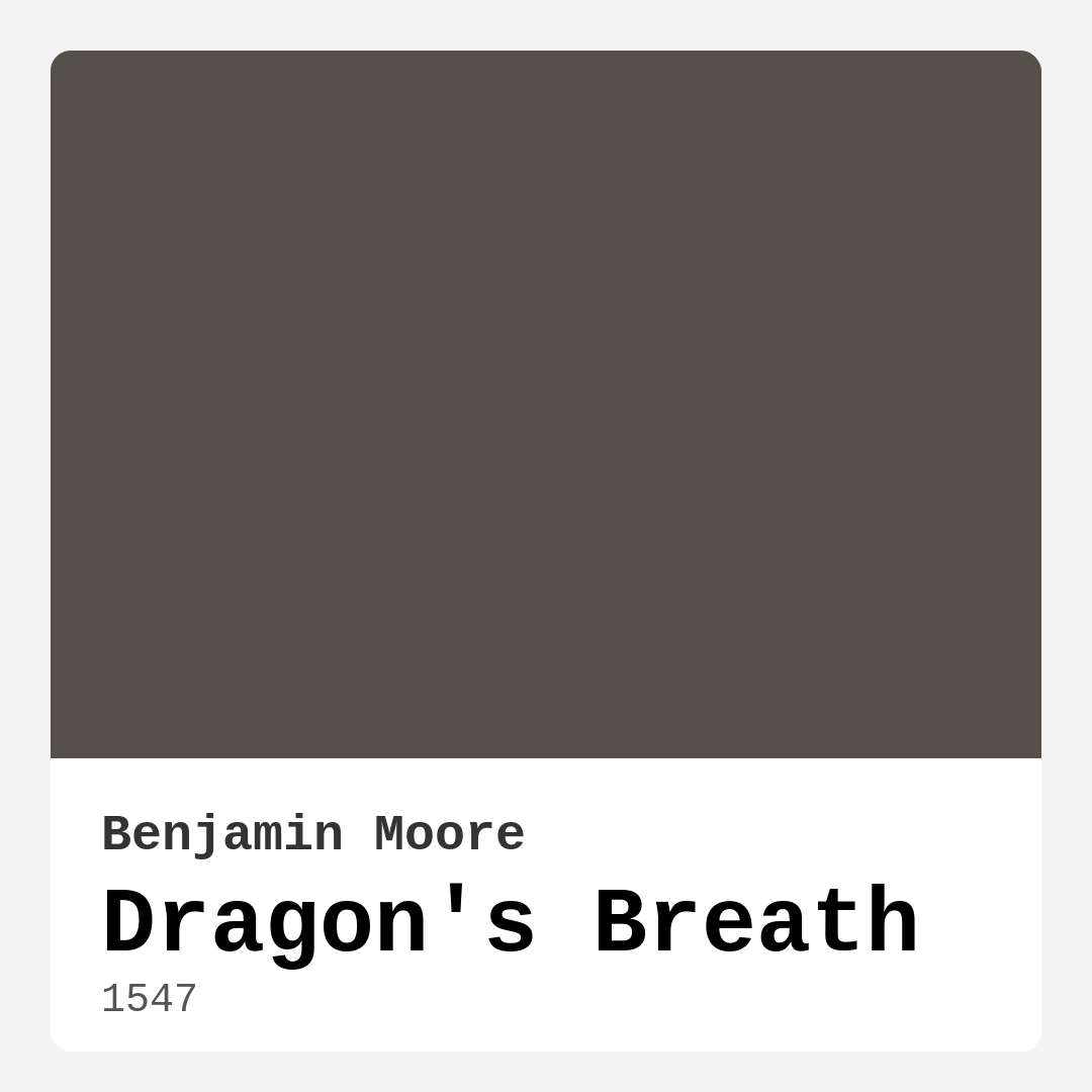
Color Preview & Key Details
| HEX Code | #55514A |
| RGB | 85, 81, 74 |
| LRV | 9.18% |
| Undertone | Red |
| Finish Options | Eggshell, Matte, Satin |
If you’re looking for a paint color that exudes sophistication and warmth while still feeling grounded and modern, let me introduce you to Benjamin Moore’s Dragon’s Breath. This deep, moody gray with red undertones is one of those shades that instantly transforms a room, adding depth and character without overwhelming the space. Whether you’re designing a cozy bedroom, a dramatic living room, or a stylish home office, Dragon’s Breath has the versatility to work in almost any setting.
First, let’s talk about its undertones. Dragon’s Breath has a subtle red base, which gives it that earthy, warm quality while still keeping it firmly in the gray family. This balance makes it incredibly adaptable—it won’t feel too cold like some grays with blue undertones, nor will it lean too warm like a traditional taupe. Instead, it sits right in that sweet spot where modern meets timeless. If you’ve ever painted a room only to realize the color looks completely different at night than it does during the day, you’ll appreciate how Dragon’s Breath holds up. In natural light, it reveals its rich complexity, while in dimmer settings, it deepens into an intimate, enveloping shade.
One of the biggest questions I get about dark colors like this is whether they’ll work in smaller rooms. The answer? Absolutely. Dragon’s Breath can actually make a small space feel cozy and intentional rather than cramped. The key is balance. Pair it with lighter furniture, crisp white trim (Benjamin Moore’s White Dove is a perfect match), and plenty of texture to keep the room from feeling too heavy. If you’re hesitant, try it on an accent wall first—you’ll be surprised at how much dimension it adds without shrinking the space.
When it comes to application, Dragon’s Breath is beginner-friendly. It rolls on smoothly, and while you’ll likely need two coats for full coverage (especially if you’re painting over a lighter color), the finish is worth it. Opt for an eggshell or satin sheen if you want a subtle glow that enhances the richness of the color. Matte finishes also work beautifully, particularly in low-traffic areas where you want a more understated look. And because it’s low-VOC and eco-certified, you won’t have to worry about harsh fumes during or after painting.
Now, let’s talk decor. Dragon’s Breath plays well with a variety of styles—modern farmhouse, industrial, rustic, even bohemian. Its muted tone makes it an excellent backdrop for bold art, metallic accents (think brass or aged bronze), and natural materials like wood and linen. If you want to lean into its warmth, pair it with creamy whites, soft taupes, or even a muted terracotta. For a cooler contrast, try accents in deep blues or slate greens. And don’t shy away from layering textures—a chunky knit throw, a leather armchair, or a woven rug will all complement this color beautifully.
Maintenance is another plus. Dragon’s Breath is scrubbable, so it’s a practical choice for spaces like dining rooms or home offices where walls might need occasional cleaning. Touch-ups are also a breeze since the color blends seamlessly. Just keep in mind that because it’s so dark, any imperfections in your walls (like dings or uneven texture) might be more noticeable. A little prep work before painting—filling holes, sanding rough spots—will go a long way.
If you’re still on the fence, here’s my advice: order a sample. Paint a large swatch on your wall and live with it for a few days. Watch how it changes with the light, and see how it interacts with your furniture and flooring. You might find that Dragon’s Breath is exactly the bold yet grounding hue your space has been missing.
At the end of the day, paint is one of the easiest ways to completely reinvent a room, and Dragon’s Breath is a color that does it with style. It’s not just gray, not just brown—it’s a sophisticated, layered shade that brings warmth and depth wherever it’s used. Whether you’re going for a dramatic accent wall or an entire room enveloped in its moody elegance, this is a color that won’t disappoint. So go ahead—take the plunge. Your walls will thank you.

Real Room Photo of Dragon’s Breath 1547


Undertones of Dragon’s Breath ?
The undertones of Dragon’s Breath are a key aspect of its character, leaning towards Red. These subtle underlying hues are what give the color its depth and complexity. For example, a gray with a blue undertone will feel cooler and more modern, while one with a brown undertone will feel warmer and more traditional. It’s essential to test this paint in your home and observe it next to your existing furniture, flooring, and decor to see how these undertones interact and reveal themselves throughout the day.
HEX value: #55514A
RGB code: 85, 81, 74
Is Dragon’s Breath Cool or Warm?
Dragon’s Breath leans toward the cool side thanks to its gray undertone, yet the warmth from its brown base prevents it from feeling too cold. This makes it an incredible choice for achieving a balanced and inviting atmosphere.
Understanding Color Properties and Interior Design Tips
Hue refers to a specific position on the color wheel, measured in degrees from 0 to 360. Each degree represents a different pure color:
- 0° represents red
- 120° represents green
- 240° represents blue
Saturation describes the intensity or purity of a color and is expressed as a percentage:
- At 0%, the color appears completely desaturated—essentially a shade of gray
- At 100%, the color is at its most vivid and vibrant
Lightness indicates how light or dark a color is, also expressed as a percentage:
- 0% lightness results in black
- 100% lightness results in white
Using Warm Colors in Interior Design
Warm hues—such as reds, oranges, yellows, warm beiges, and greiges—are excellent choices for creating inviting and energetic spaces. These colors are particularly well-suited for:
- Kitchens, living rooms, and bathrooms, where warmth enhances comfort and sociability
- Large rooms, where warm tones can help reduce the sense of emptiness and make the space feel more intimate
For example:
- Warm beige shades provide a cozy, inviting atmosphere, ideal for living rooms, bedrooms, and hallways.
- Warm greige (a mix of beige and gray) offers the warmth of beige with the modern appeal of gray, making it a versatile backdrop for dining areas, bedrooms, and living spaces.
However, be mindful when using warm light tones in rooms with limited natural light. These shades may appear muted or even take on an unpleasant yellowish tint. To avoid a dull or flat appearance:
- Add depth by incorporating richer tones like deep greens, charcoal, or chocolate brown
- Use textured elements such as curtains, rugs, or cushions to bring dimension to the space
Pro Tip: Achieving Harmony with Warm and Cool Color Balance
To create a well-balanced and visually interesting interior, mix warm and cool tones strategically. This contrast adds depth and harmony to your design.
- If your walls feature warm hues, introduce cool-colored accents such as blue or green furniture, artwork, or accessories to create contrast.
- For a polished look, consider using a complementary color scheme, which pairs colors opposite each other on the color wheel (e.g., red with green, orange with blue).
This thoughtful mix not only enhances visual appeal but also creates a space that feels both dynamic and cohesive.

Light Temperature Affects on Dragon’s Breath
Natural Light
Natural daylight changes in color temperature as the sun moves across the sky. At sunrise and sunset, the light tends to have a warm, golden tone with a color temperature around 2000 Kelvin (K). As the day progresses and the sun rises higher, the light becomes cooler and more neutral. Around midday, especially when the sky is clear, natural light typically reaches its peak brightness and shifts to a cooler tone, ranging from 5500 to 6500 Kelvin. This midday light is close to what we perceive as pure white or daylight-balanced light.
These shifts in natural light can significantly influence how colors appear in a space, which is why designers often consider both the time of day and the orientation of windows when planning interior color schemes.
Artificial Light
When choosing artificial lighting, pay close attention to the color temperature, measured in Kelvin (K). This determines how warm or cool the light will appear. Lower temperatures, around 2700K, give off a warm, yellow glow often used in living rooms or bedrooms. Higher temperatures, above 5000K, create a cool, bluish light similar to daylight, commonly used in kitchens, offices, or task areas.
Use the slider to see how lighting temperature can affect the appearance of a surface or color throughout a space.


4800K
LRV of Dragon’s Breath
The Light Reflectance Value (LRV) of Dragon’s Breath is 9.18%, which places it in the Dark colors category. This means it does not reflect light. Understanding a paint’s LRV is crucial for predicting how it will look in your space. A higher LRV indicates a lighter color that reflects more light, making rooms feel larger and brighter. A lower LRV signifies a darker color that absorbs more light, creating a cozier, more intimate atmosphere. Always consider the natural and artificial lighting in your room when selecting a paint color based on its LRV.
Detailed Review of Dragon’s Breath
Additional Paint Characteristics
Ideal Rooms
Bedroom, Dining Room, Home Office, Living Room
Decor Styles
Bohemian, Industrial, Modern, Rustic
Coverage
Good (1–2 Coats), Touch-Up Friendly
Ease of Application
Beginner Friendly, Brush Smooth, Roller-Ready
Washability
Scrubbable, Washable
VOC Level
Eco-Certified, Low VOC
Best Use
Accent Wall, Interior Walls, Large Spaces
Room Suitability
Bedroom, Dining Room, Home Office, Living Room
Tone Tag
Deep, Earthy, Muted, Warm
Finish Type
Eggshell, Matte, Satin
Paint Performance
Easy Touch-Up, High Coverage, Low Odor
Use Cases
Best for Low Light Rooms, Best for Modern Farmhouse, Designer Favorite
Mood
Cozy, Grounding, Inviting, Sophisticated
Trim Pairing
Complements Brass Fixtures, Good with Wood Trim, Pairs with White Dove
Dragon’s Breath is more than just a paint color; it’s a statement. Its deep, muted hue adds sophistication to a variety of settings, from contemporary spaces to rustic retreats. When applied, it gives walls a velvety finish that enhances your room’s depth and character. This shade works beautifully as a backdrop for art or decor, allowing brighter colors to pop. Its versatility makes it an ideal choice whether you’re looking to create a serene bedroom or a vibrant living area. Just be prepared to use two coats for optimal coverage, especially if transitioning from a lighter color. Overall, Dragon’s Breath provides a unique blend of warmth and coolness, making it an attractive option for any design lover.
Pros & Cons of 1547 Dragon’s Breath
Pros
Cons
Colors that go with Benjamin Moore Dragon’s Breath
FAQ on 1547 Dragon’s Breath
Can Dragon’s Breath be used in smaller rooms?
Absolutely! While Dragon’s Breath is a deep color, it can create a cozy atmosphere in smaller rooms. To avoid overwhelming the space, consider pairing it with lighter furniture and decor. Also, using plenty of natural light can help balance its boldness. If you want to enhance the feeling of space, accenting with whites and light shades can make a big difference.
What finishes work best with Dragon’s Breath?
Dragon’s Breath pairs well with a variety of finishes. For a smooth, sophisticated look, consider an eggshell or satin finish. These provide a soft sheen that enhances the color without being overly glossy. Matte finishes can also work beautifully, especially in low-traffic areas, creating a more subdued, elegant effect. Ultimately, it depends on the look you’re trying to achieve, but these finishes will certainly complement the rich tone of Dragon’s Breath.
Comparisons Dragon’s Breath with other colors
Dragon's Breath 1547 vs Night Owl SW 7061
| Attribute | Dragon's Breath 1547 | Night Owl SW 7061 |
|---|---|---|
| Color Name | Dragon's Breath 1547 | Night Owl SW 7061 |
| Color | ||
| Hue | Grey | Grey |
| Brightness | Dark | Dark |
| RGB | 85, 81, 74 | 99, 101, 95 |
| LRV | 9.18% | 24% |
| Finish Type | Eggshell, Matte, Satin | Eggshell, Matte, Satin |
| Finish Options | Eggshell, Matte, Satin | Eggshell, Matte, Satin |
| Ideal Rooms | Bedroom, Dining Room, Home Office, Living Room | Bedroom, Dining Room, Hallway, Home Office, Living Room |
| Decor Styles | Bohemian, Industrial, Modern, Rustic | Industrial, Minimalist, Modern, Rustic, Scandinavian |
| Coverage | Good (1–2 Coats), Touch-Up Friendly | Good (1–2 Coats), Touch-Up Friendly |
| Ease of Application | Beginner Friendly, Brush Smooth, Roller-Ready | Beginner Friendly, Brush Smooth, Fast-Drying, Roller-Ready |
| Washability | Scrubbable, Washable | Scrubbable, Washable |
| Room Suitability | Bedroom, Dining Room, Home Office, Living Room | Bedroom, Dining Room, Home Office, Living Room |
| Tone | Deep, Earthy, Muted, Warm | Balanced, Deep, Earthy, Muted |
| Paint Performance | Easy Touch-Up, High Coverage, Low Odor | Easy Touch-Up, Fade Resistant, High Coverage, Low Odor |
Dragon's Breath 1547 vs Urbane Bronze SW 7048
| Attribute | Dragon's Breath 1547 | Urbane Bronze SW 7048 |
|---|---|---|
| Color Name | Dragon's Breath 1547 | Urbane Bronze SW 7048 |
| Color | ||
| Hue | Grey | Grey |
| Brightness | Dark | Dark |
| RGB | 85, 81, 74 | 84, 80, 74 |
| LRV | 9.18% | 20% |
| Finish Type | Eggshell, Matte, Satin | Eggshell, Matte, Satin |
| Finish Options | Eggshell, Matte, Satin | Eggshell, Matte, Satin |
| Ideal Rooms | Bedroom, Dining Room, Home Office, Living Room | Bedroom, Dining Room, Home Office, Living Room |
| Decor Styles | Bohemian, Industrial, Modern, Rustic | Contemporary, Industrial, Modern, Rustic, Transitional |
| Coverage | Good (1–2 Coats), Touch-Up Friendly | Good (1–2 Coats) |
| Ease of Application | Beginner Friendly, Brush Smooth, Roller-Ready | Beginner Friendly, Brush Smooth, Roller-Ready |
| Washability | Scrubbable, Washable | Highly Washable, Washable |
| Room Suitability | Bedroom, Dining Room, Home Office, Living Room | Bedroom, Dining Room, Home Office, Living Room |
| Tone | Deep, Earthy, Muted, Warm | Deep, Earthy, Warm |
| Paint Performance | Easy Touch-Up, High Coverage, Low Odor | Easy Touch-Up, Fade Resistant, High Coverage, Low Odor |
Dragon's Breath 1547 vs Succulent SW 9650
| Attribute | Dragon's Breath 1547 | Succulent SW 9650 |
|---|---|---|
| Color Name | Dragon's Breath 1547 | Succulent SW 9650 |
| Color | ||
| Hue | Grey | Grey |
| Brightness | Dark | Dark |
| RGB | 85, 81, 74 | 97, 108, 100 |
| LRV | 9.18% | 30% |
| Finish Type | Eggshell, Matte, Satin | Eggshell, Matte, Satin |
| Finish Options | Eggshell, Matte, Satin | Eggshell, Matte, Satin |
| Ideal Rooms | Bedroom, Dining Room, Home Office, Living Room | Bathroom, Bedroom, Dining Room, Entryway, Kitchen, Living Room |
| Decor Styles | Bohemian, Industrial, Modern, Rustic | Bohemian, Contemporary, Eclectic, Minimalist, Modern Farmhouse |
| Coverage | Good (1–2 Coats), Touch-Up Friendly | Good (1–2 Coats), Touch-Up Friendly |
| Ease of Application | Beginner Friendly, Brush Smooth, Roller-Ready | Beginner Friendly, Brush Smooth, Roller-Ready |
| Washability | Scrubbable, Washable | Highly Washable, Washable |
| Room Suitability | Bedroom, Dining Room, Home Office, Living Room | Bathroom, Bedroom, Dining Room, Kitchen, Living Room |
| Tone | Deep, Earthy, Muted, Warm | Cool, Earthy, Muted |
| Paint Performance | Easy Touch-Up, High Coverage, Low Odor | Easy Touch-Up, Low Odor, Quick Drying, Scuff Resistant |
Dragon's Breath 1547 vs Grizzle Gray SW 7068
| Attribute | Dragon's Breath 1547 | Grizzle Gray SW 7068 |
|---|---|---|
| Color Name | Dragon's Breath 1547 | Grizzle Gray SW 7068 |
| Color | ||
| Hue | Grey | Grey |
| Brightness | Dark | Dark |
| RGB | 85, 81, 74 | 99, 101, 98 |
| LRV | 9.18% | 24% |
| Finish Type | Eggshell, Matte, Satin | Eggshell, Satin |
| Finish Options | Eggshell, Matte, Satin | Eggshell, Matte, Satin |
| Ideal Rooms | Bedroom, Dining Room, Home Office, Living Room | Bedroom, Dining Room, Home Office, Living Room |
| Decor Styles | Bohemian, Industrial, Modern, Rustic | Industrial, Modern, Rustic, Scandinavian |
| Coverage | Good (1–2 Coats), Touch-Up Friendly | Good (1–2 Coats), Touch-Up Friendly |
| Ease of Application | Beginner Friendly, Brush Smooth, Roller-Ready | Beginner Friendly, Brush Smooth, Roller-Ready |
| Washability | Scrubbable, Washable | Washable, Wipeable |
| Room Suitability | Bedroom, Dining Room, Home Office, Living Room | Bedroom, Dining Room, Home Office, Living Room |
| Tone | Deep, Earthy, Muted, Warm | Balanced, Cool, Muted |
| Paint Performance | Easy Touch-Up, High Coverage, Low Odor | Easy Touch-Up, High Coverage, Low Odor |
Dragon's Breath 1547 vs Iron Ore SW 7069
| Attribute | Dragon's Breath 1547 | Iron Ore SW 7069 |
|---|---|---|
| Color Name | Dragon's Breath 1547 | Iron Ore SW 7069 |
| Color | ||
| Hue | Grey | Grey |
| Brightness | Dark | Dark |
| RGB | 85, 81, 74 | 67, 67, 65 |
| LRV | 9.18% | 6% |
| Finish Type | Eggshell, Matte, Satin | Eggshell, Matte, Satin |
| Finish Options | Eggshell, Matte, Satin | Eggshell, Matte, Satin |
| Ideal Rooms | Bedroom, Dining Room, Home Office, Living Room | Bedroom, Dining Room, Entryway, Home Office, Living Room |
| Decor Styles | Bohemian, Industrial, Modern, Rustic | Contemporary, Industrial, Minimalist, Modern, Rustic |
| Coverage | Good (1–2 Coats), Touch-Up Friendly | Good (1–2 Coats), High Hide |
| Ease of Application | Beginner Friendly, Brush Smooth, Roller-Ready | Brush Smooth, Fast-Drying, Roller-Ready |
| Washability | Scrubbable, Washable | Highly Washable, Washable |
| Room Suitability | Bedroom, Dining Room, Home Office, Living Room | Bedroom, Dining Room, Entryway, Home Office, Living Room |
| Tone | Deep, Earthy, Muted, Warm | Balanced, Deep, Muted, Warm |
| Paint Performance | Easy Touch-Up, High Coverage, Low Odor | Easy Touch-Up, High Coverage, Low Odor |
Dragon's Breath 1547 vs Peppercorn SW 7674
| Attribute | Dragon's Breath 1547 | Peppercorn SW 7674 |
|---|---|---|
| Color Name | Dragon's Breath 1547 | Peppercorn SW 7674 |
| Color | ||
| Hue | Grey | Grey |
| Brightness | Dark | Dark |
| RGB | 85, 81, 74 | 88, 88, 88 |
| LRV | 9.18% | 10% |
| Finish Type | Eggshell, Matte, Satin | Eggshell, Matte, Satin |
| Finish Options | Eggshell, Matte, Satin | Eggshell, Matte, Satin |
| Ideal Rooms | Bedroom, Dining Room, Home Office, Living Room | Bedroom, Dining Room, Home Office, Living Room |
| Decor Styles | Bohemian, Industrial, Modern, Rustic | Contemporary, Industrial, Minimalist, Modern |
| Coverage | Good (1–2 Coats), Touch-Up Friendly | Good (1–2 Coats), Touch-Up Friendly |
| Ease of Application | Beginner Friendly, Brush Smooth, Roller-Ready | Beginner Friendly, Brush Smooth, Roller-Ready |
| Washability | Scrubbable, Washable | Highly Washable, Washable |
| Room Suitability | Bedroom, Dining Room, Home Office, Living Room | Bedroom, Dining Room, Home Office, Living Room |
| Tone | Deep, Earthy, Muted, Warm | Balanced, Deep, Moody, Neutral |
| Paint Performance | Easy Touch-Up, High Coverage, Low Odor | Easy Touch-Up, Low Odor, Quick Drying, Scuff Resistant |
Dragon's Breath 1547 vs Slate Tile SW 7624
| Attribute | Dragon's Breath 1547 | Slate Tile SW 7624 |
|---|---|---|
| Color Name | Dragon's Breath 1547 | Slate Tile SW 7624 |
| Color | ||
| Hue | Grey | Grey |
| Brightness | Dark | Dark |
| RGB | 85, 81, 74 | 96, 110, 116 |
| LRV | 9.18% | 15% |
| Finish Type | Eggshell, Matte, Satin | Eggshell, Matte, Satin |
| Finish Options | Eggshell, Matte, Satin | Eggshell, Matte, Satin |
| Ideal Rooms | Bedroom, Dining Room, Home Office, Living Room | Bathroom, Bedroom, Home Office, Kitchen, Living Room |
| Decor Styles | Bohemian, Industrial, Modern, Rustic | Industrial, Minimalist, Modern, Rustic |
| Coverage | Good (1–2 Coats), Touch-Up Friendly | Good (1–2 Coats) |
| Ease of Application | Beginner Friendly, Brush Smooth, Roller-Ready | Beginner Friendly, Brush Smooth, Fast-Drying, Roller-Ready |
| Washability | Scrubbable, Washable | Scrubbable, Washable |
| Room Suitability | Bedroom, Dining Room, Home Office, Living Room | Bathroom, Bedroom, Kitchen, Living Room |
| Tone | Deep, Earthy, Muted, Warm | Balanced, Cool, Muted |
| Paint Performance | Easy Touch-Up, High Coverage, Low Odor | Easy Touch-Up, High Coverage, Low Odor, Quick Drying |
Dragon's Breath 1547 vs Blustery Sky SW 9140
| Attribute | Dragon's Breath 1547 | Blustery Sky SW 9140 |
|---|---|---|
| Color Name | Dragon's Breath 1547 | Blustery Sky SW 9140 |
| Color | ||
| Hue | Grey | Grey |
| Brightness | Dark | Dark |
| RGB | 85, 81, 74 | 111, 132, 140 |
| LRV | 9.18% | 48% |
| Finish Type | Eggshell, Matte, Satin | Eggshell, Matte |
| Finish Options | Eggshell, Matte, Satin | Eggshell, Matte, Satin |
| Ideal Rooms | Bedroom, Dining Room, Home Office, Living Room | Bedroom, Dining Room, Home Office, Living Room, Nursery |
| Decor Styles | Bohemian, Industrial, Modern, Rustic | Coastal, Modern Farmhouse, Scandinavian, Transitional |
| Coverage | Good (1–2 Coats), Touch-Up Friendly | Good (1–2 Coats), Touch-Up Friendly |
| Ease of Application | Beginner Friendly, Brush Smooth, Roller-Ready | Beginner Friendly, Fast-Drying, Low Splatter, Roller-Ready |
| Washability | Scrubbable, Washable | Washable, Wipeable |
| Room Suitability | Bedroom, Dining Room, Home Office, Living Room | Bedroom, Home Office, Living Room, Nursery |
| Tone | Deep, Earthy, Muted, Warm | Balanced, Cool, Muted |
| Paint Performance | Easy Touch-Up, High Coverage, Low Odor | Easy Touch-Up, Fade Resistant, Low Odor, Quick Drying |
Dragon's Breath 1547 vs Gauntlet Gray SW 7019
| Attribute | Dragon's Breath 1547 | Gauntlet Gray SW 7019 |
|---|---|---|
| Color Name | Dragon's Breath 1547 | Gauntlet Gray SW 7019 |
| Color | ||
| Hue | Grey | Grey |
| Brightness | Dark | Dark |
| RGB | 85, 81, 74 | 120, 115, 110 |
| LRV | 9.18% | 24% |
| Finish Type | Eggshell, Matte, Satin | Eggshell, Matte, Satin |
| Finish Options | Eggshell, Matte, Satin | Eggshell, Matte, Satin |
| Ideal Rooms | Bedroom, Dining Room, Home Office, Living Room | Bedroom, Dining Room, Hallway, Home Office, Living Room |
| Decor Styles | Bohemian, Industrial, Modern, Rustic | Industrial, Modern, Rustic, Transitional |
| Coverage | Good (1–2 Coats), Touch-Up Friendly | Good (1–2 Coats), Touch-Up Friendly |
| Ease of Application | Beginner Friendly, Brush Smooth, Roller-Ready | Beginner Friendly, Brush Smooth, Roller-Ready |
| Washability | Scrubbable, Washable | Scrubbable, Washable |
| Room Suitability | Bedroom, Dining Room, Home Office, Living Room | Bedroom, Dining Room, Home Office, Living Room |
| Tone | Deep, Earthy, Muted, Warm | Dusty, Earthy, Muted, Warm |
| Paint Performance | Easy Touch-Up, High Coverage, Low Odor | Easy Touch-Up, High Coverage, Low Odor |
Dragon's Breath 1547 vs Cast Iron SW 6202
| Attribute | Dragon's Breath 1547 | Cast Iron SW 6202 |
|---|---|---|
| Color Name | Dragon's Breath 1547 | Cast Iron SW 6202 |
| Color | ||
| Hue | Grey | Grey |
| Brightness | Dark | Dark |
| RGB | 85, 81, 74 | 100, 100, 90 |
| LRV | 9.18% | 6% |
| Finish Type | Eggshell, Matte, Satin | Eggshell, Matte, Satin |
| Finish Options | Eggshell, Matte, Satin | Eggshell, Matte, Satin |
| Ideal Rooms | Bedroom, Dining Room, Home Office, Living Room | Bedroom, Dining Room, Hallway, Home Office, Kitchen, Living Room |
| Decor Styles | Bohemian, Industrial, Modern, Rustic | Contemporary, Farmhouse, Industrial, Minimalist, Modern |
| Coverage | Good (1–2 Coats), Touch-Up Friendly | Good (1–2 Coats), High Hide, Touch-Up Friendly |
| Ease of Application | Beginner Friendly, Brush Smooth, Roller-Ready | Beginner Friendly, Brush Smooth, Fast-Drying, Roller-Ready |
| Washability | Scrubbable, Washable | Highly Washable, Washable, Wipeable |
| Room Suitability | Bedroom, Dining Room, Home Office, Living Room | Bedroom, Dining Room, Home Office, Kitchen, Living Room |
| Tone | Deep, Earthy, Muted, Warm | Balanced, Deep, Dusty, Earthy, Warm |
| Paint Performance | Easy Touch-Up, High Coverage, Low Odor | Easy Touch-Up, High Coverage, Low Odor, Stain Resistant |
Official Page of Benjamin Moore Dragon’s Breath 1547