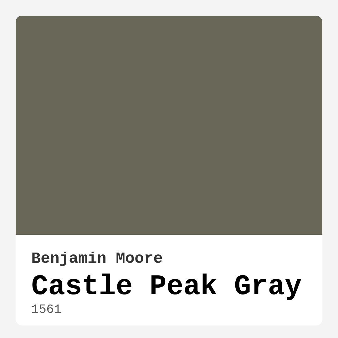
Color Preview & Key Details
| HEX Code | #696757 |
| RGB | 105, 103, 87 |
| LRV | 14.62% |
| Undertone | Yellow |
| Finish Options | Eggshell, Matte, Satin |
If you’re searching for a paint color that effortlessly balances sophistication with warmth, Benjamin Moore’s Castle Peak Gray (1561) deserves a spot on your shortlist. This isn’t your average gray—it’s a moody, earthy shade with a whisper of green that feels like a quiet morning in the mountains. Whether you’re refreshing a living room, designing a serene bedroom, or crafting a cozy home office, this color brings depth and tranquility to any space. Let’s dive into why Castle Peak Gray might be the perfect choice for your next project.
First, let’s talk about its undertones. Castle Peak Gray leans into yellow, giving it a subtle warmth that keeps it from feeling cold or sterile. Unlike cooler grays that can feel stark, this one wraps a room in comfort. The hint of green adds an organic touch, making it feel grounded and natural. It’s the kind of color that plays well with both modern and traditional decor, blending seamlessly with farmhouse wood tones, sleek contemporary furniture, or even rustic textures. If you’ve ever painted a room only to realize the color feels “off” in certain lighting, you’ll appreciate how Castle Peak Gray adapts. In natural light, it softens to a muted gray, while under artificial lighting, those earthy undertones come forward, creating a cozy, inviting vibe.
One of the biggest questions homeowners have is whether a darker gray like this will work in a smaller room. The answer? Yes—with a few smart tweaks. With an LRV (Light Reflectance Value) of 14.62%, Castle Peak Gray reflects very little light, which means it can make a small space feel intimate rather than cramped. To keep things airy, pair it with crisp white trim (Benjamin Moore’s White Dove is a classic match) or layer in lighter textiles and furniture. Good lighting is key—think warm-toned bulbs or plenty of natural light to keep the room from feeling too heavy. If you’re hesitant, test it on a single accent wall first. You might be surprised at how it elevates the room without overwhelming it.
Where Castle Peak Gray truly shines is in larger spaces. Its depth comes alive in living rooms or dining areas, adding a sense of richness that lighter colors can’t replicate. Imagine it in a modern farmhouse setting: walls painted in this elegant gray, paired with brass fixtures, a reclaimed wood table, and a few emerald green throw pillows for contrast. The color’s versatility means it also works beautifully in bedrooms, creating a restful retreat. For a home office, it strikes the right balance—professional yet warm, helping you focus without feeling sterile.
Now, let’s talk pairings. Castle Peak Gray is a team player. It harmonizes with warm woods, crisp whites, and even bold accent colors. If you love a neutral palette, try combining it with creamy off-whites or soft beiges. For a pop of contrast, deep navy or rich emerald green (like Benjamin Moore’s Essex Green) makes a striking companion. The subtle green undertone also plays nicely with muted pastels or earthy terracottas. And don’t overlook metallics—brass, gold, or even matte black hardware adds a touch of sophistication.
Practicality matters, too. Castle Peak Gray is beginner-friendly, with good coverage (usually just 1–2 coats needed) and easy touch-upability. It’s available in matte, eggshell, and satin finishes, so you can choose based on your room’s needs. Eggshell is a safe bet for most walls—durable enough for high-traffic areas but still soft to the eye. Plus, it’s low-VOC and eco-certified, so you can breathe easy during and after painting.
A few things to keep in mind: because it’s a darker shade, it’s best to avoid using it in rooms with very little natural light unless you’re going for a moody, cocoon-like effect. And while it’s versatile, always test a sample in your space. Paint a large swatch and observe it at different times of day to see how the undertones shift. Lighting can make or break a color, and Castle Peak Gray is no exception.
So, is Castle Peak Gray right for you? If you’re after a color that’s elegant but not stuffy, calming but not bland, and versatile enough to grow with your style, it’s a strong contender. It’s the kind of shade that makes a room feel intentional—like you’ve curated every detail. Whether you’re going for modern, rustic, or somewhere in between, this gray has the depth and character to anchor your design. Grab a sample, see how it looks in your space, and get ready to fall in love with the quiet beauty of Castle Peak Gray.

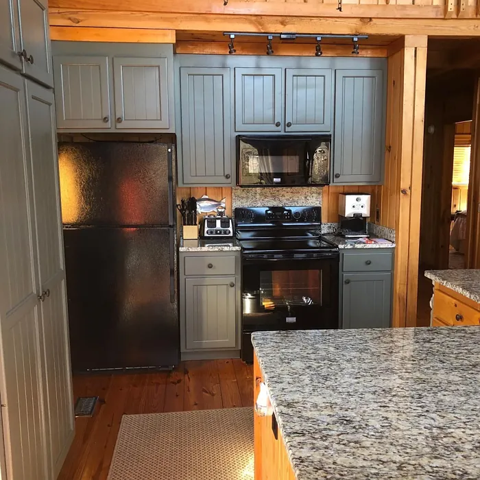
Real Room Photo of Castle Peak Gray 1561
Undertones of Castle Peak Gray ?
The undertones of Castle Peak Gray are a key aspect of its character, leaning towards Yellow. These subtle underlying hues are what give the color its depth and complexity. For example, a gray with a blue undertone will feel cooler and more modern, while one with a brown undertone will feel warmer and more traditional. It’s essential to test this paint in your home and observe it next to your existing furniture, flooring, and decor to see how these undertones interact and reveal themselves throughout the day.
HEX value: #696757
RGB code: 105, 103, 87
Is Castle Peak Gray Cool or Warm?
While primarily a cool gray, the hint of green introduces warmth, creating a balanced feel that can complement both warm and cool color palettes.
Understanding Color Properties and Interior Design Tips
Hue refers to a specific position on the color wheel, measured in degrees from 0 to 360. Each degree represents a different pure color:
- 0° represents red
- 120° represents green
- 240° represents blue
Saturation describes the intensity or purity of a color and is expressed as a percentage:
- At 0%, the color appears completely desaturated—essentially a shade of gray
- At 100%, the color is at its most vivid and vibrant
Lightness indicates how light or dark a color is, also expressed as a percentage:
- 0% lightness results in black
- 100% lightness results in white
Using Warm Colors in Interior Design
Warm hues—such as reds, oranges, yellows, warm beiges, and greiges—are excellent choices for creating inviting and energetic spaces. These colors are particularly well-suited for:
- Kitchens, living rooms, and bathrooms, where warmth enhances comfort and sociability
- Large rooms, where warm tones can help reduce the sense of emptiness and make the space feel more intimate
For example:
- Warm beige shades provide a cozy, inviting atmosphere, ideal for living rooms, bedrooms, and hallways.
- Warm greige (a mix of beige and gray) offers the warmth of beige with the modern appeal of gray, making it a versatile backdrop for dining areas, bedrooms, and living spaces.
However, be mindful when using warm light tones in rooms with limited natural light. These shades may appear muted or even take on an unpleasant yellowish tint. To avoid a dull or flat appearance:
- Add depth by incorporating richer tones like deep greens, charcoal, or chocolate brown
- Use textured elements such as curtains, rugs, or cushions to bring dimension to the space
Pro Tip: Achieving Harmony with Warm and Cool Color Balance
To create a well-balanced and visually interesting interior, mix warm and cool tones strategically. This contrast adds depth and harmony to your design.
- If your walls feature warm hues, introduce cool-colored accents such as blue or green furniture, artwork, or accessories to create contrast.
- For a polished look, consider using a complementary color scheme, which pairs colors opposite each other on the color wheel (e.g., red with green, orange with blue).
This thoughtful mix not only enhances visual appeal but also creates a space that feels both dynamic and cohesive.
Light Temperature Affects on Castle Peak Gray
Natural Light
Natural daylight changes in color temperature as the sun moves across the sky. At sunrise and sunset, the light tends to have a warm, golden tone with a color temperature around 2000 Kelvin (K). As the day progresses and the sun rises higher, the light becomes cooler and more neutral. Around midday, especially when the sky is clear, natural light typically reaches its peak brightness and shifts to a cooler tone, ranging from 5500 to 6500 Kelvin. This midday light is close to what we perceive as pure white or daylight-balanced light.
These shifts in natural light can significantly influence how colors appear in a space, which is why designers often consider both the time of day and the orientation of windows when planning interior color schemes.
Artificial Light
When choosing artificial lighting, pay close attention to the color temperature, measured in Kelvin (K). This determines how warm or cool the light will appear. Lower temperatures, around 2700K, give off a warm, yellow glow often used in living rooms or bedrooms. Higher temperatures, above 5000K, create a cool, bluish light similar to daylight, commonly used in kitchens, offices, or task areas.
Use the slider to see how lighting temperature can affect the appearance of a surface or color throughout a space.


4800K
LRV of Castle Peak Gray
The Light Reflectance Value (LRV) of Castle Peak Gray is 14.62%, which places it in the Medium Dark category. This means it reflects very little light. Understanding a paint’s LRV is crucial for predicting how it will look in your space. A higher LRV indicates a lighter color that reflects more light, making rooms feel larger and brighter. A lower LRV signifies a darker color that absorbs more light, creating a cozier, more intimate atmosphere. Always consider the natural and artificial lighting in your room when selecting a paint color based on its LRV.
Detailed Review of Castle Peak Gray
Additional Paint Characteristics
Ideal Rooms
Bedroom, Dining Room, Hallway, Home Office, Living Room
Decor Styles
Farmhouse, Modern, Rustic, Traditional
Coverage
Good (1–2 Coats), Touch-Up Friendly
Ease of Application
Beginner Friendly, Brush Smooth, Roller-Ready
Washability
Highly Washable, Washable
VOC Level
Eco-Certified, Low VOC
Best Use
Accent Wall, Interior Walls, Trim
Room Suitability
Bedroom, Dining Room, Home Office, Living Room
Tone Tag
Balanced, Earthy, Muted
Finish Type
Eggshell, Matte, Satin
Paint Performance
Easy Touch-Up, Low Odor, Quick Drying, Scuff Resistant
Use Cases
Best for Low Light Rooms, Best for Modern Farmhouse, Classic Favorite
Mood
Calm, Cozy, Inviting
Trim Pairing
Complements Brass Fixtures, Pairs with White Dove, Works with Warm Trim
Castle Peak Gray stands out as a versatile and elegant choice for home interiors. The slight green undertone adds a unique twist to the classic gray, setting it apart from more standard options. When applied, it reflects light beautifully, bringing warmth without overwhelming the space. This color is particularly effective in larger rooms, where its depth can be fully appreciated. Additionally, it pairs well with a variety of accent colors, making it easy to accessorize your decor. If you’re aiming for a serene and inviting atmosphere, Castle Peak Gray is a prime contender for your next painting project.
Pros & Cons of 1561 Castle Peak Gray
Pros
Cons
Colors that go with Benjamin Moore Castle Peak Gray
FAQ on 1561 Castle Peak Gray
Can Castle Peak Gray work in a small room?
Absolutely! While Castle Peak Gray can appear slightly darker in smaller spaces, its muted tones can create a cozy feel. To offset this, pair it with bright accents and ensure good lighting to enhance the overall ambiance.
What colors pair well with Castle Peak Gray?
Castle Peak Gray pairs beautifully with whites like Simply White or warm woods. For a bolder look, consider deep navy or rich emerald greens as accent colors. The subtle green undertone also complements soft earth tones and muted pastels well.
Comparisons Castle Peak Gray with other colors
Castle Peak Gray 1561 vs Night Owl SW 7061
| Attribute | Castle Peak Gray 1561 | Night Owl SW 7061 |
|---|---|---|
| Color Name | Castle Peak Gray 1561 | Night Owl SW 7061 |
| Color | ||
| Hue | Grey | Grey |
| Brightness | Dark | Dark |
| RGB | 105, 103, 87 | 99, 101, 95 |
| LRV | 14.62% | 24% |
| Finish Type | Eggshell, Matte, Satin | Eggshell, Matte, Satin |
| Finish Options | Eggshell, Matte, Satin | Eggshell, Matte, Satin |
| Ideal Rooms | Bedroom, Dining Room, Hallway, Home Office, Living Room | Bedroom, Dining Room, Hallway, Home Office, Living Room |
| Decor Styles | Farmhouse, Modern, Rustic, Traditional | Industrial, Minimalist, Modern, Rustic, Scandinavian |
| Coverage | Good (1–2 Coats), Touch-Up Friendly | Good (1–2 Coats), Touch-Up Friendly |
| Ease of Application | Beginner Friendly, Brush Smooth, Roller-Ready | Beginner Friendly, Brush Smooth, Fast-Drying, Roller-Ready |
| Washability | Highly Washable, Washable | Scrubbable, Washable |
| Room Suitability | Bedroom, Dining Room, Home Office, Living Room | Bedroom, Dining Room, Home Office, Living Room |
| Tone | Balanced, Earthy, Muted | Balanced, Deep, Earthy, Muted |
| Paint Performance | Easy Touch-Up, Low Odor, Quick Drying, Scuff Resistant | Easy Touch-Up, Fade Resistant, High Coverage, Low Odor |
Castle Peak Gray 1561 vs Urbane Bronze SW 7048
| Attribute | Castle Peak Gray 1561 | Urbane Bronze SW 7048 |
|---|---|---|
| Color Name | Castle Peak Gray 1561 | Urbane Bronze SW 7048 |
| Color | ||
| Hue | Grey | Grey |
| Brightness | Dark | Dark |
| RGB | 105, 103, 87 | 84, 80, 74 |
| LRV | 14.62% | 20% |
| Finish Type | Eggshell, Matte, Satin | Eggshell, Matte, Satin |
| Finish Options | Eggshell, Matte, Satin | Eggshell, Matte, Satin |
| Ideal Rooms | Bedroom, Dining Room, Hallway, Home Office, Living Room | Bedroom, Dining Room, Home Office, Living Room |
| Decor Styles | Farmhouse, Modern, Rustic, Traditional | Contemporary, Industrial, Modern, Rustic, Transitional |
| Coverage | Good (1–2 Coats), Touch-Up Friendly | Good (1–2 Coats) |
| Ease of Application | Beginner Friendly, Brush Smooth, Roller-Ready | Beginner Friendly, Brush Smooth, Roller-Ready |
| Washability | Highly Washable, Washable | Highly Washable, Washable |
| Room Suitability | Bedroom, Dining Room, Home Office, Living Room | Bedroom, Dining Room, Home Office, Living Room |
| Tone | Balanced, Earthy, Muted | Deep, Earthy, Warm |
| Paint Performance | Easy Touch-Up, Low Odor, Quick Drying, Scuff Resistant | Easy Touch-Up, Fade Resistant, High Coverage, Low Odor |
Castle Peak Gray 1561 vs Succulent SW 9650
| Attribute | Castle Peak Gray 1561 | Succulent SW 9650 |
|---|---|---|
| Color Name | Castle Peak Gray 1561 | Succulent SW 9650 |
| Color | ||
| Hue | Grey | Grey |
| Brightness | Dark | Dark |
| RGB | 105, 103, 87 | 97, 108, 100 |
| LRV | 14.62% | 30% |
| Finish Type | Eggshell, Matte, Satin | Eggshell, Matte, Satin |
| Finish Options | Eggshell, Matte, Satin | Eggshell, Matte, Satin |
| Ideal Rooms | Bedroom, Dining Room, Hallway, Home Office, Living Room | Bathroom, Bedroom, Dining Room, Entryway, Kitchen, Living Room |
| Decor Styles | Farmhouse, Modern, Rustic, Traditional | Bohemian, Contemporary, Eclectic, Minimalist, Modern Farmhouse |
| Coverage | Good (1–2 Coats), Touch-Up Friendly | Good (1–2 Coats), Touch-Up Friendly |
| Ease of Application | Beginner Friendly, Brush Smooth, Roller-Ready | Beginner Friendly, Brush Smooth, Roller-Ready |
| Washability | Highly Washable, Washable | Highly Washable, Washable |
| Room Suitability | Bedroom, Dining Room, Home Office, Living Room | Bathroom, Bedroom, Dining Room, Kitchen, Living Room |
| Tone | Balanced, Earthy, Muted | Cool, Earthy, Muted |
| Paint Performance | Easy Touch-Up, Low Odor, Quick Drying, Scuff Resistant | Easy Touch-Up, Low Odor, Quick Drying, Scuff Resistant |
Castle Peak Gray 1561 vs Grizzle Gray SW 7068
| Attribute | Castle Peak Gray 1561 | Grizzle Gray SW 7068 |
|---|---|---|
| Color Name | Castle Peak Gray 1561 | Grizzle Gray SW 7068 |
| Color | ||
| Hue | Grey | Grey |
| Brightness | Dark | Dark |
| RGB | 105, 103, 87 | 99, 101, 98 |
| LRV | 14.62% | 24% |
| Finish Type | Eggshell, Matte, Satin | Eggshell, Satin |
| Finish Options | Eggshell, Matte, Satin | Eggshell, Matte, Satin |
| Ideal Rooms | Bedroom, Dining Room, Hallway, Home Office, Living Room | Bedroom, Dining Room, Home Office, Living Room |
| Decor Styles | Farmhouse, Modern, Rustic, Traditional | Industrial, Modern, Rustic, Scandinavian |
| Coverage | Good (1–2 Coats), Touch-Up Friendly | Good (1–2 Coats), Touch-Up Friendly |
| Ease of Application | Beginner Friendly, Brush Smooth, Roller-Ready | Beginner Friendly, Brush Smooth, Roller-Ready |
| Washability | Highly Washable, Washable | Washable, Wipeable |
| Room Suitability | Bedroom, Dining Room, Home Office, Living Room | Bedroom, Dining Room, Home Office, Living Room |
| Tone | Balanced, Earthy, Muted | Balanced, Cool, Muted |
| Paint Performance | Easy Touch-Up, Low Odor, Quick Drying, Scuff Resistant | Easy Touch-Up, High Coverage, Low Odor |
Castle Peak Gray 1561 vs Iron Ore SW 7069
| Attribute | Castle Peak Gray 1561 | Iron Ore SW 7069 |
|---|---|---|
| Color Name | Castle Peak Gray 1561 | Iron Ore SW 7069 |
| Color | ||
| Hue | Grey | Grey |
| Brightness | Dark | Dark |
| RGB | 105, 103, 87 | 67, 67, 65 |
| LRV | 14.62% | 6% |
| Finish Type | Eggshell, Matte, Satin | Eggshell, Matte, Satin |
| Finish Options | Eggshell, Matte, Satin | Eggshell, Matte, Satin |
| Ideal Rooms | Bedroom, Dining Room, Hallway, Home Office, Living Room | Bedroom, Dining Room, Entryway, Home Office, Living Room |
| Decor Styles | Farmhouse, Modern, Rustic, Traditional | Contemporary, Industrial, Minimalist, Modern, Rustic |
| Coverage | Good (1–2 Coats), Touch-Up Friendly | Good (1–2 Coats), High Hide |
| Ease of Application | Beginner Friendly, Brush Smooth, Roller-Ready | Brush Smooth, Fast-Drying, Roller-Ready |
| Washability | Highly Washable, Washable | Highly Washable, Washable |
| Room Suitability | Bedroom, Dining Room, Home Office, Living Room | Bedroom, Dining Room, Entryway, Home Office, Living Room |
| Tone | Balanced, Earthy, Muted | Balanced, Deep, Muted, Warm |
| Paint Performance | Easy Touch-Up, Low Odor, Quick Drying, Scuff Resistant | Easy Touch-Up, High Coverage, Low Odor |
Castle Peak Gray 1561 vs Peppercorn SW 7674
| Attribute | Castle Peak Gray 1561 | Peppercorn SW 7674 |
|---|---|---|
| Color Name | Castle Peak Gray 1561 | Peppercorn SW 7674 |
| Color | ||
| Hue | Grey | Grey |
| Brightness | Dark | Dark |
| RGB | 105, 103, 87 | 88, 88, 88 |
| LRV | 14.62% | 10% |
| Finish Type | Eggshell, Matte, Satin | Eggshell, Matte, Satin |
| Finish Options | Eggshell, Matte, Satin | Eggshell, Matte, Satin |
| Ideal Rooms | Bedroom, Dining Room, Hallway, Home Office, Living Room | Bedroom, Dining Room, Home Office, Living Room |
| Decor Styles | Farmhouse, Modern, Rustic, Traditional | Contemporary, Industrial, Minimalist, Modern |
| Coverage | Good (1–2 Coats), Touch-Up Friendly | Good (1–2 Coats), Touch-Up Friendly |
| Ease of Application | Beginner Friendly, Brush Smooth, Roller-Ready | Beginner Friendly, Brush Smooth, Roller-Ready |
| Washability | Highly Washable, Washable | Highly Washable, Washable |
| Room Suitability | Bedroom, Dining Room, Home Office, Living Room | Bedroom, Dining Room, Home Office, Living Room |
| Tone | Balanced, Earthy, Muted | Balanced, Deep, Moody, Neutral |
| Paint Performance | Easy Touch-Up, Low Odor, Quick Drying, Scuff Resistant | Easy Touch-Up, Low Odor, Quick Drying, Scuff Resistant |
Castle Peak Gray 1561 vs Slate Tile SW 7624
| Attribute | Castle Peak Gray 1561 | Slate Tile SW 7624 |
|---|---|---|
| Color Name | Castle Peak Gray 1561 | Slate Tile SW 7624 |
| Color | ||
| Hue | Grey | Grey |
| Brightness | Dark | Dark |
| RGB | 105, 103, 87 | 96, 110, 116 |
| LRV | 14.62% | 15% |
| Finish Type | Eggshell, Matte, Satin | Eggshell, Matte, Satin |
| Finish Options | Eggshell, Matte, Satin | Eggshell, Matte, Satin |
| Ideal Rooms | Bedroom, Dining Room, Hallway, Home Office, Living Room | Bathroom, Bedroom, Home Office, Kitchen, Living Room |
| Decor Styles | Farmhouse, Modern, Rustic, Traditional | Industrial, Minimalist, Modern, Rustic |
| Coverage | Good (1–2 Coats), Touch-Up Friendly | Good (1–2 Coats) |
| Ease of Application | Beginner Friendly, Brush Smooth, Roller-Ready | Beginner Friendly, Brush Smooth, Fast-Drying, Roller-Ready |
| Washability | Highly Washable, Washable | Scrubbable, Washable |
| Room Suitability | Bedroom, Dining Room, Home Office, Living Room | Bathroom, Bedroom, Kitchen, Living Room |
| Tone | Balanced, Earthy, Muted | Balanced, Cool, Muted |
| Paint Performance | Easy Touch-Up, Low Odor, Quick Drying, Scuff Resistant | Easy Touch-Up, High Coverage, Low Odor, Quick Drying |
Castle Peak Gray 1561 vs Blustery Sky SW 9140
| Attribute | Castle Peak Gray 1561 | Blustery Sky SW 9140 |
|---|---|---|
| Color Name | Castle Peak Gray 1561 | Blustery Sky SW 9140 |
| Color | ||
| Hue | Grey | Grey |
| Brightness | Dark | Dark |
| RGB | 105, 103, 87 | 111, 132, 140 |
| LRV | 14.62% | 48% |
| Finish Type | Eggshell, Matte, Satin | Eggshell, Matte |
| Finish Options | Eggshell, Matte, Satin | Eggshell, Matte, Satin |
| Ideal Rooms | Bedroom, Dining Room, Hallway, Home Office, Living Room | Bedroom, Dining Room, Home Office, Living Room, Nursery |
| Decor Styles | Farmhouse, Modern, Rustic, Traditional | Coastal, Modern Farmhouse, Scandinavian, Transitional |
| Coverage | Good (1–2 Coats), Touch-Up Friendly | Good (1–2 Coats), Touch-Up Friendly |
| Ease of Application | Beginner Friendly, Brush Smooth, Roller-Ready | Beginner Friendly, Fast-Drying, Low Splatter, Roller-Ready |
| Washability | Highly Washable, Washable | Washable, Wipeable |
| Room Suitability | Bedroom, Dining Room, Home Office, Living Room | Bedroom, Home Office, Living Room, Nursery |
| Tone | Balanced, Earthy, Muted | Balanced, Cool, Muted |
| Paint Performance | Easy Touch-Up, Low Odor, Quick Drying, Scuff Resistant | Easy Touch-Up, Fade Resistant, Low Odor, Quick Drying |
Castle Peak Gray 1561 vs Gauntlet Gray SW 7019
| Attribute | Castle Peak Gray 1561 | Gauntlet Gray SW 7019 |
|---|---|---|
| Color Name | Castle Peak Gray 1561 | Gauntlet Gray SW 7019 |
| Color | ||
| Hue | Grey | Grey |
| Brightness | Dark | Dark |
| RGB | 105, 103, 87 | 120, 115, 110 |
| LRV | 14.62% | 24% |
| Finish Type | Eggshell, Matte, Satin | Eggshell, Matte, Satin |
| Finish Options | Eggshell, Matte, Satin | Eggshell, Matte, Satin |
| Ideal Rooms | Bedroom, Dining Room, Hallway, Home Office, Living Room | Bedroom, Dining Room, Hallway, Home Office, Living Room |
| Decor Styles | Farmhouse, Modern, Rustic, Traditional | Industrial, Modern, Rustic, Transitional |
| Coverage | Good (1–2 Coats), Touch-Up Friendly | Good (1–2 Coats), Touch-Up Friendly |
| Ease of Application | Beginner Friendly, Brush Smooth, Roller-Ready | Beginner Friendly, Brush Smooth, Roller-Ready |
| Washability | Highly Washable, Washable | Scrubbable, Washable |
| Room Suitability | Bedroom, Dining Room, Home Office, Living Room | Bedroom, Dining Room, Home Office, Living Room |
| Tone | Balanced, Earthy, Muted | Dusty, Earthy, Muted, Warm |
| Paint Performance | Easy Touch-Up, Low Odor, Quick Drying, Scuff Resistant | Easy Touch-Up, High Coverage, Low Odor |
Castle Peak Gray 1561 vs Cast Iron SW 6202
| Attribute | Castle Peak Gray 1561 | Cast Iron SW 6202 |
|---|---|---|
| Color Name | Castle Peak Gray 1561 | Cast Iron SW 6202 |
| Color | ||
| Hue | Grey | Grey |
| Brightness | Dark | Dark |
| RGB | 105, 103, 87 | 100, 100, 90 |
| LRV | 14.62% | 6% |
| Finish Type | Eggshell, Matte, Satin | Eggshell, Matte, Satin |
| Finish Options | Eggshell, Matte, Satin | Eggshell, Matte, Satin |
| Ideal Rooms | Bedroom, Dining Room, Hallway, Home Office, Living Room | Bedroom, Dining Room, Hallway, Home Office, Kitchen, Living Room |
| Decor Styles | Farmhouse, Modern, Rustic, Traditional | Contemporary, Farmhouse, Industrial, Minimalist, Modern |
| Coverage | Good (1–2 Coats), Touch-Up Friendly | Good (1–2 Coats), High Hide, Touch-Up Friendly |
| Ease of Application | Beginner Friendly, Brush Smooth, Roller-Ready | Beginner Friendly, Brush Smooth, Fast-Drying, Roller-Ready |
| Washability | Highly Washable, Washable | Highly Washable, Washable, Wipeable |
| Room Suitability | Bedroom, Dining Room, Home Office, Living Room | Bedroom, Dining Room, Home Office, Kitchen, Living Room |
| Tone | Balanced, Earthy, Muted | Balanced, Deep, Dusty, Earthy, Warm |
| Paint Performance | Easy Touch-Up, Low Odor, Quick Drying, Scuff Resistant | Easy Touch-Up, High Coverage, Low Odor, Stain Resistant |
Official Page of Benjamin Moore Castle Peak Gray 1561