
Color Preview & Key Details
| HEX Code | #C7CFC8 |
| RGB | 199, 207, 200 |
| LRV | 60.73% |
| Undertone | Green |
| Finish Options | Eggshell, Matte, Satin |
Imagine walking into a room that instantly makes you exhale—a space that feels like a quiet morning by the sea, where the air is fresh and the light is soft. That’s the magic of Benjamin Moore’s *Quiet Moments* (1563). This gentle gray-green hue isn’t just a paint color; it’s a mood. Whether you’re refreshing a tired bedroom, designing a serene home office, or creating a cozy nook for relaxation, this shade has a way of transforming spaces into tranquil retreats. But is it right for your home? Let’s dive in.
One of the first things you’ll notice about *Quiet Moments* is its versatility. With an LRV of 60.73%, it sits comfortably in the light color category, meaning it reflects plenty of light to keep rooms feeling open and airy. That makes it a fantastic choice for smaller spaces—think cramped apartments or windowless hallways—where you want to maximize brightness without going stark white. But don’t mistake “light” for “bland.” The green undertones give it depth, so it never feels flat or sterile. Instead, it’s like a whisper of nature indoors, subtle enough to blend seamlessly but interesting enough to stand on its own.
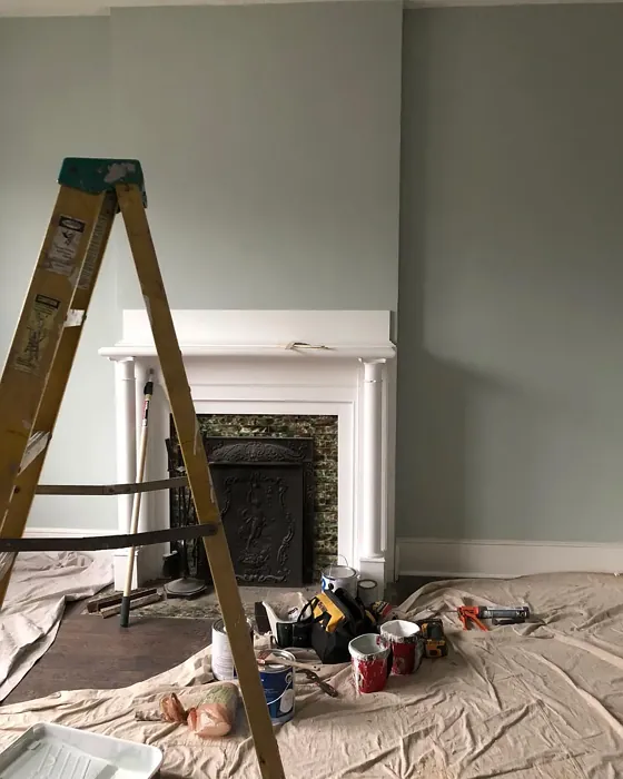
Now, let’s talk about lighting. Every color shifts depending on the light, and *Quiet Moments* is no exception. In natural daylight, it leans fresh and crisp, almost like a soft sea glass. Under warm artificial light, though, those green undertones can mellow out, pulling slightly warmer and cozier. That’s why it’s crucial to test a swatch in your space at different times of day. Paint a large poster board and move it around the room—see how it plays with your furniture, flooring, and even the view outside your window. You might be surprised how dynamic this “quiet” color can be.
When it comes to pairing *Quiet Moments* with other colors, you’ve got options. For a clean, modern look, pair it with bright whites like *Simply White* for trim and ceilings. The contrast keeps things crisp without feeling cold. If you’re after something a bit richer, try deep charcoal or navy accents—it creates a sophisticated balance that’s still calming. And if you love a touch of warmth? Brass fixtures or warm wood tones (think oak or walnut) add just enough contrast to keep the space inviting. Avoid pairing it with colors that clash with its green undertones, like overly warm reds or oranges, unless you’re going for intentional tension.
Application is where *Quiet Moments* really shines. It’s beginner-friendly, with good coverage in just one or two coats, and it’s touch-up friendly—a lifesaver if you’ve got kids or pets. The finish options (eggshell, satin, or matte) let you tailor the look to your needs. Eggshell is my go-to for most walls—it’s durable enough for high-traffic areas but still soft on the eyes. Satin works well in kitchens or bathrooms where you need a bit more washability. And matte? Perfect for ceilings or low-light rooms where you want to minimize glare.
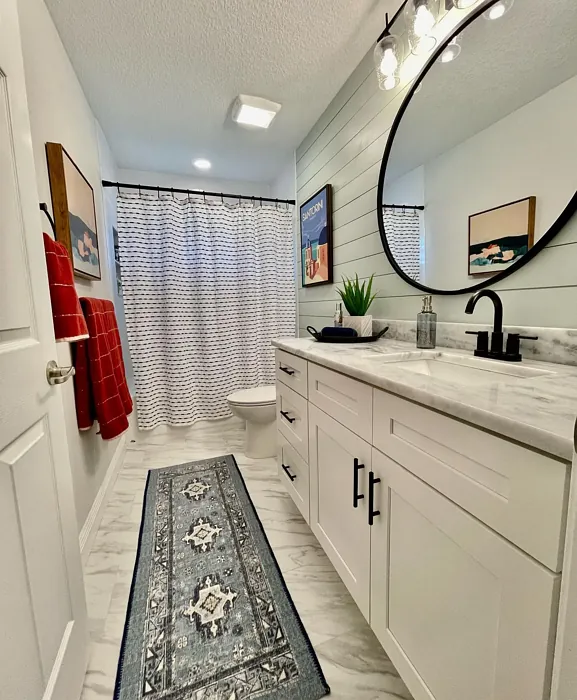
As for rooms, *Quiet Moments* is a chameleon. In a bedroom, it’s a dreamy backdrop for crisp white linens and layered textures. In a home office, it fosters focus without feeling sterile. Nurseries? Its soothing vibe is ideal for late-night feedings. And dining rooms? It sets a serene stage for gatherings, especially when paired with warm wood tables and soft lighting. Even rentals or homes on the market benefit—it’s neutral enough to appeal to buyers but distinctive enough to leave an impression.
Of course, no color is perfect. *Quiet Moments* isn’t the most durable option if you’re rough on walls (high-gloss paints hold up better to scrubbing). And while its undertones are part of its charm, they can clash with certain fixed elements—like pink-toned flooring or orangey wood—so always test first. But for most homes, the pros far outweigh the cons.
So, is *Quiet Moments* right for you? If you’re craving a space that feels calm, balanced, and effortlessly stylish, the answer is probably yes. It’s one of those rare colors that works hard without demanding attention, blending into your life while quietly making everything look better. Grab a sample, paint a swatch, and see how it makes you feel. After all, the best colors don’t just decorate your walls—they elevate your everyday.
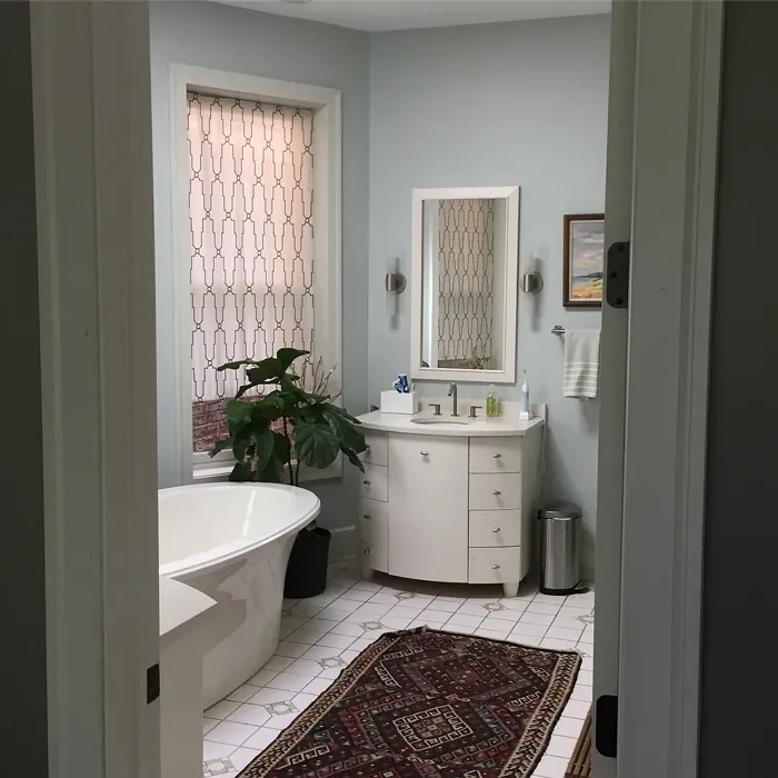
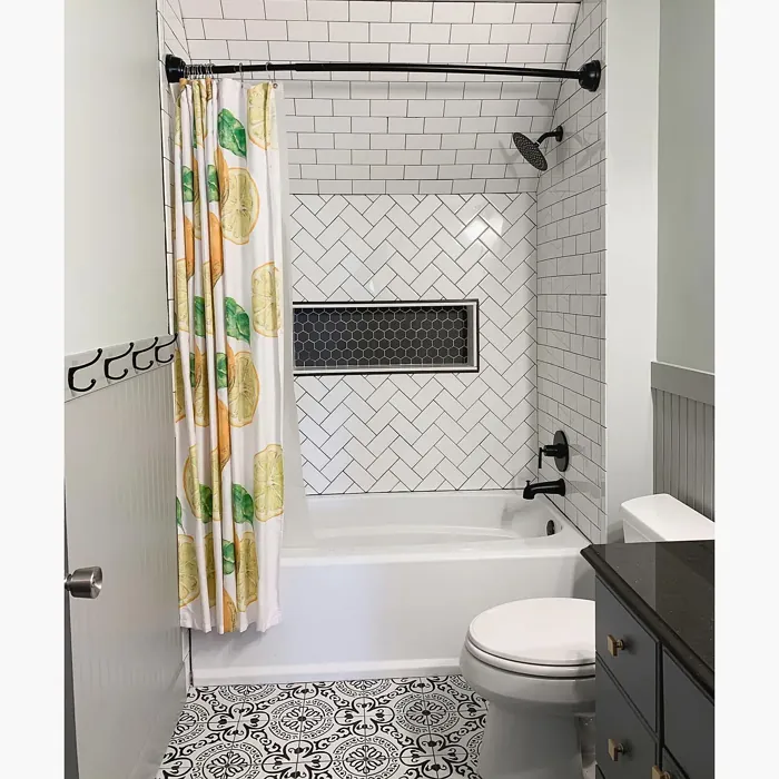
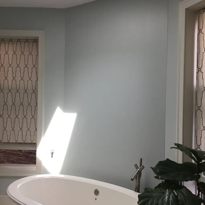
Real Room Photo of Quiet Moments 1563
Undertones of Quiet Moments ?
The undertones of Quiet Moments are a key aspect of its character, leaning towards Green. These subtle underlying hues are what give the color its depth and complexity. For example, a gray with a blue undertone will feel cooler and more modern, while one with a brown undertone will feel warmer and more traditional. It’s essential to test this paint in your home and observe it next to your existing furniture, flooring, and decor to see how these undertones interact and reveal themselves throughout the day.
HEX value: #C7CFC8
RGB code: 199, 207, 200
Is Quiet Moments Cool or Warm?
Quiet Moments leans toward the cool spectrum, yet its warm undertones provide a balanced feel. This makes it adaptable across various lighting conditions, enhancing its versatility.
Understanding Color Properties and Interior Design Tips
Hue refers to a specific position on the color wheel, measured in degrees from 0 to 360. Each degree represents a different pure color:
- 0° represents red
- 120° represents green
- 240° represents blue
Saturation describes the intensity or purity of a color and is expressed as a percentage:
- At 0%, the color appears completely desaturated—essentially a shade of gray
- At 100%, the color is at its most vivid and vibrant
Lightness indicates how light or dark a color is, also expressed as a percentage:
- 0% lightness results in black
- 100% lightness results in white
Using Warm Colors in Interior Design
Warm hues—such as reds, oranges, yellows, warm beiges, and greiges—are excellent choices for creating inviting and energetic spaces. These colors are particularly well-suited for:
- Kitchens, living rooms, and bathrooms, where warmth enhances comfort and sociability
- Large rooms, where warm tones can help reduce the sense of emptiness and make the space feel more intimate
For example:
- Warm beige shades provide a cozy, inviting atmosphere, ideal for living rooms, bedrooms, and hallways.
- Warm greige (a mix of beige and gray) offers the warmth of beige with the modern appeal of gray, making it a versatile backdrop for dining areas, bedrooms, and living spaces.
However, be mindful when using warm light tones in rooms with limited natural light. These shades may appear muted or even take on an unpleasant yellowish tint. To avoid a dull or flat appearance:
- Add depth by incorporating richer tones like deep greens, charcoal, or chocolate brown
- Use textured elements such as curtains, rugs, or cushions to bring dimension to the space
Pro Tip: Achieving Harmony with Warm and Cool Color Balance
To create a well-balanced and visually interesting interior, mix warm and cool tones strategically. This contrast adds depth and harmony to your design.
- If your walls feature warm hues, introduce cool-colored accents such as blue or green furniture, artwork, or accessories to create contrast.
- For a polished look, consider using a complementary color scheme, which pairs colors opposite each other on the color wheel (e.g., red with green, orange with blue).
This thoughtful mix not only enhances visual appeal but also creates a space that feels both dynamic and cohesive.
Light Temperature Affects on Quiet Moments
Natural Light
Natural daylight changes in color temperature as the sun moves across the sky. At sunrise and sunset, the light tends to have a warm, golden tone with a color temperature around 2000 Kelvin (K). As the day progresses and the sun rises higher, the light becomes cooler and more neutral. Around midday, especially when the sky is clear, natural light typically reaches its peak brightness and shifts to a cooler tone, ranging from 5500 to 6500 Kelvin. This midday light is close to what we perceive as pure white or daylight-balanced light.
These shifts in natural light can significantly influence how colors appear in a space, which is why designers often consider both the time of day and the orientation of windows when planning interior color schemes.
Artificial Light
When choosing artificial lighting, pay close attention to the color temperature, measured in Kelvin (K). This determines how warm or cool the light will appear. Lower temperatures, around 2700K, give off a warm, yellow glow often used in living rooms or bedrooms. Higher temperatures, above 5000K, create a cool, bluish light similar to daylight, commonly used in kitchens, offices, or task areas.
Use the slider to see how lighting temperature can affect the appearance of a surface or color throughout a space.


4800K
LRV of Quiet Moments
The Light Reflectance Value (LRV) of Quiet Moments is 60.73%, which places it in the Light colors category. This means it reflect most of the incident light. Understanding a paint’s LRV is crucial for predicting how it will look in your space. A higher LRV indicates a lighter color that reflects more light, making rooms feel larger and brighter. A lower LRV signifies a darker color that absorbs more light, creating a cozier, more intimate atmosphere. Always consider the natural and artificial lighting in your room when selecting a paint color based on its LRV.
Detailed Review of Quiet Moments
Additional Paint Characteristics
Ideal Rooms
Bedroom, Dining Room, Home Office, Living Room, Nursery
Decor Styles
Coastal, Minimalist, Modern, Scandinavian, Transitional
Coverage
Good (1–2 Coats), Touch-Up Friendly
Ease of Application
Beginner Friendly, Brush Smooth, Roller-Ready
Washability
Washable, Wipeable
VOC Level
Low VOC
Best Use
Accent Wall, Furniture, Interior Walls
Room Suitability
Bedroom, Dining Room, Home Office, Living Room, Nursery
Tone Tag
Balanced, Cool, Muted
Finish Type
Eggshell, Satin
Paint Performance
Easy Touch-Up, Low Odor, Quick Drying
Use Cases
Best for Low Light Rooms, Best for Rentals, Best for Selling Your Home
Mood
Calm, Inviting, Restful
Trim Pairing
Complements Brass Fixtures, Pairs with White Dove, Works with Warm Trim
Quiet Moments is a versatile paint that stands out for its subtle elegance. It perfectly balances warmth and coolness, making it an excellent choice for various decor styles. Whether you’re aiming for a serene coastal vibe or a sleek modern look, this hue adapts beautifully. The application is smooth, and it blends well, reducing the need for multiple coats. Its calming presence enhances light and can make smaller spaces feel more expansive. Overall, it’s a reliable option for homeowners looking to create a peaceful atmosphere in their interiors.
Pros & Cons of 1563 Quiet Moments
Pros
Cons
Colors that go with Benjamin Moore Quiet Moments
FAQ on 1563 Quiet Moments
Can Quiet Moments be used in smaller spaces?
Absolutely! Quiet Moments is ideal for smaller spaces as it can create an illusion of depth and openness. Its light reflectance helps to brighten up tight areas, making them feel airy and inviting. Just be mindful of your lighting conditions, as it may shift in tone based on the light available.
How does Quiet Moments pair with other colors?
Quiet Moments pairs beautifully with a wide range of colors. For a fresh look, consider combining it with whites like Simply White or soft pastels for a calming palette. If you’re looking for contrast, it works well with darker colors for trim or accents, creating a sophisticated balance in your space.
Comparisons Quiet Moments with other colors
Quiet Moments 1563 vs Sea Salt SW 6204
| Attribute | Quiet Moments 1563 | Sea Salt SW 6204 |
|---|---|---|
| Color Name | Quiet Moments 1563 | Sea Salt SW 6204 |
| Color | ||
| Hue | Green | Green |
| Brightness | Light | Light |
| RGB | 199, 207, 200 | 205, 210, 202 |
| LRV | 60.73% | 64% |
| Finish Type | Eggshell, Satin | Eggshell, Satin |
| Finish Options | Eggshell, Matte, Satin | Eggshell, Matte, Satin |
| Ideal Rooms | Bedroom, Dining Room, Home Office, Living Room, Nursery | Bathroom, Bedroom, Hallway, Kitchen, Living Room |
| Decor Styles | Coastal, Minimalist, Modern, Scandinavian, Transitional | Coastal, Minimalist, Modern Farmhouse, Scandinavian, Traditional |
| Coverage | Good (1–2 Coats), Touch-Up Friendly | Good (1–2 Coats), Touch-Up Friendly |
| Ease of Application | Beginner Friendly, Brush Smooth, Roller-Ready | Beginner Friendly, Brush Smooth, Fast-Drying, Roller-Ready |
| Washability | Washable, Wipeable | Highly Washable, Washable |
| Room Suitability | Bedroom, Dining Room, Home Office, Living Room, Nursery | Bathroom, Bedroom, Hallway, Kitchen, Living Room |
| Tone | Balanced, Cool, Muted | Airy, Balanced, Cool, Muted |
| Paint Performance | Easy Touch-Up, Low Odor, Quick Drying | Easy Touch-Up, High Coverage, Low Odor, Quick Drying |
Quiet Moments 1563 vs Liveable Green SW 6176
| Attribute | Quiet Moments 1563 | Liveable Green SW 6176 |
|---|---|---|
| Color Name | Quiet Moments 1563 | Liveable Green SW 6176 |
| Color | ||
| Hue | Green | Green |
| Brightness | Light | Light |
| RGB | 199, 207, 200 | 206, 206, 189 |
| LRV | 60.73% | 30% |
| Finish Type | Eggshell, Satin | Eggshell, Matte, Satin |
| Finish Options | Eggshell, Matte, Satin | Eggshell, Matte, Satin |
| Ideal Rooms | Bedroom, Dining Room, Home Office, Living Room, Nursery | Bedroom, Home Office, Kitchen, Living Room, Nursery |
| Decor Styles | Coastal, Minimalist, Modern, Scandinavian, Transitional | Contemporary, Modern Farmhouse, Rustic, Scandi |
| Coverage | Good (1–2 Coats), Touch-Up Friendly | Good (1–2 Coats), Touch-Up Friendly |
| Ease of Application | Beginner Friendly, Brush Smooth, Roller-Ready | Beginner Friendly, Brush Smooth, Roller-Ready |
| Washability | Washable, Wipeable | Highly Washable, Washable |
| Room Suitability | Bedroom, Dining Room, Home Office, Living Room, Nursery | Bedroom, Home Office, Living Room, Nursery |
| Tone | Balanced, Cool, Muted | Balanced, Earthy, Muted |
| Paint Performance | Easy Touch-Up, Low Odor, Quick Drying | Easy Touch-Up, High Coverage, Low Odor |
Quiet Moments 1563 vs Rainwashed SW 6211
| Attribute | Quiet Moments 1563 | Rainwashed SW 6211 |
|---|---|---|
| Color Name | Quiet Moments 1563 | Rainwashed SW 6211 |
| Color | ||
| Hue | Green | Green |
| Brightness | Light | Light |
| RGB | 199, 207, 200 | 194, 205, 197 |
| LRV | 60.73% | 60% |
| Finish Type | Eggshell, Satin | Eggshell, Matte, Satin |
| Finish Options | Eggshell, Matte, Satin | Eggshell, Matte, Satin |
| Ideal Rooms | Bedroom, Dining Room, Home Office, Living Room, Nursery | Bathroom, Bedroom, Home Office, Living Room, Nursery |
| Decor Styles | Coastal, Minimalist, Modern, Scandinavian, Transitional | Coastal, Farmhouse, Minimalist, Modern, Transitional |
| Coverage | Good (1–2 Coats), Touch-Up Friendly | Good (1–2 Coats), Touch-Up Friendly |
| Ease of Application | Beginner Friendly, Brush Smooth, Roller-Ready | Beginner Friendly, Brush Smooth, Fast-Drying, Roller-Ready |
| Washability | Washable, Wipeable | Washable, Wipeable |
| Room Suitability | Bedroom, Dining Room, Home Office, Living Room, Nursery | Bathroom, Bedroom, Home Office, Living Room, Nursery |
| Tone | Balanced, Cool, Muted | Balanced, Cool, Muted |
| Paint Performance | Easy Touch-Up, Low Odor, Quick Drying | Easy Touch-Up, High Coverage, Low Odor |
Quiet Moments 1563 vs Filmy Green SW 6190
| Attribute | Quiet Moments 1563 | Filmy Green SW 6190 |
|---|---|---|
| Color Name | Quiet Moments 1563 | Filmy Green SW 6190 |
| Color | ||
| Hue | Green | Green |
| Brightness | Light | Light |
| RGB | 199, 207, 200 | 209, 211, 199 |
| LRV | 60.73% | 50% |
| Finish Type | Eggshell, Satin | Eggshell, Matte, Satin |
| Finish Options | Eggshell, Matte, Satin | Eggshell, Matte, Satin |
| Ideal Rooms | Bedroom, Dining Room, Home Office, Living Room, Nursery | Bedroom, Home Office, Living Room, Nursery |
| Decor Styles | Coastal, Minimalist, Modern, Scandinavian, Transitional | Bohemian, Minimalist, Modern Farmhouse, Scandinavian |
| Coverage | Good (1–2 Coats), Touch-Up Friendly | Good (1–2 Coats) |
| Ease of Application | Beginner Friendly, Brush Smooth, Roller-Ready | Beginner Friendly, Brush Smooth, Roller-Ready |
| Washability | Washable, Wipeable | Washable, Wipeable |
| Room Suitability | Bedroom, Dining Room, Home Office, Living Room, Nursery | Bedroom, Home Office, Living Room, Nursery |
| Tone | Balanced, Cool, Muted | Calm, Earthy, Muted |
| Paint Performance | Easy Touch-Up, Low Odor, Quick Drying | Easy Touch-Up, Low Odor, Quick Drying |
Quiet Moments 1563 vs Slow Green SW 6456
| Attribute | Quiet Moments 1563 | Slow Green SW 6456 |
|---|---|---|
| Color Name | Quiet Moments 1563 | Slow Green SW 6456 |
| Color | ||
| Hue | Green | Green |
| Brightness | Light | Light |
| RGB | 199, 207, 200 | 198, 213, 201 |
| LRV | 60.73% | 48% |
| Finish Type | Eggshell, Satin | Eggshell, Matte, Satin |
| Finish Options | Eggshell, Matte, Satin | Eggshell, Matte, Satin |
| Ideal Rooms | Bedroom, Dining Room, Home Office, Living Room, Nursery | Bedroom, Dining Room, Home Office, Living Room, Nursery |
| Decor Styles | Coastal, Minimalist, Modern, Scandinavian, Transitional | Coastal, Farmhouse, Modern, Rustic, Scandinavian |
| Coverage | Good (1–2 Coats), Touch-Up Friendly | Good (1–2 Coats), Touch-Up Friendly |
| Ease of Application | Beginner Friendly, Brush Smooth, Roller-Ready | Beginner Friendly, Brush Smooth, Roller-Ready |
| Washability | Washable, Wipeable | Highly Washable, Washable |
| Room Suitability | Bedroom, Dining Room, Home Office, Living Room, Nursery | Bedroom, Dining Room, Entryway, Home Office, Living Room, Nursery |
| Tone | Balanced, Cool, Muted | Balanced, Earthy, Muted |
| Paint Performance | Easy Touch-Up, Low Odor, Quick Drying | Easy Touch-Up, Fade Resistant, Low Odor |
Quiet Moments 1563 vs Acanthus SW 0029
| Attribute | Quiet Moments 1563 | Acanthus SW 0029 |
|---|---|---|
| Color Name | Quiet Moments 1563 | Acanthus SW 0029 |
| Color | ||
| Hue | Green | Green |
| Brightness | Light | Light |
| RGB | 199, 207, 200 | 205, 205, 180 |
| LRV | 60.73% | 10% |
| Finish Type | Eggshell, Satin | Eggshell, Matte, Satin |
| Finish Options | Eggshell, Matte, Satin | Eggshell, Matte, Satin |
| Ideal Rooms | Bedroom, Dining Room, Home Office, Living Room, Nursery | Bedroom, Dining Room, Home Office, Kitchen, Living Room |
| Decor Styles | Coastal, Minimalist, Modern, Scandinavian, Transitional | Eclectic, Farmhouse, Modern, Traditional |
| Coverage | Good (1–2 Coats), Touch-Up Friendly | Good (1–2 Coats) |
| Ease of Application | Beginner Friendly, Brush Smooth, Roller-Ready | Beginner Friendly, Brush Smooth, Fast-Drying, Roller-Ready |
| Washability | Washable, Wipeable | Highly Washable, Stain Resistant, Washable |
| Room Suitability | Bedroom, Dining Room, Home Office, Living Room, Nursery | Bedroom, Dining Room, Home Office, Living Room |
| Tone | Balanced, Cool, Muted | Balanced, Earthy, Muted |
| Paint Performance | Easy Touch-Up, Low Odor, Quick Drying | Easy Touch-Up, Low Odor, Quick Drying, Scuff Resistant |
Quiet Moments 1563 vs Topiary Tint SW 6449
| Attribute | Quiet Moments 1563 | Topiary Tint SW 6449 |
|---|---|---|
| Color Name | Quiet Moments 1563 | Topiary Tint SW 6449 |
| Color | ||
| Hue | Green | Green |
| Brightness | Light | Light |
| RGB | 199, 207, 200 | 200, 216, 196 |
| LRV | 60.73% | 30% |
| Finish Type | Eggshell, Satin | Eggshell, Matte, Satin |
| Finish Options | Eggshell, Matte, Satin | Eggshell, Matte, Satin |
| Ideal Rooms | Bedroom, Dining Room, Home Office, Living Room, Nursery | Bathroom, Bedroom, Dining Room, Home Office, Kitchen, Living Room |
| Decor Styles | Coastal, Minimalist, Modern, Scandinavian, Transitional | Bohemian, Coastal, Eclectic, Modern Farmhouse, Transitional |
| Coverage | Good (1–2 Coats), Touch-Up Friendly | Good (1–2 Coats), Touch-Up Friendly |
| Ease of Application | Beginner Friendly, Brush Smooth, Roller-Ready | Beginner Friendly, Brush Smooth, Fast-Drying, Roller-Ready |
| Washability | Washable, Wipeable | Scuff Resistant, Washable |
| Room Suitability | Bedroom, Dining Room, Home Office, Living Room, Nursery | Bathroom, Bedroom, Dining Room, Kitchen, Living Room |
| Tone | Balanced, Cool, Muted | Balanced, Calm, Earthy, Muted |
| Paint Performance | Easy Touch-Up, Low Odor, Quick Drying | Easy Touch-Up, Low Odor, Quick Drying, Stain Resistant |
Quiet Moments 1563 vs Waterscape SW 6470
| Attribute | Quiet Moments 1563 | Waterscape SW 6470 |
|---|---|---|
| Color Name | Quiet Moments 1563 | Waterscape SW 6470 |
| Color | ||
| Hue | Green | Green |
| Brightness | Light | Light |
| RGB | 199, 207, 200 | 191, 210, 201 |
| LRV | 60.73% | 50% |
| Finish Type | Eggshell, Satin | Eggshell, Matte |
| Finish Options | Eggshell, Matte, Satin | Eggshell, Matte, Satin |
| Ideal Rooms | Bedroom, Dining Room, Home Office, Living Room, Nursery | Bathroom, Bedroom, Home Office, Kitchen, Living Room |
| Decor Styles | Coastal, Minimalist, Modern, Scandinavian, Transitional | Coastal, Minimalist, Modern, Scandinavian |
| Coverage | Good (1–2 Coats), Touch-Up Friendly | Good (1–2 Coats) |
| Ease of Application | Beginner Friendly, Brush Smooth, Roller-Ready | Beginner Friendly, Brush Smooth, Roller-Ready |
| Washability | Washable, Wipeable | Highly Washable, Washable |
| Room Suitability | Bedroom, Dining Room, Home Office, Living Room, Nursery | Bathroom, Bedroom, Home Office, Living Room |
| Tone | Balanced, Cool, Muted | Airy, Cool, Muted |
| Paint Performance | Easy Touch-Up, Low Odor, Quick Drying | Easy Touch-Up, Low Odor, Quick Drying |
Quiet Moments 1563 vs Bonsai Tint SW 6436
| Attribute | Quiet Moments 1563 | Bonsai Tint SW 6436 |
|---|---|---|
| Color Name | Quiet Moments 1563 | Bonsai Tint SW 6436 |
| Color | ||
| Hue | Green | Green |
| Brightness | Light | Light |
| RGB | 199, 207, 200 | 197, 209, 178 |
| LRV | 60.73% | 64% |
| Finish Type | Eggshell, Satin | Eggshell, Matte |
| Finish Options | Eggshell, Matte, Satin | Eggshell, Matte, Satin |
| Ideal Rooms | Bedroom, Dining Room, Home Office, Living Room, Nursery | Bedroom, Home Office, Living Room, Nursery |
| Decor Styles | Coastal, Minimalist, Modern, Scandinavian, Transitional | Bohemian, Minimalist, Modern, Scandinavian |
| Coverage | Good (1–2 Coats), Touch-Up Friendly | Good (1–2 Coats) |
| Ease of Application | Beginner Friendly, Brush Smooth, Roller-Ready | Beginner Friendly, Brush Smooth, Roller-Ready |
| Washability | Washable, Wipeable | Washable, Wipeable |
| Room Suitability | Bedroom, Dining Room, Home Office, Living Room, Nursery | Bedroom, Home Office, Living Room, Nursery |
| Tone | Balanced, Cool, Muted | Calm, Earthy, Muted |
| Paint Performance | Easy Touch-Up, Low Odor, Quick Drying | Easy Touch-Up, Fade Resistant, Low Odor |
Quiet Moments 1563 vs Gratifying Green SW 6435
| Attribute | Quiet Moments 1563 | Gratifying Green SW 6435 |
|---|---|---|
| Color Name | Quiet Moments 1563 | Gratifying Green SW 6435 |
| Color | ||
| Hue | Green | Green |
| Brightness | Light | Light |
| RGB | 199, 207, 200 | 218, 226, 205 |
| LRV | 60.73% | 30% |
| Finish Type | Eggshell, Satin | Eggshell, Matte, Satin |
| Finish Options | Eggshell, Matte, Satin | Eggshell, Matte, Satin |
| Ideal Rooms | Bedroom, Dining Room, Home Office, Living Room, Nursery | Bedroom, Dining Room, Home Office, Living Room, Nursery |
| Decor Styles | Coastal, Minimalist, Modern, Scandinavian, Transitional | Bohemian, Coastal, Minimalist, Modern Farmhouse |
| Coverage | Good (1–2 Coats), Touch-Up Friendly | Good (1–2 Coats), Touch-Up Friendly |
| Ease of Application | Beginner Friendly, Brush Smooth, Roller-Ready | Beginner Friendly, Brush Smooth, Roller-Ready |
| Washability | Washable, Wipeable | Washable, Wipeable |
| Room Suitability | Bedroom, Dining Room, Home Office, Living Room, Nursery | Bedroom, Home Office, Living Room, Nursery |
| Tone | Balanced, Cool, Muted | Earthy, Muted, Warm |
| Paint Performance | Easy Touch-Up, Low Odor, Quick Drying | Easy Touch-Up, Low Odor, Quick Drying |
Official Page of Benjamin Moore Quiet Moments 1563