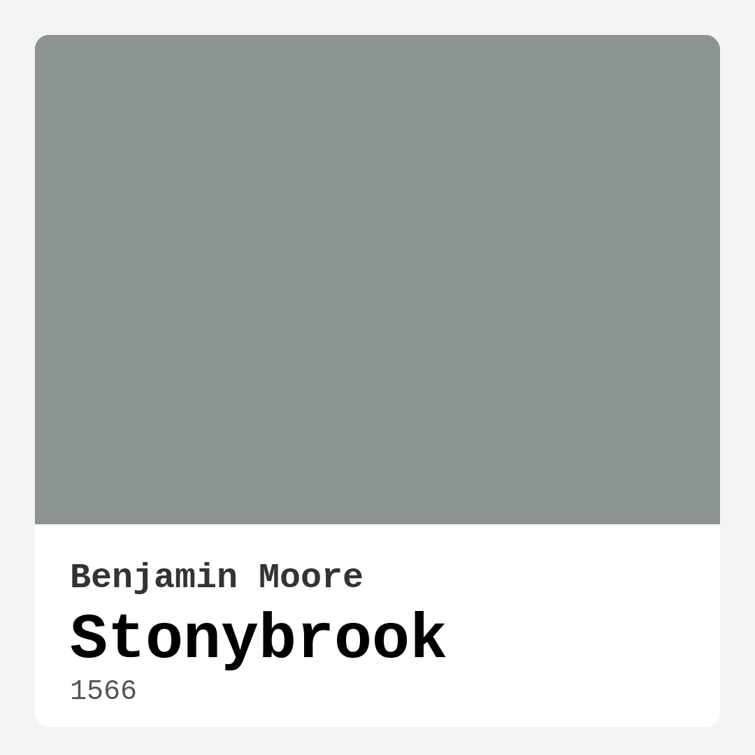
Color Preview & Key Details
| HEX Code | #8B9490 |
| RGB | 139, 148, 144 |
| LRV | 29.27% |
| Undertone | Green |
| Finish Options | Eggshell, Matte, Satin |
Imagine stepping into a room that feels instantly calming, where the ambiance wraps around you like a soft blanket. That’s what you’ll get with Stonybrook, a stunning paint color from Benjamin Moore that whispers sophistication while offering a serene presence. You might be wondering how a color can create such a vibe. Let’s dive into the world of Stonybrook and explore whether it’s the perfect fit for your next home project.
Stonybrook is a muted green with gray undertones, a beautiful example of nature’s subtle elegance. This color strikes the perfect balance between warmth and coolness, making it incredibly versatile. Whether you’re decorating a modern space or a more traditional setting, Stonybrook adapts beautifully, creating an inviting atmosphere that feels both grounded and airy.
One of the standout features of Stonybrook is its adaptability. It pairs wonderfully with natural materials like wood and stone, enhancing their textures while still making a statement on its own. Picture it as the backdrop for rustic wooden furniture or alongside sleek metallic accents. In a modern home, using Stonybrook can create a light, airy feel, especially when contrasted with crisp whites or soft creams. Conversely, in traditional settings, it adds a touch of sophistication without being overwhelming, making it an excellent choice for spaces where you want to cultivate a tranquil, welcoming atmosphere.
When it comes to application, you’ll be pleased to know that Stonybrook is beginner-friendly. The paint goes on smoothly, whether you choose a matte or eggshell finish. This makes it perfect for those weekend projects. Plus, it’s touch-up friendly, meaning that if you accidentally scuff the wall, you won’t have to redo the entire room. Its washability and stain-resistant qualities are additional bonuses, especially in high-traffic areas where walls tend to take a beating.
With a Light Reflectance Value (LRV) of about 29.27%, Stonybrook reflects a good amount of light, creating a balanced ambiance that feels cozy yet spacious. This makes it suitable for a variety of rooms, including the living room, bedroom, home office, and dining area. However, it’s essential to consider the lighting in your space. While Stonybrook shines in natural light, it can appear darker in poorly lit rooms. So, if you’re contemplating using it in a small or dimly lit space, make sure to use good lighting to highlight its beauty and keep the area feeling open.
Stonybrook also holds its own against other colors. It pairs beautifully with whites and creams to create a fresh contrast, enhancing that serene vibe. For a more dramatic effect, consider pairing it with deep navy or charcoal, which grounds the room while maintaining an inviting feel. Earthy tones, such as terracotta and muted wood finishes, also complement Stonybrook wonderfully, making your space feel warm and welcoming.
If you’re thinking about accent walls, Stonybrook is an excellent choice. It can transform a simple wall into a statement piece without overwhelming the rest of your decor. Imagine a serene Stonybrook accent wall behind a soft cream sofa adorned with colorful cushions or a wooden dining table set against this calming backdrop. The possibilities are endless, allowing your personality to shine through the decor.
You might be wondering about its compatibility with various décor styles. Whether you lean towards modern, rustic, transitional, or coastal themes, Stonybrook fits right in. For modern farmhouse aesthetics, for instance, it can serve as a grounding color that ties together earthy elements. If you’re leaning toward a coastal vibe, Stonybrook can evoke the calm of a beachside retreat, especially when paired with whites and soft blues.
Let’s talk about its undertones for a moment. The subtle gray undertones give Stonybrook a cool edge, preventing it from feeling too stark or cold. This balance makes it suitable for various lighting conditions, enhancing its versatility. Under natural light, it reveals its soft green hue, brightening up any room with a tranquil glow. Meanwhile, under artificial lighting, it maintains its muted charm, offering a cozy ambiance that enhances the overall mood of the space.
For the environmentally conscious homeowner, you’ll appreciate that Stonybrook is a low VOC, eco-certified paint. This means you can feel good about your choice, knowing it’s better for both your home and the planet. The ease of application and low odor make it even more appealing, especially if you’re tackling a big project or working in a space that’s already furnished.
Now, if you’re still unsure about using Stonybrook in smaller spaces, let me assure you — it works wonders. The muted tones can make small areas feel more inviting without feeling cramped. Just be mindful of your lighting. A well-lit room will allow Stonybrook to shine and reveal its calming nature, ensuring that even compact spaces feel open and cozy.
Whether you’re painting the entire room or just an accent wall, Stonybrook invites a sense of calm and grounding to your living spaces. Its elegant and soothing hue, coupled with its versatility across various decor styles, makes it a designer favorite. It invites you to create a space that reflects your personality while ensuring it remains welcoming to all.
As you embark on your home decorating journey, consider Stonybrook as a potential canvas for your creativity. With its ability to complement a wide range of colors and materials, you’ll find that it not only enhances your space but also elevates the mood of those who inhabit it. Transform your home into a serene retreat, and let Stonybrook be the color that ties it all together. After all, creating a beautiful interior isn’t just about choosing colors — it’s about crafting an experience, and Stonybrook is the perfect shade to help you do just that.
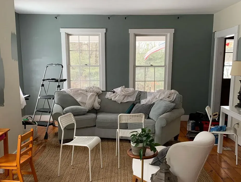
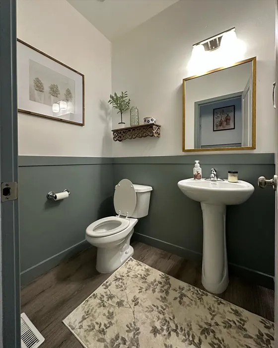
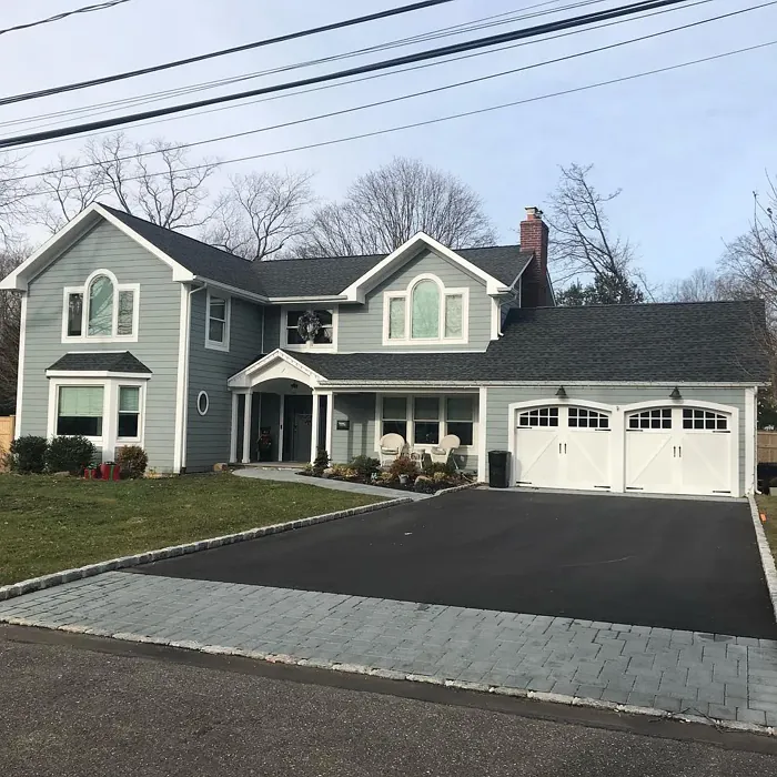
Real Room Photo of Stonybrook 1566
Undertones of Stonybrook ?
Stonybrook carries subtle undertones of gray, which lend it a cool, sophisticated edge without losing its warmth. This balance makes it perfect for spaces that need a calming influence while still feeling grounded and welcoming.
HEX value: #8B9490
RGB code: 139, 148, 144
Is Stonybrook Cool or Warm?
This color leans more toward the cool spectrum, thanks to its gray undertones. However, its muted green aspect keeps it from feeling too stark, making it a balanced choice for various lighting situations.
Understanding Color Properties and Interior Design Tips
Hue refers to a specific position on the color wheel, measured in degrees from 0 to 360. Each degree represents a different pure color:
- 0° represents red
- 120° represents green
- 240° represents blue
Saturation describes the intensity or purity of a color and is expressed as a percentage:
- At 0%, the color appears completely desaturated—essentially a shade of gray
- At 100%, the color is at its most vivid and vibrant
Lightness indicates how light or dark a color is, also expressed as a percentage:
- 0% lightness results in black
- 100% lightness results in white
Using Warm Colors in Interior Design
Warm hues—such as reds, oranges, yellows, warm beiges, and greiges—are excellent choices for creating inviting and energetic spaces. These colors are particularly well-suited for:
- Kitchens, living rooms, and bathrooms, where warmth enhances comfort and sociability
- Large rooms, where warm tones can help reduce the sense of emptiness and make the space feel more intimate
For example:
- Warm beige shades provide a cozy, inviting atmosphere, ideal for living rooms, bedrooms, and hallways.
- Warm greige (a mix of beige and gray) offers the warmth of beige with the modern appeal of gray, making it a versatile backdrop for dining areas, bedrooms, and living spaces.
However, be mindful when using warm light tones in rooms with limited natural light. These shades may appear muted or even take on an unpleasant yellowish tint. To avoid a dull or flat appearance:
- Add depth by incorporating richer tones like deep greens, charcoal, or chocolate brown
- Use textured elements such as curtains, rugs, or cushions to bring dimension to the space
Pro Tip: Achieving Harmony with Warm and Cool Color Balance
To create a well-balanced and visually interesting interior, mix warm and cool tones strategically. This contrast adds depth and harmony to your design.
- If your walls feature warm hues, introduce cool-colored accents such as blue or green furniture, artwork, or accessories to create contrast.
- For a polished look, consider using a complementary color scheme, which pairs colors opposite each other on the color wheel (e.g., red with green, orange with blue).
This thoughtful mix not only enhances visual appeal but also creates a space that feels both dynamic and cohesive.
Light Temperature Affects on Stonybrook
Natural Light
Natural daylight changes in color temperature as the sun moves across the sky. At sunrise and sunset, the light tends to have a warm, golden tone with a color temperature around 2000 Kelvin (K). As the day progresses and the sun rises higher, the light becomes cooler and more neutral. Around midday, especially when the sky is clear, natural light typically reaches its peak brightness and shifts to a cooler tone, ranging from 5500 to 6500 Kelvin. This midday light is close to what we perceive as pure white or daylight-balanced light.
These shifts in natural light can significantly influence how colors appear in a space, which is why designers often consider both the time of day and the orientation of windows when planning interior color schemes.
Artificial Light
When choosing artificial lighting, pay close attention to the color temperature, measured in Kelvin (K). This determines how warm or cool the light will appear. Lower temperatures, around 2700K, give off a warm, yellow glow often used in living rooms or bedrooms. Higher temperatures, above 5000K, create a cool, bluish light similar to daylight, commonly used in kitchens, offices, or task areas.
Use the slider to see how lighting temperature can affect the appearance of a surface or color throughout a space.


4800K
LRV of Stonybrook
The Light Reflectance Value (LRV) of Stonybrook is approximately 42. This means it reflects a moderate amount of light, creating a balanced ambiance that is neither too dark nor too bright.
Detailed Review of Stonybrook
Additional Paint Characteristics
Ideal Rooms
Bedroom, Dining Room, Home Office, Living Room
Decor Styles
Coastal, Modern, Rustic, Transitional
Coverage
Good (1–2 Coats), Touch-Up Friendly
Ease of Application
Beginner Friendly, Brush Smooth, Roller-Ready
Washability
Scrubbable, Stain Resistant, Washable
VOC Level
Eco-Certified, Low VOC
Best Use
Accent Wall, Furniture, Interior Walls
Room Suitability
Bedroom, Dining Room, Home Office, Living Room
Tone Tag
Balanced, Earthy, Muted
Finish Type
Eggshell, Matte
Paint Performance
Easy Touch-Up, High Coverage, Low Odor
Use Cases
Best for Low Light Rooms, Best for Modern Farmhouse, Designer Favorite
Mood
Calm, Grounding, Inviting
Trim Pairing
Complements Brass Fixtures, Good with Wood Trim, Pairs with White Dove
Stonybrook is a gem in the world of paint colors, offering a beautiful blend of gray and green that feels both fresh and timeless. Its muted tone lends itself well to a variety of design aesthetics, making it a fantastic choice for anyone looking to enhance their home’s ambiance. Whether you’re painting an accent wall or a full room, Stonybrook will create a soothing backdrop that allows other decor elements to shine.
One of the highlights of this color is its adaptability. It pairs wonderfully with natural materials like wood and stone, enhancing their texture while still standing out as a color in its own right. When combined with crisp whites or soft creams, Stonybrook can create a light, airy feel that’s perfect for modern homes. In more traditional settings, it adds sophistication without being overpowering. This makes it an excellent choice for spaces where you want to cultivate a tranquil, inviting atmosphere.
Pros & Cons of 1566 Stonybrook
Pros
Cons
Colors that go with Benjamin Moore Stonybrook
FAQ on 1566 Stonybrook
Can Stonybrook be used in small spaces?
Absolutely! Stonybrook’s muted tones can make small spaces feel more inviting and spacious. While it may darken slightly in low-light conditions, its calming nature helps create a cozy atmosphere without feeling cramped. Just ensure to use good lighting to highlight its beauty.
What colors pair well with Stonybrook?
Stonybrook pairs beautifully with whites and creams for a fresh contrast. It also complements earthy tones like terracotta and muted wood finishes. For a more dramatic look, consider pairing it with deep navy or charcoal for a sophisticated touch that still feels grounded.
Comparisons Stonybrook with other colors
Stonybrook 1566 vs Repose Gray SW 7015
| Attribute | Stonybrook 1566 | Repose Gray SW 7015 |
|---|---|---|
| Color Name | Stonybrook 1566 | Repose Gray SW 7015 |
| Color | ||
| Hue | Grey | Grey |
| Brightness | Medium | Medium |
| RGB | 139, 148, 144 | 204, 201, 192 |
| LRV | 29.27% | 58% |
| Finish Type | Eggshell, Matte | Eggshell, Matte, Satin |
| Finish Options | Eggshell, Matte, Satin | Eggshell, Matte, Satin |
| Ideal Rooms | Bedroom, Dining Room, Home Office, Living Room | Bedroom, Dining Room, Hallway, Home Office, Living Room |
| Decor Styles | Coastal, Modern, Rustic, Transitional | Contemporary, Farmhouse, Minimalist, Modern, Transitional |
| Coverage | Good (1–2 Coats), Touch-Up Friendly | Good (1–2 Coats), Touch-Up Friendly |
| Ease of Application | Beginner Friendly, Brush Smooth, Roller-Ready | Beginner Friendly, Brush Smooth, Fast-Drying, Roller-Ready |
| Washability | Scrubbable, Stain Resistant, Washable | Highly Washable, Washable |
| Room Suitability | Bedroom, Dining Room, Home Office, Living Room | Bedroom, Dining Room, Hallway, Home Office, Living Room |
| Tone | Balanced, Earthy, Muted | Muted, Neutral, Warm |
| Paint Performance | Easy Touch-Up, High Coverage, Low Odor | Low Odor, Quick Drying, Scuff Resistant |
Stonybrook 1566 vs Light French Gray SW 0055
| Attribute | Stonybrook 1566 | Light French Gray SW 0055 |
|---|---|---|
| Color Name | Stonybrook 1566 | Light French Gray SW 0055 |
| Color | ||
| Hue | Grey | Grey |
| Brightness | Medium | Medium |
| RGB | 139, 148, 144 | 194, 192, 187 |
| LRV | 29.27% | 53% |
| Finish Type | Eggshell, Matte | Eggshell, Matte, Satin |
| Finish Options | Eggshell, Matte, Satin | Eggshell, Matte, Satin |
| Ideal Rooms | Bedroom, Dining Room, Home Office, Living Room | Bedroom, Dining Room, Home Office, Kitchen, Living Room |
| Decor Styles | Coastal, Modern, Rustic, Transitional | Contemporary, Farmhouse, Modern, Scandinavian, Transitional |
| Coverage | Good (1–2 Coats), Touch-Up Friendly | Good (1–2 Coats), Touch-Up Friendly |
| Ease of Application | Beginner Friendly, Brush Smooth, Roller-Ready | Beginner Friendly, Brush Smooth, Roller-Ready |
| Washability | Scrubbable, Stain Resistant, Washable | Highly Washable, Washable |
| Room Suitability | Bedroom, Dining Room, Home Office, Living Room | Bedroom, Dining Room, Home Office, Kitchen, Living Room |
| Tone | Balanced, Earthy, Muted | Balanced, Muted, Neutral, Warm |
| Paint Performance | Easy Touch-Up, High Coverage, Low Odor | Easy Touch-Up, High Coverage, Low Odor |
Stonybrook 1566 vs Wordly Gray SW 7043
| Attribute | Stonybrook 1566 | Wordly Gray SW 7043 |
|---|---|---|
| Color Name | Stonybrook 1566 | Wordly Gray SW 7043 |
| Color | ||
| Hue | Grey | Grey |
| Brightness | Medium | Medium |
| RGB | 139, 148, 144 | 206, 198, 187 |
| LRV | 29.27% | 58% |
| Finish Type | Eggshell, Matte | Eggshell, Satin |
| Finish Options | Eggshell, Matte, Satin | Eggshell, Flat, Satin |
| Ideal Rooms | Bedroom, Dining Room, Home Office, Living Room | Bedroom, Home Office, Kitchen, Living Room |
| Decor Styles | Coastal, Modern, Rustic, Transitional | Minimalist, Modern, Scandi, Transitional |
| Coverage | Good (1–2 Coats), Touch-Up Friendly | Good (1–2 Coats) |
| Ease of Application | Beginner Friendly, Brush Smooth, Roller-Ready | Beginner Friendly, Brush Smooth, Fast-Drying, Roller-Ready |
| Washability | Scrubbable, Stain Resistant, Washable | Highly Washable, Washable |
| Room Suitability | Bedroom, Dining Room, Home Office, Living Room | Bedroom, Dining Room, Home Office, Living Room |
| Tone | Balanced, Earthy, Muted | Muted, Neutral, Warm |
| Paint Performance | Easy Touch-Up, High Coverage, Low Odor | Easy Touch-Up, Low Odor, Scuff Resistant |
Stonybrook 1566 vs Illusive Green SW 9164
| Attribute | Stonybrook 1566 | Illusive Green SW 9164 |
|---|---|---|
| Color Name | Stonybrook 1566 | Illusive Green SW 9164 |
| Color | ||
| Hue | Grey | Grey |
| Brightness | Medium | Medium |
| RGB | 139, 148, 144 | 146, 148, 141 |
| LRV | 29.27% | 24% |
| Finish Type | Eggshell, Matte | Eggshell, Matte, Satin |
| Finish Options | Eggshell, Matte, Satin | Eggshell, Matte, Satin |
| Ideal Rooms | Bedroom, Dining Room, Home Office, Living Room | Bedroom, Dining Room, Home Office, Living Room, Nursery |
| Decor Styles | Coastal, Modern, Rustic, Transitional | Coastal, Minimalist, Modern, Rustic, Scandinavian |
| Coverage | Good (1–2 Coats), Touch-Up Friendly | Good (1–2 Coats), Touch-Up Friendly |
| Ease of Application | Beginner Friendly, Brush Smooth, Roller-Ready | Beginner Friendly, Brush Smooth, Fast-Drying, Roller-Ready |
| Washability | Scrubbable, Stain Resistant, Washable | Highly Washable, Washable, Wipeable |
| Room Suitability | Bedroom, Dining Room, Home Office, Living Room | Bedroom, Dining Room, Home Office, Living Room, Nursery |
| Tone | Balanced, Earthy, Muted | Balanced, Earthy, Muted |
| Paint Performance | Easy Touch-Up, High Coverage, Low Odor | Easy Touch-Up, Low Odor, Quick Drying, Scuff Resistant |
Stonybrook 1566 vs Fawn Brindle SW 7640
| Attribute | Stonybrook 1566 | Fawn Brindle SW 7640 |
|---|---|---|
| Color Name | Stonybrook 1566 | Fawn Brindle SW 7640 |
| Color | ||
| Hue | Grey | Grey |
| Brightness | Medium | Medium |
| RGB | 139, 148, 144 | 167, 160, 148 |
| LRV | 29.27% | 24% |
| Finish Type | Eggshell, Matte | Eggshell, Matte |
| Finish Options | Eggshell, Matte, Satin | Eggshell, Matte, Satin |
| Ideal Rooms | Bedroom, Dining Room, Home Office, Living Room | Bedroom, Dining Room, Hallway, Home Office, Living Room |
| Decor Styles | Coastal, Modern, Rustic, Transitional | Bohemian, Minimalist, Modern Farmhouse, Transitional |
| Coverage | Good (1–2 Coats), Touch-Up Friendly | Good (1–2 Coats) |
| Ease of Application | Beginner Friendly, Brush Smooth, Roller-Ready | Brush Smooth, Fast-Drying, Roller-Ready |
| Washability | Scrubbable, Stain Resistant, Washable | Stain Resistant, Washable |
| Room Suitability | Bedroom, Dining Room, Home Office, Living Room | Bedroom, Dining Room, Home Office, Living Room |
| Tone | Balanced, Earthy, Muted | Earthy, Neutral, Warm |
| Paint Performance | Easy Touch-Up, High Coverage, Low Odor | Easy Touch-Up, Fade Resistant, Low Odor |
Stonybrook 1566 vs Balanced Beige SW 7037
| Attribute | Stonybrook 1566 | Balanced Beige SW 7037 |
|---|---|---|
| Color Name | Stonybrook 1566 | Balanced Beige SW 7037 |
| Color | ||
| Hue | Grey | Grey |
| Brightness | Medium | Medium |
| RGB | 139, 148, 144 | 192, 178, 162 |
| LRV | 29.27% | 44% |
| Finish Type | Eggshell, Matte | Eggshell, Matte, Satin |
| Finish Options | Eggshell, Matte, Satin | Eggshell, Matte, Satin |
| Ideal Rooms | Bedroom, Dining Room, Home Office, Living Room | Bedroom, Dining Room, Home Office, Kitchen, Living Room |
| Decor Styles | Coastal, Modern, Rustic, Transitional | Contemporary, Minimalist, Modern Farmhouse, Rustic, Transitional |
| Coverage | Good (1–2 Coats), Touch-Up Friendly | Good (1–2 Coats), Touch-Up Friendly |
| Ease of Application | Beginner Friendly, Brush Smooth, Roller-Ready | Beginner Friendly, Brush Smooth, Roller-Ready |
| Washability | Scrubbable, Stain Resistant, Washable | Washable, Wipeable |
| Room Suitability | Bedroom, Dining Room, Home Office, Living Room | Bedroom, Dining Room, Hallway, Kitchen, Living Room |
| Tone | Balanced, Earthy, Muted | Balanced, Earthy, Warm |
| Paint Performance | Easy Touch-Up, High Coverage, Low Odor | Easy Touch-Up, High Coverage, Low Odor |
Stonybrook 1566 vs Mushroom SW 9587
| Attribute | Stonybrook 1566 | Mushroom SW 9587 |
|---|---|---|
| Color Name | Stonybrook 1566 | Mushroom SW 9587 |
| Color | ||
| Hue | Grey | Grey |
| Brightness | Medium | Medium |
| RGB | 139, 148, 144 | 208, 199, 183 |
| LRV | 29.27% | 24% |
| Finish Type | Eggshell, Matte | Eggshell, Satin |
| Finish Options | Eggshell, Matte, Satin | Eggshell, Flat, Matte, Satin |
| Ideal Rooms | Bedroom, Dining Room, Home Office, Living Room | Bedroom, Dining Room, Hallway, Home Office, Living Room |
| Decor Styles | Coastal, Modern, Rustic, Transitional | Bohemian, Contemporary, Modern Farmhouse, Traditional |
| Coverage | Good (1–2 Coats), Touch-Up Friendly | Good (1–2 Coats) |
| Ease of Application | Beginner Friendly, Brush Smooth, Roller-Ready | Beginner Friendly, Brush Smooth, Roller-Ready |
| Washability | Scrubbable, Stain Resistant, Washable | Highly Washable, Washable |
| Room Suitability | Bedroom, Dining Room, Home Office, Living Room | Bedroom, Dining Room, Home Office, Living Room |
| Tone | Balanced, Earthy, Muted | Earthy, Neutral, Warm |
| Paint Performance | Easy Touch-Up, High Coverage, Low Odor | Easy Touch-Up, Long Lasting, Low Odor, Scuff Resistant |
Stonybrook 1566 vs Silver Strand SW 7057
| Attribute | Stonybrook 1566 | Silver Strand SW 7057 |
|---|---|---|
| Color Name | Stonybrook 1566 | Silver Strand SW 7057 |
| Color | ||
| Hue | Grey | Grey |
| Brightness | Medium | Medium |
| RGB | 139, 148, 144 | 200, 203, 196 |
| LRV | 29.27% | 66% |
| Finish Type | Eggshell, Matte | Eggshell, Satin |
| Finish Options | Eggshell, Matte, Satin | Eggshell, Matte, Satin |
| Ideal Rooms | Bedroom, Dining Room, Home Office, Living Room | Bedroom, Dining Room, Hallway, Home Office, Living Room |
| Decor Styles | Coastal, Modern, Rustic, Transitional | Coastal, Minimalist, Modern, Traditional, Transitional |
| Coverage | Good (1–2 Coats), Touch-Up Friendly | Good (1–2 Coats), Touch-Up Friendly |
| Ease of Application | Beginner Friendly, Brush Smooth, Roller-Ready | Beginner Friendly, Brush Smooth, Roller-Ready |
| Washability | Scrubbable, Stain Resistant, Washable | Highly Washable, Washable |
| Room Suitability | Bedroom, Dining Room, Home Office, Living Room | Bathroom, Bedroom, Home Office, Kitchen, Living Room |
| Tone | Balanced, Earthy, Muted | Balanced, Neutral, Warm |
| Paint Performance | Easy Touch-Up, High Coverage, Low Odor | Easy Touch-Up, High Coverage, Low Odor |
Stonybrook 1566 vs Cadet SW 9143
| Attribute | Stonybrook 1566 | Cadet SW 9143 |
|---|---|---|
| Color Name | Stonybrook 1566 | Cadet SW 9143 |
| Color | ||
| Hue | Grey | Grey |
| Brightness | Medium | Medium |
| RGB | 139, 148, 144 | 145, 153, 156 |
| LRV | 29.27% | 12% |
| Finish Type | Eggshell, Matte | Eggshell, Matte, Satin |
| Finish Options | Eggshell, Matte, Satin | Eggshell, Matte, Satin |
| Ideal Rooms | Bedroom, Dining Room, Home Office, Living Room | Bathroom, Bedroom, Hallway, Home Office, Kitchen, Living Room |
| Decor Styles | Coastal, Modern, Rustic, Transitional | Coastal, Industrial, Minimalist, Modern, Scandinavian |
| Coverage | Good (1–2 Coats), Touch-Up Friendly | Good (1–2 Coats), Touch-Up Friendly |
| Ease of Application | Beginner Friendly, Brush Smooth, Roller-Ready | Beginner Friendly, Brush Smooth, Roller-Ready |
| Washability | Scrubbable, Stain Resistant, Washable | Washable, Wipeable |
| Room Suitability | Bedroom, Dining Room, Home Office, Living Room | Bathroom, Bedroom, Hallway, Home Office, Living Room |
| Tone | Balanced, Earthy, Muted | Balanced, Cool, Muted |
| Paint Performance | Easy Touch-Up, High Coverage, Low Odor | Easy Touch-Up, High Coverage, Low Odor |
Stonybrook 1566 vs Dovetail SW 7018
| Attribute | Stonybrook 1566 | Dovetail SW 7018 |
|---|---|---|
| Color Name | Stonybrook 1566 | Dovetail SW 7018 |
| Color | ||
| Hue | Grey | Grey |
| Brightness | Medium | Medium |
| RGB | 139, 148, 144 | 144, 138, 131 |
| LRV | 29.27% | 24% |
| Finish Type | Eggshell, Matte | Eggshell, Matte, Satin |
| Finish Options | Eggshell, Matte, Satin | Eggshell, Matte, Satin |
| Ideal Rooms | Bedroom, Dining Room, Home Office, Living Room | Bedroom, Dining Room, Hallway, Home Office, Living Room |
| Decor Styles | Coastal, Modern, Rustic, Transitional | Minimalist, Modern Farmhouse, Rustic, Transitional |
| Coverage | Good (1–2 Coats), Touch-Up Friendly | Good (1–2 Coats), Touch-Up Friendly |
| Ease of Application | Beginner Friendly, Brush Smooth, Roller-Ready | Beginner Friendly, Brush Smooth, Roller-Ready |
| Washability | Scrubbable, Stain Resistant, Washable | Washable, Wipeable |
| Room Suitability | Bedroom, Dining Room, Home Office, Living Room | Bedroom, Dining Room, Home Office, Living Room |
| Tone | Balanced, Earthy, Muted | Earthy, Neutral, Warm |
| Paint Performance | Easy Touch-Up, High Coverage, Low Odor | Easy Touch-Up, Fade Resistant, Low Odor |
Official Page of Benjamin Moore Stonybrook 1566