
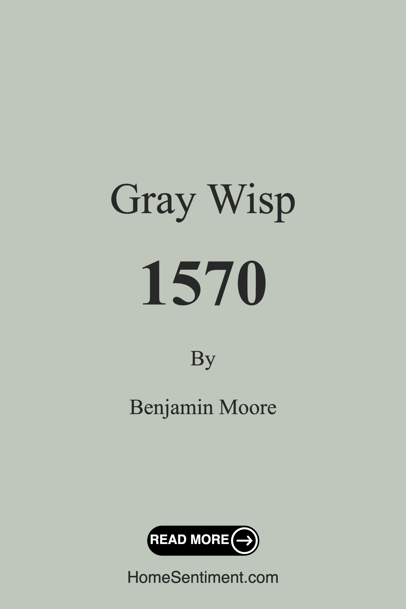
Color Preview & Key Details
| HEX Code | #BFC6BB |
| RGB | 191, 198, 187 |
| LRV | 54.43% |
| Undertone | Green |
| Finish Options | Eggshell, Matte, Satin |
Imagine stepping into a room where the air feels lighter, and a serene calm envelops you like a cozy blanket. That’s the magic of color, especially when it comes to choosing the right paint for your space. Today, let’s dive into a color that’s been making waves in home design: Gray Wisp from Benjamin Moore. This soft, muted gray has a way of whispering sophistication while maintaining a warm, inviting atmosphere.
Gray Wisp, color code 1570, is not just another gray on the market. With its delicate green undertones, it strikes a perfect balance between modernity and comfort. This color feels like a breath of fresh air, and if you’re considering a refresh in your home, it might just be the perfect fit.
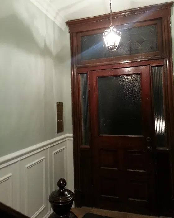
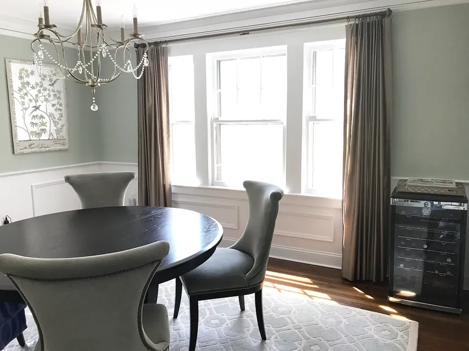
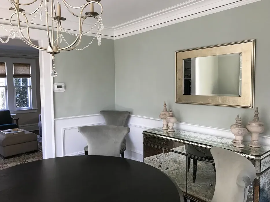
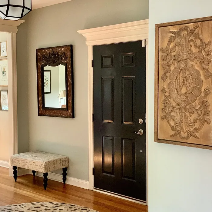
One of the standout features of Gray Wisp is its versatility. You can use it in practically any room, from the living room to the nursery. Its calming nature makes it an excellent choice for spaces where relaxation is key, like bedrooms and home offices. Even entryways can benefit from this soft hue, creating a welcoming invitation for guests.
When it comes to decor styles, Gray Wisp shines across a variety of aesthetics. Whether you lean towards modern, Scandinavian, minimalist, transitional, or farmhouse decor, this color adapts beautifully. It provides a gentle backdrop that allows your furnishings and decor elements to truly shine without overwhelming the space.
Let’s talk about how Gray Wisp interacts with light. With a Light Reflectance Value (LRV) of 54.43%, it reflects about half of the incident light, making it a light medium color. This means in bright spaces, Gray Wisp feels airy and expansive. However, in dimly lit areas, it can take on a more intimate feel, showcasing its depth and inviting warmth. This adaptability is essential, especially if you’re considering how a color will change throughout the day.
But what about its application? For those who might be new to painting, Gray Wisp is incredibly beginner-friendly. It goes on smoothly, whether you’re using a roller or a brush, and it’s touch-up friendly, so any mistakes can easily be fixed. Plus, with a low VOC formulation, you can breathe easy while you work, knowing that you’re creating a healthier environment for your home.
Now, let’s explore how Gray Wisp interacts with other colors. It pairs wonderfully with whites, particularly White Dove, which can create a lovely contrast that feels fresh yet timeless. If you’re looking to add depth, consider using it alongside darker shades like AF-470 or 445 for a more dramatic effect. For accents, you can introduce colors like deep blues or softer pastels, which will beautifully complement Gray Wisp’s muted tones.
If you’re contemplating where to use this lovely color, think about small spaces, open-concept designs, or even accent walls. Its light-reflective qualities can make a compact area feel more expansive, while its soft hue adds warmth without overwhelming the senses.
A common question many homeowners have is how Gray Wisp compares to other grays. The beauty of Gray Wisp lies in its nuanced undertones. Unlike many grays that lean too cool or too warm, Gray Wisp finds that perfect middle ground, making it suitable for various design styles. It’s an inviting gray that doesn’t feel stark or sterile, which can sometimes happen with cooler grays.
Of course, no color is without its quirks. In low light, Gray Wisp can appear slightly darker, which is something to consider if you’re painting a room that doesn’t receive a lot of natural light. To achieve the best coverage, it’s recommended to apply two coats, ensuring you get that perfect soft, muted finish that truly captures the essence of this color.
When you’re painting a space with Gray Wisp, be mindful of how its undertones interact with your existing furniture and decor. The subtle green undertones can create some lovely dialogues with wood tones, whether they’re warm or cool. Testing the paint next to your current pieces will help you understand how these colors will play together throughout the day.
Gray Wisp also boasts excellent washability, making it a fantastic choice for high-traffic areas or homes with kids and pets. If you happen to have a little mess on your hands, a quick wipe will do the trick without damaging the finish. This durability adds to the reasons why so many designers gravitate towards this hue.
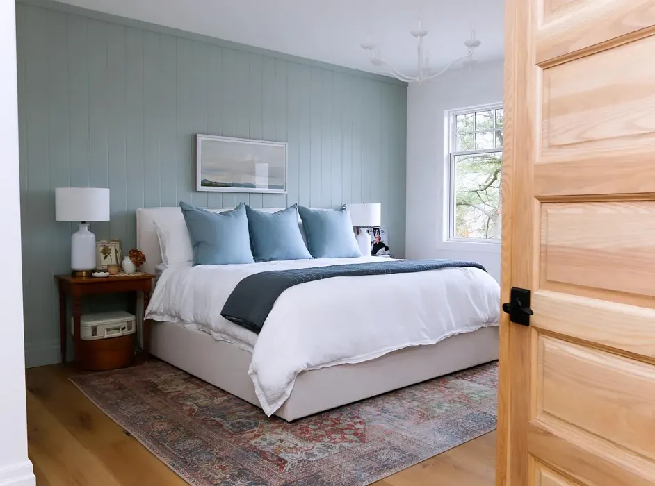
In terms of mood, Gray Wisp fosters a calm, inviting, and restful atmosphere. It’s ideal for spaces where you want to encourage relaxation and tranquility. Imagine curling up with a book in a Gray Wisp living room or enjoying a peaceful night’s sleep in a Gray Wisp bedroom.
As we wrap up, consider this: Gray Wisp isn’t just a paint color; it’s a design choice that embodies warmth, sophistication, and versatility. Whether you’re revamping a single room or refreshing your entire home, this soft gray can adapt to your needs and style. With its beautiful undertones and calming presence, it promises to create spaces that feel both modern and inviting.
So, if you’re ready to transform your home into a tranquil haven, Gray Wisp might just be the color you’ve been searching for. It’s a hue that whispers elegance while allowing you to express your unique style, making it an ideal choice for your next project.
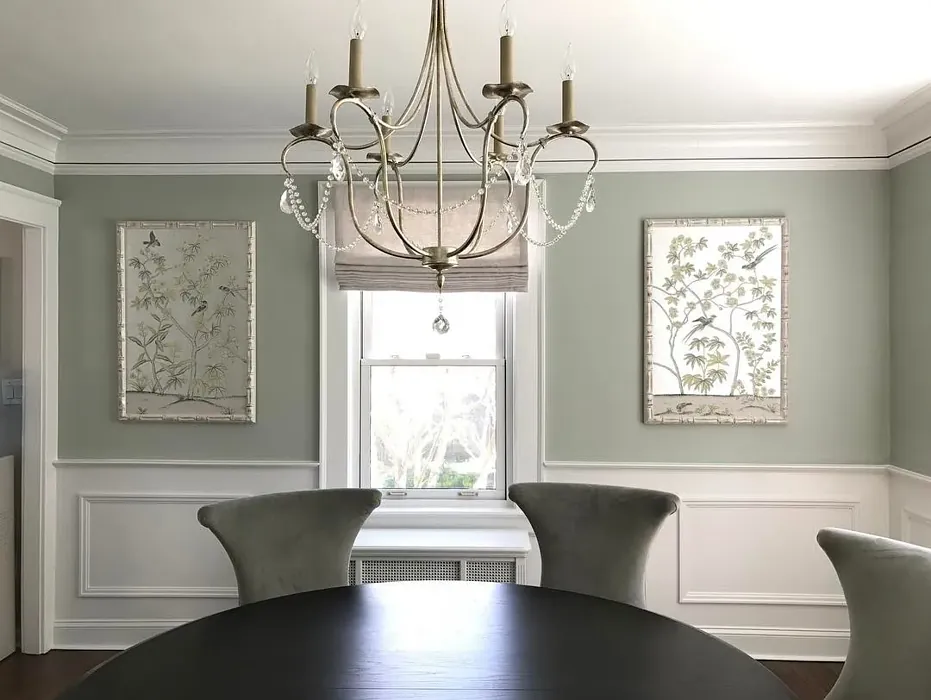
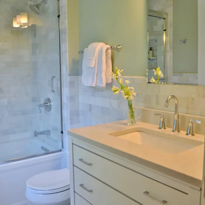
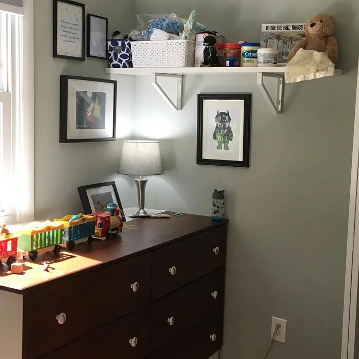
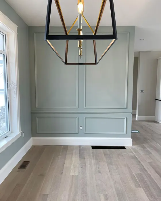
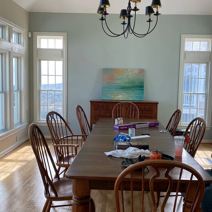
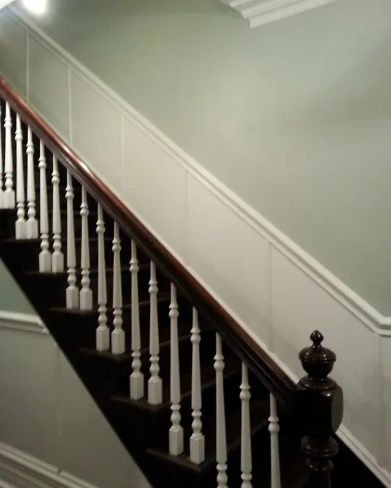
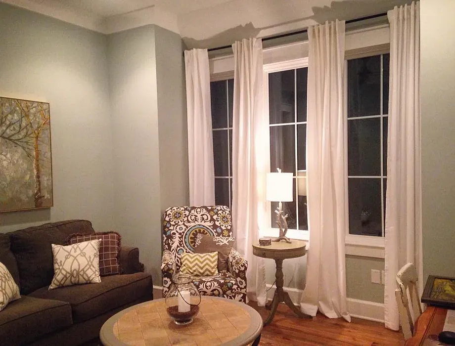
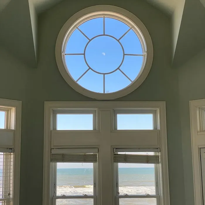
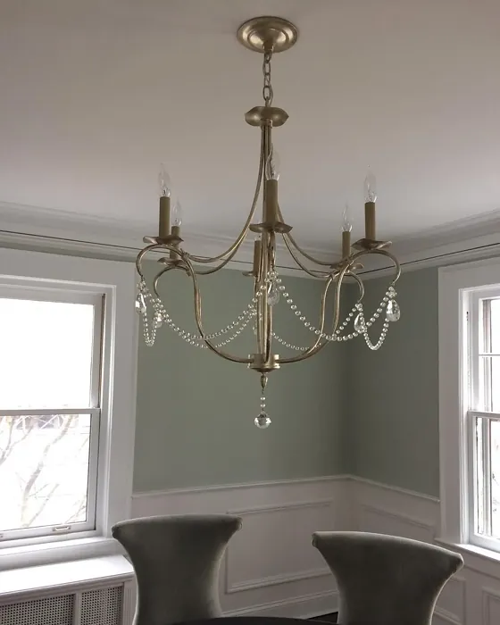
Real Room Photo of Gray Wisp 1570

Undertones of Gray Wisp ?
The undertones of Gray Wisp are a key aspect of its character, leaning towards Green. These subtle underlying hues are what give the color its depth and complexity. For example, a gray with a blue undertone will feel cooler and more modern, while one with a brown undertone will feel warmer and more traditional. It’s essential to test this paint in your home and observe it next to your existing furniture, flooring, and decor to see how these undertones interact and reveal themselves throughout the day.
HEX value: #BFC6BB
RGB code: 191, 198, 187
Is Gray Wisp Cool or Warm?
This color tends toward the cool side, but its warm undertones provide a nice balance, ensuring it doesn’t come off as too cold or sterile.
Understanding Color Properties and Interior Design Tips
Hue refers to a specific position on the color wheel, measured in degrees from 0 to 360. Each degree represents a different pure color:
- 0° represents red
- 120° represents green
- 240° represents blue
Saturation describes the intensity or purity of a color and is expressed as a percentage:
- At 0%, the color appears completely desaturated—essentially a shade of gray
- At 100%, the color is at its most vivid and vibrant
Lightness indicates how light or dark a color is, also expressed as a percentage:
- 0% lightness results in black
- 100% lightness results in white
Using Warm Colors in Interior Design
Warm hues—such as reds, oranges, yellows, warm beiges, and greiges—are excellent choices for creating inviting and energetic spaces. These colors are particularly well-suited for:
- Kitchens, living rooms, and bathrooms, where warmth enhances comfort and sociability
- Large rooms, where warm tones can help reduce the sense of emptiness and make the space feel more intimate
For example:
- Warm beige shades provide a cozy, inviting atmosphere, ideal for living rooms, bedrooms, and hallways.
- Warm greige (a mix of beige and gray) offers the warmth of beige with the modern appeal of gray, making it a versatile backdrop for dining areas, bedrooms, and living spaces.
However, be mindful when using warm light tones in rooms with limited natural light. These shades may appear muted or even take on an unpleasant yellowish tint. To avoid a dull or flat appearance:
- Add depth by incorporating richer tones like deep greens, charcoal, or chocolate brown
- Use textured elements such as curtains, rugs, or cushions to bring dimension to the space
Pro Tip: Achieving Harmony with Warm and Cool Color Balance
To create a well-balanced and visually interesting interior, mix warm and cool tones strategically. This contrast adds depth and harmony to your design.
- If your walls feature warm hues, introduce cool-colored accents such as blue or green furniture, artwork, or accessories to create contrast.
- For a polished look, consider using a complementary color scheme, which pairs colors opposite each other on the color wheel (e.g., red with green, orange with blue).
This thoughtful mix not only enhances visual appeal but also creates a space that feels both dynamic and cohesive.
Light Temperature Affects on Gray Wisp
Natural Light
Natural daylight changes in color temperature as the sun moves across the sky. At sunrise and sunset, the light tends to have a warm, golden tone with a color temperature around 2000 Kelvin (K). As the day progresses and the sun rises higher, the light becomes cooler and more neutral. Around midday, especially when the sky is clear, natural light typically reaches its peak brightness and shifts to a cooler tone, ranging from 5500 to 6500 Kelvin. This midday light is close to what we perceive as pure white or daylight-balanced light.
These shifts in natural light can significantly influence how colors appear in a space, which is why designers often consider both the time of day and the orientation of windows when planning interior color schemes.
Artificial Light
When choosing artificial lighting, pay close attention to the color temperature, measured in Kelvin (K). This determines how warm or cool the light will appear. Lower temperatures, around 2700K, give off a warm, yellow glow often used in living rooms or bedrooms. Higher temperatures, above 5000K, create a cool, bluish light similar to daylight, commonly used in kitchens, offices, or task areas.
Use the slider to see how lighting temperature can affect the appearance of a surface or color throughout a space.


4800K
LRV of Gray Wisp
The Light Reflectance Value (LRV) of Gray Wisp is 54.43%, which places it in the Light Medium colors category. This means it reflect half of the incident light. Understanding a paint’s LRV is crucial for predicting how it will look in your space. A higher LRV indicates a lighter color that reflects more light, making rooms feel larger and brighter. A lower LRV signifies a darker color that absorbs more light, creating a cozier, more intimate atmosphere. Always consider the natural and artificial lighting in your room when selecting a paint color based on its LRV.
Detailed Review of Gray Wisp
Additional Paint Characteristics
Ideal Rooms
Bedroom, Entryway, Home Office, Living Room, Nursery
Decor Styles
Farmhouse, Minimalist, Modern, Scandinavian, Transitional
Coverage
Good (1–2 Coats), Touch-Up Friendly
Ease of Application
Beginner Friendly, Brush Smooth, Roller-Ready
Washability
Washable, Wipeable
VOC Level
Low VOC
Best Use
Accent Wall, Interior Walls, Open Concept Spaces, Small Spaces
Room Suitability
Bedroom, Entryway, Home Office, Living Room, Nursery
Tone Tag
Balanced, Cool, Muted
Finish Type
Eggshell, Matte
Paint Performance
Easy Touch-Up, Low Odor, Quick Drying
Use Cases
Best for Low Light Rooms, Best for Modern Farmhouse, Best for Open Concept
Mood
Calm, Inviting, Restful
Trim Pairing
Complements Cool Trim, Good with Wood Trim, Pairs with White Dove
Gray Wisp stands out for its ability to adapt in various lighting conditions. In natural light, it leans towards a soft gray with delicate warmth, while artificial light can bring out its cooler tones. It’s a fantastic choice for those who want a neutral that feels fresh and inviting without being too stark. This color works beautifully in spaces where you want to promote calmness, such as bedrooms or home offices. Its versatility means it pairs well with a variety of accent colors, from deep blues to soft pastels, making it a favorite among designers. Overall, Gray Wisp strikes a perfect balance between modernity and comfort, making it an excellent choice for any home.
Pros & Cons of 1570 Gray Wisp
Pros
Cons
Colors that go with Benjamin Moore Gray Wisp
FAQ on 1570 Gray Wisp
How does Gray Wisp compare to other gray paints?
Gray Wisp is a unique blend of warm and cool undertones, setting it apart from typical grays. While some might lean too cool or too warm, Gray Wisp finds a lovely middle ground, making it suitable for various design styles. It pairs beautifully with both warm woods and cooler accents, allowing for a seamless integration into any space. If you’re looking for a gray that feels inviting yet sophisticated, Gray Wisp is a perfect choice.
Is Gray Wisp suitable for small spaces?
Absolutely! Gray Wisp is an excellent choice for small spaces due to its light-reflective qualities. It can help make a room feel larger and more open, while its soft tone adds warmth without overwhelming the senses. When used strategically, it can create a cozy yet spacious feel, especially when paired with lighter furniture or decor. Whether it’s a small bedroom or a quaint hallway, Gray Wisp can enhance the charm of any compact area.
Comparisons Gray Wisp with other colors
Gray Wisp 1570 vs Acacia Haze SW 9132
| Attribute | Gray Wisp 1570 | Acacia Haze SW 9132 |
|---|---|---|
| Color Name | Gray Wisp 1570 | Acacia Haze SW 9132 |
| Color | ||
| Hue | Green | Green |
| Brightness | Medium | Medium |
| RGB | 191, 198, 187 | 150, 156, 146 |
| LRV | 54.43% | 30% |
| Finish Type | Eggshell, Matte | Eggshell, Satin |
| Finish Options | Eggshell, Matte, Satin | Eggshell, Matte, Satin |
| Ideal Rooms | Bedroom, Entryway, Home Office, Living Room, Nursery | Bedroom, Dining Room, Home Office, Living Room, Nursery |
| Decor Styles | Farmhouse, Minimalist, Modern, Scandinavian, Transitional | Bohemian, Coastal, Modern Farmhouse, Scandinavian |
| Coverage | Good (1–2 Coats), Touch-Up Friendly | Good (1–2 Coats), Touch-Up Friendly |
| Ease of Application | Beginner Friendly, Brush Smooth, Roller-Ready | Beginner Friendly, Brush Smooth, Roller-Ready |
| Washability | Washable, Wipeable | Washable, Wipeable |
| Room Suitability | Bedroom, Entryway, Home Office, Living Room, Nursery | Bedroom, Home Office, Living Room, Nursery |
| Tone | Balanced, Cool, Muted | Balanced, Earthy, Muted |
| Paint Performance | Easy Touch-Up, Low Odor, Quick Drying | Easy Touch-Up, High Coverage, Low Odor |
Gray Wisp 1570 vs Evergreen Fog SW 9130
| Attribute | Gray Wisp 1570 | Evergreen Fog SW 9130 |
|---|---|---|
| Color Name | Gray Wisp 1570 | Evergreen Fog SW 9130 |
| Color | ||
| Hue | Green | Green |
| Brightness | Medium | Medium |
| RGB | 191, 198, 187 | 149, 151, 138 |
| LRV | 54.43% | 30% |
| Finish Type | Eggshell, Matte | Eggshell, Matte, Satin |
| Finish Options | Eggshell, Matte, Satin | Eggshell, Matte, Satin |
| Ideal Rooms | Bedroom, Entryway, Home Office, Living Room, Nursery | Bedroom, Dining Room, Home Office, Living Room, Nursery |
| Decor Styles | Farmhouse, Minimalist, Modern, Scandinavian, Transitional | Coastal, Modern Farmhouse, Rustic, Scandinavian, Transitional |
| Coverage | Good (1–2 Coats), Touch-Up Friendly | Good (1–2 Coats), Touch-Up Friendly |
| Ease of Application | Beginner Friendly, Brush Smooth, Roller-Ready | Beginner Friendly, Brush Smooth, Roller-Ready |
| Washability | Washable, Wipeable | Scrubbable, Washable |
| Room Suitability | Bedroom, Entryway, Home Office, Living Room, Nursery | Bedroom, Dining Room, Home Office, Living Room, Nursery |
| Tone | Balanced, Cool, Muted | Balanced, Earthy, Muted |
| Paint Performance | Easy Touch-Up, Low Odor, Quick Drying | Easy Touch-Up, Low Odor, Scuff Resistant |
Gray Wisp 1570 vs Clary Sage SW 6178
| Attribute | Gray Wisp 1570 | Clary Sage SW 6178 |
|---|---|---|
| Color Name | Gray Wisp 1570 | Clary Sage SW 6178 |
| Color | ||
| Hue | Green | Green |
| Brightness | Medium | Medium |
| RGB | 191, 198, 187 | 172, 173, 151 |
| LRV | 54.43% | 24% |
| Finish Type | Eggshell, Matte | Eggshell, Matte |
| Finish Options | Eggshell, Matte, Satin | Eggshell, Matte, Satin |
| Ideal Rooms | Bedroom, Entryway, Home Office, Living Room, Nursery | Bathroom, Bedroom, Home Office, Kitchen, Living Room |
| Decor Styles | Farmhouse, Minimalist, Modern, Scandinavian, Transitional | Bohemian, Minimalist, Modern Farmhouse, Scandinavian, Traditional |
| Coverage | Good (1–2 Coats), Touch-Up Friendly | Good (1–2 Coats), Touch-Up Friendly |
| Ease of Application | Beginner Friendly, Brush Smooth, Roller-Ready | Beginner Friendly, Brush Smooth, Roller-Ready |
| Washability | Washable, Wipeable | Washable, Wipeable |
| Room Suitability | Bedroom, Entryway, Home Office, Living Room, Nursery | Bathroom, Bedroom, Home Office, Kitchen, Living Room |
| Tone | Balanced, Cool, Muted | Cool, Earthy, Muted |
| Paint Performance | Easy Touch-Up, Low Odor, Quick Drying | Easy Touch-Up, High Coverage, Low Odor |
Gray Wisp 1570 vs Softened Green SW 6177
| Attribute | Gray Wisp 1570 | Softened Green SW 6177 |
|---|---|---|
| Color Name | Gray Wisp 1570 | Softened Green SW 6177 |
| Color | ||
| Hue | Green | Green |
| Brightness | Medium | Medium |
| RGB | 191, 198, 187 | 187, 188, 167 |
| LRV | 54.43% | 48% |
| Finish Type | Eggshell, Matte | Eggshell, Matte, Satin |
| Finish Options | Eggshell, Matte, Satin | Eggshell, Matte, Satin |
| Ideal Rooms | Bedroom, Entryway, Home Office, Living Room, Nursery | Bathroom, Bedroom, Dining Room, Home Office, Kitchen, Living Room, Nursery |
| Decor Styles | Farmhouse, Minimalist, Modern, Scandinavian, Transitional | Coastal, Farmhouse, Minimalist, Modern, Scandinavian |
| Coverage | Good (1–2 Coats), Touch-Up Friendly | Good (1–2 Coats), Touch-Up Friendly |
| Ease of Application | Beginner Friendly, Brush Smooth, Roller-Ready | Beginner Friendly, Brush Smooth, Fast-Drying, Roller-Ready |
| Washability | Washable, Wipeable | Washable, Wipeable |
| Room Suitability | Bedroom, Entryway, Home Office, Living Room, Nursery | Bathroom, Bedroom, Dining Room, Home Office, Kitchen, Living Room |
| Tone | Balanced, Cool, Muted | Calm, Earthy, Muted |
| Paint Performance | Easy Touch-Up, Low Odor, Quick Drying | Easy Touch-Up, Fade Resistant, Low Odor, Quick Drying |
Gray Wisp 1570 vs Eventide SW 9643
| Attribute | Gray Wisp 1570 | Eventide SW 9643 |
|---|---|---|
| Color Name | Gray Wisp 1570 | Eventide SW 9643 |
| Color | ||
| Hue | Green | Green |
| Brightness | Medium | Medium |
| RGB | 191, 198, 187 | 163, 175, 172 |
| LRV | 54.43% | 24% |
| Finish Type | Eggshell, Matte | Eggshell, Matte, Satin |
| Finish Options | Eggshell, Matte, Satin | Eggshell, Matte, Satin |
| Ideal Rooms | Bedroom, Entryway, Home Office, Living Room, Nursery | Bedroom, Home Office, Kitchen, Living Room, Nursery |
| Decor Styles | Farmhouse, Minimalist, Modern, Scandinavian, Transitional | Coastal, Contemporary, Minimalist, Modern |
| Coverage | Good (1–2 Coats), Touch-Up Friendly | Good (1–2 Coats), Touch-Up Friendly |
| Ease of Application | Beginner Friendly, Brush Smooth, Roller-Ready | Beginner Friendly, Brush Smooth, Fast-Drying, Roller-Ready |
| Washability | Washable, Wipeable | Washable, Wipeable |
| Room Suitability | Bedroom, Entryway, Home Office, Living Room, Nursery | Bedroom, Home Office, Living Room, Nursery |
| Tone | Balanced, Cool, Muted | Airy, Balanced, Cool, Muted |
| Paint Performance | Easy Touch-Up, Low Odor, Quick Drying | Easy Touch-Up, High Coverage, Low Odor, Quick Drying |
Gray Wisp 1570 vs Escape Gray SW 6185
| Attribute | Gray Wisp 1570 | Escape Gray SW 6185 |
|---|---|---|
| Color Name | Gray Wisp 1570 | Escape Gray SW 6185 |
| Color | ||
| Hue | Green | Green |
| Brightness | Medium | Medium |
| RGB | 191, 198, 187 | 171, 172, 159 |
| LRV | 54.43% | 48% |
| Finish Type | Eggshell, Matte | Eggshell, Matte |
| Finish Options | Eggshell, Matte, Satin | Eggshell, Matte, Satin |
| Ideal Rooms | Bedroom, Entryway, Home Office, Living Room, Nursery | Bathroom, Bedroom, Entryway, Home Office, Living Room |
| Decor Styles | Farmhouse, Minimalist, Modern, Scandinavian, Transitional | Minimalist, Modern, Scandinavian, Transitional |
| Coverage | Good (1–2 Coats), Touch-Up Friendly | Good (1–2 Coats) |
| Ease of Application | Beginner Friendly, Brush Smooth, Roller-Ready | Beginner Friendly, Brush Smooth, Roller-Ready |
| Washability | Washable, Wipeable | Highly Washable, Washable |
| Room Suitability | Bedroom, Entryway, Home Office, Living Room, Nursery | Bathroom, Bedroom, Home Office, Living Room |
| Tone | Balanced, Cool, Muted | Cool, Muted, Neutral, Warm |
| Paint Performance | Easy Touch-Up, Low Odor, Quick Drying | Easy Touch-Up, Low Odor, Scuff Resistant |
Gray Wisp 1570 vs Coastal Plain SW 6192
| Attribute | Gray Wisp 1570 | Coastal Plain SW 6192 |
|---|---|---|
| Color Name | Gray Wisp 1570 | Coastal Plain SW 6192 |
| Color | ||
| Hue | Green | Green |
| Brightness | Medium | Medium |
| RGB | 191, 198, 187 | 159, 166, 148 |
| LRV | 54.43% | 66% |
| Finish Type | Eggshell, Matte | Eggshell, Satin |
| Finish Options | Eggshell, Matte, Satin | Eggshell, Satin, Semi-Gloss |
| Ideal Rooms | Bedroom, Entryway, Home Office, Living Room, Nursery | Bathroom, Bedroom, Home Office, Kitchen, Living Room |
| Decor Styles | Farmhouse, Minimalist, Modern, Scandinavian, Transitional | Bohemian, Coastal, Contemporary, Modern Farmhouse, Rustic |
| Coverage | Good (1–2 Coats), Touch-Up Friendly | Good (1–2 Coats) |
| Ease of Application | Beginner Friendly, Brush Smooth, Roller-Ready | Beginner Friendly, Brush Smooth, Fast-Drying, Roller-Ready |
| Washability | Washable, Wipeable | Scrubbable, Washable |
| Room Suitability | Bedroom, Entryway, Home Office, Living Room, Nursery | Bathroom, Bedroom, Dining Room, Home Office, Kitchen, Living Room |
| Tone | Balanced, Cool, Muted | Cool, Earthy, Muted |
| Paint Performance | Easy Touch-Up, Low Odor, Quick Drying | High Coverage, Low Odor, Quick Drying |
Gray Wisp 1570 vs Contented SW 6191
| Attribute | Gray Wisp 1570 | Contented SW 6191 |
|---|---|---|
| Color Name | Gray Wisp 1570 | Contented SW 6191 |
| Color | ||
| Hue | Green | Green |
| Brightness | Medium | Medium |
| RGB | 191, 198, 187 | 189, 192, 179 |
| LRV | 54.43% | 45% |
| Finish Type | Eggshell, Matte | Eggshell, Matte, Satin |
| Finish Options | Eggshell, Matte, Satin | Eggshell, Matte, Satin |
| Ideal Rooms | Bedroom, Entryway, Home Office, Living Room, Nursery | Bedroom, Dining Room, Home Office, Kitchen, Living Room |
| Decor Styles | Farmhouse, Minimalist, Modern, Scandinavian, Transitional | Contemporary, Minimalist, Modern, Scandinavian, Transitional |
| Coverage | Good (1–2 Coats), Touch-Up Friendly | Good (1–2 Coats), Touch-Up Friendly |
| Ease of Application | Beginner Friendly, Brush Smooth, Roller-Ready | Beginner Friendly, Brush Smooth, Roller-Ready |
| Washability | Washable, Wipeable | Stain Resistant, Washable |
| Room Suitability | Bedroom, Entryway, Home Office, Living Room, Nursery | Bedroom, Dining Room, Home Office, Kitchen, Living Room |
| Tone | Balanced, Cool, Muted | Muted, Neutral, Warm |
| Paint Performance | Easy Touch-Up, Low Odor, Quick Drying | Easy Touch-Up, High Coverage, Low Odor |
Gray Wisp 1570 vs Jade Dragon SW 9129
| Attribute | Gray Wisp 1570 | Jade Dragon SW 9129 |
|---|---|---|
| Color Name | Gray Wisp 1570 | Jade Dragon SW 9129 |
| Color | ||
| Hue | Green | Green |
| Brightness | Medium | Medium |
| RGB | 191, 198, 187 | 144, 152, 134 |
| LRV | 54.43% | 12% |
| Finish Type | Eggshell, Matte | Eggshell, Matte, Satin |
| Finish Options | Eggshell, Matte, Satin | Eggshell, Matte, Satin |
| Ideal Rooms | Bedroom, Entryway, Home Office, Living Room, Nursery | Bedroom, Dining Room, Home Office, Living Room, Nursery |
| Decor Styles | Farmhouse, Minimalist, Modern, Scandinavian, Transitional | Bohemian, Minimalist, Modern, Traditional, Transitional |
| Coverage | Good (1–2 Coats), Touch-Up Friendly | Good (1–2 Coats), Touch-Up Friendly |
| Ease of Application | Beginner Friendly, Brush Smooth, Roller-Ready | Beginner Friendly, Brush Smooth, Fast-Drying, Roller-Ready |
| Washability | Washable, Wipeable | Highly Washable, Stain Resistant, Washable |
| Room Suitability | Bedroom, Entryway, Home Office, Living Room, Nursery | Bedroom, Dining Room, Home Office, Living Room, Nursery |
| Tone | Balanced, Cool, Muted | Balanced, Cool, Earthy, Muted |
| Paint Performance | Easy Touch-Up, Low Odor, Quick Drying | Easy Touch-Up, Fade Resistant, Low Odor, Stain Resistant |
Gray Wisp 1570 vs Underseas SW 6214
| Attribute | Gray Wisp 1570 | Underseas SW 6214 |
|---|---|---|
| Color Name | Gray Wisp 1570 | Underseas SW 6214 |
| Color | ||
| Hue | Green | Green |
| Brightness | Medium | Medium |
| RGB | 191, 198, 187 | 124, 142, 135 |
| LRV | 54.43% | 24% |
| Finish Type | Eggshell, Matte | Eggshell, Matte, Satin |
| Finish Options | Eggshell, Matte, Satin | Eggshell, Matte, Satin |
| Ideal Rooms | Bedroom, Entryway, Home Office, Living Room, Nursery | Bathroom, Bedroom, Dining Room, Hallway, Home Office, Living Room |
| Decor Styles | Farmhouse, Minimalist, Modern, Scandinavian, Transitional | Coastal, Eclectic, Farmhouse, Modern, Scandinavian |
| Coverage | Good (1–2 Coats), Touch-Up Friendly | Good (1–2 Coats), Touch-Up Friendly |
| Ease of Application | Beginner Friendly, Brush Smooth, Roller-Ready | Beginner Friendly, Brush Smooth, Fast-Drying, Roller-Ready |
| Washability | Washable, Wipeable | Highly Washable, Washable, Wipeable |
| Room Suitability | Bedroom, Entryway, Home Office, Living Room, Nursery | Bathroom, Bedroom, Dining Room, Home Office, Living Room |
| Tone | Balanced, Cool, Muted | Balanced, Cool, Earthy, Muted |
| Paint Performance | Easy Touch-Up, Low Odor, Quick Drying | Easy Touch-Up, Fade Resistant, High Coverage, Low Odor |
Official Page of Benjamin Moore Gray Wisp 1570