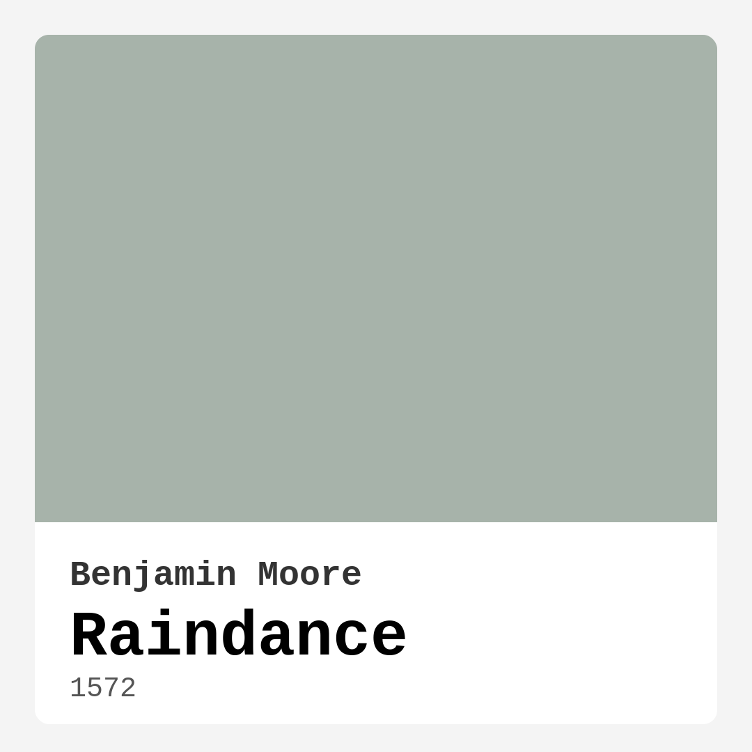
Color Preview & Key Details
| HEX Code | #A7B3AA |
| RGB | 167, 179, 170 |
| LRV | 43.47% |
| Undertone | Green |
| Finish Options | Eggshell, Matte, Satin |
Imagine stepping into a room that instantly calms your senses, enveloping you in a serene embrace that feels just like a gentle breeze on a warm day. That’s the magic of Raindance, a beautiful muted green paint color from Benjamin Moore. It’s that perfect hue that not only refreshes your space but also brings a touch of nature indoors. If you’re on the fence about using this color, let’s explore why Raindance could be just what your home needs.
At its core, Raindance is a soft, cool green that evokes a sense of tranquility. With a light reflectance value (LRV) of 43.47%, it reflects just the right amount of light to create an airy, inviting atmosphere without overwhelming your senses. It strikes a delicate balance, offering warmth without veering into overly vibrant territory. If you’re looking for a color that enhances natural light while maintaining a peaceful ambiance, Raindance is a fantastic choice.
One of the best things about Raindance is its versatility. This beautiful hue pairs beautifully with a variety of décor styles, from modern to rustic, Scandinavian to bohemian. Picture it gracing the walls of a cozy living room, a soothing bedroom, or even a fresh nursery. It’s equally at home in a chic home office or a tranquil bathroom. The muted tones provide the perfect backdrop for showcasing your furniture and décor rather than competing for attention.
Now, let’s talk about how Raindance interacts with different lighting conditions. In natural light, it exudes a soft and airy feel, making rooms feel spacious and light. However, under artificial lighting, it can reveal cooler undertones that add depth and complexity to your space. This dynamic nature makes it essential to test the color in your own home before committing. Observe how it changes throughout the day; the way light dances across the walls can transform its mood entirely.
When it comes to finishes, Raindance offers options like eggshell, satin, and matte. Each finish provides its own unique look and feel. For instance, if durability is your goal, satin is an excellent choice, especially in high-traffic areas. On the other hand, if you want a softer, more muted appearance, matte can deliver that cozy vibe you’re after. Consider the function of the space and how you want the color to interact with it.
While Raindance radiates a warm and inviting hue, it’s important to note that it may appear cooler in dim lighting. So if you’re considering this color for a small, dark room, be mindful of how it might affect the overall atmosphere. Additionally, pairing Raindance with your existing furniture requires careful consideration. It’s crucial to test samples next to your decor elements to ensure they harmonize beautifully.
One of the standout features of Raindance is its eco-friendly credentials, boasting low VOC levels that contribute to healthier indoor air quality. This makes it an excellent choice for those who are conscious about the environment and their family’s well-being. Plus, the application process is a breeze. Whether you’re a novice DIYer or a seasoned pro, you’ll find Raindance easy to work with. It rolls on smoothly and provides excellent coverage, requiring only one to two coats for a flawless finish.
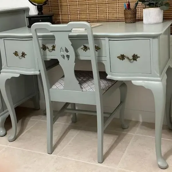
As you think about how to incorporate Raindance into your home, consider using it not just on walls but also on furniture pieces for an added touch of sophistication. Imagine a vintage dresser or a cozy bookshelf transformed by this tranquil hue. It can breathe new life into tired furniture, giving it a modern twist without losing its character.
When planning your color scheme, think about complementary shades that can enhance Raindance’s beauty. Soft whites like White Dove pair wonderfully, creating a fresh, clean look. If you’re looking to add richness, consider brass fixtures or wood trim, which provide a beautiful contrast and add warmth to the cool tones of Raindance.
The mood this color creates is undeniably calm and restful. It invites you to unwind after a long day and provides a soothing backdrop for your daily activities. If you’re after a space that feels inviting and serene, Raindance is a compelling option.
For those who appreciate a well-curated palette, Raindance can be beautifully paired with other shades. Consider lighter greens for a subtle monochromatic scheme, or deeper greens for a more dramatic contrast. The potential to play with shades is endless, allowing you to express your personal style while maintaining a cohesive look.
One thing to keep in mind is the current trends in home decor. As we move towards more natural and organic palettes, Raindance fits perfectly into this narrative. Its muted quality aligns well with the growing preference for sustainable and simple living. It’s a timeless choice that transcends fleeting trends, providing a classic yet modern aesthetic that can adapt as your taste evolves.
In conclusion, choosing Raindance means embracing a paint color that offers more than just a visual experience. It’s about creating a sanctuary in your home where you can feel relaxed and refreshed. Whether you’re looking to revamp a single room or your entire home, this gentle green invites you into a world of tranquility.
So, are you ready to take the plunge? Grab a sample, apply it to your walls, and watch as your space transforms. You might just find that Raindance is the perfect partner for your next home project. Happy decorating!

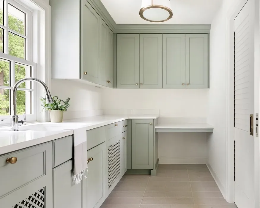
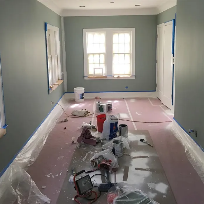
Real Room Photo of Raindance 1572
Undertones of Raindance ?
The undertones of Raindance are a key aspect of its character, leaning towards Green. These subtle underlying hues are what give the color its depth and complexity. For example, a gray with a blue undertone will feel cooler and more modern, while one with a brown undertone will feel warmer and more traditional. It’s essential to test this paint in your home and observe it next to your existing furniture, flooring, and decor to see how these undertones interact and reveal themselves throughout the day.
HEX value: #A7B3AA
RGB code: 167, 179, 170
Is Raindance Cool or Warm?
Raindance is considered a cool paint color. This characteristic plays a huge role in the overall feel of a room. Cool colors, like this one, tend to create a cozy, inviting, and energetic atmosphere, making them great for social spaces like living rooms and dining rooms. In contrast, warm colors often evoke a sense of calm and serenity, which is why they are popular in bedrooms and bathrooms. The coolth of Raindance means it will pair beautifully with corresponding decor elements.
Understanding Color Properties and Interior Design Tips
Hue refers to a specific position on the color wheel, measured in degrees from 0 to 360. Each degree represents a different pure color:
- 0° represents red
- 120° represents green
- 240° represents blue
Saturation describes the intensity or purity of a color and is expressed as a percentage:
- At 0%, the color appears completely desaturated—essentially a shade of gray
- At 100%, the color is at its most vivid and vibrant
Lightness indicates how light or dark a color is, also expressed as a percentage:
- 0% lightness results in black
- 100% lightness results in white
Using Warm Colors in Interior Design
Warm hues—such as reds, oranges, yellows, warm beiges, and greiges—are excellent choices for creating inviting and energetic spaces. These colors are particularly well-suited for:
- Kitchens, living rooms, and bathrooms, where warmth enhances comfort and sociability
- Large rooms, where warm tones can help reduce the sense of emptiness and make the space feel more intimate
For example:
- Warm beige shades provide a cozy, inviting atmosphere, ideal for living rooms, bedrooms, and hallways.
- Warm greige (a mix of beige and gray) offers the warmth of beige with the modern appeal of gray, making it a versatile backdrop for dining areas, bedrooms, and living spaces.
However, be mindful when using warm light tones in rooms with limited natural light. These shades may appear muted or even take on an unpleasant yellowish tint. To avoid a dull or flat appearance:
- Add depth by incorporating richer tones like deep greens, charcoal, or chocolate brown
- Use textured elements such as curtains, rugs, or cushions to bring dimension to the space
Pro Tip: Achieving Harmony with Warm and Cool Color Balance
To create a well-balanced and visually interesting interior, mix warm and cool tones strategically. This contrast adds depth and harmony to your design.
- If your walls feature warm hues, introduce cool-colored accents such as blue or green furniture, artwork, or accessories to create contrast.
- For a polished look, consider using a complementary color scheme, which pairs colors opposite each other on the color wheel (e.g., red with green, orange with blue).
This thoughtful mix not only enhances visual appeal but also creates a space that feels both dynamic and cohesive.
Light Temperature Affects on Raindance
Natural Light
Natural daylight changes in color temperature as the sun moves across the sky. At sunrise and sunset, the light tends to have a warm, golden tone with a color temperature around 2000 Kelvin (K). As the day progresses and the sun rises higher, the light becomes cooler and more neutral. Around midday, especially when the sky is clear, natural light typically reaches its peak brightness and shifts to a cooler tone, ranging from 5500 to 6500 Kelvin. This midday light is close to what we perceive as pure white or daylight-balanced light.
These shifts in natural light can significantly influence how colors appear in a space, which is why designers often consider both the time of day and the orientation of windows when planning interior color schemes.
Artificial Light
When choosing artificial lighting, pay close attention to the color temperature, measured in Kelvin (K). This determines how warm or cool the light will appear. Lower temperatures, around 2700K, give off a warm, yellow glow often used in living rooms or bedrooms. Higher temperatures, above 5000K, create a cool, bluish light similar to daylight, commonly used in kitchens, offices, or task areas.
Use the slider to see how lighting temperature can affect the appearance of a surface or color throughout a space.


4800K
LRV of Raindance
The Light Reflectance Value (LRV) of Raindance is 43.47%, which places it in the Light Medium colors category. This means it reflect half of the incident light. Understanding a paint’s LRV is crucial for predicting how it will look in your space. A higher LRV indicates a lighter color that reflects more light, making rooms feel larger and brighter. A lower LRV signifies a darker color that absorbs more light, creating a cozier, more intimate atmosphere. Always consider the natural and artificial lighting in your room when selecting a paint color based on its LRV.
Detailed Review of Raindance
Additional Paint Characteristics
Ideal Rooms
Bathroom, Bedroom, Home Office, Kitchen, Living Room, Nursery
Decor Styles
Bohemian, Minimalist, Modern, Rustic, Scandinavian
Coverage
Good (1–2 Coats), High Hide, Touch-Up Friendly
Ease of Application
Beginner Friendly, Brush Smooth, Roller-Ready
Washability
Highly Washable, Washable
VOC Level
Eco-Certified, Low VOC
Best Use
Accent Wall, Furniture, Interior Walls
Room Suitability
Bathroom, Bedroom, Home Office, Living Room, Nursery
Tone Tag
Balanced, Cool, Muted
Finish Type
Eggshell, Matte, Satin
Paint Performance
Easy Touch-Up, High Coverage, Low Odor, Quick Drying
Use Cases
Best for Low Light Rooms, Best for Rentals, Classic Favorite, Designer Favorite
Mood
Calm, Inviting, Restful
Trim Pairing
Complements Brass Fixtures, Good with Wood Trim, Pairs with White Dove
Raindance brings a unique blend of tranquility and sophistication to your home. This shade is particularly effective in creating a serene environment, making it ideal for spaces like bedrooms or home offices where relaxation is key. With its soft undertones, it can shift slightly in different lighting, offering a dynamic feel throughout the day. Its versatility shines through, allowing it to complement both modern and rustic decor seamlessly. Whether you’re enhancing a cozy nook or transforming a larger space, Raindance’s calming presence is sure to engage and soothe. Its application is smooth, ensuring that it covers well without excessive splatter, making it a joy to work with.
Pros & Cons of 1572 Raindance
Pros
Cons
Colors that go with Benjamin Moore Raindance
FAQ on 1572 Raindance
What types of finishes are available for Raindance?
Raindance is available in several finishes, including eggshell, satin, and matte. Each finish offers its own unique look and feel. For a more durable surface, satin is a great choice, especially in high-traffic areas. On the other hand, if you’re looking for a softer, more muted appearance, the matte finish can provide that cozy vibe. Consider your room’s function and traffic when choosing the right finish for your space.
How does Raindance compare to other greens?
Raindance distinguishes itself from other green shades through its soothing, muted tones. Unlike brighter greens that can be overwhelming, Raindance offers a balanced, calming presence that works well in various decor settings. It doesn’t compete for attention but rather complements your existing elements, creating a harmonious atmosphere. This makes it a compelling choice for anyone looking to incorporate green into their design without it feeling too bold or trendy.
Comparisons Raindance with other colors
Raindance 1572 vs Acacia Haze SW 9132
| Attribute | Raindance 1572 | Acacia Haze SW 9132 |
|---|---|---|
| Color Name | Raindance 1572 | Acacia Haze SW 9132 |
| Color | ||
| Hue | Green | Green |
| Brightness | Medium | Medium |
| RGB | 167, 179, 170 | 150, 156, 146 |
| LRV | 43.47% | 30% |
| Finish Type | Eggshell, Matte, Satin | Eggshell, Satin |
| Finish Options | Eggshell, Matte, Satin | Eggshell, Matte, Satin |
| Ideal Rooms | Bathroom, Bedroom, Home Office, Kitchen, Living Room, Nursery | Bedroom, Dining Room, Home Office, Living Room, Nursery |
| Decor Styles | Bohemian, Minimalist, Modern, Rustic, Scandinavian | Bohemian, Coastal, Modern Farmhouse, Scandinavian |
| Coverage | Good (1–2 Coats), High Hide, Touch-Up Friendly | Good (1–2 Coats), Touch-Up Friendly |
| Ease of Application | Beginner Friendly, Brush Smooth, Roller-Ready | Beginner Friendly, Brush Smooth, Roller-Ready |
| Washability | Highly Washable, Washable | Washable, Wipeable |
| Room Suitability | Bathroom, Bedroom, Home Office, Living Room, Nursery | Bedroom, Home Office, Living Room, Nursery |
| Tone | Balanced, Cool, Muted | Balanced, Earthy, Muted |
| Paint Performance | Easy Touch-Up, High Coverage, Low Odor, Quick Drying | Easy Touch-Up, High Coverage, Low Odor |
Raindance 1572 vs Evergreen Fog SW 9130
| Attribute | Raindance 1572 | Evergreen Fog SW 9130 |
|---|---|---|
| Color Name | Raindance 1572 | Evergreen Fog SW 9130 |
| Color | ||
| Hue | Green | Green |
| Brightness | Medium | Medium |
| RGB | 167, 179, 170 | 149, 151, 138 |
| LRV | 43.47% | 30% |
| Finish Type | Eggshell, Matte, Satin | Eggshell, Matte, Satin |
| Finish Options | Eggshell, Matte, Satin | Eggshell, Matte, Satin |
| Ideal Rooms | Bathroom, Bedroom, Home Office, Kitchen, Living Room, Nursery | Bedroom, Dining Room, Home Office, Living Room, Nursery |
| Decor Styles | Bohemian, Minimalist, Modern, Rustic, Scandinavian | Coastal, Modern Farmhouse, Rustic, Scandinavian, Transitional |
| Coverage | Good (1–2 Coats), High Hide, Touch-Up Friendly | Good (1–2 Coats), Touch-Up Friendly |
| Ease of Application | Beginner Friendly, Brush Smooth, Roller-Ready | Beginner Friendly, Brush Smooth, Roller-Ready |
| Washability | Highly Washable, Washable | Scrubbable, Washable |
| Room Suitability | Bathroom, Bedroom, Home Office, Living Room, Nursery | Bedroom, Dining Room, Home Office, Living Room, Nursery |
| Tone | Balanced, Cool, Muted | Balanced, Earthy, Muted |
| Paint Performance | Easy Touch-Up, High Coverage, Low Odor, Quick Drying | Easy Touch-Up, Low Odor, Scuff Resistant |
Raindance 1572 vs Clary Sage SW 6178
| Attribute | Raindance 1572 | Clary Sage SW 6178 |
|---|---|---|
| Color Name | Raindance 1572 | Clary Sage SW 6178 |
| Color | ||
| Hue | Green | Green |
| Brightness | Medium | Medium |
| RGB | 167, 179, 170 | 172, 173, 151 |
| LRV | 43.47% | 24% |
| Finish Type | Eggshell, Matte, Satin | Eggshell, Matte |
| Finish Options | Eggshell, Matte, Satin | Eggshell, Matte, Satin |
| Ideal Rooms | Bathroom, Bedroom, Home Office, Kitchen, Living Room, Nursery | Bathroom, Bedroom, Home Office, Kitchen, Living Room |
| Decor Styles | Bohemian, Minimalist, Modern, Rustic, Scandinavian | Bohemian, Minimalist, Modern Farmhouse, Scandinavian, Traditional |
| Coverage | Good (1–2 Coats), High Hide, Touch-Up Friendly | Good (1–2 Coats), Touch-Up Friendly |
| Ease of Application | Beginner Friendly, Brush Smooth, Roller-Ready | Beginner Friendly, Brush Smooth, Roller-Ready |
| Washability | Highly Washable, Washable | Washable, Wipeable |
| Room Suitability | Bathroom, Bedroom, Home Office, Living Room, Nursery | Bathroom, Bedroom, Home Office, Kitchen, Living Room |
| Tone | Balanced, Cool, Muted | Cool, Earthy, Muted |
| Paint Performance | Easy Touch-Up, High Coverage, Low Odor, Quick Drying | Easy Touch-Up, High Coverage, Low Odor |
Raindance 1572 vs Softened Green SW 6177
| Attribute | Raindance 1572 | Softened Green SW 6177 |
|---|---|---|
| Color Name | Raindance 1572 | Softened Green SW 6177 |
| Color | ||
| Hue | Green | Green |
| Brightness | Medium | Medium |
| RGB | 167, 179, 170 | 187, 188, 167 |
| LRV | 43.47% | 48% |
| Finish Type | Eggshell, Matte, Satin | Eggshell, Matte, Satin |
| Finish Options | Eggshell, Matte, Satin | Eggshell, Matte, Satin |
| Ideal Rooms | Bathroom, Bedroom, Home Office, Kitchen, Living Room, Nursery | Bathroom, Bedroom, Dining Room, Home Office, Kitchen, Living Room, Nursery |
| Decor Styles | Bohemian, Minimalist, Modern, Rustic, Scandinavian | Coastal, Farmhouse, Minimalist, Modern, Scandinavian |
| Coverage | Good (1–2 Coats), High Hide, Touch-Up Friendly | Good (1–2 Coats), Touch-Up Friendly |
| Ease of Application | Beginner Friendly, Brush Smooth, Roller-Ready | Beginner Friendly, Brush Smooth, Fast-Drying, Roller-Ready |
| Washability | Highly Washable, Washable | Washable, Wipeable |
| Room Suitability | Bathroom, Bedroom, Home Office, Living Room, Nursery | Bathroom, Bedroom, Dining Room, Home Office, Kitchen, Living Room |
| Tone | Balanced, Cool, Muted | Calm, Earthy, Muted |
| Paint Performance | Easy Touch-Up, High Coverage, Low Odor, Quick Drying | Easy Touch-Up, Fade Resistant, Low Odor, Quick Drying |
Raindance 1572 vs Eventide SW 9643
| Attribute | Raindance 1572 | Eventide SW 9643 |
|---|---|---|
| Color Name | Raindance 1572 | Eventide SW 9643 |
| Color | ||
| Hue | Green | Green |
| Brightness | Medium | Medium |
| RGB | 167, 179, 170 | 163, 175, 172 |
| LRV | 43.47% | 24% |
| Finish Type | Eggshell, Matte, Satin | Eggshell, Matte, Satin |
| Finish Options | Eggshell, Matte, Satin | Eggshell, Matte, Satin |
| Ideal Rooms | Bathroom, Bedroom, Home Office, Kitchen, Living Room, Nursery | Bedroom, Home Office, Kitchen, Living Room, Nursery |
| Decor Styles | Bohemian, Minimalist, Modern, Rustic, Scandinavian | Coastal, Contemporary, Minimalist, Modern |
| Coverage | Good (1–2 Coats), High Hide, Touch-Up Friendly | Good (1–2 Coats), Touch-Up Friendly |
| Ease of Application | Beginner Friendly, Brush Smooth, Roller-Ready | Beginner Friendly, Brush Smooth, Fast-Drying, Roller-Ready |
| Washability | Highly Washable, Washable | Washable, Wipeable |
| Room Suitability | Bathroom, Bedroom, Home Office, Living Room, Nursery | Bedroom, Home Office, Living Room, Nursery |
| Tone | Balanced, Cool, Muted | Airy, Balanced, Cool, Muted |
| Paint Performance | Easy Touch-Up, High Coverage, Low Odor, Quick Drying | Easy Touch-Up, High Coverage, Low Odor, Quick Drying |
Raindance 1572 vs Escape Gray SW 6185
| Attribute | Raindance 1572 | Escape Gray SW 6185 |
|---|---|---|
| Color Name | Raindance 1572 | Escape Gray SW 6185 |
| Color | ||
| Hue | Green | Green |
| Brightness | Medium | Medium |
| RGB | 167, 179, 170 | 171, 172, 159 |
| LRV | 43.47% | 48% |
| Finish Type | Eggshell, Matte, Satin | Eggshell, Matte |
| Finish Options | Eggshell, Matte, Satin | Eggshell, Matte, Satin |
| Ideal Rooms | Bathroom, Bedroom, Home Office, Kitchen, Living Room, Nursery | Bathroom, Bedroom, Entryway, Home Office, Living Room |
| Decor Styles | Bohemian, Minimalist, Modern, Rustic, Scandinavian | Minimalist, Modern, Scandinavian, Transitional |
| Coverage | Good (1–2 Coats), High Hide, Touch-Up Friendly | Good (1–2 Coats) |
| Ease of Application | Beginner Friendly, Brush Smooth, Roller-Ready | Beginner Friendly, Brush Smooth, Roller-Ready |
| Washability | Highly Washable, Washable | Highly Washable, Washable |
| Room Suitability | Bathroom, Bedroom, Home Office, Living Room, Nursery | Bathroom, Bedroom, Home Office, Living Room |
| Tone | Balanced, Cool, Muted | Cool, Muted, Neutral, Warm |
| Paint Performance | Easy Touch-Up, High Coverage, Low Odor, Quick Drying | Easy Touch-Up, Low Odor, Scuff Resistant |
Raindance 1572 vs Coastal Plain SW 6192
| Attribute | Raindance 1572 | Coastal Plain SW 6192 |
|---|---|---|
| Color Name | Raindance 1572 | Coastal Plain SW 6192 |
| Color | ||
| Hue | Green | Green |
| Brightness | Medium | Medium |
| RGB | 167, 179, 170 | 159, 166, 148 |
| LRV | 43.47% | 66% |
| Finish Type | Eggshell, Matte, Satin | Eggshell, Satin |
| Finish Options | Eggshell, Matte, Satin | Eggshell, Satin, Semi-Gloss |
| Ideal Rooms | Bathroom, Bedroom, Home Office, Kitchen, Living Room, Nursery | Bathroom, Bedroom, Home Office, Kitchen, Living Room |
| Decor Styles | Bohemian, Minimalist, Modern, Rustic, Scandinavian | Bohemian, Coastal, Contemporary, Modern Farmhouse, Rustic |
| Coverage | Good (1–2 Coats), High Hide, Touch-Up Friendly | Good (1–2 Coats) |
| Ease of Application | Beginner Friendly, Brush Smooth, Roller-Ready | Beginner Friendly, Brush Smooth, Fast-Drying, Roller-Ready |
| Washability | Highly Washable, Washable | Scrubbable, Washable |
| Room Suitability | Bathroom, Bedroom, Home Office, Living Room, Nursery | Bathroom, Bedroom, Dining Room, Home Office, Kitchen, Living Room |
| Tone | Balanced, Cool, Muted | Cool, Earthy, Muted |
| Paint Performance | Easy Touch-Up, High Coverage, Low Odor, Quick Drying | High Coverage, Low Odor, Quick Drying |
Raindance 1572 vs Contented SW 6191
| Attribute | Raindance 1572 | Contented SW 6191 |
|---|---|---|
| Color Name | Raindance 1572 | Contented SW 6191 |
| Color | ||
| Hue | Green | Green |
| Brightness | Medium | Medium |
| RGB | 167, 179, 170 | 189, 192, 179 |
| LRV | 43.47% | 45% |
| Finish Type | Eggshell, Matte, Satin | Eggshell, Matte, Satin |
| Finish Options | Eggshell, Matte, Satin | Eggshell, Matte, Satin |
| Ideal Rooms | Bathroom, Bedroom, Home Office, Kitchen, Living Room, Nursery | Bedroom, Dining Room, Home Office, Kitchen, Living Room |
| Decor Styles | Bohemian, Minimalist, Modern, Rustic, Scandinavian | Contemporary, Minimalist, Modern, Scandinavian, Transitional |
| Coverage | Good (1–2 Coats), High Hide, Touch-Up Friendly | Good (1–2 Coats), Touch-Up Friendly |
| Ease of Application | Beginner Friendly, Brush Smooth, Roller-Ready | Beginner Friendly, Brush Smooth, Roller-Ready |
| Washability | Highly Washable, Washable | Stain Resistant, Washable |
| Room Suitability | Bathroom, Bedroom, Home Office, Living Room, Nursery | Bedroom, Dining Room, Home Office, Kitchen, Living Room |
| Tone | Balanced, Cool, Muted | Muted, Neutral, Warm |
| Paint Performance | Easy Touch-Up, High Coverage, Low Odor, Quick Drying | Easy Touch-Up, High Coverage, Low Odor |
Raindance 1572 vs Jade Dragon SW 9129
| Attribute | Raindance 1572 | Jade Dragon SW 9129 |
|---|---|---|
| Color Name | Raindance 1572 | Jade Dragon SW 9129 |
| Color | ||
| Hue | Green | Green |
| Brightness | Medium | Medium |
| RGB | 167, 179, 170 | 144, 152, 134 |
| LRV | 43.47% | 12% |
| Finish Type | Eggshell, Matte, Satin | Eggshell, Matte, Satin |
| Finish Options | Eggshell, Matte, Satin | Eggshell, Matte, Satin |
| Ideal Rooms | Bathroom, Bedroom, Home Office, Kitchen, Living Room, Nursery | Bedroom, Dining Room, Home Office, Living Room, Nursery |
| Decor Styles | Bohemian, Minimalist, Modern, Rustic, Scandinavian | Bohemian, Minimalist, Modern, Traditional, Transitional |
| Coverage | Good (1–2 Coats), High Hide, Touch-Up Friendly | Good (1–2 Coats), Touch-Up Friendly |
| Ease of Application | Beginner Friendly, Brush Smooth, Roller-Ready | Beginner Friendly, Brush Smooth, Fast-Drying, Roller-Ready |
| Washability | Highly Washable, Washable | Highly Washable, Stain Resistant, Washable |
| Room Suitability | Bathroom, Bedroom, Home Office, Living Room, Nursery | Bedroom, Dining Room, Home Office, Living Room, Nursery |
| Tone | Balanced, Cool, Muted | Balanced, Cool, Earthy, Muted |
| Paint Performance | Easy Touch-Up, High Coverage, Low Odor, Quick Drying | Easy Touch-Up, Fade Resistant, Low Odor, Stain Resistant |
Raindance 1572 vs Underseas SW 6214
| Attribute | Raindance 1572 | Underseas SW 6214 |
|---|---|---|
| Color Name | Raindance 1572 | Underseas SW 6214 |
| Color | ||
| Hue | Green | Green |
| Brightness | Medium | Medium |
| RGB | 167, 179, 170 | 124, 142, 135 |
| LRV | 43.47% | 24% |
| Finish Type | Eggshell, Matte, Satin | Eggshell, Matte, Satin |
| Finish Options | Eggshell, Matte, Satin | Eggshell, Matte, Satin |
| Ideal Rooms | Bathroom, Bedroom, Home Office, Kitchen, Living Room, Nursery | Bathroom, Bedroom, Dining Room, Hallway, Home Office, Living Room |
| Decor Styles | Bohemian, Minimalist, Modern, Rustic, Scandinavian | Coastal, Eclectic, Farmhouse, Modern, Scandinavian |
| Coverage | Good (1–2 Coats), High Hide, Touch-Up Friendly | Good (1–2 Coats), Touch-Up Friendly |
| Ease of Application | Beginner Friendly, Brush Smooth, Roller-Ready | Beginner Friendly, Brush Smooth, Fast-Drying, Roller-Ready |
| Washability | Highly Washable, Washable | Highly Washable, Washable, Wipeable |
| Room Suitability | Bathroom, Bedroom, Home Office, Living Room, Nursery | Bathroom, Bedroom, Dining Room, Home Office, Living Room |
| Tone | Balanced, Cool, Muted | Balanced, Cool, Earthy, Muted |
| Paint Performance | Easy Touch-Up, High Coverage, Low Odor, Quick Drying | Easy Touch-Up, Fade Resistant, High Coverage, Low Odor |
Official Page of Benjamin Moore Raindance 1572