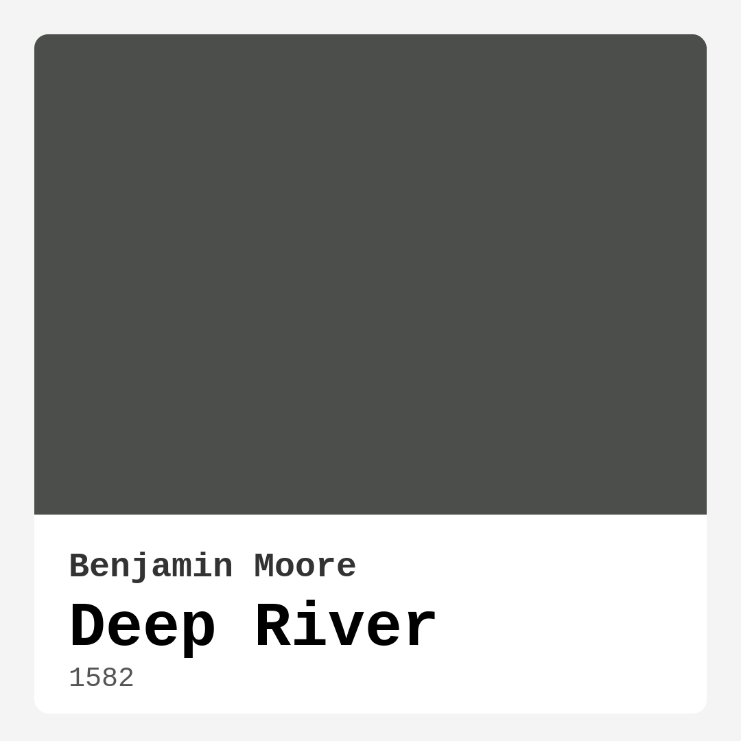
Color Preview & Key Details
| HEX Code | #4B4E4A |
| RGB | 75, 78, 74 |
| LRV | 7.82% |
| Undertone | Green |
| Finish Options | Eggshell, Matte, Satin |
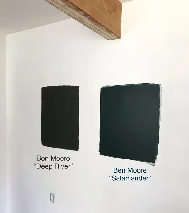
If you’re searching for a paint color that brings depth, sophistication, and a touch of serenity to your home, let me introduce you to Benjamin Moore’s Deep River (1582). This rich, muted gray with subtle green undertones is one of those rare shades that manages to feel both bold and understated at the same time. It’s the kind of color that can transform a space without overpowering it, making it a favorite among designers and homeowners alike. Whether you’re painting an accent wall, refreshing your living room, or giving your bedroom a cozy update, Deep River is a contender worth serious consideration.
First, let’s talk about the undertones because they’re what give this color its unique character. Deep River leans into green, which means it has a natural, earthy quality that keeps it from feeling too cold or sterile. Unlike grays with blue undertones that can come off as modern and crisp, or those with brown undertones that skew warm and traditional, Deep River strikes a perfect balance. It’s cool enough to feel fresh but warm enough to be inviting. This makes it incredibly versatile—it plays well with both contemporary and classic decor, so you won’t have to overhaul your entire room to make it work.
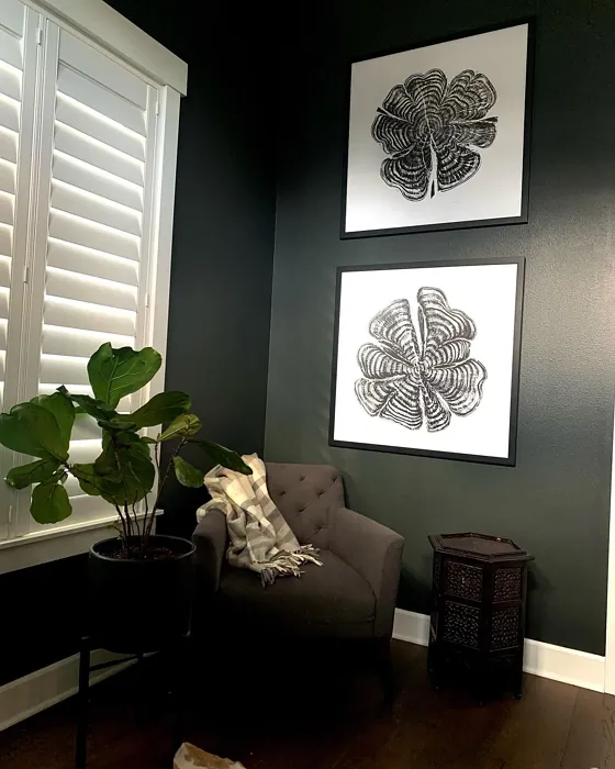
Lighting plays a huge role in how Deep River will look in your space. With a Light Reflectance Value (LRV) of just 7.82%, this is a dark color that absorbs light rather than reflecting it. In a well-lit room with plenty of natural light, you’ll see more of its gray-green personality, creating a calm, almost meditative vibe. But in a dimmer space, it takes on a moodier, more dramatic feel. If you’re worried about it feeling too heavy in a smaller room, don’t be—just balance it with lighter furniture, crisp white trim (Benjamin Moore’s White Dove is a perfect match), or plenty of layered lighting to keep things airy.
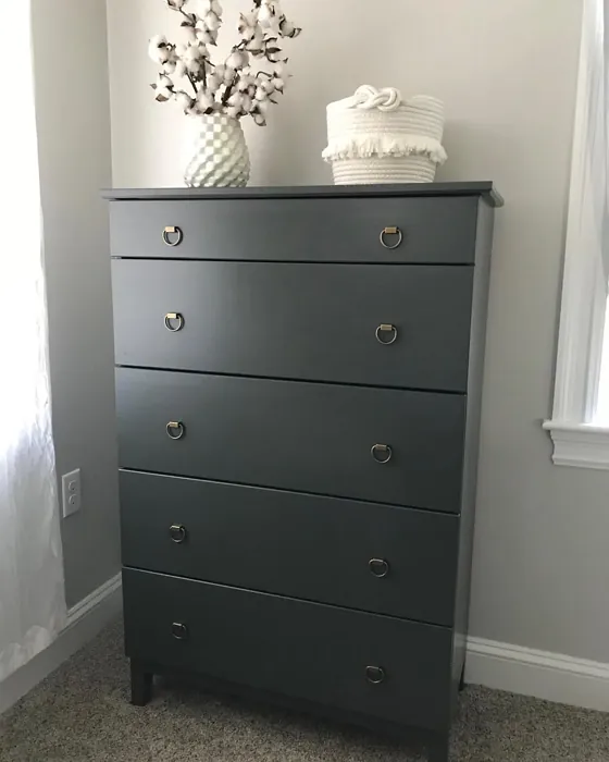
One of the things I love most about Deep River is how adaptable it is across different rooms. In a living room, it sets a sophisticated backdrop for artwork and textured fabrics. In a bedroom, it creates a restful, grounding atmosphere that’s ideal for unwinding. A home office? It’s just muted enough to keep you focused without feeling sterile. And in a dining room, it adds a touch of elegance that makes every meal feel special. It’s also a fantastic choice for furniture—imagine a Deep River-painted bookshelf or sideboard adding depth to a neutral space.
When it comes to application, this color is beginner-friendly. It covers well in one to two coats, dries quickly, and has minimal odor thanks to its low VOC formula. You can roll it on for smooth, even coverage, and it’s touch-up friendly, so small fixes won’t leave obvious marks. As for finishes, matte or eggshell will give you that soft, velvety look that’s perfect for walls, while satin is a great option for trim or high-traffic areas where you need a bit more durability. Just keep in mind that in low-light spaces, you might need an extra coat to get full, even coverage.
Now, let’s talk pairings. Deep River is a team player—it looks stunning with crisp whites, warm woods, and even bold accents. If you want to lean into its green undertones, try pairing it with earthy textures like linen, rattan, or leather. For a more modern look, contrast it with sleek black metals or glossy finishes. And if you’re feeling adventurous, its complementary hue is a soft purple, so a lavender throw pillow or a mauve accent chair could add a surprising pop.
A few pro tips: Always test this color in your space before committing. Paint a large swatch and observe it at different times of day to see how the light changes its appearance. If you’re using it in a room with limited natural light, consider supplementing with warm artificial lighting to keep it from feeling too dark. And don’t forget about trim—white or wood trim will both work beautifully, depending on the vibe you’re going for.
At the end of the day, Deep River is more than just a paint color—it’s a mood. It’s the feeling of a quiet, misty morning by the water, or the cozy embrace of a well-designed room. It’s elegant without being fussy, deep without being overwhelming, and versatile enough to suit almost any style. Whether you’re a seasoned DIYer or a first-time painter, this is a shade that’s worth considering for your next project. So grab a sample, see how it looks in your space, and get ready to fall in love with one of Benjamin Moore’s most timeless hues.
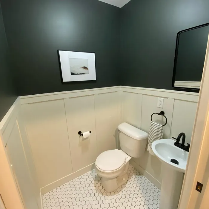
Real Room Photo of Deep River 1582
Undertones of Deep River ?
The undertones of Deep River are a key aspect of its character, leaning towards Green. These subtle underlying hues are what give the color its depth and complexity. For example, a gray with a blue undertone will feel cooler and more modern, while one with a brown undertone will feel warmer and more traditional. It’s essential to test this paint in your home and observe it next to your existing furniture, flooring, and decor to see how these undertones interact and reveal themselves throughout the day.
HEX value: #4B4E4A
RGB code: 75, 78, 74
Is Deep River Cool or Warm?
Deep River leans towards the cool side of the spectrum due to its gray base, but the green undertones introduce a warmth that’s inviting. This balance makes it a versatile choice for diverse decor styles, ensuring it feels at home in various settings.
Understanding Color Properties and Interior Design Tips
Hue refers to a specific position on the color wheel, measured in degrees from 0 to 360. Each degree represents a different pure color:
- 0° represents red
- 120° represents green
- 240° represents blue
Saturation describes the intensity or purity of a color and is expressed as a percentage:
- At 0%, the color appears completely desaturated—essentially a shade of gray
- At 100%, the color is at its most vivid and vibrant
Lightness indicates how light or dark a color is, also expressed as a percentage:
- 0% lightness results in black
- 100% lightness results in white
Using Warm Colors in Interior Design
Warm hues—such as reds, oranges, yellows, warm beiges, and greiges—are excellent choices for creating inviting and energetic spaces. These colors are particularly well-suited for:
- Kitchens, living rooms, and bathrooms, where warmth enhances comfort and sociability
- Large rooms, where warm tones can help reduce the sense of emptiness and make the space feel more intimate
For example:
- Warm beige shades provide a cozy, inviting atmosphere, ideal for living rooms, bedrooms, and hallways.
- Warm greige (a mix of beige and gray) offers the warmth of beige with the modern appeal of gray, making it a versatile backdrop for dining areas, bedrooms, and living spaces.
However, be mindful when using warm light tones in rooms with limited natural light. These shades may appear muted or even take on an unpleasant yellowish tint. To avoid a dull or flat appearance:
- Add depth by incorporating richer tones like deep greens, charcoal, or chocolate brown
- Use textured elements such as curtains, rugs, or cushions to bring dimension to the space
Pro Tip: Achieving Harmony with Warm and Cool Color Balance
To create a well-balanced and visually interesting interior, mix warm and cool tones strategically. This contrast adds depth and harmony to your design.
- If your walls feature warm hues, introduce cool-colored accents such as blue or green furniture, artwork, or accessories to create contrast.
- For a polished look, consider using a complementary color scheme, which pairs colors opposite each other on the color wheel (e.g., red with green, orange with blue).
This thoughtful mix not only enhances visual appeal but also creates a space that feels both dynamic and cohesive.
Light Temperature Affects on Deep River
Natural Light
Natural daylight changes in color temperature as the sun moves across the sky. At sunrise and sunset, the light tends to have a warm, golden tone with a color temperature around 2000 Kelvin (K). As the day progresses and the sun rises higher, the light becomes cooler and more neutral. Around midday, especially when the sky is clear, natural light typically reaches its peak brightness and shifts to a cooler tone, ranging from 5500 to 6500 Kelvin. This midday light is close to what we perceive as pure white or daylight-balanced light.
These shifts in natural light can significantly influence how colors appear in a space, which is why designers often consider both the time of day and the orientation of windows when planning interior color schemes.
Artificial Light
When choosing artificial lighting, pay close attention to the color temperature, measured in Kelvin (K). This determines how warm or cool the light will appear. Lower temperatures, around 2700K, give off a warm, yellow glow often used in living rooms or bedrooms. Higher temperatures, above 5000K, create a cool, bluish light similar to daylight, commonly used in kitchens, offices, or task areas.
Use the slider to see how lighting temperature can affect the appearance of a surface or color throughout a space.


4800K
LRV of Deep River
The Light Reflectance Value (LRV) of Deep River is 7.82%, which places it in the Dark colors category. This means it does not reflect light. Understanding a paint’s LRV is crucial for predicting how it will look in your space. A higher LRV indicates a lighter color that reflects more light, making rooms feel larger and brighter. A lower LRV signifies a darker color that absorbs more light, creating a cozier, more intimate atmosphere. Always consider the natural and artificial lighting in your room when selecting a paint color based on its LRV.
Detailed Review of Deep River
Additional Paint Characteristics
Ideal Rooms
Bedroom, Dining Room, Home Office, Living Room
Decor Styles
Industrial, Modern, Scandinavian, Transitional
Coverage
Good (1–2 Coats), Touch-Up Friendly
Ease of Application
Beginner Friendly, Brush Smooth, Fast-Drying, Roller-Ready
Washability
Washable, Wipeable
VOC Level
Low VOC
Best Use
Accent Wall, Furniture, Interior Walls
Room Suitability
Bedroom, Dining Room, Home Office, Living Room
Tone Tag
Cool, Deep, Earthy, Muted
Finish Type
Eggshell, Matte, Satin
Paint Performance
High Coverage, Low Odor, Quick Drying
Use Cases
Best for Modern Farmhouse, Classic Favorite, Designer Favorite
Mood
Cozy, Grounding, Restful
Trim Pairing
Complements Cool Trim, Good with Wood Trim, Pairs with White Dove
Deep River stands out for its versatility and muted charm. The gray base with a hint of green makes it a superb choice for various design styles, from contemporary to classic. When applied, it offers a sophisticated touch that seamlessly complements both light and dark furnishings. In well-lit spaces, it can appear lighter, while in dimmer rooms, it takes on a more dramatic feel. This makes it a fantastic option for accent walls or entire rooms alike. The application process is smooth, allowing for a clean finish with minimal effort. It dries relatively quickly, ensuring that your project stays on track without long waiting periods. Overall, Deep River provides a stunning backdrop that enhances your decor while remaining understated.
Pros & Cons of 1582 Deep River
Pros
Cons
Colors that go with Benjamin Moore Deep River
FAQ on 1582 Deep River
Can Deep River be used in small spaces?
Absolutely! While Deep River is a darker shade, its muted tone can create a cozy and inviting atmosphere in small spaces. Just ensure you have adequate lighting to prevent it from feeling too heavy. Pairing it with lighter furnishings will also help brighten the area.
What finishes work best with Deep River?
Deep River works beautifully in a matte or eggshell finish, providing a soft, sophisticated look. If you’re using it in high-traffic areas or on trim, consider a satin finish for added durability without sacrificing elegance.
Comparisons Deep River with other colors
Deep River 1582 vs Night Owl SW 7061
| Attribute | Deep River 1582 | Night Owl SW 7061 |
|---|---|---|
| Color Name | Deep River 1582 | Night Owl SW 7061 |
| Color | ||
| Hue | Grey | Grey |
| Brightness | Dark | Dark |
| RGB | 75, 78, 74 | 99, 101, 95 |
| LRV | 7.82% | 24% |
| Finish Type | Eggshell, Matte, Satin | Eggshell, Matte, Satin |
| Finish Options | Eggshell, Matte, Satin | Eggshell, Matte, Satin |
| Ideal Rooms | Bedroom, Dining Room, Home Office, Living Room | Bedroom, Dining Room, Hallway, Home Office, Living Room |
| Decor Styles | Industrial, Modern, Scandinavian, Transitional | Industrial, Minimalist, Modern, Rustic, Scandinavian |
| Coverage | Good (1–2 Coats), Touch-Up Friendly | Good (1–2 Coats), Touch-Up Friendly |
| Ease of Application | Beginner Friendly, Brush Smooth, Fast-Drying, Roller-Ready | Beginner Friendly, Brush Smooth, Fast-Drying, Roller-Ready |
| Washability | Washable, Wipeable | Scrubbable, Washable |
| Room Suitability | Bedroom, Dining Room, Home Office, Living Room | Bedroom, Dining Room, Home Office, Living Room |
| Tone | Cool, Deep, Earthy, Muted | Balanced, Deep, Earthy, Muted |
| Paint Performance | High Coverage, Low Odor, Quick Drying | Easy Touch-Up, Fade Resistant, High Coverage, Low Odor |
Deep River 1582 vs Urbane Bronze SW 7048
| Attribute | Deep River 1582 | Urbane Bronze SW 7048 |
|---|---|---|
| Color Name | Deep River 1582 | Urbane Bronze SW 7048 |
| Color | ||
| Hue | Grey | Grey |
| Brightness | Dark | Dark |
| RGB | 75, 78, 74 | 84, 80, 74 |
| LRV | 7.82% | 20% |
| Finish Type | Eggshell, Matte, Satin | Eggshell, Matte, Satin |
| Finish Options | Eggshell, Matte, Satin | Eggshell, Matte, Satin |
| Ideal Rooms | Bedroom, Dining Room, Home Office, Living Room | Bedroom, Dining Room, Home Office, Living Room |
| Decor Styles | Industrial, Modern, Scandinavian, Transitional | Contemporary, Industrial, Modern, Rustic, Transitional |
| Coverage | Good (1–2 Coats), Touch-Up Friendly | Good (1–2 Coats) |
| Ease of Application | Beginner Friendly, Brush Smooth, Fast-Drying, Roller-Ready | Beginner Friendly, Brush Smooth, Roller-Ready |
| Washability | Washable, Wipeable | Highly Washable, Washable |
| Room Suitability | Bedroom, Dining Room, Home Office, Living Room | Bedroom, Dining Room, Home Office, Living Room |
| Tone | Cool, Deep, Earthy, Muted | Deep, Earthy, Warm |
| Paint Performance | High Coverage, Low Odor, Quick Drying | Easy Touch-Up, Fade Resistant, High Coverage, Low Odor |
Deep River 1582 vs Succulent SW 9650
| Attribute | Deep River 1582 | Succulent SW 9650 |
|---|---|---|
| Color Name | Deep River 1582 | Succulent SW 9650 |
| Color | ||
| Hue | Grey | Grey |
| Brightness | Dark | Dark |
| RGB | 75, 78, 74 | 97, 108, 100 |
| LRV | 7.82% | 30% |
| Finish Type | Eggshell, Matte, Satin | Eggshell, Matte, Satin |
| Finish Options | Eggshell, Matte, Satin | Eggshell, Matte, Satin |
| Ideal Rooms | Bedroom, Dining Room, Home Office, Living Room | Bathroom, Bedroom, Dining Room, Entryway, Kitchen, Living Room |
| Decor Styles | Industrial, Modern, Scandinavian, Transitional | Bohemian, Contemporary, Eclectic, Minimalist, Modern Farmhouse |
| Coverage | Good (1–2 Coats), Touch-Up Friendly | Good (1–2 Coats), Touch-Up Friendly |
| Ease of Application | Beginner Friendly, Brush Smooth, Fast-Drying, Roller-Ready | Beginner Friendly, Brush Smooth, Roller-Ready |
| Washability | Washable, Wipeable | Highly Washable, Washable |
| Room Suitability | Bedroom, Dining Room, Home Office, Living Room | Bathroom, Bedroom, Dining Room, Kitchen, Living Room |
| Tone | Cool, Deep, Earthy, Muted | Cool, Earthy, Muted |
| Paint Performance | High Coverage, Low Odor, Quick Drying | Easy Touch-Up, Low Odor, Quick Drying, Scuff Resistant |
Deep River 1582 vs Grizzle Gray SW 7068
| Attribute | Deep River 1582 | Grizzle Gray SW 7068 |
|---|---|---|
| Color Name | Deep River 1582 | Grizzle Gray SW 7068 |
| Color | ||
| Hue | Grey | Grey |
| Brightness | Dark | Dark |
| RGB | 75, 78, 74 | 99, 101, 98 |
| LRV | 7.82% | 24% |
| Finish Type | Eggshell, Matte, Satin | Eggshell, Satin |
| Finish Options | Eggshell, Matte, Satin | Eggshell, Matte, Satin |
| Ideal Rooms | Bedroom, Dining Room, Home Office, Living Room | Bedroom, Dining Room, Home Office, Living Room |
| Decor Styles | Industrial, Modern, Scandinavian, Transitional | Industrial, Modern, Rustic, Scandinavian |
| Coverage | Good (1–2 Coats), Touch-Up Friendly | Good (1–2 Coats), Touch-Up Friendly |
| Ease of Application | Beginner Friendly, Brush Smooth, Fast-Drying, Roller-Ready | Beginner Friendly, Brush Smooth, Roller-Ready |
| Washability | Washable, Wipeable | Washable, Wipeable |
| Room Suitability | Bedroom, Dining Room, Home Office, Living Room | Bedroom, Dining Room, Home Office, Living Room |
| Tone | Cool, Deep, Earthy, Muted | Balanced, Cool, Muted |
| Paint Performance | High Coverage, Low Odor, Quick Drying | Easy Touch-Up, High Coverage, Low Odor |
Deep River 1582 vs Iron Ore SW 7069
| Attribute | Deep River 1582 | Iron Ore SW 7069 |
|---|---|---|
| Color Name | Deep River 1582 | Iron Ore SW 7069 |
| Color | ||
| Hue | Grey | Grey |
| Brightness | Dark | Dark |
| RGB | 75, 78, 74 | 67, 67, 65 |
| LRV | 7.82% | 6% |
| Finish Type | Eggshell, Matte, Satin | Eggshell, Matte, Satin |
| Finish Options | Eggshell, Matte, Satin | Eggshell, Matte, Satin |
| Ideal Rooms | Bedroom, Dining Room, Home Office, Living Room | Bedroom, Dining Room, Entryway, Home Office, Living Room |
| Decor Styles | Industrial, Modern, Scandinavian, Transitional | Contemporary, Industrial, Minimalist, Modern, Rustic |
| Coverage | Good (1–2 Coats), Touch-Up Friendly | Good (1–2 Coats), High Hide |
| Ease of Application | Beginner Friendly, Brush Smooth, Fast-Drying, Roller-Ready | Brush Smooth, Fast-Drying, Roller-Ready |
| Washability | Washable, Wipeable | Highly Washable, Washable |
| Room Suitability | Bedroom, Dining Room, Home Office, Living Room | Bedroom, Dining Room, Entryway, Home Office, Living Room |
| Tone | Cool, Deep, Earthy, Muted | Balanced, Deep, Muted, Warm |
| Paint Performance | High Coverage, Low Odor, Quick Drying | Easy Touch-Up, High Coverage, Low Odor |
Deep River 1582 vs Peppercorn SW 7674
| Attribute | Deep River 1582 | Peppercorn SW 7674 |
|---|---|---|
| Color Name | Deep River 1582 | Peppercorn SW 7674 |
| Color | ||
| Hue | Grey | Grey |
| Brightness | Dark | Dark |
| RGB | 75, 78, 74 | 88, 88, 88 |
| LRV | 7.82% | 10% |
| Finish Type | Eggshell, Matte, Satin | Eggshell, Matte, Satin |
| Finish Options | Eggshell, Matte, Satin | Eggshell, Matte, Satin |
| Ideal Rooms | Bedroom, Dining Room, Home Office, Living Room | Bedroom, Dining Room, Home Office, Living Room |
| Decor Styles | Industrial, Modern, Scandinavian, Transitional | Contemporary, Industrial, Minimalist, Modern |
| Coverage | Good (1–2 Coats), Touch-Up Friendly | Good (1–2 Coats), Touch-Up Friendly |
| Ease of Application | Beginner Friendly, Brush Smooth, Fast-Drying, Roller-Ready | Beginner Friendly, Brush Smooth, Roller-Ready |
| Washability | Washable, Wipeable | Highly Washable, Washable |
| Room Suitability | Bedroom, Dining Room, Home Office, Living Room | Bedroom, Dining Room, Home Office, Living Room |
| Tone | Cool, Deep, Earthy, Muted | Balanced, Deep, Moody, Neutral |
| Paint Performance | High Coverage, Low Odor, Quick Drying | Easy Touch-Up, Low Odor, Quick Drying, Scuff Resistant |
Deep River 1582 vs Slate Tile SW 7624
| Attribute | Deep River 1582 | Slate Tile SW 7624 |
|---|---|---|
| Color Name | Deep River 1582 | Slate Tile SW 7624 |
| Color | ||
| Hue | Grey | Grey |
| Brightness | Dark | Dark |
| RGB | 75, 78, 74 | 96, 110, 116 |
| LRV | 7.82% | 15% |
| Finish Type | Eggshell, Matte, Satin | Eggshell, Matte, Satin |
| Finish Options | Eggshell, Matte, Satin | Eggshell, Matte, Satin |
| Ideal Rooms | Bedroom, Dining Room, Home Office, Living Room | Bathroom, Bedroom, Home Office, Kitchen, Living Room |
| Decor Styles | Industrial, Modern, Scandinavian, Transitional | Industrial, Minimalist, Modern, Rustic |
| Coverage | Good (1–2 Coats), Touch-Up Friendly | Good (1–2 Coats) |
| Ease of Application | Beginner Friendly, Brush Smooth, Fast-Drying, Roller-Ready | Beginner Friendly, Brush Smooth, Fast-Drying, Roller-Ready |
| Washability | Washable, Wipeable | Scrubbable, Washable |
| Room Suitability | Bedroom, Dining Room, Home Office, Living Room | Bathroom, Bedroom, Kitchen, Living Room |
| Tone | Cool, Deep, Earthy, Muted | Balanced, Cool, Muted |
| Paint Performance | High Coverage, Low Odor, Quick Drying | Easy Touch-Up, High Coverage, Low Odor, Quick Drying |
Deep River 1582 vs Blustery Sky SW 9140
| Attribute | Deep River 1582 | Blustery Sky SW 9140 |
|---|---|---|
| Color Name | Deep River 1582 | Blustery Sky SW 9140 |
| Color | ||
| Hue | Grey | Grey |
| Brightness | Dark | Dark |
| RGB | 75, 78, 74 | 111, 132, 140 |
| LRV | 7.82% | 48% |
| Finish Type | Eggshell, Matte, Satin | Eggshell, Matte |
| Finish Options | Eggshell, Matte, Satin | Eggshell, Matte, Satin |
| Ideal Rooms | Bedroom, Dining Room, Home Office, Living Room | Bedroom, Dining Room, Home Office, Living Room, Nursery |
| Decor Styles | Industrial, Modern, Scandinavian, Transitional | Coastal, Modern Farmhouse, Scandinavian, Transitional |
| Coverage | Good (1–2 Coats), Touch-Up Friendly | Good (1–2 Coats), Touch-Up Friendly |
| Ease of Application | Beginner Friendly, Brush Smooth, Fast-Drying, Roller-Ready | Beginner Friendly, Fast-Drying, Low Splatter, Roller-Ready |
| Washability | Washable, Wipeable | Washable, Wipeable |
| Room Suitability | Bedroom, Dining Room, Home Office, Living Room | Bedroom, Home Office, Living Room, Nursery |
| Tone | Cool, Deep, Earthy, Muted | Balanced, Cool, Muted |
| Paint Performance | High Coverage, Low Odor, Quick Drying | Easy Touch-Up, Fade Resistant, Low Odor, Quick Drying |
Deep River 1582 vs Gauntlet Gray SW 7019
| Attribute | Deep River 1582 | Gauntlet Gray SW 7019 |
|---|---|---|
| Color Name | Deep River 1582 | Gauntlet Gray SW 7019 |
| Color | ||
| Hue | Grey | Grey |
| Brightness | Dark | Dark |
| RGB | 75, 78, 74 | 120, 115, 110 |
| LRV | 7.82% | 24% |
| Finish Type | Eggshell, Matte, Satin | Eggshell, Matte, Satin |
| Finish Options | Eggshell, Matte, Satin | Eggshell, Matte, Satin |
| Ideal Rooms | Bedroom, Dining Room, Home Office, Living Room | Bedroom, Dining Room, Hallway, Home Office, Living Room |
| Decor Styles | Industrial, Modern, Scandinavian, Transitional | Industrial, Modern, Rustic, Transitional |
| Coverage | Good (1–2 Coats), Touch-Up Friendly | Good (1–2 Coats), Touch-Up Friendly |
| Ease of Application | Beginner Friendly, Brush Smooth, Fast-Drying, Roller-Ready | Beginner Friendly, Brush Smooth, Roller-Ready |
| Washability | Washable, Wipeable | Scrubbable, Washable |
| Room Suitability | Bedroom, Dining Room, Home Office, Living Room | Bedroom, Dining Room, Home Office, Living Room |
| Tone | Cool, Deep, Earthy, Muted | Dusty, Earthy, Muted, Warm |
| Paint Performance | High Coverage, Low Odor, Quick Drying | Easy Touch-Up, High Coverage, Low Odor |
Deep River 1582 vs Cast Iron SW 6202
| Attribute | Deep River 1582 | Cast Iron SW 6202 |
|---|---|---|
| Color Name | Deep River 1582 | Cast Iron SW 6202 |
| Color | ||
| Hue | Grey | Grey |
| Brightness | Dark | Dark |
| RGB | 75, 78, 74 | 100, 100, 90 |
| LRV | 7.82% | 6% |
| Finish Type | Eggshell, Matte, Satin | Eggshell, Matte, Satin |
| Finish Options | Eggshell, Matte, Satin | Eggshell, Matte, Satin |
| Ideal Rooms | Bedroom, Dining Room, Home Office, Living Room | Bedroom, Dining Room, Hallway, Home Office, Kitchen, Living Room |
| Decor Styles | Industrial, Modern, Scandinavian, Transitional | Contemporary, Farmhouse, Industrial, Minimalist, Modern |
| Coverage | Good (1–2 Coats), Touch-Up Friendly | Good (1–2 Coats), High Hide, Touch-Up Friendly |
| Ease of Application | Beginner Friendly, Brush Smooth, Fast-Drying, Roller-Ready | Beginner Friendly, Brush Smooth, Fast-Drying, Roller-Ready |
| Washability | Washable, Wipeable | Highly Washable, Washable, Wipeable |
| Room Suitability | Bedroom, Dining Room, Home Office, Living Room | Bedroom, Dining Room, Home Office, Kitchen, Living Room |
| Tone | Cool, Deep, Earthy, Muted | Balanced, Deep, Dusty, Earthy, Warm |
| Paint Performance | High Coverage, Low Odor, Quick Drying | Easy Touch-Up, High Coverage, Low Odor, Stain Resistant |
Official Page of Benjamin Moore Deep River 1582