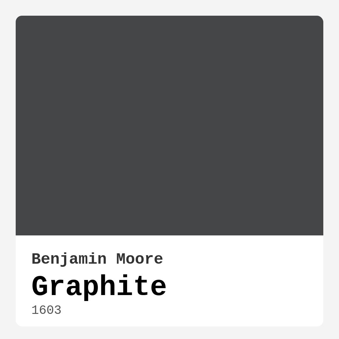
Color Preview & Key Details
| HEX Code | #444647 |
| RGB | 68, 70, 71 |
| LRV | 7.59% |
| Undertone | Blue |
| Finish Options | Matte, Satin, Semi-Gloss |
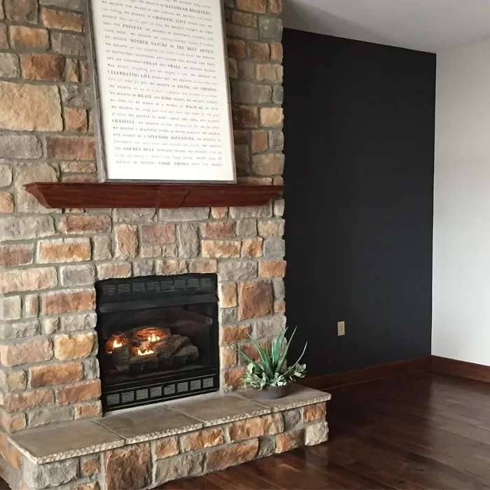
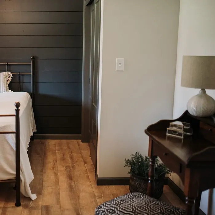
If you’re looking for a paint color that exudes sophistication while still feeling modern and versatile, Benjamin Moore’s Graphite (1603) might just be your perfect match. This deep, cool gray with subtle blue undertones is one of those shades that instantly elevates a space, giving it a polished, intentional look. Whether you’re considering it for an accent wall, a full room, or even a piece of furniture, Graphite has a way of making a statement without overpowering the rest of your decor.
One of the first things you’ll notice about Graphite is its depth. With an LRV (Light Reflectance Value) of just 7.59%, it falls firmly into the dark color category, meaning it absorbs light rather than reflecting it. This makes it ideal for creating a cozy, intimate atmosphere—perfect for bedrooms, home offices, or dining rooms where you want a sense of warmth and sophistication. But don’t let the low LRV scare you off. When balanced with lighter trim, like Benjamin Moore’s White Dove or a crisp pure white, Graphite can feel surprisingly fresh and modern rather than heavy.
The blue undertones in this color are what really set it apart from other deep grays. Unlike warmer grays that lean brown or taupe, Graphite has a cool, almost slate-like quality that gives it a sleek, contemporary edge. This makes it a fantastic choice for modern, industrial, or minimalist spaces where you want a clean, refined look. That said, it’s also versatile enough to work in more traditional settings when paired with the right furnishings—think rich wood tones, plush textiles, or metallic accents to soften its coolness.
Lighting plays a huge role in how Graphite will appear in your home. In bright, natural light, those blue undertones come forward, giving the color a crisp, almost airy feel despite its darkness. In lower light, it takes on a moodier, more dramatic presence, making it a great pick for rooms where you want to cultivate a sense of calm and grounding. If you’re using it in a space with limited natural light, consider layering in plenty of artificial lighting—warm-toned bulbs can help balance the coolness of the paint and keep the room from feeling too stark.
When it comes to application, Graphite is as user-friendly as it gets. With high coverage and a smooth finish, you’ll likely only need one or two coats to achieve a rich, even look. It’s roller-ready, fast-drying, and available in matte, satin, or semi-gloss finishes, so you can choose the sheen that best suits your project. Matte finishes will give you that ultra-modern, velvety look, while satin or semi-gloss can add a touch of elegance and make the color feel even deeper. Just keep in mind that darker colors like this can show fingerprints or smudges more easily, especially in high-traffic areas, so a washable finish like satin might be the way to go if durability is a concern.
Now, let’s talk pairings. Graphite plays well with a wide range of colors, but some combinations really make it sing. For a bold contrast, try pairing it with crisp whites or soft creams—this will keep the space feeling balanced and prevent it from becoming too dark. If you want to lean into its cool undertones, shades like icy blues or soft grays can create a serene, cohesive look. On the other hand, if you’re looking to add warmth, earthy tones like warm taupes, deep greens, or even muted reds (its complementary hue) can create a striking yet harmonious contrast.
Furniture and decor choices matter just as much as wall pairings. Lighter upholstery, natural wood finishes, and metallic accents (think brass or chrome) all work beautifully against Graphite’s dark backdrop. If you’re using it in a living room or bedroom, layering in textured fabrics—like linen, wool, or velvet—can add dimension and keep the space from feeling flat. And don’t shy away from bold artwork or statement lighting; this color provides the perfect canvas for pieces that deserve to stand out.
So, is Graphite right for your home? If you love moody, sophisticated spaces with a modern edge, absolutely. It’s a color that feels timeless yet current, making it a smart choice for everything from an accent wall in a home office to full-room drama in a dining space. Just remember to test it in your actual space before committing—paint a large swatch and observe it at different times of day to see how the light affects its tone. And if you’re worried about it feeling too dark in a smaller room, try using it on just one wall or balancing it with plenty of lighter elements to keep the space feeling open.
At the end of the day, Graphite is one of those colors that does the heavy lifting for you. It brings instant depth, elegance, and a touch of modernity to any room, all while being surprisingly easy to work with. Whether you’re going for a sleek, contemporary vibe or a cozy, intimate retreat, this shade has the versatility to deliver. So grab a sample, trust your instincts, and get ready to fall in love with one of Benjamin Moore’s most sophisticated grays.
Real Room Photo of Graphite 1603


Undertones of Graphite ?
The undertones of Graphite are a key aspect of its character, leaning towards Blue. These subtle underlying hues are what give the color its depth and complexity. For example, a gray with a blue undertone will feel cooler and more modern, while one with a brown undertone will feel warmer and more traditional. It’s essential to test this paint in your home and observe it next to your existing furniture, flooring, and decor to see how these undertones interact and reveal themselves throughout the day.
HEX value: #444647
RGB code: 68, 70, 71
Is Graphite Cool or Warm?
Graphite is primarily a cool color, which means it can evoke a sense of calm and sophistication in your space. Its coolness is balanced, ensuring it doesn’t feel too stark or harsh, making it suitable for a variety of environments.
Understanding Color Properties and Interior Design Tips
Hue refers to a specific position on the color wheel, measured in degrees from 0 to 360. Each degree represents a different pure color:
- 0° represents red
- 120° represents green
- 240° represents blue
Saturation describes the intensity or purity of a color and is expressed as a percentage:
- At 0%, the color appears completely desaturated—essentially a shade of gray
- At 100%, the color is at its most vivid and vibrant
Lightness indicates how light or dark a color is, also expressed as a percentage:
- 0% lightness results in black
- 100% lightness results in white
Using Warm Colors in Interior Design
Warm hues—such as reds, oranges, yellows, warm beiges, and greiges—are excellent choices for creating inviting and energetic spaces. These colors are particularly well-suited for:
- Kitchens, living rooms, and bathrooms, where warmth enhances comfort and sociability
- Large rooms, where warm tones can help reduce the sense of emptiness and make the space feel more intimate
For example:
- Warm beige shades provide a cozy, inviting atmosphere, ideal for living rooms, bedrooms, and hallways.
- Warm greige (a mix of beige and gray) offers the warmth of beige with the modern appeal of gray, making it a versatile backdrop for dining areas, bedrooms, and living spaces.
However, be mindful when using warm light tones in rooms with limited natural light. These shades may appear muted or even take on an unpleasant yellowish tint. To avoid a dull or flat appearance:
- Add depth by incorporating richer tones like deep greens, charcoal, or chocolate brown
- Use textured elements such as curtains, rugs, or cushions to bring dimension to the space
Pro Tip: Achieving Harmony with Warm and Cool Color Balance
To create a well-balanced and visually interesting interior, mix warm and cool tones strategically. This contrast adds depth and harmony to your design.
- If your walls feature warm hues, introduce cool-colored accents such as blue or green furniture, artwork, or accessories to create contrast.
- For a polished look, consider using a complementary color scheme, which pairs colors opposite each other on the color wheel (e.g., red with green, orange with blue).
This thoughtful mix not only enhances visual appeal but also creates a space that feels both dynamic and cohesive.
Light Temperature Affects on Graphite
Natural Light
Natural daylight changes in color temperature as the sun moves across the sky. At sunrise and sunset, the light tends to have a warm, golden tone with a color temperature around 2000 Kelvin (K). As the day progresses and the sun rises higher, the light becomes cooler and more neutral. Around midday, especially when the sky is clear, natural light typically reaches its peak brightness and shifts to a cooler tone, ranging from 5500 to 6500 Kelvin. This midday light is close to what we perceive as pure white or daylight-balanced light.
These shifts in natural light can significantly influence how colors appear in a space, which is why designers often consider both the time of day and the orientation of windows when planning interior color schemes.
Artificial Light
When choosing artificial lighting, pay close attention to the color temperature, measured in Kelvin (K). This determines how warm or cool the light will appear. Lower temperatures, around 2700K, give off a warm, yellow glow often used in living rooms or bedrooms. Higher temperatures, above 5000K, create a cool, bluish light similar to daylight, commonly used in kitchens, offices, or task areas.
Use the slider to see how lighting temperature can affect the appearance of a surface or color throughout a space.


4800K
LRV of Graphite
The Light Reflectance Value (LRV) of Graphite is 7.59%, which places it in the Dark colors category. This means it does not reflect light. Understanding a paint’s LRV is crucial for predicting how it will look in your space. A higher LRV indicates a lighter color that reflects more light, making rooms feel larger and brighter. A lower LRV signifies a darker color that absorbs more light, creating a cozier, more intimate atmosphere. Always consider the natural and artificial lighting in your room when selecting a paint color based on its LRV.
Detailed Review of Graphite
Additional Paint Characteristics
Ideal Rooms
Bedroom, Dining Room, Home Office, Living Room
Decor Styles
Contemporary, Industrial, Minimalist, Modern
Coverage
Good (1–2 Coats), High Hide
Ease of Application
Brush Smooth, Fast-Drying, Roller-Ready
Washability
Highly Washable, Washable
VOC Level
Low VOC
Best Use
Accent Wall, Furniture, Interior Walls, Trim
Room Suitability
Bedroom, Dining Room, Home Office, Living Room
Tone Tag
Cool, Deep, Moody
Finish Type
Matte, Satin, Semi-Gloss
Paint Performance
Easy Touch-Up, High Coverage, Low Odor
Use Cases
Best for Modern Farmhouse, Best for Open Concept, Designer Favorite
Mood
Calm, Grounding, Sophisticated
Trim Pairing
Complements Cool Trim, Matches Pure White, Pairs with White Dove
Graphite delivers an impressive balance of depth and versatility, making it an ideal choice for both accent walls and full-room applications. The color translates beautifully under different lighting conditions, maintaining its character whether in natural light or artificial light. Its cool undertones can soften a space while still providing a modern aesthetic. When paired with lighter or warmer colors, it can offer a striking contrast that enhances your room’s overall design. Just be mindful of how it interacts with your furnishings and decor to achieve the desired effect. With its refined look, Graphite is perfect for creating a sophisticated atmosphere in your home.
Pros & Cons of 1603 Graphite
Pros
Cons
Colors that go with Benjamin Moore Graphite
FAQ on 1603 Graphite
Can Graphite be used in small rooms?
Yes, Graphite can be used in small rooms, but it’s important to balance it with lighter colors or ample natural light. If you use it as an accent wall or in combination with lighter trims, you can create an inviting and stylish atmosphere without making the space feel cramped.
What finishes work best with Graphite?
Graphite works beautifully in various finishes, but semi-gloss or satin can enhance its depth while providing durability. Matte finishes lend a softer, more modern look, while semi-gloss can add a touch of elegance to trim and moldings, offering a nice contrast to the wall color.
Comparisons Graphite with other colors
Graphite 1603 vs Night Owl SW 7061
| Attribute | Graphite 1603 | Night Owl SW 7061 |
|---|---|---|
| Color Name | Graphite 1603 | Night Owl SW 7061 |
| Color | ||
| Hue | Grey | Grey |
| Brightness | Dark | Dark |
| RGB | 68, 70, 71 | 99, 101, 95 |
| LRV | 7.59% | 24% |
| Finish Type | Matte, Satin, Semi-Gloss | Eggshell, Matte, Satin |
| Finish Options | Matte, Satin, Semi-Gloss | Eggshell, Matte, Satin |
| Ideal Rooms | Bedroom, Dining Room, Home Office, Living Room | Bedroom, Dining Room, Hallway, Home Office, Living Room |
| Decor Styles | Contemporary, Industrial, Minimalist, Modern | Industrial, Minimalist, Modern, Rustic, Scandinavian |
| Coverage | Good (1–2 Coats), High Hide | Good (1–2 Coats), Touch-Up Friendly |
| Ease of Application | Brush Smooth, Fast-Drying, Roller-Ready | Beginner Friendly, Brush Smooth, Fast-Drying, Roller-Ready |
| Washability | Highly Washable, Washable | Scrubbable, Washable |
| Room Suitability | Bedroom, Dining Room, Home Office, Living Room | Bedroom, Dining Room, Home Office, Living Room |
| Tone | Cool, Deep, Moody | Balanced, Deep, Earthy, Muted |
| Paint Performance | Easy Touch-Up, High Coverage, Low Odor | Easy Touch-Up, Fade Resistant, High Coverage, Low Odor |
Graphite 1603 vs Urbane Bronze SW 7048
| Attribute | Graphite 1603 | Urbane Bronze SW 7048 |
|---|---|---|
| Color Name | Graphite 1603 | Urbane Bronze SW 7048 |
| Color | ||
| Hue | Grey | Grey |
| Brightness | Dark | Dark |
| RGB | 68, 70, 71 | 84, 80, 74 |
| LRV | 7.59% | 20% |
| Finish Type | Matte, Satin, Semi-Gloss | Eggshell, Matte, Satin |
| Finish Options | Matte, Satin, Semi-Gloss | Eggshell, Matte, Satin |
| Ideal Rooms | Bedroom, Dining Room, Home Office, Living Room | Bedroom, Dining Room, Home Office, Living Room |
| Decor Styles | Contemporary, Industrial, Minimalist, Modern | Contemporary, Industrial, Modern, Rustic, Transitional |
| Coverage | Good (1–2 Coats), High Hide | Good (1–2 Coats) |
| Ease of Application | Brush Smooth, Fast-Drying, Roller-Ready | Beginner Friendly, Brush Smooth, Roller-Ready |
| Washability | Highly Washable, Washable | Highly Washable, Washable |
| Room Suitability | Bedroom, Dining Room, Home Office, Living Room | Bedroom, Dining Room, Home Office, Living Room |
| Tone | Cool, Deep, Moody | Deep, Earthy, Warm |
| Paint Performance | Easy Touch-Up, High Coverage, Low Odor | Easy Touch-Up, Fade Resistant, High Coverage, Low Odor |
Graphite 1603 vs Succulent SW 9650
| Attribute | Graphite 1603 | Succulent SW 9650 |
|---|---|---|
| Color Name | Graphite 1603 | Succulent SW 9650 |
| Color | ||
| Hue | Grey | Grey |
| Brightness | Dark | Dark |
| RGB | 68, 70, 71 | 97, 108, 100 |
| LRV | 7.59% | 30% |
| Finish Type | Matte, Satin, Semi-Gloss | Eggshell, Matte, Satin |
| Finish Options | Matte, Satin, Semi-Gloss | Eggshell, Matte, Satin |
| Ideal Rooms | Bedroom, Dining Room, Home Office, Living Room | Bathroom, Bedroom, Dining Room, Entryway, Kitchen, Living Room |
| Decor Styles | Contemporary, Industrial, Minimalist, Modern | Bohemian, Contemporary, Eclectic, Minimalist, Modern Farmhouse |
| Coverage | Good (1–2 Coats), High Hide | Good (1–2 Coats), Touch-Up Friendly |
| Ease of Application | Brush Smooth, Fast-Drying, Roller-Ready | Beginner Friendly, Brush Smooth, Roller-Ready |
| Washability | Highly Washable, Washable | Highly Washable, Washable |
| Room Suitability | Bedroom, Dining Room, Home Office, Living Room | Bathroom, Bedroom, Dining Room, Kitchen, Living Room |
| Tone | Cool, Deep, Moody | Cool, Earthy, Muted |
| Paint Performance | Easy Touch-Up, High Coverage, Low Odor | Easy Touch-Up, Low Odor, Quick Drying, Scuff Resistant |
Graphite 1603 vs Grizzle Gray SW 7068
| Attribute | Graphite 1603 | Grizzle Gray SW 7068 |
|---|---|---|
| Color Name | Graphite 1603 | Grizzle Gray SW 7068 |
| Color | ||
| Hue | Grey | Grey |
| Brightness | Dark | Dark |
| RGB | 68, 70, 71 | 99, 101, 98 |
| LRV | 7.59% | 24% |
| Finish Type | Matte, Satin, Semi-Gloss | Eggshell, Satin |
| Finish Options | Matte, Satin, Semi-Gloss | Eggshell, Matte, Satin |
| Ideal Rooms | Bedroom, Dining Room, Home Office, Living Room | Bedroom, Dining Room, Home Office, Living Room |
| Decor Styles | Contemporary, Industrial, Minimalist, Modern | Industrial, Modern, Rustic, Scandinavian |
| Coverage | Good (1–2 Coats), High Hide | Good (1–2 Coats), Touch-Up Friendly |
| Ease of Application | Brush Smooth, Fast-Drying, Roller-Ready | Beginner Friendly, Brush Smooth, Roller-Ready |
| Washability | Highly Washable, Washable | Washable, Wipeable |
| Room Suitability | Bedroom, Dining Room, Home Office, Living Room | Bedroom, Dining Room, Home Office, Living Room |
| Tone | Cool, Deep, Moody | Balanced, Cool, Muted |
| Paint Performance | Easy Touch-Up, High Coverage, Low Odor | Easy Touch-Up, High Coverage, Low Odor |
Graphite 1603 vs Iron Ore SW 7069
| Attribute | Graphite 1603 | Iron Ore SW 7069 |
|---|---|---|
| Color Name | Graphite 1603 | Iron Ore SW 7069 |
| Color | ||
| Hue | Grey | Grey |
| Brightness | Dark | Dark |
| RGB | 68, 70, 71 | 67, 67, 65 |
| LRV | 7.59% | 6% |
| Finish Type | Matte, Satin, Semi-Gloss | Eggshell, Matte, Satin |
| Finish Options | Matte, Satin, Semi-Gloss | Eggshell, Matte, Satin |
| Ideal Rooms | Bedroom, Dining Room, Home Office, Living Room | Bedroom, Dining Room, Entryway, Home Office, Living Room |
| Decor Styles | Contemporary, Industrial, Minimalist, Modern | Contemporary, Industrial, Minimalist, Modern, Rustic |
| Coverage | Good (1–2 Coats), High Hide | Good (1–2 Coats), High Hide |
| Ease of Application | Brush Smooth, Fast-Drying, Roller-Ready | Brush Smooth, Fast-Drying, Roller-Ready |
| Washability | Highly Washable, Washable | Highly Washable, Washable |
| Room Suitability | Bedroom, Dining Room, Home Office, Living Room | Bedroom, Dining Room, Entryway, Home Office, Living Room |
| Tone | Cool, Deep, Moody | Balanced, Deep, Muted, Warm |
| Paint Performance | Easy Touch-Up, High Coverage, Low Odor | Easy Touch-Up, High Coverage, Low Odor |
Graphite 1603 vs Peppercorn SW 7674
| Attribute | Graphite 1603 | Peppercorn SW 7674 |
|---|---|---|
| Color Name | Graphite 1603 | Peppercorn SW 7674 |
| Color | ||
| Hue | Grey | Grey |
| Brightness | Dark | Dark |
| RGB | 68, 70, 71 | 88, 88, 88 |
| LRV | 7.59% | 10% |
| Finish Type | Matte, Satin, Semi-Gloss | Eggshell, Matte, Satin |
| Finish Options | Matte, Satin, Semi-Gloss | Eggshell, Matte, Satin |
| Ideal Rooms | Bedroom, Dining Room, Home Office, Living Room | Bedroom, Dining Room, Home Office, Living Room |
| Decor Styles | Contemporary, Industrial, Minimalist, Modern | Contemporary, Industrial, Minimalist, Modern |
| Coverage | Good (1–2 Coats), High Hide | Good (1–2 Coats), Touch-Up Friendly |
| Ease of Application | Brush Smooth, Fast-Drying, Roller-Ready | Beginner Friendly, Brush Smooth, Roller-Ready |
| Washability | Highly Washable, Washable | Highly Washable, Washable |
| Room Suitability | Bedroom, Dining Room, Home Office, Living Room | Bedroom, Dining Room, Home Office, Living Room |
| Tone | Cool, Deep, Moody | Balanced, Deep, Moody, Neutral |
| Paint Performance | Easy Touch-Up, High Coverage, Low Odor | Easy Touch-Up, Low Odor, Quick Drying, Scuff Resistant |
Graphite 1603 vs Slate Tile SW 7624
| Attribute | Graphite 1603 | Slate Tile SW 7624 |
|---|---|---|
| Color Name | Graphite 1603 | Slate Tile SW 7624 |
| Color | ||
| Hue | Grey | Grey |
| Brightness | Dark | Dark |
| RGB | 68, 70, 71 | 96, 110, 116 |
| LRV | 7.59% | 15% |
| Finish Type | Matte, Satin, Semi-Gloss | Eggshell, Matte, Satin |
| Finish Options | Matte, Satin, Semi-Gloss | Eggshell, Matte, Satin |
| Ideal Rooms | Bedroom, Dining Room, Home Office, Living Room | Bathroom, Bedroom, Home Office, Kitchen, Living Room |
| Decor Styles | Contemporary, Industrial, Minimalist, Modern | Industrial, Minimalist, Modern, Rustic |
| Coverage | Good (1–2 Coats), High Hide | Good (1–2 Coats) |
| Ease of Application | Brush Smooth, Fast-Drying, Roller-Ready | Beginner Friendly, Brush Smooth, Fast-Drying, Roller-Ready |
| Washability | Highly Washable, Washable | Scrubbable, Washable |
| Room Suitability | Bedroom, Dining Room, Home Office, Living Room | Bathroom, Bedroom, Kitchen, Living Room |
| Tone | Cool, Deep, Moody | Balanced, Cool, Muted |
| Paint Performance | Easy Touch-Up, High Coverage, Low Odor | Easy Touch-Up, High Coverage, Low Odor, Quick Drying |
Graphite 1603 vs Blustery Sky SW 9140
| Attribute | Graphite 1603 | Blustery Sky SW 9140 |
|---|---|---|
| Color Name | Graphite 1603 | Blustery Sky SW 9140 |
| Color | ||
| Hue | Grey | Grey |
| Brightness | Dark | Dark |
| RGB | 68, 70, 71 | 111, 132, 140 |
| LRV | 7.59% | 48% |
| Finish Type | Matte, Satin, Semi-Gloss | Eggshell, Matte |
| Finish Options | Matte, Satin, Semi-Gloss | Eggshell, Matte, Satin |
| Ideal Rooms | Bedroom, Dining Room, Home Office, Living Room | Bedroom, Dining Room, Home Office, Living Room, Nursery |
| Decor Styles | Contemporary, Industrial, Minimalist, Modern | Coastal, Modern Farmhouse, Scandinavian, Transitional |
| Coverage | Good (1–2 Coats), High Hide | Good (1–2 Coats), Touch-Up Friendly |
| Ease of Application | Brush Smooth, Fast-Drying, Roller-Ready | Beginner Friendly, Fast-Drying, Low Splatter, Roller-Ready |
| Washability | Highly Washable, Washable | Washable, Wipeable |
| Room Suitability | Bedroom, Dining Room, Home Office, Living Room | Bedroom, Home Office, Living Room, Nursery |
| Tone | Cool, Deep, Moody | Balanced, Cool, Muted |
| Paint Performance | Easy Touch-Up, High Coverage, Low Odor | Easy Touch-Up, Fade Resistant, Low Odor, Quick Drying |
Graphite 1603 vs Gauntlet Gray SW 7019
| Attribute | Graphite 1603 | Gauntlet Gray SW 7019 |
|---|---|---|
| Color Name | Graphite 1603 | Gauntlet Gray SW 7019 |
| Color | ||
| Hue | Grey | Grey |
| Brightness | Dark | Dark |
| RGB | 68, 70, 71 | 120, 115, 110 |
| LRV | 7.59% | 24% |
| Finish Type | Matte, Satin, Semi-Gloss | Eggshell, Matte, Satin |
| Finish Options | Matte, Satin, Semi-Gloss | Eggshell, Matte, Satin |
| Ideal Rooms | Bedroom, Dining Room, Home Office, Living Room | Bedroom, Dining Room, Hallway, Home Office, Living Room |
| Decor Styles | Contemporary, Industrial, Minimalist, Modern | Industrial, Modern, Rustic, Transitional |
| Coverage | Good (1–2 Coats), High Hide | Good (1–2 Coats), Touch-Up Friendly |
| Ease of Application | Brush Smooth, Fast-Drying, Roller-Ready | Beginner Friendly, Brush Smooth, Roller-Ready |
| Washability | Highly Washable, Washable | Scrubbable, Washable |
| Room Suitability | Bedroom, Dining Room, Home Office, Living Room | Bedroom, Dining Room, Home Office, Living Room |
| Tone | Cool, Deep, Moody | Dusty, Earthy, Muted, Warm |
| Paint Performance | Easy Touch-Up, High Coverage, Low Odor | Easy Touch-Up, High Coverage, Low Odor |
Graphite 1603 vs Cast Iron SW 6202
| Attribute | Graphite 1603 | Cast Iron SW 6202 |
|---|---|---|
| Color Name | Graphite 1603 | Cast Iron SW 6202 |
| Color | ||
| Hue | Grey | Grey |
| Brightness | Dark | Dark |
| RGB | 68, 70, 71 | 100, 100, 90 |
| LRV | 7.59% | 6% |
| Finish Type | Matte, Satin, Semi-Gloss | Eggshell, Matte, Satin |
| Finish Options | Matte, Satin, Semi-Gloss | Eggshell, Matte, Satin |
| Ideal Rooms | Bedroom, Dining Room, Home Office, Living Room | Bedroom, Dining Room, Hallway, Home Office, Kitchen, Living Room |
| Decor Styles | Contemporary, Industrial, Minimalist, Modern | Contemporary, Farmhouse, Industrial, Minimalist, Modern |
| Coverage | Good (1–2 Coats), High Hide | Good (1–2 Coats), High Hide, Touch-Up Friendly |
| Ease of Application | Brush Smooth, Fast-Drying, Roller-Ready | Beginner Friendly, Brush Smooth, Fast-Drying, Roller-Ready |
| Washability | Highly Washable, Washable | Highly Washable, Washable, Wipeable |
| Room Suitability | Bedroom, Dining Room, Home Office, Living Room | Bedroom, Dining Room, Home Office, Kitchen, Living Room |
| Tone | Cool, Deep, Moody | Balanced, Deep, Dusty, Earthy, Warm |
| Paint Performance | Easy Touch-Up, High Coverage, Low Odor | Easy Touch-Up, High Coverage, Low Odor, Stain Resistant |
Official Page of Benjamin Moore Graphite 1603