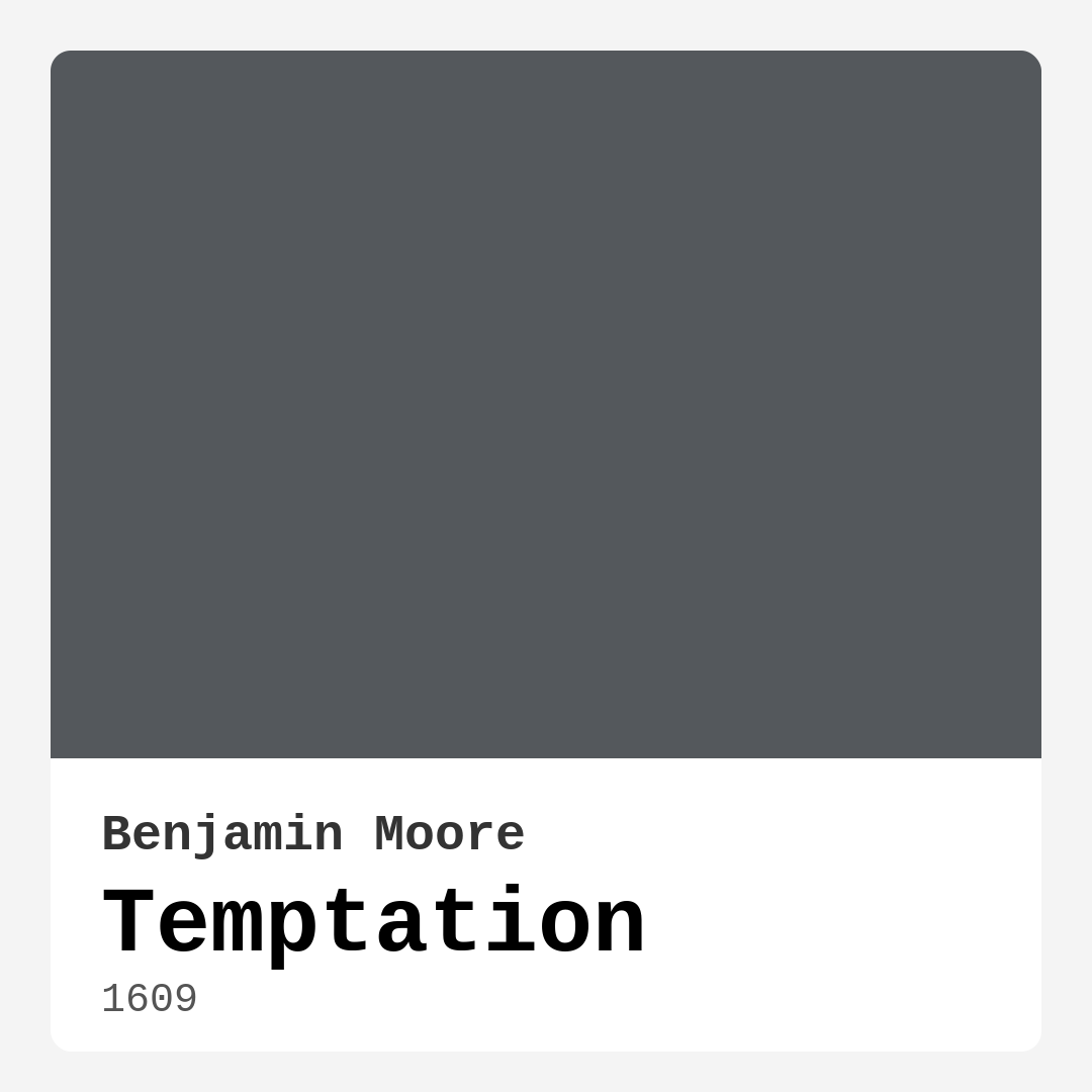
Color Preview & Key Details
| HEX Code | #54585C |
| RGB | 84, 88, 92 |
| LRV | 10.72% |
| Undertone | Blue |
| Finish Options | Eggshell, Matte, Satin |
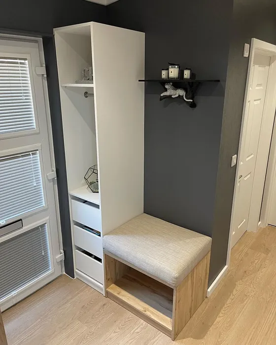
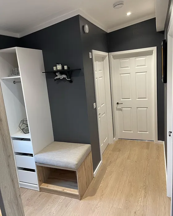
If you’re looking for a paint color that effortlessly blends sophistication with a touch of mystery, Benjamin Moore’s *Temptation* (1609) might just be your perfect match. This deep, moody gray with subtle blue undertones is a designer favorite for a reason—it’s versatile, elegant, and creates an instant sense of intimacy in any space. Whether you’re refreshing a living room, designing a cozy bedroom, or adding drama to a home office, *Temptation* delivers a stylish backdrop that elevates your decor without overpowering it.
One of the first things you’ll notice about *Temptation* is its depth. With an LRV (Light Reflectance Value) of 10.72%, it sits firmly in the medium-dark category, meaning it absorbs more light than it reflects. This gives it a rich, enveloping quality that’s perfect for creating a cocoon-like atmosphere. But don’t let the darkness intimidate you—when paired with the right lighting and furnishings, this color can make a room feel both cozy and expansive. Natural light will bring out its cooler blue undertones, while evening lamplight can soften it into something warmer and more inviting.
Speaking of undertones, that’s where *Temptation* really shines. The blue hue lurking beneath the surface keeps it modern and fresh, avoiding the flatness that some grays can fall into. This makes it a fantastic choice for contemporary, industrial, or transitional spaces. If you’ve ever painted a room gray only to have it look flat or lifeless, *Temptation* won’t disappoint—it has just enough complexity to keep things interesting. To see how it plays in your space, test a swatch near your furniture and observe how it changes throughout the day. You might be surprised at how dynamic it can be.
Now, let’s talk application. One of the best things about *Temptation* is how beginner-friendly it is. With good coverage in just one or two coats, you won’t be stuck doing endless touch-ups. It’s roller-ready, brushes on smoothly, and dries quickly, so you can finish your project without frustration. The low VOC formula means it’s kinder to your indoor air quality, and its washable finish makes it practical for high-traffic areas like living rooms or dining spaces. Whether you opt for a matte finish for a velvety look or a satin sheen to catch the light, this color adapts beautifully.
Of course, no color is perfect for every scenario. *Temptation*’s darker nature means it can make small rooms feel more enclosed if you’re not careful. If you’re working with limited square footage, consider using it on an accent wall rather than all four. Pair it with lighter furniture, crisp white trim (Benjamin Moore’s *White Dove* is a classic choice), and plenty of lighting to keep the space feeling open. Mirrors and metallic accents can also help bounce light around, preventing the room from feeling too heavy.
When it comes to decor pairings, *Temptation* is surprisingly flexible. Its cool undertones play well with warm woods, brass fixtures, and creamy neutrals, creating a balanced look. For a bold contrast, try pairing it with pops of orange—its complementary hue—through throw pillows, artwork, or even a statement chair. If you prefer a more subdued palette, layer in textures like linen, leather, or wool to add depth without introducing competing colors.
Wondering where to use it? *Temptation* excels in living rooms, where it can create a sophisticated yet welcoming vibe. In bedrooms, it sets the stage for a restful retreat, especially when paired with soft bedding and ambient lighting. Home offices benefit from its moody focus-enhancing qualities, while dining rooms gain an air of intimacy that makes dinner parties feel extra special. And don’t overlook furniture—painting a bookshelf or dresser in *Temptation* can add a high-end touch without a full-room commitment.
If you’re still on the fence, remember that paint is one of the easiest ways to transform a space. *Temptation* is a color that rewards boldness—it’s not just a backdrop but a statement. Whether you’re going for modern farmhouse charm or sleek industrial edge, this shade brings depth, character, and a touch of drama to your home. So grab a sample, brush it on your wall, and see how it makes you feel. You might just find yourself tempted to take the plunge.

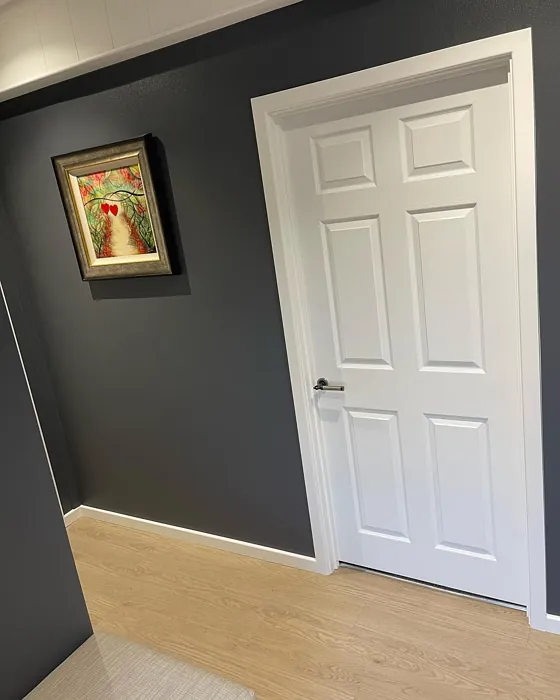
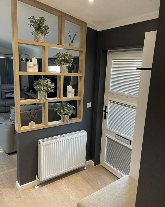
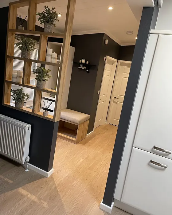
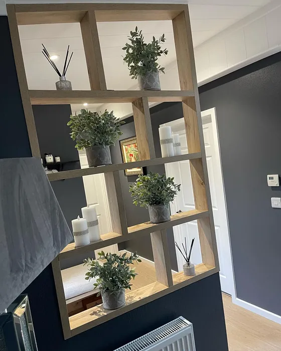
Real Room Photo of Temptation 1609
Undertones of Temptation ?
The undertones of Temptation are a key aspect of its character, leaning towards Blue. These subtle underlying hues are what give the color its depth and complexity. For example, a gray with a blue undertone will feel cooler and more modern, while one with a brown undertone will feel warmer and more traditional. It’s essential to test this paint in your home and observe it next to your existing furniture, flooring, and decor to see how these undertones interact and reveal themselves throughout the day.
HEX value: #54585C
RGB code: 84, 88, 92
Is Temptation Cool or Warm?
This color is predominantly cool, but its subtle warmth allows it to adapt to various lighting situations, making it versatile enough for many different environments.
Understanding Color Properties and Interior Design Tips
Hue refers to a specific position on the color wheel, measured in degrees from 0 to 360. Each degree represents a different pure color:
- 0° represents red
- 120° represents green
- 240° represents blue
Saturation describes the intensity or purity of a color and is expressed as a percentage:
- At 0%, the color appears completely desaturated—essentially a shade of gray
- At 100%, the color is at its most vivid and vibrant
Lightness indicates how light or dark a color is, also expressed as a percentage:
- 0% lightness results in black
- 100% lightness results in white
Using Warm Colors in Interior Design
Warm hues—such as reds, oranges, yellows, warm beiges, and greiges—are excellent choices for creating inviting and energetic spaces. These colors are particularly well-suited for:
- Kitchens, living rooms, and bathrooms, where warmth enhances comfort and sociability
- Large rooms, where warm tones can help reduce the sense of emptiness and make the space feel more intimate
For example:
- Warm beige shades provide a cozy, inviting atmosphere, ideal for living rooms, bedrooms, and hallways.
- Warm greige (a mix of beige and gray) offers the warmth of beige with the modern appeal of gray, making it a versatile backdrop for dining areas, bedrooms, and living spaces.
However, be mindful when using warm light tones in rooms with limited natural light. These shades may appear muted or even take on an unpleasant yellowish tint. To avoid a dull or flat appearance:
- Add depth by incorporating richer tones like deep greens, charcoal, or chocolate brown
- Use textured elements such as curtains, rugs, or cushions to bring dimension to the space
Pro Tip: Achieving Harmony with Warm and Cool Color Balance
To create a well-balanced and visually interesting interior, mix warm and cool tones strategically. This contrast adds depth and harmony to your design.
- If your walls feature warm hues, introduce cool-colored accents such as blue or green furniture, artwork, or accessories to create contrast.
- For a polished look, consider using a complementary color scheme, which pairs colors opposite each other on the color wheel (e.g., red with green, orange with blue).
This thoughtful mix not only enhances visual appeal but also creates a space that feels both dynamic and cohesive.
Light Temperature Affects on Temptation
Natural Light
Natural daylight changes in color temperature as the sun moves across the sky. At sunrise and sunset, the light tends to have a warm, golden tone with a color temperature around 2000 Kelvin (K). As the day progresses and the sun rises higher, the light becomes cooler and more neutral. Around midday, especially when the sky is clear, natural light typically reaches its peak brightness and shifts to a cooler tone, ranging from 5500 to 6500 Kelvin. This midday light is close to what we perceive as pure white or daylight-balanced light.
These shifts in natural light can significantly influence how colors appear in a space, which is why designers often consider both the time of day and the orientation of windows when planning interior color schemes.
Artificial Light
When choosing artificial lighting, pay close attention to the color temperature, measured in Kelvin (K). This determines how warm or cool the light will appear. Lower temperatures, around 2700K, give off a warm, yellow glow often used in living rooms or bedrooms. Higher temperatures, above 5000K, create a cool, bluish light similar to daylight, commonly used in kitchens, offices, or task areas.
Use the slider to see how lighting temperature can affect the appearance of a surface or color throughout a space.


4800K
LRV of Temptation
The Light Reflectance Value (LRV) of Temptation is 10.72%, which places it in the Medium Dark category. This means it reflects very little light. Understanding a paint’s LRV is crucial for predicting how it will look in your space. A higher LRV indicates a lighter color that reflects more light, making rooms feel larger and brighter. A lower LRV signifies a darker color that absorbs more light, creating a cozier, more intimate atmosphere. Always consider the natural and artificial lighting in your room when selecting a paint color based on its LRV.
Detailed Review of Temptation
Additional Paint Characteristics
Ideal Rooms
Bedroom, Dining Room, Home Office, Living Room
Decor Styles
Contemporary, Industrial, Modern, Transitional
Coverage
Good (1–2 Coats)
Ease of Application
Beginner Friendly, Brush Smooth, Fast-Drying, Roller-Ready
Washability
Washable, Wipeable
VOC Level
Low VOC
Best Use
Accent Wall, Furniture, Interior Walls
Room Suitability
Bedroom, Dining Room, Home Office, Living Room
Tone Tag
Cool, Deep, Moody, Muted
Finish Type
Matte, Satin
Paint Performance
Easy Touch-Up, Low Odor, Quick Drying
Use Cases
Best for Modern Farmhouse, Best for Small Spaces, Designer Favorite
Mood
Cozy, Inviting, Sophisticated
Trim Pairing
Complements Warm Trim, Matches Pure White, Pairs with White Dove
Temptation is a versatile gray that effortlessly balances warmth and coolness. It pairs beautifully with various decor styles, making it a fantastic choice for modern and traditional spaces alike. Whether used in a living room or a cozy bedroom, this color creates an atmosphere that feels both inviting and chic. The finish options, like matte and satin, add depth and richness to the walls, allowing for play with light and shadow. Keep in mind that its darker tone can absorb light, so it works best in well-lit areas or as an accent in smaller rooms. Overall, Temptation is an excellent choice if you’re looking to create a stylish, sophisticated environment in your home.
Pros & Cons of 1609 Temptation
Pros
Cons
Colors that go with Benjamin Moore Temptation
FAQ on 1609 Temptation
Is Temptation suitable for small rooms?
Absolutely! While Temptation is a darker shade, it can work well in small rooms if paired with ample lighting and lighter furniture. Consider using it as an accent wall to create depth without overwhelming the space. Just be mindful of how much natural light the room receives, as this can affect how the color looks throughout the day.
What types of finishes work best with Temptation?
Temptation pairs beautifully with a matte or eggshell finish, which can enhance its depth and richness. Matte finishes are great for a subtle look, while satin can add a slight sheen that reflects light beautifully. Choose based on the mood you want to create; a glossier finish can make the color pop more, while a matte finish keeps it soft and cozy.
Comparisons Temptation with other colors
Temptation 1609 vs Night Owl SW 7061
| Attribute | Temptation 1609 | Night Owl SW 7061 |
|---|---|---|
| Color Name | Temptation 1609 | Night Owl SW 7061 |
| Color | ||
| Hue | Grey | Grey |
| Brightness | Dark | Dark |
| RGB | 84, 88, 92 | 99, 101, 95 |
| LRV | 10.72% | 24% |
| Finish Type | Matte, Satin | Eggshell, Matte, Satin |
| Finish Options | Eggshell, Matte, Satin | Eggshell, Matte, Satin |
| Ideal Rooms | Bedroom, Dining Room, Home Office, Living Room | Bedroom, Dining Room, Hallway, Home Office, Living Room |
| Decor Styles | Contemporary, Industrial, Modern, Transitional | Industrial, Minimalist, Modern, Rustic, Scandinavian |
| Coverage | Good (1–2 Coats) | Good (1–2 Coats), Touch-Up Friendly |
| Ease of Application | Beginner Friendly, Brush Smooth, Fast-Drying, Roller-Ready | Beginner Friendly, Brush Smooth, Fast-Drying, Roller-Ready |
| Washability | Washable, Wipeable | Scrubbable, Washable |
| Room Suitability | Bedroom, Dining Room, Home Office, Living Room | Bedroom, Dining Room, Home Office, Living Room |
| Tone | Cool, Deep, Moody, Muted | Balanced, Deep, Earthy, Muted |
| Paint Performance | Easy Touch-Up, Low Odor, Quick Drying | Easy Touch-Up, Fade Resistant, High Coverage, Low Odor |
Temptation 1609 vs Urbane Bronze SW 7048
| Attribute | Temptation 1609 | Urbane Bronze SW 7048 |
|---|---|---|
| Color Name | Temptation 1609 | Urbane Bronze SW 7048 |
| Color | ||
| Hue | Grey | Grey |
| Brightness | Dark | Dark |
| RGB | 84, 88, 92 | 84, 80, 74 |
| LRV | 10.72% | 20% |
| Finish Type | Matte, Satin | Eggshell, Matte, Satin |
| Finish Options | Eggshell, Matte, Satin | Eggshell, Matte, Satin |
| Ideal Rooms | Bedroom, Dining Room, Home Office, Living Room | Bedroom, Dining Room, Home Office, Living Room |
| Decor Styles | Contemporary, Industrial, Modern, Transitional | Contemporary, Industrial, Modern, Rustic, Transitional |
| Coverage | Good (1–2 Coats) | Good (1–2 Coats) |
| Ease of Application | Beginner Friendly, Brush Smooth, Fast-Drying, Roller-Ready | Beginner Friendly, Brush Smooth, Roller-Ready |
| Washability | Washable, Wipeable | Highly Washable, Washable |
| Room Suitability | Bedroom, Dining Room, Home Office, Living Room | Bedroom, Dining Room, Home Office, Living Room |
| Tone | Cool, Deep, Moody, Muted | Deep, Earthy, Warm |
| Paint Performance | Easy Touch-Up, Low Odor, Quick Drying | Easy Touch-Up, Fade Resistant, High Coverage, Low Odor |
Temptation 1609 vs Succulent SW 9650
| Attribute | Temptation 1609 | Succulent SW 9650 |
|---|---|---|
| Color Name | Temptation 1609 | Succulent SW 9650 |
| Color | ||
| Hue | Grey | Grey |
| Brightness | Dark | Dark |
| RGB | 84, 88, 92 | 97, 108, 100 |
| LRV | 10.72% | 30% |
| Finish Type | Matte, Satin | Eggshell, Matte, Satin |
| Finish Options | Eggshell, Matte, Satin | Eggshell, Matte, Satin |
| Ideal Rooms | Bedroom, Dining Room, Home Office, Living Room | Bathroom, Bedroom, Dining Room, Entryway, Kitchen, Living Room |
| Decor Styles | Contemporary, Industrial, Modern, Transitional | Bohemian, Contemporary, Eclectic, Minimalist, Modern Farmhouse |
| Coverage | Good (1–2 Coats) | Good (1–2 Coats), Touch-Up Friendly |
| Ease of Application | Beginner Friendly, Brush Smooth, Fast-Drying, Roller-Ready | Beginner Friendly, Brush Smooth, Roller-Ready |
| Washability | Washable, Wipeable | Highly Washable, Washable |
| Room Suitability | Bedroom, Dining Room, Home Office, Living Room | Bathroom, Bedroom, Dining Room, Kitchen, Living Room |
| Tone | Cool, Deep, Moody, Muted | Cool, Earthy, Muted |
| Paint Performance | Easy Touch-Up, Low Odor, Quick Drying | Easy Touch-Up, Low Odor, Quick Drying, Scuff Resistant |
Temptation 1609 vs Grizzle Gray SW 7068
| Attribute | Temptation 1609 | Grizzle Gray SW 7068 |
|---|---|---|
| Color Name | Temptation 1609 | Grizzle Gray SW 7068 |
| Color | ||
| Hue | Grey | Grey |
| Brightness | Dark | Dark |
| RGB | 84, 88, 92 | 99, 101, 98 |
| LRV | 10.72% | 24% |
| Finish Type | Matte, Satin | Eggshell, Satin |
| Finish Options | Eggshell, Matte, Satin | Eggshell, Matte, Satin |
| Ideal Rooms | Bedroom, Dining Room, Home Office, Living Room | Bedroom, Dining Room, Home Office, Living Room |
| Decor Styles | Contemporary, Industrial, Modern, Transitional | Industrial, Modern, Rustic, Scandinavian |
| Coverage | Good (1–2 Coats) | Good (1–2 Coats), Touch-Up Friendly |
| Ease of Application | Beginner Friendly, Brush Smooth, Fast-Drying, Roller-Ready | Beginner Friendly, Brush Smooth, Roller-Ready |
| Washability | Washable, Wipeable | Washable, Wipeable |
| Room Suitability | Bedroom, Dining Room, Home Office, Living Room | Bedroom, Dining Room, Home Office, Living Room |
| Tone | Cool, Deep, Moody, Muted | Balanced, Cool, Muted |
| Paint Performance | Easy Touch-Up, Low Odor, Quick Drying | Easy Touch-Up, High Coverage, Low Odor |
Temptation 1609 vs Iron Ore SW 7069
| Attribute | Temptation 1609 | Iron Ore SW 7069 |
|---|---|---|
| Color Name | Temptation 1609 | Iron Ore SW 7069 |
| Color | ||
| Hue | Grey | Grey |
| Brightness | Dark | Dark |
| RGB | 84, 88, 92 | 67, 67, 65 |
| LRV | 10.72% | 6% |
| Finish Type | Matte, Satin | Eggshell, Matte, Satin |
| Finish Options | Eggshell, Matte, Satin | Eggshell, Matte, Satin |
| Ideal Rooms | Bedroom, Dining Room, Home Office, Living Room | Bedroom, Dining Room, Entryway, Home Office, Living Room |
| Decor Styles | Contemporary, Industrial, Modern, Transitional | Contemporary, Industrial, Minimalist, Modern, Rustic |
| Coverage | Good (1–2 Coats) | Good (1–2 Coats), High Hide |
| Ease of Application | Beginner Friendly, Brush Smooth, Fast-Drying, Roller-Ready | Brush Smooth, Fast-Drying, Roller-Ready |
| Washability | Washable, Wipeable | Highly Washable, Washable |
| Room Suitability | Bedroom, Dining Room, Home Office, Living Room | Bedroom, Dining Room, Entryway, Home Office, Living Room |
| Tone | Cool, Deep, Moody, Muted | Balanced, Deep, Muted, Warm |
| Paint Performance | Easy Touch-Up, Low Odor, Quick Drying | Easy Touch-Up, High Coverage, Low Odor |
Temptation 1609 vs Peppercorn SW 7674
| Attribute | Temptation 1609 | Peppercorn SW 7674 |
|---|---|---|
| Color Name | Temptation 1609 | Peppercorn SW 7674 |
| Color | ||
| Hue | Grey | Grey |
| Brightness | Dark | Dark |
| RGB | 84, 88, 92 | 88, 88, 88 |
| LRV | 10.72% | 10% |
| Finish Type | Matte, Satin | Eggshell, Matte, Satin |
| Finish Options | Eggshell, Matte, Satin | Eggshell, Matte, Satin |
| Ideal Rooms | Bedroom, Dining Room, Home Office, Living Room | Bedroom, Dining Room, Home Office, Living Room |
| Decor Styles | Contemporary, Industrial, Modern, Transitional | Contemporary, Industrial, Minimalist, Modern |
| Coverage | Good (1–2 Coats) | Good (1–2 Coats), Touch-Up Friendly |
| Ease of Application | Beginner Friendly, Brush Smooth, Fast-Drying, Roller-Ready | Beginner Friendly, Brush Smooth, Roller-Ready |
| Washability | Washable, Wipeable | Highly Washable, Washable |
| Room Suitability | Bedroom, Dining Room, Home Office, Living Room | Bedroom, Dining Room, Home Office, Living Room |
| Tone | Cool, Deep, Moody, Muted | Balanced, Deep, Moody, Neutral |
| Paint Performance | Easy Touch-Up, Low Odor, Quick Drying | Easy Touch-Up, Low Odor, Quick Drying, Scuff Resistant |
Temptation 1609 vs Slate Tile SW 7624
| Attribute | Temptation 1609 | Slate Tile SW 7624 |
|---|---|---|
| Color Name | Temptation 1609 | Slate Tile SW 7624 |
| Color | ||
| Hue | Grey | Grey |
| Brightness | Dark | Dark |
| RGB | 84, 88, 92 | 96, 110, 116 |
| LRV | 10.72% | 15% |
| Finish Type | Matte, Satin | Eggshell, Matte, Satin |
| Finish Options | Eggshell, Matte, Satin | Eggshell, Matte, Satin |
| Ideal Rooms | Bedroom, Dining Room, Home Office, Living Room | Bathroom, Bedroom, Home Office, Kitchen, Living Room |
| Decor Styles | Contemporary, Industrial, Modern, Transitional | Industrial, Minimalist, Modern, Rustic |
| Coverage | Good (1–2 Coats) | Good (1–2 Coats) |
| Ease of Application | Beginner Friendly, Brush Smooth, Fast-Drying, Roller-Ready | Beginner Friendly, Brush Smooth, Fast-Drying, Roller-Ready |
| Washability | Washable, Wipeable | Scrubbable, Washable |
| Room Suitability | Bedroom, Dining Room, Home Office, Living Room | Bathroom, Bedroom, Kitchen, Living Room |
| Tone | Cool, Deep, Moody, Muted | Balanced, Cool, Muted |
| Paint Performance | Easy Touch-Up, Low Odor, Quick Drying | Easy Touch-Up, High Coverage, Low Odor, Quick Drying |
Temptation 1609 vs Blustery Sky SW 9140
| Attribute | Temptation 1609 | Blustery Sky SW 9140 |
|---|---|---|
| Color Name | Temptation 1609 | Blustery Sky SW 9140 |
| Color | ||
| Hue | Grey | Grey |
| Brightness | Dark | Dark |
| RGB | 84, 88, 92 | 111, 132, 140 |
| LRV | 10.72% | 48% |
| Finish Type | Matte, Satin | Eggshell, Matte |
| Finish Options | Eggshell, Matte, Satin | Eggshell, Matte, Satin |
| Ideal Rooms | Bedroom, Dining Room, Home Office, Living Room | Bedroom, Dining Room, Home Office, Living Room, Nursery |
| Decor Styles | Contemporary, Industrial, Modern, Transitional | Coastal, Modern Farmhouse, Scandinavian, Transitional |
| Coverage | Good (1–2 Coats) | Good (1–2 Coats), Touch-Up Friendly |
| Ease of Application | Beginner Friendly, Brush Smooth, Fast-Drying, Roller-Ready | Beginner Friendly, Fast-Drying, Low Splatter, Roller-Ready |
| Washability | Washable, Wipeable | Washable, Wipeable |
| Room Suitability | Bedroom, Dining Room, Home Office, Living Room | Bedroom, Home Office, Living Room, Nursery |
| Tone | Cool, Deep, Moody, Muted | Balanced, Cool, Muted |
| Paint Performance | Easy Touch-Up, Low Odor, Quick Drying | Easy Touch-Up, Fade Resistant, Low Odor, Quick Drying |
Temptation 1609 vs Gauntlet Gray SW 7019
| Attribute | Temptation 1609 | Gauntlet Gray SW 7019 |
|---|---|---|
| Color Name | Temptation 1609 | Gauntlet Gray SW 7019 |
| Color | ||
| Hue | Grey | Grey |
| Brightness | Dark | Dark |
| RGB | 84, 88, 92 | 120, 115, 110 |
| LRV | 10.72% | 24% |
| Finish Type | Matte, Satin | Eggshell, Matte, Satin |
| Finish Options | Eggshell, Matte, Satin | Eggshell, Matte, Satin |
| Ideal Rooms | Bedroom, Dining Room, Home Office, Living Room | Bedroom, Dining Room, Hallway, Home Office, Living Room |
| Decor Styles | Contemporary, Industrial, Modern, Transitional | Industrial, Modern, Rustic, Transitional |
| Coverage | Good (1–2 Coats) | Good (1–2 Coats), Touch-Up Friendly |
| Ease of Application | Beginner Friendly, Brush Smooth, Fast-Drying, Roller-Ready | Beginner Friendly, Brush Smooth, Roller-Ready |
| Washability | Washable, Wipeable | Scrubbable, Washable |
| Room Suitability | Bedroom, Dining Room, Home Office, Living Room | Bedroom, Dining Room, Home Office, Living Room |
| Tone | Cool, Deep, Moody, Muted | Dusty, Earthy, Muted, Warm |
| Paint Performance | Easy Touch-Up, Low Odor, Quick Drying | Easy Touch-Up, High Coverage, Low Odor |
Temptation 1609 vs Cast Iron SW 6202
| Attribute | Temptation 1609 | Cast Iron SW 6202 |
|---|---|---|
| Color Name | Temptation 1609 | Cast Iron SW 6202 |
| Color | ||
| Hue | Grey | Grey |
| Brightness | Dark | Dark |
| RGB | 84, 88, 92 | 100, 100, 90 |
| LRV | 10.72% | 6% |
| Finish Type | Matte, Satin | Eggshell, Matte, Satin |
| Finish Options | Eggshell, Matte, Satin | Eggshell, Matte, Satin |
| Ideal Rooms | Bedroom, Dining Room, Home Office, Living Room | Bedroom, Dining Room, Hallway, Home Office, Kitchen, Living Room |
| Decor Styles | Contemporary, Industrial, Modern, Transitional | Contemporary, Farmhouse, Industrial, Minimalist, Modern |
| Coverage | Good (1–2 Coats) | Good (1–2 Coats), High Hide, Touch-Up Friendly |
| Ease of Application | Beginner Friendly, Brush Smooth, Fast-Drying, Roller-Ready | Beginner Friendly, Brush Smooth, Fast-Drying, Roller-Ready |
| Washability | Washable, Wipeable | Highly Washable, Washable, Wipeable |
| Room Suitability | Bedroom, Dining Room, Home Office, Living Room | Bedroom, Dining Room, Home Office, Kitchen, Living Room |
| Tone | Cool, Deep, Moody, Muted | Balanced, Deep, Dusty, Earthy, Warm |
| Paint Performance | Easy Touch-Up, Low Odor, Quick Drying | Easy Touch-Up, High Coverage, Low Odor, Stain Resistant |
Official Page of Benjamin Moore Temptation 1609