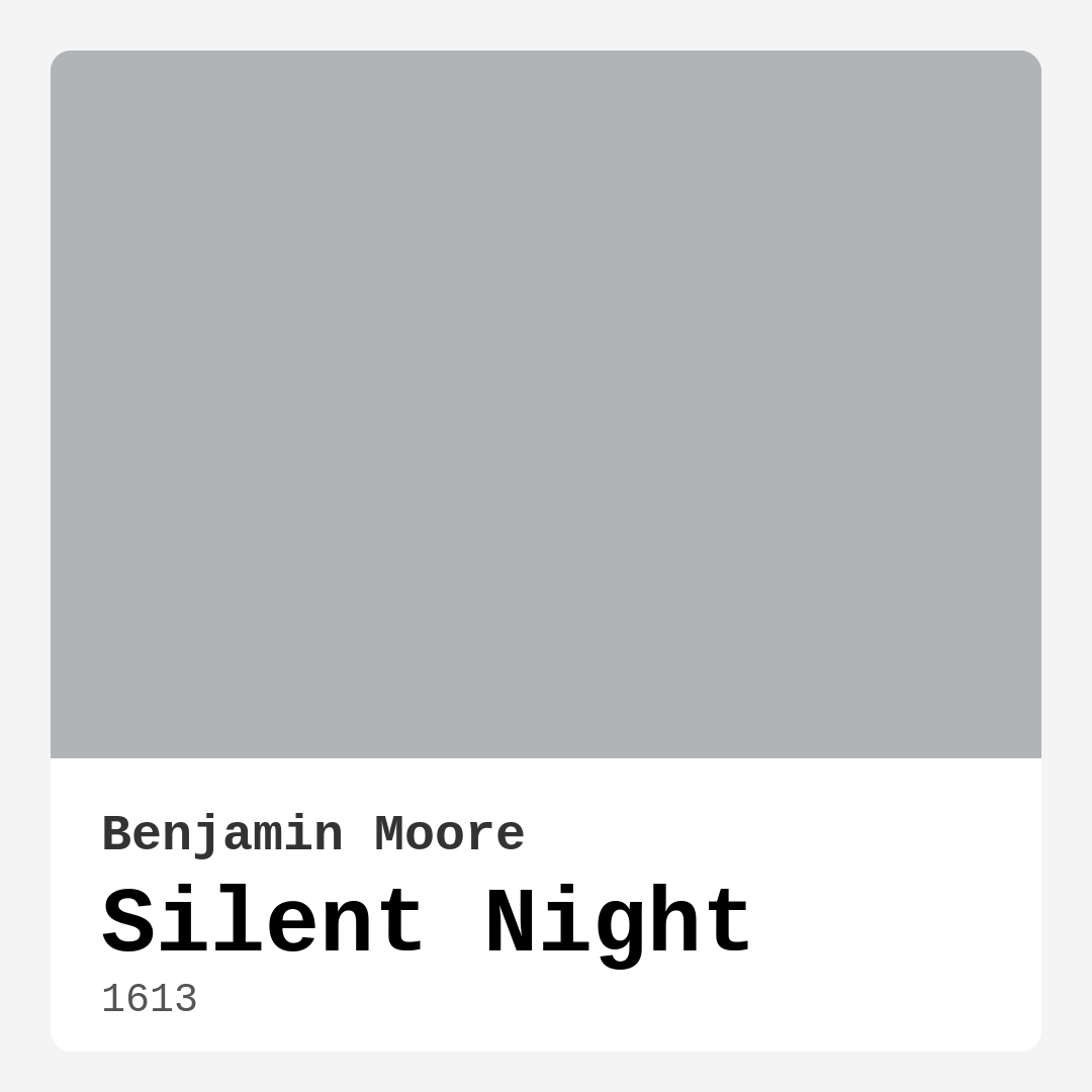
Color Preview & Key Details
| HEX Code | #B0B4B7 |
| RGB | 176, 180, 183 |
| LRV | 45.38% |
| Undertone | Blue |
| Finish Options | Eggshell, Flat, Matte, Satin |
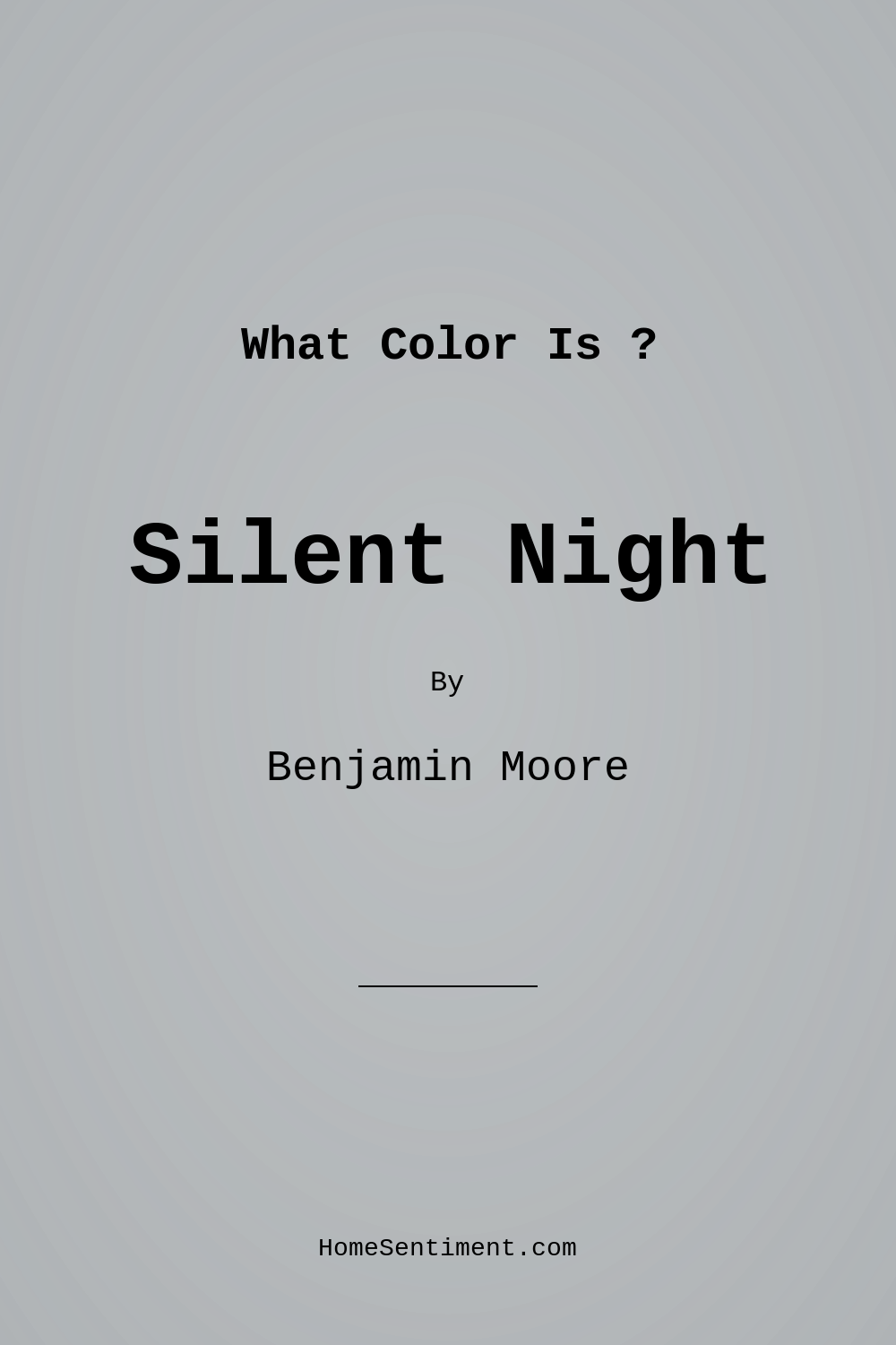
Imagine stepping into a room that feels like a gentle embrace, where the chaos of the outside world melts away. This isn’t just a dream; it can be your reality with the right paint color. Let’s talk about Silent Night, a captivating shade by Benjamin Moore that’s making waves in the world of home decor. This medium grey hue, with its serene and sophisticated vibe, is perfect for any space wanting to exude tranquility.
Silent Night (color code 1613) is more than just a color; it’s an experience. With its cool undertones and a Light Reflectance Value (LRV) of about 45.38%, it’s a versatile choice that reflects just the right amount of light. Imagine a living room bathed in this soft, calming grey, where natural light dances across the walls, creating a peaceful retreat. In the glow of evening lamps, it transforms into an inviting space, perfect for winding down after a long day.
One of the standout features of Silent Night is its adaptability. The subtle blue undertones emerge beautifully under varying lighting conditions. In bright daylight, the color feels airy and fresh, while in dimmer settings, it takes on a cozy, intimate charm. This duality makes it an excellent choice for rooms like bedrooms or home offices, where you want to create a relaxing atmosphere.
When considering Silent Night, think about the style of decor you’re aiming for. This paint color shines in modern, Scandinavian, and minimalist designs, but it’s also a fantastic fit for transitional and contemporary spaces. It pairs effortlessly with white trim, enhancing its elegance without overwhelming the room. Picture crisp white baseboards or crown molding contrasting with the cool grey, creating a clean, polished look that feels upscale yet approachable.
If you’re wondering where to use Silent Night, the answer is almost anywhere. It’s perfect for living rooms, bedrooms, nurseries, dining rooms, and even home offices. The calming nature of this hue makes it ideal for spaces where relaxation and focus are key. Imagine a nursery where your little one can drift off to sleep under the soothing influence of Silent Night, or a tranquil bedroom retreat that invites restful nights and peaceful mornings.
Now, let’s talk about application. One of the reasons homeowners love Silent Night is the ease of use. It’s beginner-friendly and applies smoothly whether you’re using a brush or a roller, making it ideal for DIY projects. With good coverage in just one to two coats, it’s touch-up friendly, so any nicks or scratches can be easily fixed without a hassle. Plus, Silent Night is washability-wise a dream. It’s wipeable, washable, and scrubbable, perfect for high-traffic areas where durability is essential.
You might be asking, can this color be used in high-traffic areas? Absolutely! Silent Night is durable enough for busy hallways or living rooms. Just choose a finish like eggshell or satin to ensure it holds up well over time while still looking fabulous.
Lighting, as with any paint color, plays a crucial role in how Silent Night will appear in your space. It’s best enjoyed in both natural and artificial light. During the day, it showcases its cool undertones beautifully, while at night, it transforms into a warm, welcoming retreat. For indoor lighting, consider soft white bulbs to enhance its calming effect. This attention to light will ensure you get the most out of this gorgeous color.
If you’re still unsure, think about how Silent Night interacts with other colors. It pairs beautifully with a range of shades, from soft whites to deeper blues and greens. Play with complementary shades like Benjamin Moore’s White Dove for trim, or even deeper hues for an accent wall. You could also explore lighter shades like 2133-60 or CSP-590 for a layered, monochromatic look that feels sophisticated and cohesive.
On the flip side, there are a few things to consider. In smaller rooms, Silent Night can appear darker, so ensure you have adequate lighting to keep the space feeling open and airy. Its subtle undertones might not suit everyone’s taste, but for those who appreciate a muted, balanced tone, it’s a gem.
It’s also helpful to know that Silent Night is classified as low VOC, making it an eco-friendly choice for your home. You can rest easy knowing you’re not only creating a beautiful space but also a healthier one.
As you contemplate your project, remember that Silent Night offers a unique blend of calmness and sophistication. Whether you’re looking to refresh a living area or create a serene bedroom, this paint color can help you achieve a harmonious environment.
So, what do you think? Are you ready to embrace the tranquility of Silent Night in your own home? With its versatility, ease of application, and stunning adaptability to light, it’s a choice that will elevate your space and bring a sense of peace to your everyday life. Let this serene shade guide you in your decor journey, and transform your house into a serene sanctuary that truly feels like home.
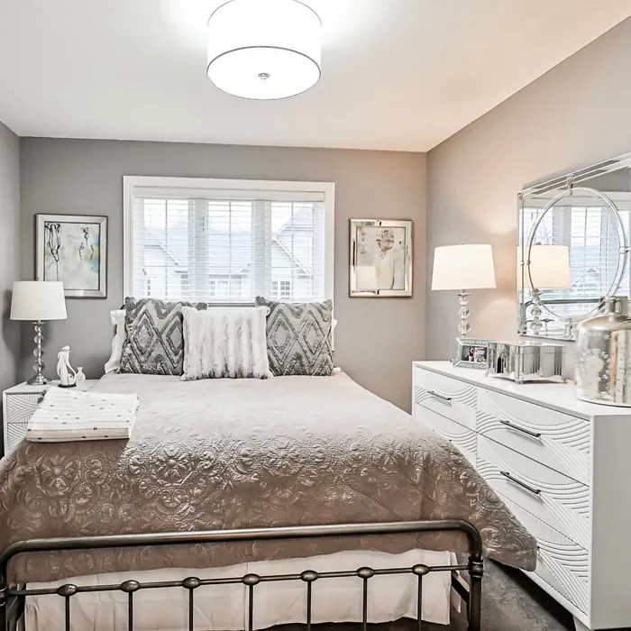
Real Room Photo of Silent Night 1613
Undertones of Silent Night ?
Silent Night carries a gentle blue undertone that becomes more pronounced in certain lighting conditions. This subtle hue adds depth and complexity to the color, allowing it to harmonize beautifully with a range of other shades, from soft whites to deeper blues and greens.
HEX value: #B0B4B7
RGB code: 176, 180, 183
Is Silent Night Cool or Warm?
This color is predominantly cool, with blue-gray tones that lend a refreshing quality to your space. It works especially well in areas where you want to promote relaxation and calmness, making it suitable for bedrooms and home offices.
Understanding Color Properties and Interior Design Tips
Hue refers to a specific position on the color wheel, measured in degrees from 0 to 360. Each degree represents a different pure color:
- 0° represents red
- 120° represents green
- 240° represents blue
Saturation describes the intensity or purity of a color and is expressed as a percentage:
- At 0%, the color appears completely desaturated—essentially a shade of gray
- At 100%, the color is at its most vivid and vibrant
Lightness indicates how light or dark a color is, also expressed as a percentage:
- 0% lightness results in black
- 100% lightness results in white
Using Warm Colors in Interior Design
Warm hues—such as reds, oranges, yellows, warm beiges, and greiges—are excellent choices for creating inviting and energetic spaces. These colors are particularly well-suited for:
- Kitchens, living rooms, and bathrooms, where warmth enhances comfort and sociability
- Large rooms, where warm tones can help reduce the sense of emptiness and make the space feel more intimate
For example:
- Warm beige shades provide a cozy, inviting atmosphere, ideal for living rooms, bedrooms, and hallways.
- Warm greige (a mix of beige and gray) offers the warmth of beige with the modern appeal of gray, making it a versatile backdrop for dining areas, bedrooms, and living spaces.
However, be mindful when using warm light tones in rooms with limited natural light. These shades may appear muted or even take on an unpleasant yellowish tint. To avoid a dull or flat appearance:
- Add depth by incorporating richer tones like deep greens, charcoal, or chocolate brown
- Use textured elements such as curtains, rugs, or cushions to bring dimension to the space
Pro Tip: Achieving Harmony with Warm and Cool Color Balance
To create a well-balanced and visually interesting interior, mix warm and cool tones strategically. This contrast adds depth and harmony to your design.
- If your walls feature warm hues, introduce cool-colored accents such as blue or green furniture, artwork, or accessories to create contrast.
- For a polished look, consider using a complementary color scheme, which pairs colors opposite each other on the color wheel (e.g., red with green, orange with blue).
This thoughtful mix not only enhances visual appeal but also creates a space that feels both dynamic and cohesive.
Light Temperature Affects on Silent Night
Natural Light
Natural daylight changes in color temperature as the sun moves across the sky. At sunrise and sunset, the light tends to have a warm, golden tone with a color temperature around 2000 Kelvin (K). As the day progresses and the sun rises higher, the light becomes cooler and more neutral. Around midday, especially when the sky is clear, natural light typically reaches its peak brightness and shifts to a cooler tone, ranging from 5500 to 6500 Kelvin. This midday light is close to what we perceive as pure white or daylight-balanced light.
These shifts in natural light can significantly influence how colors appear in a space, which is why designers often consider both the time of day and the orientation of windows when planning interior color schemes.
Artificial Light
When choosing artificial lighting, pay close attention to the color temperature, measured in Kelvin (K). This determines how warm or cool the light will appear. Lower temperatures, around 2700K, give off a warm, yellow glow often used in living rooms or bedrooms. Higher temperatures, above 5000K, create a cool, bluish light similar to daylight, commonly used in kitchens, offices, or task areas.
Use the slider to see how lighting temperature can affect the appearance of a surface or color throughout a space.


4800K
LRV of Silent Night
The Light Reflectance Value (LRV) of Silent Night is approximately 50, meaning it reflects a moderate amount of light. This makes it suitable for spaces where you want to achieve a balance between brightness and coziness.
Detailed Review of Silent Night
Additional Paint Characteristics
Ideal Rooms
Bedroom, Dining Room, Entryway, Home Office, Living Room, Nursery
Decor Styles
Contemporary, Minimalist, Modern, Scandinavian, Transitional
Coverage
Good (1–2 Coats), Touch-Up Friendly
Ease of Application
Beginner Friendly, Brush Smooth, Fast-Drying, Roller-Ready
Washability
Scrubbable, Washable, Wipeable
VOC Level
Low VOC, Ultra Low VOC
Best Use
Accent Wall, Furniture, Interior Walls
Room Suitability
Bedroom, Dining Room, Home Office, Living Room, Nursery
Tone Tag
Balanced, Cool, Muted
Finish Type
Eggshell, Matte, Satin
Paint Performance
Easy Touch-Up, High Coverage, Low Odor
Use Cases
Best for Low Light Rooms, Best for Small Spaces, Designer Favorite
Mood
Calm, Inviting, Restful
Trim Pairing
Complements Cool Trim, Pairs with White Dove, Works with Warm Trim
Silent Night offers a unique blend of calmness and sophistication, making it an excellent choice for various spaces in your home. Its cool undertones provide a refreshing backdrop that can easily complement both warm and cool accents. Whether you’re looking to create a restful bedroom or a serene living area, this paint color stands out as an inviting option.
What sets Silent Night apart is its adaptability. In bright light, it exudes a soft, airy feel, while in dimmer settings, it takes on a more intimate, cozy vibe. This duality allows you to play with the mood of a room simply through lighting. Additionally, it pairs exceptionally well with white trim or natural wood, enhancing its elegance without overpowering the overall aesthetic. For best results, consider applying it with a brush for detailed areas and a roller for larger spaces, ensuring even coverage.
Pros & Cons of 1613 Silent Night
Pros
Cons
Colors that go with Benjamin Moore Silent Night
FAQ on 1613 Silent Night
Can Silent Night be used in high-traffic areas?
Absolutely! Silent Night is durable and washable, making it suitable for high-traffic areas like hallways and living rooms. Just ensure you use a finish that can withstand wear, like eggshell or satin, to maintain its appearance over time.
What type of lighting works best with Silent Night?
This color works wonderfully in both natural and artificial light. In daylight, it showcases its cool undertones beautifully, while in the evening, it offers a warm, inviting atmosphere. Consider using soft white bulbs for indoor lighting to enhance its calming effect.
Comparisons Silent Night with other colors
Silent Night 1613 vs Repose Gray SW 7015
| Attribute | Silent Night 1613 | Repose Gray SW 7015 |
|---|---|---|
| Color Name | Silent Night 1613 | Repose Gray SW 7015 |
| Color | ||
| Hue | Grey | Grey |
| Brightness | Medium | Medium |
| RGB | 176, 180, 183 | 204, 201, 192 |
| LRV | 45.38% | 58% |
| Finish Type | Eggshell, Matte, Satin | Eggshell, Matte, Satin |
| Finish Options | Eggshell, Flat, Matte, Satin | Eggshell, Matte, Satin |
| Ideal Rooms | Bedroom, Dining Room, Entryway, Home Office, Living Room, Nursery | Bedroom, Dining Room, Hallway, Home Office, Living Room |
| Decor Styles | Contemporary, Minimalist, Modern, Scandinavian, Transitional | Contemporary, Farmhouse, Minimalist, Modern, Transitional |
| Coverage | Good (1–2 Coats), Touch-Up Friendly | Good (1–2 Coats), Touch-Up Friendly |
| Ease of Application | Beginner Friendly, Brush Smooth, Fast-Drying, Roller-Ready | Beginner Friendly, Brush Smooth, Fast-Drying, Roller-Ready |
| Washability | Scrubbable, Washable, Wipeable | Highly Washable, Washable |
| Room Suitability | Bedroom, Dining Room, Home Office, Living Room, Nursery | Bedroom, Dining Room, Hallway, Home Office, Living Room |
| Tone | Balanced, Cool, Muted | Muted, Neutral, Warm |
| Paint Performance | Easy Touch-Up, High Coverage, Low Odor | Low Odor, Quick Drying, Scuff Resistant |
Silent Night 1613 vs Light French Gray SW 0055
| Attribute | Silent Night 1613 | Light French Gray SW 0055 |
|---|---|---|
| Color Name | Silent Night 1613 | Light French Gray SW 0055 |
| Color | ||
| Hue | Grey | Grey |
| Brightness | Medium | Medium |
| RGB | 176, 180, 183 | 194, 192, 187 |
| LRV | 45.38% | 53% |
| Finish Type | Eggshell, Matte, Satin | Eggshell, Matte, Satin |
| Finish Options | Eggshell, Flat, Matte, Satin | Eggshell, Matte, Satin |
| Ideal Rooms | Bedroom, Dining Room, Entryway, Home Office, Living Room, Nursery | Bedroom, Dining Room, Home Office, Kitchen, Living Room |
| Decor Styles | Contemporary, Minimalist, Modern, Scandinavian, Transitional | Contemporary, Farmhouse, Modern, Scandinavian, Transitional |
| Coverage | Good (1–2 Coats), Touch-Up Friendly | Good (1–2 Coats), Touch-Up Friendly |
| Ease of Application | Beginner Friendly, Brush Smooth, Fast-Drying, Roller-Ready | Beginner Friendly, Brush Smooth, Roller-Ready |
| Washability | Scrubbable, Washable, Wipeable | Highly Washable, Washable |
| Room Suitability | Bedroom, Dining Room, Home Office, Living Room, Nursery | Bedroom, Dining Room, Home Office, Kitchen, Living Room |
| Tone | Balanced, Cool, Muted | Balanced, Muted, Neutral, Warm |
| Paint Performance | Easy Touch-Up, High Coverage, Low Odor | Easy Touch-Up, High Coverage, Low Odor |
Silent Night 1613 vs Wordly Gray SW 7043
| Attribute | Silent Night 1613 | Wordly Gray SW 7043 |
|---|---|---|
| Color Name | Silent Night 1613 | Wordly Gray SW 7043 |
| Color | ||
| Hue | Grey | Grey |
| Brightness | Medium | Medium |
| RGB | 176, 180, 183 | 206, 198, 187 |
| LRV | 45.38% | 58% |
| Finish Type | Eggshell, Matte, Satin | Eggshell, Satin |
| Finish Options | Eggshell, Flat, Matte, Satin | Eggshell, Flat, Satin |
| Ideal Rooms | Bedroom, Dining Room, Entryway, Home Office, Living Room, Nursery | Bedroom, Home Office, Kitchen, Living Room |
| Decor Styles | Contemporary, Minimalist, Modern, Scandinavian, Transitional | Minimalist, Modern, Scandi, Transitional |
| Coverage | Good (1–2 Coats), Touch-Up Friendly | Good (1–2 Coats) |
| Ease of Application | Beginner Friendly, Brush Smooth, Fast-Drying, Roller-Ready | Beginner Friendly, Brush Smooth, Fast-Drying, Roller-Ready |
| Washability | Scrubbable, Washable, Wipeable | Highly Washable, Washable |
| Room Suitability | Bedroom, Dining Room, Home Office, Living Room, Nursery | Bedroom, Dining Room, Home Office, Living Room |
| Tone | Balanced, Cool, Muted | Muted, Neutral, Warm |
| Paint Performance | Easy Touch-Up, High Coverage, Low Odor | Easy Touch-Up, Low Odor, Scuff Resistant |
Silent Night 1613 vs Illusive Green SW 9164
| Attribute | Silent Night 1613 | Illusive Green SW 9164 |
|---|---|---|
| Color Name | Silent Night 1613 | Illusive Green SW 9164 |
| Color | ||
| Hue | Grey | Grey |
| Brightness | Medium | Medium |
| RGB | 176, 180, 183 | 146, 148, 141 |
| LRV | 45.38% | 24% |
| Finish Type | Eggshell, Matte, Satin | Eggshell, Matte, Satin |
| Finish Options | Eggshell, Flat, Matte, Satin | Eggshell, Matte, Satin |
| Ideal Rooms | Bedroom, Dining Room, Entryway, Home Office, Living Room, Nursery | Bedroom, Dining Room, Home Office, Living Room, Nursery |
| Decor Styles | Contemporary, Minimalist, Modern, Scandinavian, Transitional | Coastal, Minimalist, Modern, Rustic, Scandinavian |
| Coverage | Good (1–2 Coats), Touch-Up Friendly | Good (1–2 Coats), Touch-Up Friendly |
| Ease of Application | Beginner Friendly, Brush Smooth, Fast-Drying, Roller-Ready | Beginner Friendly, Brush Smooth, Fast-Drying, Roller-Ready |
| Washability | Scrubbable, Washable, Wipeable | Highly Washable, Washable, Wipeable |
| Room Suitability | Bedroom, Dining Room, Home Office, Living Room, Nursery | Bedroom, Dining Room, Home Office, Living Room, Nursery |
| Tone | Balanced, Cool, Muted | Balanced, Earthy, Muted |
| Paint Performance | Easy Touch-Up, High Coverage, Low Odor | Easy Touch-Up, Low Odor, Quick Drying, Scuff Resistant |
Silent Night 1613 vs Fawn Brindle SW 7640
| Attribute | Silent Night 1613 | Fawn Brindle SW 7640 |
|---|---|---|
| Color Name | Silent Night 1613 | Fawn Brindle SW 7640 |
| Color | ||
| Hue | Grey | Grey |
| Brightness | Medium | Medium |
| RGB | 176, 180, 183 | 167, 160, 148 |
| LRV | 45.38% | 24% |
| Finish Type | Eggshell, Matte, Satin | Eggshell, Matte |
| Finish Options | Eggshell, Flat, Matte, Satin | Eggshell, Matte, Satin |
| Ideal Rooms | Bedroom, Dining Room, Entryway, Home Office, Living Room, Nursery | Bedroom, Dining Room, Hallway, Home Office, Living Room |
| Decor Styles | Contemporary, Minimalist, Modern, Scandinavian, Transitional | Bohemian, Minimalist, Modern Farmhouse, Transitional |
| Coverage | Good (1–2 Coats), Touch-Up Friendly | Good (1–2 Coats) |
| Ease of Application | Beginner Friendly, Brush Smooth, Fast-Drying, Roller-Ready | Brush Smooth, Fast-Drying, Roller-Ready |
| Washability | Scrubbable, Washable, Wipeable | Stain Resistant, Washable |
| Room Suitability | Bedroom, Dining Room, Home Office, Living Room, Nursery | Bedroom, Dining Room, Home Office, Living Room |
| Tone | Balanced, Cool, Muted | Earthy, Neutral, Warm |
| Paint Performance | Easy Touch-Up, High Coverage, Low Odor | Easy Touch-Up, Fade Resistant, Low Odor |
Silent Night 1613 vs Balanced Beige SW 7037
| Attribute | Silent Night 1613 | Balanced Beige SW 7037 |
|---|---|---|
| Color Name | Silent Night 1613 | Balanced Beige SW 7037 |
| Color | ||
| Hue | Grey | Grey |
| Brightness | Medium | Medium |
| RGB | 176, 180, 183 | 192, 178, 162 |
| LRV | 45.38% | 44% |
| Finish Type | Eggshell, Matte, Satin | Eggshell, Matte, Satin |
| Finish Options | Eggshell, Flat, Matte, Satin | Eggshell, Matte, Satin |
| Ideal Rooms | Bedroom, Dining Room, Entryway, Home Office, Living Room, Nursery | Bedroom, Dining Room, Home Office, Kitchen, Living Room |
| Decor Styles | Contemporary, Minimalist, Modern, Scandinavian, Transitional | Contemporary, Minimalist, Modern Farmhouse, Rustic, Transitional |
| Coverage | Good (1–2 Coats), Touch-Up Friendly | Good (1–2 Coats), Touch-Up Friendly |
| Ease of Application | Beginner Friendly, Brush Smooth, Fast-Drying, Roller-Ready | Beginner Friendly, Brush Smooth, Roller-Ready |
| Washability | Scrubbable, Washable, Wipeable | Washable, Wipeable |
| Room Suitability | Bedroom, Dining Room, Home Office, Living Room, Nursery | Bedroom, Dining Room, Hallway, Kitchen, Living Room |
| Tone | Balanced, Cool, Muted | Balanced, Earthy, Warm |
| Paint Performance | Easy Touch-Up, High Coverage, Low Odor | Easy Touch-Up, High Coverage, Low Odor |
Silent Night 1613 vs Mushroom SW 9587
| Attribute | Silent Night 1613 | Mushroom SW 9587 |
|---|---|---|
| Color Name | Silent Night 1613 | Mushroom SW 9587 |
| Color | ||
| Hue | Grey | Grey |
| Brightness | Medium | Medium |
| RGB | 176, 180, 183 | 208, 199, 183 |
| LRV | 45.38% | 24% |
| Finish Type | Eggshell, Matte, Satin | Eggshell, Satin |
| Finish Options | Eggshell, Flat, Matte, Satin | Eggshell, Flat, Matte, Satin |
| Ideal Rooms | Bedroom, Dining Room, Entryway, Home Office, Living Room, Nursery | Bedroom, Dining Room, Hallway, Home Office, Living Room |
| Decor Styles | Contemporary, Minimalist, Modern, Scandinavian, Transitional | Bohemian, Contemporary, Modern Farmhouse, Traditional |
| Coverage | Good (1–2 Coats), Touch-Up Friendly | Good (1–2 Coats) |
| Ease of Application | Beginner Friendly, Brush Smooth, Fast-Drying, Roller-Ready | Beginner Friendly, Brush Smooth, Roller-Ready |
| Washability | Scrubbable, Washable, Wipeable | Highly Washable, Washable |
| Room Suitability | Bedroom, Dining Room, Home Office, Living Room, Nursery | Bedroom, Dining Room, Home Office, Living Room |
| Tone | Balanced, Cool, Muted | Earthy, Neutral, Warm |
| Paint Performance | Easy Touch-Up, High Coverage, Low Odor | Easy Touch-Up, Long Lasting, Low Odor, Scuff Resistant |
Silent Night 1613 vs Silver Strand SW 7057
| Attribute | Silent Night 1613 | Silver Strand SW 7057 |
|---|---|---|
| Color Name | Silent Night 1613 | Silver Strand SW 7057 |
| Color | ||
| Hue | Grey | Grey |
| Brightness | Medium | Medium |
| RGB | 176, 180, 183 | 200, 203, 196 |
| LRV | 45.38% | 66% |
| Finish Type | Eggshell, Matte, Satin | Eggshell, Satin |
| Finish Options | Eggshell, Flat, Matte, Satin | Eggshell, Matte, Satin |
| Ideal Rooms | Bedroom, Dining Room, Entryway, Home Office, Living Room, Nursery | Bedroom, Dining Room, Hallway, Home Office, Living Room |
| Decor Styles | Contemporary, Minimalist, Modern, Scandinavian, Transitional | Coastal, Minimalist, Modern, Traditional, Transitional |
| Coverage | Good (1–2 Coats), Touch-Up Friendly | Good (1–2 Coats), Touch-Up Friendly |
| Ease of Application | Beginner Friendly, Brush Smooth, Fast-Drying, Roller-Ready | Beginner Friendly, Brush Smooth, Roller-Ready |
| Washability | Scrubbable, Washable, Wipeable | Highly Washable, Washable |
| Room Suitability | Bedroom, Dining Room, Home Office, Living Room, Nursery | Bathroom, Bedroom, Home Office, Kitchen, Living Room |
| Tone | Balanced, Cool, Muted | Balanced, Neutral, Warm |
| Paint Performance | Easy Touch-Up, High Coverage, Low Odor | Easy Touch-Up, High Coverage, Low Odor |
Silent Night 1613 vs Cadet SW 9143
| Attribute | Silent Night 1613 | Cadet SW 9143 |
|---|---|---|
| Color Name | Silent Night 1613 | Cadet SW 9143 |
| Color | ||
| Hue | Grey | Grey |
| Brightness | Medium | Medium |
| RGB | 176, 180, 183 | 145, 153, 156 |
| LRV | 45.38% | 12% |
| Finish Type | Eggshell, Matte, Satin | Eggshell, Matte, Satin |
| Finish Options | Eggshell, Flat, Matte, Satin | Eggshell, Matte, Satin |
| Ideal Rooms | Bedroom, Dining Room, Entryway, Home Office, Living Room, Nursery | Bathroom, Bedroom, Hallway, Home Office, Kitchen, Living Room |
| Decor Styles | Contemporary, Minimalist, Modern, Scandinavian, Transitional | Coastal, Industrial, Minimalist, Modern, Scandinavian |
| Coverage | Good (1–2 Coats), Touch-Up Friendly | Good (1–2 Coats), Touch-Up Friendly |
| Ease of Application | Beginner Friendly, Brush Smooth, Fast-Drying, Roller-Ready | Beginner Friendly, Brush Smooth, Roller-Ready |
| Washability | Scrubbable, Washable, Wipeable | Washable, Wipeable |
| Room Suitability | Bedroom, Dining Room, Home Office, Living Room, Nursery | Bathroom, Bedroom, Hallway, Home Office, Living Room |
| Tone | Balanced, Cool, Muted | Balanced, Cool, Muted |
| Paint Performance | Easy Touch-Up, High Coverage, Low Odor | Easy Touch-Up, High Coverage, Low Odor |
Silent Night 1613 vs Dovetail SW 7018
| Attribute | Silent Night 1613 | Dovetail SW 7018 |
|---|---|---|
| Color Name | Silent Night 1613 | Dovetail SW 7018 |
| Color | ||
| Hue | Grey | Grey |
| Brightness | Medium | Medium |
| RGB | 176, 180, 183 | 144, 138, 131 |
| LRV | 45.38% | 24% |
| Finish Type | Eggshell, Matte, Satin | Eggshell, Matte, Satin |
| Finish Options | Eggshell, Flat, Matte, Satin | Eggshell, Matte, Satin |
| Ideal Rooms | Bedroom, Dining Room, Entryway, Home Office, Living Room, Nursery | Bedroom, Dining Room, Hallway, Home Office, Living Room |
| Decor Styles | Contemporary, Minimalist, Modern, Scandinavian, Transitional | Minimalist, Modern Farmhouse, Rustic, Transitional |
| Coverage | Good (1–2 Coats), Touch-Up Friendly | Good (1–2 Coats), Touch-Up Friendly |
| Ease of Application | Beginner Friendly, Brush Smooth, Fast-Drying, Roller-Ready | Beginner Friendly, Brush Smooth, Roller-Ready |
| Washability | Scrubbable, Washable, Wipeable | Washable, Wipeable |
| Room Suitability | Bedroom, Dining Room, Home Office, Living Room, Nursery | Bedroom, Dining Room, Home Office, Living Room |
| Tone | Balanced, Cool, Muted | Earthy, Neutral, Warm |
| Paint Performance | Easy Touch-Up, High Coverage, Low Odor | Easy Touch-Up, Fade Resistant, Low Odor |
Official Page of Benjamin Moore Silent Night 1613