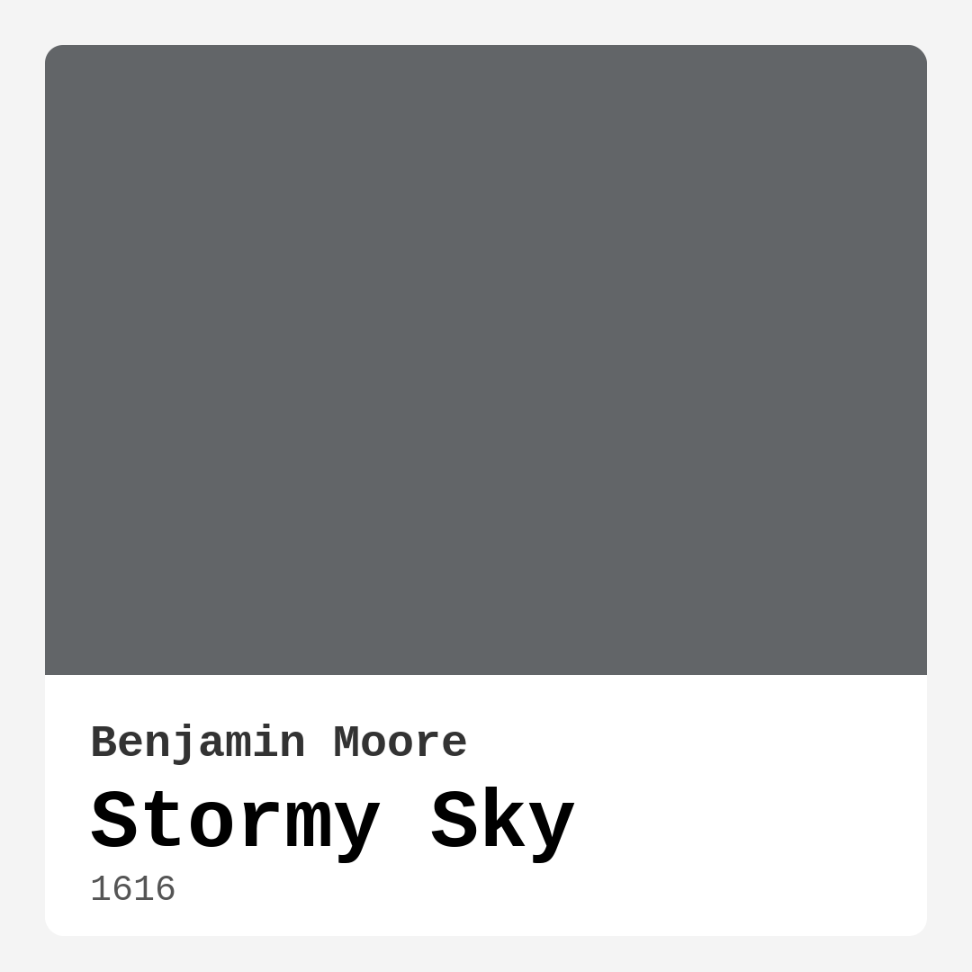
Color Preview & Key Details
| HEX Code | #626568 |
| RGB | 98, 101, 104 |
| LRV | 13.75% |
| Undertone | Blue |
| Finish Options | Eggshell, Matte, Satin |
If you’re searching for a paint color that effortlessly blends sophistication with versatility, Benjamin Moore’s Stormy Sky (1616) might just be your perfect match. This rich, cool gray with subtle blue undertones has a way of transforming spaces into serene yet dynamic retreats. Whether you’re refreshing a single wall or reimagining an entire room, Stormy Sky brings depth and elegance without overwhelming the senses. Let’s dive into what makes this color so special and how you can make it work in your home.
First, let’s talk about the undertones—because they’re everything. Stormy Sky leans into its blue base, giving it a modern, slightly moody vibe that feels both timeless and fresh. Unlike warmer grays that can pull beige or taupe, this one stays true to its cool roots, making it a fantastic choice for contemporary, industrial, or Scandinavian-inspired spaces. But here’s the thing: undertones can play tricks on you depending on your lighting. In a sun-drenched room, those blue hints come alive, creating an airy, almost ethereal feel. In lower light, it deepens into a more neutral gray, perfect for cozying up a bedroom or a dimly lit dining room. Always test a swatch in your space before committing—you’ll thank yourself later.
Now, let’s address the elephant in the room: will Stormy Sky make a small space feel cramped? The short answer is—it depends. With an LRV (Light Reflectance Value) of 13.75%, it’s on the darker side, meaning it absorbs more light than it reflects. If you’re working with a tight room, consider using it on just one accent wall paired with lighter furnishings or crisp white trim (Benjamin Moore’s White Dove is a dreamy combo). This keeps the drama without sacrificing openness. But if you’ve got a spacious, well-lit area? Go all in. The color’s adaptability means it’ll shine in open-concept living rooms or home offices where you want a touch of refined moodiness.
Application is where Stormy Sky really earns its stripes. Whether you’re a DIY newbie or a seasoned painter, you’ll appreciate how smoothly it goes on. The coverage is excellent—most projects only need one or two coats—and it’s touch-up friendly, so minor mishaps won’t haunt you. Stick to matte, eggshell, or satin finishes depending on your room’s traffic. Matte is gorgeous for low-touch areas like bedrooms, while eggshell or satin works better in spaces like living rooms where wipeability matters. Just a heads-up: if you’re using it on high-traffic surfaces like cabinetry or doors, keep a cloth handy for fingerprints, as darker shades tend to show smudges more easily.
When it comes to pairing, Stormy Sky is a team player. Its cool undertones harmonize beautifully with warm woods, crisp whites, and even bold accent colors. For a balanced look, try it with complementary shades like soft oranges or taupes (think throw pillows or artwork). If you’re after a monochromatic scheme, layer it with lighter grays like Gray Owl or deeper tones from the same family for a cohesive, designer-worthy effect. And don’t forget trim—clean white trim keeps things sharp, while natural wood trim adds warmth and contrast.
Wondering how it stacks up against other grays? Stormy Sky stands out for its versatility. Unlike some grays that can feel flat or overly trendy, this one has just enough complexity to keep it interesting. It’s darker than Mindful Gray but shares that same chameleon-like quality, shifting with the light to keep your space feeling dynamic. Plus, its low VOC formula means you can breathe easy during and after your project—no harsh fumes, just beautiful results.
So, who’s this color really for? If you love the idea of a room that feels calm yet sophisticated, restful but never boring, Stormy Sky is worth a closer look. It’s a designer favorite for a reason—it works in modern farmhouses, urban lofts, and everything in between. Picture it in a bedroom with linen bedding and brass accents, or a home office paired with a sleek black desk and greenery for a touch of life. Even a dining room wrapped in this hue feels instantly more intimate and inviting.
At the end of the day, paint is personal. But if you’re drawn to colors that balance drama with versatility, Stormy Sky might just be your next obsession. Grab a sample, paint a big swatch, and live with it for a few days. Watch how it changes with the light, how it plays with your furniture, and how it makes you feel. Because the best colors aren’t just seen—they’re experienced. And this one? It’s ready to transform your space into something truly special.

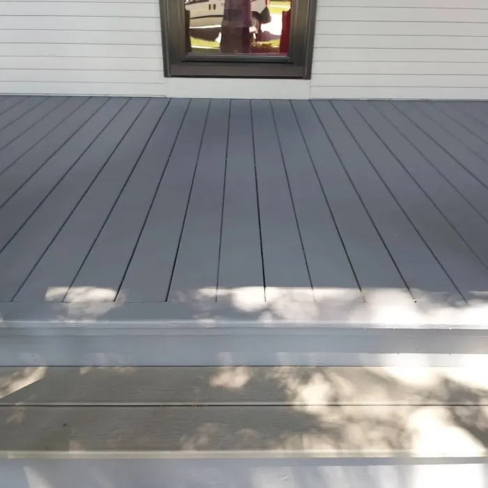
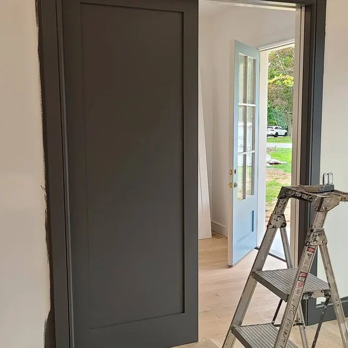
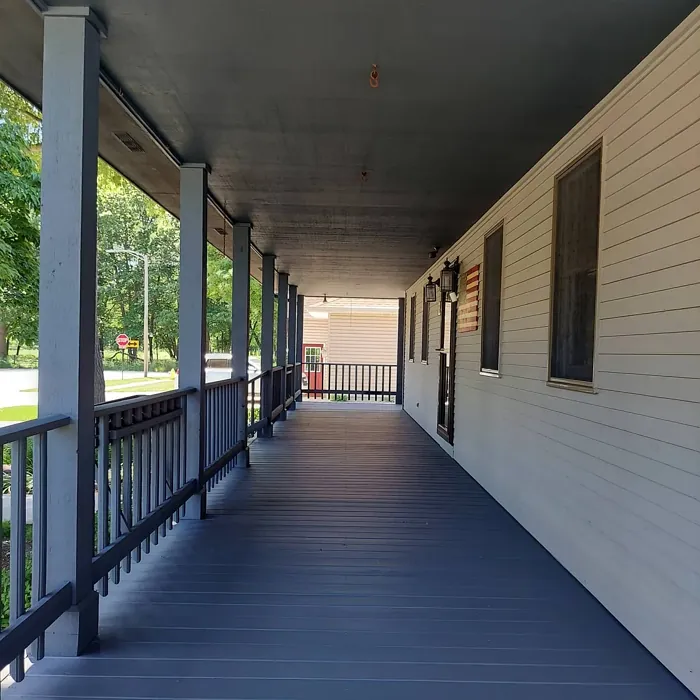
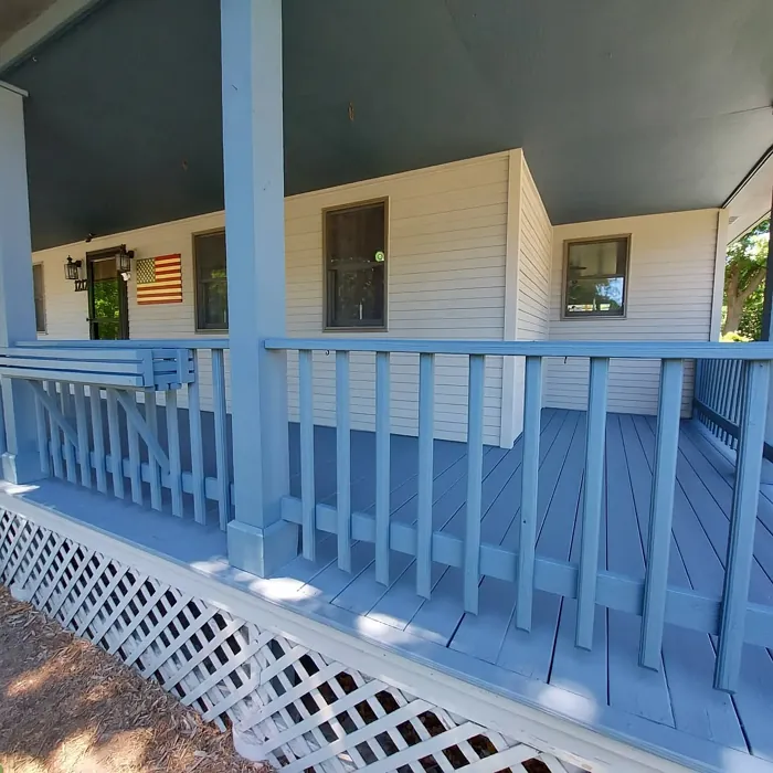
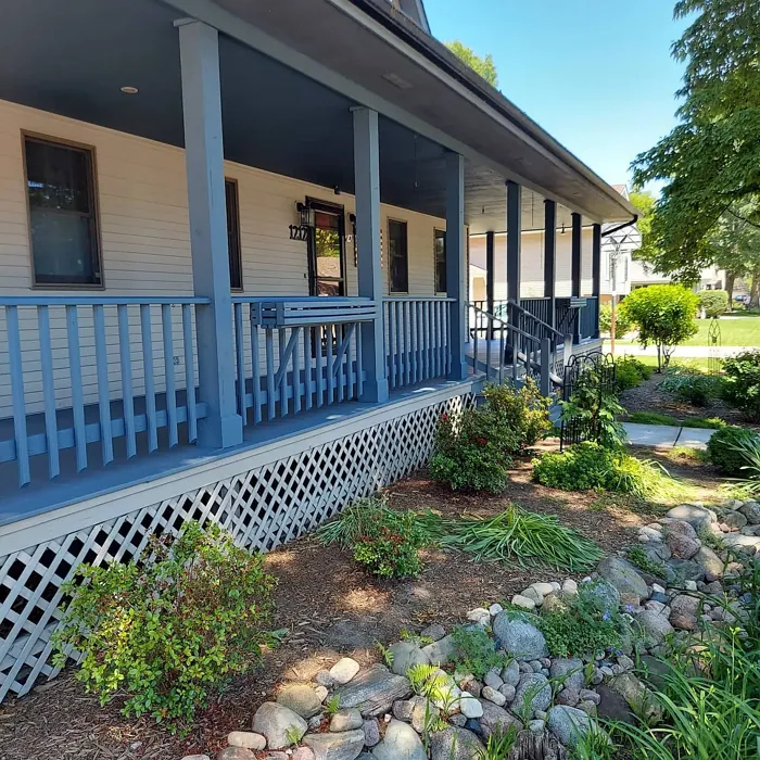
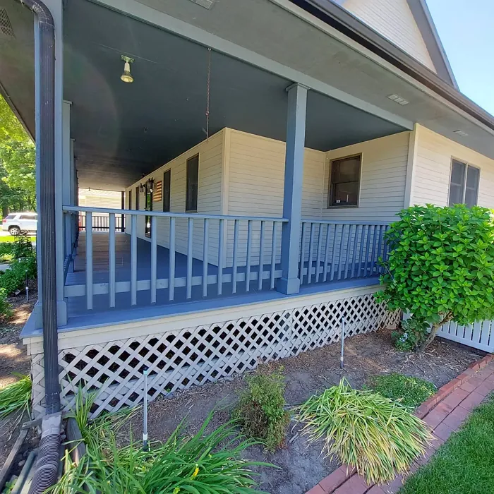
Real Room Photo of Stormy Sky 1616

Undertones of Stormy Sky ?
The undertones of Stormy Sky are a key aspect of its character, leaning towards Blue. These subtle underlying hues are what give the color its depth and complexity. For example, a gray with a blue undertone will feel cooler and more modern, while one with a brown undertone will feel warmer and more traditional. It’s essential to test this paint in your home and observe it next to your existing furniture, flooring, and decor to see how these undertones interact and reveal themselves throughout the day.
HEX value: #626568
RGB code: 98, 101, 104
Is Stormy Sky Cool or Warm?
Stormy Sky leans cool, making it an excellent choice for those looking to incorporate a modern touch in their interiors. Its coolness can balance warmer tones in your decor, allowing for a harmonious blend of colors that feels both fresh and inviting.
Understanding Color Properties and Interior Design Tips
Hue refers to a specific position on the color wheel, measured in degrees from 0 to 360. Each degree represents a different pure color:
- 0° represents red
- 120° represents green
- 240° represents blue
Saturation describes the intensity or purity of a color and is expressed as a percentage:
- At 0%, the color appears completely desaturated—essentially a shade of gray
- At 100%, the color is at its most vivid and vibrant
Lightness indicates how light or dark a color is, also expressed as a percentage:
- 0% lightness results in black
- 100% lightness results in white
Using Warm Colors in Interior Design
Warm hues—such as reds, oranges, yellows, warm beiges, and greiges—are excellent choices for creating inviting and energetic spaces. These colors are particularly well-suited for:
- Kitchens, living rooms, and bathrooms, where warmth enhances comfort and sociability
- Large rooms, where warm tones can help reduce the sense of emptiness and make the space feel more intimate
For example:
- Warm beige shades provide a cozy, inviting atmosphere, ideal for living rooms, bedrooms, and hallways.
- Warm greige (a mix of beige and gray) offers the warmth of beige with the modern appeal of gray, making it a versatile backdrop for dining areas, bedrooms, and living spaces.
However, be mindful when using warm light tones in rooms with limited natural light. These shades may appear muted or even take on an unpleasant yellowish tint. To avoid a dull or flat appearance:
- Add depth by incorporating richer tones like deep greens, charcoal, or chocolate brown
- Use textured elements such as curtains, rugs, or cushions to bring dimension to the space
Pro Tip: Achieving Harmony with Warm and Cool Color Balance
To create a well-balanced and visually interesting interior, mix warm and cool tones strategically. This contrast adds depth and harmony to your design.
- If your walls feature warm hues, introduce cool-colored accents such as blue or green furniture, artwork, or accessories to create contrast.
- For a polished look, consider using a complementary color scheme, which pairs colors opposite each other on the color wheel (e.g., red with green, orange with blue).
This thoughtful mix not only enhances visual appeal but also creates a space that feels both dynamic and cohesive.
Light Temperature Affects on Stormy Sky
Natural Light
Natural daylight changes in color temperature as the sun moves across the sky. At sunrise and sunset, the light tends to have a warm, golden tone with a color temperature around 2000 Kelvin (K). As the day progresses and the sun rises higher, the light becomes cooler and more neutral. Around midday, especially when the sky is clear, natural light typically reaches its peak brightness and shifts to a cooler tone, ranging from 5500 to 6500 Kelvin. This midday light is close to what we perceive as pure white or daylight-balanced light.
These shifts in natural light can significantly influence how colors appear in a space, which is why designers often consider both the time of day and the orientation of windows when planning interior color schemes.
Artificial Light
When choosing artificial lighting, pay close attention to the color temperature, measured in Kelvin (K). This determines how warm or cool the light will appear. Lower temperatures, around 2700K, give off a warm, yellow glow often used in living rooms or bedrooms. Higher temperatures, above 5000K, create a cool, bluish light similar to daylight, commonly used in kitchens, offices, or task areas.
Use the slider to see how lighting temperature can affect the appearance of a surface or color throughout a space.


4800K
LRV of Stormy Sky
The Light Reflectance Value (LRV) of Stormy Sky is 13.75%, which places it in the Medium Dark category. This means it reflects very little light. Understanding a paint’s LRV is crucial for predicting how it will look in your space. A higher LRV indicates a lighter color that reflects more light, making rooms feel larger and brighter. A lower LRV signifies a darker color that absorbs more light, creating a cozier, more intimate atmosphere. Always consider the natural and artificial lighting in your room when selecting a paint color based on its LRV.
Detailed Review of Stormy Sky
Additional Paint Characteristics
Ideal Rooms
Bedroom, Dining Room, Home Office, Living Room
Decor Styles
Contemporary, Industrial, Modern, Scandinavian
Coverage
Good (1–2 Coats), Touch-Up Friendly
Ease of Application
Beginner Friendly, Brush Smooth, Roller-Ready
Washability
Scrubbable, Washable, Wipeable
VOC Level
Low VOC, Ultra Low VOC
Best Use
Accent Wall, Furniture, Interior Walls
Room Suitability
Bedroom, Dining Room, Home Office, Living Room
Tone Tag
Balanced, Cool, Muted
Finish Type
Eggshell, Matte, Satin
Paint Performance
Easy Touch-Up, High Coverage, Low Odor
Use Cases
Best for Modern Farmhouse, Best for Open Concept, Designer Favorite
Mood
Calm, Restful, Sophisticated
Trim Pairing
Complements Cool Trim, Good with Wood Trim, Pairs with White Dove
Applying Stormy Sky is a delight for both novice and experienced DIYers. Its smooth consistency glides on effortlessly, reducing the likelihood of streaks and ensuring an even finish. The color performs well in various lighting conditions, shifting subtly from a warm gray to a cooler tone, which adds dimension to any room. Users often appreciate its versatility, seamlessly fitting into both bold and minimalist spaces alike. Plus, it boasts good coverage, typically requiring just one or two coats for a flawless appearance. Whether you’re transforming a single accent wall or refreshing an entire room, Stormy Sky delivers a sophisticated touch that elevates your home decor.
Pros & Cons of 1616 Stormy Sky
Pros
Cons
Colors that go with Benjamin Moore Stormy Sky
FAQ on 1616 Stormy Sky
Is Stormy Sky suitable for small rooms?
Yes, Stormy Sky can work well in small rooms, but keep in mind that it may appear darker due to limited light. To counter this, pair it with lighter furnishings or accents to create balance. Using it on one accent wall can also help maintain a sense of space while still providing that chic, moody vibe.
How does Stormy Sky compare to other gray paints?
Compared to other gray paints, Stormy Sky stands out for its unique blue undertones, which can provide a cooler, more sophisticated feel. While some grays lean towards a warmer beige or taupe, Stormy Sky maintains a true gray look, making it versatile across various decor styles without feeling overly trendy.
Comparisons Stormy Sky with other colors
Stormy Sky 1616 vs Night Owl SW 7061
| Attribute | Stormy Sky 1616 | Night Owl SW 7061 |
|---|---|---|
| Color Name | Stormy Sky 1616 | Night Owl SW 7061 |
| Color | ||
| Hue | Grey | Grey |
| Brightness | Dark | Dark |
| RGB | 98, 101, 104 | 99, 101, 95 |
| LRV | 13.75% | 24% |
| Finish Type | Eggshell, Matte, Satin | Eggshell, Matte, Satin |
| Finish Options | Eggshell, Matte, Satin | Eggshell, Matte, Satin |
| Ideal Rooms | Bedroom, Dining Room, Home Office, Living Room | Bedroom, Dining Room, Hallway, Home Office, Living Room |
| Decor Styles | Contemporary, Industrial, Modern, Scandinavian | Industrial, Minimalist, Modern, Rustic, Scandinavian |
| Coverage | Good (1–2 Coats), Touch-Up Friendly | Good (1–2 Coats), Touch-Up Friendly |
| Ease of Application | Beginner Friendly, Brush Smooth, Roller-Ready | Beginner Friendly, Brush Smooth, Fast-Drying, Roller-Ready |
| Washability | Scrubbable, Washable, Wipeable | Scrubbable, Washable |
| Room Suitability | Bedroom, Dining Room, Home Office, Living Room | Bedroom, Dining Room, Home Office, Living Room |
| Tone | Balanced, Cool, Muted | Balanced, Deep, Earthy, Muted |
| Paint Performance | Easy Touch-Up, High Coverage, Low Odor | Easy Touch-Up, Fade Resistant, High Coverage, Low Odor |
Stormy Sky 1616 vs Urbane Bronze SW 7048
| Attribute | Stormy Sky 1616 | Urbane Bronze SW 7048 |
|---|---|---|
| Color Name | Stormy Sky 1616 | Urbane Bronze SW 7048 |
| Color | ||
| Hue | Grey | Grey |
| Brightness | Dark | Dark |
| RGB | 98, 101, 104 | 84, 80, 74 |
| LRV | 13.75% | 20% |
| Finish Type | Eggshell, Matte, Satin | Eggshell, Matte, Satin |
| Finish Options | Eggshell, Matte, Satin | Eggshell, Matte, Satin |
| Ideal Rooms | Bedroom, Dining Room, Home Office, Living Room | Bedroom, Dining Room, Home Office, Living Room |
| Decor Styles | Contemporary, Industrial, Modern, Scandinavian | Contemporary, Industrial, Modern, Rustic, Transitional |
| Coverage | Good (1–2 Coats), Touch-Up Friendly | Good (1–2 Coats) |
| Ease of Application | Beginner Friendly, Brush Smooth, Roller-Ready | Beginner Friendly, Brush Smooth, Roller-Ready |
| Washability | Scrubbable, Washable, Wipeable | Highly Washable, Washable |
| Room Suitability | Bedroom, Dining Room, Home Office, Living Room | Bedroom, Dining Room, Home Office, Living Room |
| Tone | Balanced, Cool, Muted | Deep, Earthy, Warm |
| Paint Performance | Easy Touch-Up, High Coverage, Low Odor | Easy Touch-Up, Fade Resistant, High Coverage, Low Odor |
Stormy Sky 1616 vs Succulent SW 9650
| Attribute | Stormy Sky 1616 | Succulent SW 9650 |
|---|---|---|
| Color Name | Stormy Sky 1616 | Succulent SW 9650 |
| Color | ||
| Hue | Grey | Grey |
| Brightness | Dark | Dark |
| RGB | 98, 101, 104 | 97, 108, 100 |
| LRV | 13.75% | 30% |
| Finish Type | Eggshell, Matte, Satin | Eggshell, Matte, Satin |
| Finish Options | Eggshell, Matte, Satin | Eggshell, Matte, Satin |
| Ideal Rooms | Bedroom, Dining Room, Home Office, Living Room | Bathroom, Bedroom, Dining Room, Entryway, Kitchen, Living Room |
| Decor Styles | Contemporary, Industrial, Modern, Scandinavian | Bohemian, Contemporary, Eclectic, Minimalist, Modern Farmhouse |
| Coverage | Good (1–2 Coats), Touch-Up Friendly | Good (1–2 Coats), Touch-Up Friendly |
| Ease of Application | Beginner Friendly, Brush Smooth, Roller-Ready | Beginner Friendly, Brush Smooth, Roller-Ready |
| Washability | Scrubbable, Washable, Wipeable | Highly Washable, Washable |
| Room Suitability | Bedroom, Dining Room, Home Office, Living Room | Bathroom, Bedroom, Dining Room, Kitchen, Living Room |
| Tone | Balanced, Cool, Muted | Cool, Earthy, Muted |
| Paint Performance | Easy Touch-Up, High Coverage, Low Odor | Easy Touch-Up, Low Odor, Quick Drying, Scuff Resistant |
Stormy Sky 1616 vs Grizzle Gray SW 7068
| Attribute | Stormy Sky 1616 | Grizzle Gray SW 7068 |
|---|---|---|
| Color Name | Stormy Sky 1616 | Grizzle Gray SW 7068 |
| Color | ||
| Hue | Grey | Grey |
| Brightness | Dark | Dark |
| RGB | 98, 101, 104 | 99, 101, 98 |
| LRV | 13.75% | 24% |
| Finish Type | Eggshell, Matte, Satin | Eggshell, Satin |
| Finish Options | Eggshell, Matte, Satin | Eggshell, Matte, Satin |
| Ideal Rooms | Bedroom, Dining Room, Home Office, Living Room | Bedroom, Dining Room, Home Office, Living Room |
| Decor Styles | Contemporary, Industrial, Modern, Scandinavian | Industrial, Modern, Rustic, Scandinavian |
| Coverage | Good (1–2 Coats), Touch-Up Friendly | Good (1–2 Coats), Touch-Up Friendly |
| Ease of Application | Beginner Friendly, Brush Smooth, Roller-Ready | Beginner Friendly, Brush Smooth, Roller-Ready |
| Washability | Scrubbable, Washable, Wipeable | Washable, Wipeable |
| Room Suitability | Bedroom, Dining Room, Home Office, Living Room | Bedroom, Dining Room, Home Office, Living Room |
| Tone | Balanced, Cool, Muted | Balanced, Cool, Muted |
| Paint Performance | Easy Touch-Up, High Coverage, Low Odor | Easy Touch-Up, High Coverage, Low Odor |
Stormy Sky 1616 vs Iron Ore SW 7069
| Attribute | Stormy Sky 1616 | Iron Ore SW 7069 |
|---|---|---|
| Color Name | Stormy Sky 1616 | Iron Ore SW 7069 |
| Color | ||
| Hue | Grey | Grey |
| Brightness | Dark | Dark |
| RGB | 98, 101, 104 | 67, 67, 65 |
| LRV | 13.75% | 6% |
| Finish Type | Eggshell, Matte, Satin | Eggshell, Matte, Satin |
| Finish Options | Eggshell, Matte, Satin | Eggshell, Matte, Satin |
| Ideal Rooms | Bedroom, Dining Room, Home Office, Living Room | Bedroom, Dining Room, Entryway, Home Office, Living Room |
| Decor Styles | Contemporary, Industrial, Modern, Scandinavian | Contemporary, Industrial, Minimalist, Modern, Rustic |
| Coverage | Good (1–2 Coats), Touch-Up Friendly | Good (1–2 Coats), High Hide |
| Ease of Application | Beginner Friendly, Brush Smooth, Roller-Ready | Brush Smooth, Fast-Drying, Roller-Ready |
| Washability | Scrubbable, Washable, Wipeable | Highly Washable, Washable |
| Room Suitability | Bedroom, Dining Room, Home Office, Living Room | Bedroom, Dining Room, Entryway, Home Office, Living Room |
| Tone | Balanced, Cool, Muted | Balanced, Deep, Muted, Warm |
| Paint Performance | Easy Touch-Up, High Coverage, Low Odor | Easy Touch-Up, High Coverage, Low Odor |
Stormy Sky 1616 vs Peppercorn SW 7674
| Attribute | Stormy Sky 1616 | Peppercorn SW 7674 |
|---|---|---|
| Color Name | Stormy Sky 1616 | Peppercorn SW 7674 |
| Color | ||
| Hue | Grey | Grey |
| Brightness | Dark | Dark |
| RGB | 98, 101, 104 | 88, 88, 88 |
| LRV | 13.75% | 10% |
| Finish Type | Eggshell, Matte, Satin | Eggshell, Matte, Satin |
| Finish Options | Eggshell, Matte, Satin | Eggshell, Matte, Satin |
| Ideal Rooms | Bedroom, Dining Room, Home Office, Living Room | Bedroom, Dining Room, Home Office, Living Room |
| Decor Styles | Contemporary, Industrial, Modern, Scandinavian | Contemporary, Industrial, Minimalist, Modern |
| Coverage | Good (1–2 Coats), Touch-Up Friendly | Good (1–2 Coats), Touch-Up Friendly |
| Ease of Application | Beginner Friendly, Brush Smooth, Roller-Ready | Beginner Friendly, Brush Smooth, Roller-Ready |
| Washability | Scrubbable, Washable, Wipeable | Highly Washable, Washable |
| Room Suitability | Bedroom, Dining Room, Home Office, Living Room | Bedroom, Dining Room, Home Office, Living Room |
| Tone | Balanced, Cool, Muted | Balanced, Deep, Moody, Neutral |
| Paint Performance | Easy Touch-Up, High Coverage, Low Odor | Easy Touch-Up, Low Odor, Quick Drying, Scuff Resistant |
Stormy Sky 1616 vs Slate Tile SW 7624
| Attribute | Stormy Sky 1616 | Slate Tile SW 7624 |
|---|---|---|
| Color Name | Stormy Sky 1616 | Slate Tile SW 7624 |
| Color | ||
| Hue | Grey | Grey |
| Brightness | Dark | Dark |
| RGB | 98, 101, 104 | 96, 110, 116 |
| LRV | 13.75% | 15% |
| Finish Type | Eggshell, Matte, Satin | Eggshell, Matte, Satin |
| Finish Options | Eggshell, Matte, Satin | Eggshell, Matte, Satin |
| Ideal Rooms | Bedroom, Dining Room, Home Office, Living Room | Bathroom, Bedroom, Home Office, Kitchen, Living Room |
| Decor Styles | Contemporary, Industrial, Modern, Scandinavian | Industrial, Minimalist, Modern, Rustic |
| Coverage | Good (1–2 Coats), Touch-Up Friendly | Good (1–2 Coats) |
| Ease of Application | Beginner Friendly, Brush Smooth, Roller-Ready | Beginner Friendly, Brush Smooth, Fast-Drying, Roller-Ready |
| Washability | Scrubbable, Washable, Wipeable | Scrubbable, Washable |
| Room Suitability | Bedroom, Dining Room, Home Office, Living Room | Bathroom, Bedroom, Kitchen, Living Room |
| Tone | Balanced, Cool, Muted | Balanced, Cool, Muted |
| Paint Performance | Easy Touch-Up, High Coverage, Low Odor | Easy Touch-Up, High Coverage, Low Odor, Quick Drying |
Stormy Sky 1616 vs Blustery Sky SW 9140
| Attribute | Stormy Sky 1616 | Blustery Sky SW 9140 |
|---|---|---|
| Color Name | Stormy Sky 1616 | Blustery Sky SW 9140 |
| Color | ||
| Hue | Grey | Grey |
| Brightness | Dark | Dark |
| RGB | 98, 101, 104 | 111, 132, 140 |
| LRV | 13.75% | 48% |
| Finish Type | Eggshell, Matte, Satin | Eggshell, Matte |
| Finish Options | Eggshell, Matte, Satin | Eggshell, Matte, Satin |
| Ideal Rooms | Bedroom, Dining Room, Home Office, Living Room | Bedroom, Dining Room, Home Office, Living Room, Nursery |
| Decor Styles | Contemporary, Industrial, Modern, Scandinavian | Coastal, Modern Farmhouse, Scandinavian, Transitional |
| Coverage | Good (1–2 Coats), Touch-Up Friendly | Good (1–2 Coats), Touch-Up Friendly |
| Ease of Application | Beginner Friendly, Brush Smooth, Roller-Ready | Beginner Friendly, Fast-Drying, Low Splatter, Roller-Ready |
| Washability | Scrubbable, Washable, Wipeable | Washable, Wipeable |
| Room Suitability | Bedroom, Dining Room, Home Office, Living Room | Bedroom, Home Office, Living Room, Nursery |
| Tone | Balanced, Cool, Muted | Balanced, Cool, Muted |
| Paint Performance | Easy Touch-Up, High Coverage, Low Odor | Easy Touch-Up, Fade Resistant, Low Odor, Quick Drying |
Stormy Sky 1616 vs Gauntlet Gray SW 7019
| Attribute | Stormy Sky 1616 | Gauntlet Gray SW 7019 |
|---|---|---|
| Color Name | Stormy Sky 1616 | Gauntlet Gray SW 7019 |
| Color | ||
| Hue | Grey | Grey |
| Brightness | Dark | Dark |
| RGB | 98, 101, 104 | 120, 115, 110 |
| LRV | 13.75% | 24% |
| Finish Type | Eggshell, Matte, Satin | Eggshell, Matte, Satin |
| Finish Options | Eggshell, Matte, Satin | Eggshell, Matte, Satin |
| Ideal Rooms | Bedroom, Dining Room, Home Office, Living Room | Bedroom, Dining Room, Hallway, Home Office, Living Room |
| Decor Styles | Contemporary, Industrial, Modern, Scandinavian | Industrial, Modern, Rustic, Transitional |
| Coverage | Good (1–2 Coats), Touch-Up Friendly | Good (1–2 Coats), Touch-Up Friendly |
| Ease of Application | Beginner Friendly, Brush Smooth, Roller-Ready | Beginner Friendly, Brush Smooth, Roller-Ready |
| Washability | Scrubbable, Washable, Wipeable | Scrubbable, Washable |
| Room Suitability | Bedroom, Dining Room, Home Office, Living Room | Bedroom, Dining Room, Home Office, Living Room |
| Tone | Balanced, Cool, Muted | Dusty, Earthy, Muted, Warm |
| Paint Performance | Easy Touch-Up, High Coverage, Low Odor | Easy Touch-Up, High Coverage, Low Odor |
Stormy Sky 1616 vs Cast Iron SW 6202
| Attribute | Stormy Sky 1616 | Cast Iron SW 6202 |
|---|---|---|
| Color Name | Stormy Sky 1616 | Cast Iron SW 6202 |
| Color | ||
| Hue | Grey | Grey |
| Brightness | Dark | Dark |
| RGB | 98, 101, 104 | 100, 100, 90 |
| LRV | 13.75% | 6% |
| Finish Type | Eggshell, Matte, Satin | Eggshell, Matte, Satin |
| Finish Options | Eggshell, Matte, Satin | Eggshell, Matte, Satin |
| Ideal Rooms | Bedroom, Dining Room, Home Office, Living Room | Bedroom, Dining Room, Hallway, Home Office, Kitchen, Living Room |
| Decor Styles | Contemporary, Industrial, Modern, Scandinavian | Contemporary, Farmhouse, Industrial, Minimalist, Modern |
| Coverage | Good (1–2 Coats), Touch-Up Friendly | Good (1–2 Coats), High Hide, Touch-Up Friendly |
| Ease of Application | Beginner Friendly, Brush Smooth, Roller-Ready | Beginner Friendly, Brush Smooth, Fast-Drying, Roller-Ready |
| Washability | Scrubbable, Washable, Wipeable | Highly Washable, Washable, Wipeable |
| Room Suitability | Bedroom, Dining Room, Home Office, Living Room | Bedroom, Dining Room, Home Office, Kitchen, Living Room |
| Tone | Balanced, Cool, Muted | Balanced, Deep, Dusty, Earthy, Warm |
| Paint Performance | Easy Touch-Up, High Coverage, Low Odor | Easy Touch-Up, High Coverage, Low Odor, Stain Resistant |
Official Page of Benjamin Moore Stormy Sky 1616