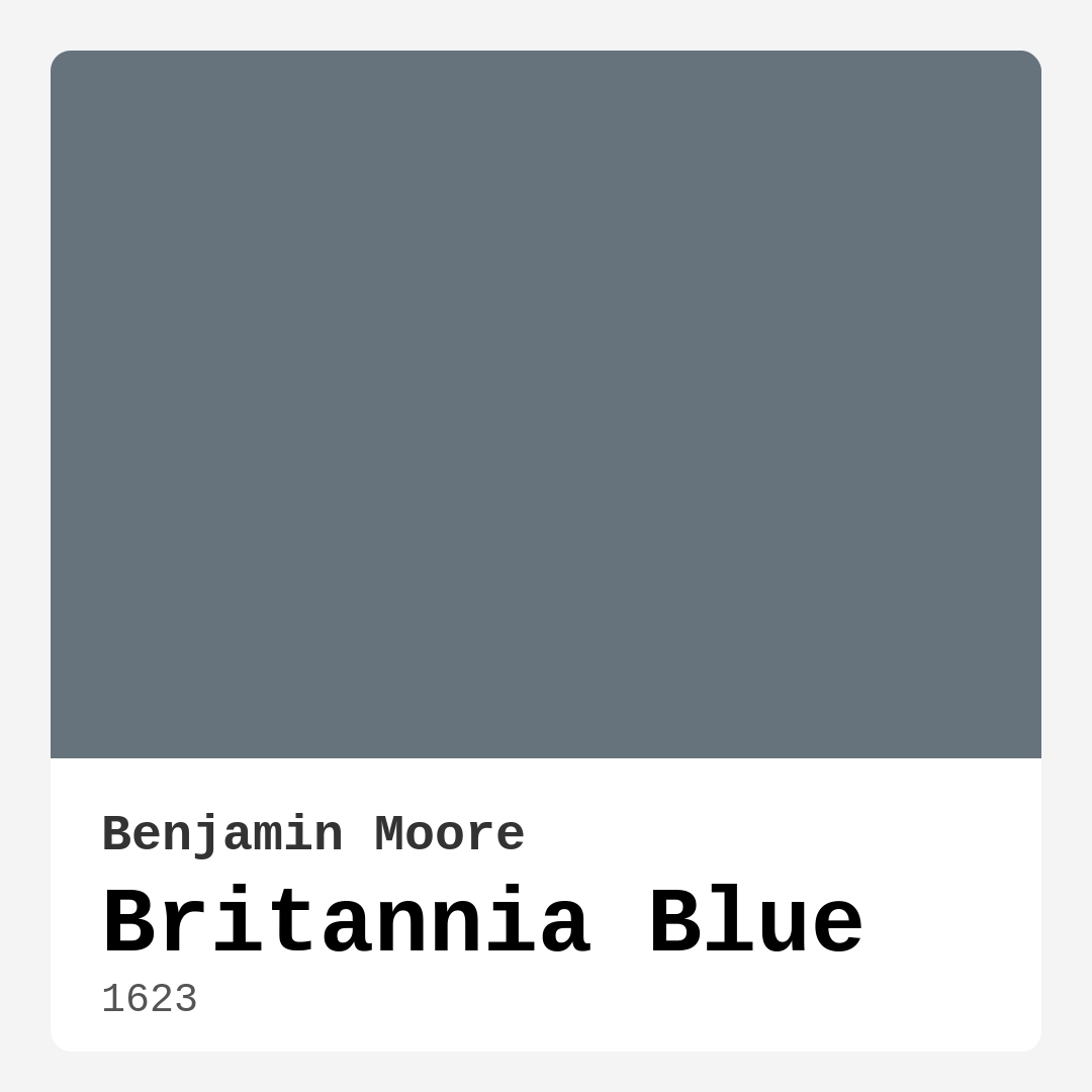
Color Preview & Key Details
| HEX Code | #67737C |
| RGB | 103, 115, 124 |
| LRV | 18.06% |
| Undertone | Blue |
| Finish Options | Eggshell, Flat, Matte, Satin |
If you’re looking for a paint color that effortlessly balances sophistication with serenity, let me introduce you to Britannia Blue by Benjamin Moore. This isn’t just another blue—it’s a carefully crafted shade that blends cool teal undertones with a whisper of gray, creating a hue that feels both modern and timeless. Whether you’re refreshing a single room or reimagining your entire home, Britannia Blue has the versatility to adapt to your vision while adding a touch of understated elegance.
One of the first things you’ll notice about Britannia Blue is its depth. With an LRV (Light Reflectance Value) of 18.06%, it sits comfortably in the medium-dark range, meaning it reflects very little light. This gives it a rich, enveloping quality that’s perfect for creating cozy, intimate spaces. But don’t let that fool you—this color is far from overwhelming. Its cool undertones keep it feeling fresh, especially when paired with the right lighting and decor. In bright, natural light, those teal notes come alive, adding a subtle vibrancy. In softer, dimmer settings, it mellows into a muted gray-blue that feels soothing and refined.
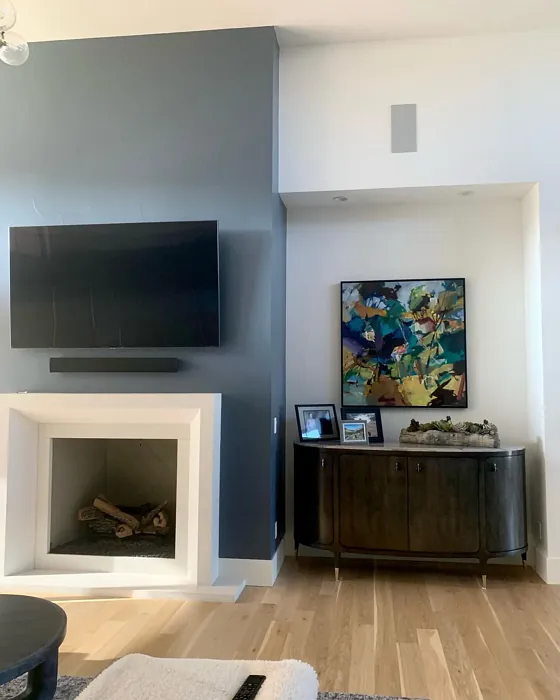
So where does Britannia Blue shine brightest? Think living rooms that crave a calming backdrop, bedrooms designed for relaxation, or home offices that need a touch of tranquility. It’s also a stunning choice for dining rooms, where its sophistication can set the tone for intimate gatherings. And yes, it even works in kitchens—especially when paired with crisp white cabinetry or warm wood accents. The key is balancing its coolness with elements that bring warmth. For example, pairing it with creamy whites like Benjamin Moore’s White Dove on trim creates a crisp contrast that keeps the space feeling airy. If you’re feeling bold, try it on an accent wall to add depth without closing in the room.
When it comes to application, Britannia Blue is as user-friendly as it gets. It offers excellent coverage, often needing just one or two coats for a flawless finish. Whether you’re rolling it on or brushing it, the consistency is smooth and forgiving, making it a great option for DIYers. Plus, it dries quickly and comes in low-VOC formulas, so you won’t be stuck waiting days for the smell to dissipate. Choose a matte finish if you want to emphasize its depth, or opt for satin or eggshell in high-traffic areas for added durability and a subtle sheen.
Now, let’s talk decor. Britannia Blue plays well with a variety of styles—think modern, coastal, Scandinavian, or transitional. Its versatility lies in its ability to adapt. In a minimalist space, it acts as a serene anchor. In a coastal-inspired room, it echoes the tranquility of the sea. Pair it with natural textures like linen, rattan, or light wood to soften its coolness, or go for metallic accents in brass or chrome to elevate its sophistication. If you’re worried about it feeling too chilly, layer in warm neutrals like taupe or caramel to create balance. And don’t shy away from pops of complementary colors—think soft blush pinks or muted terracottas—to add dimension.
Of course, no color is without its considerations. Britannia Blue’s cool undertones mean it can feel a bit chilly in rooms with limited natural light. If your space is on the darker side, you might want to test a swatch first or pair it with plenty of warm lighting and light-reflecting surfaces. And while its coverage is generally great, you may need a second coat in some spots to achieve that perfect, even finish. But these are small trade-offs for a color that brings so much character to a room.
If you’re still on the fence, here’s a pro tip: test it in your space before committing. Paint a large swatch on the wall and observe it at different times of day. Notice how it shifts with the light, how it interacts with your furniture, and how it makes you feel. That’s the beauty of Britannia Blue—it’s not just a color; it’s a mood. Calm, inviting, sophisticated. Whether you’re going for a full-room transformation or just a subtle refresh, this shade has the power to elevate your home in ways you might not expect. So grab a sample, trust your instincts, and get ready to fall in love with one of Benjamin Moore’s most versatile blues.

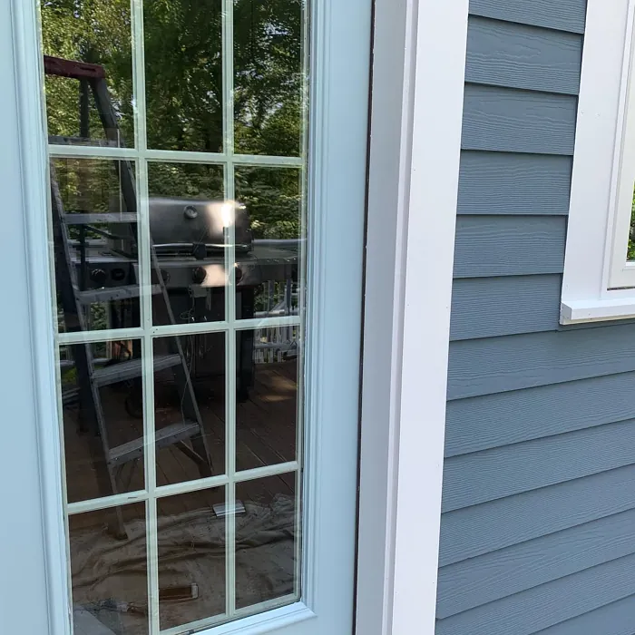
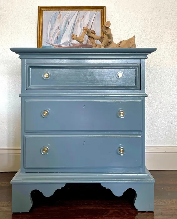
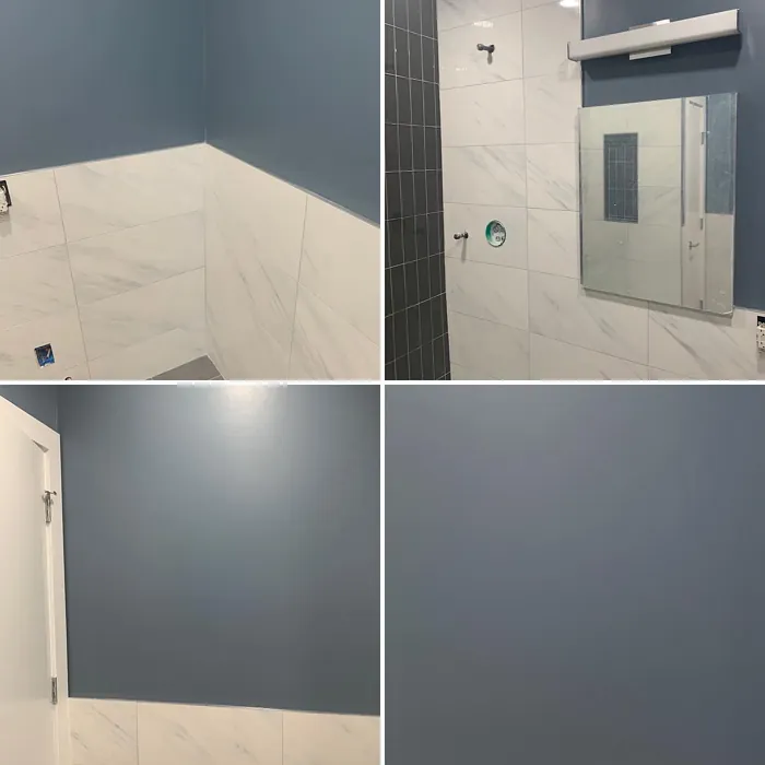
Real Room Photo of Britannia Blue 1623

Undertones of Britannia Blue ?
The undertones of Britannia Blue are a key aspect of its character, leaning towards Blue. These subtle underlying hues are what give the color its depth and complexity. For example, a gray with a blue undertone will feel cooler and more modern, while one with a brown undertone will feel warmer and more traditional. It’s essential to test this paint in your home and observe it next to your existing furniture, flooring, and decor to see how these undertones interact and reveal themselves throughout the day.
HEX value: #67737C
RGB code: 103, 115, 124
Is Britannia Blue Cool or Warm?
Britannia Blue leans towards the cool side of the spectrum, providing a refreshing and sophisticated vibe. This makes it ideal for modern spaces that benefit from a calming backdrop.
Understanding Color Properties and Interior Design Tips
Hue refers to a specific position on the color wheel, measured in degrees from 0 to 360. Each degree represents a different pure color:
- 0° represents red
- 120° represents green
- 240° represents blue
Saturation describes the intensity or purity of a color and is expressed as a percentage:
- At 0%, the color appears completely desaturated—essentially a shade of gray
- At 100%, the color is at its most vivid and vibrant
Lightness indicates how light or dark a color is, also expressed as a percentage:
- 0% lightness results in black
- 100% lightness results in white
Using Warm Colors in Interior Design
Warm hues—such as reds, oranges, yellows, warm beiges, and greiges—are excellent choices for creating inviting and energetic spaces. These colors are particularly well-suited for:
- Kitchens, living rooms, and bathrooms, where warmth enhances comfort and sociability
- Large rooms, where warm tones can help reduce the sense of emptiness and make the space feel more intimate
For example:
- Warm beige shades provide a cozy, inviting atmosphere, ideal for living rooms, bedrooms, and hallways.
- Warm greige (a mix of beige and gray) offers the warmth of beige with the modern appeal of gray, making it a versatile backdrop for dining areas, bedrooms, and living spaces.
However, be mindful when using warm light tones in rooms with limited natural light. These shades may appear muted or even take on an unpleasant yellowish tint. To avoid a dull or flat appearance:
- Add depth by incorporating richer tones like deep greens, charcoal, or chocolate brown
- Use textured elements such as curtains, rugs, or cushions to bring dimension to the space
Pro Tip: Achieving Harmony with Warm and Cool Color Balance
To create a well-balanced and visually interesting interior, mix warm and cool tones strategically. This contrast adds depth and harmony to your design.
- If your walls feature warm hues, introduce cool-colored accents such as blue or green furniture, artwork, or accessories to create contrast.
- For a polished look, consider using a complementary color scheme, which pairs colors opposite each other on the color wheel (e.g., red with green, orange with blue).
This thoughtful mix not only enhances visual appeal but also creates a space that feels both dynamic and cohesive.

Light Temperature Affects on Britannia Blue
Natural Light
Natural daylight changes in color temperature as the sun moves across the sky. At sunrise and sunset, the light tends to have a warm, golden tone with a color temperature around 2000 Kelvin (K). As the day progresses and the sun rises higher, the light becomes cooler and more neutral. Around midday, especially when the sky is clear, natural light typically reaches its peak brightness and shifts to a cooler tone, ranging from 5500 to 6500 Kelvin. This midday light is close to what we perceive as pure white or daylight-balanced light.
These shifts in natural light can significantly influence how colors appear in a space, which is why designers often consider both the time of day and the orientation of windows when planning interior color schemes.
Artificial Light
When choosing artificial lighting, pay close attention to the color temperature, measured in Kelvin (K). This determines how warm or cool the light will appear. Lower temperatures, around 2700K, give off a warm, yellow glow often used in living rooms or bedrooms. Higher temperatures, above 5000K, create a cool, bluish light similar to daylight, commonly used in kitchens, offices, or task areas.
Use the slider to see how lighting temperature can affect the appearance of a surface or color throughout a space.


4800K
LRV of Britannia Blue
The Light Reflectance Value (LRV) of Britannia Blue is 18.06%, which places it in the Medium Dark category. This means it reflects very little light. Understanding a paint’s LRV is crucial for predicting how it will look in your space. A higher LRV indicates a lighter color that reflects more light, making rooms feel larger and brighter. A lower LRV signifies a darker color that absorbs more light, creating a cozier, more intimate atmosphere. Always consider the natural and artificial lighting in your room when selecting a paint color based on its LRV.
Detailed Review of Britannia Blue
Additional Paint Characteristics
Ideal Rooms
Bedroom, Dining Room, Home Office, Kitchen, Living Room
Decor Styles
Coastal, Modern, Scandinavian, Transitional
Coverage
Good (1–2 Coats)
Ease of Application
Beginner Friendly, Brush Smooth, Fast-Drying, Roller-Ready
Washability
Washable, Wipeable
VOC Level
Low VOC, Ultra Low VOC
Best Use
Accent Wall, Furniture, Interior Walls
Room Suitability
Bedroom, Dining Room, Home Office, Living Room
Tone Tag
Balanced, Cool, Muted
Finish Type
Eggshell, Matte, Satin
Paint Performance
Fade Resistant, Low Odor, Quick Drying
Use Cases
Best for Open Concept, Best for Small Spaces, Designer Favorite
Mood
Calm, Inviting, Sophisticated
Trim Pairing
Complements Cool Trim, Pairs with White Dove, Works with Warm Trim
Britannia Blue is a versatile color that can transform any room into a tranquil haven. Its cool undertones create a calming effect, perfect for relaxation spaces like bedrooms and living rooms. When applied, it offers excellent coverage, requiring just one to two coats for a smooth finish. The hue adapts beautifully under varying lighting conditions, appearing more muted in low light and vibrant in natural daylight. This makes it a fantastic choice for dynamic spaces where the ambiance changes throughout the day. Pair it with white trim for a crisp contrast or with wooden elements for a warm touch. Overall, Britannia Blue balances elegance and approachability, making it a standout choice for your next project.
Pros & Cons of 1623 Britannia Blue
Pros
Cons
Colors that go with Benjamin Moore Britannia Blue
FAQ on 1623 Britannia Blue
What types of finishes work best with Britannia Blue?
Britannia Blue works beautifully in several finishes, including matte, eggshell, and satin. Matte finishes can enhance the depth of the color, while satin adds a subtle sheen, making it suitable for areas like kitchens and bathrooms. If you’re looking for a more durable option, satin or eggshell finishes are recommended, especially in high-traffic areas.
Can Britannia Blue be used in small spaces?
Yes, Britannia Blue can work well in small spaces! Its cool undertones can help create an illusion of more space while maintaining an inviting atmosphere. Pair it with light-colored furniture or white trim to enhance the feeling of openness. Just be mindful of the lighting, as it may appear darker in confined areas.
Comparisons Britannia Blue with other colors
Britannia Blue 1623 vs Naval SW 6244
| Attribute | Britannia Blue 1623 | Naval SW 6244 |
|---|---|---|
| Color Name | Britannia Blue 1623 | Naval SW 6244 |
| Color | ||
| Hue | Blue | Blue |
| Brightness | Dark | Dark |
| RGB | 103, 115, 124 | 47, 61, 76 |
| LRV | 18.06% | 4% |
| Finish Type | Eggshell, Matte, Satin | Matte, Satin, Semi-Gloss |
| Finish Options | Eggshell, Flat, Matte, Satin | Matte, Satin, Semi-Gloss |
| Ideal Rooms | Bedroom, Dining Room, Home Office, Kitchen, Living Room | Bedroom, Dining Room, Hallway, Home Office, Living Room |
| Decor Styles | Coastal, Modern, Scandinavian, Transitional | Coastal, Industrial, Minimalist, Modern, Traditional |
| Coverage | Good (1–2 Coats) | Good (1–2 Coats), Self-Priming |
| Ease of Application | Beginner Friendly, Brush Smooth, Fast-Drying, Roller-Ready | Beginner Friendly, Brush Smooth, Roller-Ready |
| Washability | Washable, Wipeable | Highly Washable, Washable |
| Room Suitability | Bedroom, Dining Room, Home Office, Living Room | Bedroom, Dining Room, Entryway, Home Office, Living Room |
| Tone | Balanced, Cool, Muted | Cool, Deep, Moody |
| Paint Performance | Fade Resistant, Low Odor, Quick Drying | Easy Touch-Up, High Coverage, Low Odor, Scuff Resistant |
Britannia Blue 1623 vs Sea Serpent SW 7615
| Attribute | Britannia Blue 1623 | Sea Serpent SW 7615 |
|---|---|---|
| Color Name | Britannia Blue 1623 | Sea Serpent SW 7615 |
| Color | ||
| Hue | Blue | Blue |
| Brightness | Dark | Dark |
| RGB | 103, 115, 124 | 62, 75, 84 |
| LRV | 18.06% | 12% |
| Finish Type | Eggshell, Matte, Satin | Eggshell, Matte, Satin |
| Finish Options | Eggshell, Flat, Matte, Satin | Eggshell, Matte, Satin |
| Ideal Rooms | Bedroom, Dining Room, Home Office, Kitchen, Living Room | Bathroom, Bedroom, Home Office, Living Room |
| Decor Styles | Coastal, Modern, Scandinavian, Transitional | Coastal, Farmhouse, Industrial, Modern |
| Coverage | Good (1–2 Coats) | Good (1–2 Coats), Touch-Up Friendly |
| Ease of Application | Beginner Friendly, Brush Smooth, Fast-Drying, Roller-Ready | Beginner Friendly, Brush Smooth, Roller-Ready |
| Washability | Washable, Wipeable | Highly Washable, Washable |
| Room Suitability | Bedroom, Dining Room, Home Office, Living Room | Bathroom, Bedroom, Home Office, Living Room |
| Tone | Balanced, Cool, Muted | Cool, Deep, Moody |
| Paint Performance | Fade Resistant, Low Odor, Quick Drying | Easy Touch-Up, High Coverage, Low Odor |
Britannia Blue 1623 vs Rain Cloud SW 9639
| Attribute | Britannia Blue 1623 | Rain Cloud SW 9639 |
|---|---|---|
| Color Name | Britannia Blue 1623 | Rain Cloud SW 9639 |
| Color | ||
| Hue | Blue | Blue |
| Brightness | Dark | Dark |
| RGB | 103, 115, 124 | 83, 97, 104 |
| LRV | 18.06% | 30% |
| Finish Type | Eggshell, Matte, Satin | Eggshell, Matte, Satin |
| Finish Options | Eggshell, Flat, Matte, Satin | Eggshell, Matte, Satin |
| Ideal Rooms | Bedroom, Dining Room, Home Office, Kitchen, Living Room | Bedroom, Dining Room, Home Office, Living Room |
| Decor Styles | Coastal, Modern, Scandinavian, Transitional | Coastal, Contemporary, Minimalist, Scandinavian |
| Coverage | Good (1–2 Coats) | Good (1–2 Coats), Touch-Up Friendly |
| Ease of Application | Beginner Friendly, Brush Smooth, Fast-Drying, Roller-Ready | Beginner Friendly, Brush Smooth, Roller-Ready |
| Washability | Washable, Wipeable | Highly Washable, Washable |
| Room Suitability | Bedroom, Dining Room, Home Office, Living Room | Bedroom, Home Office, Living Room |
| Tone | Balanced, Cool, Muted | Balanced, Cool, Muted |
| Paint Performance | Fade Resistant, Low Odor, Quick Drying | Easy Touch-Up, Fade Resistant, Low Odor |
Britannia Blue 1623 vs Indigo Batik SW 7602
| Attribute | Britannia Blue 1623 | Indigo Batik SW 7602 |
|---|---|---|
| Color Name | Britannia Blue 1623 | Indigo Batik SW 7602 |
| Color | ||
| Hue | Blue | Blue |
| Brightness | Dark | Dark |
| RGB | 103, 115, 124 | 62, 80, 99 |
| LRV | 18.06% | 10% |
| Finish Type | Eggshell, Matte, Satin | Matte, Satin |
| Finish Options | Eggshell, Flat, Matte, Satin | Eggshell, Flat, Matte, Satin |
| Ideal Rooms | Bedroom, Dining Room, Home Office, Kitchen, Living Room | Bedroom, Dining Room, Home Office, Living Room |
| Decor Styles | Coastal, Modern, Scandinavian, Transitional | Bohemian, Coastal, Contemporary, Modern |
| Coverage | Good (1–2 Coats) | Good (1–2 Coats), Touch-Up Friendly |
| Ease of Application | Beginner Friendly, Brush Smooth, Fast-Drying, Roller-Ready | Brush Smooth, Fast-Drying, Roller-Ready |
| Washability | Washable, Wipeable | Scrubbable, Washable, Wipeable |
| Room Suitability | Bedroom, Dining Room, Home Office, Living Room | Bedroom, Dining Room, Home Office, Living Room |
| Tone | Balanced, Cool, Muted | Cool, Deep, Moody |
| Paint Performance | Fade Resistant, Low Odor, Quick Drying | Easy Touch-Up, High Coverage, Low Odor, Quick Drying |
Britannia Blue 1623 vs Sea Mariner SW 9640
| Attribute | Britannia Blue 1623 | Sea Mariner SW 9640 |
|---|---|---|
| Color Name | Britannia Blue 1623 | Sea Mariner SW 9640 |
| Color | ||
| Hue | Blue | Blue |
| Brightness | Dark | Dark |
| RGB | 103, 115, 124 | 67, 74, 84 |
| LRV | 18.06% | 6% |
| Finish Type | Eggshell, Matte, Satin | Eggshell, Matte, Satin |
| Finish Options | Eggshell, Flat, Matte, Satin | Eggshell, Matte, Satin |
| Ideal Rooms | Bedroom, Dining Room, Home Office, Kitchen, Living Room | Bedroom, Dining Room, Hallway, Home Office, Living Room |
| Decor Styles | Coastal, Modern, Scandinavian, Transitional | Coastal, Industrial, Minimalist, Modern |
| Coverage | Good (1–2 Coats) | Good (1–2 Coats) |
| Ease of Application | Beginner Friendly, Brush Smooth, Fast-Drying, Roller-Ready | Beginner Friendly, Brush Smooth, Roller-Ready |
| Washability | Washable, Wipeable | Scrubbable, Washable |
| Room Suitability | Bedroom, Dining Room, Home Office, Living Room | Bedroom, Dining Room, Home Office, Living Room |
| Tone | Balanced, Cool, Muted | Cool, Deep, Moody |
| Paint Performance | Fade Resistant, Low Odor, Quick Drying | Easy Touch-Up, Low Odor, Quick Drying |
Britannia Blue 1623 vs Still Water SW 6223
| Attribute | Britannia Blue 1623 | Still Water SW 6223 |
|---|---|---|
| Color Name | Britannia Blue 1623 | Still Water SW 6223 |
| Color | ||
| Hue | Blue | Blue |
| Brightness | Dark | Dark |
| RGB | 103, 115, 124 | 74, 93, 95 |
| LRV | 18.06% | 48% |
| Finish Type | Eggshell, Matte, Satin | Eggshell, Matte, Satin |
| Finish Options | Eggshell, Flat, Matte, Satin | Eggshell, Matte, Satin |
| Ideal Rooms | Bedroom, Dining Room, Home Office, Kitchen, Living Room | Bedroom, Dining Room, Home Office, Living Room, Nursery |
| Decor Styles | Coastal, Modern, Scandinavian, Transitional | Coastal, Contemporary, Farmhouse, Modern, Rustic |
| Coverage | Good (1–2 Coats) | Good (1–2 Coats), Touch-Up Friendly |
| Ease of Application | Beginner Friendly, Brush Smooth, Fast-Drying, Roller-Ready | Beginner Friendly, Brush Smooth, Roller-Ready |
| Washability | Washable, Wipeable | Highly Washable, Washable |
| Room Suitability | Bedroom, Dining Room, Home Office, Living Room | Bedroom, Dining Room, Home Office, Living Room |
| Tone | Balanced, Cool, Muted | Cool, Earthy, Muted |
| Paint Performance | Fade Resistant, Low Odor, Quick Drying | Easy Touch-Up, Fade Resistant, Low Odor |
Britannia Blue 1623 vs Waterloo SW 9141
| Attribute | Britannia Blue 1623 | Waterloo SW 9141 |
|---|---|---|
| Color Name | Britannia Blue 1623 | Waterloo SW 9141 |
| Color | ||
| Hue | Blue | Blue |
| Brightness | Dark | Dark |
| RGB | 103, 115, 124 | 83, 104, 114 |
| LRV | 18.06% | 12% |
| Finish Type | Eggshell, Matte, Satin | Matte, Satin |
| Finish Options | Eggshell, Flat, Matte, Satin | Matte, Satin, Semi-Gloss |
| Ideal Rooms | Bedroom, Dining Room, Home Office, Kitchen, Living Room | Bedroom, Dining Room, Hallway, Home Office, Living Room |
| Decor Styles | Coastal, Modern, Scandinavian, Transitional | Coastal, Industrial, Modern, Rustic |
| Coverage | Good (1–2 Coats) | Good (1–2 Coats), Touch-Up Friendly |
| Ease of Application | Beginner Friendly, Brush Smooth, Fast-Drying, Roller-Ready | Brush Smooth, Fast-Drying, Roller-Ready |
| Washability | Washable, Wipeable | Scrubbable, Washable |
| Room Suitability | Bedroom, Dining Room, Home Office, Living Room | Bedroom, Dining Room, Home Office, Living Room |
| Tone | Balanced, Cool, Muted | Balanced, Cool, Muted |
| Paint Performance | Fade Resistant, Low Odor, Quick Drying | Easy Touch-Up, Fade Resistant, Low Odor, Quick Drying |
Britannia Blue 1623 vs Smoky Blue SW 7604
| Attribute | Britannia Blue 1623 | Smoky Blue SW 7604 |
|---|---|---|
| Color Name | Britannia Blue 1623 | Smoky Blue SW 7604 |
| Color | ||
| Hue | Blue | Blue |
| Brightness | Dark | Dark |
| RGB | 103, 115, 124 | 89, 110, 121 |
| LRV | 18.06% | 15% |
| Finish Type | Eggshell, Matte, Satin | Eggshell, Matte, Satin |
| Finish Options | Eggshell, Flat, Matte, Satin | Eggshell, Matte, Satin |
| Ideal Rooms | Bedroom, Dining Room, Home Office, Kitchen, Living Room | Bathroom, Bedroom, Home Office, Kitchen, Living Room |
| Decor Styles | Coastal, Modern, Scandinavian, Transitional | Coastal, Modern, Scandinavian, Transitional |
| Coverage | Good (1–2 Coats) | Good (1–2 Coats), Touch-Up Friendly |
| Ease of Application | Beginner Friendly, Brush Smooth, Fast-Drying, Roller-Ready | Beginner Friendly, Brush Smooth, Roller-Ready |
| Washability | Washable, Wipeable | Highly Washable, Washable |
| Room Suitability | Bedroom, Dining Room, Home Office, Living Room | Bathroom, Bedroom, Home Office, Living Room |
| Tone | Balanced, Cool, Muted | Cool, Dusty, Muted |
| Paint Performance | Fade Resistant, Low Odor, Quick Drying | High Coverage, Low Odor, Quick Drying |
Britannia Blue 1623 vs Needlepoint Navy SW 0032
| Attribute | Britannia Blue 1623 | Needlepoint Navy SW 0032 |
|---|---|---|
| Color Name | Britannia Blue 1623 | Needlepoint Navy SW 0032 |
| Color | ||
| Hue | Blue | Blue |
| Brightness | Dark | Dark |
| RGB | 103, 115, 124 | 84, 102, 112 |
| LRV | 18.06% | 4% |
| Finish Type | Eggshell, Matte, Satin | Matte, Satin, Semi-Gloss |
| Finish Options | Eggshell, Flat, Matte, Satin | Matte, Satin, Semi-Gloss |
| Ideal Rooms | Bedroom, Dining Room, Home Office, Kitchen, Living Room | Bedroom, Dining Room, Entryway, Home Office, Living Room |
| Decor Styles | Coastal, Modern, Scandinavian, Transitional | Coastal, Contemporary, Modern Farmhouse, Nautical, Traditional |
| Coverage | Good (1–2 Coats) | Good (1–2 Coats), Touch-Up Friendly |
| Ease of Application | Beginner Friendly, Brush Smooth, Fast-Drying, Roller-Ready | Beginner Friendly, Brush Smooth, Fast-Drying, Roller-Ready |
| Washability | Washable, Wipeable | Scrubbable, Washable |
| Room Suitability | Bedroom, Dining Room, Home Office, Living Room | Bedroom, Dining Room, Home Office, Living Room |
| Tone | Balanced, Cool, Muted | Cool, Deep, Muted |
| Paint Performance | Fade Resistant, Low Odor, Quick Drying | Easy Touch-Up, High Coverage, Low Odor, Quick Drying, Stain Resistant |
Britannia Blue 1623 vs Riverway SW 6222
| Attribute | Britannia Blue 1623 | Riverway SW 6222 |
|---|---|---|
| Color Name | Britannia Blue 1623 | Riverway SW 6222 |
| Color | ||
| Hue | Blue | Blue |
| Brightness | Dark | Dark |
| RGB | 103, 115, 124 | 93, 114, 116 |
| LRV | 18.06% | 24% |
| Finish Type | Eggshell, Matte, Satin | Eggshell, Satin |
| Finish Options | Eggshell, Flat, Matte, Satin | Eggshell, Matte, Satin |
| Ideal Rooms | Bedroom, Dining Room, Home Office, Kitchen, Living Room | Bathroom, Bedroom, Dining Room, Home Office, Living Room |
| Decor Styles | Coastal, Modern, Scandinavian, Transitional | Coastal, Contemporary, Eclectic, Modern, Rustic |
| Coverage | Good (1–2 Coats) | Good (1–2 Coats), Touch-Up Friendly |
| Ease of Application | Beginner Friendly, Brush Smooth, Fast-Drying, Roller-Ready | Beginner Friendly, Brush Smooth, Fast-Drying, Low Splatter, Roller-Ready |
| Washability | Washable, Wipeable | Highly Washable, Washable |
| Room Suitability | Bedroom, Dining Room, Home Office, Living Room | Bathroom, Bedroom, Home Office, Living Room |
| Tone | Balanced, Cool, Muted | Balanced, Cool, Muted |
| Paint Performance | Fade Resistant, Low Odor, Quick Drying | Easy Touch-Up, High Coverage, Low Odor, Quick Drying |
Official Page of Benjamin Moore Britannia Blue 1623