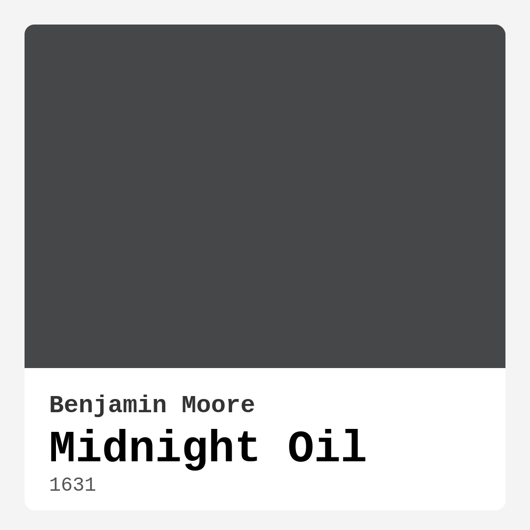
Color Preview & Key Details
| HEX Code | #464748 |
| RGB | 70, 71, 72 |
| LRV | 7.67% |
| Undertone | Blue |
| Finish Options | Eggshell, Matte, Satin |
If you’re looking for a paint color that exudes sophistication while still feeling warm and inviting, Benjamin Moore’s *Midnight Oil* (1631) might just be your perfect match. This deep, moody gray with subtle blue undertones is one of those rare shades that manages to be both dramatic and versatile. Whether you’re designing a cozy bedroom, a sleek home office, or a statement-making living room, this color has the depth and elegance to transform your space into something truly special.
Let’s talk about what makes *Midnight Oil* stand out. First, its LRV (Light Reflectance Value) of 7.67% tells you this is a dark color—one that absorbs light rather than reflecting it. That means it creates an intimate, cocoon-like atmosphere, perfect for rooms where you want to feel grounded and relaxed. But don’t let the darkness intimidate you. Thanks to its blue undertones, it avoids feeling heavy or oppressive, instead offering a modern, slightly cool vibe that pairs beautifully with both warm and cool decor.
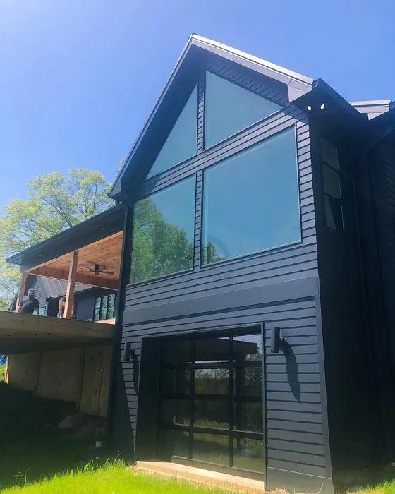
One of the best things about *Midnight Oil* is how dynamic it is. In natural daylight, the blue undertones come forward, giving it a fresh, almost airy quality despite its depth. Under artificial lighting, especially warm-toned bulbs, it takes on a richer, more mysterious feel. This chameleon-like quality means the color never feels flat—it shifts and changes throughout the day, keeping your space interesting.
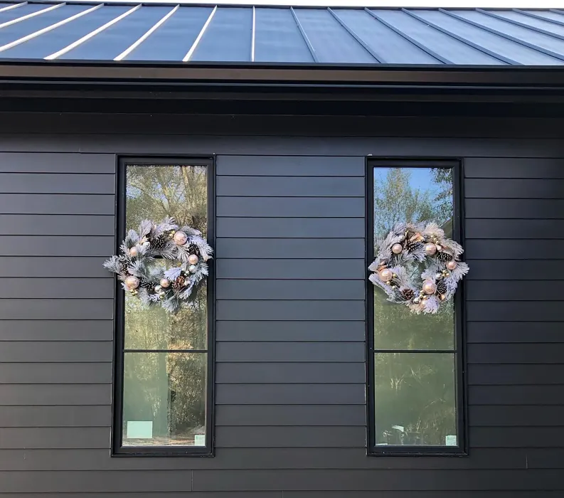
Now, let’s address the elephant in the room: can you use this in a small space? Absolutely, but with some strategy. While dark colors can make small rooms feel cozier (which is great for bedrooms or reading nooks), they can also make them feel tighter if overused. If you love *Midnight Oil* but have a compact room, consider using it on just one accent wall or pairing it with plenty of lighter elements—think crisp white trim, light-colored furniture, or mirrors to bounce light around. The contrast will keep the room feeling balanced rather than closed-in.
When it comes to finishes, *Midnight Oil* shines in matte or eggshell. A matte finish enhances its velvety depth, making walls feel like a luxurious backdrop, while eggshell offers a slight sheen that’s easier to clean—ideal for high-traffic areas like living rooms or dining spaces. If you’re feeling bold, a satin finish can add a modern edge, especially in spaces with lots of natural or artificial light.
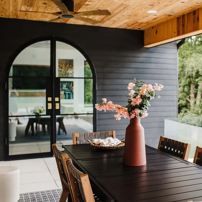
Pairing this color with the right accents is key to making it work in your home. For a sleek, contemporary look, try combining it with crisp whites like *White Dove* for trim and ceilings. The contrast is striking and keeps the space feeling fresh. If you want warmth, brass or gold fixtures add a touch of luxury that plays beautifully off the cool undertones. For a pop of contrast, consider accents in its complementary color—orange. A burnt orange throw pillow, a terracotta vase, or even a muted peach rug can create a stunning visual balance.
Furniture and decor choices also matter. In a living room, *Midnight Oil* pairs beautifully with mid-century modern pieces, leather sofas, or even rustic wood tones. In a bedroom, layer it with soft textiles in creams, taupes, or even deep blues for a serene retreat. And if you’re using it in a home office, it creates a focused, sophisticated atmosphere—especially when paired with sleek black desks and metallic accents.
Practicality is another strong suit of this color. It’s low-VOC, so it’s a great choice if you’re mindful of indoor air quality. It’s also touch-up friendly and highly washable, making it a solid pick for spaces that see a lot of action. Just keep in mind that dark colors like this can show dust and fingerprints more easily, so if you’re using it in a high-traffic area, a satin or eggshell finish will make maintenance a breeze.
If you’re still on the fence, here’s a pro tip: always test the color in your space before committing. Paint a large swatch on the wall and observe it at different times of day. You’ll see how the light plays with the undertones and how it interacts with your existing furniture and flooring. *Midnight Oil* is one of those colors that can look completely different from one room to another based on lighting and surroundings, so seeing it in context is crucial.
For those who love *Midnight Oil* but want something a little lighter or darker, Benjamin Moore offers a great range of similar shades. Lighter options like *Gray Owl* (2137-60) or *Stonington Gray* (HC-170) keep the cool gray vibe but brighten things up. If you want to go even darker, *Wrought Iron* (2124-10) or *Onyx* (2132-10) offer deeper, more intense alternatives.
At the end of the day, *Midnight Oil* is a color that rewards boldness. It’s not just a paint choice—it’s a design statement. Whether you’re using it to create a moody accent wall, a cozy bedroom retreat, or a sleek modern living space, it brings depth, sophistication, and a touch of drama to any room. If you’re ready to step away from safe neutrals and embrace something with more character, this might just be the color you’ve been waiting for.
So go ahead—take the plunge. With the right lighting, finishes, and accents, *Midnight Oil* can turn your space into something truly extraordinary. And isn’t that what great design is all about?

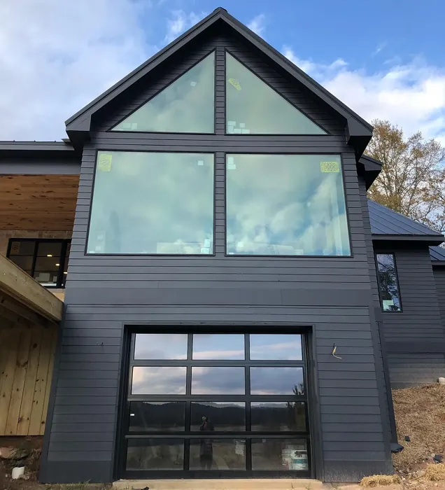
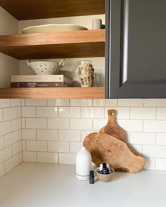
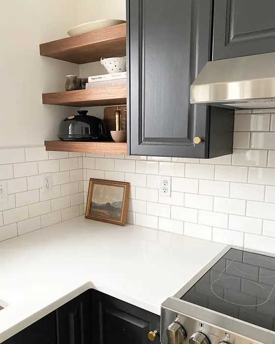
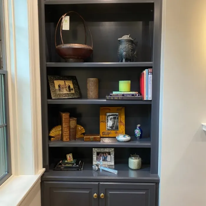
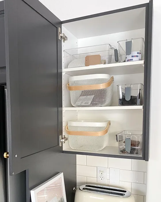
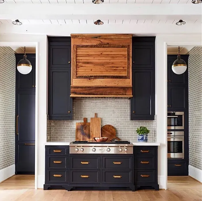
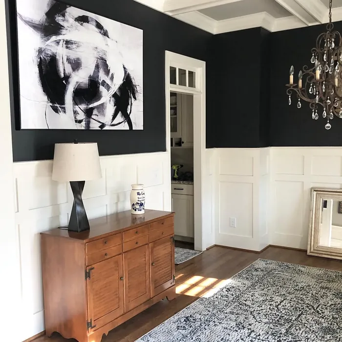
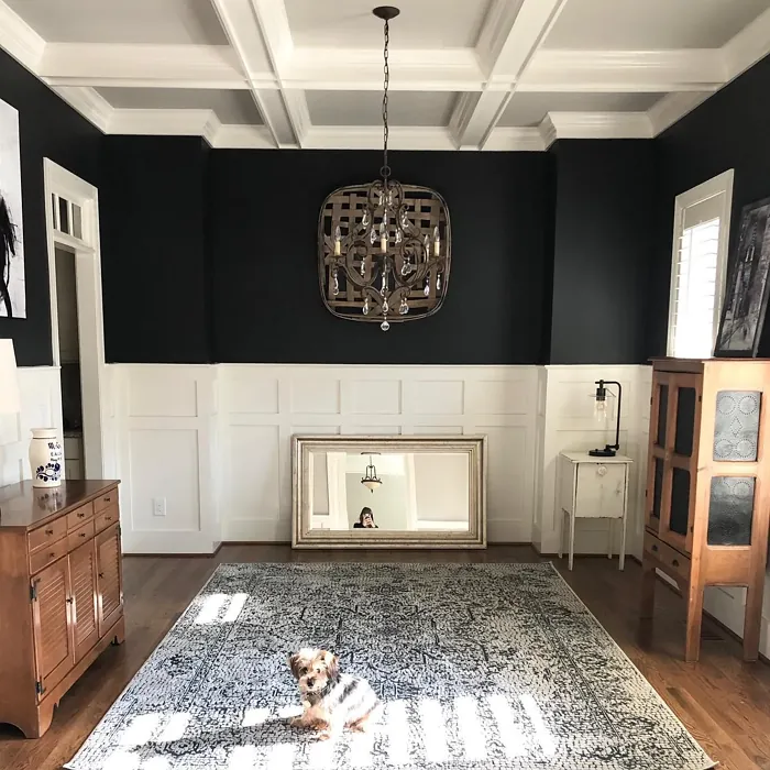
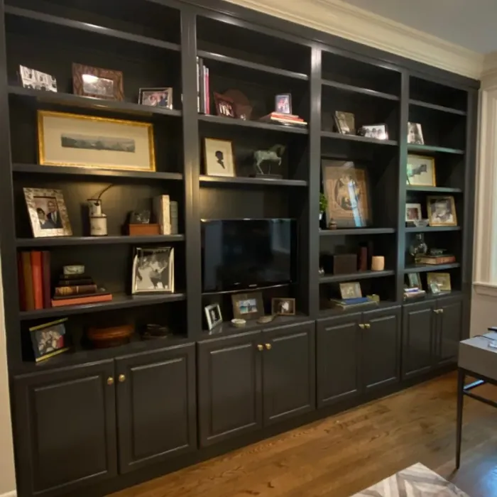
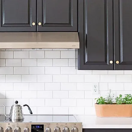
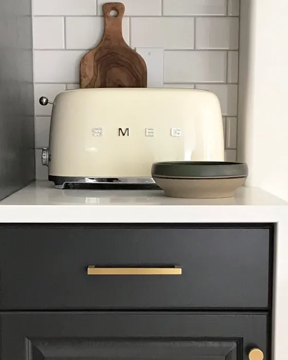
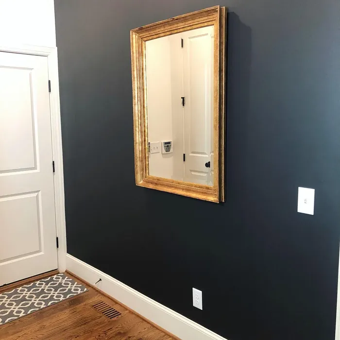
Real Room Photo of Midnight Oil 1631


Undertones of Midnight Oil ?
The undertones of Midnight Oil are a key aspect of its character, leaning towards Blue. These subtle underlying hues are what give the color its depth and complexity. For example, a gray with a blue undertone will feel cooler and more modern, while one with a brown undertone will feel warmer and more traditional. It’s essential to test this paint in your home and observe it next to your existing furniture, flooring, and decor to see how these undertones interact and reveal themselves throughout the day.
HEX value: #464748
RGB code: 70, 71, 72
Is Midnight Oil Cool or Warm?
Midnight Oil is predominantly cool but with warm undertones that prevent it from feeling harsh or stark. This makes it adaptable to different decor styles and lighting.
Understanding Color Properties and Interior Design Tips
Hue refers to a specific position on the color wheel, measured in degrees from 0 to 360. Each degree represents a different pure color:
- 0° represents red
- 120° represents green
- 240° represents blue
Saturation describes the intensity or purity of a color and is expressed as a percentage:
- At 0%, the color appears completely desaturated—essentially a shade of gray
- At 100%, the color is at its most vivid and vibrant
Lightness indicates how light or dark a color is, also expressed as a percentage:
- 0% lightness results in black
- 100% lightness results in white
Using Warm Colors in Interior Design
Warm hues—such as reds, oranges, yellows, warm beiges, and greiges—are excellent choices for creating inviting and energetic spaces. These colors are particularly well-suited for:
- Kitchens, living rooms, and bathrooms, where warmth enhances comfort and sociability
- Large rooms, where warm tones can help reduce the sense of emptiness and make the space feel more intimate
For example:
- Warm beige shades provide a cozy, inviting atmosphere, ideal for living rooms, bedrooms, and hallways.
- Warm greige (a mix of beige and gray) offers the warmth of beige with the modern appeal of gray, making it a versatile backdrop for dining areas, bedrooms, and living spaces.
However, be mindful when using warm light tones in rooms with limited natural light. These shades may appear muted or even take on an unpleasant yellowish tint. To avoid a dull or flat appearance:
- Add depth by incorporating richer tones like deep greens, charcoal, or chocolate brown
- Use textured elements such as curtains, rugs, or cushions to bring dimension to the space
Pro Tip: Achieving Harmony with Warm and Cool Color Balance
To create a well-balanced and visually interesting interior, mix warm and cool tones strategically. This contrast adds depth and harmony to your design.
- If your walls feature warm hues, introduce cool-colored accents such as blue or green furniture, artwork, or accessories to create contrast.
- For a polished look, consider using a complementary color scheme, which pairs colors opposite each other on the color wheel (e.g., red with green, orange with blue).
This thoughtful mix not only enhances visual appeal but also creates a space that feels both dynamic and cohesive.
Light Temperature Affects on Midnight Oil
Natural Light
Natural daylight changes in color temperature as the sun moves across the sky. At sunrise and sunset, the light tends to have a warm, golden tone with a color temperature around 2000 Kelvin (K). As the day progresses and the sun rises higher, the light becomes cooler and more neutral. Around midday, especially when the sky is clear, natural light typically reaches its peak brightness and shifts to a cooler tone, ranging from 5500 to 6500 Kelvin. This midday light is close to what we perceive as pure white or daylight-balanced light.
These shifts in natural light can significantly influence how colors appear in a space, which is why designers often consider both the time of day and the orientation of windows when planning interior color schemes.
Artificial Light
When choosing artificial lighting, pay close attention to the color temperature, measured in Kelvin (K). This determines how warm or cool the light will appear. Lower temperatures, around 2700K, give off a warm, yellow glow often used in living rooms or bedrooms. Higher temperatures, above 5000K, create a cool, bluish light similar to daylight, commonly used in kitchens, offices, or task areas.
Use the slider to see how lighting temperature can affect the appearance of a surface or color throughout a space.


4800K
LRV of Midnight Oil
The Light Reflectance Value (LRV) of Midnight Oil is 7.67%, which places it in the Dark colors category. This means it does not reflect light. Understanding a paint’s LRV is crucial for predicting how it will look in your space. A higher LRV indicates a lighter color that reflects more light, making rooms feel larger and brighter. A lower LRV signifies a darker color that absorbs more light, creating a cozier, more intimate atmosphere. Always consider the natural and artificial lighting in your room when selecting a paint color based on its LRV.
Detailed Review of Midnight Oil
Additional Paint Characteristics
Ideal Rooms
Bedroom, Dining Room, Home Office, Living Room
Decor Styles
Contemporary, Industrial, Minimalist, Modern
Coverage
Good (1–2 Coats), Touch-Up Friendly
Ease of Application
Brush Smooth, Fast-Drying, Roller-Ready
Washability
Highly Washable, Washable
VOC Level
Low VOC, Ultra Low VOC
Best Use
Accent Wall, Furniture, Interior Walls
Room Suitability
Bedroom, Dining Room, Home Office, Living Room
Tone Tag
Cool, Deep, Moody
Finish Type
Eggshell, Matte, Satin
Paint Performance
Low Odor, Quick Drying, Stain Resistant
Use Cases
Best for Low Light Rooms, Classic Favorite, Designer Favorite
Mood
Cozy, Grounding, Sophisticated
Trim Pairing
Complements Brass Fixtures, Matches Pure White, Pairs with White Dove
Midnight Oil stands out as a versatile choice for anyone looking to add a touch of drama to their interiors. Its rich, dark tone creates a stunning backdrop that can complement both light and dark furnishings seamlessly. When applied, it offers a smooth finish that enhances the texture of walls while still allowing for easy touch-ups. The color shifts slightly with changing light, revealing subtle undertones that make it feel alive, rather than flat. Whether you’re using it in a cozy bedroom or a vibrant living room, it can serve as either a bold statement or a sophisticated neutral, depending on your decor choices. Overall, it’s a fantastic option for anyone wanting to explore deeper, more complex shades without overwhelming a space.
Pros & Cons of 1631 Midnight Oil
Pros
Cons
Colors that go with Benjamin Moore Midnight Oil
FAQ on 1631 Midnight Oil
Can Midnight Oil be used in small rooms?
Yes, while Midnight Oil can create a cozy feel, it may also make smaller spaces appear tighter. To counteract this, consider pairing it with lighter accents or using it as an accent wall rather than for all four walls. This way, you can enjoy the richness of the color without overwhelming the room.
What finishes work best with Midnight Oil?
Midnight Oil looks stunning in a matte or eggshell finish, allowing its depth to shine through while providing a smooth texture. For a more modern look, satin finishes can add a subtle sheen without detracting from its overall aesthetic. Choose a finish based on the atmosphere you want to create.
Comparisons Midnight Oil with other colors
Midnight Oil 1631 vs Night Owl SW 7061
| Attribute | Midnight Oil 1631 | Night Owl SW 7061 |
|---|---|---|
| Color Name | Midnight Oil 1631 | Night Owl SW 7061 |
| Color | ||
| Hue | Grey | Grey |
| Brightness | Dark | Dark |
| RGB | 70, 71, 72 | 99, 101, 95 |
| LRV | 7.67% | 24% |
| Finish Type | Eggshell, Matte, Satin | Eggshell, Matte, Satin |
| Finish Options | Eggshell, Matte, Satin | Eggshell, Matte, Satin |
| Ideal Rooms | Bedroom, Dining Room, Home Office, Living Room | Bedroom, Dining Room, Hallway, Home Office, Living Room |
| Decor Styles | Contemporary, Industrial, Minimalist, Modern | Industrial, Minimalist, Modern, Rustic, Scandinavian |
| Coverage | Good (1–2 Coats), Touch-Up Friendly | Good (1–2 Coats), Touch-Up Friendly |
| Ease of Application | Brush Smooth, Fast-Drying, Roller-Ready | Beginner Friendly, Brush Smooth, Fast-Drying, Roller-Ready |
| Washability | Highly Washable, Washable | Scrubbable, Washable |
| Room Suitability | Bedroom, Dining Room, Home Office, Living Room | Bedroom, Dining Room, Home Office, Living Room |
| Tone | Cool, Deep, Moody | Balanced, Deep, Earthy, Muted |
| Paint Performance | Low Odor, Quick Drying, Stain Resistant | Easy Touch-Up, Fade Resistant, High Coverage, Low Odor |
Midnight Oil 1631 vs Urbane Bronze SW 7048
| Attribute | Midnight Oil 1631 | Urbane Bronze SW 7048 |
|---|---|---|
| Color Name | Midnight Oil 1631 | Urbane Bronze SW 7048 |
| Color | ||
| Hue | Grey | Grey |
| Brightness | Dark | Dark |
| RGB | 70, 71, 72 | 84, 80, 74 |
| LRV | 7.67% | 20% |
| Finish Type | Eggshell, Matte, Satin | Eggshell, Matte, Satin |
| Finish Options | Eggshell, Matte, Satin | Eggshell, Matte, Satin |
| Ideal Rooms | Bedroom, Dining Room, Home Office, Living Room | Bedroom, Dining Room, Home Office, Living Room |
| Decor Styles | Contemporary, Industrial, Minimalist, Modern | Contemporary, Industrial, Modern, Rustic, Transitional |
| Coverage | Good (1–2 Coats), Touch-Up Friendly | Good (1–2 Coats) |
| Ease of Application | Brush Smooth, Fast-Drying, Roller-Ready | Beginner Friendly, Brush Smooth, Roller-Ready |
| Washability | Highly Washable, Washable | Highly Washable, Washable |
| Room Suitability | Bedroom, Dining Room, Home Office, Living Room | Bedroom, Dining Room, Home Office, Living Room |
| Tone | Cool, Deep, Moody | Deep, Earthy, Warm |
| Paint Performance | Low Odor, Quick Drying, Stain Resistant | Easy Touch-Up, Fade Resistant, High Coverage, Low Odor |
Midnight Oil 1631 vs Succulent SW 9650
| Attribute | Midnight Oil 1631 | Succulent SW 9650 |
|---|---|---|
| Color Name | Midnight Oil 1631 | Succulent SW 9650 |
| Color | ||
| Hue | Grey | Grey |
| Brightness | Dark | Dark |
| RGB | 70, 71, 72 | 97, 108, 100 |
| LRV | 7.67% | 30% |
| Finish Type | Eggshell, Matte, Satin | Eggshell, Matte, Satin |
| Finish Options | Eggshell, Matte, Satin | Eggshell, Matte, Satin |
| Ideal Rooms | Bedroom, Dining Room, Home Office, Living Room | Bathroom, Bedroom, Dining Room, Entryway, Kitchen, Living Room |
| Decor Styles | Contemporary, Industrial, Minimalist, Modern | Bohemian, Contemporary, Eclectic, Minimalist, Modern Farmhouse |
| Coverage | Good (1–2 Coats), Touch-Up Friendly | Good (1–2 Coats), Touch-Up Friendly |
| Ease of Application | Brush Smooth, Fast-Drying, Roller-Ready | Beginner Friendly, Brush Smooth, Roller-Ready |
| Washability | Highly Washable, Washable | Highly Washable, Washable |
| Room Suitability | Bedroom, Dining Room, Home Office, Living Room | Bathroom, Bedroom, Dining Room, Kitchen, Living Room |
| Tone | Cool, Deep, Moody | Cool, Earthy, Muted |
| Paint Performance | Low Odor, Quick Drying, Stain Resistant | Easy Touch-Up, Low Odor, Quick Drying, Scuff Resistant |
Midnight Oil 1631 vs Grizzle Gray SW 7068
| Attribute | Midnight Oil 1631 | Grizzle Gray SW 7068 |
|---|---|---|
| Color Name | Midnight Oil 1631 | Grizzle Gray SW 7068 |
| Color | ||
| Hue | Grey | Grey |
| Brightness | Dark | Dark |
| RGB | 70, 71, 72 | 99, 101, 98 |
| LRV | 7.67% | 24% |
| Finish Type | Eggshell, Matte, Satin | Eggshell, Satin |
| Finish Options | Eggshell, Matte, Satin | Eggshell, Matte, Satin |
| Ideal Rooms | Bedroom, Dining Room, Home Office, Living Room | Bedroom, Dining Room, Home Office, Living Room |
| Decor Styles | Contemporary, Industrial, Minimalist, Modern | Industrial, Modern, Rustic, Scandinavian |
| Coverage | Good (1–2 Coats), Touch-Up Friendly | Good (1–2 Coats), Touch-Up Friendly |
| Ease of Application | Brush Smooth, Fast-Drying, Roller-Ready | Beginner Friendly, Brush Smooth, Roller-Ready |
| Washability | Highly Washable, Washable | Washable, Wipeable |
| Room Suitability | Bedroom, Dining Room, Home Office, Living Room | Bedroom, Dining Room, Home Office, Living Room |
| Tone | Cool, Deep, Moody | Balanced, Cool, Muted |
| Paint Performance | Low Odor, Quick Drying, Stain Resistant | Easy Touch-Up, High Coverage, Low Odor |
Midnight Oil 1631 vs Iron Ore SW 7069
| Attribute | Midnight Oil 1631 | Iron Ore SW 7069 |
|---|---|---|
| Color Name | Midnight Oil 1631 | Iron Ore SW 7069 |
| Color | ||
| Hue | Grey | Grey |
| Brightness | Dark | Dark |
| RGB | 70, 71, 72 | 67, 67, 65 |
| LRV | 7.67% | 6% |
| Finish Type | Eggshell, Matte, Satin | Eggshell, Matte, Satin |
| Finish Options | Eggshell, Matte, Satin | Eggshell, Matte, Satin |
| Ideal Rooms | Bedroom, Dining Room, Home Office, Living Room | Bedroom, Dining Room, Entryway, Home Office, Living Room |
| Decor Styles | Contemporary, Industrial, Minimalist, Modern | Contemporary, Industrial, Minimalist, Modern, Rustic |
| Coverage | Good (1–2 Coats), Touch-Up Friendly | Good (1–2 Coats), High Hide |
| Ease of Application | Brush Smooth, Fast-Drying, Roller-Ready | Brush Smooth, Fast-Drying, Roller-Ready |
| Washability | Highly Washable, Washable | Highly Washable, Washable |
| Room Suitability | Bedroom, Dining Room, Home Office, Living Room | Bedroom, Dining Room, Entryway, Home Office, Living Room |
| Tone | Cool, Deep, Moody | Balanced, Deep, Muted, Warm |
| Paint Performance | Low Odor, Quick Drying, Stain Resistant | Easy Touch-Up, High Coverage, Low Odor |
Midnight Oil 1631 vs Peppercorn SW 7674
| Attribute | Midnight Oil 1631 | Peppercorn SW 7674 |
|---|---|---|
| Color Name | Midnight Oil 1631 | Peppercorn SW 7674 |
| Color | ||
| Hue | Grey | Grey |
| Brightness | Dark | Dark |
| RGB | 70, 71, 72 | 88, 88, 88 |
| LRV | 7.67% | 10% |
| Finish Type | Eggshell, Matte, Satin | Eggshell, Matte, Satin |
| Finish Options | Eggshell, Matte, Satin | Eggshell, Matte, Satin |
| Ideal Rooms | Bedroom, Dining Room, Home Office, Living Room | Bedroom, Dining Room, Home Office, Living Room |
| Decor Styles | Contemporary, Industrial, Minimalist, Modern | Contemporary, Industrial, Minimalist, Modern |
| Coverage | Good (1–2 Coats), Touch-Up Friendly | Good (1–2 Coats), Touch-Up Friendly |
| Ease of Application | Brush Smooth, Fast-Drying, Roller-Ready | Beginner Friendly, Brush Smooth, Roller-Ready |
| Washability | Highly Washable, Washable | Highly Washable, Washable |
| Room Suitability | Bedroom, Dining Room, Home Office, Living Room | Bedroom, Dining Room, Home Office, Living Room |
| Tone | Cool, Deep, Moody | Balanced, Deep, Moody, Neutral |
| Paint Performance | Low Odor, Quick Drying, Stain Resistant | Easy Touch-Up, Low Odor, Quick Drying, Scuff Resistant |
Midnight Oil 1631 vs Slate Tile SW 7624
| Attribute | Midnight Oil 1631 | Slate Tile SW 7624 |
|---|---|---|
| Color Name | Midnight Oil 1631 | Slate Tile SW 7624 |
| Color | ||
| Hue | Grey | Grey |
| Brightness | Dark | Dark |
| RGB | 70, 71, 72 | 96, 110, 116 |
| LRV | 7.67% | 15% |
| Finish Type | Eggshell, Matte, Satin | Eggshell, Matte, Satin |
| Finish Options | Eggshell, Matte, Satin | Eggshell, Matte, Satin |
| Ideal Rooms | Bedroom, Dining Room, Home Office, Living Room | Bathroom, Bedroom, Home Office, Kitchen, Living Room |
| Decor Styles | Contemporary, Industrial, Minimalist, Modern | Industrial, Minimalist, Modern, Rustic |
| Coverage | Good (1–2 Coats), Touch-Up Friendly | Good (1–2 Coats) |
| Ease of Application | Brush Smooth, Fast-Drying, Roller-Ready | Beginner Friendly, Brush Smooth, Fast-Drying, Roller-Ready |
| Washability | Highly Washable, Washable | Scrubbable, Washable |
| Room Suitability | Bedroom, Dining Room, Home Office, Living Room | Bathroom, Bedroom, Kitchen, Living Room |
| Tone | Cool, Deep, Moody | Balanced, Cool, Muted |
| Paint Performance | Low Odor, Quick Drying, Stain Resistant | Easy Touch-Up, High Coverage, Low Odor, Quick Drying |
Midnight Oil 1631 vs Blustery Sky SW 9140
| Attribute | Midnight Oil 1631 | Blustery Sky SW 9140 |
|---|---|---|
| Color Name | Midnight Oil 1631 | Blustery Sky SW 9140 |
| Color | ||
| Hue | Grey | Grey |
| Brightness | Dark | Dark |
| RGB | 70, 71, 72 | 111, 132, 140 |
| LRV | 7.67% | 48% |
| Finish Type | Eggshell, Matte, Satin | Eggshell, Matte |
| Finish Options | Eggshell, Matte, Satin | Eggshell, Matte, Satin |
| Ideal Rooms | Bedroom, Dining Room, Home Office, Living Room | Bedroom, Dining Room, Home Office, Living Room, Nursery |
| Decor Styles | Contemporary, Industrial, Minimalist, Modern | Coastal, Modern Farmhouse, Scandinavian, Transitional |
| Coverage | Good (1–2 Coats), Touch-Up Friendly | Good (1–2 Coats), Touch-Up Friendly |
| Ease of Application | Brush Smooth, Fast-Drying, Roller-Ready | Beginner Friendly, Fast-Drying, Low Splatter, Roller-Ready |
| Washability | Highly Washable, Washable | Washable, Wipeable |
| Room Suitability | Bedroom, Dining Room, Home Office, Living Room | Bedroom, Home Office, Living Room, Nursery |
| Tone | Cool, Deep, Moody | Balanced, Cool, Muted |
| Paint Performance | Low Odor, Quick Drying, Stain Resistant | Easy Touch-Up, Fade Resistant, Low Odor, Quick Drying |
Midnight Oil 1631 vs Gauntlet Gray SW 7019
| Attribute | Midnight Oil 1631 | Gauntlet Gray SW 7019 |
|---|---|---|
| Color Name | Midnight Oil 1631 | Gauntlet Gray SW 7019 |
| Color | ||
| Hue | Grey | Grey |
| Brightness | Dark | Dark |
| RGB | 70, 71, 72 | 120, 115, 110 |
| LRV | 7.67% | 24% |
| Finish Type | Eggshell, Matte, Satin | Eggshell, Matte, Satin |
| Finish Options | Eggshell, Matte, Satin | Eggshell, Matte, Satin |
| Ideal Rooms | Bedroom, Dining Room, Home Office, Living Room | Bedroom, Dining Room, Hallway, Home Office, Living Room |
| Decor Styles | Contemporary, Industrial, Minimalist, Modern | Industrial, Modern, Rustic, Transitional |
| Coverage | Good (1–2 Coats), Touch-Up Friendly | Good (1–2 Coats), Touch-Up Friendly |
| Ease of Application | Brush Smooth, Fast-Drying, Roller-Ready | Beginner Friendly, Brush Smooth, Roller-Ready |
| Washability | Highly Washable, Washable | Scrubbable, Washable |
| Room Suitability | Bedroom, Dining Room, Home Office, Living Room | Bedroom, Dining Room, Home Office, Living Room |
| Tone | Cool, Deep, Moody | Dusty, Earthy, Muted, Warm |
| Paint Performance | Low Odor, Quick Drying, Stain Resistant | Easy Touch-Up, High Coverage, Low Odor |
Midnight Oil 1631 vs Cast Iron SW 6202
| Attribute | Midnight Oil 1631 | Cast Iron SW 6202 |
|---|---|---|
| Color Name | Midnight Oil 1631 | Cast Iron SW 6202 |
| Color | ||
| Hue | Grey | Grey |
| Brightness | Dark | Dark |
| RGB | 70, 71, 72 | 100, 100, 90 |
| LRV | 7.67% | 6% |
| Finish Type | Eggshell, Matte, Satin | Eggshell, Matte, Satin |
| Finish Options | Eggshell, Matte, Satin | Eggshell, Matte, Satin |
| Ideal Rooms | Bedroom, Dining Room, Home Office, Living Room | Bedroom, Dining Room, Hallway, Home Office, Kitchen, Living Room |
| Decor Styles | Contemporary, Industrial, Minimalist, Modern | Contemporary, Farmhouse, Industrial, Minimalist, Modern |
| Coverage | Good (1–2 Coats), Touch-Up Friendly | Good (1–2 Coats), High Hide, Touch-Up Friendly |
| Ease of Application | Brush Smooth, Fast-Drying, Roller-Ready | Beginner Friendly, Brush Smooth, Fast-Drying, Roller-Ready |
| Washability | Highly Washable, Washable | Highly Washable, Washable, Wipeable |
| Room Suitability | Bedroom, Dining Room, Home Office, Living Room | Bedroom, Dining Room, Home Office, Kitchen, Living Room |
| Tone | Cool, Deep, Moody | Balanced, Deep, Dusty, Earthy, Warm |
| Paint Performance | Low Odor, Quick Drying, Stain Resistant | Easy Touch-Up, High Coverage, Low Odor, Stain Resistant |
Official Page of Benjamin Moore Midnight Oil 1631