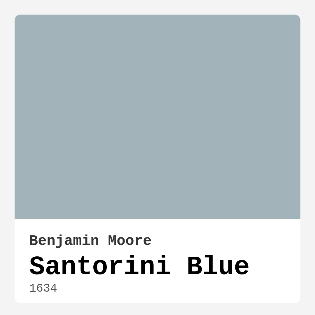
Color Preview & Key Details
| HEX Code | #A2B4BA |
| RGB | 162, 180, 186 |
| LRV | 44.67% |
| Undertone | Blue |
| Finish Options | Eggshell, Matte, Satin |
Imagine walking into a room that instantly transports you to a serene island, where the sound of gentle waves lapping at the shore fills the air, and the sky meets the sea in perfect harmony. That’s the magic of Santorini Blue, a color that embodies the calming essence of the Greek islands. This stunning shade from Benjamin Moore, with the color code 1634, is your ticket to transforming any space into a refreshing retreat. As someone who’s spent years exploring the world of color in home design, I’m excited to help you determine if this tranquil hue is the right choice for your upcoming project.
Santorini Blue is a delightful blend of blue and gray, creating a muted tone that exudes sophistication while maintaining a soft, inviting quality. With an LRV of around 44.67%, it reflects about half of the light that hits it, making it ideal for various lighting conditions. You’ll find that in bright spaces, it bursts forth with its beautiful blue characteristics, while in dimmer areas, it softens to a more muted, cozy feel. This makes it a versatile option for almost any room in your home.
When it comes to application, Santorini Blue is a dream. It’s beginner-friendly, rolls on smoothly, and dries quickly, so you can see the beauty of your transformation come to life in no time. You might need one to two coats for optimal coverage, especially if you’re painting over a darker color, but generally, it offers good coverage that’s easy to achieve. Just remember to test a small area first to see how it interacts with the light in your space.
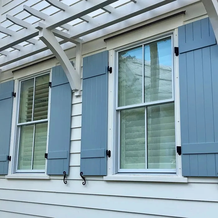
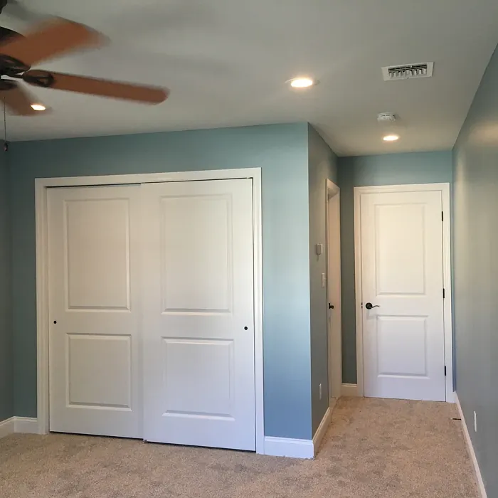
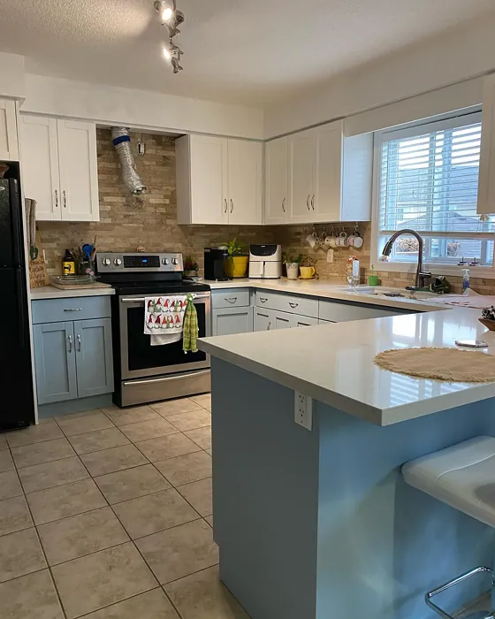
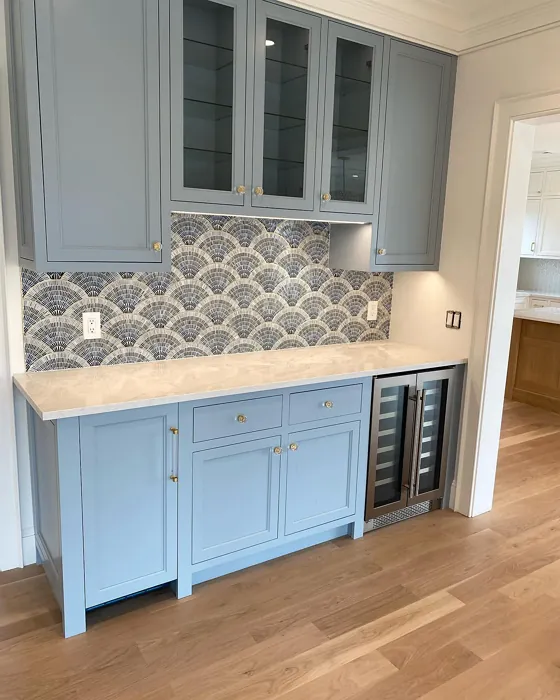
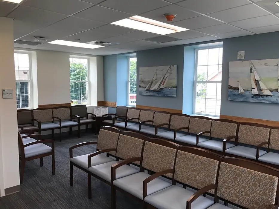
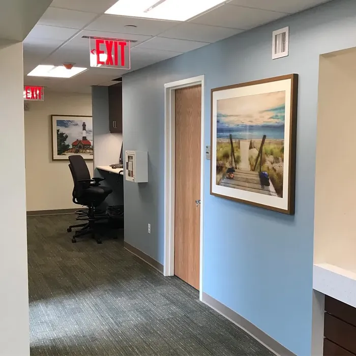
Now, let’s talk about where to use this captivating color. Santorini Blue works brilliantly in living rooms, bedrooms, bathrooms, and dining rooms. Imagine a serene bedroom where you awaken surrounded by this calming hue, or a chic bathroom that evokes a spa-like experience. It’s also an excellent choice for a light-filled living room, creating an inviting atmosphere for family gatherings or quiet evenings at home.
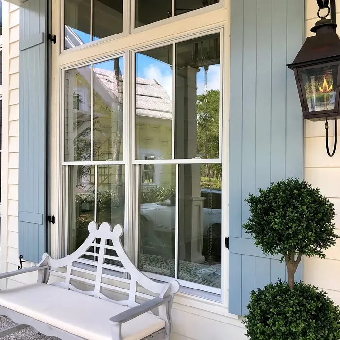
In terms of decor styles, Santorini Blue shines in coastal, modern, farmhouse, and Scandinavian designs. Its versatility allows it to blend seamlessly with various aesthetics, whether you’re aiming for a bright, airy beach house feel or a cozy, rustic cabin vibe. Pair it with whites and earthy tones, and you’ll create a stylish combination that is simultaneously contemporary and timeless.
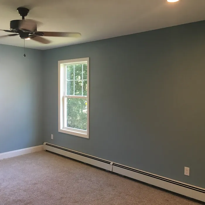
If you’re considering Santorini Blue for a small room, don’t shy away. Despite its muted depth, it can create an illusion of openness. Just be mindful of the lighting; in low light, it might appear darker, so pairing it with lighter trim can enhance that airy, spacious feel you’re after. Picture a cozy nursery or a home office where calmness reigns supreme, allowing you to focus and relax in equal measure.
One of the standout features of Santorini Blue is its washability. Life can get messy, and this color is highly washable, making it a practical choice for busy households. Whether you’re dealing with fingerprints from little ones or the occasional mark from day-to-day living, a simple wipe can bring your walls back to pristine condition.
Now, let’s hone in on the undertones. Santorini Blue is predominantly a cool shade, but those subtle gray undertones add a layer of warmth that prevents it from feeling stark or uninviting. This balanced quality means it can easily complement both warm and cool palettes in your decor. So whether you’re leaning towards a more earthy tone in your furnishings or a brighter, cooler aesthetic, Santorini Blue will fit right in.
When deciding on complementary colors, you have a wealth of options. Soft whites like White Dove can provide a crisp contrast that elevates the soothing nature of Santorini Blue. You can also incorporate earth tones or deeper shades to create depth and interest. For instance, pairing it with natural wood finishes can add warmth, while light grays or soft greens can keep the aesthetic fresh and modern.
If you’re excited about the idea of an accent wall, Santorini Blue is perfect for that too. Imagine a feature wall in your living room or bedroom that draws the eye and creates a stunning focal point. You can also think about painting furniture in this color, giving your pieces a chic refresh that stands out without overwhelming the space.
In terms of performance, Santorini Blue is designed to last. It’s fade-resistant, ensuring that your space continues to look vibrant over time. Plus, with a low VOC level, it’s an eco-conscious choice, allowing you to beautify your home without compromising your health or the environment.
While Santorini Blue is a dream color, it does come with a few considerations. Depending on the lighting in your space, it can appear different at various times of the day. This is something to keep in mind when selecting this hue; always observe how it looks in your specific environment before committing fully. Additionally, while it’s a beautiful shade, it might require multiple coats to achieve the desired vibrancy, particularly on darker walls.
In summary, Santorini Blue is more than just a paint color; it’s an experience waiting to unfold in your home. With its soft, calming hue, versatility across decor styles, and easy application, it has everything you need to create a serene and inviting atmosphere. Whether you’re designing a tranquil bedroom, a chic bathroom, or a cozy living space, this elegant shade can transform your home into a sanctuary of peace and style.
So, what do you think? Could Santorini Blue be the paint color that turns your vision into reality? I encourage you to grab a sample and bring it into your space. You might just find that it’s the perfect touch to elevate your home into a beautiful retreat.
Real Room Photo of Santorini Blue 1634
Undertones of Santorini Blue ?
Santorini Blue features subtle undertones of gray, which give it a sophisticated edge. This underlying warmth ensures it doesn’t feel cold or sterile, making it a welcoming choice for various spaces.
HEX value: #A2B4BA
RGB code: 162, 180, 186
Is Santorini Blue Cool or Warm?
This color leans cool, but its gray undertones lend it a balanced quality that makes it versatile enough to complement both warm and cool palettes.
Understanding Color Properties and Interior Design Tips
Hue refers to a specific position on the color wheel, measured in degrees from 0 to 360. Each degree represents a different pure color:
- 0° represents red
- 120° represents green
- 240° represents blue
Saturation describes the intensity or purity of a color and is expressed as a percentage:
- At 0%, the color appears completely desaturated—essentially a shade of gray
- At 100%, the color is at its most vivid and vibrant
Lightness indicates how light or dark a color is, also expressed as a percentage:
- 0% lightness results in black
- 100% lightness results in white
Using Warm Colors in Interior Design
Warm hues—such as reds, oranges, yellows, warm beiges, and greiges—are excellent choices for creating inviting and energetic spaces. These colors are particularly well-suited for:
- Kitchens, living rooms, and bathrooms, where warmth enhances comfort and sociability
- Large rooms, where warm tones can help reduce the sense of emptiness and make the space feel more intimate
For example:
- Warm beige shades provide a cozy, inviting atmosphere, ideal for living rooms, bedrooms, and hallways.
- Warm greige (a mix of beige and gray) offers the warmth of beige with the modern appeal of gray, making it a versatile backdrop for dining areas, bedrooms, and living spaces.
However, be mindful when using warm light tones in rooms with limited natural light. These shades may appear muted or even take on an unpleasant yellowish tint. To avoid a dull or flat appearance:
- Add depth by incorporating richer tones like deep greens, charcoal, or chocolate brown
- Use textured elements such as curtains, rugs, or cushions to bring dimension to the space
Pro Tip: Achieving Harmony with Warm and Cool Color Balance
To create a well-balanced and visually interesting interior, mix warm and cool tones strategically. This contrast adds depth and harmony to your design.
- If your walls feature warm hues, introduce cool-colored accents such as blue or green furniture, artwork, or accessories to create contrast.
- For a polished look, consider using a complementary color scheme, which pairs colors opposite each other on the color wheel (e.g., red with green, orange with blue).
This thoughtful mix not only enhances visual appeal but also creates a space that feels both dynamic and cohesive.
Light Temperature Affects on Santorini Blue
Natural Light
Natural daylight changes in color temperature as the sun moves across the sky. At sunrise and sunset, the light tends to have a warm, golden tone with a color temperature around 2000 Kelvin (K). As the day progresses and the sun rises higher, the light becomes cooler and more neutral. Around midday, especially when the sky is clear, natural light typically reaches its peak brightness and shifts to a cooler tone, ranging from 5500 to 6500 Kelvin. This midday light is close to what we perceive as pure white or daylight-balanced light.
These shifts in natural light can significantly influence how colors appear in a space, which is why designers often consider both the time of day and the orientation of windows when planning interior color schemes.
Artificial Light
When choosing artificial lighting, pay close attention to the color temperature, measured in Kelvin (K). This determines how warm or cool the light will appear. Lower temperatures, around 2700K, give off a warm, yellow glow often used in living rooms or bedrooms. Higher temperatures, above 5000K, create a cool, bluish light similar to daylight, commonly used in kitchens, offices, or task areas.
Use the slider to see how lighting temperature can affect the appearance of a surface or color throughout a space.


4800K
LRV of Santorini Blue
The Light Reflectance Value (LRV) of Santorini Blue is approximately 40, meaning it reflects a moderate amount of light, helping to keep spaces feeling open without being overly bright.
Detailed Review of Santorini Blue
Additional Paint Characteristics
Ideal Rooms
Bathroom, Bedroom, Home Office, Living Room, Nursery
Decor Styles
Coastal, Farmhouse, Modern, Scandinavian
Coverage
Good (1–2 Coats)
Ease of Application
Beginner Friendly, Brush Smooth, Fast-Drying, Roller-Ready
Washability
Highly Washable, Washable
VOC Level
Eco-Certified, Low VOC
Best Use
Accent Wall, Furniture, Interior Walls
Room Suitability
Bathroom, Bedroom, Dining Room, Living Room
Tone Tag
Balanced, Cool, Muted
Finish Type
Eggshell, Matte
Paint Performance
Easy Touch-Up, Fade Resistant, Low Odor, Quick Drying
Use Cases
Best for Low Light Rooms, Best for Modern Farmhouse, Best for Rentals, Designer Favorite
Mood
Calm, Inviting, Restful
Trim Pairing
Complements Cool Trim, Pairs with White Dove
Santorini Blue is more than just a color; it’s an experience. With its soft blue-gray hue, it brings a subtle elegance to any space, making it ideal for creating a calming atmosphere. When applied, it dries evenly, providing a smooth finish that enhances the aesthetics of your walls. It’s particularly effective in larger rooms where it can open up the space and create an airy feel. Whether you’re aiming for a serene bedroom or a chic bathroom, this shade works beautifully with both natural and artificial light, ensuring your room looks great any time of day. Plus, it pairs wonderfully with whites and earthy tones, allowing for stylish combinations that are easy to achieve.
Pros & Cons of 1634 Santorini Blue
Pros
Cons
Colors that go with Benjamin Moore Santorini Blue
FAQ on 1634 Santorini Blue
How many coats of Santorini Blue do I need?
For most applications, one to two coats of Santorini Blue should suffice. If you’re covering a darker color, you might need an extra coat to achieve the desired vibrancy. Always test a small area first to see how it looks under your room’s lighting conditions.
Can I use Santorini Blue in a small room?
Absolutely! While it’s a soft color, Santorini Blue can still work well in smaller spaces. It can create an illusion of depth and openness. Just be mindful of the lighting in the room, as it may appear darker in low light. Pairing it with lighter trim can help enhance the light and spacious feel.
Comparisons Santorini Blue with other colors
Santorini Blue 1634 vs Dutch Tile Blue SW 0031
| Attribute | Santorini Blue 1634 | Dutch Tile Blue SW 0031 |
|---|---|---|
| Color Name | Santorini Blue 1634 | Dutch Tile Blue SW 0031 |
| Color | ||
| Hue | Blue | Blue |
| Brightness | Medium | Medium |
| RGB | 162, 180, 186 | 154, 171, 171 |
| LRV | 44.67% | 24% |
| Finish Type | Eggshell, Matte | Eggshell, Matte, Satin |
| Finish Options | Eggshell, Matte, Satin | Eggshell, Flat, Matte, Satin |
| Ideal Rooms | Bathroom, Bedroom, Home Office, Living Room, Nursery | Bathroom, Bedroom, Dining Room, Hallway, Home Office, Kitchen, Living Room |
| Decor Styles | Coastal, Farmhouse, Modern, Scandinavian | Coastal, Modern Farmhouse, Scandinavian, Traditional, Transitional |
| Coverage | Good (1–2 Coats) | Good (1–2 Coats) |
| Ease of Application | Beginner Friendly, Brush Smooth, Fast-Drying, Roller-Ready | Beginner Friendly, Brush Smooth, Fast-Drying, Roller-Ready |
| Washability | Highly Washable, Washable | Highly Washable, Washable |
| Room Suitability | Bathroom, Bedroom, Dining Room, Living Room | Bathroom, Bedroom, Dining Room, Kitchen, Living Room |
| Tone | Balanced, Cool, Muted | Balanced, Cool, Muted |
| Paint Performance | Easy Touch-Up, Fade Resistant, Low Odor, Quick Drying | Easy Touch-Up, High Coverage, Low Odor, Quick Drying |
Santorini Blue 1634 vs Debonair SW 9139
| Attribute | Santorini Blue 1634 | Debonair SW 9139 |
|---|---|---|
| Color Name | Santorini Blue 1634 | Debonair SW 9139 |
| Color | ||
| Hue | Blue | Blue |
| Brightness | Medium | Medium |
| RGB | 162, 180, 186 | 144, 160, 166 |
| LRV | 44.67% | 30% |
| Finish Type | Eggshell, Matte | Eggshell, Matte, Satin |
| Finish Options | Eggshell, Matte, Satin | Eggshell, Matte, Satin |
| Ideal Rooms | Bathroom, Bedroom, Home Office, Living Room, Nursery | Bedroom, Dining Room, Home Office, Living Room |
| Decor Styles | Coastal, Farmhouse, Modern, Scandinavian | Coastal, Industrial, Modern, Transitional |
| Coverage | Good (1–2 Coats) | Good (1–2 Coats) |
| Ease of Application | Beginner Friendly, Brush Smooth, Fast-Drying, Roller-Ready | Beginner Friendly, Brush Smooth, Roller-Ready |
| Washability | Highly Washable, Washable | Washable, Wipeable |
| Room Suitability | Bathroom, Bedroom, Dining Room, Living Room | Bedroom, Dining Room, Home Office, Living Room |
| Tone | Balanced, Cool, Muted | Balanced, Cool, Muted |
| Paint Performance | Easy Touch-Up, Fade Resistant, Low Odor, Quick Drying | Easy Touch-Up, Low Odor, Quick Drying |
Santorini Blue 1634 vs Stardew SW 9138
| Attribute | Santorini Blue 1634 | Stardew SW 9138 |
|---|---|---|
| Color Name | Santorini Blue 1634 | Stardew SW 9138 |
| Color | ||
| Hue | Blue | Blue |
| Brightness | Medium | Medium |
| RGB | 162, 180, 186 | 166, 178, 181 |
| LRV | 44.67% | 30% |
| Finish Type | Eggshell, Matte | Eggshell, Satin |
| Finish Options | Eggshell, Matte, Satin | Eggshell, Matte, Satin |
| Ideal Rooms | Bathroom, Bedroom, Home Office, Living Room, Nursery | Bathroom, Bedroom, Home Office, Living Room, Nursery |
| Decor Styles | Coastal, Farmhouse, Modern, Scandinavian | Coastal, Farmhouse, Modern, Scandinavian |
| Coverage | Good (1–2 Coats) | Good (1–2 Coats) |
| Ease of Application | Beginner Friendly, Brush Smooth, Fast-Drying, Roller-Ready | Beginner Friendly, Brush Smooth, Roller-Ready |
| Washability | Highly Washable, Washable | Highly Washable, Washable, Wipeable |
| Room Suitability | Bathroom, Bedroom, Dining Room, Living Room | Bathroom, Bedroom, Home Office, Living Room |
| Tone | Balanced, Cool, Muted | Calm, Cool, Muted |
| Paint Performance | Easy Touch-Up, Fade Resistant, Low Odor, Quick Drying | Easy Touch-Up, High Coverage, Low Odor |
Santorini Blue 1634 vs Niebla Azul SW 9137
| Attribute | Santorini Blue 1634 | Niebla Azul SW 9137 |
|---|---|---|
| Color Name | Santorini Blue 1634 | Niebla Azul SW 9137 |
| Color | ||
| Hue | Blue | Blue |
| Brightness | Medium | Medium |
| RGB | 162, 180, 186 | 182, 195, 196 |
| LRV | 44.67% | 48% |
| Finish Type | Eggshell, Matte | Eggshell, Matte, Satin |
| Finish Options | Eggshell, Matte, Satin | Eggshell, Matte, Satin |
| Ideal Rooms | Bathroom, Bedroom, Home Office, Living Room, Nursery | Bedroom, Home Office, Living Room, Nursery |
| Decor Styles | Coastal, Farmhouse, Modern, Scandinavian | Coastal, Modern, Scandinavian, Transitional |
| Coverage | Good (1–2 Coats) | Good (1–2 Coats), Touch-Up Friendly |
| Ease of Application | Beginner Friendly, Brush Smooth, Fast-Drying, Roller-Ready | Beginner Friendly, Brush Smooth, Roller-Ready |
| Washability | Highly Washable, Washable | Highly Washable, Washable |
| Room Suitability | Bathroom, Bedroom, Dining Room, Living Room | Bedroom, Home Office, Living Room, Nursery |
| Tone | Balanced, Cool, Muted | Airy, Cool, Muted |
| Paint Performance | Easy Touch-Up, Fade Resistant, Low Odor, Quick Drying | Easy Touch-Up, Fade Resistant, Low Odor, Scuff Resistant |
Santorini Blue 1634 vs Rain SW 6219
| Attribute | Santorini Blue 1634 | Rain SW 6219 |
|---|---|---|
| Color Name | Santorini Blue 1634 | Rain SW 6219 |
| Color | ||
| Hue | Blue | Blue |
| Brightness | Medium | Medium |
| RGB | 162, 180, 186 | 171, 190, 191 |
| LRV | 44.67% | 50% |
| Finish Type | Eggshell, Matte | Eggshell, Matte, Satin |
| Finish Options | Eggshell, Matte, Satin | Eggshell, Matte, Satin |
| Ideal Rooms | Bathroom, Bedroom, Home Office, Living Room, Nursery | Bathroom, Bedroom, Home Office, Living Room, Nursery |
| Decor Styles | Coastal, Farmhouse, Modern, Scandinavian | Coastal, Minimalist, Modern, Scandinavian, Transitional |
| Coverage | Good (1–2 Coats) | Good (1–2 Coats), Touch-Up Friendly |
| Ease of Application | Beginner Friendly, Brush Smooth, Fast-Drying, Roller-Ready | Beginner Friendly, Brush Smooth, Fast-Drying, Roller-Ready |
| Washability | Highly Washable, Washable | Scrubbable, Stain Resistant, Washable |
| Room Suitability | Bathroom, Bedroom, Dining Room, Living Room | Bathroom, Bedroom, Home Office, Living Room, Nursery |
| Tone | Balanced, Cool, Muted | Balanced, Cool, Muted |
| Paint Performance | Easy Touch-Up, Fade Resistant, Low Odor, Quick Drying | Easy Touch-Up, Low Odor, Quick Drying, Stain Resistant |
Santorini Blue 1634 vs Morning at Sea SW 9634
| Attribute | Santorini Blue 1634 | Morning at Sea SW 9634 |
|---|---|---|
| Color Name | Santorini Blue 1634 | Morning at Sea SW 9634 |
| Color | ||
| Hue | Blue | Blue |
| Brightness | Medium | Medium |
| RGB | 162, 180, 186 | 130, 151, 155 |
| LRV | 44.67% | 50% |
| Finish Type | Eggshell, Matte | Eggshell, Matte |
| Finish Options | Eggshell, Matte, Satin | Eggshell, Matte, Satin |
| Ideal Rooms | Bathroom, Bedroom, Home Office, Living Room, Nursery | Bathroom, Bedroom, Home Office, Living Room |
| Decor Styles | Coastal, Farmhouse, Modern, Scandinavian | Coastal, Minimalist, Modern, Scandinavian |
| Coverage | Good (1–2 Coats) | Good (1–2 Coats), Touch-Up Friendly |
| Ease of Application | Beginner Friendly, Brush Smooth, Fast-Drying, Roller-Ready | Beginner Friendly, Brush Smooth, Roller-Ready |
| Washability | Highly Washable, Washable | Washable, Wipeable |
| Room Suitability | Bathroom, Bedroom, Dining Room, Living Room | Bathroom, Bedroom, Home Office, Living Room |
| Tone | Balanced, Cool, Muted | Airy, Cool, Muted |
| Paint Performance | Easy Touch-Up, Fade Resistant, Low Odor, Quick Drying | Easy Touch-Up, Fade Resistant, Low Odor |
Santorini Blue 1634 vs Sleepy Blue SW 6225
| Attribute | Santorini Blue 1634 | Sleepy Blue SW 6225 |
|---|---|---|
| Color Name | Santorini Blue 1634 | Sleepy Blue SW 6225 |
| Color | ||
| Hue | Blue | Blue |
| Brightness | Medium | Medium |
| RGB | 162, 180, 186 | 188, 203, 206 |
| LRV | 44.67% | 50% |
| Finish Type | Eggshell, Matte | Eggshell, Matte, Satin |
| Finish Options | Eggshell, Matte, Satin | Eggshell, Matte, Satin |
| Ideal Rooms | Bathroom, Bedroom, Home Office, Living Room, Nursery | Bedroom, Home Office, Living Room, Nursery |
| Decor Styles | Coastal, Farmhouse, Modern, Scandinavian | Coastal, Minimalist, Modern Farmhouse, Scandinavian |
| Coverage | Good (1–2 Coats) | Good (1–2 Coats) |
| Ease of Application | Beginner Friendly, Brush Smooth, Fast-Drying, Roller-Ready | Beginner Friendly, Brush Smooth, Fast-Drying, Roller-Ready |
| Washability | Highly Washable, Washable | Highly Washable, Washable |
| Room Suitability | Bathroom, Bedroom, Dining Room, Living Room | Bedroom, Home Office, Living Room, Nursery |
| Tone | Balanced, Cool, Muted | Airy, Cool, Muted |
| Paint Performance | Easy Touch-Up, Fade Resistant, Low Odor, Quick Drying | Easy Touch-Up, Low Odor, Quick Drying, Scuff Resistant |
Santorini Blue 1634 vs Lakeside SW 9683
| Attribute | Santorini Blue 1634 | Lakeside SW 9683 |
|---|---|---|
| Color Name | Santorini Blue 1634 | Lakeside SW 9683 |
| Color | ||
| Hue | Blue | Blue |
| Brightness | Medium | Medium |
| RGB | 162, 180, 186 | 173, 184, 192 |
| LRV | 44.67% | 24% |
| Finish Type | Eggshell, Matte | Eggshell, Matte, Satin |
| Finish Options | Eggshell, Matte, Satin | Eggshell, Matte, Satin |
| Ideal Rooms | Bathroom, Bedroom, Home Office, Living Room, Nursery | Bathroom, Bedroom, Home Office, Living Room |
| Decor Styles | Coastal, Farmhouse, Modern, Scandinavian | Coastal, Minimalist, Modern, Rustic |
| Coverage | Good (1–2 Coats) | Good (1–2 Coats) |
| Ease of Application | Beginner Friendly, Brush Smooth, Fast-Drying, Roller-Ready | Beginner Friendly, Brush Smooth, Roller-Ready |
| Washability | Highly Washable, Washable | Scrubbable, Washable |
| Room Suitability | Bathroom, Bedroom, Dining Room, Living Room | Bathroom, Bedroom, Home Office, Living Room |
| Tone | Balanced, Cool, Muted | Balanced, Cool, Muted |
| Paint Performance | Easy Touch-Up, Fade Resistant, Low Odor, Quick Drying | Easy Touch-Up, Fade Resistant, High Coverage, Low Odor |
Santorini Blue 1634 vs Upward SW 6239
| Attribute | Santorini Blue 1634 | Upward SW 6239 |
|---|---|---|
| Color Name | Santorini Blue 1634 | Upward SW 6239 |
| Color | ||
| Hue | Blue | Blue |
| Brightness | Medium | Medium |
| RGB | 162, 180, 186 | 191, 201, 208 |
| LRV | 44.67% | 75% |
| Finish Type | Eggshell, Matte | Eggshell, Satin |
| Finish Options | Eggshell, Matte, Satin | Eggshell, Flat, Satin |
| Ideal Rooms | Bathroom, Bedroom, Home Office, Living Room, Nursery | Bedroom, Dining Room, Home Office, Living Room, Nursery |
| Decor Styles | Coastal, Farmhouse, Modern, Scandinavian | Coastal, Minimalist, Modern, Scandinavian |
| Coverage | Good (1–2 Coats) | Good (1–2 Coats), Touch-Up Friendly |
| Ease of Application | Beginner Friendly, Brush Smooth, Fast-Drying, Roller-Ready | Beginner Friendly, Brush Smooth, Fast-Drying, Roller-Ready |
| Washability | Highly Washable, Washable | Washable, Wipeable |
| Room Suitability | Bathroom, Bedroom, Dining Room, Living Room | Bedroom, Home Office, Living Room, Nursery |
| Tone | Balanced, Cool, Muted | Cool, Crisp, Muted |
| Paint Performance | Easy Touch-Up, Fade Resistant, Low Odor, Quick Drying | High Coverage, Low Odor, Quick Drying |
Santorini Blue 1634 vs Aleutian SW 6241
| Attribute | Santorini Blue 1634 | Aleutian SW 6241 |
|---|---|---|
| Color Name | Santorini Blue 1634 | Aleutian SW 6241 |
| Color | ||
| Hue | Blue | Blue |
| Brightness | Medium | Medium |
| RGB | 162, 180, 186 | 152, 169, 183 |
| LRV | 44.67% | 24% |
| Finish Type | Eggshell, Matte | Eggshell, Matte, Satin |
| Finish Options | Eggshell, Matte, Satin | Eggshell, Matte, Satin |
| Ideal Rooms | Bathroom, Bedroom, Home Office, Living Room, Nursery | Bathroom, Bedroom, Home Office, Kitchen, Living Room, Nursery |
| Decor Styles | Coastal, Farmhouse, Modern, Scandinavian | Coastal, Minimalist, Modern, Scandinavian, Transitional |
| Coverage | Good (1–2 Coats) | Good (1–2 Coats), Touch-Up Friendly |
| Ease of Application | Beginner Friendly, Brush Smooth, Fast-Drying, Roller-Ready | Beginner Friendly, Brush Smooth, Fast-Drying, Roller-Ready |
| Washability | Highly Washable, Washable | Scrubbable, Stain Resistant, Washable |
| Room Suitability | Bathroom, Bedroom, Dining Room, Living Room | Bathroom, Bedroom, Home Office, Living Room, Nursery |
| Tone | Balanced, Cool, Muted | Airy, Balanced, Cool, Muted |
| Paint Performance | Easy Touch-Up, Fade Resistant, Low Odor, Quick Drying | Easy Touch-Up, Fade Resistant, Low Odor, Quick Drying |
Official Page of Benjamin Moore Santorini Blue 1634