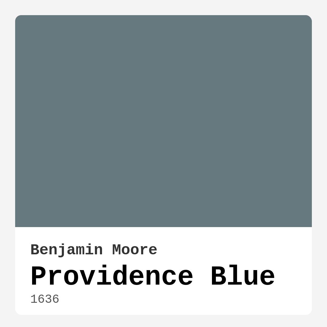
Color Preview & Key Details
| HEX Code | #66797F |
| RGB | 102, 121, 127 |
| LRV | 19.23% |
| Undertone | Blue |
| Finish Options | Matte, Satin, Semi-Gloss |
If you’re searching for a paint color that effortlessly blends sophistication with serenity, let me introduce you to Benjamin Moore’s Providence Blue. This stunning shade—coded as 1636—is a perfect balance of blue and gray, offering a calming yet refined presence in any space. Whether you’re refreshing a single room or reimagining your entire home, Providence Blue has the versatility to adapt to your vision while creating an atmosphere that feels both inviting and intentional.
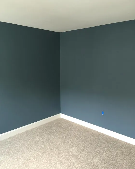
One of the first things you’ll notice about Providence Blue is its depth. With an LRV (Light Reflectance Value) of 19.23%, it sits comfortably in the medium-dark range, meaning it absorbs more light than it reflects. This gives it a rich, enveloping quality that works beautifully in well-lit spaces. If your room gets plenty of natural light, the color will appear crisp and fresh, almost like a soft ocean mist. In rooms with less light, it takes on a more muted, intimate feel—ideal for cozy bedrooms or snug reading nooks. Just keep in mind that in dimly lit areas, it can lean darker, so consider adding layered lighting to keep the space from feeling too heavy.
The undertones here are pure blue, which keeps the color cool and modern. Unlike some blue-grays that pull green or purple, Providence Blue stays true to its roots, making it incredibly easy to pair with other colors. If you’re wondering what works best alongside it, think crisp whites like Benjamin Moore’s White Dove for trim, or warm woods for a natural contrast. For a bolder look, try pairing it with muted reds or soft corals—these complementary hues will make the blue pop without overwhelming the space.
When it comes to application, this color is a dream. It offers excellent coverage, often needing just one or two coats, and it’s touch-up friendly, which is a lifesaver if you’re painting around kids or pets. The finish options—matte, satin, or semi-gloss—give you flexibility depending on the room’s function. A matte finish in a bedroom adds understated elegance, while a satin or semi-gloss in a kitchen or bathroom makes cleaning a breeze. And because it’s low-VOC and eco-certified, you won’t have to worry about harsh fumes during or after painting.
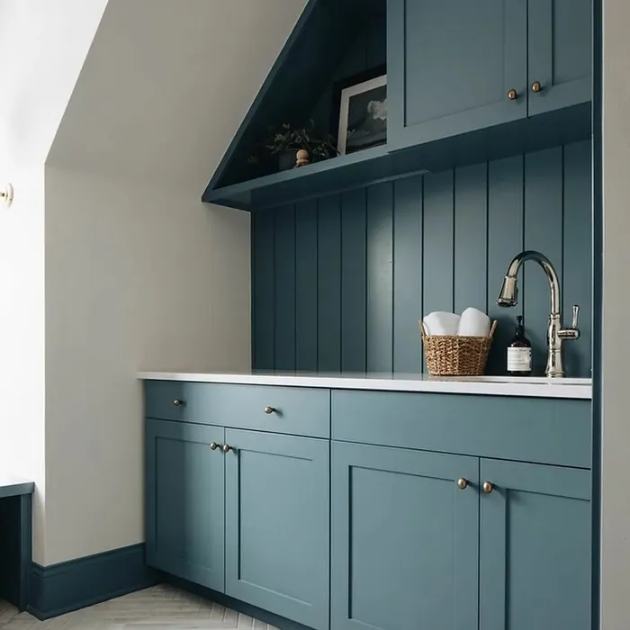
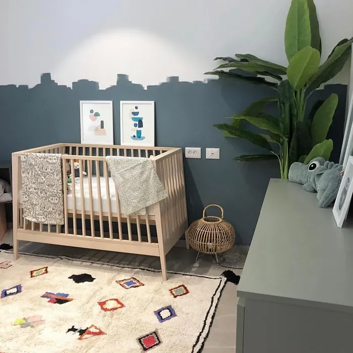
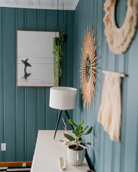
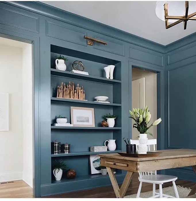
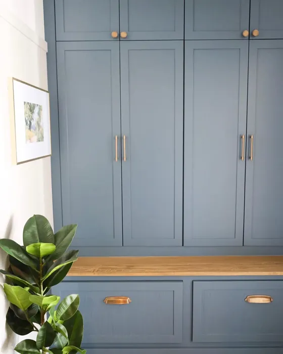
So where does Providence Blue shine brightest? Let’s start with living rooms. Its serene vibe makes it a fantastic backdrop for both lively gatherings and quiet evenings. Pair it with neutral furniture and textured throws for a relaxed, coastal feel, or go modern with sleek metals and minimalist decor. In bedrooms, it creates a restful retreat—especially when layered with soft linens and warm wood tones. Home offices benefit from its calming influence, helping to foster focus without feeling sterile. And don’t overlook kitchens! When used on cabinetry or an accent wall, it brings a touch of sophistication that’s unexpected yet timeless.
If you love the idea of Providence Blue but aren’t ready to commit to full walls, consider using it on furniture or trim. A painted dresser or bookshelf in this hue adds just enough color without dominating the room. For trim, it pairs beautifully with lighter walls, creating a subtle contrast that feels polished but not overly formal. And if you’re working with a farmhouse or traditional style, it blends seamlessly with shiplap, beadboard, and vintage accents.
Now, let’s talk about the mood. This color is all about calm and tranquility. It doesn’t shout for attention—it whispers, inviting you to slow down and breathe. That’s why it’s such a great choice for spaces where you want to unwind. But don’t mistake its quiet nature for blandness. Providence Blue has a quiet confidence that elevates a room without overpowering it. It’s the kind of color that makes you feel like you’ve curated your space with intention, not just followed a trend.
A few pro tips before you dive in: Always test the color in your home. Paint a large swatch and observe it at different times of day. Notice how it changes with the light and how it interacts with your existing decor. If you’re worried about it feeling too dark, balance it with plenty of light-reflecting elements—think mirrors, metallic finishes, and sheer curtains. And if you’re pairing it with wood tones, lean toward warmer stains to keep the space from feeling too cool.
At the end of the day, Providence Blue is more than just a paint color—it’s a mood, a feeling, a backdrop for the life you want to live at home. Whether you’re going for coastal charm, modern edge, or timeless tradition, this shade has the versatility to deliver. So grab a brush, trust your instincts, and let this beautiful blue-gray transform your space into something truly special. You won’t regret it.

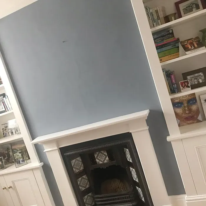
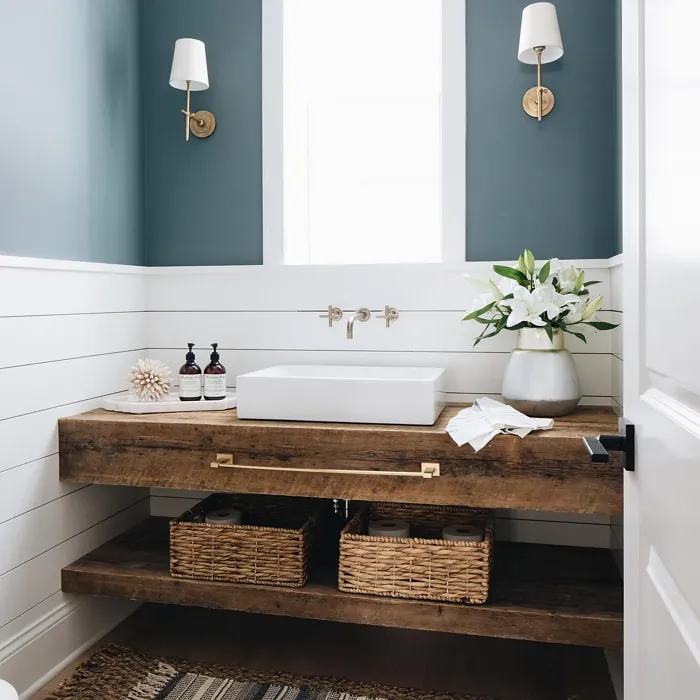
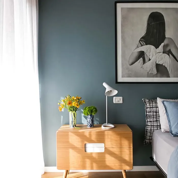
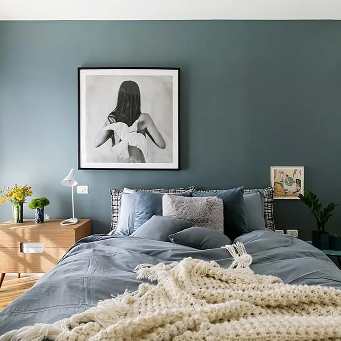
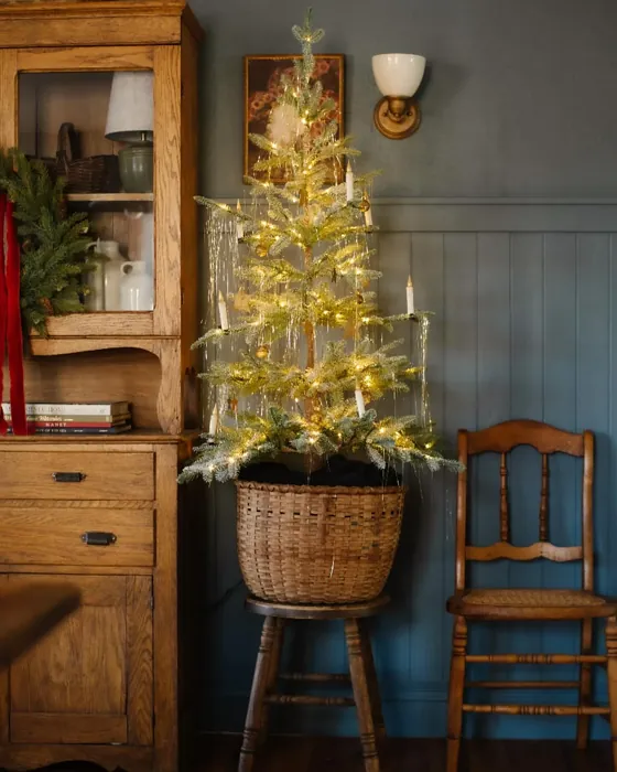
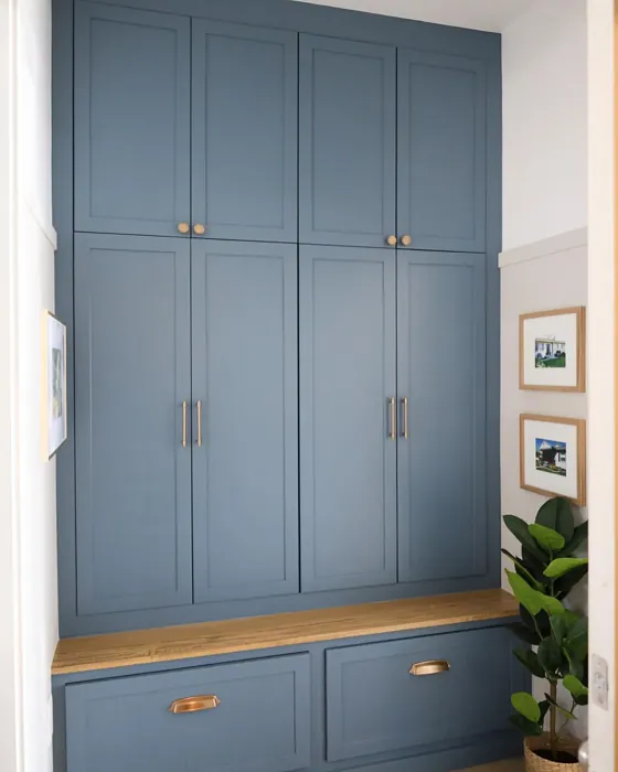
Real Room Photo of Providence Blue 1636
Undertones of Providence Blue ?
The undertones of Providence Blue are a key aspect of its character, leaning towards Blue. These subtle underlying hues are what give the color its depth and complexity. For example, a gray with a blue undertone will feel cooler and more modern, while one with a brown undertone will feel warmer and more traditional. It’s essential to test this paint in your home and observe it next to your existing furniture, flooring, and decor to see how these undertones interact and reveal themselves throughout the day.
HEX value: #66797F
RGB code: 102, 121, 127
Is Providence Blue Cool or Warm?
This color falls on the cooler side of the spectrum, offering a refreshing and tranquil vibe. Its coolness can help create a serene atmosphere, especially in rooms where you seek to unwind.
Understanding Color Properties and Interior Design Tips
Hue refers to a specific position on the color wheel, measured in degrees from 0 to 360. Each degree represents a different pure color:
- 0° represents red
- 120° represents green
- 240° represents blue
Saturation describes the intensity or purity of a color and is expressed as a percentage:
- At 0%, the color appears completely desaturated—essentially a shade of gray
- At 100%, the color is at its most vivid and vibrant
Lightness indicates how light or dark a color is, also expressed as a percentage:
- 0% lightness results in black
- 100% lightness results in white
Using Warm Colors in Interior Design
Warm hues—such as reds, oranges, yellows, warm beiges, and greiges—are excellent choices for creating inviting and energetic spaces. These colors are particularly well-suited for:
- Kitchens, living rooms, and bathrooms, where warmth enhances comfort and sociability
- Large rooms, where warm tones can help reduce the sense of emptiness and make the space feel more intimate
For example:
- Warm beige shades provide a cozy, inviting atmosphere, ideal for living rooms, bedrooms, and hallways.
- Warm greige (a mix of beige and gray) offers the warmth of beige with the modern appeal of gray, making it a versatile backdrop for dining areas, bedrooms, and living spaces.
However, be mindful when using warm light tones in rooms with limited natural light. These shades may appear muted or even take on an unpleasant yellowish tint. To avoid a dull or flat appearance:
- Add depth by incorporating richer tones like deep greens, charcoal, or chocolate brown
- Use textured elements such as curtains, rugs, or cushions to bring dimension to the space
Pro Tip: Achieving Harmony with Warm and Cool Color Balance
To create a well-balanced and visually interesting interior, mix warm and cool tones strategically. This contrast adds depth and harmony to your design.
- If your walls feature warm hues, introduce cool-colored accents such as blue or green furniture, artwork, or accessories to create contrast.
- For a polished look, consider using a complementary color scheme, which pairs colors opposite each other on the color wheel (e.g., red with green, orange with blue).
This thoughtful mix not only enhances visual appeal but also creates a space that feels both dynamic and cohesive.

Light Temperature Affects on Providence Blue
Natural Light
Natural daylight changes in color temperature as the sun moves across the sky. At sunrise and sunset, the light tends to have a warm, golden tone with a color temperature around 2000 Kelvin (K). As the day progresses and the sun rises higher, the light becomes cooler and more neutral. Around midday, especially when the sky is clear, natural light typically reaches its peak brightness and shifts to a cooler tone, ranging from 5500 to 6500 Kelvin. This midday light is close to what we perceive as pure white or daylight-balanced light.
These shifts in natural light can significantly influence how colors appear in a space, which is why designers often consider both the time of day and the orientation of windows when planning interior color schemes.
Artificial Light
When choosing artificial lighting, pay close attention to the color temperature, measured in Kelvin (K). This determines how warm or cool the light will appear. Lower temperatures, around 2700K, give off a warm, yellow glow often used in living rooms or bedrooms. Higher temperatures, above 5000K, create a cool, bluish light similar to daylight, commonly used in kitchens, offices, or task areas.
Use the slider to see how lighting temperature can affect the appearance of a surface or color throughout a space.


4800K
LRV of Providence Blue
The Light Reflectance Value (LRV) of Providence Blue is 19.23%, which places it in the Medium Dark category. This means it reflects very little light. Understanding a paint’s LRV is crucial for predicting how it will look in your space. A higher LRV indicates a lighter color that reflects more light, making rooms feel larger and brighter. A lower LRV signifies a darker color that absorbs more light, creating a cozier, more intimate atmosphere. Always consider the natural and artificial lighting in your room when selecting a paint color based on its LRV.
Detailed Review of Providence Blue
Additional Paint Characteristics
Ideal Rooms
Bedroom, Home Office, Kitchen, Living Room
Decor Styles
Coastal, Farmhouse, Modern, Traditional
Coverage
Good (1–2 Coats), Touch-Up Friendly
Ease of Application
Beginner Friendly, Brush Smooth, Roller-Ready
Washability
Scrubbable, Washable
VOC Level
Eco-Certified, Low VOC
Best Use
Accent Wall, Furniture, Interior Walls, Trim
Room Suitability
Bedroom, Home Office, Kitchen, Living Room
Tone Tag
Balanced, Cool, Muted
Finish Type
Matte, Satin, Semi-Gloss
Paint Performance
Easy Touch-Up, High Coverage, Low Odor
Use Cases
Best for Modern Farmhouse, Best for Rentals, Classic Favorite
Mood
Calm, Inviting, Restful
Trim Pairing
Complements Cool Trim, Good with Wood Trim, Pairs with White Dove
When it comes to selecting the perfect color for your living space, Providence Blue stands out for its unique ability to adapt to different lighting conditions. In natural light, it exudes a crisp, fresh vibe, while artificial light brings out its softer, more muted hues. This makes it a fantastic choice for spaces where you want to foster relaxation and calmness, such as bedrooms and home offices. Its application is smooth and even, providing excellent coverage with just one to two coats. Whether you’re painting an accent wall or an entire room, this color will leave you feeling refreshed and inspired.
Pros & Cons of 1636 Providence Blue
Pros
Cons
Colors that go with Benjamin Moore Providence Blue
FAQ on 1636 Providence Blue
Is Providence Blue suitable for small spaces?
Absolutely! Providence Blue can work wonders in small spaces. Its cool tones can make a room feel larger and more open while still maintaining a cozy atmosphere. Just make sure to use it in well-lit areas to avoid any darkening effects.
What finishes are available for Providence Blue?
Providence Blue is available in a variety of finishes, including matte, satin, and semi-gloss. Each finish offers a different look and feel, so you can select the one that best suits your style and the room’s function. For a more modern look, consider satin or semi-gloss, while matte finishes are perfect for a more understated elegance.
Comparisons Providence Blue with other colors
Providence Blue 1636 vs Naval SW 6244
| Attribute | Providence Blue 1636 | Naval SW 6244 |
|---|---|---|
| Color Name | Providence Blue 1636 | Naval SW 6244 |
| Color | ||
| Hue | Blue | Blue |
| Brightness | Dark | Dark |
| RGB | 102, 121, 127 | 47, 61, 76 |
| LRV | 19.23% | 4% |
| Finish Type | Matte, Satin, Semi-Gloss | Matte, Satin, Semi-Gloss |
| Finish Options | Matte, Satin, Semi-Gloss | Matte, Satin, Semi-Gloss |
| Ideal Rooms | Bedroom, Home Office, Kitchen, Living Room | Bedroom, Dining Room, Hallway, Home Office, Living Room |
| Decor Styles | Coastal, Farmhouse, Modern, Traditional | Coastal, Industrial, Minimalist, Modern, Traditional |
| Coverage | Good (1–2 Coats), Touch-Up Friendly | Good (1–2 Coats), Self-Priming |
| Ease of Application | Beginner Friendly, Brush Smooth, Roller-Ready | Beginner Friendly, Brush Smooth, Roller-Ready |
| Washability | Scrubbable, Washable | Highly Washable, Washable |
| Room Suitability | Bedroom, Home Office, Kitchen, Living Room | Bedroom, Dining Room, Entryway, Home Office, Living Room |
| Tone | Balanced, Cool, Muted | Cool, Deep, Moody |
| Paint Performance | Easy Touch-Up, High Coverage, Low Odor | Easy Touch-Up, High Coverage, Low Odor, Scuff Resistant |
Providence Blue 1636 vs Sea Serpent SW 7615
| Attribute | Providence Blue 1636 | Sea Serpent SW 7615 |
|---|---|---|
| Color Name | Providence Blue 1636 | Sea Serpent SW 7615 |
| Color | ||
| Hue | Blue | Blue |
| Brightness | Dark | Dark |
| RGB | 102, 121, 127 | 62, 75, 84 |
| LRV | 19.23% | 12% |
| Finish Type | Matte, Satin, Semi-Gloss | Eggshell, Matte, Satin |
| Finish Options | Matte, Satin, Semi-Gloss | Eggshell, Matte, Satin |
| Ideal Rooms | Bedroom, Home Office, Kitchen, Living Room | Bathroom, Bedroom, Home Office, Living Room |
| Decor Styles | Coastal, Farmhouse, Modern, Traditional | Coastal, Farmhouse, Industrial, Modern |
| Coverage | Good (1–2 Coats), Touch-Up Friendly | Good (1–2 Coats), Touch-Up Friendly |
| Ease of Application | Beginner Friendly, Brush Smooth, Roller-Ready | Beginner Friendly, Brush Smooth, Roller-Ready |
| Washability | Scrubbable, Washable | Highly Washable, Washable |
| Room Suitability | Bedroom, Home Office, Kitchen, Living Room | Bathroom, Bedroom, Home Office, Living Room |
| Tone | Balanced, Cool, Muted | Cool, Deep, Moody |
| Paint Performance | Easy Touch-Up, High Coverage, Low Odor | Easy Touch-Up, High Coverage, Low Odor |
Providence Blue 1636 vs Rain Cloud SW 9639
| Attribute | Providence Blue 1636 | Rain Cloud SW 9639 |
|---|---|---|
| Color Name | Providence Blue 1636 | Rain Cloud SW 9639 |
| Color | ||
| Hue | Blue | Blue |
| Brightness | Dark | Dark |
| RGB | 102, 121, 127 | 83, 97, 104 |
| LRV | 19.23% | 30% |
| Finish Type | Matte, Satin, Semi-Gloss | Eggshell, Matte, Satin |
| Finish Options | Matte, Satin, Semi-Gloss | Eggshell, Matte, Satin |
| Ideal Rooms | Bedroom, Home Office, Kitchen, Living Room | Bedroom, Dining Room, Home Office, Living Room |
| Decor Styles | Coastal, Farmhouse, Modern, Traditional | Coastal, Contemporary, Minimalist, Scandinavian |
| Coverage | Good (1–2 Coats), Touch-Up Friendly | Good (1–2 Coats), Touch-Up Friendly |
| Ease of Application | Beginner Friendly, Brush Smooth, Roller-Ready | Beginner Friendly, Brush Smooth, Roller-Ready |
| Washability | Scrubbable, Washable | Highly Washable, Washable |
| Room Suitability | Bedroom, Home Office, Kitchen, Living Room | Bedroom, Home Office, Living Room |
| Tone | Balanced, Cool, Muted | Balanced, Cool, Muted |
| Paint Performance | Easy Touch-Up, High Coverage, Low Odor | Easy Touch-Up, Fade Resistant, Low Odor |
Providence Blue 1636 vs Indigo Batik SW 7602
| Attribute | Providence Blue 1636 | Indigo Batik SW 7602 |
|---|---|---|
| Color Name | Providence Blue 1636 | Indigo Batik SW 7602 |
| Color | ||
| Hue | Blue | Blue |
| Brightness | Dark | Dark |
| RGB | 102, 121, 127 | 62, 80, 99 |
| LRV | 19.23% | 10% |
| Finish Type | Matte, Satin, Semi-Gloss | Matte, Satin |
| Finish Options | Matte, Satin, Semi-Gloss | Eggshell, Flat, Matte, Satin |
| Ideal Rooms | Bedroom, Home Office, Kitchen, Living Room | Bedroom, Dining Room, Home Office, Living Room |
| Decor Styles | Coastal, Farmhouse, Modern, Traditional | Bohemian, Coastal, Contemporary, Modern |
| Coverage | Good (1–2 Coats), Touch-Up Friendly | Good (1–2 Coats), Touch-Up Friendly |
| Ease of Application | Beginner Friendly, Brush Smooth, Roller-Ready | Brush Smooth, Fast-Drying, Roller-Ready |
| Washability | Scrubbable, Washable | Scrubbable, Washable, Wipeable |
| Room Suitability | Bedroom, Home Office, Kitchen, Living Room | Bedroom, Dining Room, Home Office, Living Room |
| Tone | Balanced, Cool, Muted | Cool, Deep, Moody |
| Paint Performance | Easy Touch-Up, High Coverage, Low Odor | Easy Touch-Up, High Coverage, Low Odor, Quick Drying |
Providence Blue 1636 vs Sea Mariner SW 9640
| Attribute | Providence Blue 1636 | Sea Mariner SW 9640 |
|---|---|---|
| Color Name | Providence Blue 1636 | Sea Mariner SW 9640 |
| Color | ||
| Hue | Blue | Blue |
| Brightness | Dark | Dark |
| RGB | 102, 121, 127 | 67, 74, 84 |
| LRV | 19.23% | 6% |
| Finish Type | Matte, Satin, Semi-Gloss | Eggshell, Matte, Satin |
| Finish Options | Matte, Satin, Semi-Gloss | Eggshell, Matte, Satin |
| Ideal Rooms | Bedroom, Home Office, Kitchen, Living Room | Bedroom, Dining Room, Hallway, Home Office, Living Room |
| Decor Styles | Coastal, Farmhouse, Modern, Traditional | Coastal, Industrial, Minimalist, Modern |
| Coverage | Good (1–2 Coats), Touch-Up Friendly | Good (1–2 Coats) |
| Ease of Application | Beginner Friendly, Brush Smooth, Roller-Ready | Beginner Friendly, Brush Smooth, Roller-Ready |
| Washability | Scrubbable, Washable | Scrubbable, Washable |
| Room Suitability | Bedroom, Home Office, Kitchen, Living Room | Bedroom, Dining Room, Home Office, Living Room |
| Tone | Balanced, Cool, Muted | Cool, Deep, Moody |
| Paint Performance | Easy Touch-Up, High Coverage, Low Odor | Easy Touch-Up, Low Odor, Quick Drying |
Providence Blue 1636 vs Still Water SW 6223
| Attribute | Providence Blue 1636 | Still Water SW 6223 |
|---|---|---|
| Color Name | Providence Blue 1636 | Still Water SW 6223 |
| Color | ||
| Hue | Blue | Blue |
| Brightness | Dark | Dark |
| RGB | 102, 121, 127 | 74, 93, 95 |
| LRV | 19.23% | 48% |
| Finish Type | Matte, Satin, Semi-Gloss | Eggshell, Matte, Satin |
| Finish Options | Matte, Satin, Semi-Gloss | Eggshell, Matte, Satin |
| Ideal Rooms | Bedroom, Home Office, Kitchen, Living Room | Bedroom, Dining Room, Home Office, Living Room, Nursery |
| Decor Styles | Coastal, Farmhouse, Modern, Traditional | Coastal, Contemporary, Farmhouse, Modern, Rustic |
| Coverage | Good (1–2 Coats), Touch-Up Friendly | Good (1–2 Coats), Touch-Up Friendly |
| Ease of Application | Beginner Friendly, Brush Smooth, Roller-Ready | Beginner Friendly, Brush Smooth, Roller-Ready |
| Washability | Scrubbable, Washable | Highly Washable, Washable |
| Room Suitability | Bedroom, Home Office, Kitchen, Living Room | Bedroom, Dining Room, Home Office, Living Room |
| Tone | Balanced, Cool, Muted | Cool, Earthy, Muted |
| Paint Performance | Easy Touch-Up, High Coverage, Low Odor | Easy Touch-Up, Fade Resistant, Low Odor |
Providence Blue 1636 vs Waterloo SW 9141
| Attribute | Providence Blue 1636 | Waterloo SW 9141 |
|---|---|---|
| Color Name | Providence Blue 1636 | Waterloo SW 9141 |
| Color | ||
| Hue | Blue | Blue |
| Brightness | Dark | Dark |
| RGB | 102, 121, 127 | 83, 104, 114 |
| LRV | 19.23% | 12% |
| Finish Type | Matte, Satin, Semi-Gloss | Matte, Satin |
| Finish Options | Matte, Satin, Semi-Gloss | Matte, Satin, Semi-Gloss |
| Ideal Rooms | Bedroom, Home Office, Kitchen, Living Room | Bedroom, Dining Room, Hallway, Home Office, Living Room |
| Decor Styles | Coastal, Farmhouse, Modern, Traditional | Coastal, Industrial, Modern, Rustic |
| Coverage | Good (1–2 Coats), Touch-Up Friendly | Good (1–2 Coats), Touch-Up Friendly |
| Ease of Application | Beginner Friendly, Brush Smooth, Roller-Ready | Brush Smooth, Fast-Drying, Roller-Ready |
| Washability | Scrubbable, Washable | Scrubbable, Washable |
| Room Suitability | Bedroom, Home Office, Kitchen, Living Room | Bedroom, Dining Room, Home Office, Living Room |
| Tone | Balanced, Cool, Muted | Balanced, Cool, Muted |
| Paint Performance | Easy Touch-Up, High Coverage, Low Odor | Easy Touch-Up, Fade Resistant, Low Odor, Quick Drying |
Providence Blue 1636 vs Smoky Blue SW 7604
| Attribute | Providence Blue 1636 | Smoky Blue SW 7604 |
|---|---|---|
| Color Name | Providence Blue 1636 | Smoky Blue SW 7604 |
| Color | ||
| Hue | Blue | Blue |
| Brightness | Dark | Dark |
| RGB | 102, 121, 127 | 89, 110, 121 |
| LRV | 19.23% | 15% |
| Finish Type | Matte, Satin, Semi-Gloss | Eggshell, Matte, Satin |
| Finish Options | Matte, Satin, Semi-Gloss | Eggshell, Matte, Satin |
| Ideal Rooms | Bedroom, Home Office, Kitchen, Living Room | Bathroom, Bedroom, Home Office, Kitchen, Living Room |
| Decor Styles | Coastal, Farmhouse, Modern, Traditional | Coastal, Modern, Scandinavian, Transitional |
| Coverage | Good (1–2 Coats), Touch-Up Friendly | Good (1–2 Coats), Touch-Up Friendly |
| Ease of Application | Beginner Friendly, Brush Smooth, Roller-Ready | Beginner Friendly, Brush Smooth, Roller-Ready |
| Washability | Scrubbable, Washable | Highly Washable, Washable |
| Room Suitability | Bedroom, Home Office, Kitchen, Living Room | Bathroom, Bedroom, Home Office, Living Room |
| Tone | Balanced, Cool, Muted | Cool, Dusty, Muted |
| Paint Performance | Easy Touch-Up, High Coverage, Low Odor | High Coverage, Low Odor, Quick Drying |
Providence Blue 1636 vs Needlepoint Navy SW 0032
| Attribute | Providence Blue 1636 | Needlepoint Navy SW 0032 |
|---|---|---|
| Color Name | Providence Blue 1636 | Needlepoint Navy SW 0032 |
| Color | ||
| Hue | Blue | Blue |
| Brightness | Dark | Dark |
| RGB | 102, 121, 127 | 84, 102, 112 |
| LRV | 19.23% | 4% |
| Finish Type | Matte, Satin, Semi-Gloss | Matte, Satin, Semi-Gloss |
| Finish Options | Matte, Satin, Semi-Gloss | Matte, Satin, Semi-Gloss |
| Ideal Rooms | Bedroom, Home Office, Kitchen, Living Room | Bedroom, Dining Room, Entryway, Home Office, Living Room |
| Decor Styles | Coastal, Farmhouse, Modern, Traditional | Coastal, Contemporary, Modern Farmhouse, Nautical, Traditional |
| Coverage | Good (1–2 Coats), Touch-Up Friendly | Good (1–2 Coats), Touch-Up Friendly |
| Ease of Application | Beginner Friendly, Brush Smooth, Roller-Ready | Beginner Friendly, Brush Smooth, Fast-Drying, Roller-Ready |
| Washability | Scrubbable, Washable | Scrubbable, Washable |
| Room Suitability | Bedroom, Home Office, Kitchen, Living Room | Bedroom, Dining Room, Home Office, Living Room |
| Tone | Balanced, Cool, Muted | Cool, Deep, Muted |
| Paint Performance | Easy Touch-Up, High Coverage, Low Odor | Easy Touch-Up, High Coverage, Low Odor, Quick Drying, Stain Resistant |
Providence Blue 1636 vs Riverway SW 6222
| Attribute | Providence Blue 1636 | Riverway SW 6222 |
|---|---|---|
| Color Name | Providence Blue 1636 | Riverway SW 6222 |
| Color | ||
| Hue | Blue | Blue |
| Brightness | Dark | Dark |
| RGB | 102, 121, 127 | 93, 114, 116 |
| LRV | 19.23% | 24% |
| Finish Type | Matte, Satin, Semi-Gloss | Eggshell, Satin |
| Finish Options | Matte, Satin, Semi-Gloss | Eggshell, Matte, Satin |
| Ideal Rooms | Bedroom, Home Office, Kitchen, Living Room | Bathroom, Bedroom, Dining Room, Home Office, Living Room |
| Decor Styles | Coastal, Farmhouse, Modern, Traditional | Coastal, Contemporary, Eclectic, Modern, Rustic |
| Coverage | Good (1–2 Coats), Touch-Up Friendly | Good (1–2 Coats), Touch-Up Friendly |
| Ease of Application | Beginner Friendly, Brush Smooth, Roller-Ready | Beginner Friendly, Brush Smooth, Fast-Drying, Low Splatter, Roller-Ready |
| Washability | Scrubbable, Washable | Highly Washable, Washable |
| Room Suitability | Bedroom, Home Office, Kitchen, Living Room | Bathroom, Bedroom, Home Office, Living Room |
| Tone | Balanced, Cool, Muted | Balanced, Cool, Muted |
| Paint Performance | Easy Touch-Up, High Coverage, Low Odor | Easy Touch-Up, High Coverage, Low Odor, Quick Drying |
Official Page of Benjamin Moore Providence Blue 1636