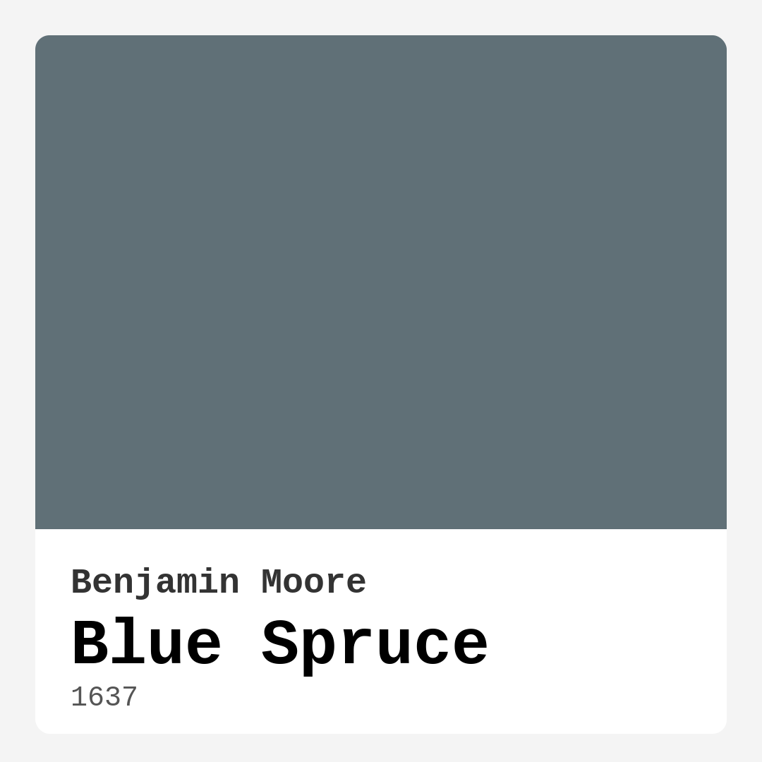
Color Preview & Key Details
| HEX Code | #607077 |
| RGB | 96, 112, 119 |
| LRV | 16.81% |
| Undertone | Blue |
| Finish Options | Eggshell, Matte, Satin |
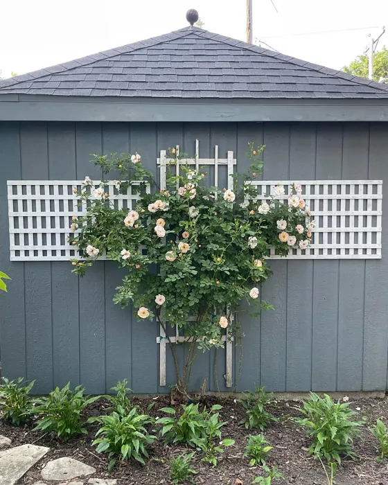
If you’re searching for a paint color that effortlessly blends sophistication with tranquility, Benjamin Moore’s Blue Spruce (1637) might just be your perfect match. This rich, muted hue captures the essence of a serene forest, balancing cool blue undertones with just a hint of warmth to create a versatile backdrop for any room. Whether you’re redesigning a cozy bedroom, a modern living room, or a peaceful home office, Blue Spruce brings depth and character without overwhelming the space.
One of the standout qualities of Blue Spruce is its adaptability. With an LRV (Light Reflectance Value) of 16.81%, it sits comfortably in the medium-dark range, meaning it absorbs more light than it reflects. This makes it an excellent choice for creating an intimate, grounded atmosphere—ideal for spaces where you want to unwind. In well-lit rooms, it takes on a vibrant, almost teal-like quality, while in dimmer settings, it deepens into a more subdued, cozy shade. If you’re worried about it feeling too dark in a small space, don’t be. Pair it with lighter accents—think crisp whites, soft creams, or even warm wood tones—and it’ll add just the right amount of drama without closing the room in.
Application is a breeze with Blue Spruce. It’s beginner-friendly, offering good coverage in just one or two coats, and it’s available in matte, eggshell, and satin finishes. Matte is perfect for low-traffic areas where you want a velvety, sophisticated look, while eggshell and satin are great for spaces that need a bit more durability, like hallways or kids’ rooms. Plus, it’s low-VOC, quick-drying, and resistant to scuffs and fading, so you won’t have to worry about constant touch-ups.
When it comes to pairing, Blue Spruce plays well with a variety of colors. For trim, White Dove or Simply White keeps things fresh and modern, while black or dark wood trim adds a striking contrast. If you’re feeling adventurous, try complementary shades like warm taupes, soft grays, or even muted reds (thanks to its subtle green undertones) to create a balanced, harmonious palette. Natural materials—think linen, jute, or reclaimed wood—enhance its earthy vibe, making it a great fit for rustic, coastal, or contemporary styles.
So, is Blue Spruce right for your home? If you’re drawn to colors that feel both calming and refined, it’s absolutely worth considering. Test it on your walls first—paint a large swatch and observe it at different times of day. Notice how it shifts with the light, and pay attention to how it interacts with your furniture and decor. You might just find that this versatile, timeless hue is exactly what your space has been missing.

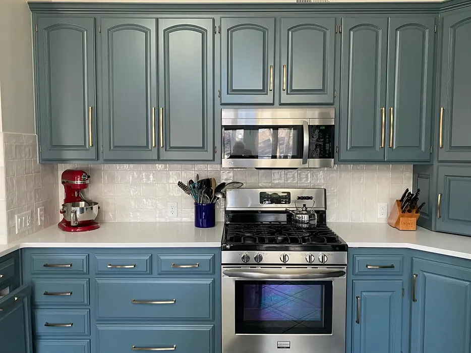
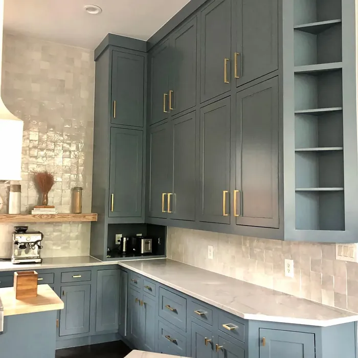
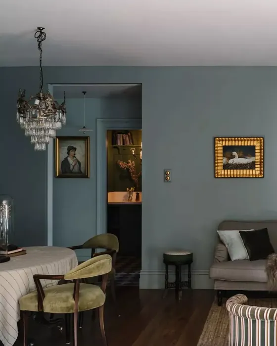
Real Room Photo of Blue Spruce 1637
Undertones of Blue Spruce ?
The undertones of Blue Spruce are a key aspect of its character, leaning towards Blue. These subtle underlying hues are what give the color its depth and complexity. For example, a gray with a blue undertone will feel cooler and more modern, while one with a brown undertone will feel warmer and more traditional. It’s essential to test this paint in your home and observe it next to your existing furniture, flooring, and decor to see how these undertones interact and reveal themselves throughout the day.
HEX value: #607077
RGB code: 96, 112, 119
Is Blue Spruce Cool or Warm?
While Blue Spruce is primarily a cool color, its subtle warmth from the green undertone adds a layer of depth, making it feel more inviting. This balance allows it to work well in both bright and dimly lit spaces, adapting to the surrounding environment effectively.
Understanding Color Properties and Interior Design Tips
Hue refers to a specific position on the color wheel, measured in degrees from 0 to 360. Each degree represents a different pure color:
- 0° represents red
- 120° represents green
- 240° represents blue
Saturation describes the intensity or purity of a color and is expressed as a percentage:
- At 0%, the color appears completely desaturated—essentially a shade of gray
- At 100%, the color is at its most vivid and vibrant
Lightness indicates how light or dark a color is, also expressed as a percentage:
- 0% lightness results in black
- 100% lightness results in white
Using Warm Colors in Interior Design
Warm hues—such as reds, oranges, yellows, warm beiges, and greiges—are excellent choices for creating inviting and energetic spaces. These colors are particularly well-suited for:
- Kitchens, living rooms, and bathrooms, where warmth enhances comfort and sociability
- Large rooms, where warm tones can help reduce the sense of emptiness and make the space feel more intimate
For example:
- Warm beige shades provide a cozy, inviting atmosphere, ideal for living rooms, bedrooms, and hallways.
- Warm greige (a mix of beige and gray) offers the warmth of beige with the modern appeal of gray, making it a versatile backdrop for dining areas, bedrooms, and living spaces.
However, be mindful when using warm light tones in rooms with limited natural light. These shades may appear muted or even take on an unpleasant yellowish tint. To avoid a dull or flat appearance:
- Add depth by incorporating richer tones like deep greens, charcoal, or chocolate brown
- Use textured elements such as curtains, rugs, or cushions to bring dimension to the space
Pro Tip: Achieving Harmony with Warm and Cool Color Balance
To create a well-balanced and visually interesting interior, mix warm and cool tones strategically. This contrast adds depth and harmony to your design.
- If your walls feature warm hues, introduce cool-colored accents such as blue or green furniture, artwork, or accessories to create contrast.
- For a polished look, consider using a complementary color scheme, which pairs colors opposite each other on the color wheel (e.g., red with green, orange with blue).
This thoughtful mix not only enhances visual appeal but also creates a space that feels both dynamic and cohesive.

Light Temperature Affects on Blue Spruce
Natural Light
Natural daylight changes in color temperature as the sun moves across the sky. At sunrise and sunset, the light tends to have a warm, golden tone with a color temperature around 2000 Kelvin (K). As the day progresses and the sun rises higher, the light becomes cooler and more neutral. Around midday, especially when the sky is clear, natural light typically reaches its peak brightness and shifts to a cooler tone, ranging from 5500 to 6500 Kelvin. This midday light is close to what we perceive as pure white or daylight-balanced light.
These shifts in natural light can significantly influence how colors appear in a space, which is why designers often consider both the time of day and the orientation of windows when planning interior color schemes.
Artificial Light
When choosing artificial lighting, pay close attention to the color temperature, measured in Kelvin (K). This determines how warm or cool the light will appear. Lower temperatures, around 2700K, give off a warm, yellow glow often used in living rooms or bedrooms. Higher temperatures, above 5000K, create a cool, bluish light similar to daylight, commonly used in kitchens, offices, or task areas.
Use the slider to see how lighting temperature can affect the appearance of a surface or color throughout a space.


4800K
LRV of Blue Spruce
The Light Reflectance Value (LRV) of Blue Spruce is 16.81%, which places it in the Medium Dark category. This means it reflects very little light. Understanding a paint’s LRV is crucial for predicting how it will look in your space. A higher LRV indicates a lighter color that reflects more light, making rooms feel larger and brighter. A lower LRV signifies a darker color that absorbs more light, creating a cozier, more intimate atmosphere. Always consider the natural and artificial lighting in your room when selecting a paint color based on its LRV.
Detailed Review of Blue Spruce
Additional Paint Characteristics
Ideal Rooms
Bathroom, Bedroom, Entryway, Home Office, Living Room
Decor Styles
Coastal, Contemporary, Modern, Rustic
Coverage
Good (1–2 Coats)
Ease of Application
Beginner Friendly, Brush Smooth, Roller-Ready
Washability
Highly Washable, Washable
VOC Level
Low VOC
Best Use
Accent Wall, Interior Walls, Trim
Room Suitability
Bathroom, Bedroom, Home Office, Living Room
Tone Tag
Cool, Earthy, Muted
Finish Type
Eggshell, Matte, Satin
Paint Performance
Fade Resistant, Low Odor, Quick Drying, Scuff Resistant
Use Cases
Best for Modern Farmhouse, Best for Open Concept, Classic Favorite
Mood
Calm, Grounding, Inviting
Trim Pairing
Complements Cool Trim, Matches Pure White, Pairs with White Dove
Blue Spruce stands out with its unique blend of green and blue undertones, making it a versatile choice for various spaces. When applied, it provides a calming backdrop that pairs well with both light and dark accents. It’s particularly striking in natural light, where it can shift between a deep teal and a soft, muted blue, depending on the time of day. This color works beautifully with wood elements, enhancing the warmth of your decor while maintaining a fresh feel. Whether you’re aiming for a contemporary look or a rustic vibe, Blue Spruce adds depth without overwhelming the space. It’s also worth noting that it holds up well over time, resisting fading and keeping its rich color intact.
Pros & Cons of 1637 Blue Spruce
Pros
Cons
Colors that go with Benjamin Moore Blue Spruce
FAQ on 1637 Blue Spruce
Can Blue Spruce be used in small spaces?
Absolutely! Blue Spruce can work wonderfully in small spaces, especially when paired with lighter accents. Its muted tone prevents it from overwhelming a room, while still adding character. Just be mindful of the lighting; in well-lit areas, it can feel more vibrant, while in dimmer spaces, it may appear deeper and cozier.
What trim colors work best with Blue Spruce?
Blue Spruce pairs beautifully with a variety of trim colors. For a fresh look, consider white or off-white options like White Dove or Simply White. If you’re aiming for a more dramatic contrast, black or dark wood trims can also complement this hue nicely, enhancing its depth and richness.
Comparisons Blue Spruce with other colors
Blue Spruce 1637 vs Naval SW 6244
| Attribute | Blue Spruce 1637 | Naval SW 6244 |
|---|---|---|
| Color Name | Blue Spruce 1637 | Naval SW 6244 |
| Color | ||
| Hue | Blue | Blue |
| Brightness | Dark | Dark |
| RGB | 96, 112, 119 | 47, 61, 76 |
| LRV | 16.81% | 4% |
| Finish Type | Eggshell, Matte, Satin | Matte, Satin, Semi-Gloss |
| Finish Options | Eggshell, Matte, Satin | Matte, Satin, Semi-Gloss |
| Ideal Rooms | Bathroom, Bedroom, Entryway, Home Office, Living Room | Bedroom, Dining Room, Hallway, Home Office, Living Room |
| Decor Styles | Coastal, Contemporary, Modern, Rustic | Coastal, Industrial, Minimalist, Modern, Traditional |
| Coverage | Good (1–2 Coats) | Good (1–2 Coats), Self-Priming |
| Ease of Application | Beginner Friendly, Brush Smooth, Roller-Ready | Beginner Friendly, Brush Smooth, Roller-Ready |
| Washability | Highly Washable, Washable | Highly Washable, Washable |
| Room Suitability | Bathroom, Bedroom, Home Office, Living Room | Bedroom, Dining Room, Entryway, Home Office, Living Room |
| Tone | Cool, Earthy, Muted | Cool, Deep, Moody |
| Paint Performance | Fade Resistant, Low Odor, Quick Drying, Scuff Resistant | Easy Touch-Up, High Coverage, Low Odor, Scuff Resistant |
Blue Spruce 1637 vs Sea Serpent SW 7615
| Attribute | Blue Spruce 1637 | Sea Serpent SW 7615 |
|---|---|---|
| Color Name | Blue Spruce 1637 | Sea Serpent SW 7615 |
| Color | ||
| Hue | Blue | Blue |
| Brightness | Dark | Dark |
| RGB | 96, 112, 119 | 62, 75, 84 |
| LRV | 16.81% | 12% |
| Finish Type | Eggshell, Matte, Satin | Eggshell, Matte, Satin |
| Finish Options | Eggshell, Matte, Satin | Eggshell, Matte, Satin |
| Ideal Rooms | Bathroom, Bedroom, Entryway, Home Office, Living Room | Bathroom, Bedroom, Home Office, Living Room |
| Decor Styles | Coastal, Contemporary, Modern, Rustic | Coastal, Farmhouse, Industrial, Modern |
| Coverage | Good (1–2 Coats) | Good (1–2 Coats), Touch-Up Friendly |
| Ease of Application | Beginner Friendly, Brush Smooth, Roller-Ready | Beginner Friendly, Brush Smooth, Roller-Ready |
| Washability | Highly Washable, Washable | Highly Washable, Washable |
| Room Suitability | Bathroom, Bedroom, Home Office, Living Room | Bathroom, Bedroom, Home Office, Living Room |
| Tone | Cool, Earthy, Muted | Cool, Deep, Moody |
| Paint Performance | Fade Resistant, Low Odor, Quick Drying, Scuff Resistant | Easy Touch-Up, High Coverage, Low Odor |
Blue Spruce 1637 vs Rain Cloud SW 9639
| Attribute | Blue Spruce 1637 | Rain Cloud SW 9639 |
|---|---|---|
| Color Name | Blue Spruce 1637 | Rain Cloud SW 9639 |
| Color | ||
| Hue | Blue | Blue |
| Brightness | Dark | Dark |
| RGB | 96, 112, 119 | 83, 97, 104 |
| LRV | 16.81% | 30% |
| Finish Type | Eggshell, Matte, Satin | Eggshell, Matte, Satin |
| Finish Options | Eggshell, Matte, Satin | Eggshell, Matte, Satin |
| Ideal Rooms | Bathroom, Bedroom, Entryway, Home Office, Living Room | Bedroom, Dining Room, Home Office, Living Room |
| Decor Styles | Coastal, Contemporary, Modern, Rustic | Coastal, Contemporary, Minimalist, Scandinavian |
| Coverage | Good (1–2 Coats) | Good (1–2 Coats), Touch-Up Friendly |
| Ease of Application | Beginner Friendly, Brush Smooth, Roller-Ready | Beginner Friendly, Brush Smooth, Roller-Ready |
| Washability | Highly Washable, Washable | Highly Washable, Washable |
| Room Suitability | Bathroom, Bedroom, Home Office, Living Room | Bedroom, Home Office, Living Room |
| Tone | Cool, Earthy, Muted | Balanced, Cool, Muted |
| Paint Performance | Fade Resistant, Low Odor, Quick Drying, Scuff Resistant | Easy Touch-Up, Fade Resistant, Low Odor |
Blue Spruce 1637 vs Indigo Batik SW 7602
| Attribute | Blue Spruce 1637 | Indigo Batik SW 7602 |
|---|---|---|
| Color Name | Blue Spruce 1637 | Indigo Batik SW 7602 |
| Color | ||
| Hue | Blue | Blue |
| Brightness | Dark | Dark |
| RGB | 96, 112, 119 | 62, 80, 99 |
| LRV | 16.81% | 10% |
| Finish Type | Eggshell, Matte, Satin | Matte, Satin |
| Finish Options | Eggshell, Matte, Satin | Eggshell, Flat, Matte, Satin |
| Ideal Rooms | Bathroom, Bedroom, Entryway, Home Office, Living Room | Bedroom, Dining Room, Home Office, Living Room |
| Decor Styles | Coastal, Contemporary, Modern, Rustic | Bohemian, Coastal, Contemporary, Modern |
| Coverage | Good (1–2 Coats) | Good (1–2 Coats), Touch-Up Friendly |
| Ease of Application | Beginner Friendly, Brush Smooth, Roller-Ready | Brush Smooth, Fast-Drying, Roller-Ready |
| Washability | Highly Washable, Washable | Scrubbable, Washable, Wipeable |
| Room Suitability | Bathroom, Bedroom, Home Office, Living Room | Bedroom, Dining Room, Home Office, Living Room |
| Tone | Cool, Earthy, Muted | Cool, Deep, Moody |
| Paint Performance | Fade Resistant, Low Odor, Quick Drying, Scuff Resistant | Easy Touch-Up, High Coverage, Low Odor, Quick Drying |
Blue Spruce 1637 vs Sea Mariner SW 9640
| Attribute | Blue Spruce 1637 | Sea Mariner SW 9640 |
|---|---|---|
| Color Name | Blue Spruce 1637 | Sea Mariner SW 9640 |
| Color | ||
| Hue | Blue | Blue |
| Brightness | Dark | Dark |
| RGB | 96, 112, 119 | 67, 74, 84 |
| LRV | 16.81% | 6% |
| Finish Type | Eggshell, Matte, Satin | Eggshell, Matte, Satin |
| Finish Options | Eggshell, Matte, Satin | Eggshell, Matte, Satin |
| Ideal Rooms | Bathroom, Bedroom, Entryway, Home Office, Living Room | Bedroom, Dining Room, Hallway, Home Office, Living Room |
| Decor Styles | Coastal, Contemporary, Modern, Rustic | Coastal, Industrial, Minimalist, Modern |
| Coverage | Good (1–2 Coats) | Good (1–2 Coats) |
| Ease of Application | Beginner Friendly, Brush Smooth, Roller-Ready | Beginner Friendly, Brush Smooth, Roller-Ready |
| Washability | Highly Washable, Washable | Scrubbable, Washable |
| Room Suitability | Bathroom, Bedroom, Home Office, Living Room | Bedroom, Dining Room, Home Office, Living Room |
| Tone | Cool, Earthy, Muted | Cool, Deep, Moody |
| Paint Performance | Fade Resistant, Low Odor, Quick Drying, Scuff Resistant | Easy Touch-Up, Low Odor, Quick Drying |
Blue Spruce 1637 vs Still Water SW 6223
| Attribute | Blue Spruce 1637 | Still Water SW 6223 |
|---|---|---|
| Color Name | Blue Spruce 1637 | Still Water SW 6223 |
| Color | ||
| Hue | Blue | Blue |
| Brightness | Dark | Dark |
| RGB | 96, 112, 119 | 74, 93, 95 |
| LRV | 16.81% | 48% |
| Finish Type | Eggshell, Matte, Satin | Eggshell, Matte, Satin |
| Finish Options | Eggshell, Matte, Satin | Eggshell, Matte, Satin |
| Ideal Rooms | Bathroom, Bedroom, Entryway, Home Office, Living Room | Bedroom, Dining Room, Home Office, Living Room, Nursery |
| Decor Styles | Coastal, Contemporary, Modern, Rustic | Coastal, Contemporary, Farmhouse, Modern, Rustic |
| Coverage | Good (1–2 Coats) | Good (1–2 Coats), Touch-Up Friendly |
| Ease of Application | Beginner Friendly, Brush Smooth, Roller-Ready | Beginner Friendly, Brush Smooth, Roller-Ready |
| Washability | Highly Washable, Washable | Highly Washable, Washable |
| Room Suitability | Bathroom, Bedroom, Home Office, Living Room | Bedroom, Dining Room, Home Office, Living Room |
| Tone | Cool, Earthy, Muted | Cool, Earthy, Muted |
| Paint Performance | Fade Resistant, Low Odor, Quick Drying, Scuff Resistant | Easy Touch-Up, Fade Resistant, Low Odor |
Blue Spruce 1637 vs Waterloo SW 9141
| Attribute | Blue Spruce 1637 | Waterloo SW 9141 |
|---|---|---|
| Color Name | Blue Spruce 1637 | Waterloo SW 9141 |
| Color | ||
| Hue | Blue | Blue |
| Brightness | Dark | Dark |
| RGB | 96, 112, 119 | 83, 104, 114 |
| LRV | 16.81% | 12% |
| Finish Type | Eggshell, Matte, Satin | Matte, Satin |
| Finish Options | Eggshell, Matte, Satin | Matte, Satin, Semi-Gloss |
| Ideal Rooms | Bathroom, Bedroom, Entryway, Home Office, Living Room | Bedroom, Dining Room, Hallway, Home Office, Living Room |
| Decor Styles | Coastal, Contemporary, Modern, Rustic | Coastal, Industrial, Modern, Rustic |
| Coverage | Good (1–2 Coats) | Good (1–2 Coats), Touch-Up Friendly |
| Ease of Application | Beginner Friendly, Brush Smooth, Roller-Ready | Brush Smooth, Fast-Drying, Roller-Ready |
| Washability | Highly Washable, Washable | Scrubbable, Washable |
| Room Suitability | Bathroom, Bedroom, Home Office, Living Room | Bedroom, Dining Room, Home Office, Living Room |
| Tone | Cool, Earthy, Muted | Balanced, Cool, Muted |
| Paint Performance | Fade Resistant, Low Odor, Quick Drying, Scuff Resistant | Easy Touch-Up, Fade Resistant, Low Odor, Quick Drying |
Blue Spruce 1637 vs Smoky Blue SW 7604
| Attribute | Blue Spruce 1637 | Smoky Blue SW 7604 |
|---|---|---|
| Color Name | Blue Spruce 1637 | Smoky Blue SW 7604 |
| Color | ||
| Hue | Blue | Blue |
| Brightness | Dark | Dark |
| RGB | 96, 112, 119 | 89, 110, 121 |
| LRV | 16.81% | 15% |
| Finish Type | Eggshell, Matte, Satin | Eggshell, Matte, Satin |
| Finish Options | Eggshell, Matte, Satin | Eggshell, Matte, Satin |
| Ideal Rooms | Bathroom, Bedroom, Entryway, Home Office, Living Room | Bathroom, Bedroom, Home Office, Kitchen, Living Room |
| Decor Styles | Coastal, Contemporary, Modern, Rustic | Coastal, Modern, Scandinavian, Transitional |
| Coverage | Good (1–2 Coats) | Good (1–2 Coats), Touch-Up Friendly |
| Ease of Application | Beginner Friendly, Brush Smooth, Roller-Ready | Beginner Friendly, Brush Smooth, Roller-Ready |
| Washability | Highly Washable, Washable | Highly Washable, Washable |
| Room Suitability | Bathroom, Bedroom, Home Office, Living Room | Bathroom, Bedroom, Home Office, Living Room |
| Tone | Cool, Earthy, Muted | Cool, Dusty, Muted |
| Paint Performance | Fade Resistant, Low Odor, Quick Drying, Scuff Resistant | High Coverage, Low Odor, Quick Drying |
Blue Spruce 1637 vs Needlepoint Navy SW 0032
| Attribute | Blue Spruce 1637 | Needlepoint Navy SW 0032 |
|---|---|---|
| Color Name | Blue Spruce 1637 | Needlepoint Navy SW 0032 |
| Color | ||
| Hue | Blue | Blue |
| Brightness | Dark | Dark |
| RGB | 96, 112, 119 | 84, 102, 112 |
| LRV | 16.81% | 4% |
| Finish Type | Eggshell, Matte, Satin | Matte, Satin, Semi-Gloss |
| Finish Options | Eggshell, Matte, Satin | Matte, Satin, Semi-Gloss |
| Ideal Rooms | Bathroom, Bedroom, Entryway, Home Office, Living Room | Bedroom, Dining Room, Entryway, Home Office, Living Room |
| Decor Styles | Coastal, Contemporary, Modern, Rustic | Coastal, Contemporary, Modern Farmhouse, Nautical, Traditional |
| Coverage | Good (1–2 Coats) | Good (1–2 Coats), Touch-Up Friendly |
| Ease of Application | Beginner Friendly, Brush Smooth, Roller-Ready | Beginner Friendly, Brush Smooth, Fast-Drying, Roller-Ready |
| Washability | Highly Washable, Washable | Scrubbable, Washable |
| Room Suitability | Bathroom, Bedroom, Home Office, Living Room | Bedroom, Dining Room, Home Office, Living Room |
| Tone | Cool, Earthy, Muted | Cool, Deep, Muted |
| Paint Performance | Fade Resistant, Low Odor, Quick Drying, Scuff Resistant | Easy Touch-Up, High Coverage, Low Odor, Quick Drying, Stain Resistant |
Blue Spruce 1637 vs Riverway SW 6222
| Attribute | Blue Spruce 1637 | Riverway SW 6222 |
|---|---|---|
| Color Name | Blue Spruce 1637 | Riverway SW 6222 |
| Color | ||
| Hue | Blue | Blue |
| Brightness | Dark | Dark |
| RGB | 96, 112, 119 | 93, 114, 116 |
| LRV | 16.81% | 24% |
| Finish Type | Eggshell, Matte, Satin | Eggshell, Satin |
| Finish Options | Eggshell, Matte, Satin | Eggshell, Matte, Satin |
| Ideal Rooms | Bathroom, Bedroom, Entryway, Home Office, Living Room | Bathroom, Bedroom, Dining Room, Home Office, Living Room |
| Decor Styles | Coastal, Contemporary, Modern, Rustic | Coastal, Contemporary, Eclectic, Modern, Rustic |
| Coverage | Good (1–2 Coats) | Good (1–2 Coats), Touch-Up Friendly |
| Ease of Application | Beginner Friendly, Brush Smooth, Roller-Ready | Beginner Friendly, Brush Smooth, Fast-Drying, Low Splatter, Roller-Ready |
| Washability | Highly Washable, Washable | Highly Washable, Washable |
| Room Suitability | Bathroom, Bedroom, Home Office, Living Room | Bathroom, Bedroom, Home Office, Living Room |
| Tone | Cool, Earthy, Muted | Balanced, Cool, Muted |
| Paint Performance | Fade Resistant, Low Odor, Quick Drying, Scuff Resistant | Easy Touch-Up, High Coverage, Low Odor, Quick Drying |
Official Page of Benjamin Moore Blue Spruce 1637