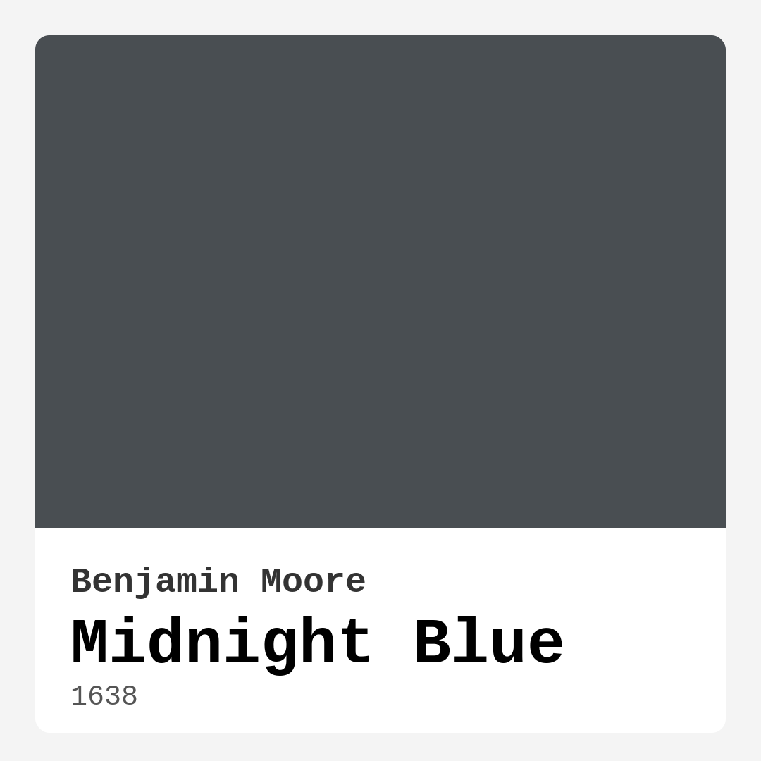
Color Preview & Key Details
| HEX Code | #494E52 |
| RGB | 73, 78, 82 |
| LRV | 8.22% |
| Undertone | Blue |
| Finish Options | Matte, Satin, Semi-Gloss |
If you’re looking for a paint color that exudes sophistication while still feeling warm and inviting, Benjamin Moore’s Midnight Blue (1638) might just be your perfect match. This deep, moody blue with a touch of gray is like wrapping your walls in the quiet elegance of a starlit night. It’s a color that commands attention without being overpowering, making it a favorite among designers and homeowners alike. Whether you’re aiming for a modern, coastal, industrial, or traditional look, Midnight Blue adapts effortlessly, proving just how versatile it really is.
One of the first things you’ll notice about this color is its richness. It’s not just a flat dark blue—it has depth, almost as if it shifts slightly depending on the light. In natural daylight, it feels vibrant and alive, while in the evening or under soft artificial lighting, it takes on a more intimate, moody vibe. That duality makes it ideal for spaces like living rooms, bedrooms, or home offices where you want a balance of energy and calm. And because it leans cool, it brings a refreshing, tranquil quality to any room.
Now, let’s talk about application. If you’re new to painting, Midnight Blue is a great place to start. It’s beginner-friendly, roller-ready, and brush-smooth, meaning you won’t struggle with streaks or uneven coverage. Most projects will only need one or two coats, and if you ever need to touch up a spot later, it blends seamlessly. The finish options—matte, satin, or semi-gloss—give you flexibility depending on the look you’re going for. Matte will enhance that velvety depth, while semi-gloss can add a bit of sheen for a more polished feel, especially on trim or furniture.
But what about small spaces? You might be wondering if a dark color like this will make a room feel cramped. The answer is: it depends. Midnight Blue can absolutely work in smaller rooms, but the key is balance. Pair it with plenty of natural light, crisp white trim (Benjamin Moore’s White Dove is a perfect match), and lighter furnishings to keep the space feeling open. An accent wall in this hue can also add drama without overwhelming the room. On the flip side, if you have a large, well-lit space, going all-in with Midnight Blue on every wall can create a stunning, enveloping effect that feels both cozy and luxurious.
When it comes to decor, this color plays well with others. For a timeless look, pair it with whites, creams, or light grays. If you want something bolder, try jewel tones like emerald green or mustard yellow—they pop beautifully against the deep blue backdrop. Metallic accents in brass or gold add warmth and a touch of glam, while natural wood tones keep things grounded and organic. And don’t forget about texture! Layering in fabrics like linen, velvet, or wool will enhance the richness of the color and make the space feel more inviting.
A word of caution: because Midnight Blue has a low Light Reflectance Value (LRV of 8.22%), it doesn’t bounce much light back into the room. That’s part of what gives it that cozy, intimate feel, but it also means you’ll want to be mindful of lighting. If your room doesn’t get a lot of natural light, consider adding plenty of lamps or even a mirror to help brighten things up. On the other hand, if you’re using it in a space that’s already well-lit, the color will shine (figuratively, of course—it’s still a dark hue).
As for durability, this paint holds up well. It’s washable (even highly washable in some finishes), so it’s a practical choice for high-traffic areas or homes with kids or pets. Plus, it’s low-VOC and eco-certified, so you won’t have to worry about harsh fumes during or after painting. That’s a win for both your home and the environment.
If you’re still on the fence, here’s a pro tip: always test the color in your space before committing. Paint a large swatch on the wall and observe it at different times of day. You’ll see how the undertones—those subtle hints of blue and gray—interact with your lighting and existing decor. Sometimes, colors can surprise you once they’re on the walls, and Midnight Blue is no exception.
So, is Midnight Blue right for your project? If you’re after a color that’s equal parts sophisticated and soothing, with enough versatility to fit almost any style, then yes—it’s a fantastic choice. Whether you’re painting an accent wall, a piece of furniture, or an entire room, this shade delivers depth, drama, and a whole lot of personality. Just remember to balance it with light and texture, and you’ll have a space that feels curated, cohesive, and utterly captivating.
At the end of the day, paint is one of the easiest and most impactful ways to transform a room. And with Midnight Blue, you’re not just choosing a color—you’re setting a mood. One that’s calm, grounded, and undeniably stylish. So go ahead, take the plunge. Your dream space is waiting.
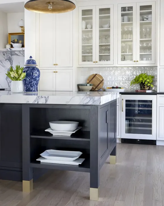
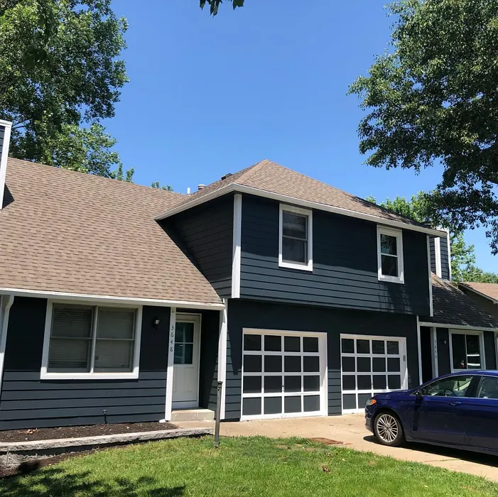
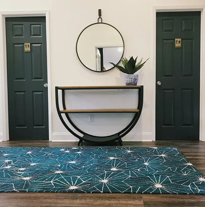
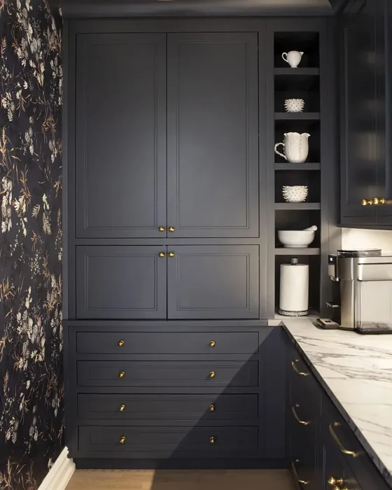
Real Room Photo of Midnight Blue 1638
Undertones of Midnight Blue ?
The undertones of Midnight Blue are a key aspect of its character, leaning towards Blue. These subtle underlying hues are what give the color its depth and complexity. For example, a gray with a blue undertone will feel cooler and more modern, while one with a brown undertone will feel warmer and more traditional. It’s essential to test this paint in your home and observe it next to your existing furniture, flooring, and decor to see how these undertones interact and reveal themselves throughout the day.
HEX value: #494E52
RGB code: 73, 78, 82
Is Midnight Blue Cool or Warm?
This color leans more towards the cool side, thanks to its blue-gray base. It provides a refreshing vibe that can evoke feelings of tranquility and calmness.
Understanding Color Properties and Interior Design Tips
Hue refers to a specific position on the color wheel, measured in degrees from 0 to 360. Each degree represents a different pure color:
- 0° represents red
- 120° represents green
- 240° represents blue
Saturation describes the intensity or purity of a color and is expressed as a percentage:
- At 0%, the color appears completely desaturated—essentially a shade of gray
- At 100%, the color is at its most vivid and vibrant
Lightness indicates how light or dark a color is, also expressed as a percentage:
- 0% lightness results in black
- 100% lightness results in white
Using Warm Colors in Interior Design
Warm hues—such as reds, oranges, yellows, warm beiges, and greiges—are excellent choices for creating inviting and energetic spaces. These colors are particularly well-suited for:
- Kitchens, living rooms, and bathrooms, where warmth enhances comfort and sociability
- Large rooms, where warm tones can help reduce the sense of emptiness and make the space feel more intimate
For example:
- Warm beige shades provide a cozy, inviting atmosphere, ideal for living rooms, bedrooms, and hallways.
- Warm greige (a mix of beige and gray) offers the warmth of beige with the modern appeal of gray, making it a versatile backdrop for dining areas, bedrooms, and living spaces.
However, be mindful when using warm light tones in rooms with limited natural light. These shades may appear muted or even take on an unpleasant yellowish tint. To avoid a dull or flat appearance:
- Add depth by incorporating richer tones like deep greens, charcoal, or chocolate brown
- Use textured elements such as curtains, rugs, or cushions to bring dimension to the space
Pro Tip: Achieving Harmony with Warm and Cool Color Balance
To create a well-balanced and visually interesting interior, mix warm and cool tones strategically. This contrast adds depth and harmony to your design.
- If your walls feature warm hues, introduce cool-colored accents such as blue or green furniture, artwork, or accessories to create contrast.
- For a polished look, consider using a complementary color scheme, which pairs colors opposite each other on the color wheel (e.g., red with green, orange with blue).
This thoughtful mix not only enhances visual appeal but also creates a space that feels both dynamic and cohesive.
Light Temperature Affects on Midnight Blue
Natural Light
Natural daylight changes in color temperature as the sun moves across the sky. At sunrise and sunset, the light tends to have a warm, golden tone with a color temperature around 2000 Kelvin (K). As the day progresses and the sun rises higher, the light becomes cooler and more neutral. Around midday, especially when the sky is clear, natural light typically reaches its peak brightness and shifts to a cooler tone, ranging from 5500 to 6500 Kelvin. This midday light is close to what we perceive as pure white or daylight-balanced light.
These shifts in natural light can significantly influence how colors appear in a space, which is why designers often consider both the time of day and the orientation of windows when planning interior color schemes.
Artificial Light
When choosing artificial lighting, pay close attention to the color temperature, measured in Kelvin (K). This determines how warm or cool the light will appear. Lower temperatures, around 2700K, give off a warm, yellow glow often used in living rooms or bedrooms. Higher temperatures, above 5000K, create a cool, bluish light similar to daylight, commonly used in kitchens, offices, or task areas.
Use the slider to see how lighting temperature can affect the appearance of a surface or color throughout a space.


4800K
LRV of Midnight Blue
The Light Reflectance Value (LRV) of Midnight Blue is 8.22%, which places it in the Dark colors category. This means it does not reflect light. Understanding a paint’s LRV is crucial for predicting how it will look in your space. A higher LRV indicates a lighter color that reflects more light, making rooms feel larger and brighter. A lower LRV signifies a darker color that absorbs more light, creating a cozier, more intimate atmosphere. Always consider the natural and artificial lighting in your room when selecting a paint color based on its LRV.
Detailed Review of Midnight Blue
Additional Paint Characteristics
Ideal Rooms
Bedroom, Dining Room, Hallway, Home Office, Living Room
Decor Styles
Coastal, Industrial, Modern, Traditional
Coverage
Good (1–2 Coats), Touch-Up Friendly
Ease of Application
Beginner Friendly, Brush Smooth, Roller-Ready
Washability
Highly Washable, Washable
VOC Level
Eco-Certified, Low VOC
Best Use
Accent Wall, Furniture, Interior Walls
Room Suitability
Bedroom, Dining Room, Home Office, Living Room
Tone Tag
Cool, Deep, Moody
Finish Type
Matte, Satin, Semi-Gloss
Paint Performance
Easy Touch-Up, High Coverage, Low Odor
Use Cases
Best for Low Light Rooms, Classic Favorite, Designer Favorite
Mood
Calm, Grounding, Sophisticated
Trim Pairing
Complements Brass Fixtures, Matches Pure White, Pairs with White Dove
Using Midnight Blue in your home can transform it entirely, offering a rich depth that draws the eye. This color works beautifully in both large and small spaces, providing a sense of intimacy without overwhelming the area. Its understated elegance pairs well with both light and dark furniture, making it a flexible choice for various decor styles. One of the standout benefits of this paint is its ability to create a calming atmosphere, perfect for bedrooms or home offices where relaxation and focus are key. However, be mindful that the darker tone can absorb light, so it may be best suited for rooms with ample natural light or paired with brighter accents to maintain a balanced look.
Pros & Cons of 1638 Midnight Blue
Pros
Cons
Colors that go with Benjamin Moore Midnight Blue
FAQ on 1638 Midnight Blue
Can Midnight Blue be used in small spaces?
Absolutely! Midnight Blue can be a stunning choice for small spaces, as it adds depth and sophistication. However, to prevent the room from feeling too closed in, consider using plenty of natural light and complementing it with lighter decor elements. Accent pieces in white or light wood can help brighten the overall look.
How does Midnight Blue pair with other colors?
Midnight Blue pairs beautifully with a variety of colors. It works well with whites, creams, and light grays for a classic look. For a bolder style, consider pairing it with rich jewel tones like emerald green or mustard yellow. This color’s versatility makes it an easy match for both warm and cool palettes.
Comparisons Midnight Blue with other colors
Midnight Blue 1638 vs Naval SW 6244
| Attribute | Midnight Blue 1638 | Naval SW 6244 |
|---|---|---|
| Color Name | Midnight Blue 1638 | Naval SW 6244 |
| Color | ||
| Hue | Blue | Blue |
| Brightness | Dark | Dark |
| RGB | 73, 78, 82 | 47, 61, 76 |
| LRV | 8.22% | 4% |
| Finish Type | Matte, Satin, Semi-Gloss | Matte, Satin, Semi-Gloss |
| Finish Options | Matte, Satin, Semi-Gloss | Matte, Satin, Semi-Gloss |
| Ideal Rooms | Bedroom, Dining Room, Hallway, Home Office, Living Room | Bedroom, Dining Room, Hallway, Home Office, Living Room |
| Decor Styles | Coastal, Industrial, Modern, Traditional | Coastal, Industrial, Minimalist, Modern, Traditional |
| Coverage | Good (1–2 Coats), Touch-Up Friendly | Good (1–2 Coats), Self-Priming |
| Ease of Application | Beginner Friendly, Brush Smooth, Roller-Ready | Beginner Friendly, Brush Smooth, Roller-Ready |
| Washability | Highly Washable, Washable | Highly Washable, Washable |
| Room Suitability | Bedroom, Dining Room, Home Office, Living Room | Bedroom, Dining Room, Entryway, Home Office, Living Room |
| Tone | Cool, Deep, Moody | Cool, Deep, Moody |
| Paint Performance | Easy Touch-Up, High Coverage, Low Odor | Easy Touch-Up, High Coverage, Low Odor, Scuff Resistant |
Midnight Blue 1638 vs Sea Serpent SW 7615
| Attribute | Midnight Blue 1638 | Sea Serpent SW 7615 |
|---|---|---|
| Color Name | Midnight Blue 1638 | Sea Serpent SW 7615 |
| Color | ||
| Hue | Blue | Blue |
| Brightness | Dark | Dark |
| RGB | 73, 78, 82 | 62, 75, 84 |
| LRV | 8.22% | 12% |
| Finish Type | Matte, Satin, Semi-Gloss | Eggshell, Matte, Satin |
| Finish Options | Matte, Satin, Semi-Gloss | Eggshell, Matte, Satin |
| Ideal Rooms | Bedroom, Dining Room, Hallway, Home Office, Living Room | Bathroom, Bedroom, Home Office, Living Room |
| Decor Styles | Coastal, Industrial, Modern, Traditional | Coastal, Farmhouse, Industrial, Modern |
| Coverage | Good (1–2 Coats), Touch-Up Friendly | Good (1–2 Coats), Touch-Up Friendly |
| Ease of Application | Beginner Friendly, Brush Smooth, Roller-Ready | Beginner Friendly, Brush Smooth, Roller-Ready |
| Washability | Highly Washable, Washable | Highly Washable, Washable |
| Room Suitability | Bedroom, Dining Room, Home Office, Living Room | Bathroom, Bedroom, Home Office, Living Room |
| Tone | Cool, Deep, Moody | Cool, Deep, Moody |
| Paint Performance | Easy Touch-Up, High Coverage, Low Odor | Easy Touch-Up, High Coverage, Low Odor |
Midnight Blue 1638 vs Rain Cloud SW 9639
| Attribute | Midnight Blue 1638 | Rain Cloud SW 9639 |
|---|---|---|
| Color Name | Midnight Blue 1638 | Rain Cloud SW 9639 |
| Color | ||
| Hue | Blue | Blue |
| Brightness | Dark | Dark |
| RGB | 73, 78, 82 | 83, 97, 104 |
| LRV | 8.22% | 30% |
| Finish Type | Matte, Satin, Semi-Gloss | Eggshell, Matte, Satin |
| Finish Options | Matte, Satin, Semi-Gloss | Eggshell, Matte, Satin |
| Ideal Rooms | Bedroom, Dining Room, Hallway, Home Office, Living Room | Bedroom, Dining Room, Home Office, Living Room |
| Decor Styles | Coastal, Industrial, Modern, Traditional | Coastal, Contemporary, Minimalist, Scandinavian |
| Coverage | Good (1–2 Coats), Touch-Up Friendly | Good (1–2 Coats), Touch-Up Friendly |
| Ease of Application | Beginner Friendly, Brush Smooth, Roller-Ready | Beginner Friendly, Brush Smooth, Roller-Ready |
| Washability | Highly Washable, Washable | Highly Washable, Washable |
| Room Suitability | Bedroom, Dining Room, Home Office, Living Room | Bedroom, Home Office, Living Room |
| Tone | Cool, Deep, Moody | Balanced, Cool, Muted |
| Paint Performance | Easy Touch-Up, High Coverage, Low Odor | Easy Touch-Up, Fade Resistant, Low Odor |
Midnight Blue 1638 vs Indigo Batik SW 7602
| Attribute | Midnight Blue 1638 | Indigo Batik SW 7602 |
|---|---|---|
| Color Name | Midnight Blue 1638 | Indigo Batik SW 7602 |
| Color | ||
| Hue | Blue | Blue |
| Brightness | Dark | Dark |
| RGB | 73, 78, 82 | 62, 80, 99 |
| LRV | 8.22% | 10% |
| Finish Type | Matte, Satin, Semi-Gloss | Matte, Satin |
| Finish Options | Matte, Satin, Semi-Gloss | Eggshell, Flat, Matte, Satin |
| Ideal Rooms | Bedroom, Dining Room, Hallway, Home Office, Living Room | Bedroom, Dining Room, Home Office, Living Room |
| Decor Styles | Coastal, Industrial, Modern, Traditional | Bohemian, Coastal, Contemporary, Modern |
| Coverage | Good (1–2 Coats), Touch-Up Friendly | Good (1–2 Coats), Touch-Up Friendly |
| Ease of Application | Beginner Friendly, Brush Smooth, Roller-Ready | Brush Smooth, Fast-Drying, Roller-Ready |
| Washability | Highly Washable, Washable | Scrubbable, Washable, Wipeable |
| Room Suitability | Bedroom, Dining Room, Home Office, Living Room | Bedroom, Dining Room, Home Office, Living Room |
| Tone | Cool, Deep, Moody | Cool, Deep, Moody |
| Paint Performance | Easy Touch-Up, High Coverage, Low Odor | Easy Touch-Up, High Coverage, Low Odor, Quick Drying |
Midnight Blue 1638 vs Sea Mariner SW 9640
| Attribute | Midnight Blue 1638 | Sea Mariner SW 9640 |
|---|---|---|
| Color Name | Midnight Blue 1638 | Sea Mariner SW 9640 |
| Color | ||
| Hue | Blue | Blue |
| Brightness | Dark | Dark |
| RGB | 73, 78, 82 | 67, 74, 84 |
| LRV | 8.22% | 6% |
| Finish Type | Matte, Satin, Semi-Gloss | Eggshell, Matte, Satin |
| Finish Options | Matte, Satin, Semi-Gloss | Eggshell, Matte, Satin |
| Ideal Rooms | Bedroom, Dining Room, Hallway, Home Office, Living Room | Bedroom, Dining Room, Hallway, Home Office, Living Room |
| Decor Styles | Coastal, Industrial, Modern, Traditional | Coastal, Industrial, Minimalist, Modern |
| Coverage | Good (1–2 Coats), Touch-Up Friendly | Good (1–2 Coats) |
| Ease of Application | Beginner Friendly, Brush Smooth, Roller-Ready | Beginner Friendly, Brush Smooth, Roller-Ready |
| Washability | Highly Washable, Washable | Scrubbable, Washable |
| Room Suitability | Bedroom, Dining Room, Home Office, Living Room | Bedroom, Dining Room, Home Office, Living Room |
| Tone | Cool, Deep, Moody | Cool, Deep, Moody |
| Paint Performance | Easy Touch-Up, High Coverage, Low Odor | Easy Touch-Up, Low Odor, Quick Drying |
Midnight Blue 1638 vs Still Water SW 6223
| Attribute | Midnight Blue 1638 | Still Water SW 6223 |
|---|---|---|
| Color Name | Midnight Blue 1638 | Still Water SW 6223 |
| Color | ||
| Hue | Blue | Blue |
| Brightness | Dark | Dark |
| RGB | 73, 78, 82 | 74, 93, 95 |
| LRV | 8.22% | 48% |
| Finish Type | Matte, Satin, Semi-Gloss | Eggshell, Matte, Satin |
| Finish Options | Matte, Satin, Semi-Gloss | Eggshell, Matte, Satin |
| Ideal Rooms | Bedroom, Dining Room, Hallway, Home Office, Living Room | Bedroom, Dining Room, Home Office, Living Room, Nursery |
| Decor Styles | Coastal, Industrial, Modern, Traditional | Coastal, Contemporary, Farmhouse, Modern, Rustic |
| Coverage | Good (1–2 Coats), Touch-Up Friendly | Good (1–2 Coats), Touch-Up Friendly |
| Ease of Application | Beginner Friendly, Brush Smooth, Roller-Ready | Beginner Friendly, Brush Smooth, Roller-Ready |
| Washability | Highly Washable, Washable | Highly Washable, Washable |
| Room Suitability | Bedroom, Dining Room, Home Office, Living Room | Bedroom, Dining Room, Home Office, Living Room |
| Tone | Cool, Deep, Moody | Cool, Earthy, Muted |
| Paint Performance | Easy Touch-Up, High Coverage, Low Odor | Easy Touch-Up, Fade Resistant, Low Odor |
Midnight Blue 1638 vs Waterloo SW 9141
| Attribute | Midnight Blue 1638 | Waterloo SW 9141 |
|---|---|---|
| Color Name | Midnight Blue 1638 | Waterloo SW 9141 |
| Color | ||
| Hue | Blue | Blue |
| Brightness | Dark | Dark |
| RGB | 73, 78, 82 | 83, 104, 114 |
| LRV | 8.22% | 12% |
| Finish Type | Matte, Satin, Semi-Gloss | Matte, Satin |
| Finish Options | Matte, Satin, Semi-Gloss | Matte, Satin, Semi-Gloss |
| Ideal Rooms | Bedroom, Dining Room, Hallway, Home Office, Living Room | Bedroom, Dining Room, Hallway, Home Office, Living Room |
| Decor Styles | Coastal, Industrial, Modern, Traditional | Coastal, Industrial, Modern, Rustic |
| Coverage | Good (1–2 Coats), Touch-Up Friendly | Good (1–2 Coats), Touch-Up Friendly |
| Ease of Application | Beginner Friendly, Brush Smooth, Roller-Ready | Brush Smooth, Fast-Drying, Roller-Ready |
| Washability | Highly Washable, Washable | Scrubbable, Washable |
| Room Suitability | Bedroom, Dining Room, Home Office, Living Room | Bedroom, Dining Room, Home Office, Living Room |
| Tone | Cool, Deep, Moody | Balanced, Cool, Muted |
| Paint Performance | Easy Touch-Up, High Coverage, Low Odor | Easy Touch-Up, Fade Resistant, Low Odor, Quick Drying |
Midnight Blue 1638 vs Smoky Blue SW 7604
| Attribute | Midnight Blue 1638 | Smoky Blue SW 7604 |
|---|---|---|
| Color Name | Midnight Blue 1638 | Smoky Blue SW 7604 |
| Color | ||
| Hue | Blue | Blue |
| Brightness | Dark | Dark |
| RGB | 73, 78, 82 | 89, 110, 121 |
| LRV | 8.22% | 15% |
| Finish Type | Matte, Satin, Semi-Gloss | Eggshell, Matte, Satin |
| Finish Options | Matte, Satin, Semi-Gloss | Eggshell, Matte, Satin |
| Ideal Rooms | Bedroom, Dining Room, Hallway, Home Office, Living Room | Bathroom, Bedroom, Home Office, Kitchen, Living Room |
| Decor Styles | Coastal, Industrial, Modern, Traditional | Coastal, Modern, Scandinavian, Transitional |
| Coverage | Good (1–2 Coats), Touch-Up Friendly | Good (1–2 Coats), Touch-Up Friendly |
| Ease of Application | Beginner Friendly, Brush Smooth, Roller-Ready | Beginner Friendly, Brush Smooth, Roller-Ready |
| Washability | Highly Washable, Washable | Highly Washable, Washable |
| Room Suitability | Bedroom, Dining Room, Home Office, Living Room | Bathroom, Bedroom, Home Office, Living Room |
| Tone | Cool, Deep, Moody | Cool, Dusty, Muted |
| Paint Performance | Easy Touch-Up, High Coverage, Low Odor | High Coverage, Low Odor, Quick Drying |
Midnight Blue 1638 vs Needlepoint Navy SW 0032
| Attribute | Midnight Blue 1638 | Needlepoint Navy SW 0032 |
|---|---|---|
| Color Name | Midnight Blue 1638 | Needlepoint Navy SW 0032 |
| Color | ||
| Hue | Blue | Blue |
| Brightness | Dark | Dark |
| RGB | 73, 78, 82 | 84, 102, 112 |
| LRV | 8.22% | 4% |
| Finish Type | Matte, Satin, Semi-Gloss | Matte, Satin, Semi-Gloss |
| Finish Options | Matte, Satin, Semi-Gloss | Matte, Satin, Semi-Gloss |
| Ideal Rooms | Bedroom, Dining Room, Hallway, Home Office, Living Room | Bedroom, Dining Room, Entryway, Home Office, Living Room |
| Decor Styles | Coastal, Industrial, Modern, Traditional | Coastal, Contemporary, Modern Farmhouse, Nautical, Traditional |
| Coverage | Good (1–2 Coats), Touch-Up Friendly | Good (1–2 Coats), Touch-Up Friendly |
| Ease of Application | Beginner Friendly, Brush Smooth, Roller-Ready | Beginner Friendly, Brush Smooth, Fast-Drying, Roller-Ready |
| Washability | Highly Washable, Washable | Scrubbable, Washable |
| Room Suitability | Bedroom, Dining Room, Home Office, Living Room | Bedroom, Dining Room, Home Office, Living Room |
| Tone | Cool, Deep, Moody | Cool, Deep, Muted |
| Paint Performance | Easy Touch-Up, High Coverage, Low Odor | Easy Touch-Up, High Coverage, Low Odor, Quick Drying, Stain Resistant |
Midnight Blue 1638 vs Riverway SW 6222
| Attribute | Midnight Blue 1638 | Riverway SW 6222 |
|---|---|---|
| Color Name | Midnight Blue 1638 | Riverway SW 6222 |
| Color | ||
| Hue | Blue | Blue |
| Brightness | Dark | Dark |
| RGB | 73, 78, 82 | 93, 114, 116 |
| LRV | 8.22% | 24% |
| Finish Type | Matte, Satin, Semi-Gloss | Eggshell, Satin |
| Finish Options | Matte, Satin, Semi-Gloss | Eggshell, Matte, Satin |
| Ideal Rooms | Bedroom, Dining Room, Hallway, Home Office, Living Room | Bathroom, Bedroom, Dining Room, Home Office, Living Room |
| Decor Styles | Coastal, Industrial, Modern, Traditional | Coastal, Contemporary, Eclectic, Modern, Rustic |
| Coverage | Good (1–2 Coats), Touch-Up Friendly | Good (1–2 Coats), Touch-Up Friendly |
| Ease of Application | Beginner Friendly, Brush Smooth, Roller-Ready | Beginner Friendly, Brush Smooth, Fast-Drying, Low Splatter, Roller-Ready |
| Washability | Highly Washable, Washable | Highly Washable, Washable |
| Room Suitability | Bedroom, Dining Room, Home Office, Living Room | Bathroom, Bedroom, Home Office, Living Room |
| Tone | Cool, Deep, Moody | Balanced, Cool, Muted |
| Paint Performance | Easy Touch-Up, High Coverage, Low Odor | Easy Touch-Up, High Coverage, Low Odor, Quick Drying |
Official Page of Benjamin Moore Midnight Blue 1638