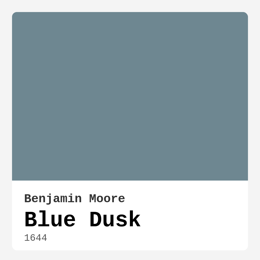
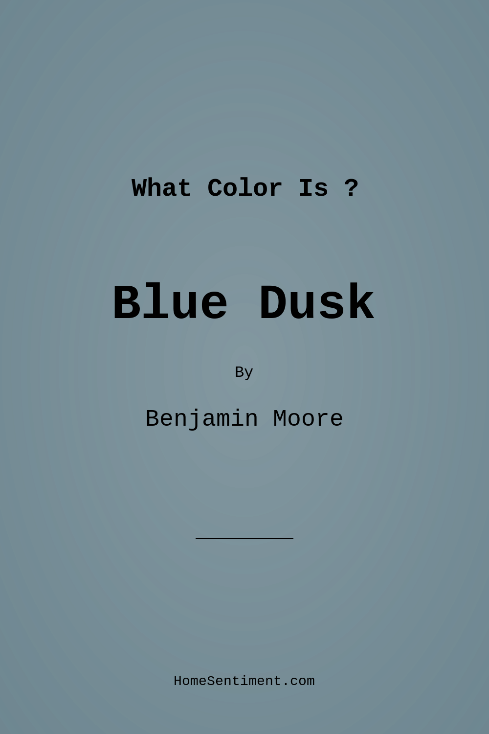
Color Preview & Key Details
| HEX Code | #6E8791 |
| RGB | 110, 135, 145 |
| LRV | 24.03% |
| Undertone | Blue |
| Finish Options | Eggshell, Matte, Satin |
If you’re searching for a paint color that effortlessly blends sophistication with serenity, Benjamin Moore’s Blue Dusk (1644) might just be your perfect match. This soft gray-blue hue captures the quiet magic of twilight skies, bringing a sense of calm and balance to any space. Whether you’re refreshing a bedroom, designing a home office, or creating a cozy nook, Blue Dusk has the versatility to adapt to your vision while infusing your home with a restful, inviting atmosphere.
One of the standout qualities of Blue Dusk is its ability to transform with the light. In bright daylight, it reflects beautifully, giving walls a soft, luminous glow that makes a room feel open and airy. As the sun sets, the color deepens into a richer, more enveloping shade, perfect for creating a snug retreat. This dynamic quality makes it ideal for rooms where you spend different times of day—like a living room that transitions from morning coffee to evening relaxation. Just keep in mind that in low-light spaces, it can appear darker, so consider adding ample lighting or pairing it with lighter furnishings to keep the vibe fresh.
When it comes to application, Blue Dusk is a dream to work with. It offers excellent coverage, often needing just one or two coats, and its smooth, fast-drying formula makes it beginner-friendly. Whether you opt for a matte, eggshell, or satin finish, the result is a polished look that feels intentional and refined. Plus, its low VOC content means you won’t have to worry about harsh fumes, making it a great choice for families or anyone sensitive to indoor air quality. And because it’s both washable and scuff-resistant, it holds up well in high-traffic areas—perfect for homes with kids or pets.
Decorating with Blue Dusk is where the real fun begins. Its cool, muted undertones make it incredibly versatile, playing well with a range of styles from coastal to minimalist. For a crisp, modern look, pair it with bright white trim like Simply White or Pure White. If you prefer warmth, try combining it with natural wood tones or brass fixtures—the contrast will add depth and richness to the space. And if you’re feeling bold, an accent wall in Blue Dusk can serve as a stunning backdrop for artwork or a gallery wall, letting the color shine without overwhelming the room.
Not sure which rooms suit Blue Dusk best? Think about spaces where you want to cultivate tranquility. Bedrooms benefit from its calming effect, helping you unwind at the end of the day. Home offices become more focused and serene, while nurseries feel gentle and soothing. Even dining rooms can take on an elegant, intimate vibe when painted in this hue. And if you’re working with a small space, don’t shy away—Blue Dusk can actually make tight areas feel more expansive, especially when paired with light-reflecting decor and good lighting.
A few things to keep in mind: Blue Dusk leans cool, so if your existing decor is heavy on warm tones, you might need to balance it out with creamy neutrals or earthy accents. Testing a sample in your space is always a smart move—observe how it changes throughout the day and alongside your furniture and flooring. And while it’s a forgiving color, its true beauty comes out in well-lit rooms, so consider layering your lighting with lamps and sconces to highlight its best qualities.
In the end, Blue Dusk is more than just a paint color—it’s a mood. It’s the quiet hush of evening, the soft glow of a well-loved space, the backdrop to moments of relaxation and connection. If you’re looking for a shade that’s as versatile as it is beautiful, this might be the one. Whether you’re painting a single wall or an entire home, Blue Dusk has a way of making everything feel just right. So grab a brush, trust your instincts, and let this serene hue work its magic in your space.
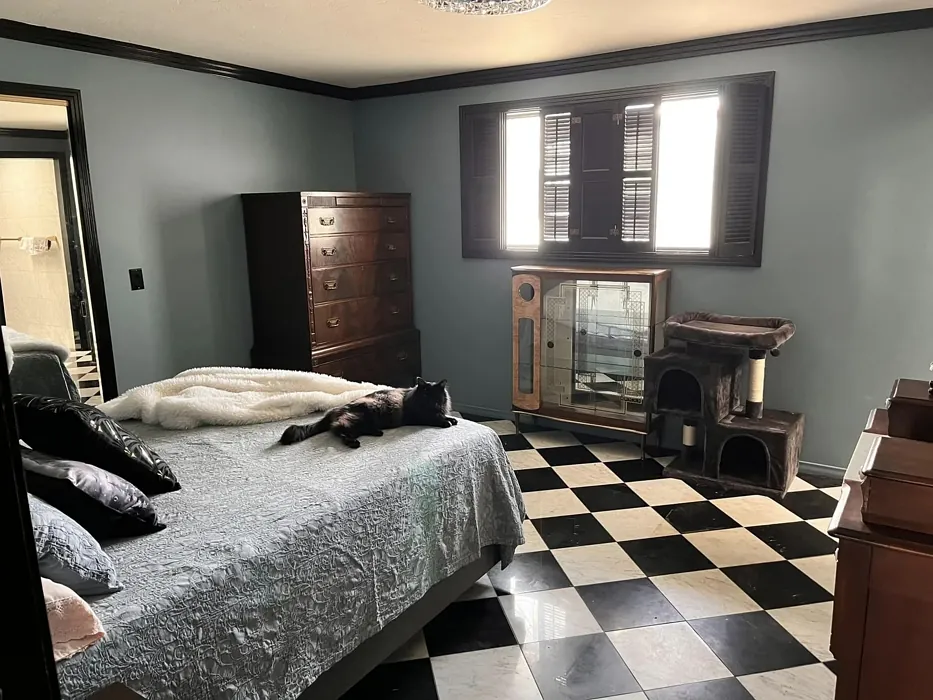
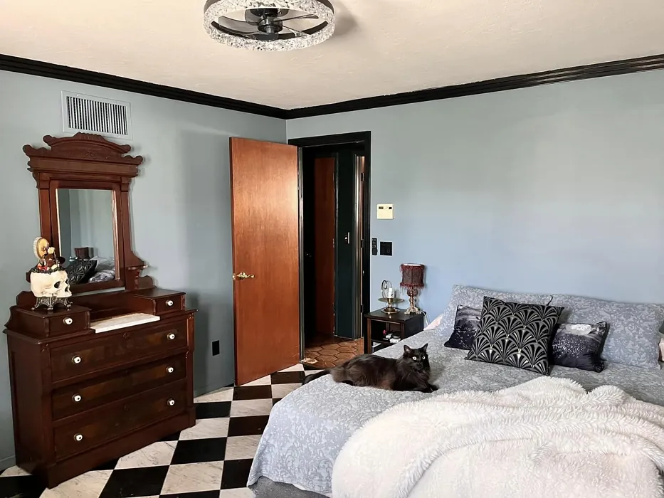
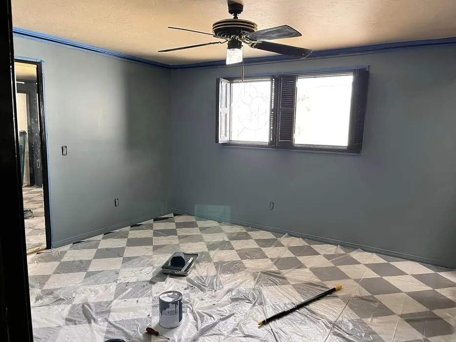
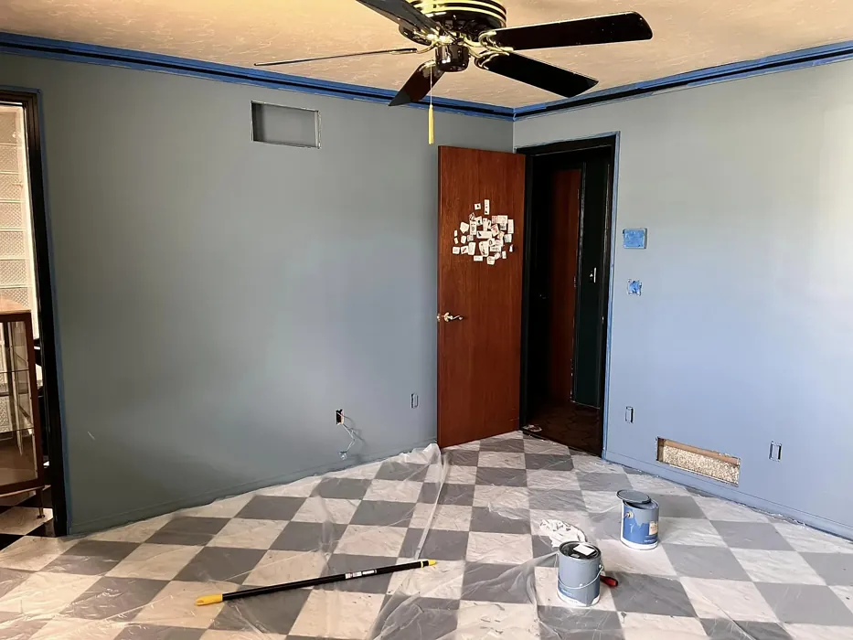
Real Room Photo of Blue Dusk 1644
Undertones of Blue Dusk ?
The undertones of Blue Dusk are a key aspect of its character, leaning towards Blue. These subtle underlying hues are what give the color its depth and complexity. For example, a gray with a blue undertone will feel cooler and more modern, while one with a brown undertone will feel warmer and more traditional. It’s essential to test this paint in your home and observe it next to your existing furniture, flooring, and decor to see how these undertones interact and reveal themselves throughout the day.
HEX value: #6E8791
RGB code: 110, 135, 145
Is Blue Dusk Cool or Warm?
Blue Dusk is primarily a cool color, making it ideal for creating a refreshing ambiance. It pairs beautifully with warmer accents, allowing you to balance out your space effortlessly.
Understanding Color Properties and Interior Design Tips
Hue refers to a specific position on the color wheel, measured in degrees from 0 to 360. Each degree represents a different pure color:
- 0° represents red
- 120° represents green
- 240° represents blue
Saturation describes the intensity or purity of a color and is expressed as a percentage:
- At 0%, the color appears completely desaturated—essentially a shade of gray
- At 100%, the color is at its most vivid and vibrant
Lightness indicates how light or dark a color is, also expressed as a percentage:
- 0% lightness results in black
- 100% lightness results in white
Using Warm Colors in Interior Design
Warm hues—such as reds, oranges, yellows, warm beiges, and greiges—are excellent choices for creating inviting and energetic spaces. These colors are particularly well-suited for:
- Kitchens, living rooms, and bathrooms, where warmth enhances comfort and sociability
- Large rooms, where warm tones can help reduce the sense of emptiness and make the space feel more intimate
For example:
- Warm beige shades provide a cozy, inviting atmosphere, ideal for living rooms, bedrooms, and hallways.
- Warm greige (a mix of beige and gray) offers the warmth of beige with the modern appeal of gray, making it a versatile backdrop for dining areas, bedrooms, and living spaces.
However, be mindful when using warm light tones in rooms with limited natural light. These shades may appear muted or even take on an unpleasant yellowish tint. To avoid a dull or flat appearance:
- Add depth by incorporating richer tones like deep greens, charcoal, or chocolate brown
- Use textured elements such as curtains, rugs, or cushions to bring dimension to the space
Pro Tip: Achieving Harmony with Warm and Cool Color Balance
To create a well-balanced and visually interesting interior, mix warm and cool tones strategically. This contrast adds depth and harmony to your design.
- If your walls feature warm hues, introduce cool-colored accents such as blue or green furniture, artwork, or accessories to create contrast.
- For a polished look, consider using a complementary color scheme, which pairs colors opposite each other on the color wheel (e.g., red with green, orange with blue).
This thoughtful mix not only enhances visual appeal but also creates a space that feels both dynamic and cohesive.
Light Temperature Affects on Blue Dusk
Natural Light
Natural daylight changes in color temperature as the sun moves across the sky. At sunrise and sunset, the light tends to have a warm, golden tone with a color temperature around 2000 Kelvin (K). As the day progresses and the sun rises higher, the light becomes cooler and more neutral. Around midday, especially when the sky is clear, natural light typically reaches its peak brightness and shifts to a cooler tone, ranging from 5500 to 6500 Kelvin. This midday light is close to what we perceive as pure white or daylight-balanced light.
These shifts in natural light can significantly influence how colors appear in a space, which is why designers often consider both the time of day and the orientation of windows when planning interior color schemes.
Artificial Light
When choosing artificial lighting, pay close attention to the color temperature, measured in Kelvin (K). This determines how warm or cool the light will appear. Lower temperatures, around 2700K, give off a warm, yellow glow often used in living rooms or bedrooms. Higher temperatures, above 5000K, create a cool, bluish light similar to daylight, commonly used in kitchens, offices, or task areas.
Use the slider to see how lighting temperature can affect the appearance of a surface or color throughout a space.


4800K
LRV of Blue Dusk
The Light Reflectance Value (LRV) of Blue Dusk is 24.03%, which places it in the Medium colors category. This means it reflect a lot of light. Understanding a paint’s LRV is crucial for predicting how it will look in your space. A higher LRV indicates a lighter color that reflects more light, making rooms feel larger and brighter. A lower LRV signifies a darker color that absorbs more light, creating a cozier, more intimate atmosphere. Always consider the natural and artificial lighting in your room when selecting a paint color based on its LRV.
Detailed Review of Blue Dusk
Additional Paint Characteristics
Ideal Rooms
Bedroom, Dining Room, Home Office, Living Room, Nursery
Decor Styles
Coastal, Minimalist, Modern, Scandinavian, Transitional
Coverage
Good (1–2 Coats), Touch-Up Friendly
Ease of Application
Beginner Friendly, Brush Smooth, Fast-Drying
Washability
Washable, Wipeable
VOC Level
Low VOC
Best Use
Accent Wall, Interior Walls, Trim
Room Suitability
Bedroom, Dining Room, Home Office, Living Room, Nursery
Tone Tag
Balanced, Cool, Muted
Finish Type
Eggshell, Matte, Satin
Paint Performance
Low Odor, Quick Drying, Scuff Resistant
Use Cases
Best for Low Light Rooms, Best for Rentals, Designer Favorite
Mood
Calm, Inviting, Restful
Trim Pairing
Complements Brass Fixtures, Good with Wood Trim, Pairs with White Dove
Blue Dusk is a fantastic choice for those seeking a versatile and soothing color. It plays beautifully with natural light, bringing out different aspects throughout the day. In the morning, it appears more vibrant, while in the evening, it envelops your space in a cozy, subdued glow. This color works wonders in creating a serene atmosphere, making it perfect for bedrooms or home offices. Its adaptable nature means it pairs well with a variety of decor styles, from coastal to modern, ensuring you won’t tire of it quickly. Additionally, the application process is smooth, allowing for an impeccable finish that will elevate any wall.
Pros & Cons of 1644 Blue Dusk
Pros
Cons
Colors that go with Benjamin Moore Blue Dusk
FAQ on 1644 Blue Dusk
Can Blue Dusk be used in small spaces?
Absolutely! Blue Dusk can actually work wonders in small spaces. Its soft, cool tones can make a room feel more open and airy. Just be mindful of the lighting; a well-lit area will help highlight its beauty, while darker spaces might make it feel more subdued. Pair it with lighter furniture or accents to keep the space feeling fresh and inviting.
What trim colors pair well with Blue Dusk?
Blue Dusk pairs beautifully with a variety of trim colors. For a crisp contrast, consider using a bright white like Simply White or Pure White. If you’re looking for a more cohesive look, soft wood tones can enhance the warmth of the space. Alternatively, pairing it with cool grays or blacks can create a modern, sophisticated aesthetic. The options are plentiful, so feel free to experiment!
Comparisons Blue Dusk with other colors
Blue Dusk 1644 vs Naval SW 6244
| Attribute | Blue Dusk 1644 | Naval SW 6244 |
|---|---|---|
| Color Name | Blue Dusk 1644 | Naval SW 6244 |
| Color | ||
| Hue | Blue | Blue |
| Brightness | Dark | Dark |
| RGB | 110, 135, 145 | 47, 61, 76 |
| LRV | 24.03% | 4% |
| Finish Type | Eggshell, Matte, Satin | Matte, Satin, Semi-Gloss |
| Finish Options | Eggshell, Matte, Satin | Matte, Satin, Semi-Gloss |
| Ideal Rooms | Bedroom, Dining Room, Home Office, Living Room, Nursery | Bedroom, Dining Room, Hallway, Home Office, Living Room |
| Decor Styles | Coastal, Minimalist, Modern, Scandinavian, Transitional | Coastal, Industrial, Minimalist, Modern, Traditional |
| Coverage | Good (1–2 Coats), Touch-Up Friendly | Good (1–2 Coats), Self-Priming |
| Ease of Application | Beginner Friendly, Brush Smooth, Fast-Drying | Beginner Friendly, Brush Smooth, Roller-Ready |
| Washability | Washable, Wipeable | Highly Washable, Washable |
| Room Suitability | Bedroom, Dining Room, Home Office, Living Room, Nursery | Bedroom, Dining Room, Entryway, Home Office, Living Room |
| Tone | Balanced, Cool, Muted | Cool, Deep, Moody |
| Paint Performance | Low Odor, Quick Drying, Scuff Resistant | Easy Touch-Up, High Coverage, Low Odor, Scuff Resistant |
Blue Dusk 1644 vs Sea Serpent SW 7615
| Attribute | Blue Dusk 1644 | Sea Serpent SW 7615 |
|---|---|---|
| Color Name | Blue Dusk 1644 | Sea Serpent SW 7615 |
| Color | ||
| Hue | Blue | Blue |
| Brightness | Dark | Dark |
| RGB | 110, 135, 145 | 62, 75, 84 |
| LRV | 24.03% | 12% |
| Finish Type | Eggshell, Matte, Satin | Eggshell, Matte, Satin |
| Finish Options | Eggshell, Matte, Satin | Eggshell, Matte, Satin |
| Ideal Rooms | Bedroom, Dining Room, Home Office, Living Room, Nursery | Bathroom, Bedroom, Home Office, Living Room |
| Decor Styles | Coastal, Minimalist, Modern, Scandinavian, Transitional | Coastal, Farmhouse, Industrial, Modern |
| Coverage | Good (1–2 Coats), Touch-Up Friendly | Good (1–2 Coats), Touch-Up Friendly |
| Ease of Application | Beginner Friendly, Brush Smooth, Fast-Drying | Beginner Friendly, Brush Smooth, Roller-Ready |
| Washability | Washable, Wipeable | Highly Washable, Washable |
| Room Suitability | Bedroom, Dining Room, Home Office, Living Room, Nursery | Bathroom, Bedroom, Home Office, Living Room |
| Tone | Balanced, Cool, Muted | Cool, Deep, Moody |
| Paint Performance | Low Odor, Quick Drying, Scuff Resistant | Easy Touch-Up, High Coverage, Low Odor |
Blue Dusk 1644 vs Rain Cloud SW 9639
| Attribute | Blue Dusk 1644 | Rain Cloud SW 9639 |
|---|---|---|
| Color Name | Blue Dusk 1644 | Rain Cloud SW 9639 |
| Color | ||
| Hue | Blue | Blue |
| Brightness | Dark | Dark |
| RGB | 110, 135, 145 | 83, 97, 104 |
| LRV | 24.03% | 30% |
| Finish Type | Eggshell, Matte, Satin | Eggshell, Matte, Satin |
| Finish Options | Eggshell, Matte, Satin | Eggshell, Matte, Satin |
| Ideal Rooms | Bedroom, Dining Room, Home Office, Living Room, Nursery | Bedroom, Dining Room, Home Office, Living Room |
| Decor Styles | Coastal, Minimalist, Modern, Scandinavian, Transitional | Coastal, Contemporary, Minimalist, Scandinavian |
| Coverage | Good (1–2 Coats), Touch-Up Friendly | Good (1–2 Coats), Touch-Up Friendly |
| Ease of Application | Beginner Friendly, Brush Smooth, Fast-Drying | Beginner Friendly, Brush Smooth, Roller-Ready |
| Washability | Washable, Wipeable | Highly Washable, Washable |
| Room Suitability | Bedroom, Dining Room, Home Office, Living Room, Nursery | Bedroom, Home Office, Living Room |
| Tone | Balanced, Cool, Muted | Balanced, Cool, Muted |
| Paint Performance | Low Odor, Quick Drying, Scuff Resistant | Easy Touch-Up, Fade Resistant, Low Odor |
Blue Dusk 1644 vs Indigo Batik SW 7602
| Attribute | Blue Dusk 1644 | Indigo Batik SW 7602 |
|---|---|---|
| Color Name | Blue Dusk 1644 | Indigo Batik SW 7602 |
| Color | ||
| Hue | Blue | Blue |
| Brightness | Dark | Dark |
| RGB | 110, 135, 145 | 62, 80, 99 |
| LRV | 24.03% | 10% |
| Finish Type | Eggshell, Matte, Satin | Matte, Satin |
| Finish Options | Eggshell, Matte, Satin | Eggshell, Flat, Matte, Satin |
| Ideal Rooms | Bedroom, Dining Room, Home Office, Living Room, Nursery | Bedroom, Dining Room, Home Office, Living Room |
| Decor Styles | Coastal, Minimalist, Modern, Scandinavian, Transitional | Bohemian, Coastal, Contemporary, Modern |
| Coverage | Good (1–2 Coats), Touch-Up Friendly | Good (1–2 Coats), Touch-Up Friendly |
| Ease of Application | Beginner Friendly, Brush Smooth, Fast-Drying | Brush Smooth, Fast-Drying, Roller-Ready |
| Washability | Washable, Wipeable | Scrubbable, Washable, Wipeable |
| Room Suitability | Bedroom, Dining Room, Home Office, Living Room, Nursery | Bedroom, Dining Room, Home Office, Living Room |
| Tone | Balanced, Cool, Muted | Cool, Deep, Moody |
| Paint Performance | Low Odor, Quick Drying, Scuff Resistant | Easy Touch-Up, High Coverage, Low Odor, Quick Drying |
Blue Dusk 1644 vs Sea Mariner SW 9640
| Attribute | Blue Dusk 1644 | Sea Mariner SW 9640 |
|---|---|---|
| Color Name | Blue Dusk 1644 | Sea Mariner SW 9640 |
| Color | ||
| Hue | Blue | Blue |
| Brightness | Dark | Dark |
| RGB | 110, 135, 145 | 67, 74, 84 |
| LRV | 24.03% | 6% |
| Finish Type | Eggshell, Matte, Satin | Eggshell, Matte, Satin |
| Finish Options | Eggshell, Matte, Satin | Eggshell, Matte, Satin |
| Ideal Rooms | Bedroom, Dining Room, Home Office, Living Room, Nursery | Bedroom, Dining Room, Hallway, Home Office, Living Room |
| Decor Styles | Coastal, Minimalist, Modern, Scandinavian, Transitional | Coastal, Industrial, Minimalist, Modern |
| Coverage | Good (1–2 Coats), Touch-Up Friendly | Good (1–2 Coats) |
| Ease of Application | Beginner Friendly, Brush Smooth, Fast-Drying | Beginner Friendly, Brush Smooth, Roller-Ready |
| Washability | Washable, Wipeable | Scrubbable, Washable |
| Room Suitability | Bedroom, Dining Room, Home Office, Living Room, Nursery | Bedroom, Dining Room, Home Office, Living Room |
| Tone | Balanced, Cool, Muted | Cool, Deep, Moody |
| Paint Performance | Low Odor, Quick Drying, Scuff Resistant | Easy Touch-Up, Low Odor, Quick Drying |
Blue Dusk 1644 vs Still Water SW 6223
| Attribute | Blue Dusk 1644 | Still Water SW 6223 |
|---|---|---|
| Color Name | Blue Dusk 1644 | Still Water SW 6223 |
| Color | ||
| Hue | Blue | Blue |
| Brightness | Dark | Dark |
| RGB | 110, 135, 145 | 74, 93, 95 |
| LRV | 24.03% | 48% |
| Finish Type | Eggshell, Matte, Satin | Eggshell, Matte, Satin |
| Finish Options | Eggshell, Matte, Satin | Eggshell, Matte, Satin |
| Ideal Rooms | Bedroom, Dining Room, Home Office, Living Room, Nursery | Bedroom, Dining Room, Home Office, Living Room, Nursery |
| Decor Styles | Coastal, Minimalist, Modern, Scandinavian, Transitional | Coastal, Contemporary, Farmhouse, Modern, Rustic |
| Coverage | Good (1–2 Coats), Touch-Up Friendly | Good (1–2 Coats), Touch-Up Friendly |
| Ease of Application | Beginner Friendly, Brush Smooth, Fast-Drying | Beginner Friendly, Brush Smooth, Roller-Ready |
| Washability | Washable, Wipeable | Highly Washable, Washable |
| Room Suitability | Bedroom, Dining Room, Home Office, Living Room, Nursery | Bedroom, Dining Room, Home Office, Living Room |
| Tone | Balanced, Cool, Muted | Cool, Earthy, Muted |
| Paint Performance | Low Odor, Quick Drying, Scuff Resistant | Easy Touch-Up, Fade Resistant, Low Odor |
Blue Dusk 1644 vs Waterloo SW 9141
| Attribute | Blue Dusk 1644 | Waterloo SW 9141 |
|---|---|---|
| Color Name | Blue Dusk 1644 | Waterloo SW 9141 |
| Color | ||
| Hue | Blue | Blue |
| Brightness | Dark | Dark |
| RGB | 110, 135, 145 | 83, 104, 114 |
| LRV | 24.03% | 12% |
| Finish Type | Eggshell, Matte, Satin | Matte, Satin |
| Finish Options | Eggshell, Matte, Satin | Matte, Satin, Semi-Gloss |
| Ideal Rooms | Bedroom, Dining Room, Home Office, Living Room, Nursery | Bedroom, Dining Room, Hallway, Home Office, Living Room |
| Decor Styles | Coastal, Minimalist, Modern, Scandinavian, Transitional | Coastal, Industrial, Modern, Rustic |
| Coverage | Good (1–2 Coats), Touch-Up Friendly | Good (1–2 Coats), Touch-Up Friendly |
| Ease of Application | Beginner Friendly, Brush Smooth, Fast-Drying | Brush Smooth, Fast-Drying, Roller-Ready |
| Washability | Washable, Wipeable | Scrubbable, Washable |
| Room Suitability | Bedroom, Dining Room, Home Office, Living Room, Nursery | Bedroom, Dining Room, Home Office, Living Room |
| Tone | Balanced, Cool, Muted | Balanced, Cool, Muted |
| Paint Performance | Low Odor, Quick Drying, Scuff Resistant | Easy Touch-Up, Fade Resistant, Low Odor, Quick Drying |
Blue Dusk 1644 vs Smoky Blue SW 7604
| Attribute | Blue Dusk 1644 | Smoky Blue SW 7604 |
|---|---|---|
| Color Name | Blue Dusk 1644 | Smoky Blue SW 7604 |
| Color | ||
| Hue | Blue | Blue |
| Brightness | Dark | Dark |
| RGB | 110, 135, 145 | 89, 110, 121 |
| LRV | 24.03% | 15% |
| Finish Type | Eggshell, Matte, Satin | Eggshell, Matte, Satin |
| Finish Options | Eggshell, Matte, Satin | Eggshell, Matte, Satin |
| Ideal Rooms | Bedroom, Dining Room, Home Office, Living Room, Nursery | Bathroom, Bedroom, Home Office, Kitchen, Living Room |
| Decor Styles | Coastal, Minimalist, Modern, Scandinavian, Transitional | Coastal, Modern, Scandinavian, Transitional |
| Coverage | Good (1–2 Coats), Touch-Up Friendly | Good (1–2 Coats), Touch-Up Friendly |
| Ease of Application | Beginner Friendly, Brush Smooth, Fast-Drying | Beginner Friendly, Brush Smooth, Roller-Ready |
| Washability | Washable, Wipeable | Highly Washable, Washable |
| Room Suitability | Bedroom, Dining Room, Home Office, Living Room, Nursery | Bathroom, Bedroom, Home Office, Living Room |
| Tone | Balanced, Cool, Muted | Cool, Dusty, Muted |
| Paint Performance | Low Odor, Quick Drying, Scuff Resistant | High Coverage, Low Odor, Quick Drying |
Blue Dusk 1644 vs Needlepoint Navy SW 0032
| Attribute | Blue Dusk 1644 | Needlepoint Navy SW 0032 |
|---|---|---|
| Color Name | Blue Dusk 1644 | Needlepoint Navy SW 0032 |
| Color | ||
| Hue | Blue | Blue |
| Brightness | Dark | Dark |
| RGB | 110, 135, 145 | 84, 102, 112 |
| LRV | 24.03% | 4% |
| Finish Type | Eggshell, Matte, Satin | Matte, Satin, Semi-Gloss |
| Finish Options | Eggshell, Matte, Satin | Matte, Satin, Semi-Gloss |
| Ideal Rooms | Bedroom, Dining Room, Home Office, Living Room, Nursery | Bedroom, Dining Room, Entryway, Home Office, Living Room |
| Decor Styles | Coastal, Minimalist, Modern, Scandinavian, Transitional | Coastal, Contemporary, Modern Farmhouse, Nautical, Traditional |
| Coverage | Good (1–2 Coats), Touch-Up Friendly | Good (1–2 Coats), Touch-Up Friendly |
| Ease of Application | Beginner Friendly, Brush Smooth, Fast-Drying | Beginner Friendly, Brush Smooth, Fast-Drying, Roller-Ready |
| Washability | Washable, Wipeable | Scrubbable, Washable |
| Room Suitability | Bedroom, Dining Room, Home Office, Living Room, Nursery | Bedroom, Dining Room, Home Office, Living Room |
| Tone | Balanced, Cool, Muted | Cool, Deep, Muted |
| Paint Performance | Low Odor, Quick Drying, Scuff Resistant | Easy Touch-Up, High Coverage, Low Odor, Quick Drying, Stain Resistant |
Blue Dusk 1644 vs Riverway SW 6222
| Attribute | Blue Dusk 1644 | Riverway SW 6222 |
|---|---|---|
| Color Name | Blue Dusk 1644 | Riverway SW 6222 |
| Color | ||
| Hue | Blue | Blue |
| Brightness | Dark | Dark |
| RGB | 110, 135, 145 | 93, 114, 116 |
| LRV | 24.03% | 24% |
| Finish Type | Eggshell, Matte, Satin | Eggshell, Satin |
| Finish Options | Eggshell, Matte, Satin | Eggshell, Matte, Satin |
| Ideal Rooms | Bedroom, Dining Room, Home Office, Living Room, Nursery | Bathroom, Bedroom, Dining Room, Home Office, Living Room |
| Decor Styles | Coastal, Minimalist, Modern, Scandinavian, Transitional | Coastal, Contemporary, Eclectic, Modern, Rustic |
| Coverage | Good (1–2 Coats), Touch-Up Friendly | Good (1–2 Coats), Touch-Up Friendly |
| Ease of Application | Beginner Friendly, Brush Smooth, Fast-Drying | Beginner Friendly, Brush Smooth, Fast-Drying, Low Splatter, Roller-Ready |
| Washability | Washable, Wipeable | Highly Washable, Washable |
| Room Suitability | Bedroom, Dining Room, Home Office, Living Room, Nursery | Bathroom, Bedroom, Home Office, Living Room |
| Tone | Balanced, Cool, Muted | Balanced, Cool, Muted |
| Paint Performance | Low Odor, Quick Drying, Scuff Resistant | Easy Touch-Up, High Coverage, Low Odor, Quick Drying |
Official Page of Benjamin Moore Blue Dusk 1644