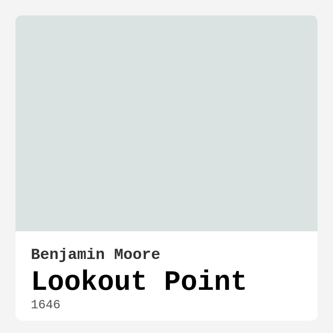
Color Preview & Key Details
| HEX Code | #DAE3E2 |
| RGB | 218, 227, 226 |
| LRV | 74.07% |
| Undertone | Green and Blue |
| Finish Options | Eggshell, Flat, Matte, Satin |
Imagine stepping into a room that instantly makes you exhale—a space so light and airy, it feels like a gentle coastal breeze just swept through. That’s the magic of Benjamin Moore’s Lookout Point (1646). This soft, serene blue-green hue is like a breath of fresh air for your walls, effortlessly bringing the tranquility of the seaside into your home. Whether you’re dreaming of a calming bedroom retreat, a spa-like bathroom, or a living room that feels effortlessly inviting, this color might just be your perfect match.
Lookout Point sits in that sweet spot between blue and green, with undertones that shift subtly depending on the light. In bright daylight, you’ll notice its cool, refreshing side—think of the pale tint of ocean waves under a clear sky. But as the sun sets and the room grows cozier, it reveals a warmer, almost misty quality that keeps it from feeling stark or chilly. That balance is what makes it so versatile. It plays well with modern minimalism, coastal charm, or even Scandinavian simplicity, adapting to your style without missing a beat.
One of the best things about this color? It’s incredibly easy to work with. The LRV (Light Reflectance Value) of 74.07 means it reflects a lot of light, making rooms feel larger and brighter—ideal for smaller spaces or areas with limited natural light. But don’t just take my word for it. Test a swatch on your wall and watch how it transforms throughout the day. You’ll see how it dances between cool and warm, always keeping the room feeling fresh and alive.
Application is a breeze, too. Whether you’re a DIY newbie or a seasoned painter, Lookout Point is beginner-friendly. It rolls on smoothly, dries quickly, and typically only needs one or two coats for full, even coverage. Plus, it’s low-VOC and eco-certified, so you can breathe easy knowing your home stays healthy. And when life happens (because it always does), the high washability means scrubbing away fingerprints or smudges won’t leave you staring at patchy spots.
Now, let’s talk pairings. This color loves crisp, clean whites like Benjamin Moore’s White Dove for trim—it’s a classic combo that amplifies that airy, coastal vibe. But if you want to add depth, try layering in natural wood tones or brushed brass fixtures. The warmth of brass against Lookout Point’s cool undertones creates a gorgeous contrast that feels both elegant and relaxed. For a bolder accent, consider deeper blues or greens from its complementary palette, like Benjamin Moore’s AF-625 or 1365. These shades add richness without overpowering the room’s serene mood.
Of course, no color is perfect for every scenario. Lookout Point thrives in well-lit spaces, so if your room is on the darker side, it might appear lighter than expected. That’s why testing is key. Paint a large swatch, live with it for a few days, and see how it behaves in your specific lighting. And while it’s primarily an interior star, if you’re tempted to use it outside, stick to protected areas—this shade isn’t formulated to battle the elements like dedicated exterior paints.
So, who is Lookout Point for? If you’re craving a space that feels calm but not boring, sophisticated but not stuffy, this color is a winner. It’s perfect for bedrooms where you want to unwind, home offices that need a touch of inspiration, or bathrooms that deserve a spa-worthy upgrade. Even nurseries benefit from its gentle, restful energy. And if you’re renting? It’s a landlord-friendly shade that’s easy to paint over when it’s time to move.
At the end of the day, paint is more than just color—it’s mood, it’s atmosphere, it’s the backdrop to your life. Lookout Point delivers all of that with effortless grace. It’s the kind of hue that makes you pause, take a deep breath, and feel just a little more at peace in your own home. So, if you’re ready to bring a slice of coastal serenity indoors, grab a sample and see how it transforms your space. You might just fall in love with the way it makes every day feel like a quiet moment by the water.
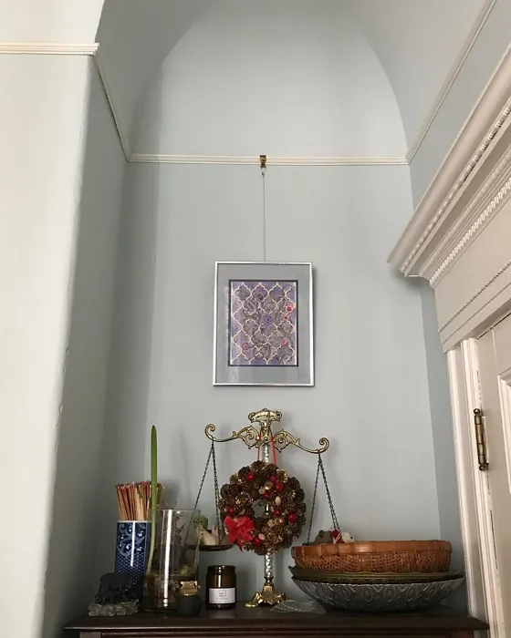
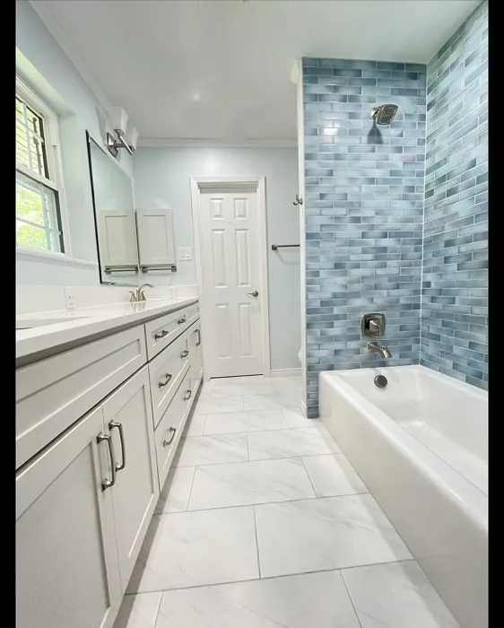
Real Room Photo of Lookout Point 1646
Undertones of Lookout Point ?
The undertones of Lookout Point are a key aspect of its character, leaning towards Green and Blue. These subtle underlying hues are what give the color its depth and complexity. For example, a gray with a blue undertone will feel cooler and more modern, while one with a brown undertone will feel warmer and more traditional. It’s essential to test this paint in your home and observe it next to your existing furniture, flooring, and decor to see how these undertones interact and reveal themselves throughout the day.
HEX value: #DAE3E2
RGB code: 218, 227, 226
Is Lookout Point Cool or Warm?
This color leans more towards cool but maintains a balanced warmth. It’s perfect for those who want a refreshing hue without the chill that some blues can bring.
Understanding Color Properties and Interior Design Tips
Hue refers to a specific position on the color wheel, measured in degrees from 0 to 360. Each degree represents a different pure color:
- 0° represents red
- 120° represents green
- 240° represents blue
Saturation describes the intensity or purity of a color and is expressed as a percentage:
- At 0%, the color appears completely desaturated—essentially a shade of gray
- At 100%, the color is at its most vivid and vibrant
Lightness indicates how light or dark a color is, also expressed as a percentage:
- 0% lightness results in black
- 100% lightness results in white
Using Warm Colors in Interior Design
Warm hues—such as reds, oranges, yellows, warm beiges, and greiges—are excellent choices for creating inviting and energetic spaces. These colors are particularly well-suited for:
- Kitchens, living rooms, and bathrooms, where warmth enhances comfort and sociability
- Large rooms, where warm tones can help reduce the sense of emptiness and make the space feel more intimate
For example:
- Warm beige shades provide a cozy, inviting atmosphere, ideal for living rooms, bedrooms, and hallways.
- Warm greige (a mix of beige and gray) offers the warmth of beige with the modern appeal of gray, making it a versatile backdrop for dining areas, bedrooms, and living spaces.
However, be mindful when using warm light tones in rooms with limited natural light. These shades may appear muted or even take on an unpleasant yellowish tint. To avoid a dull or flat appearance:
- Add depth by incorporating richer tones like deep greens, charcoal, or chocolate brown
- Use textured elements such as curtains, rugs, or cushions to bring dimension to the space
Pro Tip: Achieving Harmony with Warm and Cool Color Balance
To create a well-balanced and visually interesting interior, mix warm and cool tones strategically. This contrast adds depth and harmony to your design.
- If your walls feature warm hues, introduce cool-colored accents such as blue or green furniture, artwork, or accessories to create contrast.
- For a polished look, consider using a complementary color scheme, which pairs colors opposite each other on the color wheel (e.g., red with green, orange with blue).
This thoughtful mix not only enhances visual appeal but also creates a space that feels both dynamic and cohesive.
Light Temperature Affects on Lookout Point
Natural Light
Natural daylight changes in color temperature as the sun moves across the sky. At sunrise and sunset, the light tends to have a warm, golden tone with a color temperature around 2000 Kelvin (K). As the day progresses and the sun rises higher, the light becomes cooler and more neutral. Around midday, especially when the sky is clear, natural light typically reaches its peak brightness and shifts to a cooler tone, ranging from 5500 to 6500 Kelvin. This midday light is close to what we perceive as pure white or daylight-balanced light.
These shifts in natural light can significantly influence how colors appear in a space, which is why designers often consider both the time of day and the orientation of windows when planning interior color schemes.
Artificial Light
When choosing artificial lighting, pay close attention to the color temperature, measured in Kelvin (K). This determines how warm or cool the light will appear. Lower temperatures, around 2700K, give off a warm, yellow glow often used in living rooms or bedrooms. Higher temperatures, above 5000K, create a cool, bluish light similar to daylight, commonly used in kitchens, offices, or task areas.
Use the slider to see how lighting temperature can affect the appearance of a surface or color throughout a space.


4800K
LRV of Lookout Point
The Light Reflectance Value (LRV) of Lookout Point is 74.07%, which places it in the Off‑White colors category. This means it reflect a lot of light. Understanding a paint’s LRV is crucial for predicting how it will look in your space. A higher LRV indicates a lighter color that reflects more light, making rooms feel larger and brighter. A lower LRV signifies a darker color that absorbs more light, creating a cozier, more intimate atmosphere. Always consider the natural and artificial lighting in your room when selecting a paint color based on its LRV.
Detailed Review of Lookout Point
Additional Paint Characteristics
Ideal Rooms
Bathroom, Bedroom, Home Office, Living Room, Nursery
Decor Styles
Coastal, Contemporary, Minimalist, Scandinavian
Coverage
Good (1–2 Coats)
Ease of Application
Beginner Friendly, Brush Smooth, Fast-Drying, Low Splatter, Roller-Ready
Washability
Highly Washable, Washable
VOC Level
Eco-Certified, Low VOC
Best Use
Accent Wall, Ceilings, Interior Walls
Room Suitability
Bathroom, Bedroom, Home Office, Living Room
Tone Tag
Airy, Balanced, Cool
Finish Type
Eggshell, Satin
Paint Performance
Easy Touch-Up, Fade Resistant, High Coverage, Low Odor, Quick Drying
Use Cases
Best for Low Light Rooms, Best for Rentals, Classic Favorite
Mood
Calm, Inviting, Restful
Trim Pairing
Complements Brass Fixtures, Matches Pure White, Pairs with White Dove
Lookout Point is a stunning choice for anyone looking to infuse their space with tranquility. The subtle blue-green tone evokes the feeling of ocean breezes and sandy shores, making it an excellent pick for bedrooms and bathrooms. Its versatility allows it to work beautifully in both modern and traditional settings, providing a refreshing backdrop without overwhelming the senses. When applied, it glides on smoothly and dries evenly, requiring just one or two coats for full coverage. This paint not only changes the mood of a room but also adds a touch of sophistication. Plus, it pairs wonderfully with natural wood accents and crisp white trim, enhancing that airy feel. If you’re aiming for a calm retreat at home, Lookout Point is a go-to.
Pros & Cons of 1646 Lookout Point
Pros
Cons
Colors that go with Benjamin Moore Lookout Point
FAQ on 1646 Lookout Point
Is Lookout Point suitable for small spaces?
Absolutely! Lookout Point is an excellent choice for small spaces. Its light and airy tone can make a room feel larger and more open. When paired with adequate lighting, it creates an inviting atmosphere that enhances the sense of space, making it perfect for hallways, bathrooms, or cozy nooks.
Can Lookout Point be used outdoors?
While Lookout Point is primarily designed for interior use, it can be applied outdoors in well-protected areas. However, for exterior walls, it’s recommended to choose a paint specifically formulated for outdoor conditions to ensure longevity and durability against the elements.
Comparisons Lookout Point with other colors
Lookout Point 1646 vs Moonmist SW 9144
| Attribute | Lookout Point 1646 | Moonmist SW 9144 |
|---|---|---|
| Color Name | Lookout Point 1646 | Moonmist SW 9144 |
| Color | ||
| Hue | Blue | Blue |
| Brightness | Light | Light |
| RGB | 218, 227, 226 | 201, 217, 224 |
| LRV | 74.07% | 65% |
| Finish Type | Eggshell, Satin | Eggshell, Satin |
| Finish Options | Eggshell, Flat, Matte, Satin | Eggshell, Flat, Matte, Satin |
| Ideal Rooms | Bathroom, Bedroom, Home Office, Living Room, Nursery | Bathroom, Bedroom, Home Office, Living Room, Nursery |
| Decor Styles | Coastal, Contemporary, Minimalist, Scandinavian | Coastal, Minimalist, Modern, Scandinavian |
| Coverage | Good (1–2 Coats) | Good (1–2 Coats) |
| Ease of Application | Beginner Friendly, Brush Smooth, Fast-Drying, Low Splatter, Roller-Ready | Beginner Friendly, Brush Smooth, Fast-Drying, Roller-Ready |
| Washability | Highly Washable, Washable | Washable, Wipeable |
| Room Suitability | Bathroom, Bedroom, Home Office, Living Room | Bathroom, Bedroom, Home Office, Living Room |
| Tone | Airy, Balanced, Cool | Airy, Cool, Muted |
| Paint Performance | Easy Touch-Up, Fade Resistant, High Coverage, Low Odor, Quick Drying | High Coverage, Low Odor, Quick Drying |
Lookout Point 1646 vs North Star SW 6246
| Attribute | Lookout Point 1646 | North Star SW 6246 |
|---|---|---|
| Color Name | Lookout Point 1646 | North Star SW 6246 |
| Color | ||
| Hue | Blue | Blue |
| Brightness | Light | Light |
| RGB | 218, 227, 226 | 202, 208, 210 |
| LRV | 74.07% | 75% |
| Finish Type | Eggshell, Satin | Eggshell, Satin |
| Finish Options | Eggshell, Flat, Matte, Satin | Eggshell, Satin, Semi-Gloss |
| Ideal Rooms | Bathroom, Bedroom, Home Office, Living Room, Nursery | Bedroom, Hallway, Home Office, Living Room, Nursery |
| Decor Styles | Coastal, Contemporary, Minimalist, Scandinavian | Coastal, Minimalist, Modern, Scandinavian |
| Coverage | Good (1–2 Coats) | Good (1–2 Coats) |
| Ease of Application | Beginner Friendly, Brush Smooth, Fast-Drying, Low Splatter, Roller-Ready | Beginner Friendly, Brush Smooth, Roller-Ready |
| Washability | Highly Washable, Washable | Highly Washable, Washable |
| Room Suitability | Bathroom, Bedroom, Home Office, Living Room | Bedroom, Home Office, Living Room, Nursery |
| Tone | Airy, Balanced, Cool | Airy, Balanced, Cool, Muted |
| Paint Performance | Easy Touch-Up, Fade Resistant, High Coverage, Low Odor, Quick Drying | Easy Touch-Up, Fade Resistant, Low Odor, Quick Drying |
Lookout Point 1646 vs Lullaby SW 9136
| Attribute | Lookout Point 1646 | Lullaby SW 9136 |
|---|---|---|
| Color Name | Lookout Point 1646 | Lullaby SW 9136 |
| Color | ||
| Hue | Blue | Blue |
| Brightness | Light | Light |
| RGB | 218, 227, 226 | 203, 212, 212 |
| LRV | 74.07% | 66% |
| Finish Type | Eggshell, Satin | Eggshell, Satin |
| Finish Options | Eggshell, Flat, Matte, Satin | Eggshell, Flat, Matte, Satin |
| Ideal Rooms | Bathroom, Bedroom, Home Office, Living Room, Nursery | Bedroom, Home Office, Living Room, Nursery |
| Decor Styles | Coastal, Contemporary, Minimalist, Scandinavian | Bohemian, Coastal, Modern, Scandinavian |
| Coverage | Good (1–2 Coats) | Good (1–2 Coats), Touch-Up Friendly |
| Ease of Application | Beginner Friendly, Brush Smooth, Fast-Drying, Low Splatter, Roller-Ready | Beginner Friendly, Brush Smooth, Roller-Ready |
| Washability | Highly Washable, Washable | Spot Clean Only, Washable |
| Room Suitability | Bathroom, Bedroom, Home Office, Living Room | Bedroom, Home Office, Living Room, Nursery |
| Tone | Airy, Balanced, Cool | Airy, Cool, Muted |
| Paint Performance | Easy Touch-Up, Fade Resistant, High Coverage, Low Odor, Quick Drying | Easy Touch-Up, High Coverage, Low Odor |
Lookout Point 1646 vs Hinting Blue SW 6519
| Attribute | Lookout Point 1646 | Hinting Blue SW 6519 |
|---|---|---|
| Color Name | Lookout Point 1646 | Hinting Blue SW 6519 |
| Color | ||
| Hue | Blue | Blue |
| Brightness | Light | Light |
| RGB | 218, 227, 226 | 206, 217, 221 |
| LRV | 74.07% | 48% |
| Finish Type | Eggshell, Satin | Eggshell, Matte, Satin |
| Finish Options | Eggshell, Flat, Matte, Satin | Eggshell, Matte, Satin |
| Ideal Rooms | Bathroom, Bedroom, Home Office, Living Room, Nursery | Bedroom, Home Office, Kids Room, Living Room, Nursery |
| Decor Styles | Coastal, Contemporary, Minimalist, Scandinavian | Coastal, Farmhouse, Minimalist, Modern, Scandinavian |
| Coverage | Good (1–2 Coats) | Good (1–2 Coats), Touch-Up Friendly |
| Ease of Application | Beginner Friendly, Brush Smooth, Fast-Drying, Low Splatter, Roller-Ready | Beginner Friendly, Brush Smooth, Fast-Drying, Roller-Ready |
| Washability | Highly Washable, Washable | Washable, Wipeable |
| Room Suitability | Bathroom, Bedroom, Home Office, Living Room | Bedroom, Home Office, Kids Room, Living Room, Nursery |
| Tone | Airy, Balanced, Cool | Airy, Balanced, Cool, Muted |
| Paint Performance | Easy Touch-Up, Fade Resistant, High Coverage, Low Odor, Quick Drying | Easy Touch-Up, Low Odor, Quick Drying |
Lookout Point 1646 vs Lauren's Surprise SW 6791
| Attribute | Lookout Point 1646 | Lauren's Surprise SW 6791 |
|---|---|---|
| Color Name | Lookout Point 1646 | Lauren's Surprise SW 6791 |
| Color | ||
| Hue | Blue | Blue |
| Brightness | Light | Light |
| RGB | 218, 227, 226 | 213, 229, 231 |
| LRV | 74.07% | 66% |
| Finish Type | Eggshell, Satin | Eggshell, Satin |
| Finish Options | Eggshell, Flat, Matte, Satin | Eggshell, Satin, Semi-Gloss |
| Ideal Rooms | Bathroom, Bedroom, Home Office, Living Room, Nursery | Bedroom, Home Office, Living Room, Nursery |
| Decor Styles | Coastal, Contemporary, Minimalist, Scandinavian | Coastal, Farmhouse, Modern, Scandinavian |
| Coverage | Good (1–2 Coats) | Good (1–2 Coats), Touch-Up Friendly |
| Ease of Application | Beginner Friendly, Brush Smooth, Fast-Drying, Low Splatter, Roller-Ready | Beginner Friendly, Brush Smooth, Roller-Ready |
| Washability | Highly Washable, Washable | Highly Washable, Washable |
| Room Suitability | Bathroom, Bedroom, Home Office, Living Room | Bedroom, Home Office, Living Room, Nursery |
| Tone | Airy, Balanced, Cool | Balanced, Cool, Pastel |
| Paint Performance | Easy Touch-Up, Fade Resistant, High Coverage, Low Odor, Quick Drying | Easy Touch-Up, High Coverage, Low Odor |
Lookout Point 1646 vs Sky High SW 6504
| Attribute | Lookout Point 1646 | Sky High SW 6504 |
|---|---|---|
| Color Name | Lookout Point 1646 | Sky High SW 6504 |
| Color | ||
| Hue | Blue | Blue |
| Brightness | Light | Light |
| RGB | 218, 227, 226 | 220, 231, 232 |
| LRV | 74.07% | 66% |
| Finish Type | Eggshell, Satin | Eggshell, Matte, Satin |
| Finish Options | Eggshell, Flat, Matte, Satin | Eggshell, Matte, Satin |
| Ideal Rooms | Bathroom, Bedroom, Home Office, Living Room, Nursery | Bathroom, Bedroom, Home Office, Kitchen, Living Room |
| Decor Styles | Coastal, Contemporary, Minimalist, Scandinavian | Coastal, Minimalist, Modern, Scandinavian |
| Coverage | Good (1–2 Coats) | Good (1–2 Coats), Touch-Up Friendly |
| Ease of Application | Beginner Friendly, Brush Smooth, Fast-Drying, Low Splatter, Roller-Ready | Beginner Friendly, Brush Smooth, Fast-Drying, Roller-Ready |
| Washability | Highly Washable, Washable | Washable, Wipeable |
| Room Suitability | Bathroom, Bedroom, Home Office, Living Room | Bathroom, Bedroom, Home Office, Kitchen, Living Room |
| Tone | Airy, Balanced, Cool | Airy, Cool, Muted |
| Paint Performance | Easy Touch-Up, Fade Resistant, High Coverage, Low Odor, Quick Drying | High Coverage, Low Odor, Quick Drying |
Lookout Point 1646 vs Tradewind SW 6218
| Attribute | Lookout Point 1646 | Tradewind SW 6218 |
|---|---|---|
| Color Name | Lookout Point 1646 | Tradewind SW 6218 |
| Color | ||
| Hue | Blue | Blue |
| Brightness | Light | Light |
| RGB | 218, 227, 226 | 194, 207, 207 |
| LRV | 74.07% | 66% |
| Finish Type | Eggshell, Satin | Eggshell, Satin |
| Finish Options | Eggshell, Flat, Matte, Satin | Eggshell, Matte, Satin |
| Ideal Rooms | Bathroom, Bedroom, Home Office, Living Room, Nursery | Bedroom, Dining Room, Home Office, Living Room, Nursery |
| Decor Styles | Coastal, Contemporary, Minimalist, Scandinavian | Coastal, Minimalist, Modern, Scandinavian |
| Coverage | Good (1–2 Coats) | Good (1–2 Coats), Touch-Up Friendly |
| Ease of Application | Beginner Friendly, Brush Smooth, Fast-Drying, Low Splatter, Roller-Ready | Beginner Friendly, Brush Smooth, Fast-Drying, Roller-Ready |
| Washability | Highly Washable, Washable | Washable, Wipeable |
| Room Suitability | Bathroom, Bedroom, Home Office, Living Room | Bedroom, Home Office, Living Room, Nursery |
| Tone | Airy, Balanced, Cool | Airy, Cool, Muted, Soft |
| Paint Performance | Easy Touch-Up, Fade Resistant, High Coverage, Low Odor, Quick Drying | Easy Touch-Up, Low Odor, Quick Drying |
Lookout Point 1646 vs Glimmer SW 6476
| Attribute | Lookout Point 1646 | Glimmer SW 6476 |
|---|---|---|
| Color Name | Lookout Point 1646 | Glimmer SW 6476 |
| Color | ||
| Hue | Blue | Blue |
| Brightness | Light | Light |
| RGB | 218, 227, 226 | 224, 231, 226 |
| LRV | 74.07% | 69% |
| Finish Type | Eggshell, Satin | Eggshell, Matte, Satin |
| Finish Options | Eggshell, Flat, Matte, Satin | Eggshell, Matte, Satin |
| Ideal Rooms | Bathroom, Bedroom, Home Office, Living Room, Nursery | Bathroom, Bedroom, Home Office, Kitchen, Living Room, Nursery |
| Decor Styles | Coastal, Contemporary, Minimalist, Scandinavian | Coastal, Farmhouse, Minimalist, Modern, Scandinavian |
| Coverage | Good (1–2 Coats) | Good (1–2 Coats), Touch-Up Friendly |
| Ease of Application | Beginner Friendly, Brush Smooth, Fast-Drying, Low Splatter, Roller-Ready | Beginner Friendly, Brush Smooth, Fast-Drying, Roller-Ready |
| Washability | Highly Washable, Washable | Washable, Wipeable |
| Room Suitability | Bathroom, Bedroom, Home Office, Living Room | Bathroom, Bedroom, Home Office, Living Room, Nursery |
| Tone | Airy, Balanced, Cool | Airy, Balanced, Cool |
| Paint Performance | Easy Touch-Up, Fade Resistant, High Coverage, Low Odor, Quick Drying | Easy Touch-Up, Fade Resistant, Low Odor, Quick Drying |
Lookout Point 1646 vs Misty SW 6232
| Attribute | Lookout Point 1646 | Misty SW 6232 |
|---|---|---|
| Color Name | Lookout Point 1646 | Misty SW 6232 |
| Color | ||
| Hue | Blue | Blue |
| Brightness | Light | Light |
| RGB | 218, 227, 226 | 205, 210, 210 |
| LRV | 74.07% | 64% |
| Finish Type | Eggshell, Satin | Eggshell, Matte |
| Finish Options | Eggshell, Flat, Matte, Satin | Eggshell, Matte, Satin |
| Ideal Rooms | Bathroom, Bedroom, Home Office, Living Room, Nursery | Bedroom, Home Office, Kitchen, Living Room, Nursery |
| Decor Styles | Coastal, Contemporary, Minimalist, Scandinavian | Minimalist, Modern, Scandinavian, Transitional |
| Coverage | Good (1–2 Coats) | Good (1–2 Coats), Touch-Up Friendly |
| Ease of Application | Beginner Friendly, Brush Smooth, Fast-Drying, Low Splatter, Roller-Ready | Beginner Friendly, Fast-Drying, Low Splatter |
| Washability | Highly Washable, Washable | Washable, Wipeable |
| Room Suitability | Bathroom, Bedroom, Home Office, Living Room | Bedroom, Home Office, Kitchen, Living Room, Nursery |
| Tone | Airy, Balanced, Cool | Airy, Balanced, Cool |
| Paint Performance | Easy Touch-Up, Fade Resistant, High Coverage, Low Odor, Quick Drying | High Coverage, Low Odor, Quick Drying |
Lookout Point 1646 vs Mild Blue SW 6533
| Attribute | Lookout Point 1646 | Mild Blue SW 6533 |
|---|---|---|
| Color Name | Lookout Point 1646 | Mild Blue SW 6533 |
| Color | ||
| Hue | Blue | Blue |
| Brightness | Light | Light |
| RGB | 218, 227, 226 | 203, 213, 219 |
| LRV | 74.07% | 48% |
| Finish Type | Eggshell, Satin | Eggshell, Matte, Satin |
| Finish Options | Eggshell, Flat, Matte, Satin | Eggshell, Matte, Satin |
| Ideal Rooms | Bathroom, Bedroom, Home Office, Living Room, Nursery | Bedroom, Dining Room, Home Office, Living Room, Nursery |
| Decor Styles | Coastal, Contemporary, Minimalist, Scandinavian | Coastal, Minimalist, Modern, Scandinavian |
| Coverage | Good (1–2 Coats) | Good (1–2 Coats), Touch-Up Friendly |
| Ease of Application | Beginner Friendly, Brush Smooth, Fast-Drying, Low Splatter, Roller-Ready | Beginner Friendly, Brush Smooth, Fast-Drying, Roller-Ready |
| Washability | Highly Washable, Washable | Washable, Wipeable |
| Room Suitability | Bathroom, Bedroom, Home Office, Living Room | Bedroom, Home Office, Living Room, Nursery |
| Tone | Airy, Balanced, Cool | Airy, Cool, Muted |
| Paint Performance | Easy Touch-Up, Fade Resistant, High Coverage, Low Odor, Quick Drying | Easy Touch-Up, Low Odor, Quick Drying |
Official Page of Benjamin Moore Lookout Point 1646