
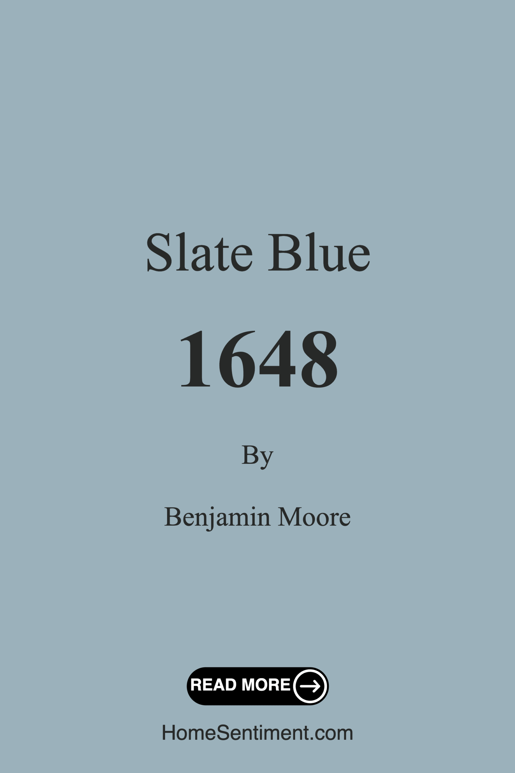
Color Preview & Key Details
| HEX Code | #9BB1BB |
| RGB | 155, 177, 187 |
| LRV | 43.21% |
| Undertone | Blue |
| Finish Options | Eggshell, Flat, Matte, Satin |
Imagine stepping into a room that instantly feels inviting and serene, where the worries of the day melt away as soon as you walk through the door. What if I told you that the paint on the walls could create that exact atmosphere? Enter Slate Blue from Benjamin Moore, a color that beautifully merges calmness with sophistication, offering a tranquil escape right in your home.
Slate Blue, with its hue code 1648, is an exquisite medium blue that carries subtle gray undertones, creating depth and richness. It’s like the calm waters of a gentle lake on a misty morning, inviting you to relax and breathe a little easier. This color isn’t just a pretty face; it’s versatile enough to fit seamlessly into both modern and traditional decor styles, making it a fantastic choice for various spaces in your home.
When you’re considering a paint color, one of the first questions that often arises is about its adaptability. Slate Blue shines in this department. Whether you’re looking to paint a cozy bedroom, a restful nursery, or a warm living room, this color will serve as a beautiful backdrop. It’s not just about the color itself but the mood it evokes. Slate Blue promotes a sense of tranquility, making it perfect for spaces where you want to unwind or focus, such as a home office or a peaceful reading nook.
Not only is Slate Blue visually appealing, but its application is user-friendly, too. Whether you’re a seasoned DIYer or a novice, you’ll find that this paint is roller-ready and brush smooth, making it a dream to apply. Plus, it’s fast-drying, so you won’t be left waiting too long to admire your handiwork. This quality, combined with its good coverage—usually requiring only 1 to 2 coats—means you’ll spend less time painting and more time enjoying your beautiful new space.
When it comes to pairing Slate Blue with other colors, the options are plentiful. It harmonizes beautifully with crisp whites like Pure White and White Dove, which can help to brighten the space and create a fresh, airy feel. If you’re a fan of natural materials, you’ll love how it complements wood tones, enhancing their warmth while still maintaining a cool balance. For a bit of glam, think about incorporating warm metallics like brass, which can elevate the sophistication level of your decor.
If you’re after a bolder statement, consider contrasting Slate Blue with deeper shades, such as navy or charcoal. This can create a striking visual impact, especially if you’re looking to draw attention to an accent wall or a piece of furniture. Just remember that lighting plays a crucial role in how this color is perceived. In natural light, Slate Blue reveals its softer tones, while artificial lighting may deepen its hue, adding warmth and richness to your space.
Now, let’s talk about its practicality. Slate Blue is highly washable, making it a great choice for high-traffic areas or homes with kids and pets. Its low VOC content means you can feel good about using it in your home without worrying about indoor air quality. And with a Light Reflectance Value (LRV) of around 43.21%, this color strikes that perfect balance between light and dark, reflecting just enough light to keep the space feeling bright without losing its cozy depth.
One of the standout aspects of Slate Blue is how it can transform smaller rooms. If you’re working with a compact space, this color can create an illusion of expanded dimensions while still wrapping you in a warm, inviting atmosphere. Pairing it with lighter trim can enhance this effect, so consider that when planning your space.
Of course, no paint color is without its challenges. In low light, Slate Blue can appear darker than expected, which may not suit every room. It’s important to test the color in your specific space, observing how it interacts with different lighting throughout the day. Additionally, careful color pairing is necessary to avoid clashing; while it beautifully complements many hues, some combinations may be less harmonious.
When you decide to embrace Slate Blue, you’re not just choosing a color; you’re selecting a mood. This hue leans towards the cool side of the spectrum, making it perfect for creating a serene atmosphere. It invites relaxation and warmth into your home, making it an ideal candidate for spaces meant for unwinding or gathering.
As you envision your walls dressed in Slate Blue, think about the potential it holds for your decor. It’s a designer favorite, especially for those embracing modern farmhouse aesthetics or coastal vibes. Whether you’re painting an entire room or just an accent wall, this color’s adaptable charm will surely impress your guests and provide you with a personal sanctuary.
In summary, Slate Blue is more than just a paint color; it’s an elegant choice that embodies calmness and sophistication, adaptable to various design styles. It promises good coverage, ease of application, and a washability that suits the demands of everyday life. The way it interacts with light and its stunning versatility makes it a standout option for any home. So, as you plan your next project, don’t overlook the potential of this beautiful hue. Let Slate Blue transform your space into a haven of tranquility, where every moment feels just a bit more peaceful.
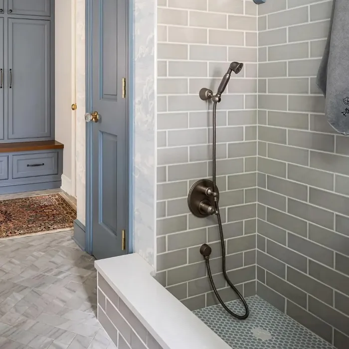
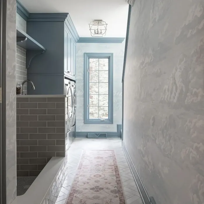
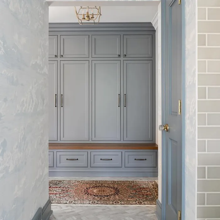
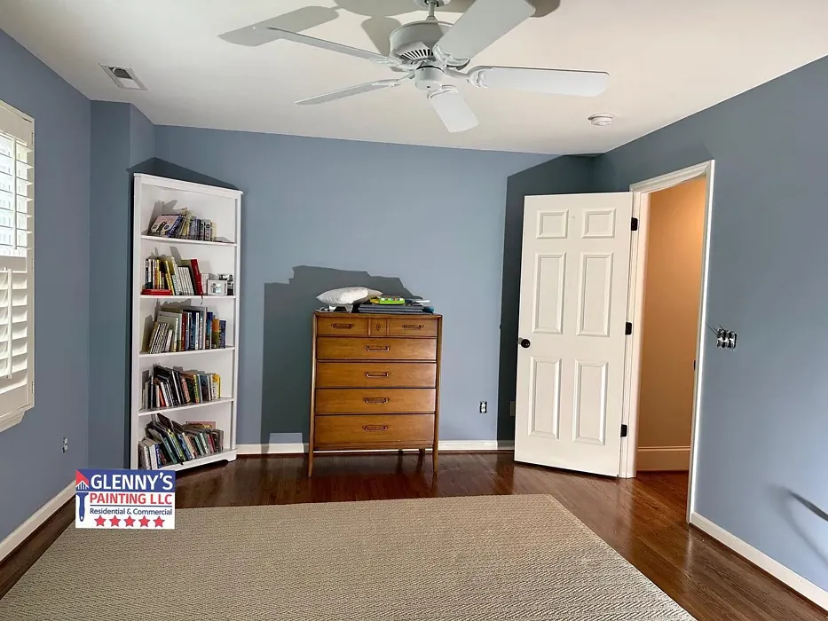
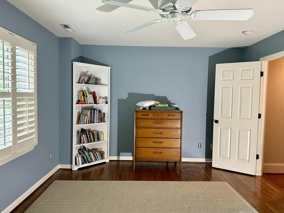
Real Room Photo of Slate Blue 1648
Undertones of Slate Blue ?
Slate Blue features subtle gray undertones that add depth and richness to the color, making it more than just a standard blue. This complexity helps the color adapt beautifully to various lighting conditions, enhancing its appeal in different spaces.
HEX value: #9BB1BB
RGB code: 155, 177, 187
Is Slate Blue Cool or Warm?
This shade leans towards the cool side of the color spectrum, creating a serene atmosphere. Its calming effect can make spaces feel larger and more inviting, perfect for creating a peaceful retreat in your home.
Understanding Color Properties and Interior Design Tips
Hue refers to a specific position on the color wheel, measured in degrees from 0 to 360. Each degree represents a different pure color:
- 0° represents red
- 120° represents green
- 240° represents blue
Saturation describes the intensity or purity of a color and is expressed as a percentage:
- At 0%, the color appears completely desaturated—essentially a shade of gray
- At 100%, the color is at its most vivid and vibrant
Lightness indicates how light or dark a color is, also expressed as a percentage:
- 0% lightness results in black
- 100% lightness results in white
Using Warm Colors in Interior Design
Warm hues—such as reds, oranges, yellows, warm beiges, and greiges—are excellent choices for creating inviting and energetic spaces. These colors are particularly well-suited for:
- Kitchens, living rooms, and bathrooms, where warmth enhances comfort and sociability
- Large rooms, where warm tones can help reduce the sense of emptiness and make the space feel more intimate
For example:
- Warm beige shades provide a cozy, inviting atmosphere, ideal for living rooms, bedrooms, and hallways.
- Warm greige (a mix of beige and gray) offers the warmth of beige with the modern appeal of gray, making it a versatile backdrop for dining areas, bedrooms, and living spaces.
However, be mindful when using warm light tones in rooms with limited natural light. These shades may appear muted or even take on an unpleasant yellowish tint. To avoid a dull or flat appearance:
- Add depth by incorporating richer tones like deep greens, charcoal, or chocolate brown
- Use textured elements such as curtains, rugs, or cushions to bring dimension to the space
Pro Tip: Achieving Harmony with Warm and Cool Color Balance
To create a well-balanced and visually interesting interior, mix warm and cool tones strategically. This contrast adds depth and harmony to your design.
- If your walls feature warm hues, introduce cool-colored accents such as blue or green furniture, artwork, or accessories to create contrast.
- For a polished look, consider using a complementary color scheme, which pairs colors opposite each other on the color wheel (e.g., red with green, orange with blue).
This thoughtful mix not only enhances visual appeal but also creates a space that feels both dynamic and cohesive.

Light Temperature Affects on Slate Blue
Natural Light
Natural daylight changes in color temperature as the sun moves across the sky. At sunrise and sunset, the light tends to have a warm, golden tone with a color temperature around 2000 Kelvin (K). As the day progresses and the sun rises higher, the light becomes cooler and more neutral. Around midday, especially when the sky is clear, natural light typically reaches its peak brightness and shifts to a cooler tone, ranging from 5500 to 6500 Kelvin. This midday light is close to what we perceive as pure white or daylight-balanced light.
These shifts in natural light can significantly influence how colors appear in a space, which is why designers often consider both the time of day and the orientation of windows when planning interior color schemes.
Artificial Light
When choosing artificial lighting, pay close attention to the color temperature, measured in Kelvin (K). This determines how warm or cool the light will appear. Lower temperatures, around 2700K, give off a warm, yellow glow often used in living rooms or bedrooms. Higher temperatures, above 5000K, create a cool, bluish light similar to daylight, commonly used in kitchens, offices, or task areas.
Use the slider to see how lighting temperature can affect the appearance of a surface or color throughout a space.


4800K
LRV of Slate Blue
With a Light Reflectance Value (LRV) of around 50, Slate Blue strikes a balance between light and dark, reflecting a decent amount of light while still providing depth.
Detailed Review of Slate Blue
Additional Paint Characteristics
Ideal Rooms
Bedroom, Dining Room, Home Office, Living Room, Nursery
Decor Styles
Coastal, Modern, Traditional, Transitional
Coverage
Good (1–2 Coats), Touch-Up Friendly
Ease of Application
Beginner Friendly, Brush Smooth, Fast-Drying, Roller-Ready
Washability
Highly Washable, Washable
VOC Level
Eco-Certified, Low VOC
Best Use
Accent Wall, Furniture, Interior Walls
Room Suitability
Bedroom, Home Office, Living Room, Nursery
Tone Tag
Balanced, Cool, Muted
Finish Type
Eggshell, Matte, Satin
Paint Performance
High Coverage, Low Odor, Quick Drying
Use Cases
Best for Modern Farmhouse, Best for Rentals, Designer Favorite
Mood
Calm, Inviting, Restful
Trim Pairing
Complements Brass Fixtures, Good with Wood Trim, Pairs with White Dove
Slate Blue stands out for its unique blend of calmness and sophistication, making it an ideal choice for various spaces. The color’s versatility allows it to shine in both bright and dim lighting, adapting to the vibe of the room. When applied, it offers a smooth finish that enhances both contemporary and classic decor styles. The hue pairs well with whites and natural wood tones, making it easy to incorporate into existing design schemes. Additionally, its calming nature can bring a sense of tranquility to bedrooms or home offices, promoting relaxation and focus. Whether you’re painting an accent wall or an entire room, Slate Blue’s adaptable charm is sure to impress.
Pros & Cons of 1648 Slate Blue
Pros
Cons
Colors that go with Benjamin Moore Slate Blue
FAQ on 1648 Slate Blue
What colors pair well with Slate Blue?
Slate Blue harmonizes beautifully with whites, such as Pure White or White Dove, and complements natural wood tones. You can also pair it with warm metallics like brass for a sophisticated touch or opt for cooler shades like soft grays to maintain a serene atmosphere. For a bolder look, consider contrasting it with a deep navy or charcoal.
Can I use Slate Blue in small rooms?
Absolutely! Slate Blue can work wonders in small rooms by creating an illusion of space while maintaining a cozy atmosphere. Its cool undertones can help make the room feel more expansive, especially when paired with lighter trim or accents. Just be mindful of the lighting; natural light will enhance its calming effect.
Comparisons Slate Blue with other colors
Slate Blue 1648 vs Dutch Tile Blue SW 0031
| Attribute | Slate Blue 1648 | Dutch Tile Blue SW 0031 |
|---|---|---|
| Color Name | Slate Blue 1648 | Dutch Tile Blue SW 0031 |
| Color | ||
| Hue | Blue | Blue |
| Brightness | Medium | Medium |
| RGB | 155, 177, 187 | 154, 171, 171 |
| LRV | 43.21% | 24% |
| Finish Type | Eggshell, Matte, Satin | Eggshell, Matte, Satin |
| Finish Options | Eggshell, Flat, Matte, Satin | Eggshell, Flat, Matte, Satin |
| Ideal Rooms | Bedroom, Dining Room, Home Office, Living Room, Nursery | Bathroom, Bedroom, Dining Room, Hallway, Home Office, Kitchen, Living Room |
| Decor Styles | Coastal, Modern, Traditional, Transitional | Coastal, Modern Farmhouse, Scandinavian, Traditional, Transitional |
| Coverage | Good (1–2 Coats), Touch-Up Friendly | Good (1–2 Coats) |
| Ease of Application | Beginner Friendly, Brush Smooth, Fast-Drying, Roller-Ready | Beginner Friendly, Brush Smooth, Fast-Drying, Roller-Ready |
| Washability | Highly Washable, Washable | Highly Washable, Washable |
| Room Suitability | Bedroom, Home Office, Living Room, Nursery | Bathroom, Bedroom, Dining Room, Kitchen, Living Room |
| Tone | Balanced, Cool, Muted | Balanced, Cool, Muted |
| Paint Performance | High Coverage, Low Odor, Quick Drying | Easy Touch-Up, High Coverage, Low Odor, Quick Drying |
Slate Blue 1648 vs Debonair SW 9139
| Attribute | Slate Blue 1648 | Debonair SW 9139 |
|---|---|---|
| Color Name | Slate Blue 1648 | Debonair SW 9139 |
| Color | ||
| Hue | Blue | Blue |
| Brightness | Medium | Medium |
| RGB | 155, 177, 187 | 144, 160, 166 |
| LRV | 43.21% | 30% |
| Finish Type | Eggshell, Matte, Satin | Eggshell, Matte, Satin |
| Finish Options | Eggshell, Flat, Matte, Satin | Eggshell, Matte, Satin |
| Ideal Rooms | Bedroom, Dining Room, Home Office, Living Room, Nursery | Bedroom, Dining Room, Home Office, Living Room |
| Decor Styles | Coastal, Modern, Traditional, Transitional | Coastal, Industrial, Modern, Transitional |
| Coverage | Good (1–2 Coats), Touch-Up Friendly | Good (1–2 Coats) |
| Ease of Application | Beginner Friendly, Brush Smooth, Fast-Drying, Roller-Ready | Beginner Friendly, Brush Smooth, Roller-Ready |
| Washability | Highly Washable, Washable | Washable, Wipeable |
| Room Suitability | Bedroom, Home Office, Living Room, Nursery | Bedroom, Dining Room, Home Office, Living Room |
| Tone | Balanced, Cool, Muted | Balanced, Cool, Muted |
| Paint Performance | High Coverage, Low Odor, Quick Drying | Easy Touch-Up, Low Odor, Quick Drying |
Slate Blue 1648 vs Stardew SW 9138
| Attribute | Slate Blue 1648 | Stardew SW 9138 |
|---|---|---|
| Color Name | Slate Blue 1648 | Stardew SW 9138 |
| Color | ||
| Hue | Blue | Blue |
| Brightness | Medium | Medium |
| RGB | 155, 177, 187 | 166, 178, 181 |
| LRV | 43.21% | 30% |
| Finish Type | Eggshell, Matte, Satin | Eggshell, Satin |
| Finish Options | Eggshell, Flat, Matte, Satin | Eggshell, Matte, Satin |
| Ideal Rooms | Bedroom, Dining Room, Home Office, Living Room, Nursery | Bathroom, Bedroom, Home Office, Living Room, Nursery |
| Decor Styles | Coastal, Modern, Traditional, Transitional | Coastal, Farmhouse, Modern, Scandinavian |
| Coverage | Good (1–2 Coats), Touch-Up Friendly | Good (1–2 Coats) |
| Ease of Application | Beginner Friendly, Brush Smooth, Fast-Drying, Roller-Ready | Beginner Friendly, Brush Smooth, Roller-Ready |
| Washability | Highly Washable, Washable | Highly Washable, Washable, Wipeable |
| Room Suitability | Bedroom, Home Office, Living Room, Nursery | Bathroom, Bedroom, Home Office, Living Room |
| Tone | Balanced, Cool, Muted | Calm, Cool, Muted |
| Paint Performance | High Coverage, Low Odor, Quick Drying | Easy Touch-Up, High Coverage, Low Odor |
Slate Blue 1648 vs Niebla Azul SW 9137
| Attribute | Slate Blue 1648 | Niebla Azul SW 9137 |
|---|---|---|
| Color Name | Slate Blue 1648 | Niebla Azul SW 9137 |
| Color | ||
| Hue | Blue | Blue |
| Brightness | Medium | Medium |
| RGB | 155, 177, 187 | 182, 195, 196 |
| LRV | 43.21% | 48% |
| Finish Type | Eggshell, Matte, Satin | Eggshell, Matte, Satin |
| Finish Options | Eggshell, Flat, Matte, Satin | Eggshell, Matte, Satin |
| Ideal Rooms | Bedroom, Dining Room, Home Office, Living Room, Nursery | Bedroom, Home Office, Living Room, Nursery |
| Decor Styles | Coastal, Modern, Traditional, Transitional | Coastal, Modern, Scandinavian, Transitional |
| Coverage | Good (1–2 Coats), Touch-Up Friendly | Good (1–2 Coats), Touch-Up Friendly |
| Ease of Application | Beginner Friendly, Brush Smooth, Fast-Drying, Roller-Ready | Beginner Friendly, Brush Smooth, Roller-Ready |
| Washability | Highly Washable, Washable | Highly Washable, Washable |
| Room Suitability | Bedroom, Home Office, Living Room, Nursery | Bedroom, Home Office, Living Room, Nursery |
| Tone | Balanced, Cool, Muted | Airy, Cool, Muted |
| Paint Performance | High Coverage, Low Odor, Quick Drying | Easy Touch-Up, Fade Resistant, Low Odor, Scuff Resistant |
Slate Blue 1648 vs Rain SW 6219
| Attribute | Slate Blue 1648 | Rain SW 6219 |
|---|---|---|
| Color Name | Slate Blue 1648 | Rain SW 6219 |
| Color | ||
| Hue | Blue | Blue |
| Brightness | Medium | Medium |
| RGB | 155, 177, 187 | 171, 190, 191 |
| LRV | 43.21% | 50% |
| Finish Type | Eggshell, Matte, Satin | Eggshell, Matte, Satin |
| Finish Options | Eggshell, Flat, Matte, Satin | Eggshell, Matte, Satin |
| Ideal Rooms | Bedroom, Dining Room, Home Office, Living Room, Nursery | Bathroom, Bedroom, Home Office, Living Room, Nursery |
| Decor Styles | Coastal, Modern, Traditional, Transitional | Coastal, Minimalist, Modern, Scandinavian, Transitional |
| Coverage | Good (1–2 Coats), Touch-Up Friendly | Good (1–2 Coats), Touch-Up Friendly |
| Ease of Application | Beginner Friendly, Brush Smooth, Fast-Drying, Roller-Ready | Beginner Friendly, Brush Smooth, Fast-Drying, Roller-Ready |
| Washability | Highly Washable, Washable | Scrubbable, Stain Resistant, Washable |
| Room Suitability | Bedroom, Home Office, Living Room, Nursery | Bathroom, Bedroom, Home Office, Living Room, Nursery |
| Tone | Balanced, Cool, Muted | Balanced, Cool, Muted |
| Paint Performance | High Coverage, Low Odor, Quick Drying | Easy Touch-Up, Low Odor, Quick Drying, Stain Resistant |
Slate Blue 1648 vs Morning at Sea SW 9634
| Attribute | Slate Blue 1648 | Morning at Sea SW 9634 |
|---|---|---|
| Color Name | Slate Blue 1648 | Morning at Sea SW 9634 |
| Color | ||
| Hue | Blue | Blue |
| Brightness | Medium | Medium |
| RGB | 155, 177, 187 | 130, 151, 155 |
| LRV | 43.21% | 50% |
| Finish Type | Eggshell, Matte, Satin | Eggshell, Matte |
| Finish Options | Eggshell, Flat, Matte, Satin | Eggshell, Matte, Satin |
| Ideal Rooms | Bedroom, Dining Room, Home Office, Living Room, Nursery | Bathroom, Bedroom, Home Office, Living Room |
| Decor Styles | Coastal, Modern, Traditional, Transitional | Coastal, Minimalist, Modern, Scandinavian |
| Coverage | Good (1–2 Coats), Touch-Up Friendly | Good (1–2 Coats), Touch-Up Friendly |
| Ease of Application | Beginner Friendly, Brush Smooth, Fast-Drying, Roller-Ready | Beginner Friendly, Brush Smooth, Roller-Ready |
| Washability | Highly Washable, Washable | Washable, Wipeable |
| Room Suitability | Bedroom, Home Office, Living Room, Nursery | Bathroom, Bedroom, Home Office, Living Room |
| Tone | Balanced, Cool, Muted | Airy, Cool, Muted |
| Paint Performance | High Coverage, Low Odor, Quick Drying | Easy Touch-Up, Fade Resistant, Low Odor |
Slate Blue 1648 vs Sleepy Blue SW 6225
| Attribute | Slate Blue 1648 | Sleepy Blue SW 6225 |
|---|---|---|
| Color Name | Slate Blue 1648 | Sleepy Blue SW 6225 |
| Color | ||
| Hue | Blue | Blue |
| Brightness | Medium | Medium |
| RGB | 155, 177, 187 | 188, 203, 206 |
| LRV | 43.21% | 50% |
| Finish Type | Eggshell, Matte, Satin | Eggshell, Matte, Satin |
| Finish Options | Eggshell, Flat, Matte, Satin | Eggshell, Matte, Satin |
| Ideal Rooms | Bedroom, Dining Room, Home Office, Living Room, Nursery | Bedroom, Home Office, Living Room, Nursery |
| Decor Styles | Coastal, Modern, Traditional, Transitional | Coastal, Minimalist, Modern Farmhouse, Scandinavian |
| Coverage | Good (1–2 Coats), Touch-Up Friendly | Good (1–2 Coats) |
| Ease of Application | Beginner Friendly, Brush Smooth, Fast-Drying, Roller-Ready | Beginner Friendly, Brush Smooth, Fast-Drying, Roller-Ready |
| Washability | Highly Washable, Washable | Highly Washable, Washable |
| Room Suitability | Bedroom, Home Office, Living Room, Nursery | Bedroom, Home Office, Living Room, Nursery |
| Tone | Balanced, Cool, Muted | Airy, Cool, Muted |
| Paint Performance | High Coverage, Low Odor, Quick Drying | Easy Touch-Up, Low Odor, Quick Drying, Scuff Resistant |
Slate Blue 1648 vs Lakeside SW 9683
| Attribute | Slate Blue 1648 | Lakeside SW 9683 |
|---|---|---|
| Color Name | Slate Blue 1648 | Lakeside SW 9683 |
| Color | ||
| Hue | Blue | Blue |
| Brightness | Medium | Medium |
| RGB | 155, 177, 187 | 173, 184, 192 |
| LRV | 43.21% | 24% |
| Finish Type | Eggshell, Matte, Satin | Eggshell, Matte, Satin |
| Finish Options | Eggshell, Flat, Matte, Satin | Eggshell, Matte, Satin |
| Ideal Rooms | Bedroom, Dining Room, Home Office, Living Room, Nursery | Bathroom, Bedroom, Home Office, Living Room |
| Decor Styles | Coastal, Modern, Traditional, Transitional | Coastal, Minimalist, Modern, Rustic |
| Coverage | Good (1–2 Coats), Touch-Up Friendly | Good (1–2 Coats) |
| Ease of Application | Beginner Friendly, Brush Smooth, Fast-Drying, Roller-Ready | Beginner Friendly, Brush Smooth, Roller-Ready |
| Washability | Highly Washable, Washable | Scrubbable, Washable |
| Room Suitability | Bedroom, Home Office, Living Room, Nursery | Bathroom, Bedroom, Home Office, Living Room |
| Tone | Balanced, Cool, Muted | Balanced, Cool, Muted |
| Paint Performance | High Coverage, Low Odor, Quick Drying | Easy Touch-Up, Fade Resistant, High Coverage, Low Odor |
Slate Blue 1648 vs Upward SW 6239
| Attribute | Slate Blue 1648 | Upward SW 6239 |
|---|---|---|
| Color Name | Slate Blue 1648 | Upward SW 6239 |
| Color | ||
| Hue | Blue | Blue |
| Brightness | Medium | Medium |
| RGB | 155, 177, 187 | 191, 201, 208 |
| LRV | 43.21% | 75% |
| Finish Type | Eggshell, Matte, Satin | Eggshell, Satin |
| Finish Options | Eggshell, Flat, Matte, Satin | Eggshell, Flat, Satin |
| Ideal Rooms | Bedroom, Dining Room, Home Office, Living Room, Nursery | Bedroom, Dining Room, Home Office, Living Room, Nursery |
| Decor Styles | Coastal, Modern, Traditional, Transitional | Coastal, Minimalist, Modern, Scandinavian |
| Coverage | Good (1–2 Coats), Touch-Up Friendly | Good (1–2 Coats), Touch-Up Friendly |
| Ease of Application | Beginner Friendly, Brush Smooth, Fast-Drying, Roller-Ready | Beginner Friendly, Brush Smooth, Fast-Drying, Roller-Ready |
| Washability | Highly Washable, Washable | Washable, Wipeable |
| Room Suitability | Bedroom, Home Office, Living Room, Nursery | Bedroom, Home Office, Living Room, Nursery |
| Tone | Balanced, Cool, Muted | Cool, Crisp, Muted |
| Paint Performance | High Coverage, Low Odor, Quick Drying | High Coverage, Low Odor, Quick Drying |
Slate Blue 1648 vs Aleutian SW 6241
| Attribute | Slate Blue 1648 | Aleutian SW 6241 |
|---|---|---|
| Color Name | Slate Blue 1648 | Aleutian SW 6241 |
| Color | ||
| Hue | Blue | Blue |
| Brightness | Medium | Medium |
| RGB | 155, 177, 187 | 152, 169, 183 |
| LRV | 43.21% | 24% |
| Finish Type | Eggshell, Matte, Satin | Eggshell, Matte, Satin |
| Finish Options | Eggshell, Flat, Matte, Satin | Eggshell, Matte, Satin |
| Ideal Rooms | Bedroom, Dining Room, Home Office, Living Room, Nursery | Bathroom, Bedroom, Home Office, Kitchen, Living Room, Nursery |
| Decor Styles | Coastal, Modern, Traditional, Transitional | Coastal, Minimalist, Modern, Scandinavian, Transitional |
| Coverage | Good (1–2 Coats), Touch-Up Friendly | Good (1–2 Coats), Touch-Up Friendly |
| Ease of Application | Beginner Friendly, Brush Smooth, Fast-Drying, Roller-Ready | Beginner Friendly, Brush Smooth, Fast-Drying, Roller-Ready |
| Washability | Highly Washable, Washable | Scrubbable, Stain Resistant, Washable |
| Room Suitability | Bedroom, Home Office, Living Room, Nursery | Bathroom, Bedroom, Home Office, Living Room, Nursery |
| Tone | Balanced, Cool, Muted | Airy, Balanced, Cool, Muted |
| Paint Performance | High Coverage, Low Odor, Quick Drying | Easy Touch-Up, Fade Resistant, Low Odor, Quick Drying |
Official Page of Benjamin Moore Slate Blue 1648