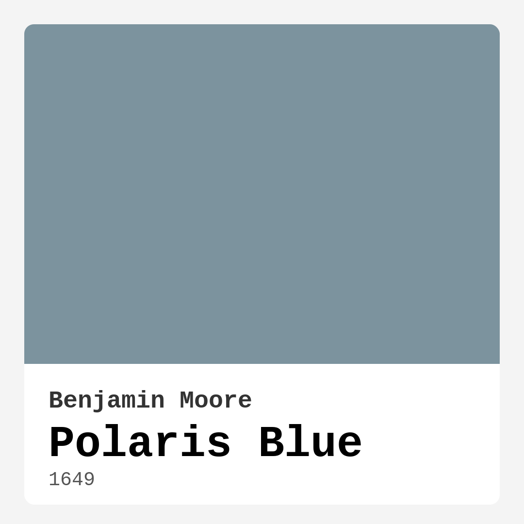
Color Preview & Key Details
| HEX Code | #7C939E |
| RGB | 124, 147, 158 |
| LRV | 29.27% |
| Undertone | Blue |
| Finish Options | Matte, Satin, Semi-Gloss |
Imagine stepping into a room wrapped in a color that immediately calms your senses, one that feels both fresh and timeless. That’s the magic of Polaris Blue, a captivating hue from Benjamin Moore that effortlessly transforms spaces into serene retreats. Whether you’re contemplating a living room makeover or reimagining your bedroom, this cool-toned color brings a sense of tranquility that feels inviting and sophisticated.
Polaris Blue, with its soft blend of blue and gray, sits comfortably on the medium side of the spectrum, making it versatile enough for various decor styles. Its hex code, #7C939E, captures that essence beautifully, and with an LRV of 29.27%, it strikes a perfect balance between light and dark. You’re not just painting a wall; you’re crafting an atmosphere.
One of the standout qualities of Polaris Blue is its ability to reflect a lot of light. This means it can brighten a space, enhancing the natural sunlight that flows in. You’ll find that during the day, this color radiates a serene softness that can make a room feel open and airy. It’s particularly effective in spaces like living rooms and home offices, where you want to foster a calm yet productive environment.
Now, let’s chat about the practical side of using Polaris Blue. Applying this paint is a breeze, even for beginners. It goes on smoothly, whether you’re using a roller or a brush, and the coverage is impressive. Most homeowners find that one to two coats are sufficient, which can save you time and money. Plus, it’s touch-up friendly, so if life happens and you scuff the wall, a little dab of paint will have it looking fresh again in no time.
When you’re choosing colors for your home, lighting is key. Polaris Blue shines in spaces with plenty of natural light, where it reveals its true beauty. However, in dimmer lighting, it can lean cooler, which might not resonate with everyone. To make the most of this hue, ensure that your spaces are well-lit, especially if you’re using it in smaller rooms. It can create an illusion of spaciousness, making cozy areas feel expansive.
Polaris Blue pairs exceptionally well with various trim colors. For a classic look, crisp whites like White Dove or Simply White create a beautiful contrast, enhancing the serene quality of the blue. If you’re leaning towards a modern aesthetic, think about incorporating black windows or wood trim. These combinations not only highlight the calming nature of Polaris Blue but also keep your overall design feeling fresh and inviting.
One of the reasons Polaris Blue is so adaptable is its understated sophistication. It harmonizes beautifully with both warm and cool colors, making it an excellent choice for eclectic palettes. Whether you’re incorporating earthy tones or opting for a more modern, minimalistic vibe, this blue-gray blend integrates seamlessly, allowing you to express your unique style.
When considering the overall mood you want to create, Polaris Blue excels at fostering a calm, restful environment. It’s ideal for bedrooms, where you want to unwind at the end of the day, or dining rooms, where you seek to create an inviting space for gatherings. Think of it as a backdrop for your life’s moments—whether intimate dinners or lively conversations.
If you’re worried about pairing it with overly warm colors, it’s understandable. While Polaris Blue can be a challenge next to certain warm hues, it thrives when surrounded by complementary shades. Colors like soft grays or even muted greens can enhance its cool undertones, creating a cohesive look that feels intentional and stylish.
For those who love a little contrast, consider adding deeper shades to the mix. Darker blues like Benjamin Moore’s 1645 or 1671 can create a striking accent wall or be used in decorative elements like cushions and throws to make Polaris Blue pop. These deeper tones serve as a lovely counterpoint, adding depth and interest to your overall design.
Let’s not forget about the eco-friendly aspect of Polaris Blue. With a low VOC level and eco-certification, you can feel good about bringing this color into your home. It’s a responsible choice that doesn’t compromise on aesthetics. Plus, its washability means you won’t have to live with stains and marks; a simple wipe can keep your walls looking pristine.
Decorating with Polaris Blue opens up a world of possibilities. Picture it on interior walls, as an accent wall, or even on furniture pieces that need a refresh. The soothing aura it brings can be the perfect finishing touch to a modern farmhouse or a coastal-inspired space. Its versatility also makes it suitable for transitional styles, blending elements from different eras effortlessly.
So, how do you envision Polaris Blue fitting into your home? Maybe it’s that cozy study where you can escape with a good book, or perhaps it’s the dining room where you gather with family and friends. Whatever your vision, this color is here to help you create the sanctuary you’ve always dreamed of.
You might be wondering if Polaris Blue works well in small rooms. Absolutely! It gives the illusion of openness while maintaining that cozy feel. Pair it with lighter furnishings to enhance this effect, and watch as the room transforms.
In conclusion, choosing a paint color should never feel daunting. With Polaris Blue, you’re opting for a hue that combines serenity, sophistication, and versatility. Whether you’re embarking on a small project or a complete overhaul, this color invites you to embrace its tranquility while allowing your personal style to shine through. So, grab that paintbrush, and let Polaris Blue guide you to create a space that feels just right for you. You’re one step closer to a beautifully designed home!
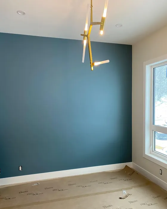
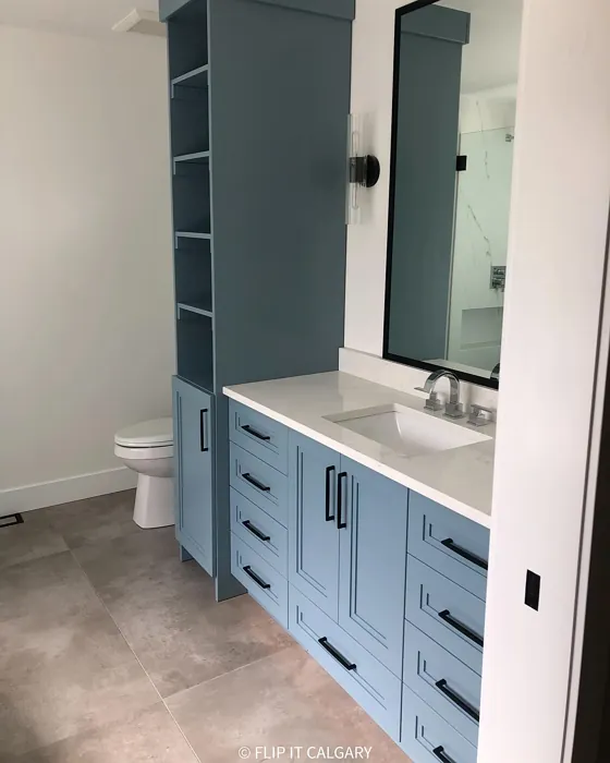
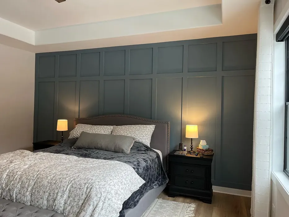
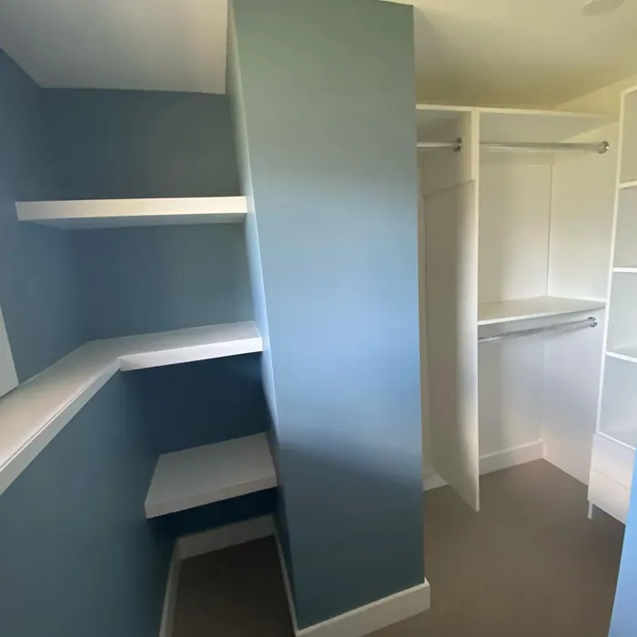
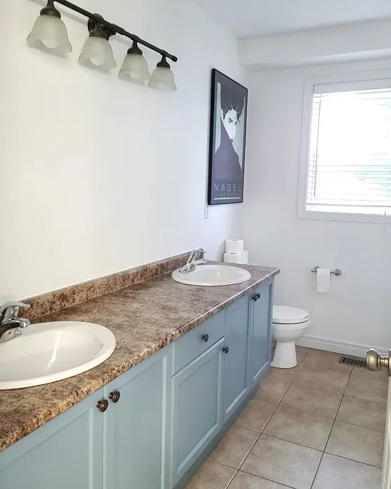
Real Room Photo of Polaris Blue 1649
Undertones of Polaris Blue ?
Polaris Blue features subtle undertones of gray, giving it a cool yet sophisticated edge. This balance allows it to harmonize beautifully with both warm and cool colors, making it an adaptable choice for any palette.
HEX value: #7C939E
RGB code: 124, 147, 158
Is Polaris Blue Cool or Warm?
This color leans towards the cool spectrum, making it ideal for creating refreshing and calming environments. It can enhance light in a space, particularly in rooms that receive plenty of natural sunlight.
Understanding Color Properties and Interior Design Tips
Hue refers to a specific position on the color wheel, measured in degrees from 0 to 360. Each degree represents a different pure color:
- 0° represents red
- 120° represents green
- 240° represents blue
Saturation describes the intensity or purity of a color and is expressed as a percentage:
- At 0%, the color appears completely desaturated—essentially a shade of gray
- At 100%, the color is at its most vivid and vibrant
Lightness indicates how light or dark a color is, also expressed as a percentage:
- 0% lightness results in black
- 100% lightness results in white
Using Warm Colors in Interior Design
Warm hues—such as reds, oranges, yellows, warm beiges, and greiges—are excellent choices for creating inviting and energetic spaces. These colors are particularly well-suited for:
- Kitchens, living rooms, and bathrooms, where warmth enhances comfort and sociability
- Large rooms, where warm tones can help reduce the sense of emptiness and make the space feel more intimate
For example:
- Warm beige shades provide a cozy, inviting atmosphere, ideal for living rooms, bedrooms, and hallways.
- Warm greige (a mix of beige and gray) offers the warmth of beige with the modern appeal of gray, making it a versatile backdrop for dining areas, bedrooms, and living spaces.
However, be mindful when using warm light tones in rooms with limited natural light. These shades may appear muted or even take on an unpleasant yellowish tint. To avoid a dull or flat appearance:
- Add depth by incorporating richer tones like deep greens, charcoal, or chocolate brown
- Use textured elements such as curtains, rugs, or cushions to bring dimension to the space
Pro Tip: Achieving Harmony with Warm and Cool Color Balance
To create a well-balanced and visually interesting interior, mix warm and cool tones strategically. This contrast adds depth and harmony to your design.
- If your walls feature warm hues, introduce cool-colored accents such as blue or green furniture, artwork, or accessories to create contrast.
- For a polished look, consider using a complementary color scheme, which pairs colors opposite each other on the color wheel (e.g., red with green, orange with blue).
This thoughtful mix not only enhances visual appeal but also creates a space that feels both dynamic and cohesive.

Light Temperature Affects on Polaris Blue
Natural Light
Natural daylight changes in color temperature as the sun moves across the sky. At sunrise and sunset, the light tends to have a warm, golden tone with a color temperature around 2000 Kelvin (K). As the day progresses and the sun rises higher, the light becomes cooler and more neutral. Around midday, especially when the sky is clear, natural light typically reaches its peak brightness and shifts to a cooler tone, ranging from 5500 to 6500 Kelvin. This midday light is close to what we perceive as pure white or daylight-balanced light.
These shifts in natural light can significantly influence how colors appear in a space, which is why designers often consider both the time of day and the orientation of windows when planning interior color schemes.
Artificial Light
When choosing artificial lighting, pay close attention to the color temperature, measured in Kelvin (K). This determines how warm or cool the light will appear. Lower temperatures, around 2700K, give off a warm, yellow glow often used in living rooms or bedrooms. Higher temperatures, above 5000K, create a cool, bluish light similar to daylight, commonly used in kitchens, offices, or task areas.
Use the slider to see how lighting temperature can affect the appearance of a surface or color throughout a space.


4800K
LRV of Polaris Blue
With a Light Reflectance Value (LRV) of approximately 35, Polaris Blue strikes a balance between light and dark, ensuring it remains inviting without feeling heavy or oppressive.
Detailed Review of Polaris Blue
Additional Paint Characteristics
Ideal Rooms
Bedroom, Dining Room, Home Office, Living Room
Decor Styles
Coastal, Modern, Scandinavian, Transitional
Coverage
Good (1–2 Coats), Touch-Up Friendly
Ease of Application
Beginner Friendly, Brush Smooth, Roller-Ready
Washability
Highly Washable, Washable
VOC Level
Eco-Certified, Low VOC
Best Use
Accent Wall, Furniture, Interior Walls
Room Suitability
Bedroom, Dining Room, Home Office, Living Room
Tone Tag
Balanced, Cool, Muted
Finish Type
Matte, Satin
Paint Performance
Easy Touch-Up, Fade Resistant, High Coverage, Low Odor
Use Cases
Best for Modern Farmhouse, Best for Open Concept, Best for Small Spaces
Mood
Calm, Inviting, Restful
Trim Pairing
Complements Brass Fixtures, Good with Wood Trim, Pairs with White Dove
When it comes to choosing a paint color that blends sophistication with tranquility, Polaris Blue shines. The unique balance of blue and gray creates a versatile tone that complements both modern and traditional decor. Its muted quality helps it stand out without overwhelming a space, making it an excellent choice for accent walls or whole room applications. The paint applies smoothly and evenly, and it’s easy to work with, even for beginners. Its good coverage means you might get away with just one or two coats, saving you time and effort. Whether you want to create a cozy nook or a fresh, airy atmosphere, Polaris Blue delivers a sense of peace, making it a top pick for any room.
Pros & Cons of 1649 Polaris Blue
Pros
Cons
Colors that go with Benjamin Moore Polaris Blue
FAQ on 1649 Polaris Blue
Can Polaris Blue be used in small rooms?
Absolutely! Polaris Blue works well in small spaces by giving an illusion of openness while maintaining a cozy feel. Its cool undertones can make a room feel more expansive, especially when paired with lighter furnishings and decor. Just be mindful of your lighting to ensure the color doesn’t feel too cold.
What trim colors pair well with Polaris Blue?
Polaris Blue pairs beautifully with crisp white trims like White Dove or Simply White for a classic look. If you’re going for a more modern aesthetic, consider pairing it with black windows or wood trim to add contrast and warmth. These combinations help highlight the calming nature of the blue while keeping the overall design fresh and inviting.
Comparisons Polaris Blue with other colors
Polaris Blue 1649 vs Dutch Tile Blue SW 0031
| Attribute | Polaris Blue 1649 | Dutch Tile Blue SW 0031 |
|---|---|---|
| Color Name | Polaris Blue 1649 | Dutch Tile Blue SW 0031 |
| Color | ||
| Hue | Blue | Blue |
| Brightness | Medium | Medium |
| RGB | 124, 147, 158 | 154, 171, 171 |
| LRV | 29.27% | 24% |
| Finish Type | Matte, Satin | Eggshell, Matte, Satin |
| Finish Options | Matte, Satin, Semi-Gloss | Eggshell, Flat, Matte, Satin |
| Ideal Rooms | Bedroom, Dining Room, Home Office, Living Room | Bathroom, Bedroom, Dining Room, Hallway, Home Office, Kitchen, Living Room |
| Decor Styles | Coastal, Modern, Scandinavian, Transitional | Coastal, Modern Farmhouse, Scandinavian, Traditional, Transitional |
| Coverage | Good (1–2 Coats), Touch-Up Friendly | Good (1–2 Coats) |
| Ease of Application | Beginner Friendly, Brush Smooth, Roller-Ready | Beginner Friendly, Brush Smooth, Fast-Drying, Roller-Ready |
| Washability | Highly Washable, Washable | Highly Washable, Washable |
| Room Suitability | Bedroom, Dining Room, Home Office, Living Room | Bathroom, Bedroom, Dining Room, Kitchen, Living Room |
| Tone | Balanced, Cool, Muted | Balanced, Cool, Muted |
| Paint Performance | Easy Touch-Up, Fade Resistant, High Coverage, Low Odor | Easy Touch-Up, High Coverage, Low Odor, Quick Drying |
Polaris Blue 1649 vs Debonair SW 9139
| Attribute | Polaris Blue 1649 | Debonair SW 9139 |
|---|---|---|
| Color Name | Polaris Blue 1649 | Debonair SW 9139 |
| Color | ||
| Hue | Blue | Blue |
| Brightness | Medium | Medium |
| RGB | 124, 147, 158 | 144, 160, 166 |
| LRV | 29.27% | 30% |
| Finish Type | Matte, Satin | Eggshell, Matte, Satin |
| Finish Options | Matte, Satin, Semi-Gloss | Eggshell, Matte, Satin |
| Ideal Rooms | Bedroom, Dining Room, Home Office, Living Room | Bedroom, Dining Room, Home Office, Living Room |
| Decor Styles | Coastal, Modern, Scandinavian, Transitional | Coastal, Industrial, Modern, Transitional |
| Coverage | Good (1–2 Coats), Touch-Up Friendly | Good (1–2 Coats) |
| Ease of Application | Beginner Friendly, Brush Smooth, Roller-Ready | Beginner Friendly, Brush Smooth, Roller-Ready |
| Washability | Highly Washable, Washable | Washable, Wipeable |
| Room Suitability | Bedroom, Dining Room, Home Office, Living Room | Bedroom, Dining Room, Home Office, Living Room |
| Tone | Balanced, Cool, Muted | Balanced, Cool, Muted |
| Paint Performance | Easy Touch-Up, Fade Resistant, High Coverage, Low Odor | Easy Touch-Up, Low Odor, Quick Drying |
Polaris Blue 1649 vs Stardew SW 9138
| Attribute | Polaris Blue 1649 | Stardew SW 9138 |
|---|---|---|
| Color Name | Polaris Blue 1649 | Stardew SW 9138 |
| Color | ||
| Hue | Blue | Blue |
| Brightness | Medium | Medium |
| RGB | 124, 147, 158 | 166, 178, 181 |
| LRV | 29.27% | 30% |
| Finish Type | Matte, Satin | Eggshell, Satin |
| Finish Options | Matte, Satin, Semi-Gloss | Eggshell, Matte, Satin |
| Ideal Rooms | Bedroom, Dining Room, Home Office, Living Room | Bathroom, Bedroom, Home Office, Living Room, Nursery |
| Decor Styles | Coastal, Modern, Scandinavian, Transitional | Coastal, Farmhouse, Modern, Scandinavian |
| Coverage | Good (1–2 Coats), Touch-Up Friendly | Good (1–2 Coats) |
| Ease of Application | Beginner Friendly, Brush Smooth, Roller-Ready | Beginner Friendly, Brush Smooth, Roller-Ready |
| Washability | Highly Washable, Washable | Highly Washable, Washable, Wipeable |
| Room Suitability | Bedroom, Dining Room, Home Office, Living Room | Bathroom, Bedroom, Home Office, Living Room |
| Tone | Balanced, Cool, Muted | Calm, Cool, Muted |
| Paint Performance | Easy Touch-Up, Fade Resistant, High Coverage, Low Odor | Easy Touch-Up, High Coverage, Low Odor |
Polaris Blue 1649 vs Niebla Azul SW 9137
| Attribute | Polaris Blue 1649 | Niebla Azul SW 9137 |
|---|---|---|
| Color Name | Polaris Blue 1649 | Niebla Azul SW 9137 |
| Color | ||
| Hue | Blue | Blue |
| Brightness | Medium | Medium |
| RGB | 124, 147, 158 | 182, 195, 196 |
| LRV | 29.27% | 48% |
| Finish Type | Matte, Satin | Eggshell, Matte, Satin |
| Finish Options | Matte, Satin, Semi-Gloss | Eggshell, Matte, Satin |
| Ideal Rooms | Bedroom, Dining Room, Home Office, Living Room | Bedroom, Home Office, Living Room, Nursery |
| Decor Styles | Coastal, Modern, Scandinavian, Transitional | Coastal, Modern, Scandinavian, Transitional |
| Coverage | Good (1–2 Coats), Touch-Up Friendly | Good (1–2 Coats), Touch-Up Friendly |
| Ease of Application | Beginner Friendly, Brush Smooth, Roller-Ready | Beginner Friendly, Brush Smooth, Roller-Ready |
| Washability | Highly Washable, Washable | Highly Washable, Washable |
| Room Suitability | Bedroom, Dining Room, Home Office, Living Room | Bedroom, Home Office, Living Room, Nursery |
| Tone | Balanced, Cool, Muted | Airy, Cool, Muted |
| Paint Performance | Easy Touch-Up, Fade Resistant, High Coverage, Low Odor | Easy Touch-Up, Fade Resistant, Low Odor, Scuff Resistant |
Polaris Blue 1649 vs Rain SW 6219
| Attribute | Polaris Blue 1649 | Rain SW 6219 |
|---|---|---|
| Color Name | Polaris Blue 1649 | Rain SW 6219 |
| Color | ||
| Hue | Blue | Blue |
| Brightness | Medium | Medium |
| RGB | 124, 147, 158 | 171, 190, 191 |
| LRV | 29.27% | 50% |
| Finish Type | Matte, Satin | Eggshell, Matte, Satin |
| Finish Options | Matte, Satin, Semi-Gloss | Eggshell, Matte, Satin |
| Ideal Rooms | Bedroom, Dining Room, Home Office, Living Room | Bathroom, Bedroom, Home Office, Living Room, Nursery |
| Decor Styles | Coastal, Modern, Scandinavian, Transitional | Coastal, Minimalist, Modern, Scandinavian, Transitional |
| Coverage | Good (1–2 Coats), Touch-Up Friendly | Good (1–2 Coats), Touch-Up Friendly |
| Ease of Application | Beginner Friendly, Brush Smooth, Roller-Ready | Beginner Friendly, Brush Smooth, Fast-Drying, Roller-Ready |
| Washability | Highly Washable, Washable | Scrubbable, Stain Resistant, Washable |
| Room Suitability | Bedroom, Dining Room, Home Office, Living Room | Bathroom, Bedroom, Home Office, Living Room, Nursery |
| Tone | Balanced, Cool, Muted | Balanced, Cool, Muted |
| Paint Performance | Easy Touch-Up, Fade Resistant, High Coverage, Low Odor | Easy Touch-Up, Low Odor, Quick Drying, Stain Resistant |
Polaris Blue 1649 vs Morning at Sea SW 9634
| Attribute | Polaris Blue 1649 | Morning at Sea SW 9634 |
|---|---|---|
| Color Name | Polaris Blue 1649 | Morning at Sea SW 9634 |
| Color | ||
| Hue | Blue | Blue |
| Brightness | Medium | Medium |
| RGB | 124, 147, 158 | 130, 151, 155 |
| LRV | 29.27% | 50% |
| Finish Type | Matte, Satin | Eggshell, Matte |
| Finish Options | Matte, Satin, Semi-Gloss | Eggshell, Matte, Satin |
| Ideal Rooms | Bedroom, Dining Room, Home Office, Living Room | Bathroom, Bedroom, Home Office, Living Room |
| Decor Styles | Coastal, Modern, Scandinavian, Transitional | Coastal, Minimalist, Modern, Scandinavian |
| Coverage | Good (1–2 Coats), Touch-Up Friendly | Good (1–2 Coats), Touch-Up Friendly |
| Ease of Application | Beginner Friendly, Brush Smooth, Roller-Ready | Beginner Friendly, Brush Smooth, Roller-Ready |
| Washability | Highly Washable, Washable | Washable, Wipeable |
| Room Suitability | Bedroom, Dining Room, Home Office, Living Room | Bathroom, Bedroom, Home Office, Living Room |
| Tone | Balanced, Cool, Muted | Airy, Cool, Muted |
| Paint Performance | Easy Touch-Up, Fade Resistant, High Coverage, Low Odor | Easy Touch-Up, Fade Resistant, Low Odor |
Polaris Blue 1649 vs Sleepy Blue SW 6225
| Attribute | Polaris Blue 1649 | Sleepy Blue SW 6225 |
|---|---|---|
| Color Name | Polaris Blue 1649 | Sleepy Blue SW 6225 |
| Color | ||
| Hue | Blue | Blue |
| Brightness | Medium | Medium |
| RGB | 124, 147, 158 | 188, 203, 206 |
| LRV | 29.27% | 50% |
| Finish Type | Matte, Satin | Eggshell, Matte, Satin |
| Finish Options | Matte, Satin, Semi-Gloss | Eggshell, Matte, Satin |
| Ideal Rooms | Bedroom, Dining Room, Home Office, Living Room | Bedroom, Home Office, Living Room, Nursery |
| Decor Styles | Coastal, Modern, Scandinavian, Transitional | Coastal, Minimalist, Modern Farmhouse, Scandinavian |
| Coverage | Good (1–2 Coats), Touch-Up Friendly | Good (1–2 Coats) |
| Ease of Application | Beginner Friendly, Brush Smooth, Roller-Ready | Beginner Friendly, Brush Smooth, Fast-Drying, Roller-Ready |
| Washability | Highly Washable, Washable | Highly Washable, Washable |
| Room Suitability | Bedroom, Dining Room, Home Office, Living Room | Bedroom, Home Office, Living Room, Nursery |
| Tone | Balanced, Cool, Muted | Airy, Cool, Muted |
| Paint Performance | Easy Touch-Up, Fade Resistant, High Coverage, Low Odor | Easy Touch-Up, Low Odor, Quick Drying, Scuff Resistant |
Polaris Blue 1649 vs Lakeside SW 9683
| Attribute | Polaris Blue 1649 | Lakeside SW 9683 |
|---|---|---|
| Color Name | Polaris Blue 1649 | Lakeside SW 9683 |
| Color | ||
| Hue | Blue | Blue |
| Brightness | Medium | Medium |
| RGB | 124, 147, 158 | 173, 184, 192 |
| LRV | 29.27% | 24% |
| Finish Type | Matte, Satin | Eggshell, Matte, Satin |
| Finish Options | Matte, Satin, Semi-Gloss | Eggshell, Matte, Satin |
| Ideal Rooms | Bedroom, Dining Room, Home Office, Living Room | Bathroom, Bedroom, Home Office, Living Room |
| Decor Styles | Coastal, Modern, Scandinavian, Transitional | Coastal, Minimalist, Modern, Rustic |
| Coverage | Good (1–2 Coats), Touch-Up Friendly | Good (1–2 Coats) |
| Ease of Application | Beginner Friendly, Brush Smooth, Roller-Ready | Beginner Friendly, Brush Smooth, Roller-Ready |
| Washability | Highly Washable, Washable | Scrubbable, Washable |
| Room Suitability | Bedroom, Dining Room, Home Office, Living Room | Bathroom, Bedroom, Home Office, Living Room |
| Tone | Balanced, Cool, Muted | Balanced, Cool, Muted |
| Paint Performance | Easy Touch-Up, Fade Resistant, High Coverage, Low Odor | Easy Touch-Up, Fade Resistant, High Coverage, Low Odor |
Polaris Blue 1649 vs Upward SW 6239
| Attribute | Polaris Blue 1649 | Upward SW 6239 |
|---|---|---|
| Color Name | Polaris Blue 1649 | Upward SW 6239 |
| Color | ||
| Hue | Blue | Blue |
| Brightness | Medium | Medium |
| RGB | 124, 147, 158 | 191, 201, 208 |
| LRV | 29.27% | 75% |
| Finish Type | Matte, Satin | Eggshell, Satin |
| Finish Options | Matte, Satin, Semi-Gloss | Eggshell, Flat, Satin |
| Ideal Rooms | Bedroom, Dining Room, Home Office, Living Room | Bedroom, Dining Room, Home Office, Living Room, Nursery |
| Decor Styles | Coastal, Modern, Scandinavian, Transitional | Coastal, Minimalist, Modern, Scandinavian |
| Coverage | Good (1–2 Coats), Touch-Up Friendly | Good (1–2 Coats), Touch-Up Friendly |
| Ease of Application | Beginner Friendly, Brush Smooth, Roller-Ready | Beginner Friendly, Brush Smooth, Fast-Drying, Roller-Ready |
| Washability | Highly Washable, Washable | Washable, Wipeable |
| Room Suitability | Bedroom, Dining Room, Home Office, Living Room | Bedroom, Home Office, Living Room, Nursery |
| Tone | Balanced, Cool, Muted | Cool, Crisp, Muted |
| Paint Performance | Easy Touch-Up, Fade Resistant, High Coverage, Low Odor | High Coverage, Low Odor, Quick Drying |
Polaris Blue 1649 vs Aleutian SW 6241
| Attribute | Polaris Blue 1649 | Aleutian SW 6241 |
|---|---|---|
| Color Name | Polaris Blue 1649 | Aleutian SW 6241 |
| Color | ||
| Hue | Blue | Blue |
| Brightness | Medium | Medium |
| RGB | 124, 147, 158 | 152, 169, 183 |
| LRV | 29.27% | 24% |
| Finish Type | Matte, Satin | Eggshell, Matte, Satin |
| Finish Options | Matte, Satin, Semi-Gloss | Eggshell, Matte, Satin |
| Ideal Rooms | Bedroom, Dining Room, Home Office, Living Room | Bathroom, Bedroom, Home Office, Kitchen, Living Room, Nursery |
| Decor Styles | Coastal, Modern, Scandinavian, Transitional | Coastal, Minimalist, Modern, Scandinavian, Transitional |
| Coverage | Good (1–2 Coats), Touch-Up Friendly | Good (1–2 Coats), Touch-Up Friendly |
| Ease of Application | Beginner Friendly, Brush Smooth, Roller-Ready | Beginner Friendly, Brush Smooth, Fast-Drying, Roller-Ready |
| Washability | Highly Washable, Washable | Scrubbable, Stain Resistant, Washable |
| Room Suitability | Bedroom, Dining Room, Home Office, Living Room | Bathroom, Bedroom, Home Office, Living Room, Nursery |
| Tone | Balanced, Cool, Muted | Airy, Balanced, Cool, Muted |
| Paint Performance | Easy Touch-Up, Fade Resistant, High Coverage, Low Odor | Easy Touch-Up, Fade Resistant, Low Odor, Quick Drying |
Official Page of Benjamin Moore Polaris Blue 1649