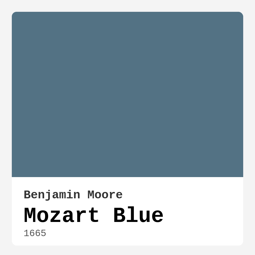
Color Preview & Key Details
| HEX Code | #537284 |
| RGB | 83, 114, 132 |
| LRV | 16.93% |
| Undertone | Blue |
| Finish Options | Eggshell, Matte, Satin |
If you’re searching for a paint color that effortlessly balances serenity and sophistication, let me introduce you to Mozart Blue by Benjamin Moore. This stunning shade, with its muted elegance and calming presence, is one of those rare hues that can transform a space without overwhelming it. Picture the soft, misty tones of a quiet lake at dawn—gentle yet deeply evocative. That’s the magic of Mozart Blue. Whether you’re refreshing a bedroom, creating a cozy living room, or designing a home office that inspires focus, this color has the versatility to adapt while maintaining its unique character.
Mozart Blue (color code 1665) sits firmly in the blue family, but don’t let that fool you into thinking it’s one-dimensional. Its undertones carry just enough warmth to keep it from feeling icy, making it a fantastic choice for spaces where you want a cool yet inviting atmosphere. With an LRV of 16.93%, it’s a medium-dark shade that absorbs more light than it reflects, which means it’ll create a cocoon-like effect in rooms with ample natural light and a richer, more intimate vibe in dimmer spaces. If you’re worried about it feeling too dark in a small room, don’t be—paired with light furnishings or crisp white trim, it can actually make a compact space feel cozy rather than cramped.
One of the standout qualities of Mozart Blue is its adaptability across different decor styles. Love the clean lines of modern design? This color’s muted sophistication will complement your aesthetic perfectly. Drawn to coastal or Scandinavian vibes? Its watery undertones evoke a breezy, relaxed feel. Even rustic or farmhouse spaces can benefit from its grounded, earthy depth. And because it’s so versatile, you won’t have to overhaul your entire decor to make it work. A few well-chosen accents—think warm wood tones, crisp whites, or even a pop of complementary red—can tie everything together beautifully.
When it comes to application, Mozart Blue is as user-friendly as it gets. It’s beginner-friendly, with smooth coverage that typically only requires one or two coats. Whether you’re rolling it on or brushing it, the finish is consistently even, and touch-ups are a breeze. The low VOC formula means you won’t be dealing with harsh fumes, making it a great choice for homes where air quality matters. And because it’s wipeable and washable, it’s practical for high-traffic areas or rooms like kitchens and bathrooms where splashes and smudges are inevitable. Just keep in mind that darker colors like this one can show application flaws more easily, so take your time with prep work—clean walls, proper priming, and quality tools will make all the difference.
Lighting plays a huge role in how Mozart Blue will look in your space. In rooms flooded with natural light, it takes on a softer, almost ethereal quality, with its blue-gray undertones coming forward. In spaces with less light, it deepens into a more dramatic, moody shade—perfect for creating a bedroom retreat that feels like a sanctuary. If you’re unsure, test a small section first and observe it at different times of day. You’ll quickly see how dynamic this color can be.
Wondering what trim colors to pair with it? You can’t go wrong with classic whites like Benjamin Moore’s White Dove or Simply White. These bright, clean options will make Mozart Blue pop while keeping the overall look fresh and balanced. If you prefer something with a bit more contrast, warm wood trim adds a touch of organic texture, while cool grays can enhance its modern edge. And if you’re feeling bold, a deep, complementary red (think terracotta or brick) can create a striking, unexpected contrast that’s full of personality.
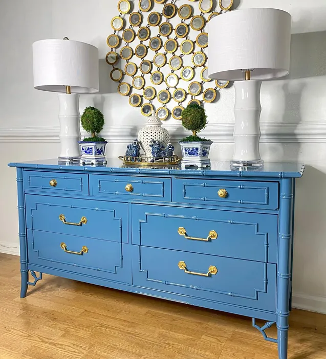
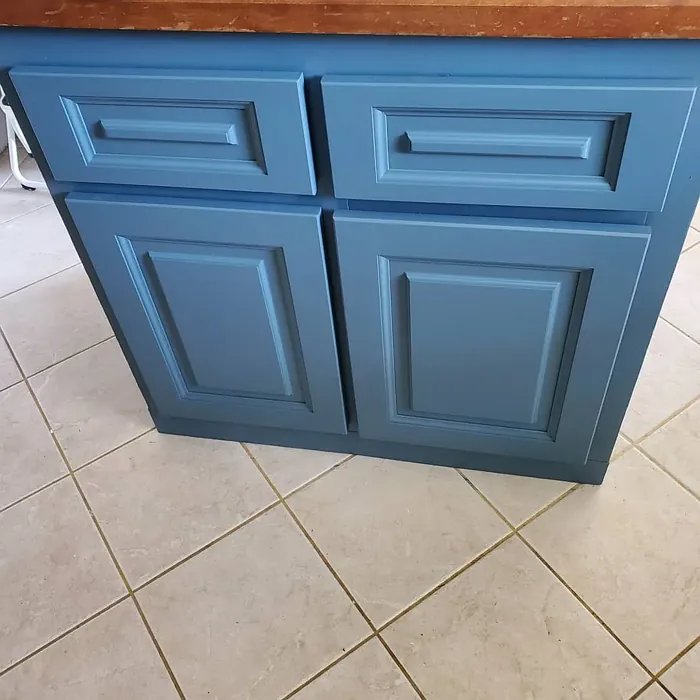
For those who love Mozart Blue but aren’t ready to commit to a full room, consider using it on an accent wall or even a piece of furniture. A bookshelf, dresser, or front door painted in this shade can add just the right amount of depth and interest without overwhelming the space. And if you’re renting or just like to switch things up often, its timeless appeal means it won’t feel dated in a year or two.
At the end of the day, Mozart Blue is more than just a paint color—it’s a mood. It’s the feeling of quiet mornings with a cup of coffee, of coming home to a space that instantly relaxes you. It’s versatile enough to work in almost any room and adaptable enough to suit a range of styles. Whether you’re a seasoned DIYer or a first-time painter, this shade is a joy to work with, offering professional-looking results with minimal fuss. So if you’re looking for a color that’s equal parts calming and captivating, Mozart Blue might just be the perfect choice for your next project.
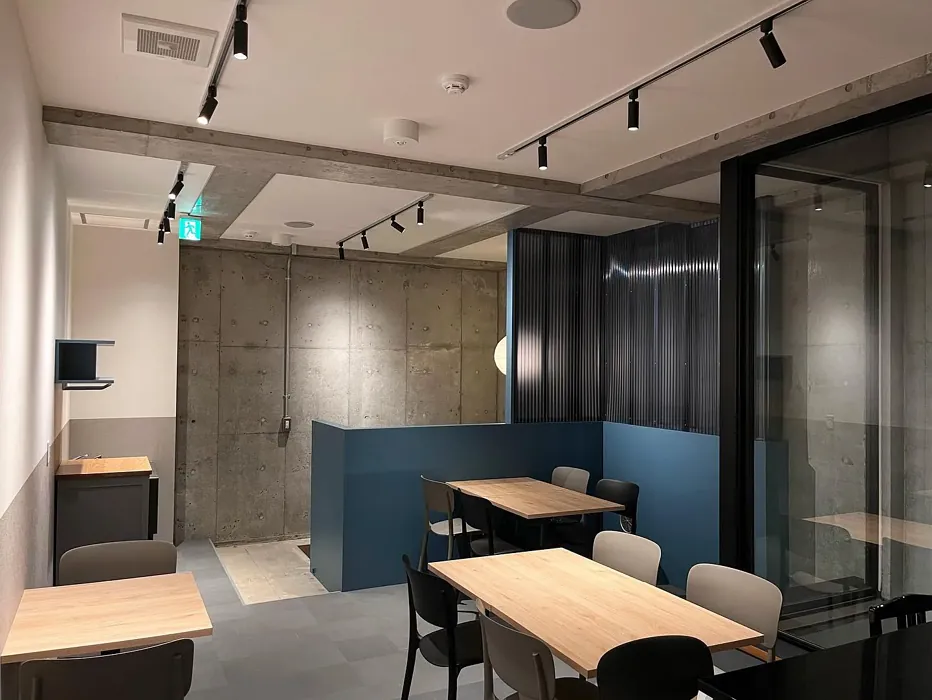
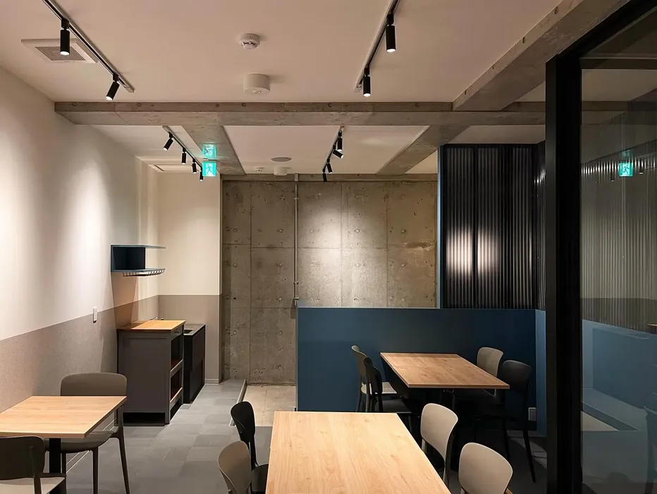
Real Room Photo of Mozart Blue 1665
Undertones of Mozart Blue ?
The undertones of Mozart Blue are a key aspect of its character, leaning towards Blue. These subtle underlying hues are what give the color its depth and complexity. For example, a gray with a blue undertone will feel cooler and more modern, while one with a brown undertone will feel warmer and more traditional. It’s essential to test this paint in your home and observe it next to your existing furniture, flooring, and decor to see how these undertones interact and reveal themselves throughout the day.
HEX value: #537284
RGB code: 83, 114, 132
Is Mozart Blue Cool or Warm?
This color leans more towards the cool side, but its gentle warmth from the gray undertones provides a balanced feel. It doesn’t overpower a room, making it ideal for creating a calming environment that feels inviting yet sophisticated.
Understanding Color Properties and Interior Design Tips
Hue refers to a specific position on the color wheel, measured in degrees from 0 to 360. Each degree represents a different pure color:
- 0° represents red
- 120° represents green
- 240° represents blue
Saturation describes the intensity or purity of a color and is expressed as a percentage:
- At 0%, the color appears completely desaturated—essentially a shade of gray
- At 100%, the color is at its most vivid and vibrant
Lightness indicates how light or dark a color is, also expressed as a percentage:
- 0% lightness results in black
- 100% lightness results in white
Using Warm Colors in Interior Design
Warm hues—such as reds, oranges, yellows, warm beiges, and greiges—are excellent choices for creating inviting and energetic spaces. These colors are particularly well-suited for:
- Kitchens, living rooms, and bathrooms, where warmth enhances comfort and sociability
- Large rooms, where warm tones can help reduce the sense of emptiness and make the space feel more intimate
For example:
- Warm beige shades provide a cozy, inviting atmosphere, ideal for living rooms, bedrooms, and hallways.
- Warm greige (a mix of beige and gray) offers the warmth of beige with the modern appeal of gray, making it a versatile backdrop for dining areas, bedrooms, and living spaces.
However, be mindful when using warm light tones in rooms with limited natural light. These shades may appear muted or even take on an unpleasant yellowish tint. To avoid a dull or flat appearance:
- Add depth by incorporating richer tones like deep greens, charcoal, or chocolate brown
- Use textured elements such as curtains, rugs, or cushions to bring dimension to the space
Pro Tip: Achieving Harmony with Warm and Cool Color Balance
To create a well-balanced and visually interesting interior, mix warm and cool tones strategically. This contrast adds depth and harmony to your design.
- If your walls feature warm hues, introduce cool-colored accents such as blue or green furniture, artwork, or accessories to create contrast.
- For a polished look, consider using a complementary color scheme, which pairs colors opposite each other on the color wheel (e.g., red with green, orange with blue).
This thoughtful mix not only enhances visual appeal but also creates a space that feels both dynamic and cohesive.
Light Temperature Affects on Mozart Blue
Natural Light
Natural daylight changes in color temperature as the sun moves across the sky. At sunrise and sunset, the light tends to have a warm, golden tone with a color temperature around 2000 Kelvin (K). As the day progresses and the sun rises higher, the light becomes cooler and more neutral. Around midday, especially when the sky is clear, natural light typically reaches its peak brightness and shifts to a cooler tone, ranging from 5500 to 6500 Kelvin. This midday light is close to what we perceive as pure white or daylight-balanced light.
These shifts in natural light can significantly influence how colors appear in a space, which is why designers often consider both the time of day and the orientation of windows when planning interior color schemes.
Artificial Light
When choosing artificial lighting, pay close attention to the color temperature, measured in Kelvin (K). This determines how warm or cool the light will appear. Lower temperatures, around 2700K, give off a warm, yellow glow often used in living rooms or bedrooms. Higher temperatures, above 5000K, create a cool, bluish light similar to daylight, commonly used in kitchens, offices, or task areas.
Use the slider to see how lighting temperature can affect the appearance of a surface or color throughout a space.


4800K
LRV of Mozart Blue
The Light Reflectance Value (LRV) of Mozart Blue is 16.93%, which places it in the Medium Dark category. This means it reflects very little light. Understanding a paint’s LRV is crucial for predicting how it will look in your space. A higher LRV indicates a lighter color that reflects more light, making rooms feel larger and brighter. A lower LRV signifies a darker color that absorbs more light, creating a cozier, more intimate atmosphere. Always consider the natural and artificial lighting in your room when selecting a paint color based on its LRV.
Detailed Review of Mozart Blue
Additional Paint Characteristics
Ideal Rooms
Bathroom, Bedroom, Home Office, Living Room
Decor Styles
Coastal, Modern, Rustic, Scandinavian
Coverage
Good (1–2 Coats), Touch-Up Friendly
Ease of Application
Beginner Friendly, Brush Smooth, Roller-Ready
Washability
Washable, Wipeable
VOC Level
Low VOC
Best Use
Accent Wall, Furniture, Interior Walls
Room Suitability
Bathroom, Bedroom, Home Office, Living Room
Tone Tag
Balanced, Cool, Muted
Finish Type
Eggshell, Matte, Satin
Paint Performance
Easy Touch-Up, Fade Resistant, High Coverage, Low Odor
Use Cases
Best for Modern Farmhouse, Best for Rentals, Designer Favorite
Mood
Calm, Grounding, Inviting
Trim Pairing
Complements Cool Trim, Good with Wood Trim, Pairs with White Dove
Applying Mozart Blue is a delightful experience. The paint flows smoothly from brush to surface, providing excellent coverage in just a couple of coats. Its subtle undertones play beautifully under different lighting, showcasing a rich depth that can transform a room. Whether you’re painting an accent wall or a full room, it’s easy to achieve a polished finish. This shade is perfect for those who want to create a serene atmosphere, and it pairs well with a variety of decor styles. Just ensure to let it dry properly between coats for the best results. You’ll love the fresh, airy feel it brings to your space!
Pros & Cons of 1665 Mozart Blue
Pros
Cons
Colors that go with Benjamin Moore Mozart Blue
FAQ on 1665 Mozart Blue
Can Mozart Blue be used in small spaces?
Absolutely! While Mozart Blue has a deeper tone, it can create a cozy feel in small spaces. Just be mindful of lighting; in well-lit areas, it can open up the space beautifully. Pair it with lighter furnishings or accents to maintain a balanced atmosphere.
What trim colors work best with Mozart Blue?
Mozart Blue pairs wonderfully with bright whites like White Dove or Simply White, which can help highlight its beauty. You can also consider warm wood trims to add contrast or even cool grays for a more modern look.
Comparisons Mozart Blue with other colors
Mozart Blue 1665 vs Naval SW 6244
| Attribute | Mozart Blue 1665 | Naval SW 6244 |
|---|---|---|
| Color Name | Mozart Blue 1665 | Naval SW 6244 |
| Color | ||
| Hue | Blue | Blue |
| Brightness | Dark | Dark |
| RGB | 83, 114, 132 | 47, 61, 76 |
| LRV | 16.93% | 4% |
| Finish Type | Eggshell, Matte, Satin | Matte, Satin, Semi-Gloss |
| Finish Options | Eggshell, Matte, Satin | Matte, Satin, Semi-Gloss |
| Ideal Rooms | Bathroom, Bedroom, Home Office, Living Room | Bedroom, Dining Room, Hallway, Home Office, Living Room |
| Decor Styles | Coastal, Modern, Rustic, Scandinavian | Coastal, Industrial, Minimalist, Modern, Traditional |
| Coverage | Good (1–2 Coats), Touch-Up Friendly | Good (1–2 Coats), Self-Priming |
| Ease of Application | Beginner Friendly, Brush Smooth, Roller-Ready | Beginner Friendly, Brush Smooth, Roller-Ready |
| Washability | Washable, Wipeable | Highly Washable, Washable |
| Room Suitability | Bathroom, Bedroom, Home Office, Living Room | Bedroom, Dining Room, Entryway, Home Office, Living Room |
| Tone | Balanced, Cool, Muted | Cool, Deep, Moody |
| Paint Performance | Easy Touch-Up, Fade Resistant, High Coverage, Low Odor | Easy Touch-Up, High Coverage, Low Odor, Scuff Resistant |
Mozart Blue 1665 vs Sea Serpent SW 7615
| Attribute | Mozart Blue 1665 | Sea Serpent SW 7615 |
|---|---|---|
| Color Name | Mozart Blue 1665 | Sea Serpent SW 7615 |
| Color | ||
| Hue | Blue | Blue |
| Brightness | Dark | Dark |
| RGB | 83, 114, 132 | 62, 75, 84 |
| LRV | 16.93% | 12% |
| Finish Type | Eggshell, Matte, Satin | Eggshell, Matte, Satin |
| Finish Options | Eggshell, Matte, Satin | Eggshell, Matte, Satin |
| Ideal Rooms | Bathroom, Bedroom, Home Office, Living Room | Bathroom, Bedroom, Home Office, Living Room |
| Decor Styles | Coastal, Modern, Rustic, Scandinavian | Coastal, Farmhouse, Industrial, Modern |
| Coverage | Good (1–2 Coats), Touch-Up Friendly | Good (1–2 Coats), Touch-Up Friendly |
| Ease of Application | Beginner Friendly, Brush Smooth, Roller-Ready | Beginner Friendly, Brush Smooth, Roller-Ready |
| Washability | Washable, Wipeable | Highly Washable, Washable |
| Room Suitability | Bathroom, Bedroom, Home Office, Living Room | Bathroom, Bedroom, Home Office, Living Room |
| Tone | Balanced, Cool, Muted | Cool, Deep, Moody |
| Paint Performance | Easy Touch-Up, Fade Resistant, High Coverage, Low Odor | Easy Touch-Up, High Coverage, Low Odor |
Mozart Blue 1665 vs Rain Cloud SW 9639
| Attribute | Mozart Blue 1665 | Rain Cloud SW 9639 |
|---|---|---|
| Color Name | Mozart Blue 1665 | Rain Cloud SW 9639 |
| Color | ||
| Hue | Blue | Blue |
| Brightness | Dark | Dark |
| RGB | 83, 114, 132 | 83, 97, 104 |
| LRV | 16.93% | 30% |
| Finish Type | Eggshell, Matte, Satin | Eggshell, Matte, Satin |
| Finish Options | Eggshell, Matte, Satin | Eggshell, Matte, Satin |
| Ideal Rooms | Bathroom, Bedroom, Home Office, Living Room | Bedroom, Dining Room, Home Office, Living Room |
| Decor Styles | Coastal, Modern, Rustic, Scandinavian | Coastal, Contemporary, Minimalist, Scandinavian |
| Coverage | Good (1–2 Coats), Touch-Up Friendly | Good (1–2 Coats), Touch-Up Friendly |
| Ease of Application | Beginner Friendly, Brush Smooth, Roller-Ready | Beginner Friendly, Brush Smooth, Roller-Ready |
| Washability | Washable, Wipeable | Highly Washable, Washable |
| Room Suitability | Bathroom, Bedroom, Home Office, Living Room | Bedroom, Home Office, Living Room |
| Tone | Balanced, Cool, Muted | Balanced, Cool, Muted |
| Paint Performance | Easy Touch-Up, Fade Resistant, High Coverage, Low Odor | Easy Touch-Up, Fade Resistant, Low Odor |
Mozart Blue 1665 vs Indigo Batik SW 7602
| Attribute | Mozart Blue 1665 | Indigo Batik SW 7602 |
|---|---|---|
| Color Name | Mozart Blue 1665 | Indigo Batik SW 7602 |
| Color | ||
| Hue | Blue | Blue |
| Brightness | Dark | Dark |
| RGB | 83, 114, 132 | 62, 80, 99 |
| LRV | 16.93% | 10% |
| Finish Type | Eggshell, Matte, Satin | Matte, Satin |
| Finish Options | Eggshell, Matte, Satin | Eggshell, Flat, Matte, Satin |
| Ideal Rooms | Bathroom, Bedroom, Home Office, Living Room | Bedroom, Dining Room, Home Office, Living Room |
| Decor Styles | Coastal, Modern, Rustic, Scandinavian | Bohemian, Coastal, Contemporary, Modern |
| Coverage | Good (1–2 Coats), Touch-Up Friendly | Good (1–2 Coats), Touch-Up Friendly |
| Ease of Application | Beginner Friendly, Brush Smooth, Roller-Ready | Brush Smooth, Fast-Drying, Roller-Ready |
| Washability | Washable, Wipeable | Scrubbable, Washable, Wipeable |
| Room Suitability | Bathroom, Bedroom, Home Office, Living Room | Bedroom, Dining Room, Home Office, Living Room |
| Tone | Balanced, Cool, Muted | Cool, Deep, Moody |
| Paint Performance | Easy Touch-Up, Fade Resistant, High Coverage, Low Odor | Easy Touch-Up, High Coverage, Low Odor, Quick Drying |
Mozart Blue 1665 vs Sea Mariner SW 9640
| Attribute | Mozart Blue 1665 | Sea Mariner SW 9640 |
|---|---|---|
| Color Name | Mozart Blue 1665 | Sea Mariner SW 9640 |
| Color | ||
| Hue | Blue | Blue |
| Brightness | Dark | Dark |
| RGB | 83, 114, 132 | 67, 74, 84 |
| LRV | 16.93% | 6% |
| Finish Type | Eggshell, Matte, Satin | Eggshell, Matte, Satin |
| Finish Options | Eggshell, Matte, Satin | Eggshell, Matte, Satin |
| Ideal Rooms | Bathroom, Bedroom, Home Office, Living Room | Bedroom, Dining Room, Hallway, Home Office, Living Room |
| Decor Styles | Coastal, Modern, Rustic, Scandinavian | Coastal, Industrial, Minimalist, Modern |
| Coverage | Good (1–2 Coats), Touch-Up Friendly | Good (1–2 Coats) |
| Ease of Application | Beginner Friendly, Brush Smooth, Roller-Ready | Beginner Friendly, Brush Smooth, Roller-Ready |
| Washability | Washable, Wipeable | Scrubbable, Washable |
| Room Suitability | Bathroom, Bedroom, Home Office, Living Room | Bedroom, Dining Room, Home Office, Living Room |
| Tone | Balanced, Cool, Muted | Cool, Deep, Moody |
| Paint Performance | Easy Touch-Up, Fade Resistant, High Coverage, Low Odor | Easy Touch-Up, Low Odor, Quick Drying |
Mozart Blue 1665 vs Still Water SW 6223
| Attribute | Mozart Blue 1665 | Still Water SW 6223 |
|---|---|---|
| Color Name | Mozart Blue 1665 | Still Water SW 6223 |
| Color | ||
| Hue | Blue | Blue |
| Brightness | Dark | Dark |
| RGB | 83, 114, 132 | 74, 93, 95 |
| LRV | 16.93% | 48% |
| Finish Type | Eggshell, Matte, Satin | Eggshell, Matte, Satin |
| Finish Options | Eggshell, Matte, Satin | Eggshell, Matte, Satin |
| Ideal Rooms | Bathroom, Bedroom, Home Office, Living Room | Bedroom, Dining Room, Home Office, Living Room, Nursery |
| Decor Styles | Coastal, Modern, Rustic, Scandinavian | Coastal, Contemporary, Farmhouse, Modern, Rustic |
| Coverage | Good (1–2 Coats), Touch-Up Friendly | Good (1–2 Coats), Touch-Up Friendly |
| Ease of Application | Beginner Friendly, Brush Smooth, Roller-Ready | Beginner Friendly, Brush Smooth, Roller-Ready |
| Washability | Washable, Wipeable | Highly Washable, Washable |
| Room Suitability | Bathroom, Bedroom, Home Office, Living Room | Bedroom, Dining Room, Home Office, Living Room |
| Tone | Balanced, Cool, Muted | Cool, Earthy, Muted |
| Paint Performance | Easy Touch-Up, Fade Resistant, High Coverage, Low Odor | Easy Touch-Up, Fade Resistant, Low Odor |
Mozart Blue 1665 vs Waterloo SW 9141
| Attribute | Mozart Blue 1665 | Waterloo SW 9141 |
|---|---|---|
| Color Name | Mozart Blue 1665 | Waterloo SW 9141 |
| Color | ||
| Hue | Blue | Blue |
| Brightness | Dark | Dark |
| RGB | 83, 114, 132 | 83, 104, 114 |
| LRV | 16.93% | 12% |
| Finish Type | Eggshell, Matte, Satin | Matte, Satin |
| Finish Options | Eggshell, Matte, Satin | Matte, Satin, Semi-Gloss |
| Ideal Rooms | Bathroom, Bedroom, Home Office, Living Room | Bedroom, Dining Room, Hallway, Home Office, Living Room |
| Decor Styles | Coastal, Modern, Rustic, Scandinavian | Coastal, Industrial, Modern, Rustic |
| Coverage | Good (1–2 Coats), Touch-Up Friendly | Good (1–2 Coats), Touch-Up Friendly |
| Ease of Application | Beginner Friendly, Brush Smooth, Roller-Ready | Brush Smooth, Fast-Drying, Roller-Ready |
| Washability | Washable, Wipeable | Scrubbable, Washable |
| Room Suitability | Bathroom, Bedroom, Home Office, Living Room | Bedroom, Dining Room, Home Office, Living Room |
| Tone | Balanced, Cool, Muted | Balanced, Cool, Muted |
| Paint Performance | Easy Touch-Up, Fade Resistant, High Coverage, Low Odor | Easy Touch-Up, Fade Resistant, Low Odor, Quick Drying |
Mozart Blue 1665 vs Smoky Blue SW 7604
| Attribute | Mozart Blue 1665 | Smoky Blue SW 7604 |
|---|---|---|
| Color Name | Mozart Blue 1665 | Smoky Blue SW 7604 |
| Color | ||
| Hue | Blue | Blue |
| Brightness | Dark | Dark |
| RGB | 83, 114, 132 | 89, 110, 121 |
| LRV | 16.93% | 15% |
| Finish Type | Eggshell, Matte, Satin | Eggshell, Matte, Satin |
| Finish Options | Eggshell, Matte, Satin | Eggshell, Matte, Satin |
| Ideal Rooms | Bathroom, Bedroom, Home Office, Living Room | Bathroom, Bedroom, Home Office, Kitchen, Living Room |
| Decor Styles | Coastal, Modern, Rustic, Scandinavian | Coastal, Modern, Scandinavian, Transitional |
| Coverage | Good (1–2 Coats), Touch-Up Friendly | Good (1–2 Coats), Touch-Up Friendly |
| Ease of Application | Beginner Friendly, Brush Smooth, Roller-Ready | Beginner Friendly, Brush Smooth, Roller-Ready |
| Washability | Washable, Wipeable | Highly Washable, Washable |
| Room Suitability | Bathroom, Bedroom, Home Office, Living Room | Bathroom, Bedroom, Home Office, Living Room |
| Tone | Balanced, Cool, Muted | Cool, Dusty, Muted |
| Paint Performance | Easy Touch-Up, Fade Resistant, High Coverage, Low Odor | High Coverage, Low Odor, Quick Drying |
Mozart Blue 1665 vs Needlepoint Navy SW 0032
| Attribute | Mozart Blue 1665 | Needlepoint Navy SW 0032 |
|---|---|---|
| Color Name | Mozart Blue 1665 | Needlepoint Navy SW 0032 |
| Color | ||
| Hue | Blue | Blue |
| Brightness | Dark | Dark |
| RGB | 83, 114, 132 | 84, 102, 112 |
| LRV | 16.93% | 4% |
| Finish Type | Eggshell, Matte, Satin | Matte, Satin, Semi-Gloss |
| Finish Options | Eggshell, Matte, Satin | Matte, Satin, Semi-Gloss |
| Ideal Rooms | Bathroom, Bedroom, Home Office, Living Room | Bedroom, Dining Room, Entryway, Home Office, Living Room |
| Decor Styles | Coastal, Modern, Rustic, Scandinavian | Coastal, Contemporary, Modern Farmhouse, Nautical, Traditional |
| Coverage | Good (1–2 Coats), Touch-Up Friendly | Good (1–2 Coats), Touch-Up Friendly |
| Ease of Application | Beginner Friendly, Brush Smooth, Roller-Ready | Beginner Friendly, Brush Smooth, Fast-Drying, Roller-Ready |
| Washability | Washable, Wipeable | Scrubbable, Washable |
| Room Suitability | Bathroom, Bedroom, Home Office, Living Room | Bedroom, Dining Room, Home Office, Living Room |
| Tone | Balanced, Cool, Muted | Cool, Deep, Muted |
| Paint Performance | Easy Touch-Up, Fade Resistant, High Coverage, Low Odor | Easy Touch-Up, High Coverage, Low Odor, Quick Drying, Stain Resistant |
Mozart Blue 1665 vs Riverway SW 6222
| Attribute | Mozart Blue 1665 | Riverway SW 6222 |
|---|---|---|
| Color Name | Mozart Blue 1665 | Riverway SW 6222 |
| Color | ||
| Hue | Blue | Blue |
| Brightness | Dark | Dark |
| RGB | 83, 114, 132 | 93, 114, 116 |
| LRV | 16.93% | 24% |
| Finish Type | Eggshell, Matte, Satin | Eggshell, Satin |
| Finish Options | Eggshell, Matte, Satin | Eggshell, Matte, Satin |
| Ideal Rooms | Bathroom, Bedroom, Home Office, Living Room | Bathroom, Bedroom, Dining Room, Home Office, Living Room |
| Decor Styles | Coastal, Modern, Rustic, Scandinavian | Coastal, Contemporary, Eclectic, Modern, Rustic |
| Coverage | Good (1–2 Coats), Touch-Up Friendly | Good (1–2 Coats), Touch-Up Friendly |
| Ease of Application | Beginner Friendly, Brush Smooth, Roller-Ready | Beginner Friendly, Brush Smooth, Fast-Drying, Low Splatter, Roller-Ready |
| Washability | Washable, Wipeable | Highly Washable, Washable |
| Room Suitability | Bathroom, Bedroom, Home Office, Living Room | Bathroom, Bedroom, Home Office, Living Room |
| Tone | Balanced, Cool, Muted | Balanced, Cool, Muted |
| Paint Performance | Easy Touch-Up, Fade Resistant, High Coverage, Low Odor | Easy Touch-Up, High Coverage, Low Odor, Quick Drying |
Official Page of Benjamin Moore Mozart Blue 1665