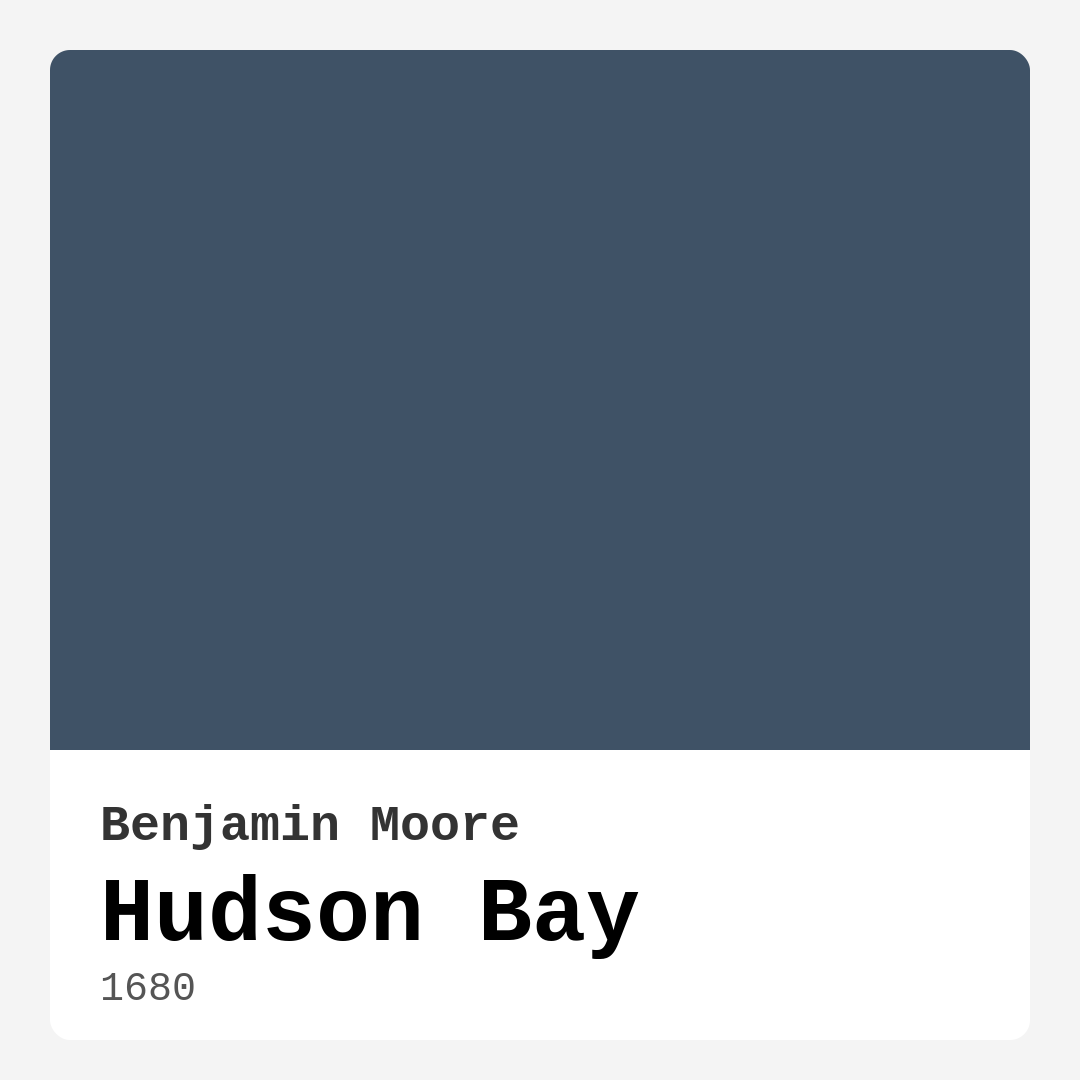
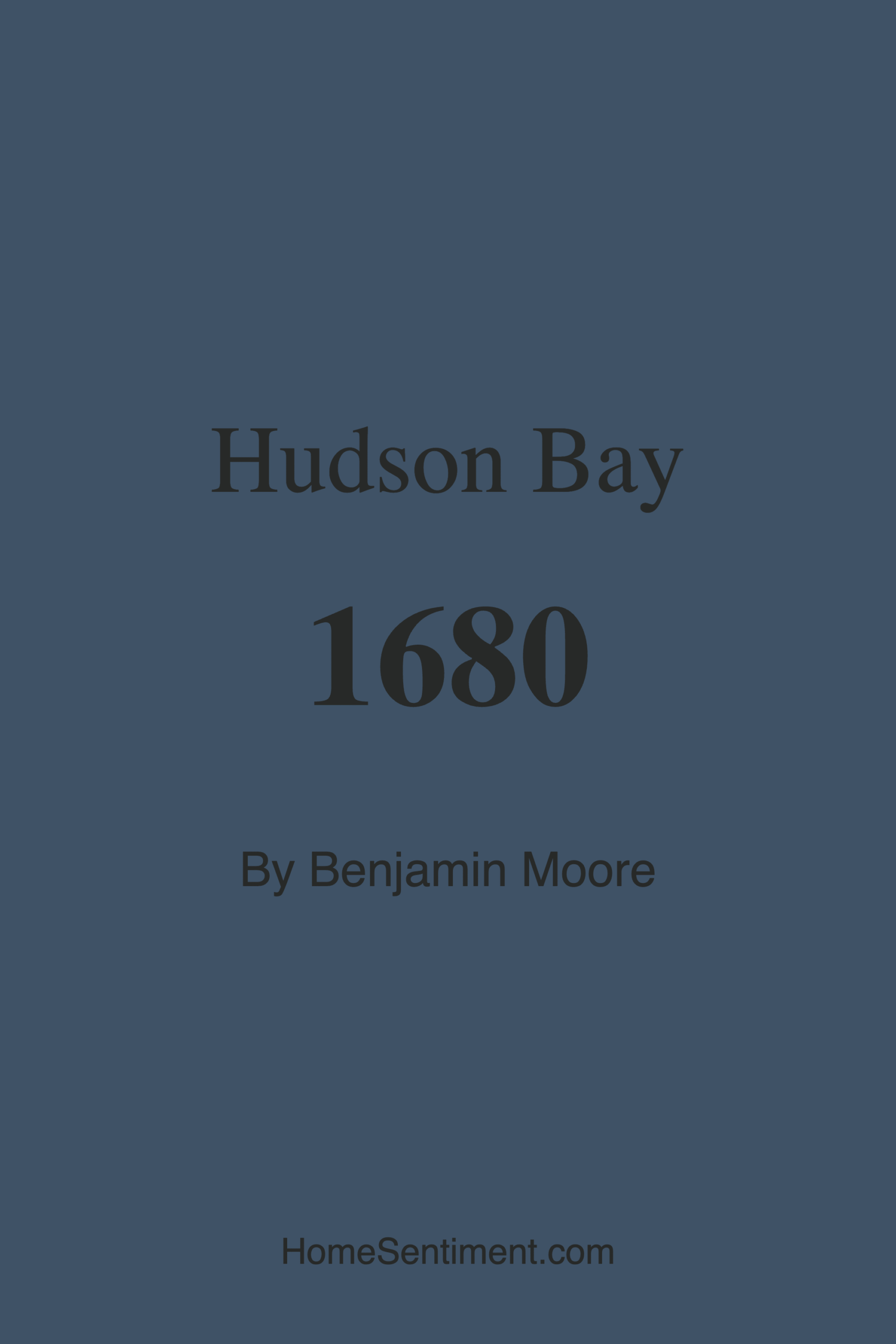
Color Preview & Key Details
| HEX Code | #3F5266 |
| RGB | 63, 82, 102 |
| LRV | 9.77% |
| Undertone | Blue |
| Finish Options | Matte, Satin, Semi-Gloss |
If you’re searching for a paint color that effortlessly blends sophistication with tranquility, Benjamin Moore’s Hudson Bay might just be your perfect match. This deep blue-gray, with its serene and balanced undertones, has become a go-to choice for designers and homeowners alike. It’s the kind of color that doesn’t just sit on your walls—it transforms them, creating a backdrop that’s both calming and strikingly elegant.
Hudson Bay (color code 1680) is a dark, cool-toned blue with an LRV of 9.77%, meaning it absorbs light rather than reflecting it. This gives it a rich, enveloping quality that works wonders in spaces where you want to cultivate a sense of intimacy and relaxation. Think cozy bedrooms, inviting living rooms, or even a home office where focus and calm are key. The muted blue undertones keep it from feeling too stark, while the depth of the shade adds just enough drama to make a statement without overwhelming the room.
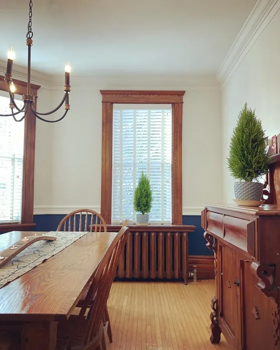
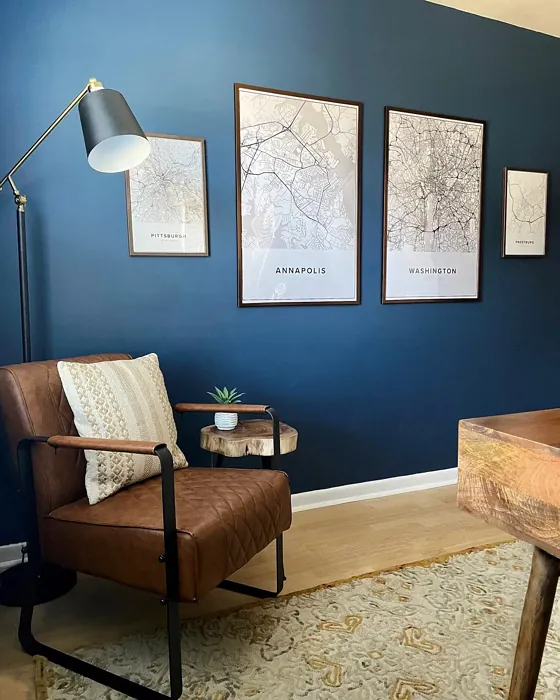
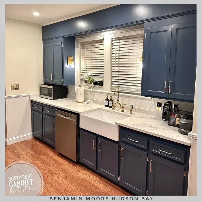
One of the best things about Hudson Bay is its versatility. Whether your style leans modern, coastal, Scandinavian, or rustic, this color adapts beautifully. Pair it with crisp white trim like Benjamin Moore’s White Dove for a classic, clean look, or let it play off warm wood tones and brass fixtures for a touch of organic warmth. If you’re feeling bold, try it on an accent wall in a dining room—it’ll make your space feel instantly more refined. And because it’s a darker shade, it has a way of making lighter furniture and decor pop, creating a balanced yet dynamic aesthetic.
Application is a breeze, even if you’re new to painting. The formula is beginner-friendly, gliding on smoothly whether you’re using a roller or a brush. You’ll likely need two coats for full, even coverage, but the effort is worth it—the finish is rich and velvety, especially in a matte or satin sheen. Plus, it’s highly washable, so it holds up well in high-traffic areas. And since it’s low-VOC, you won’t have to worry about harsh fumes lingering in your home.
Now, let’s talk lighting. In a room with plenty of natural light, Hudson Bay takes on a crisp, almost oceanic quality—cool and refreshing. But in lower light, it becomes moodier and more intimate, like twilight settling over water. This makes it ideal for north-facing rooms or spaces where you want to dial down the brightness for a cozier vibe. Just keep in mind that in very small rooms, it can feel a bit heavy if used on all four walls. If you love the color but have limited square footage, consider using it on a single accent wall or pairing it with lighter complementary shades to keep the space feeling open.
Speaking of pairings, Hudson Bay plays well with a wide range of colors. Soft whites and creams create a timeless contrast, while muted pastels (think blush pink or sage green) add a subtle, harmonious touch. For something bolder, try accents in warm terra-cotta or burnt orange—the complementary hue to blue—to create a striking yet balanced look. And if you’re drawn to monochromatic schemes, layering it with lighter blues or deeper navy tones can add depth and dimension.
When it comes to finishes, you’ve got options. A matte finish will give you that velvety, almost chalky look that’s perfect for hiding imperfections, while satin adds a soft sheen that’s easy to clean—great for kitchens or kids’ rooms. Semi-gloss works beautifully on trim or furniture, adding just enough shine to catch the light without feeling too glossy.
So, is Hudson Bay right for your home? If you’re looking for a color that’s equal parts serene and stylish, the answer is probably yes. It’s a designer favorite for a reason—it’s adaptable, easy to work with, and brings an instant sense of calm to any space. Test it out with a sample pot first, though. Paint a large swatch and observe it at different times of day to see how the light plays with its undertones. You might just find that it’s the missing piece in your decor puzzle.
At the end of the day, the best paint color is one that makes you feel something. And Hudson Bay? It feels like a deep breath, a quiet moment, a space where you can truly unwind. Whether you’re refreshing a single room or reimagining your entire home, this shade has the power to transform not just your walls, but the way you experience your space. So go ahead—dive in. The water’s fine.
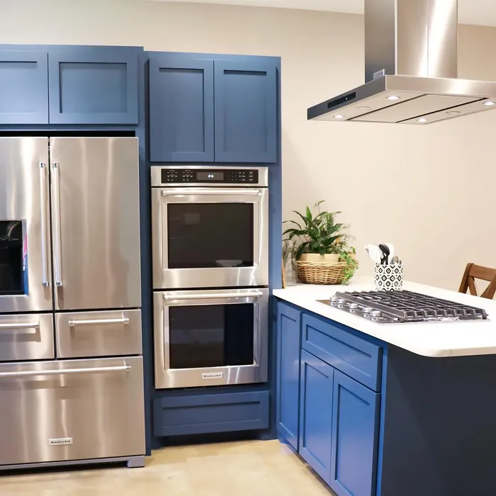
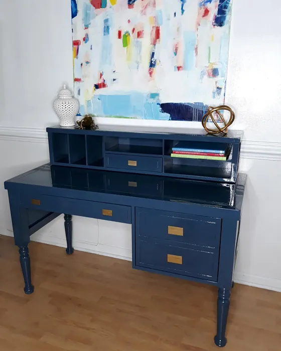
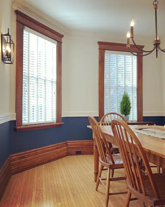
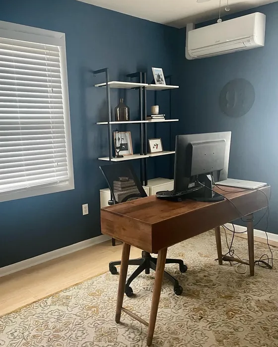
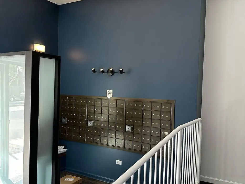
Real Room Photo of Hudson Bay 1680
Undertones of Hudson Bay ?
The undertones of Hudson Bay are a key aspect of its character, leaning towards Blue. These subtle underlying hues are what give the color its depth and complexity. For example, a gray with a blue undertone will feel cooler and more modern, while one with a brown undertone will feel warmer and more traditional. It’s essential to test this paint in your home and observe it next to your existing furniture, flooring, and decor to see how these undertones interact and reveal themselves throughout the day.
HEX value: #3F5266
RGB code: 63, 82, 102
Is Hudson Bay Cool or Warm?
Hudson Bay leans towards the cool side of the spectrum, offering a refreshing vibe that can evoke feelings of calmness and clarity. This makes it a fantastic choice for spaces where you want to unwind or focus.
Understanding Color Properties and Interior Design Tips
Hue refers to a specific position on the color wheel, measured in degrees from 0 to 360. Each degree represents a different pure color:
- 0° represents red
- 120° represents green
- 240° represents blue
Saturation describes the intensity or purity of a color and is expressed as a percentage:
- At 0%, the color appears completely desaturated—essentially a shade of gray
- At 100%, the color is at its most vivid and vibrant
Lightness indicates how light or dark a color is, also expressed as a percentage:
- 0% lightness results in black
- 100% lightness results in white
Using Warm Colors in Interior Design
Warm hues—such as reds, oranges, yellows, warm beiges, and greiges—are excellent choices for creating inviting and energetic spaces. These colors are particularly well-suited for:
- Kitchens, living rooms, and bathrooms, where warmth enhances comfort and sociability
- Large rooms, where warm tones can help reduce the sense of emptiness and make the space feel more intimate
For example:
- Warm beige shades provide a cozy, inviting atmosphere, ideal for living rooms, bedrooms, and hallways.
- Warm greige (a mix of beige and gray) offers the warmth of beige with the modern appeal of gray, making it a versatile backdrop for dining areas, bedrooms, and living spaces.
However, be mindful when using warm light tones in rooms with limited natural light. These shades may appear muted or even take on an unpleasant yellowish tint. To avoid a dull or flat appearance:
- Add depth by incorporating richer tones like deep greens, charcoal, or chocolate brown
- Use textured elements such as curtains, rugs, or cushions to bring dimension to the space
Pro Tip: Achieving Harmony with Warm and Cool Color Balance
To create a well-balanced and visually interesting interior, mix warm and cool tones strategically. This contrast adds depth and harmony to your design.
- If your walls feature warm hues, introduce cool-colored accents such as blue or green furniture, artwork, or accessories to create contrast.
- For a polished look, consider using a complementary color scheme, which pairs colors opposite each other on the color wheel (e.g., red with green, orange with blue).
This thoughtful mix not only enhances visual appeal but also creates a space that feels both dynamic and cohesive.
Light Temperature Affects on Hudson Bay
Natural Light
Natural daylight changes in color temperature as the sun moves across the sky. At sunrise and sunset, the light tends to have a warm, golden tone with a color temperature around 2000 Kelvin (K). As the day progresses and the sun rises higher, the light becomes cooler and more neutral. Around midday, especially when the sky is clear, natural light typically reaches its peak brightness and shifts to a cooler tone, ranging from 5500 to 6500 Kelvin. This midday light is close to what we perceive as pure white or daylight-balanced light.
These shifts in natural light can significantly influence how colors appear in a space, which is why designers often consider both the time of day and the orientation of windows when planning interior color schemes.
Artificial Light
When choosing artificial lighting, pay close attention to the color temperature, measured in Kelvin (K). This determines how warm or cool the light will appear. Lower temperatures, around 2700K, give off a warm, yellow glow often used in living rooms or bedrooms. Higher temperatures, above 5000K, create a cool, bluish light similar to daylight, commonly used in kitchens, offices, or task areas.
Use the slider to see how lighting temperature can affect the appearance of a surface or color throughout a space.


4800K
LRV of Hudson Bay
The Light Reflectance Value (LRV) of Hudson Bay is 9.77%, which places it in the Dark colors category. This means it does not reflect light. Understanding a paint’s LRV is crucial for predicting how it will look in your space. A higher LRV indicates a lighter color that reflects more light, making rooms feel larger and brighter. A lower LRV signifies a darker color that absorbs more light, creating a cozier, more intimate atmosphere. Always consider the natural and artificial lighting in your room when selecting a paint color based on its LRV.
Detailed Review of Hudson Bay
Additional Paint Characteristics
Ideal Rooms
Bedroom, Dining Room, Home Office, Living Room
Decor Styles
Coastal, Modern, Rustic, Scandinavian
Coverage
Good (1–2 Coats)
Ease of Application
Beginner Friendly, Brush Smooth, Roller-Ready
Washability
Highly Washable, Washable
VOC Level
Low VOC
Best Use
Accent Wall, Furniture, Interior Walls
Room Suitability
Bedroom, Dining Room, Home Office, Living Room
Tone Tag
Cool, Deep, Muted
Finish Type
Matte, Satin, Semi-Gloss
Paint Performance
Easy Touch-Up, High Coverage, Low Odor
Use Cases
Best for Low Light Rooms, Best for Modern Farmhouse, Designer Favorite
Mood
Calm, Inviting, Restful
Trim Pairing
Complements Brass Fixtures, Matches Pure White, Pairs with White Dove
Hudson Bay is more than just a color; it’s a mood-setter. With its deep, cool undertones, it brings a sense of peace and tranquility to any room. The versatility of this shade means it can be used in various settings, whether you’re looking to create a cozy reading nook or a stylish office space. When applied, the paint glides on smoothly, making it beginner-friendly while still delivering professional results. It’s ideal for accent walls but can easily cover larger areas without losing its charm. Overall, Hudson Bay stands out for its ability to harmonize with both light and dark furnishings, creating a sophisticated backdrop for your decor.
Pros & Cons of 1680 Hudson Bay
Pros
Cons
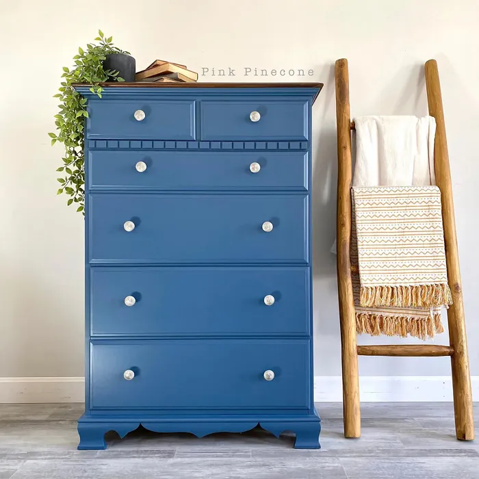
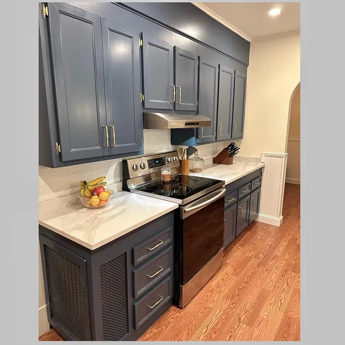
Colors that go with Benjamin Moore Hudson Bay
FAQ on 1680 Hudson Bay
Can Hudson Bay be used in small rooms?
Absolutely! While Hudson Bay is a deeper color, it can work beautifully in small rooms when paired with adequate lighting. To avoid overwhelming the space, consider using it as an accent wall or combining it with lighter hues to keep the room feeling open and airy.
What colors pair well with Hudson Bay?
Hudson Bay pairs beautifully with soft whites, warm wood tones, and muted pastels. Colors like White Dove or Simply White create a stunning contrast, while earthy tones enhance its natural vibe. Feel free to experiment with different palettes to find what resonates best with your style.
Comparisons Hudson Bay with other colors
Hudson Bay 1680 vs Naval SW 6244
| Attribute | Hudson Bay 1680 | Naval SW 6244 |
|---|---|---|
| Color Name | Hudson Bay 1680 | Naval SW 6244 |
| Color | ||
| Hue | Blue | Blue |
| Brightness | Dark | Dark |
| RGB | 63, 82, 102 | 47, 61, 76 |
| LRV | 9.77% | 4% |
| Finish Type | Matte, Satin, Semi-Gloss | Matte, Satin, Semi-Gloss |
| Finish Options | Matte, Satin, Semi-Gloss | Matte, Satin, Semi-Gloss |
| Ideal Rooms | Bedroom, Dining Room, Home Office, Living Room | Bedroom, Dining Room, Hallway, Home Office, Living Room |
| Decor Styles | Coastal, Modern, Rustic, Scandinavian | Coastal, Industrial, Minimalist, Modern, Traditional |
| Coverage | Good (1–2 Coats) | Good (1–2 Coats), Self-Priming |
| Ease of Application | Beginner Friendly, Brush Smooth, Roller-Ready | Beginner Friendly, Brush Smooth, Roller-Ready |
| Washability | Highly Washable, Washable | Highly Washable, Washable |
| Room Suitability | Bedroom, Dining Room, Home Office, Living Room | Bedroom, Dining Room, Entryway, Home Office, Living Room |
| Tone | Cool, Deep, Muted | Cool, Deep, Moody |
| Paint Performance | Easy Touch-Up, High Coverage, Low Odor | Easy Touch-Up, High Coverage, Low Odor, Scuff Resistant |
Hudson Bay 1680 vs Sea Serpent SW 7615
| Attribute | Hudson Bay 1680 | Sea Serpent SW 7615 |
|---|---|---|
| Color Name | Hudson Bay 1680 | Sea Serpent SW 7615 |
| Color | ||
| Hue | Blue | Blue |
| Brightness | Dark | Dark |
| RGB | 63, 82, 102 | 62, 75, 84 |
| LRV | 9.77% | 12% |
| Finish Type | Matte, Satin, Semi-Gloss | Eggshell, Matte, Satin |
| Finish Options | Matte, Satin, Semi-Gloss | Eggshell, Matte, Satin |
| Ideal Rooms | Bedroom, Dining Room, Home Office, Living Room | Bathroom, Bedroom, Home Office, Living Room |
| Decor Styles | Coastal, Modern, Rustic, Scandinavian | Coastal, Farmhouse, Industrial, Modern |
| Coverage | Good (1–2 Coats) | Good (1–2 Coats), Touch-Up Friendly |
| Ease of Application | Beginner Friendly, Brush Smooth, Roller-Ready | Beginner Friendly, Brush Smooth, Roller-Ready |
| Washability | Highly Washable, Washable | Highly Washable, Washable |
| Room Suitability | Bedroom, Dining Room, Home Office, Living Room | Bathroom, Bedroom, Home Office, Living Room |
| Tone | Cool, Deep, Muted | Cool, Deep, Moody |
| Paint Performance | Easy Touch-Up, High Coverage, Low Odor | Easy Touch-Up, High Coverage, Low Odor |
Hudson Bay 1680 vs Rain Cloud SW 9639
| Attribute | Hudson Bay 1680 | Rain Cloud SW 9639 |
|---|---|---|
| Color Name | Hudson Bay 1680 | Rain Cloud SW 9639 |
| Color | ||
| Hue | Blue | Blue |
| Brightness | Dark | Dark |
| RGB | 63, 82, 102 | 83, 97, 104 |
| LRV | 9.77% | 30% |
| Finish Type | Matte, Satin, Semi-Gloss | Eggshell, Matte, Satin |
| Finish Options | Matte, Satin, Semi-Gloss | Eggshell, Matte, Satin |
| Ideal Rooms | Bedroom, Dining Room, Home Office, Living Room | Bedroom, Dining Room, Home Office, Living Room |
| Decor Styles | Coastal, Modern, Rustic, Scandinavian | Coastal, Contemporary, Minimalist, Scandinavian |
| Coverage | Good (1–2 Coats) | Good (1–2 Coats), Touch-Up Friendly |
| Ease of Application | Beginner Friendly, Brush Smooth, Roller-Ready | Beginner Friendly, Brush Smooth, Roller-Ready |
| Washability | Highly Washable, Washable | Highly Washable, Washable |
| Room Suitability | Bedroom, Dining Room, Home Office, Living Room | Bedroom, Home Office, Living Room |
| Tone | Cool, Deep, Muted | Balanced, Cool, Muted |
| Paint Performance | Easy Touch-Up, High Coverage, Low Odor | Easy Touch-Up, Fade Resistant, Low Odor |
Hudson Bay 1680 vs Indigo Batik SW 7602
| Attribute | Hudson Bay 1680 | Indigo Batik SW 7602 |
|---|---|---|
| Color Name | Hudson Bay 1680 | Indigo Batik SW 7602 |
| Color | ||
| Hue | Blue | Blue |
| Brightness | Dark | Dark |
| RGB | 63, 82, 102 | 62, 80, 99 |
| LRV | 9.77% | 10% |
| Finish Type | Matte, Satin, Semi-Gloss | Matte, Satin |
| Finish Options | Matte, Satin, Semi-Gloss | Eggshell, Flat, Matte, Satin |
| Ideal Rooms | Bedroom, Dining Room, Home Office, Living Room | Bedroom, Dining Room, Home Office, Living Room |
| Decor Styles | Coastal, Modern, Rustic, Scandinavian | Bohemian, Coastal, Contemporary, Modern |
| Coverage | Good (1–2 Coats) | Good (1–2 Coats), Touch-Up Friendly |
| Ease of Application | Beginner Friendly, Brush Smooth, Roller-Ready | Brush Smooth, Fast-Drying, Roller-Ready |
| Washability | Highly Washable, Washable | Scrubbable, Washable, Wipeable |
| Room Suitability | Bedroom, Dining Room, Home Office, Living Room | Bedroom, Dining Room, Home Office, Living Room |
| Tone | Cool, Deep, Muted | Cool, Deep, Moody |
| Paint Performance | Easy Touch-Up, High Coverage, Low Odor | Easy Touch-Up, High Coverage, Low Odor, Quick Drying |
Hudson Bay 1680 vs Sea Mariner SW 9640
| Attribute | Hudson Bay 1680 | Sea Mariner SW 9640 |
|---|---|---|
| Color Name | Hudson Bay 1680 | Sea Mariner SW 9640 |
| Color | ||
| Hue | Blue | Blue |
| Brightness | Dark | Dark |
| RGB | 63, 82, 102 | 67, 74, 84 |
| LRV | 9.77% | 6% |
| Finish Type | Matte, Satin, Semi-Gloss | Eggshell, Matte, Satin |
| Finish Options | Matte, Satin, Semi-Gloss | Eggshell, Matte, Satin |
| Ideal Rooms | Bedroom, Dining Room, Home Office, Living Room | Bedroom, Dining Room, Hallway, Home Office, Living Room |
| Decor Styles | Coastal, Modern, Rustic, Scandinavian | Coastal, Industrial, Minimalist, Modern |
| Coverage | Good (1–2 Coats) | Good (1–2 Coats) |
| Ease of Application | Beginner Friendly, Brush Smooth, Roller-Ready | Beginner Friendly, Brush Smooth, Roller-Ready |
| Washability | Highly Washable, Washable | Scrubbable, Washable |
| Room Suitability | Bedroom, Dining Room, Home Office, Living Room | Bedroom, Dining Room, Home Office, Living Room |
| Tone | Cool, Deep, Muted | Cool, Deep, Moody |
| Paint Performance | Easy Touch-Up, High Coverage, Low Odor | Easy Touch-Up, Low Odor, Quick Drying |
Hudson Bay 1680 vs Still Water SW 6223
| Attribute | Hudson Bay 1680 | Still Water SW 6223 |
|---|---|---|
| Color Name | Hudson Bay 1680 | Still Water SW 6223 |
| Color | ||
| Hue | Blue | Blue |
| Brightness | Dark | Dark |
| RGB | 63, 82, 102 | 74, 93, 95 |
| LRV | 9.77% | 48% |
| Finish Type | Matte, Satin, Semi-Gloss | Eggshell, Matte, Satin |
| Finish Options | Matte, Satin, Semi-Gloss | Eggshell, Matte, Satin |
| Ideal Rooms | Bedroom, Dining Room, Home Office, Living Room | Bedroom, Dining Room, Home Office, Living Room, Nursery |
| Decor Styles | Coastal, Modern, Rustic, Scandinavian | Coastal, Contemporary, Farmhouse, Modern, Rustic |
| Coverage | Good (1–2 Coats) | Good (1–2 Coats), Touch-Up Friendly |
| Ease of Application | Beginner Friendly, Brush Smooth, Roller-Ready | Beginner Friendly, Brush Smooth, Roller-Ready |
| Washability | Highly Washable, Washable | Highly Washable, Washable |
| Room Suitability | Bedroom, Dining Room, Home Office, Living Room | Bedroom, Dining Room, Home Office, Living Room |
| Tone | Cool, Deep, Muted | Cool, Earthy, Muted |
| Paint Performance | Easy Touch-Up, High Coverage, Low Odor | Easy Touch-Up, Fade Resistant, Low Odor |
Hudson Bay 1680 vs Waterloo SW 9141
| Attribute | Hudson Bay 1680 | Waterloo SW 9141 |
|---|---|---|
| Color Name | Hudson Bay 1680 | Waterloo SW 9141 |
| Color | ||
| Hue | Blue | Blue |
| Brightness | Dark | Dark |
| RGB | 63, 82, 102 | 83, 104, 114 |
| LRV | 9.77% | 12% |
| Finish Type | Matte, Satin, Semi-Gloss | Matte, Satin |
| Finish Options | Matte, Satin, Semi-Gloss | Matte, Satin, Semi-Gloss |
| Ideal Rooms | Bedroom, Dining Room, Home Office, Living Room | Bedroom, Dining Room, Hallway, Home Office, Living Room |
| Decor Styles | Coastal, Modern, Rustic, Scandinavian | Coastal, Industrial, Modern, Rustic |
| Coverage | Good (1–2 Coats) | Good (1–2 Coats), Touch-Up Friendly |
| Ease of Application | Beginner Friendly, Brush Smooth, Roller-Ready | Brush Smooth, Fast-Drying, Roller-Ready |
| Washability | Highly Washable, Washable | Scrubbable, Washable |
| Room Suitability | Bedroom, Dining Room, Home Office, Living Room | Bedroom, Dining Room, Home Office, Living Room |
| Tone | Cool, Deep, Muted | Balanced, Cool, Muted |
| Paint Performance | Easy Touch-Up, High Coverage, Low Odor | Easy Touch-Up, Fade Resistant, Low Odor, Quick Drying |
Hudson Bay 1680 vs Smoky Blue SW 7604
| Attribute | Hudson Bay 1680 | Smoky Blue SW 7604 |
|---|---|---|
| Color Name | Hudson Bay 1680 | Smoky Blue SW 7604 |
| Color | ||
| Hue | Blue | Blue |
| Brightness | Dark | Dark |
| RGB | 63, 82, 102 | 89, 110, 121 |
| LRV | 9.77% | 15% |
| Finish Type | Matte, Satin, Semi-Gloss | Eggshell, Matte, Satin |
| Finish Options | Matte, Satin, Semi-Gloss | Eggshell, Matte, Satin |
| Ideal Rooms | Bedroom, Dining Room, Home Office, Living Room | Bathroom, Bedroom, Home Office, Kitchen, Living Room |
| Decor Styles | Coastal, Modern, Rustic, Scandinavian | Coastal, Modern, Scandinavian, Transitional |
| Coverage | Good (1–2 Coats) | Good (1–2 Coats), Touch-Up Friendly |
| Ease of Application | Beginner Friendly, Brush Smooth, Roller-Ready | Beginner Friendly, Brush Smooth, Roller-Ready |
| Washability | Highly Washable, Washable | Highly Washable, Washable |
| Room Suitability | Bedroom, Dining Room, Home Office, Living Room | Bathroom, Bedroom, Home Office, Living Room |
| Tone | Cool, Deep, Muted | Cool, Dusty, Muted |
| Paint Performance | Easy Touch-Up, High Coverage, Low Odor | High Coverage, Low Odor, Quick Drying |
Hudson Bay 1680 vs Needlepoint Navy SW 0032
| Attribute | Hudson Bay 1680 | Needlepoint Navy SW 0032 |
|---|---|---|
| Color Name | Hudson Bay 1680 | Needlepoint Navy SW 0032 |
| Color | ||
| Hue | Blue | Blue |
| Brightness | Dark | Dark |
| RGB | 63, 82, 102 | 84, 102, 112 |
| LRV | 9.77% | 4% |
| Finish Type | Matte, Satin, Semi-Gloss | Matte, Satin, Semi-Gloss |
| Finish Options | Matte, Satin, Semi-Gloss | Matte, Satin, Semi-Gloss |
| Ideal Rooms | Bedroom, Dining Room, Home Office, Living Room | Bedroom, Dining Room, Entryway, Home Office, Living Room |
| Decor Styles | Coastal, Modern, Rustic, Scandinavian | Coastal, Contemporary, Modern Farmhouse, Nautical, Traditional |
| Coverage | Good (1–2 Coats) | Good (1–2 Coats), Touch-Up Friendly |
| Ease of Application | Beginner Friendly, Brush Smooth, Roller-Ready | Beginner Friendly, Brush Smooth, Fast-Drying, Roller-Ready |
| Washability | Highly Washable, Washable | Scrubbable, Washable |
| Room Suitability | Bedroom, Dining Room, Home Office, Living Room | Bedroom, Dining Room, Home Office, Living Room |
| Tone | Cool, Deep, Muted | Cool, Deep, Muted |
| Paint Performance | Easy Touch-Up, High Coverage, Low Odor | Easy Touch-Up, High Coverage, Low Odor, Quick Drying, Stain Resistant |
Hudson Bay 1680 vs Riverway SW 6222
| Attribute | Hudson Bay 1680 | Riverway SW 6222 |
|---|---|---|
| Color Name | Hudson Bay 1680 | Riverway SW 6222 |
| Color | ||
| Hue | Blue | Blue |
| Brightness | Dark | Dark |
| RGB | 63, 82, 102 | 93, 114, 116 |
| LRV | 9.77% | 24% |
| Finish Type | Matte, Satin, Semi-Gloss | Eggshell, Satin |
| Finish Options | Matte, Satin, Semi-Gloss | Eggshell, Matte, Satin |
| Ideal Rooms | Bedroom, Dining Room, Home Office, Living Room | Bathroom, Bedroom, Dining Room, Home Office, Living Room |
| Decor Styles | Coastal, Modern, Rustic, Scandinavian | Coastal, Contemporary, Eclectic, Modern, Rustic |
| Coverage | Good (1–2 Coats) | Good (1–2 Coats), Touch-Up Friendly |
| Ease of Application | Beginner Friendly, Brush Smooth, Roller-Ready | Beginner Friendly, Brush Smooth, Fast-Drying, Low Splatter, Roller-Ready |
| Washability | Highly Washable, Washable | Highly Washable, Washable |
| Room Suitability | Bedroom, Dining Room, Home Office, Living Room | Bathroom, Bedroom, Home Office, Living Room |
| Tone | Cool, Deep, Muted | Balanced, Cool, Muted |
| Paint Performance | Easy Touch-Up, High Coverage, Low Odor | Easy Touch-Up, High Coverage, Low Odor, Quick Drying |
Official Page of Benjamin Moore Hudson Bay 1680