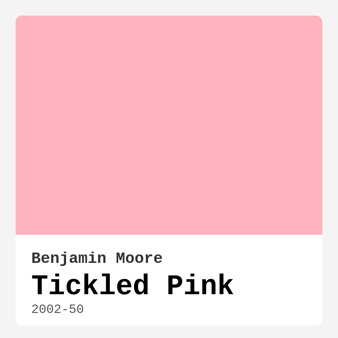
Color Preview & Key Details
| HEX Code | #FFB3BD |
| RGB | 255, 179, 189 |
| LRV | 55.54% |
| Undertone | Red |
| Finish Options | Eggshell, Flat, Satin |
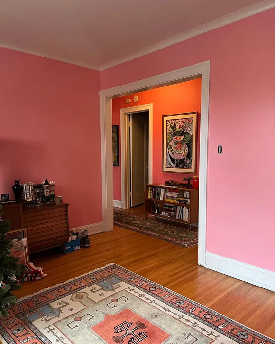
Picture this: you walk into a room, and immediately, you’re enveloped by a hue that feels like a warm hug. That’s the magic of Tickled Pink by Benjamin Moore. This delightful soft pink isn’t just a color; it’s an experience, a vibe that oozes warmth and charm. It invites you in, sparking feelings of joy and comfort, making it a fantastic choice for various spaces in your home.
So, what is it about Tickled Pink that makes it stand out? Firstly, let’s talk about its delightful undertones. With a soft red undertone, this pink radiates warmth, making it incredibly inviting. It’s perfect for spaces where you want to foster a sense of comfort—think nurseries, bedrooms, and even dining rooms. The color’s brightness, with a Light Reflectance Value (LRV) of 55.54%, means it reflects a good amount of light. This characteristic can make smaller rooms feel larger and airier, which is always a plus in home design.
Applying this paint is a dream. Whether you’re a seasoned DIYer or a beginner, you’ll find that Tickled Pink glides on smoothly, thanks to its beginner-friendly formula. You can choose from a flat, eggshell, or satin finish, depending on the look you’re going for. If you’re unsure, eggshell is a popular middle ground, offering a slight sheen without being too glossy. Just keep in mind that while the color has good coverage with one to two coats, it might require a bit more in areas with high traffic, as it can show scuffing.
Now, let’s chat about the ambiance this color creates. In bright, natural light, Tickled Pink bursts forth with a cheerful vibrancy, bringing a playful energy to the space. However, in dimmer light, it softens beautifully, creating a cozy, calming atmosphere. This dual nature makes it a versatile choice, suitable for both lively gatherings and peaceful retreats.
When you’re considering where to use Tickled Pink, think beyond just the nursery. It’s an excellent option for bedrooms, where it can foster a soothing environment for rest. In living rooms, it can create a warm gathering spot that encourages conversation and connection. In dining rooms, it offers a charming backdrop for family meals and gatherings with friends.
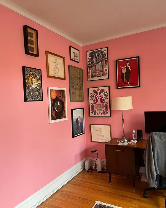
One of the best aspects of this color is its versatility across different decor styles. Whether your home leans towards modern, vintage, farmhouse, or eclectic, Tickled Pink can seamlessly fit in and enhance the overall aesthetic. For a modern look, pair it with sleek, minimalist furniture and metallic accents. If your style is more vintage or farmhouse, consider rustic wood elements and softer fabrics that complement the warmth of the pink.
You might be wondering about trim colors that work beautifully with Tickled Pink. The classic choice is always white—specifically shades like White Dove or Simply White. These whites create a refreshing contrast that enhances the softness of Tickled Pink, allowing it to shine without overshadowing it. If you’re feeling a bit bolder, incorporating warm wood trims or even brass fixtures can add a touch of elegance and uniqueness to your space.
While Tickled Pink is undeniably gorgeous, it’s essential to think about how it interacts with your specific lighting and decor. Test the paint in your home. Observe how it looks against your existing furniture, flooring, and decor at different times of the day. You’ll find that the color can shift slightly, revealing new depths and tones based on the light. This testing is crucial, as the warmth of Tickled Pink can be amplified in bright daylight but may feel softer and more subdued under artificial lighting.
Another important consideration when planning your painting project is the practicality of the finish. Tickled Pink is easy to clean, with a wipeable and washable surface. This is especially handy in spaces like children’s rooms, where creativity can sometimes lead to messes. You can enjoy the lovely hue without worrying too much about upkeep, just be aware that it may need more frequent touch-ups in high-traffic areas.
If you’re looking for complementary colors, you can explore a palette that includes deeper shades like 2039-60 or 2042-60, which can create a striking contrast, or softer pastels that harmonize beautifully with Tickled Pink. The key is to balance the warmth of this pink with colors that either ground it or elevate its charm.
As for who should consider using Tickled Pink, the answer is simple—everyone! Whether you’re a young couple looking to infuse warmth into your first home, a parent wanting a cheerful nursery, or even a retiree seeking to create a cozy reading nook, Tickled Pink is a fantastic option that brings happiness into your space.
Ultimately, paint is more than just a color on the wall; it’s about the feelings and memories it evokes. Tickled Pink is a perfect example of how a color can transform a space into a sanctuary filled with warmth, joy, and elegance. So, if you’re on the fence about this lovely hue, consider giving it a chance. It just might be the perfect touch to bring your vision to life.
In the world of home décor, colors have the power to make us feel a certain way, and Tickled Pink is a hue that undoubtedly brings a smile to your face. So go ahead, embrace the warmth and charm of Tickled Pink, and let it brighten up your home.
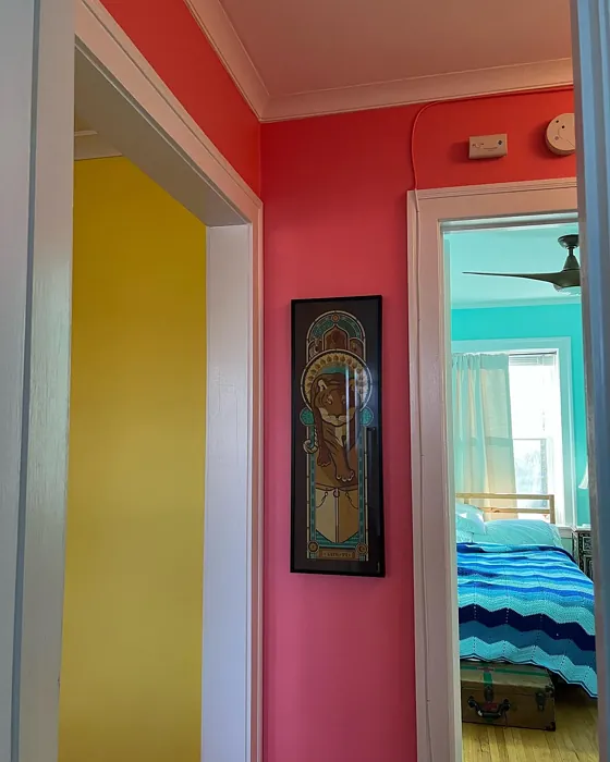
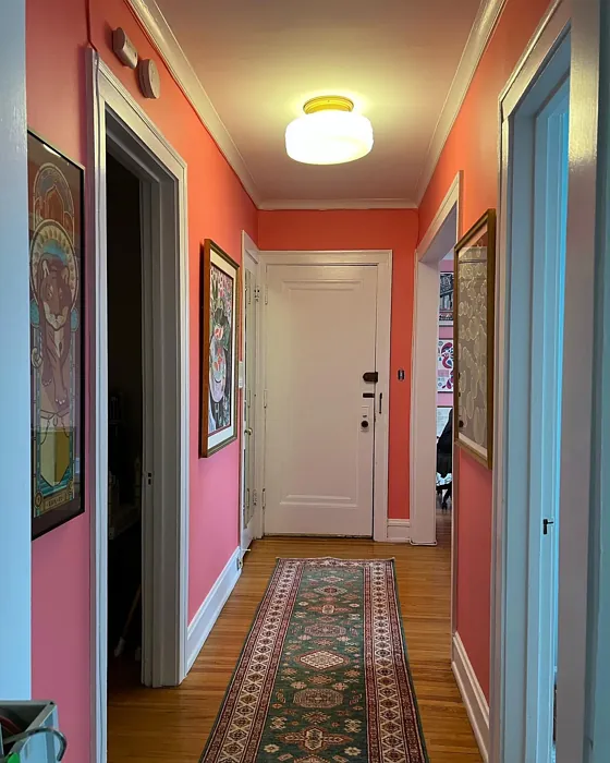
Real Room Photo of Tickled Pink 2002-50
Undertones of Tickled Pink ?
The undertones of Tickled Pink are a key aspect of its character, leaning towards Red. These subtle underlying hues are what give the color its depth and complexity. For example, a gray with a blue undertone will feel cooler and more modern, while one with a brown undertone will feel warmer and more traditional. It’s essential to test this paint in your home and observe it next to your existing furniture, flooring, and decor to see how these undertones interact and reveal themselves throughout the day.
HEX value: #FFB3BD
RGB code: 255, 179, 189
Is Tickled Pink Cool or Warm?
Tickled Pink is considered a warm paint color. This characteristic plays a huge role in the overall feel of a room. Warm colors, like this one, tend to create a cozy, inviting, and energetic atmosphere, making them great for social spaces like living rooms and dining rooms. In contrast, cool colors often evoke a sense of calm and serenity, which is why they are popular in bedrooms and bathrooms. The warmth of Tickled Pink means it will pair beautifully with corresponding decor elements.
Understanding Color Properties and Interior Design Tips
Hue refers to a specific position on the color wheel, measured in degrees from 0 to 360. Each degree represents a different pure color:
- 0° represents red
- 120° represents green
- 240° represents blue
Saturation describes the intensity or purity of a color and is expressed as a percentage:
- At 0%, the color appears completely desaturated—essentially a shade of gray
- At 100%, the color is at its most vivid and vibrant
Lightness indicates how light or dark a color is, also expressed as a percentage:
- 0% lightness results in black
- 100% lightness results in white
Using Warm Colors in Interior Design
Warm hues—such as reds, oranges, yellows, warm beiges, and greiges—are excellent choices for creating inviting and energetic spaces. These colors are particularly well-suited for:
- Kitchens, living rooms, and bathrooms, where warmth enhances comfort and sociability
- Large rooms, where warm tones can help reduce the sense of emptiness and make the space feel more intimate
For example:
- Warm beige shades provide a cozy, inviting atmosphere, ideal for living rooms, bedrooms, and hallways.
- Warm greige (a mix of beige and gray) offers the warmth of beige with the modern appeal of gray, making it a versatile backdrop for dining areas, bedrooms, and living spaces.
However, be mindful when using warm light tones in rooms with limited natural light. These shades may appear muted or even take on an unpleasant yellowish tint. To avoid a dull or flat appearance:
- Add depth by incorporating richer tones like deep greens, charcoal, or chocolate brown
- Use textured elements such as curtains, rugs, or cushions to bring dimension to the space
Pro Tip: Achieving Harmony with Warm and Cool Color Balance
To create a well-balanced and visually interesting interior, mix warm and cool tones strategically. This contrast adds depth and harmony to your design.
- If your walls feature warm hues, introduce cool-colored accents such as blue or green furniture, artwork, or accessories to create contrast.
- For a polished look, consider using a complementary color scheme, which pairs colors opposite each other on the color wheel (e.g., red with green, orange with blue).
This thoughtful mix not only enhances visual appeal but also creates a space that feels both dynamic and cohesive.
Light Temperature Affects on Tickled Pink
Natural Light
Natural daylight changes in color temperature as the sun moves across the sky. At sunrise and sunset, the light tends to have a warm, golden tone with a color temperature around 2000 Kelvin (K). As the day progresses and the sun rises higher, the light becomes cooler and more neutral. Around midday, especially when the sky is clear, natural light typically reaches its peak brightness and shifts to a cooler tone, ranging from 5500 to 6500 Kelvin. This midday light is close to what we perceive as pure white or daylight-balanced light.
These shifts in natural light can significantly influence how colors appear in a space, which is why designers often consider both the time of day and the orientation of windows when planning interior color schemes.
Artificial Light
When choosing artificial lighting, pay close attention to the color temperature, measured in Kelvin (K). This determines how warm or cool the light will appear. Lower temperatures, around 2700K, give off a warm, yellow glow often used in living rooms or bedrooms. Higher temperatures, above 5000K, create a cool, bluish light similar to daylight, commonly used in kitchens, offices, or task areas.
Use the slider to see how lighting temperature can affect the appearance of a surface or color throughout a space.


4800K
LRV of Tickled Pink
The Light Reflectance Value (LRV) of Tickled Pink is 55.54%, which places it in the Light colors category. This means it reflect most of the incident light. Understanding a paint’s LRV is crucial for predicting how it will look in your space. A higher LRV indicates a lighter color that reflects more light, making rooms feel larger and brighter. A lower LRV signifies a darker color that absorbs more light, creating a cozier, more intimate atmosphere. Always consider the natural and artificial lighting in your room when selecting a paint color based on its LRV.
Detailed Review of Tickled Pink
Additional Paint Characteristics
Ideal Rooms
Bedroom, Dining Room, Home Office, Living Room, Nursery
Decor Styles
Eclectic, Farmhouse, Modern, Vintage
Coverage
Good (1–2 Coats), Touch-Up Friendly
Ease of Application
Beginner Friendly, Brush Smooth, Roller-Ready
Washability
Washable, Wipeable
VOC Level
Eco-Certified, Low VOC
Best Use
Accent Wall, Bedroom, Interior Walls, Nursery
Room Suitability
Bedroom, Dining Room, Living Room, Nursery
Tone Tag
Creamy, Pastel, Warm
Finish Type
Eggshell, Satin
Paint Performance
Easy Touch-Up, Low Odor, Quick Drying
Use Cases
Best for Rentals, Best for Small Spaces, Designer Favorite
Mood
Cozy, Inviting, Warm
Trim Pairing
Complements Brass Fixtures, Pairs with White Dove
Tickled Pink is more than just a color; it’s an experience. This soft pink shade adds a playful yet sophisticated vibe to any room. Its versatility shines as it can effortlessly complement various decor styles, from modern to vintage. When applied, it has a smooth finish that enhances the room’s ambiance, making it feel airy and light. Ideal for nurseries or bedrooms, it encourages relaxation and warmth. However, it’s essential to consider the lighting in your space, as natural light can make it appear brighter, while artificial light may soften its charm. Overall, if you’re seeking a color that evokes happiness and comfort, Tickled Pink deserves a spot on your walls.
Pros & Cons of 2002-50 Tickled Pink
Pros
Cons
Colors that go with Benjamin Moore Tickled Pink
FAQ on 2002-50 Tickled Pink
Is Tickled Pink suitable for children’s rooms?
Absolutely! Tickled Pink is an excellent choice for children’s rooms due to its soft and cheerful nature. It creates a warm and inviting environment that can inspire creativity and comfort. Plus, its wipeable surface makes it practical for the occasional mess that comes with kids. Just keep in mind that while it’s lovely, it may need touch-ups over time in high-traffic areas.
What trim colors work best with Tickled Pink?
Tickled Pink pairs beautifully with white trims, particularly shades like White Dove or Simply White. These crisp whites create a refreshing contrast against the softness of the pink, enhancing its warmth without overpowering it. For a more eclectic look, consider pairing it with warm wood trim or brass fixtures, which can add an elegant touch to the overall aesthetic.
Comparisons Tickled Pink with other colors
Tickled Pink 2002-50 vs Realist Beige SW 6078
| Attribute | Tickled Pink 2002-50 | Realist Beige SW 6078 |
|---|---|---|
| Color Name | Tickled Pink 2002-50 | Realist Beige SW 6078 |
| Color | ||
| Hue | Pink | Pink |
| Brightness | Medium | Medium |
| RGB | 255, 179, 189 | 211, 200, 189 |
| LRV | 55.54% | 34% |
| Finish Type | Eggshell, Satin | Eggshell, Matte, Satin |
| Finish Options | Eggshell, Flat, Satin | Eggshell, Matte, Satin |
| Ideal Rooms | Bedroom, Dining Room, Home Office, Living Room, Nursery | Bedroom, Dining Room, Entryway, Home Office, Kitchen, Living Room |
| Decor Styles | Eclectic, Farmhouse, Modern, Vintage | Contemporary, Minimalist, Modern Farmhouse, Rustic, Traditional |
| Coverage | Good (1–2 Coats), Touch-Up Friendly | Good (1–2 Coats), Touch-Up Friendly |
| Ease of Application | Beginner Friendly, Brush Smooth, Roller-Ready | Beginner Friendly, Brush Smooth, Fast-Drying, Roller-Ready |
| Washability | Washable, Wipeable | Washable, Wipeable |
| Room Suitability | Bedroom, Dining Room, Living Room, Nursery | Bedroom, Dining Room, Home Office, Kitchen, Living Room |
| Tone | Creamy, Pastel, Warm | Earthy, Neutral, Warm |
| Paint Performance | Easy Touch-Up, Low Odor, Quick Drying | High Coverage, Low Odor, Quick Drying |
Tickled Pink 2002-50 vs Rosaline Pearl SW 9077
| Attribute | Tickled Pink 2002-50 | Rosaline Pearl SW 9077 |
|---|---|---|
| Color Name | Tickled Pink 2002-50 | Rosaline Pearl SW 9077 |
| Color | ||
| Hue | Pink | Pink |
| Brightness | Medium | Medium |
| RGB | 255, 179, 189 | 163, 136, 135 |
| LRV | 55.54% | 69% |
| Finish Type | Eggshell, Satin | Eggshell, Matte |
| Finish Options | Eggshell, Flat, Satin | Eggshell, Matte, Satin |
| Ideal Rooms | Bedroom, Dining Room, Home Office, Living Room, Nursery | Bedroom, Dining Room, Home Office, Living Room |
| Decor Styles | Eclectic, Farmhouse, Modern, Vintage | Bohemian, Contemporary, Modern, Transitional |
| Coverage | Good (1–2 Coats), Touch-Up Friendly | Good (1–2 Coats) |
| Ease of Application | Beginner Friendly, Brush Smooth, Roller-Ready | Beginner Friendly, Brush Smooth, Fast-Drying, Roller-Ready |
| Washability | Washable, Wipeable | Washable, Wipeable |
| Room Suitability | Bedroom, Dining Room, Living Room, Nursery | Bedroom, Dining Room, Home Office, Living Room |
| Tone | Creamy, Pastel, Warm | Dusty, Muted, Warm |
| Paint Performance | Easy Touch-Up, Low Odor, Quick Drying | Easy Touch-Up, Fade Resistant, Low Odor |
Tickled Pink 2002-50 vs Cabbage Rose SW 0003
| Attribute | Tickled Pink 2002-50 | Cabbage Rose SW 0003 |
|---|---|---|
| Color Name | Tickled Pink 2002-50 | Cabbage Rose SW 0003 |
| Color | ||
| Hue | Pink | Pink |
| Brightness | Medium | Medium |
| RGB | 255, 179, 189 | 197, 159, 145 |
| LRV | 55.54% | 15% |
| Finish Type | Eggshell, Satin | Eggshell, Matte, Satin |
| Finish Options | Eggshell, Flat, Satin | Eggshell, Matte, Satin |
| Ideal Rooms | Bedroom, Dining Room, Home Office, Living Room, Nursery | Bedroom, Dining Room, Hallway, Living Room, Nursery |
| Decor Styles | Eclectic, Farmhouse, Modern, Vintage | Cottage, Modern Farmhouse, Romantic, Shabby Chic, Vintage |
| Coverage | Good (1–2 Coats), Touch-Up Friendly | Good (1–2 Coats), Touch-Up Friendly |
| Ease of Application | Beginner Friendly, Brush Smooth, Roller-Ready | Beginner Friendly, Brush Smooth, Roller-Ready |
| Washability | Washable, Wipeable | Washable, Wipeable |
| Room Suitability | Bedroom, Dining Room, Living Room, Nursery | Bedroom, Dining Room, Hallway, Living Room, Nursery |
| Tone | Creamy, Pastel, Warm | Earthy, Muted, Warm |
| Paint Performance | Easy Touch-Up, Low Odor, Quick Drying | Easy Touch-Up, Low Odor |
Tickled Pink 2002-50 vs Sashay Sand SW 6051
| Attribute | Tickled Pink 2002-50 | Sashay Sand SW 6051 |
|---|---|---|
| Color Name | Tickled Pink 2002-50 | Sashay Sand SW 6051 |
| Color | ||
| Hue | Pink | Pink |
| Brightness | Medium | Medium |
| RGB | 255, 179, 189 | 207, 180, 168 |
| LRV | 55.54% | 64% |
| Finish Type | Eggshell, Satin | Eggshell, Matte, Satin |
| Finish Options | Eggshell, Flat, Satin | Eggshell, Matte, Satin |
| Ideal Rooms | Bedroom, Dining Room, Home Office, Living Room, Nursery | Bedroom, Dining Room, Home Office, Kitchen, Living Room |
| Decor Styles | Eclectic, Farmhouse, Modern, Vintage | Bohemian, Contemporary, Modern Farmhouse, Scandinavian, Transitional |
| Coverage | Good (1–2 Coats), Touch-Up Friendly | Good (1–2 Coats), Touch-Up Friendly |
| Ease of Application | Beginner Friendly, Brush Smooth, Roller-Ready | Beginner Friendly, Fast-Drying, Roller-Ready |
| Washability | Washable, Wipeable | Highly Washable, Washable |
| Room Suitability | Bedroom, Dining Room, Living Room, Nursery | Bedroom, Dining Room, Home Office, Kitchen, Living Room |
| Tone | Creamy, Pastel, Warm | Earthy, Muted, Warm |
| Paint Performance | Easy Touch-Up, Low Odor, Quick Drying | Easy Touch-Up, Low Odor, Quick Drying, Scuff Resistant |
Tickled Pink 2002-50 vs Touch of Sand SW 9085
| Attribute | Tickled Pink 2002-50 | Touch of Sand SW 9085 |
|---|---|---|
| Color Name | Tickled Pink 2002-50 | Touch of Sand SW 9085 |
| Color | ||
| Hue | Pink | Pink |
| Brightness | Medium | Medium |
| RGB | 255, 179, 189 | 213, 199, 186 |
| LRV | 55.54% | 66% |
| Finish Type | Eggshell, Satin | Eggshell, Matte, Satin |
| Finish Options | Eggshell, Flat, Satin | Eggshell, Matte, Satin |
| Ideal Rooms | Bedroom, Dining Room, Home Office, Living Room, Nursery | Bathroom, Bedroom, Dining Room, Home Office, Kitchen, Living Room |
| Decor Styles | Eclectic, Farmhouse, Modern, Vintage | Bohemian, Coastal, Contemporary, Modern Farmhouse, Rustic |
| Coverage | Good (1–2 Coats), Touch-Up Friendly | Good (1–2 Coats), Touch-Up Friendly |
| Ease of Application | Beginner Friendly, Brush Smooth, Roller-Ready | Beginner Friendly, Brush Smooth, Fast-Drying, Roller-Ready |
| Washability | Washable, Wipeable | Washable, Wipeable |
| Room Suitability | Bedroom, Dining Room, Living Room, Nursery | Bathroom, Bedroom, Dining Room, Home Office, Kitchen, Living Room |
| Tone | Creamy, Pastel, Warm | Earthy, Muted, Neutral, Warm |
| Paint Performance | Easy Touch-Up, Low Odor, Quick Drying | Easy Touch-Up, Low Odor, Quick Drying, Scuff Resistant |
Tickled Pink 2002-50 vs Pink Shadow SW 0070
| Attribute | Tickled Pink 2002-50 | Pink Shadow SW 0070 |
|---|---|---|
| Color Name | Tickled Pink 2002-50 | Pink Shadow SW 0070 |
| Color | ||
| Hue | Pink | Pink |
| Brightness | Medium | Medium |
| RGB | 255, 179, 189 | 222, 195, 185 |
| LRV | 55.54% | 45% |
| Finish Type | Eggshell, Satin | Eggshell, Matte, Satin |
| Finish Options | Eggshell, Flat, Satin | Eggshell, Matte, Satin |
| Ideal Rooms | Bedroom, Dining Room, Home Office, Living Room, Nursery | Bedroom, Dining Room, Home Office, Living Room, Nursery |
| Decor Styles | Eclectic, Farmhouse, Modern, Vintage | Bohemian, Minimalist, Modern Farmhouse, Scandinavian, Traditional |
| Coverage | Good (1–2 Coats), Touch-Up Friendly | Good (1–2 Coats) |
| Ease of Application | Beginner Friendly, Brush Smooth, Roller-Ready | Beginner Friendly, Brush Smooth, Fast-Drying, Roller-Ready |
| Washability | Washable, Wipeable | Washable, Wipeable |
| Room Suitability | Bedroom, Dining Room, Living Room, Nursery | Bedroom, Dining Room, Living Room, Nursery |
| Tone | Creamy, Pastel, Warm | Muted, Pastel, Warm |
| Paint Performance | Easy Touch-Up, Low Odor, Quick Drying | Easy Touch-Up, High Coverage, Low Odor |
Tickled Pink 2002-50 vs Hushed Auburn SW 9080
| Attribute | Tickled Pink 2002-50 | Hushed Auburn SW 9080 |
|---|---|---|
| Color Name | Tickled Pink 2002-50 | Hushed Auburn SW 9080 |
| Color | ||
| Hue | Pink | Pink |
| Brightness | Medium | Medium |
| RGB | 255, 179, 189 | 168, 133, 122 |
| LRV | 55.54% | 12% |
| Finish Type | Eggshell, Satin | Eggshell, Matte, Satin |
| Finish Options | Eggshell, Flat, Satin | Eggshell, Matte, Satin |
| Ideal Rooms | Bedroom, Dining Room, Home Office, Living Room, Nursery | Bedroom, Dining Room, Home Office, Living Room |
| Decor Styles | Eclectic, Farmhouse, Modern, Vintage | Contemporary, Modern Farmhouse, Rustic, Transitional |
| Coverage | Good (1–2 Coats), Touch-Up Friendly | Good (1–2 Coats), Touch-Up Friendly |
| Ease of Application | Beginner Friendly, Brush Smooth, Roller-Ready | Beginner Friendly, Brush Smooth, Fast-Drying, Roller-Ready |
| Washability | Washable, Wipeable | Washable, Wipeable |
| Room Suitability | Bedroom, Dining Room, Living Room, Nursery | Bedroom, Dining Room, Home Office, Living Room |
| Tone | Creamy, Pastel, Warm | Earthy, Muted, Warm |
| Paint Performance | Easy Touch-Up, Low Odor, Quick Drying | Easy Touch-Up, High Coverage, Low Odor |
Tickled Pink 2002-50 vs Likeable Sand SW 6058
| Attribute | Tickled Pink 2002-50 | Likeable Sand SW 6058 |
|---|---|---|
| Color Name | Tickled Pink 2002-50 | Likeable Sand SW 6058 |
| Color | ||
| Hue | Pink | Pink |
| Brightness | Medium | Medium |
| RGB | 255, 179, 189 | 209, 183, 168 |
| LRV | 55.54% | 61% |
| Finish Type | Eggshell, Satin | Eggshell, Matte, Satin |
| Finish Options | Eggshell, Flat, Satin | Eggshell, Matte, Satin |
| Ideal Rooms | Bedroom, Dining Room, Home Office, Living Room, Nursery | Bedroom, Dining Room, Home Office, Kitchen, Living Room |
| Decor Styles | Eclectic, Farmhouse, Modern, Vintage | Bohemian, Coastal, Contemporary, Modern Farmhouse, Rustic |
| Coverage | Good (1–2 Coats), Touch-Up Friendly | Good (1–2 Coats), Touch-Up Friendly |
| Ease of Application | Beginner Friendly, Brush Smooth, Roller-Ready | Beginner Friendly, Brush Smooth, Fast-Drying, Roller-Ready |
| Washability | Washable, Wipeable | Washable, Wipeable |
| Room Suitability | Bedroom, Dining Room, Living Room, Nursery | Bedroom, Dining Room, Home Office, Kitchen, Living Room |
| Tone | Creamy, Pastel, Warm | Earthy, Muted, Warm |
| Paint Performance | Easy Touch-Up, Low Odor, Quick Drying | Easy Touch-Up, Low Odor, Quick Drying |
Tickled Pink 2002-50 vs Glamour SW 6031
| Attribute | Tickled Pink 2002-50 | Glamour SW 6031 |
|---|---|---|
| Color Name | Tickled Pink 2002-50 | Glamour SW 6031 |
| Color | ||
| Hue | Pink | Pink |
| Brightness | Medium | Medium |
| RGB | 255, 179, 189 | 182, 160, 154 |
| LRV | 55.54% | 30% |
| Finish Type | Eggshell, Satin | Eggshell, Matte, Satin |
| Finish Options | Eggshell, Flat, Satin | Eggshell, Matte, Satin |
| Ideal Rooms | Bedroom, Dining Room, Home Office, Living Room, Nursery | Bedroom, Dining Room, Home Office, Living Room |
| Decor Styles | Eclectic, Farmhouse, Modern, Vintage | Bohemian, Classic, Modern, Transitional |
| Coverage | Good (1–2 Coats), Touch-Up Friendly | Good (1–2 Coats) |
| Ease of Application | Beginner Friendly, Brush Smooth, Roller-Ready | Beginner Friendly, Brush Smooth, Fast-Drying, Roller-Ready |
| Washability | Washable, Wipeable | Scrubbable, Washable |
| Room Suitability | Bedroom, Dining Room, Living Room, Nursery | Bedroom, Dining Room, Home Office, Living Room |
| Tone | Creamy, Pastel, Warm | Balanced, Neutral, Warm |
| Paint Performance | Easy Touch-Up, Low Odor, Quick Drying | Easy Touch-Up, Low Odor, Quick Drying |
Tickled Pink 2002-50 vs Temperate Taupe SW 6037
| Attribute | Tickled Pink 2002-50 | Temperate Taupe SW 6037 |
|---|---|---|
| Color Name | Tickled Pink 2002-50 | Temperate Taupe SW 6037 |
| Color | ||
| Hue | Pink | Pink |
| Brightness | Medium | Medium |
| RGB | 255, 179, 189 | 191, 177, 170 |
| LRV | 55.54% | 34% |
| Finish Type | Eggshell, Satin | Eggshell, Matte, Satin |
| Finish Options | Eggshell, Flat, Satin | Eggshell, Matte, Satin |
| Ideal Rooms | Bedroom, Dining Room, Home Office, Living Room, Nursery | Bedroom, Dining Room, Home Office, Kitchen, Living Room |
| Decor Styles | Eclectic, Farmhouse, Modern, Vintage | Bohemian, Modern Farmhouse, Rustic, Transitional |
| Coverage | Good (1–2 Coats), Touch-Up Friendly | Good (1–2 Coats), Touch-Up Friendly |
| Ease of Application | Beginner Friendly, Brush Smooth, Roller-Ready | Beginner Friendly, Brush Smooth, Fast-Drying, Roller-Ready |
| Washability | Washable, Wipeable | Highly Washable, Washable |
| Room Suitability | Bedroom, Dining Room, Living Room, Nursery | Bedroom, Dining Room, Home Office, Living Room |
| Tone | Creamy, Pastel, Warm | Earthy, Neutral, Warm |
| Paint Performance | Easy Touch-Up, Low Odor, Quick Drying | Long Lasting, Low Odor, Quick Drying, Scuff Resistant |
Official Page of Benjamin Moore Tickled Pink 2002-50