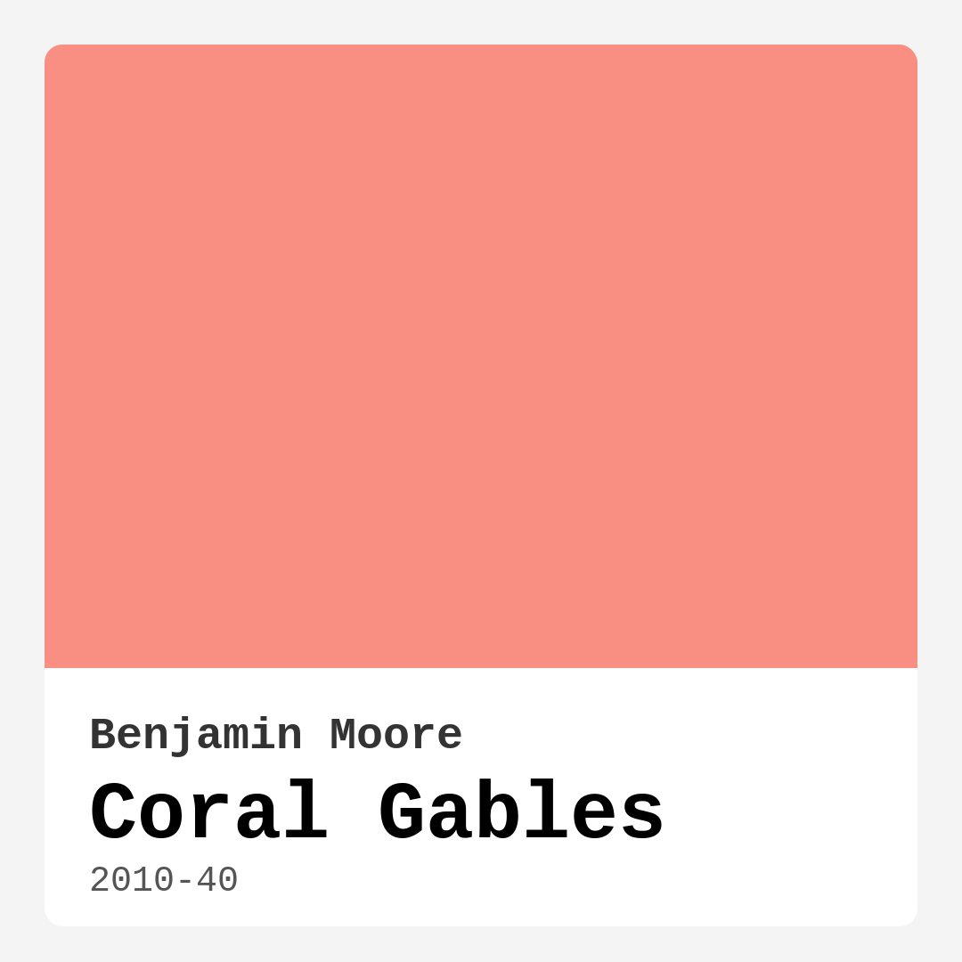
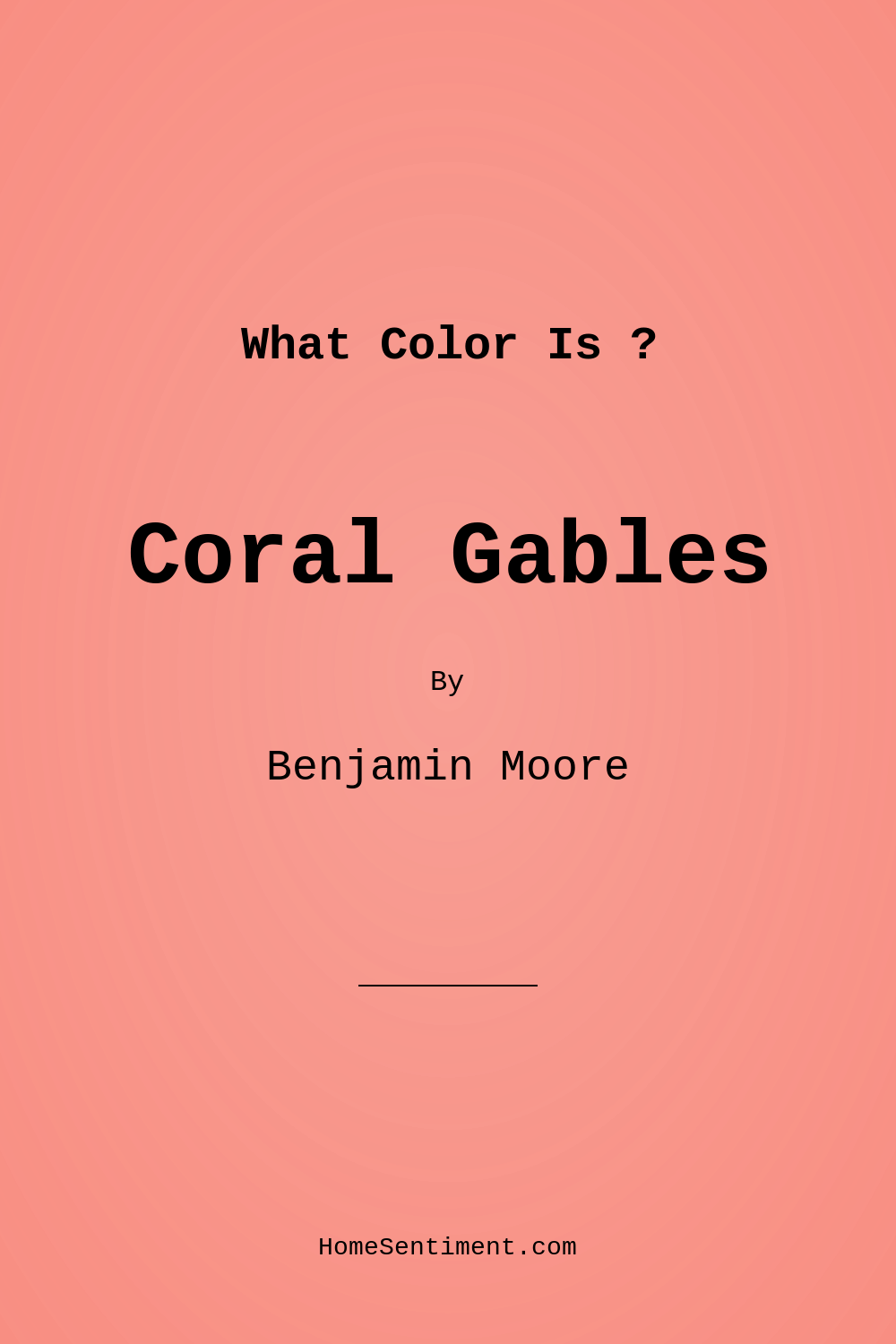
Color Preview & Key Details
| HEX Code | #F98F83 |
| RGB | 249, 143, 131 |
| LRV | 40.46% |
| Undertone | Red |
| Finish Options | Eggshell, Matte, Satin |
Imagine stepping into a room that feels like a warm embrace, where the walls invite you to relax and enjoy the moment. This is the magic of Coral Gables, a vibrant peachy coral paint color from Benjamin Moore that brings an undeniable sense of joy to any space. If you’re considering a fresh coat for your home, let’s dive into why this color might just be the perfect choice for your project.
Coral Gables, with the color code 2010-40, radiates warmth and energy, making it a standout option for various rooms in your home. Its cheerful hue is particularly inviting, and it perfectly balances playful and sophisticated elements. Whether you’re going for a coastal vibe, a modern farmhouse feel, or even a bohemian twist, Coral Gables adapts beautifully to your style.
One of the key features of Coral Gables is its warmth. It leans into the red undertones, creating an earthy yet lively atmosphere. This color can create a cozy ambiance in your living room or a cheerful environment in the kitchen. Imagine hosting brunch with friends, the sun streaming in and reflecting off those vibrant walls, filling the space with light and energy.
When it comes to application, Coral Gables stands out for its ease. It’s beginner-friendly, making it a great choice whether you’re a seasoned DIYer or a first-time painter. With a good coverage rate, typically needing just one to two coats, you’ll find yourself enjoying the transformation rather than feeling overwhelmed. The finishes available—Matte, Eggshell, and Satin—allow you to choose the perfect look for your space. A Matte finish offers a soft, sophisticated look, while Satin can add a subtle sheen that enhances the color’s vibrancy.
Speaking of vibrancy, Coral Gables shines in different lighting conditions. In bright light, it reveals its full character, making spaces feel larger and more open. When the lights dim, it takes on a softer, cozier feel, ensuring your home always has a welcoming vibe. Its Light Reflectance Value (LRV) of 40.46% means it reflects about half of the incident light, making it an excellent choice for both bright and dark areas.
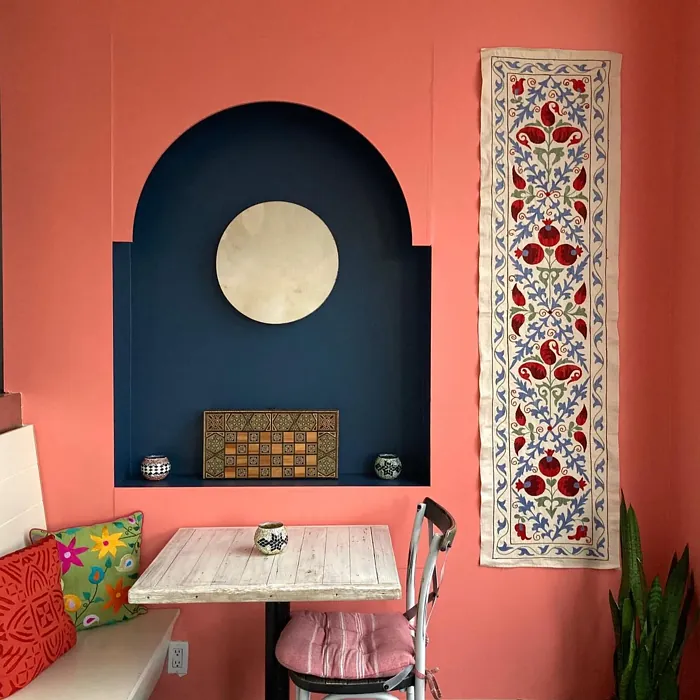
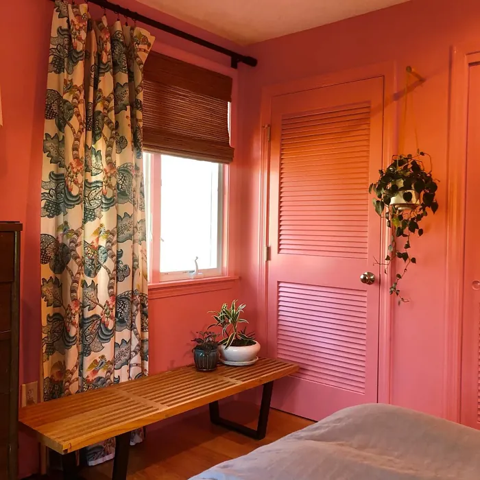
Now, let’s talk about where Coral Gables can really shine. It’s ideal for living rooms, bedrooms, kitchens, dining areas, and even home offices. Picture a home office painted in this lively hue, sparking creativity and keeping you energized throughout the workday. Or imagine a dining room where you gather with family, the walls expressing warmth and joy, making every meal feel special.
However, it’s essential to consider how Coral Gables will work with your existing décor. This vibrant color pairs wonderfully with white or light wood trim, creating a fresh and inviting look. It also complements brass fixtures beautifully, adding a touch of elegance while maintaining that warm, welcoming feel. You might even find Coral Gables to be the perfect accent color for more muted palettes, allowing it to stand out without overwhelming the space.
But let’s not ignore the practical side. Coral Gables is designed for everyday living. It’s wipeable and washable, so you can keep those walls looking fresh without worrying about scuffs and marks from daily life. The low VOC formula means you can paint your space with peace of mind, knowing you’re choosing a healthier option for your home environment.
Of course, any bold color comes with its considerations. Some may find that Coral Gables feels overwhelming in very small spaces, so if you’re looking to paint a cozy nook, think about using it as an accent wall instead. This way, you can maintain the energetic vibe while keeping the rest of the room more subdued.
If you’re still on the fence about Coral Gables, it’s a great idea to test it out. Grab some sample pots and paint a small section of your wall. Observe how the color shifts throughout the day, noting how it interacts with your existing furniture and decor. Remember that the undertones are crucial; the red undertone can change how the color feels in relation to your other colors.
For those who might be interested in complementary options, Coral Gables pairs beautifully with softer shades like Benjamin Moore’s White Dove or muted greens. These colors can help create a balanced palette that enhances Coral Gables’ vibrancy without competing for attention.
If you’re looking for a color that inspires warmth and energy while still feeling sophisticated, Coral Gables could be the perfect match for your home. Its ability to brighten up spaces, combined with its versatility across different decor styles, makes it a designer favorite.
As you consider your next home project, think about how Coral Gables can bring your vision to life. Whether you’re planning a complete overhaul or simply looking to freshen up an existing space, this color radiates joy and invites creativity.
So grab that paintbrush, embrace the warmth of Coral Gables, and watch as your home transforms into a lively and inviting sanctuary. It’s not just a color; it’s an experience waiting to happen.
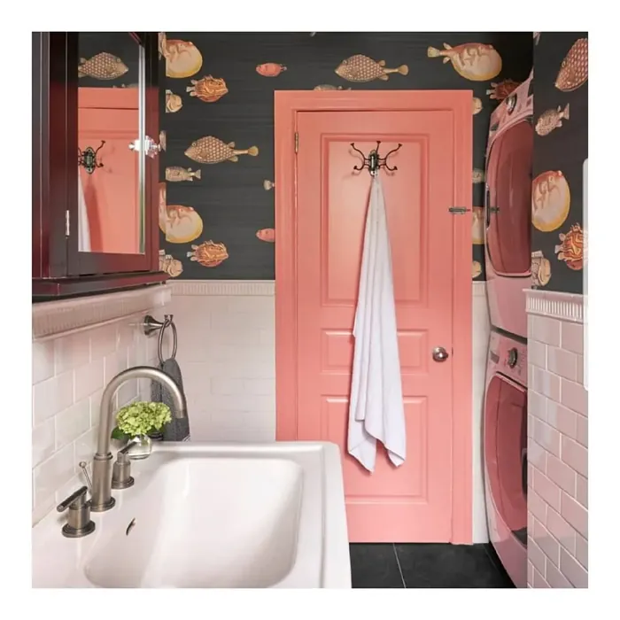
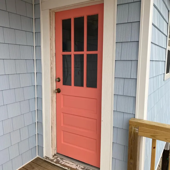
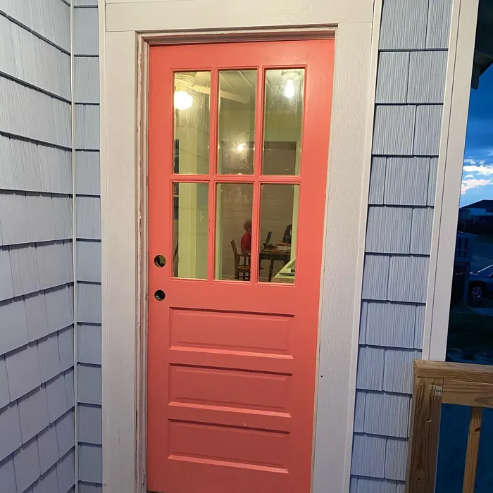
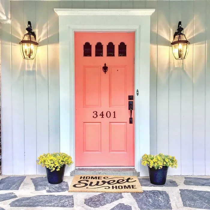
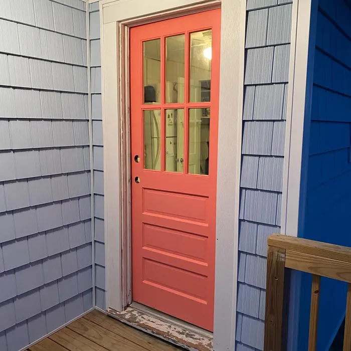
Real Room Photo of Coral Gables 2010-40
Undertones of Coral Gables ?
The undertones of Coral Gables are a key aspect of its character, leaning towards Red. These subtle underlying hues are what give the color its depth and complexity. For example, a gray with a blue undertone will feel cooler and more modern, while one with a brown undertone will feel warmer and more traditional. It’s essential to test this paint in your home and observe it next to your existing furniture, flooring, and decor to see how these undertones interact and reveal themselves throughout the day.
HEX value: #F98F83
RGB code: 249, 143, 131
Is Coral Gables Cool or Warm?
This color falls firmly into the warm category, radiating a sunny disposition that can brighten up a room. The warmth in Coral Gables makes it ideal for creating a welcoming environment, whether used in a cozy living room or a cheerful kitchen. Its warmth works wonders in both light and dark spaces, ensuring it always feels inviting.
Understanding Color Properties and Interior Design Tips
Hue refers to a specific position on the color wheel, measured in degrees from 0 to 360. Each degree represents a different pure color:
- 0° represents red
- 120° represents green
- 240° represents blue
Saturation describes the intensity or purity of a color and is expressed as a percentage:
- At 0%, the color appears completely desaturated—essentially a shade of gray
- At 100%, the color is at its most vivid and vibrant
Lightness indicates how light or dark a color is, also expressed as a percentage:
- 0% lightness results in black
- 100% lightness results in white
Using Warm Colors in Interior Design
Warm hues—such as reds, oranges, yellows, warm beiges, and greiges—are excellent choices for creating inviting and energetic spaces. These colors are particularly well-suited for:
- Kitchens, living rooms, and bathrooms, where warmth enhances comfort and sociability
- Large rooms, where warm tones can help reduce the sense of emptiness and make the space feel more intimate
For example:
- Warm beige shades provide a cozy, inviting atmosphere, ideal for living rooms, bedrooms, and hallways.
- Warm greige (a mix of beige and gray) offers the warmth of beige with the modern appeal of gray, making it a versatile backdrop for dining areas, bedrooms, and living spaces.
However, be mindful when using warm light tones in rooms with limited natural light. These shades may appear muted or even take on an unpleasant yellowish tint. To avoid a dull or flat appearance:
- Add depth by incorporating richer tones like deep greens, charcoal, or chocolate brown
- Use textured elements such as curtains, rugs, or cushions to bring dimension to the space
Pro Tip: Achieving Harmony with Warm and Cool Color Balance
To create a well-balanced and visually interesting interior, mix warm and cool tones strategically. This contrast adds depth and harmony to your design.
- If your walls feature warm hues, introduce cool-colored accents such as blue or green furniture, artwork, or accessories to create contrast.
- For a polished look, consider using a complementary color scheme, which pairs colors opposite each other on the color wheel (e.g., red with green, orange with blue).
This thoughtful mix not only enhances visual appeal but also creates a space that feels both dynamic and cohesive.
Light Temperature Affects on Coral Gables
Natural Light
Natural daylight changes in color temperature as the sun moves across the sky. At sunrise and sunset, the light tends to have a warm, golden tone with a color temperature around 2000 Kelvin (K). As the day progresses and the sun rises higher, the light becomes cooler and more neutral. Around midday, especially when the sky is clear, natural light typically reaches its peak brightness and shifts to a cooler tone, ranging from 5500 to 6500 Kelvin. This midday light is close to what we perceive as pure white or daylight-balanced light.
These shifts in natural light can significantly influence how colors appear in a space, which is why designers often consider both the time of day and the orientation of windows when planning interior color schemes.
Artificial Light
When choosing artificial lighting, pay close attention to the color temperature, measured in Kelvin (K). This determines how warm or cool the light will appear. Lower temperatures, around 2700K, give off a warm, yellow glow often used in living rooms or bedrooms. Higher temperatures, above 5000K, create a cool, bluish light similar to daylight, commonly used in kitchens, offices, or task areas.
Use the slider to see how lighting temperature can affect the appearance of a surface or color throughout a space.


4800K
LRV of Coral Gables
The Light Reflectance Value (LRV) of Coral Gables is 40.46%, which places it in the Light Medium colors category. This means it reflect half of the incident light. Understanding a paint’s LRV is crucial for predicting how it will look in your space. A higher LRV indicates a lighter color that reflects more light, making rooms feel larger and brighter. A lower LRV signifies a darker color that absorbs more light, creating a cozier, more intimate atmosphere. Always consider the natural and artificial lighting in your room when selecting a paint color based on its LRV.
Detailed Review of Coral Gables
Additional Paint Characteristics
Ideal Rooms
Bedroom, Dining Room, Entryway, Home Office, Kitchen, Living Room
Decor Styles
Bohemian, Coastal, Contemporary, Eclectic, Modern Farmhouse
Coverage
Good (1–2 Coats), Touch-Up Friendly
Ease of Application
Beginner Friendly, Brush Smooth, Roller-Ready
Washability
Washable, Wipeable
VOC Level
Low VOC
Best Use
Accent Wall, Interior Walls, Large Spaces, Small Spaces
Room Suitability
Bedroom, Dining Room, Home Office, Kitchen, Living Room
Tone Tag
Earthy, Inviting, Warm
Finish Type
Eggshell, Matte, Satin
Paint Performance
High Coverage, Low Odor, Quick Drying
Use Cases
Best for Modern Farmhouse, Best for Open Concept, Designer Favorite, Trending in 2025
Mood
Cozy, Energetic, Inviting
Trim Pairing
Complements Brass Fixtures, Good with Wood Trim, Pairs with White Dove
Coral Gables is an excellent choice for anyone looking to infuse their space with a lively and spirited ambiance. The color works beautifully in both natural and artificial light, maintaining its vibrancy without feeling overwhelming. While it is a bold statement color, it can seamlessly blend into more muted palettes, making it a versatile option for accent walls or entire rooms. It pairs well with white or light wood trim, enhancing its cheerful nature while keeping the overall look fresh and inviting. If you’re aiming for a space that feels alive yet grounded, Coral Gables is a fantastic contender.
Pros & Cons of 2010-40 Coral Gables
Pros
Cons
Colors that go with Benjamin Moore Coral Gables
FAQ on 2010-40 Coral Gables
What types of finishes are available for Coral Gables?
Coral Gables comes in several finishes, including Matte, Eggshell, and Satin. Each finish offers a different look and feel, allowing you to tailor the appearance to your personal style and the specific needs of your space. For example, a Matte finish can create a soft, sophisticated look, while Satin provides a subtle sheen that enhances the color’s vibrancy.
Is Coral Gables suitable for high-traffic areas?
Yes, Coral Gables can be used in high-traffic areas, especially in finishes like Eggshell or Satin, which offer better durability and washability. While it’s a bold color choice, its low VOC and easy application make it a practical option for busy homes. Just be sure to prep the surfaces well for the best results.
Comparisons Coral Gables with other colors
Coral Gables 2010-40 vs Realist Beige SW 6078
| Attribute | Coral Gables 2010-40 | Realist Beige SW 6078 |
|---|---|---|
| Color Name | Coral Gables 2010-40 | Realist Beige SW 6078 |
| Color | ||
| Hue | Pink | Pink |
| Brightness | Medium | Medium |
| RGB | 249, 143, 131 | 211, 200, 189 |
| LRV | 40.46% | 34% |
| Finish Type | Eggshell, Matte, Satin | Eggshell, Matte, Satin |
| Finish Options | Eggshell, Matte, Satin | Eggshell, Matte, Satin |
| Ideal Rooms | Bedroom, Dining Room, Entryway, Home Office, Kitchen, Living Room | Bedroom, Dining Room, Entryway, Home Office, Kitchen, Living Room |
| Decor Styles | Bohemian, Coastal, Contemporary, Eclectic, Modern Farmhouse | Contemporary, Minimalist, Modern Farmhouse, Rustic, Traditional |
| Coverage | Good (1–2 Coats), Touch-Up Friendly | Good (1–2 Coats), Touch-Up Friendly |
| Ease of Application | Beginner Friendly, Brush Smooth, Roller-Ready | Beginner Friendly, Brush Smooth, Fast-Drying, Roller-Ready |
| Washability | Washable, Wipeable | Washable, Wipeable |
| Room Suitability | Bedroom, Dining Room, Home Office, Kitchen, Living Room | Bedroom, Dining Room, Home Office, Kitchen, Living Room |
| Tone | Earthy, Inviting, Warm | Earthy, Neutral, Warm |
| Paint Performance | High Coverage, Low Odor, Quick Drying | High Coverage, Low Odor, Quick Drying |
Coral Gables 2010-40 vs Rosaline Pearl SW 9077
| Attribute | Coral Gables 2010-40 | Rosaline Pearl SW 9077 |
|---|---|---|
| Color Name | Coral Gables 2010-40 | Rosaline Pearl SW 9077 |
| Color | ||
| Hue | Pink | Pink |
| Brightness | Medium | Medium |
| RGB | 249, 143, 131 | 163, 136, 135 |
| LRV | 40.46% | 69% |
| Finish Type | Eggshell, Matte, Satin | Eggshell, Matte |
| Finish Options | Eggshell, Matte, Satin | Eggshell, Matte, Satin |
| Ideal Rooms | Bedroom, Dining Room, Entryway, Home Office, Kitchen, Living Room | Bedroom, Dining Room, Home Office, Living Room |
| Decor Styles | Bohemian, Coastal, Contemporary, Eclectic, Modern Farmhouse | Bohemian, Contemporary, Modern, Transitional |
| Coverage | Good (1–2 Coats), Touch-Up Friendly | Good (1–2 Coats) |
| Ease of Application | Beginner Friendly, Brush Smooth, Roller-Ready | Beginner Friendly, Brush Smooth, Fast-Drying, Roller-Ready |
| Washability | Washable, Wipeable | Washable, Wipeable |
| Room Suitability | Bedroom, Dining Room, Home Office, Kitchen, Living Room | Bedroom, Dining Room, Home Office, Living Room |
| Tone | Earthy, Inviting, Warm | Dusty, Muted, Warm |
| Paint Performance | High Coverage, Low Odor, Quick Drying | Easy Touch-Up, Fade Resistant, Low Odor |
Coral Gables 2010-40 vs Cabbage Rose SW 0003
| Attribute | Coral Gables 2010-40 | Cabbage Rose SW 0003 |
|---|---|---|
| Color Name | Coral Gables 2010-40 | Cabbage Rose SW 0003 |
| Color | ||
| Hue | Pink | Pink |
| Brightness | Medium | Medium |
| RGB | 249, 143, 131 | 197, 159, 145 |
| LRV | 40.46% | 15% |
| Finish Type | Eggshell, Matte, Satin | Eggshell, Matte, Satin |
| Finish Options | Eggshell, Matte, Satin | Eggshell, Matte, Satin |
| Ideal Rooms | Bedroom, Dining Room, Entryway, Home Office, Kitchen, Living Room | Bedroom, Dining Room, Hallway, Living Room, Nursery |
| Decor Styles | Bohemian, Coastal, Contemporary, Eclectic, Modern Farmhouse | Cottage, Modern Farmhouse, Romantic, Shabby Chic, Vintage |
| Coverage | Good (1–2 Coats), Touch-Up Friendly | Good (1–2 Coats), Touch-Up Friendly |
| Ease of Application | Beginner Friendly, Brush Smooth, Roller-Ready | Beginner Friendly, Brush Smooth, Roller-Ready |
| Washability | Washable, Wipeable | Washable, Wipeable |
| Room Suitability | Bedroom, Dining Room, Home Office, Kitchen, Living Room | Bedroom, Dining Room, Hallway, Living Room, Nursery |
| Tone | Earthy, Inviting, Warm | Earthy, Muted, Warm |
| Paint Performance | High Coverage, Low Odor, Quick Drying | Easy Touch-Up, Low Odor |
Coral Gables 2010-40 vs Sashay Sand SW 6051
| Attribute | Coral Gables 2010-40 | Sashay Sand SW 6051 |
|---|---|---|
| Color Name | Coral Gables 2010-40 | Sashay Sand SW 6051 |
| Color | ||
| Hue | Pink | Pink |
| Brightness | Medium | Medium |
| RGB | 249, 143, 131 | 207, 180, 168 |
| LRV | 40.46% | 64% |
| Finish Type | Eggshell, Matte, Satin | Eggshell, Matte, Satin |
| Finish Options | Eggshell, Matte, Satin | Eggshell, Matte, Satin |
| Ideal Rooms | Bedroom, Dining Room, Entryway, Home Office, Kitchen, Living Room | Bedroom, Dining Room, Home Office, Kitchen, Living Room |
| Decor Styles | Bohemian, Coastal, Contemporary, Eclectic, Modern Farmhouse | Bohemian, Contemporary, Modern Farmhouse, Scandinavian, Transitional |
| Coverage | Good (1–2 Coats), Touch-Up Friendly | Good (1–2 Coats), Touch-Up Friendly |
| Ease of Application | Beginner Friendly, Brush Smooth, Roller-Ready | Beginner Friendly, Fast-Drying, Roller-Ready |
| Washability | Washable, Wipeable | Highly Washable, Washable |
| Room Suitability | Bedroom, Dining Room, Home Office, Kitchen, Living Room | Bedroom, Dining Room, Home Office, Kitchen, Living Room |
| Tone | Earthy, Inviting, Warm | Earthy, Muted, Warm |
| Paint Performance | High Coverage, Low Odor, Quick Drying | Easy Touch-Up, Low Odor, Quick Drying, Scuff Resistant |
Coral Gables 2010-40 vs Touch of Sand SW 9085
| Attribute | Coral Gables 2010-40 | Touch of Sand SW 9085 |
|---|---|---|
| Color Name | Coral Gables 2010-40 | Touch of Sand SW 9085 |
| Color | ||
| Hue | Pink | Pink |
| Brightness | Medium | Medium |
| RGB | 249, 143, 131 | 213, 199, 186 |
| LRV | 40.46% | 66% |
| Finish Type | Eggshell, Matte, Satin | Eggshell, Matte, Satin |
| Finish Options | Eggshell, Matte, Satin | Eggshell, Matte, Satin |
| Ideal Rooms | Bedroom, Dining Room, Entryway, Home Office, Kitchen, Living Room | Bathroom, Bedroom, Dining Room, Home Office, Kitchen, Living Room |
| Decor Styles | Bohemian, Coastal, Contemporary, Eclectic, Modern Farmhouse | Bohemian, Coastal, Contemporary, Modern Farmhouse, Rustic |
| Coverage | Good (1–2 Coats), Touch-Up Friendly | Good (1–2 Coats), Touch-Up Friendly |
| Ease of Application | Beginner Friendly, Brush Smooth, Roller-Ready | Beginner Friendly, Brush Smooth, Fast-Drying, Roller-Ready |
| Washability | Washable, Wipeable | Washable, Wipeable |
| Room Suitability | Bedroom, Dining Room, Home Office, Kitchen, Living Room | Bathroom, Bedroom, Dining Room, Home Office, Kitchen, Living Room |
| Tone | Earthy, Inviting, Warm | Earthy, Muted, Neutral, Warm |
| Paint Performance | High Coverage, Low Odor, Quick Drying | Easy Touch-Up, Low Odor, Quick Drying, Scuff Resistant |
Coral Gables 2010-40 vs Pink Shadow SW 0070
| Attribute | Coral Gables 2010-40 | Pink Shadow SW 0070 |
|---|---|---|
| Color Name | Coral Gables 2010-40 | Pink Shadow SW 0070 |
| Color | ||
| Hue | Pink | Pink |
| Brightness | Medium | Medium |
| RGB | 249, 143, 131 | 222, 195, 185 |
| LRV | 40.46% | 45% |
| Finish Type | Eggshell, Matte, Satin | Eggshell, Matte, Satin |
| Finish Options | Eggshell, Matte, Satin | Eggshell, Matte, Satin |
| Ideal Rooms | Bedroom, Dining Room, Entryway, Home Office, Kitchen, Living Room | Bedroom, Dining Room, Home Office, Living Room, Nursery |
| Decor Styles | Bohemian, Coastal, Contemporary, Eclectic, Modern Farmhouse | Bohemian, Minimalist, Modern Farmhouse, Scandinavian, Traditional |
| Coverage | Good (1–2 Coats), Touch-Up Friendly | Good (1–2 Coats) |
| Ease of Application | Beginner Friendly, Brush Smooth, Roller-Ready | Beginner Friendly, Brush Smooth, Fast-Drying, Roller-Ready |
| Washability | Washable, Wipeable | Washable, Wipeable |
| Room Suitability | Bedroom, Dining Room, Home Office, Kitchen, Living Room | Bedroom, Dining Room, Living Room, Nursery |
| Tone | Earthy, Inviting, Warm | Muted, Pastel, Warm |
| Paint Performance | High Coverage, Low Odor, Quick Drying | Easy Touch-Up, High Coverage, Low Odor |
Coral Gables 2010-40 vs Hushed Auburn SW 9080
| Attribute | Coral Gables 2010-40 | Hushed Auburn SW 9080 |
|---|---|---|
| Color Name | Coral Gables 2010-40 | Hushed Auburn SW 9080 |
| Color | ||
| Hue | Pink | Pink |
| Brightness | Medium | Medium |
| RGB | 249, 143, 131 | 168, 133, 122 |
| LRV | 40.46% | 12% |
| Finish Type | Eggshell, Matte, Satin | Eggshell, Matte, Satin |
| Finish Options | Eggshell, Matte, Satin | Eggshell, Matte, Satin |
| Ideal Rooms | Bedroom, Dining Room, Entryway, Home Office, Kitchen, Living Room | Bedroom, Dining Room, Home Office, Living Room |
| Decor Styles | Bohemian, Coastal, Contemporary, Eclectic, Modern Farmhouse | Contemporary, Modern Farmhouse, Rustic, Transitional |
| Coverage | Good (1–2 Coats), Touch-Up Friendly | Good (1–2 Coats), Touch-Up Friendly |
| Ease of Application | Beginner Friendly, Brush Smooth, Roller-Ready | Beginner Friendly, Brush Smooth, Fast-Drying, Roller-Ready |
| Washability | Washable, Wipeable | Washable, Wipeable |
| Room Suitability | Bedroom, Dining Room, Home Office, Kitchen, Living Room | Bedroom, Dining Room, Home Office, Living Room |
| Tone | Earthy, Inviting, Warm | Earthy, Muted, Warm |
| Paint Performance | High Coverage, Low Odor, Quick Drying | Easy Touch-Up, High Coverage, Low Odor |
Coral Gables 2010-40 vs Likeable Sand SW 6058
| Attribute | Coral Gables 2010-40 | Likeable Sand SW 6058 |
|---|---|---|
| Color Name | Coral Gables 2010-40 | Likeable Sand SW 6058 |
| Color | ||
| Hue | Pink | Pink |
| Brightness | Medium | Medium |
| RGB | 249, 143, 131 | 209, 183, 168 |
| LRV | 40.46% | 61% |
| Finish Type | Eggshell, Matte, Satin | Eggshell, Matte, Satin |
| Finish Options | Eggshell, Matte, Satin | Eggshell, Matte, Satin |
| Ideal Rooms | Bedroom, Dining Room, Entryway, Home Office, Kitchen, Living Room | Bedroom, Dining Room, Home Office, Kitchen, Living Room |
| Decor Styles | Bohemian, Coastal, Contemporary, Eclectic, Modern Farmhouse | Bohemian, Coastal, Contemporary, Modern Farmhouse, Rustic |
| Coverage | Good (1–2 Coats), Touch-Up Friendly | Good (1–2 Coats), Touch-Up Friendly |
| Ease of Application | Beginner Friendly, Brush Smooth, Roller-Ready | Beginner Friendly, Brush Smooth, Fast-Drying, Roller-Ready |
| Washability | Washable, Wipeable | Washable, Wipeable |
| Room Suitability | Bedroom, Dining Room, Home Office, Kitchen, Living Room | Bedroom, Dining Room, Home Office, Kitchen, Living Room |
| Tone | Earthy, Inviting, Warm | Earthy, Muted, Warm |
| Paint Performance | High Coverage, Low Odor, Quick Drying | Easy Touch-Up, Low Odor, Quick Drying |
Coral Gables 2010-40 vs Glamour SW 6031
| Attribute | Coral Gables 2010-40 | Glamour SW 6031 |
|---|---|---|
| Color Name | Coral Gables 2010-40 | Glamour SW 6031 |
| Color | ||
| Hue | Pink | Pink |
| Brightness | Medium | Medium |
| RGB | 249, 143, 131 | 182, 160, 154 |
| LRV | 40.46% | 30% |
| Finish Type | Eggshell, Matte, Satin | Eggshell, Matte, Satin |
| Finish Options | Eggshell, Matte, Satin | Eggshell, Matte, Satin |
| Ideal Rooms | Bedroom, Dining Room, Entryway, Home Office, Kitchen, Living Room | Bedroom, Dining Room, Home Office, Living Room |
| Decor Styles | Bohemian, Coastal, Contemporary, Eclectic, Modern Farmhouse | Bohemian, Classic, Modern, Transitional |
| Coverage | Good (1–2 Coats), Touch-Up Friendly | Good (1–2 Coats) |
| Ease of Application | Beginner Friendly, Brush Smooth, Roller-Ready | Beginner Friendly, Brush Smooth, Fast-Drying, Roller-Ready |
| Washability | Washable, Wipeable | Scrubbable, Washable |
| Room Suitability | Bedroom, Dining Room, Home Office, Kitchen, Living Room | Bedroom, Dining Room, Home Office, Living Room |
| Tone | Earthy, Inviting, Warm | Balanced, Neutral, Warm |
| Paint Performance | High Coverage, Low Odor, Quick Drying | Easy Touch-Up, Low Odor, Quick Drying |
Coral Gables 2010-40 vs Temperate Taupe SW 6037
| Attribute | Coral Gables 2010-40 | Temperate Taupe SW 6037 |
|---|---|---|
| Color Name | Coral Gables 2010-40 | Temperate Taupe SW 6037 |
| Color | ||
| Hue | Pink | Pink |
| Brightness | Medium | Medium |
| RGB | 249, 143, 131 | 191, 177, 170 |
| LRV | 40.46% | 34% |
| Finish Type | Eggshell, Matte, Satin | Eggshell, Matte, Satin |
| Finish Options | Eggshell, Matte, Satin | Eggshell, Matte, Satin |
| Ideal Rooms | Bedroom, Dining Room, Entryway, Home Office, Kitchen, Living Room | Bedroom, Dining Room, Home Office, Kitchen, Living Room |
| Decor Styles | Bohemian, Coastal, Contemporary, Eclectic, Modern Farmhouse | Bohemian, Modern Farmhouse, Rustic, Transitional |
| Coverage | Good (1–2 Coats), Touch-Up Friendly | Good (1–2 Coats), Touch-Up Friendly |
| Ease of Application | Beginner Friendly, Brush Smooth, Roller-Ready | Beginner Friendly, Brush Smooth, Fast-Drying, Roller-Ready |
| Washability | Washable, Wipeable | Highly Washable, Washable |
| Room Suitability | Bedroom, Dining Room, Home Office, Kitchen, Living Room | Bedroom, Dining Room, Home Office, Living Room |
| Tone | Earthy, Inviting, Warm | Earthy, Neutral, Warm |
| Paint Performance | High Coverage, Low Odor, Quick Drying | Long Lasting, Low Odor, Quick Drying, Scuff Resistant |
Official Page of Benjamin Moore Coral Gables 2010-40