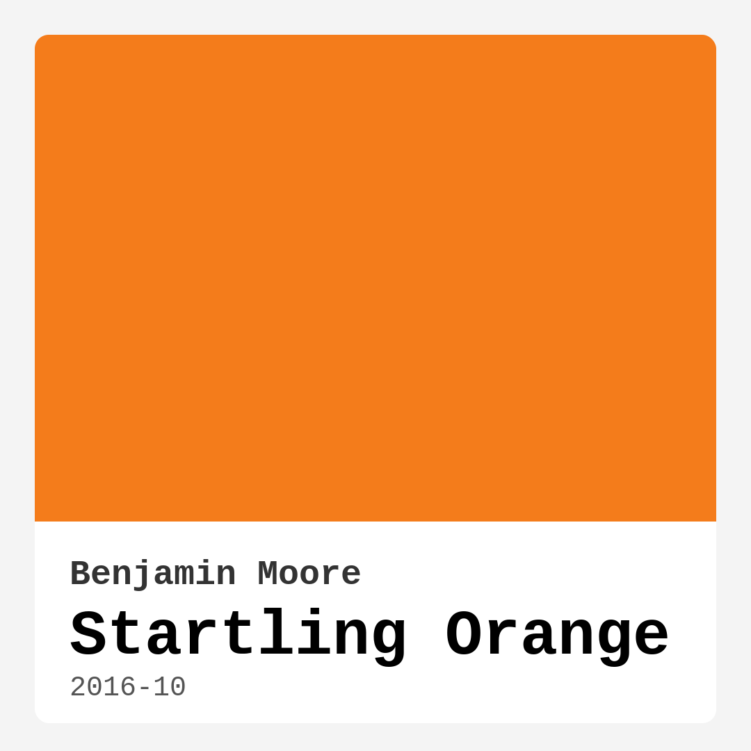
Color Preview & Key Details
| HEX Code | #F47C1B |
| RGB | 244, 124, 27 |
| LRV | 32.31% |
| Undertone | Red |
| Finish Options | Matte, Satin, Semi-Gloss |
Picture this: you walk into a room and are instantly enveloped by a burst of energy and warmth, almost like stepping into a sun-drenched oasis. That welcoming vibe could very well come from a splash of Startling Orange on the walls. This captivating hue isn’t just a color; it’s an experience. If you’re considering adding a touch of vibrancy to your space, it’s essential to understand what Startling Orange has to offer.
Startling Orange, with its color code of 2016-10 from Benjamin Moore, is a bold, attention-grabbing shade that radiates warmth and liveliness. It’s a warm paint color, falling under the red hue category, and its hex code (#F47C1B) perfectly encapsulates that zesty tone. Think of it as the cheerful friend who walks into a room and instantly lifts everyone’s spirits. With an LRV (Light Reflectance Value) of 32.31%, it reflects a considerable amount of light, making any room feel more open and inviting.
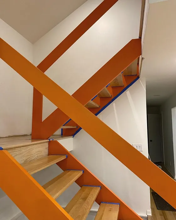
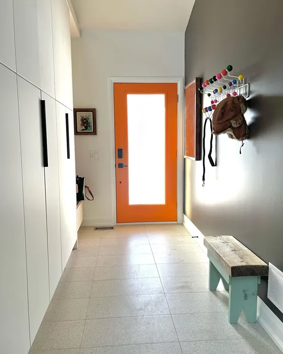
Now, you might be wondering if such an eye-catching color could work in your home. The answer is a resounding yes! Startling Orange is incredibly versatile. It’s perfect for a wide range of spaces, from the living room to the kitchen, and even in a home office or kids’ room. It’s an ideal candidate for an accent wall or even for painting furniture if you’re feeling adventurous. This color shines in modern, eclectic, bohemian, contemporary, or retro decor styles. Its vibrant, warm personality adds a playful touch, making it a fabulous choice for anyone looking to create a joyful atmosphere.
When it comes to application, Startling Orange is beginner-friendly. It rolls on smoothly and dries quickly, which means you can enjoy your new look in no time. Whether you choose a satin or semi-gloss finish, this color will pop beautifully. These finishes enhance its vibrancy while also making it easier to clean. If you prefer a more muted effect, a matte finish can soften its brightness, although you’ll want to be prepared for a little extra maintenance.
One of the best things about Startling Orange is its washability. It’s wipeable and washable, so you won’t have to worry about those inevitable smudges or fingerprints. Plus, its low VOC level means you’re making a healthier choice for your indoor air quality, which is always a plus.
However, there are a few things to keep in mind. Startling Orange is a bold color, and in small spaces, it can feel overwhelming if not balanced correctly. If you’re working with a compact area, consider using it as an accent wall and pairing it with lighter shades to keep things from feeling too heavy. Adding soft furnishings or decor in neutral or pastel tones will help tone it down while allowing the warmth to shine through.
The undertones of Startling Orange lean towards red, giving it a depth that adds to its allure. Testing this paint in your home is crucial. Observe how it interacts with your existing furniture, flooring, and decor under different lighting conditions. In natural light, it shines brilliantly, while under artificial light, it can shift slightly, appearing even warmer, making it a versatile choice for various lighting situations.
When it comes to color pairings, Startling Orange teams up beautifully with complementary shades. You can play up its vibrancy by pairing it with greens for a refreshing contrast. Whites, like Benjamin Moore’s White Dove or Pure White, work wonders to balance its boldness. Brass fixtures can add a touch of elegance, while wood trim brings a warm, organic feel to the space.
If you’re considering this color for a rental or thinking about selling your home, Startling Orange can be a smart choice. Its energetic mood is appealing to potential buyers, and it’s a designer favorite for good reason. In fact, it’s trending for 2025, so you’ll be ahead of the curve.
While Startling Orange is undeniably lively, it also requires thoughtful planning. You want to ensure that it harmonizes with your overall design. Think about how you want the room to feel. If you’re aiming for an energizing, inviting space, Startling Orange does the trick. But if you want a more serene environment, consider softer shades to balance it out.
Imagine walking into your home after a long day and being greeted by the cheerful embrace of Startling Orange. It can transform your space into a haven of warmth and joy. Adding this color into your interior design repertoire is about more than just aesthetics; it’s about creating an atmosphere that resonates with your personality.
To recap, Startling Orange is a vibrant, warm paint color that can bring a joyful energy to any room. Its versatility allows it to shine in various decor styles, making it a great choice for living rooms, kitchens, and more. The ease of application and maintenance makes it beginner-friendly, while its washability and low VOC level ensure a healthier home environment.
As you embark on your painting journey, remember that colors tell a story. Startling Orange can tell one of warmth, energy, and zest for life. So, are you ready to add a spark of life to your home with this delightful hue? Embrace the adventure of color, and let Startling Orange bring that much-needed vibrancy to your space.
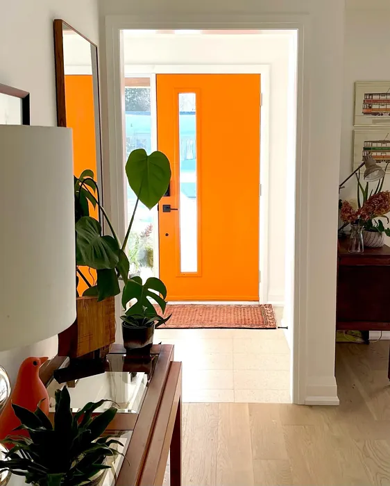
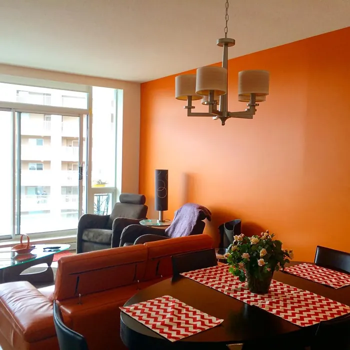
Real Room Photo of Startling Orange 2016-10
Undertones of Startling Orange ?
The undertones of Startling Orange are a key aspect of its character, leaning towards Red. These subtle underlying hues are what give the color its depth and complexity. For example, a gray with a blue undertone will feel cooler and more modern, while one with a brown undertone will feel warmer and more traditional. It’s essential to test this paint in your home and observe it next to your existing furniture, flooring, and decor to see how these undertones interact and reveal themselves throughout the day.
HEX value: #F47C1B
RGB code: 244, 124, 27
Is Startling Orange Cool or Warm?
Startling Orange is considered a warm paint color. This characteristic plays a huge role in the overall feel of a room. Warm colors, like this one, tend to create a cozy, inviting, and energetic atmosphere, making them great for social spaces like living rooms and dining rooms. In contrast, cool colors often evoke a sense of calm and serenity, which is why they are popular in bedrooms and bathrooms. The warmth of Startling Orange means it will pair beautifully with corresponding decor elements.
Understanding Color Properties and Interior Design Tips
Hue refers to a specific position on the color wheel, measured in degrees from 0 to 360. Each degree represents a different pure color:
- 0° represents red
- 120° represents green
- 240° represents blue
Saturation describes the intensity or purity of a color and is expressed as a percentage:
- At 0%, the color appears completely desaturated—essentially a shade of gray
- At 100%, the color is at its most vivid and vibrant
Lightness indicates how light or dark a color is, also expressed as a percentage:
- 0% lightness results in black
- 100% lightness results in white
Using Warm Colors in Interior Design
Warm hues—such as reds, oranges, yellows, warm beiges, and greiges—are excellent choices for creating inviting and energetic spaces. These colors are particularly well-suited for:
- Kitchens, living rooms, and bathrooms, where warmth enhances comfort and sociability
- Large rooms, where warm tones can help reduce the sense of emptiness and make the space feel more intimate
For example:
- Warm beige shades provide a cozy, inviting atmosphere, ideal for living rooms, bedrooms, and hallways.
- Warm greige (a mix of beige and gray) offers the warmth of beige with the modern appeal of gray, making it a versatile backdrop for dining areas, bedrooms, and living spaces.
However, be mindful when using warm light tones in rooms with limited natural light. These shades may appear muted or even take on an unpleasant yellowish tint. To avoid a dull or flat appearance:
- Add depth by incorporating richer tones like deep greens, charcoal, or chocolate brown
- Use textured elements such as curtains, rugs, or cushions to bring dimension to the space
Pro Tip: Achieving Harmony with Warm and Cool Color Balance
To create a well-balanced and visually interesting interior, mix warm and cool tones strategically. This contrast adds depth and harmony to your design.
- If your walls feature warm hues, introduce cool-colored accents such as blue or green furniture, artwork, or accessories to create contrast.
- For a polished look, consider using a complementary color scheme, which pairs colors opposite each other on the color wheel (e.g., red with green, orange with blue).
This thoughtful mix not only enhances visual appeal but also creates a space that feels both dynamic and cohesive.
Light Temperature Affects on Startling Orange
Natural Light
Natural daylight changes in color temperature as the sun moves across the sky. At sunrise and sunset, the light tends to have a warm, golden tone with a color temperature around 2000 Kelvin (K). As the day progresses and the sun rises higher, the light becomes cooler and more neutral. Around midday, especially when the sky is clear, natural light typically reaches its peak brightness and shifts to a cooler tone, ranging from 5500 to 6500 Kelvin. This midday light is close to what we perceive as pure white or daylight-balanced light.
These shifts in natural light can significantly influence how colors appear in a space, which is why designers often consider both the time of day and the orientation of windows when planning interior color schemes.
Artificial Light
When choosing artificial lighting, pay close attention to the color temperature, measured in Kelvin (K). This determines how warm or cool the light will appear. Lower temperatures, around 2700K, give off a warm, yellow glow often used in living rooms or bedrooms. Higher temperatures, above 5000K, create a cool, bluish light similar to daylight, commonly used in kitchens, offices, or task areas.
Use the slider to see how lighting temperature can affect the appearance of a surface or color throughout a space.


4800K
LRV of Startling Orange
The Light Reflectance Value (LRV) of Startling Orange is 32.31%, which places it in the Medium colors category. This means it reflect a lot of light. Understanding a paint’s LRV is crucial for predicting how it will look in your space. A higher LRV indicates a lighter color that reflects more light, making rooms feel larger and brighter. A lower LRV signifies a darker color that absorbs more light, creating a cozier, more intimate atmosphere. Always consider the natural and artificial lighting in your room when selecting a paint color based on its LRV.
Detailed Review of Startling Orange
Additional Paint Characteristics
Ideal Rooms
Entryway, Home Office, Kids Room, Kitchen, Living Room
Decor Styles
Bohemian, Contemporary, Eclectic, Modern, Retro
Coverage
Good (1–2 Coats), Touch-Up Friendly
Ease of Application
Beginner Friendly, Brush Smooth, Fast-Drying, Roller-Ready
Washability
Washable, Wipeable
VOC Level
Low VOC
Best Use
Accent Wall, Furniture, Interior Walls, Kids Room, Open Concept Spaces
Room Suitability
Entryway, Home Office, Kids Room, Kitchen, Living Room
Tone Tag
Bold, Bright, Warm
Finish Type
Satin, Semi-Gloss
Paint Performance
Easy Touch-Up, High Coverage, Quick Drying
Use Cases
Best for Modern Farmhouse, Best for Rentals, Best for Selling Your Home, Designer Favorite, Trending in 2025
Mood
Brightening, Energizing, Inviting
Trim Pairing
Complements Brass Fixtures, Good with Wood Trim, Matches Pure White, Pairs with White Dove
Startling Orange is truly a showstopper. Its rich, saturated tone is perfect for those wanting to inject some vibrancy into their home. When applied, it provides a smooth finish that enhances the room’s lighting, making spaces feel open and lively. The color works exceptionally well in open areas where it can be appreciated from various angles. While it’s bold, it can also be paired with softer tones for a balanced look. Be prepared, though; this color demands attention and can easily become the focal point of any room. It’s a great choice for accent walls, children’s rooms, or as a cheerful backdrop in a home office.
Pros & Cons of 2016-10 Startling Orange
Pros
Cons
Colors that go with Benjamin Moore Startling Orange
FAQ on 2016-10 Startling Orange
Can I use Startling Orange in a small room?
Absolutely! While Startling Orange is a bold choice, it can work beautifully in small rooms if balanced correctly. Consider using it as an accent wall or pairing it with lighter shades to prevent it from feeling overwhelming. The key is to complement it with soft furnishings or decor that can help tone it down, allowing the warmth to shine without dominating the space.
What types of finishes are best for Startling Orange?
For Startling Orange, a satin or semi-gloss finish can enhance its vibrancy, making the color pop while adding a slight sheen. These finishes are also easier to clean, which is particularly useful in high-traffic areas or kitchens. If you’re looking for a more muted effect, a matte finish can soften the brightness, creating a cozy atmosphere, but keep in mind that it may require more maintenance.
Comparisons Startling Orange with other colors
Startling Orange 2016-10 vs Coral Clay SW 9005
| Attribute | Startling Orange 2016-10 | Coral Clay SW 9005 |
|---|---|---|
| Color Name | Startling Orange 2016-10 | Coral Clay SW 9005 |
| Color | ||
| Hue | Red | Red |
| Brightness | Medium | Medium |
| RGB | 244, 124, 27 | 191, 121, 110 |
| LRV | 32.31% | 6% |
| Finish Type | Satin, Semi-Gloss | Eggshell, Matte, Satin |
| Finish Options | Matte, Satin, Semi-Gloss | Eggshell, Matte, Satin |
| Ideal Rooms | Entryway, Home Office, Kids Room, Kitchen, Living Room | Bedroom, Dining Room, Home Office, Living Room |
| Decor Styles | Bohemian, Contemporary, Eclectic, Modern, Retro | Bohemian, Coastal, Modern Farmhouse, Rustic |
| Coverage | Good (1–2 Coats), Touch-Up Friendly | Good (1–2 Coats) |
| Ease of Application | Beginner Friendly, Brush Smooth, Fast-Drying, Roller-Ready | Beginner Friendly, Brush Smooth, Roller-Ready |
| Washability | Washable, Wipeable | Washable, Wipeable |
| Room Suitability | Entryway, Home Office, Kids Room, Kitchen, Living Room | Bedroom, Dining Room, Home Office, Living Room |
| Tone | Bold, Bright, Warm | Earthy, Muted, Warm |
| Paint Performance | Easy Touch-Up, High Coverage, Quick Drying | Easy Touch-Up, High Coverage, Low Odor |
Startling Orange 2016-10 vs Baked Clay SW 6340
| Attribute | Startling Orange 2016-10 | Baked Clay SW 6340 |
|---|---|---|
| Color Name | Startling Orange 2016-10 | Baked Clay SW 6340 |
| Color | ||
| Hue | Red | Red |
| Brightness | Medium | Medium |
| RGB | 244, 124, 27 | 193, 120, 92 |
| LRV | 32.31% | 30% |
| Finish Type | Satin, Semi-Gloss | Matte, Satin |
| Finish Options | Matte, Satin, Semi-Gloss | Eggshell, Matte, Satin |
| Ideal Rooms | Entryway, Home Office, Kids Room, Kitchen, Living Room | Bedroom, Dining Room, Entryway, Home Office, Kitchen, Living Room |
| Decor Styles | Bohemian, Contemporary, Eclectic, Modern, Retro | Bohemian, Mediterranean, Modern Farmhouse, Rustic, Transitional |
| Coverage | Good (1–2 Coats), Touch-Up Friendly | Good (1–2 Coats), Touch-Up Friendly |
| Ease of Application | Beginner Friendly, Brush Smooth, Fast-Drying, Roller-Ready | Beginner Friendly, Brush Smooth, Fast-Drying, Roller-Ready |
| Washability | Washable, Wipeable | Washable, Wipeable |
| Room Suitability | Entryway, Home Office, Kids Room, Kitchen, Living Room | Bedroom, Dining Room, Entryway, Home Office, Living Room |
| Tone | Bold, Bright, Warm | Earthy, Muted, Warm |
| Paint Performance | Easy Touch-Up, High Coverage, Quick Drying | Easy Touch-Up, Low Odor, Quick Drying |
Startling Orange 2016-10 vs Mellow Mauve SW 0039
| Attribute | Startling Orange 2016-10 | Mellow Mauve SW 0039 |
|---|---|---|
| Color Name | Startling Orange 2016-10 | Mellow Mauve SW 0039 |
| Color | ||
| Hue | Red | Red |
| Brightness | Medium | Medium |
| RGB | 244, 124, 27 | 196, 149, 122 |
| LRV | 32.31% | 24% |
| Finish Type | Satin, Semi-Gloss | Eggshell, Matte, Satin |
| Finish Options | Matte, Satin, Semi-Gloss | Eggshell, Matte, Satin |
| Ideal Rooms | Entryway, Home Office, Kids Room, Kitchen, Living Room | Bedroom, Dining Room, Kitchen, Living Room, Nursery |
| Decor Styles | Bohemian, Contemporary, Eclectic, Modern, Retro | Bohemian, Modern, Rustic, Traditional |
| Coverage | Good (1–2 Coats), Touch-Up Friendly | Good (1–2 Coats), Touch-Up Friendly |
| Ease of Application | Beginner Friendly, Brush Smooth, Fast-Drying, Roller-Ready | Beginner Friendly, Brush Smooth, Roller-Ready |
| Washability | Washable, Wipeable | Scrubbable, Washable, Wipeable |
| Room Suitability | Entryway, Home Office, Kids Room, Kitchen, Living Room | Bedroom, Dining Room, Living Room, Nursery |
| Tone | Bold, Bright, Warm | Dusty, Earthy, Muted, Warm |
| Paint Performance | Easy Touch-Up, High Coverage, Quick Drying | Easy Touch-Up, Low Odor, Quick Drying |
Startling Orange 2016-10 vs Chivalry Copper SW 6353
| Attribute | Startling Orange 2016-10 | Chivalry Copper SW 6353 |
|---|---|---|
| Color Name | Startling Orange 2016-10 | Chivalry Copper SW 6353 |
| Color | ||
| Hue | Red | Red |
| Brightness | Medium | Medium |
| RGB | 244, 124, 27 | 212, 150, 110 |
| LRV | 32.31% | 24% |
| Finish Type | Satin, Semi-Gloss | Eggshell, Satin |
| Finish Options | Matte, Satin, Semi-Gloss | Eggshell, Satin, Semi-Gloss |
| Ideal Rooms | Entryway, Home Office, Kids Room, Kitchen, Living Room | Bedroom, Dining Room, Entryway, Home Office, Living Room |
| Decor Styles | Bohemian, Contemporary, Eclectic, Modern, Retro | Farmhouse, Modern, Rustic, Transitional |
| Coverage | Good (1–2 Coats), Touch-Up Friendly | Good (1–2 Coats), Touch-Up Friendly |
| Ease of Application | Beginner Friendly, Brush Smooth, Fast-Drying, Roller-Ready | Beginner Friendly, Brush Smooth, Fast-Drying, Roller-Ready |
| Washability | Washable, Wipeable | Washable, Wipeable |
| Room Suitability | Entryway, Home Office, Kids Room, Kitchen, Living Room | Bedroom, Dining Room, Home Office, Living Room |
| Tone | Bold, Bright, Warm | Earthy, Muted, Warm |
| Paint Performance | Easy Touch-Up, High Coverage, Quick Drying | Easy Touch-Up, High Coverage, Low Odor, Quick Drying |
Startling Orange 2016-10 vs Windswept Canyon SW 9010
| Attribute | Startling Orange 2016-10 | Windswept Canyon SW 9010 |
|---|---|---|
| Color Name | Startling Orange 2016-10 | Windswept Canyon SW 9010 |
| Color | ||
| Hue | Red | Red |
| Brightness | Medium | Medium |
| RGB | 244, 124, 27 | 219, 164, 128 |
| LRV | 32.31% | 0% |
| Finish Type | Satin, Semi-Gloss | Eggshell, Matte, Satin |
| Finish Options | Matte, Satin, Semi-Gloss | Eggshell, Matte, Satin |
| Ideal Rooms | Entryway, Home Office, Kids Room, Kitchen, Living Room | Bedroom, Dining Room, Home Office, Kitchen, Living Room |
| Decor Styles | Bohemian, Contemporary, Eclectic, Modern, Retro | Bohemian, Coastal, Modern Farmhouse, Rustic, Transitional |
| Coverage | Good (1–2 Coats), Touch-Up Friendly | Good (1–2 Coats) |
| Ease of Application | Beginner Friendly, Brush Smooth, Fast-Drying, Roller-Ready | Beginner Friendly, Brush Smooth, Fast-Drying, Roller-Ready |
| Washability | Washable, Wipeable | Highly Washable, Washable |
| Room Suitability | Entryway, Home Office, Kids Room, Kitchen, Living Room | Bedroom, Dining Room, Home Office, Kitchen, Living Room |
| Tone | Bold, Bright, Warm | Earthy, Muted, Warm |
| Paint Performance | Easy Touch-Up, High Coverage, Quick Drying | High Coverage, Low Odor, Quick Drying |
Startling Orange 2016-10 vs Navel SW 6887
| Attribute | Startling Orange 2016-10 | Navel SW 6887 |
|---|---|---|
| Color Name | Startling Orange 2016-10 | Navel SW 6887 |
| Color | ||
| Hue | Red | Red |
| Brightness | Medium | Medium |
| RGB | 244, 124, 27 | 236, 132, 48 |
| LRV | 32.31% | 4% |
| Finish Type | Satin, Semi-Gloss | Satin, Semi-Gloss |
| Finish Options | Matte, Satin, Semi-Gloss | Eggshell, Satin, Semi-Gloss |
| Ideal Rooms | Entryway, Home Office, Kids Room, Kitchen, Living Room | Dining Room, Entryway, Home Office, Kitchen, Living Room |
| Decor Styles | Bohemian, Contemporary, Eclectic, Modern, Retro | Bohemian, Contemporary, Modern, Rustic |
| Coverage | Good (1–2 Coats), Touch-Up Friendly | Good (1–2 Coats), Touch-Up Friendly |
| Ease of Application | Beginner Friendly, Brush Smooth, Fast-Drying, Roller-Ready | Beginner Friendly, Brush Smooth, Fast-Drying, Roller-Ready |
| Washability | Washable, Wipeable | Washable, Wipeable |
| Room Suitability | Entryway, Home Office, Kids Room, Kitchen, Living Room | Dining Room, Home Office, Kitchen, Living Room |
| Tone | Bold, Bright, Warm | Bold, Earthy, Warm |
| Paint Performance | Easy Touch-Up, High Coverage, Quick Drying | Low Odor, Quick Drying, Scuff Resistant |
Startling Orange 2016-10 vs Invigorate SW 6886
| Attribute | Startling Orange 2016-10 | Invigorate SW 6886 |
|---|---|---|
| Color Name | Startling Orange 2016-10 | Invigorate SW 6886 |
| Color | ||
| Hue | Red | Red |
| Brightness | Medium | Medium |
| RGB | 244, 124, 27 | 228, 114, 55 |
| LRV | 32.31% | 40% |
| Finish Type | Satin, Semi-Gloss | Satin, Semi-Gloss |
| Finish Options | Matte, Satin, Semi-Gloss | Matte, Satin, Semi-Gloss |
| Ideal Rooms | Entryway, Home Office, Kids Room, Kitchen, Living Room | Dining Room, Entryway, Home Office, Kitchen, Living Room |
| Decor Styles | Bohemian, Contemporary, Eclectic, Modern, Retro | Bohemian, Eclectic, Modern, Transitional |
| Coverage | Good (1–2 Coats), Touch-Up Friendly | Good (1–2 Coats), Touch-Up Friendly |
| Ease of Application | Beginner Friendly, Brush Smooth, Fast-Drying, Roller-Ready | Beginner Friendly, Brush Smooth, Fast-Drying, Roller-Ready |
| Washability | Washable, Wipeable | Highly Washable, Washable |
| Room Suitability | Entryway, Home Office, Kids Room, Kitchen, Living Room | Dining Room, Home Office, Kitchen, Living Room |
| Tone | Bold, Bright, Warm | Bold, Earthy, Warm |
| Paint Performance | Easy Touch-Up, High Coverage, Quick Drying | Easy Touch-Up, High Coverage, Low Odor, Quick Drying |
Startling Orange 2016-10 vs Knockout Orange SW 6885
| Attribute | Startling Orange 2016-10 | Knockout Orange SW 6885 |
|---|---|---|
| Color Name | Startling Orange 2016-10 | Knockout Orange SW 6885 |
| Color | ||
| Hue | Red | Red |
| Brightness | Medium | Medium |
| RGB | 244, 124, 27 | 225, 111, 62 |
| LRV | 32.31% | 45% |
| Finish Type | Satin, Semi-Gloss | Matte, Satin, Semi-Gloss |
| Finish Options | Matte, Satin, Semi-Gloss | Matte, Satin, Semi-Gloss |
| Ideal Rooms | Entryway, Home Office, Kids Room, Kitchen, Living Room | Dining Room, Home Office, Kids Room, Kitchen, Living Room |
| Decor Styles | Bohemian, Contemporary, Eclectic, Modern, Retro | Contemporary, Eclectic, Industrial, Modern, Transitional |
| Coverage | Good (1–2 Coats), Touch-Up Friendly | Good (1–2 Coats), High Hide, Touch-Up Friendly |
| Ease of Application | Beginner Friendly, Brush Smooth, Fast-Drying, Roller-Ready | Beginner Friendly, Brush Smooth, Fast-Drying, Low Splatter, Roller-Ready |
| Washability | Washable, Wipeable | Scrubbable, Stain Resistant, Washable |
| Room Suitability | Entryway, Home Office, Kids Room, Kitchen, Living Room | Dining Room, Entryway, Kids Room, Kitchen, Living Room |
| Tone | Bold, Bright, Warm | Bold, Inviting, Warm |
| Paint Performance | Easy Touch-Up, High Coverage, Quick Drying | Easy Touch-Up, High Coverage, Long Lasting, Scuff Resistant |
Startling Orange 2016-10 vs Autumnal SW 6361
| Attribute | Startling Orange 2016-10 | Autumnal SW 6361 |
|---|---|---|
| Color Name | Startling Orange 2016-10 | Autumnal SW 6361 |
| Color | ||
| Hue | Red | Red |
| Brightness | Medium | Medium |
| RGB | 244, 124, 27 | 205, 140, 93 |
| LRV | 32.31% | 24% |
| Finish Type | Satin, Semi-Gloss | Eggshell, Matte |
| Finish Options | Matte, Satin, Semi-Gloss | Eggshell, Flat, Matte, Satin |
| Ideal Rooms | Entryway, Home Office, Kids Room, Kitchen, Living Room | Bedroom, Dining Room, Home Office, Living Room |
| Decor Styles | Bohemian, Contemporary, Eclectic, Modern, Retro | Bohemian, Modern Farmhouse, Rustic, Traditional |
| Coverage | Good (1–2 Coats), Touch-Up Friendly | Good (1–2 Coats) |
| Ease of Application | Beginner Friendly, Brush Smooth, Fast-Drying, Roller-Ready | Beginner Friendly, Brush Smooth, Fast-Drying, Roller-Ready |
| Washability | Washable, Wipeable | Washable, Wipeable |
| Room Suitability | Entryway, Home Office, Kids Room, Kitchen, Living Room | Bedroom, Dining Room, Home Office, Living Room |
| Tone | Bold, Bright, Warm | Earthy, Muted, Warm |
| Paint Performance | Easy Touch-Up, High Coverage, Quick Drying | Easy Touch-Up, Low Odor, Quick Drying |
Startling Orange 2016-10 vs Outgoing Orange SW 6641
| Attribute | Startling Orange 2016-10 | Outgoing Orange SW 6641 |
|---|---|---|
| Color Name | Startling Orange 2016-10 | Outgoing Orange SW 6641 |
| Color | ||
| Hue | Red | Red |
| Brightness | Medium | Medium |
| RGB | 244, 124, 27 | 230, 149, 95 |
| LRV | 32.31% | 45% |
| Finish Type | Satin, Semi-Gloss | Satin, Semi-Gloss |
| Finish Options | Matte, Satin, Semi-Gloss | Eggshell, Flat, Satin, Semi-Gloss |
| Ideal Rooms | Entryway, Home Office, Kids Room, Kitchen, Living Room | Dining Room, Entryway, Kitchen, Living Room |
| Decor Styles | Bohemian, Contemporary, Eclectic, Modern, Retro | Bohemian, Eclectic, Modern, Transitional |
| Coverage | Good (1–2 Coats), Touch-Up Friendly | Good (1–2 Coats), Touch-Up Friendly |
| Ease of Application | Beginner Friendly, Brush Smooth, Fast-Drying, Roller-Ready | Beginner Friendly, Brush Smooth, Fast-Drying, Roller-Ready |
| Washability | Washable, Wipeable | Highly Washable, Washable |
| Room Suitability | Entryway, Home Office, Kids Room, Kitchen, Living Room | Dining Room, Entryway, Kitchen, Living Room |
| Tone | Bold, Bright, Warm | Bold, Warm |
| Paint Performance | Easy Touch-Up, High Coverage, Quick Drying | High Coverage, Low Odor, Quick Drying |
Official Page of Benjamin Moore Startling Orange 2016-10