
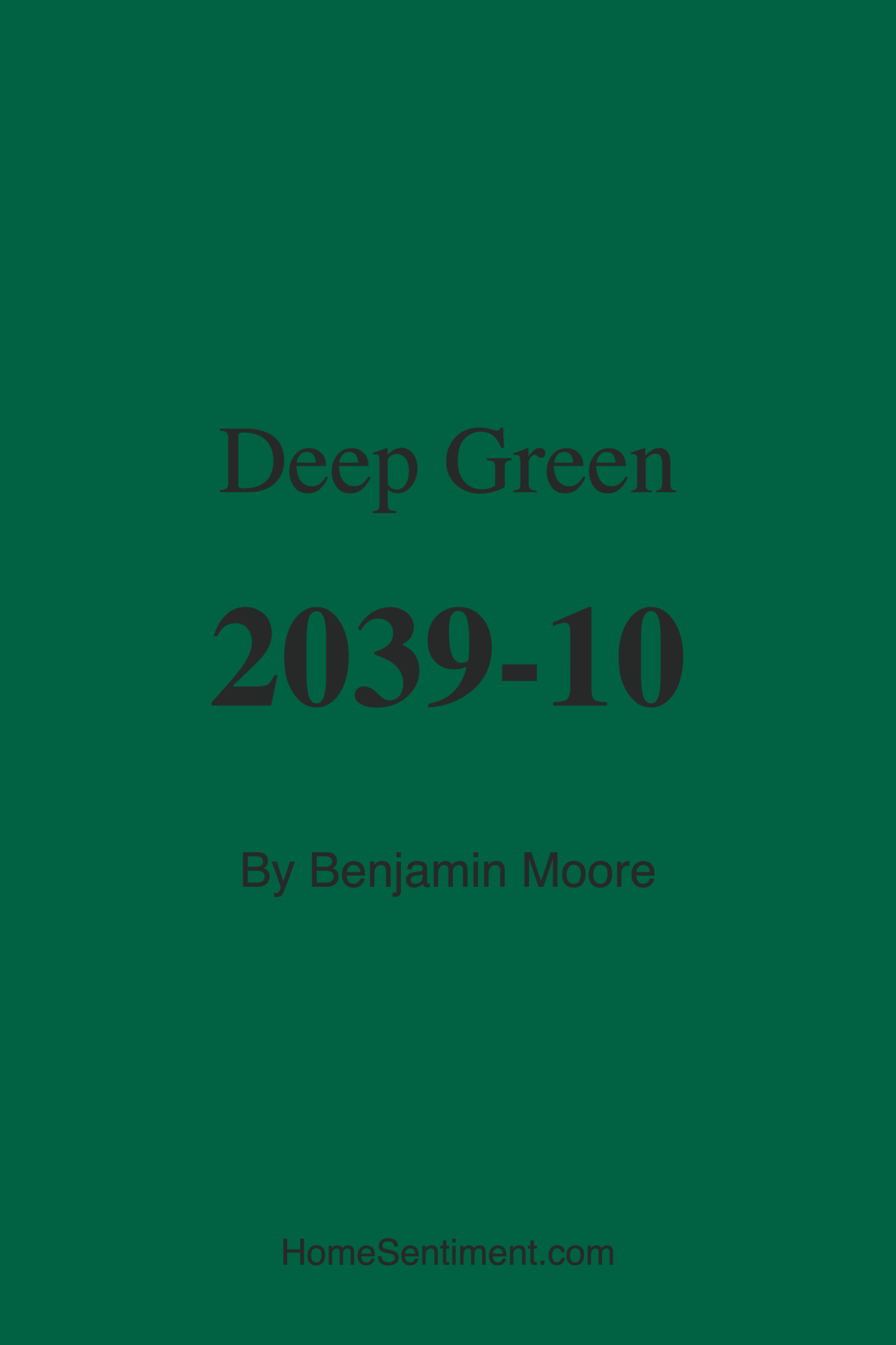
Color Preview & Key Details
| HEX Code | #006242 |
| RGB | 0, 98, 66 |
| LRV | 9.73% |
| Undertone | Green |
| Finish Options | Eggshell, Flat, Matte, Satin, Semi-Gloss |
If you’re looking for a paint color that brings the lush, grounding energy of nature into your home, Benjamin Moore’s Deep Green (2039-10) might just be your perfect match. This rich, dark green hue—with its HEX code #006242—captures the essence of dense forests and verdant landscapes, offering a sense of tranquility and sophistication to any space. Whether you’re aiming for a moody, intimate vibe or a bold, elegant statement, this color delivers. But before you commit, let’s dive into everything you need to know to decide if Deep Green is right for your project.
First, let’s talk about its undertones. Deep Green leans into its cool, green base without any unexpected shifts—what you see is what you get. That means it won’t suddenly pull blue or gray in certain lights, which makes it a reliable choice if you love the idea of a true, deep forest green. Cool undertones give it a calming, serene quality, perfect for creating a retreat-like atmosphere in bedrooms or a focused, inspiring environment in a home office. But if your space already leans warm with lots of reds or yellows in your furniture or flooring, test a sample first to ensure the coolness doesn’t clash.
Lighting plays a huge role in how this color performs. With an LRV (Light Reflectance Value) of just 9.73%, Deep Green absorbs light rather than reflecting it, which means it can feel enveloping and cozy—or potentially overwhelming in a small, dim room. In natural light, the color shines at its truest, revealing its full depth and richness. Under warm artificial lighting, it softens slightly, taking on a more muted, inviting tone. But in low light? It can read as nearly black, which isn’t necessarily a bad thing if you’re going for drama. If you’re worried about it feeling too dark, pair it with plenty of light-colored furnishings, mirrors, or metallic accents to balance the weight.
Now, where does Deep Green work best? It’s incredibly versatile. In a living room, it creates an elegant backdrop for both modern and traditional decor, especially when paired with crisp white trim or brass fixtures. A dining room wrapped in this hue feels intimate and luxurious—imagine it with a glossy finish and a statement chandelier. Bedrooms benefit from its calming energy, and it’s a standout choice for an entryway, making a bold first impression. Even basements, which often lack natural light, can handle this color if you lean into the moody, cocoon-like effect. Just avoid using it in tiny, windowless spaces unless you’re intentionally aiming for a cave-like retreat.
One of the biggest perks of Deep Green is its practicality. Benjamin Moore’s formula offers excellent coverage—you’ll likely need just one or two coats—and it’s self-priming, which saves time and effort. It’s also low-VOC and eco-certified, so you don’t have to worry about harsh fumes. The finish options are flexible, too. A matte or eggshell finish will give you a velvety, sophisticated look, while satin adds a subtle sheen that’s easy to clean, making it great for high-traffic areas. And thanks to its mildew-resistant properties, it’s a smart pick for humid climates or rooms like basements.
Wondering how to style it? Deep Green plays well with a range of colors. For a timeless look, pair it with whites or creams—think white trim, linen curtains, or a light rug to keep the space airy. Metallics like gold, brass, or even antique copper add warmth and luxury. If you’re feeling adventurous, try contrasting it with burnt orange or mustard yellow for a vibrant, nature-inspired palette. Earthy neutrals—think warm woods, rattan, or leather—enhance its organic vibe. And if you’re into moody spaces, layer it with other deep tones like charcoal or navy for a layered, sophisticated effect.
A few things to watch out for: Deep Green’s darkness can make small rooms feel smaller, so use it strategically. If you’re hesitant, start with an accent wall or try it on built-ins or cabinetry instead of the entire room. And while its cool undertones are part of its charm, they might not harmonize with warmer decor styles unless balanced carefully. Always test a sample in your space at different times of day to see how the light changes it.
So, is Deep Green the right choice for you? If you love rich, nature-inspired colors and want a shade that feels both timeless and bold, absolutely. It’s a designer favorite for a reason—it’s versatile, elegant, and packed with personality. Whether you’re going for a cozy bedroom, a dramatic dining room, or a statement-making entryway, this color brings depth and sophistication to the table. Just remember: with great color comes great responsibility. Use it thoughtfully, balance it with lighter elements, and you’ll end up with a space that feels anything but ordinary.
Still on the fence? Grab a sample and live with it for a few days. Paint a large swatch, move it around the room, and see how it makes you feel. Because at the end of the day, the best color for your home is the one that makes you smile every time you walk in.
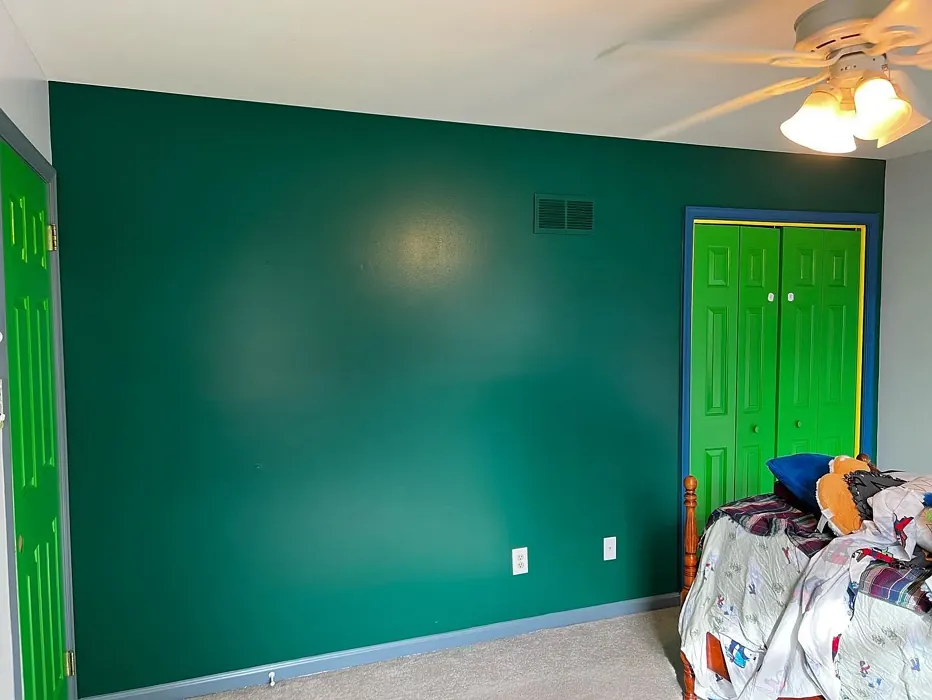
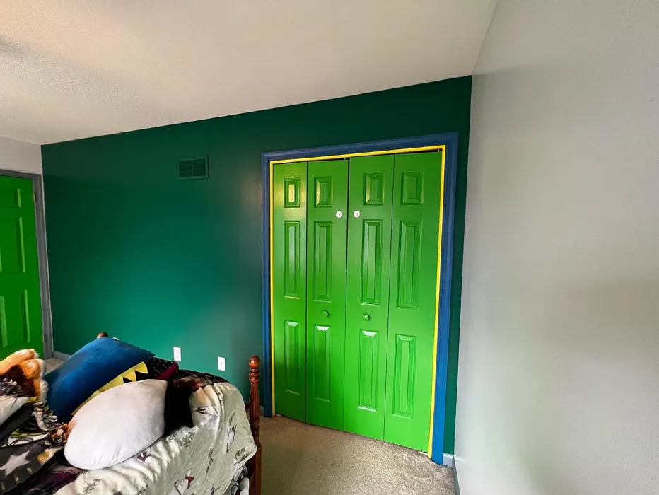
Real Room Photo of Deep Green 2039-10
Undertones of Deep Green ?
The undertones of Deep Green are a key aspect of its character, leaning towards Green. These subtle underlying hues are what give the color its depth and complexity. For example, a gray with a blue undertone will feel cooler and more modern, while one with a brown undertone will feel warmer and more traditional. It’s essential to test this paint in your home and observe it next to your existing furniture, flooring, and decor to see how these undertones interact and reveal themselves throughout the day.
HEX value: #006242
RGB code: 0, 98, 66
Is Deep Green Cool or Warm?
Deep Green leans towards the cool side of the color spectrum. This coolness is what gives the color its calming and soothing quality. Cool colors are known for their ability to make a space feel more expansive and open, which is why Deep Green works so well in rooms where you want to create a sense of peace and tranquility. Its cool nature also means it pairs beautifully with other cool colors as well as warm accents, offering versatility in design.
Understanding Color Properties and Interior Design Tips
Hue refers to a specific position on the color wheel, measured in degrees from 0 to 360. Each degree represents a different pure color:
- 0° represents red
- 120° represents green
- 240° represents blue
Saturation describes the intensity or purity of a color and is expressed as a percentage:
- At 0%, the color appears completely desaturated—essentially a shade of gray
- At 100%, the color is at its most vivid and vibrant
Lightness indicates how light or dark a color is, also expressed as a percentage:
- 0% lightness results in black
- 100% lightness results in white
Using Warm Colors in Interior Design
Warm hues—such as reds, oranges, yellows, warm beiges, and greiges—are excellent choices for creating inviting and energetic spaces. These colors are particularly well-suited for:
- Kitchens, living rooms, and bathrooms, where warmth enhances comfort and sociability
- Large rooms, where warm tones can help reduce the sense of emptiness and make the space feel more intimate
For example:
- Warm beige shades provide a cozy, inviting atmosphere, ideal for living rooms, bedrooms, and hallways.
- Warm greige (a mix of beige and gray) offers the warmth of beige with the modern appeal of gray, making it a versatile backdrop for dining areas, bedrooms, and living spaces.
However, be mindful when using warm light tones in rooms with limited natural light. These shades may appear muted or even take on an unpleasant yellowish tint. To avoid a dull or flat appearance:
- Add depth by incorporating richer tones like deep greens, charcoal, or chocolate brown
- Use textured elements such as curtains, rugs, or cushions to bring dimension to the space
Pro Tip: Achieving Harmony with Warm and Cool Color Balance
To create a well-balanced and visually interesting interior, mix warm and cool tones strategically. This contrast adds depth and harmony to your design.
- If your walls feature warm hues, introduce cool-colored accents such as blue or green furniture, artwork, or accessories to create contrast.
- For a polished look, consider using a complementary color scheme, which pairs colors opposite each other on the color wheel (e.g., red with green, orange with blue).
This thoughtful mix not only enhances visual appeal but also creates a space that feels both dynamic and cohesive.
Light Temperature Affects on Deep Green
Natural Light
Natural daylight changes in color temperature as the sun moves across the sky. At sunrise and sunset, the light tends to have a warm, golden tone with a color temperature around 2000 Kelvin (K). As the day progresses and the sun rises higher, the light becomes cooler and more neutral. Around midday, especially when the sky is clear, natural light typically reaches its peak brightness and shifts to a cooler tone, ranging from 5500 to 6500 Kelvin. This midday light is close to what we perceive as pure white or daylight-balanced light.
These shifts in natural light can significantly influence how colors appear in a space, which is why designers often consider both the time of day and the orientation of windows when planning interior color schemes.
Artificial Light
When choosing artificial lighting, pay close attention to the color temperature, measured in Kelvin (K). This determines how warm or cool the light will appear. Lower temperatures, around 2700K, give off a warm, yellow glow often used in living rooms or bedrooms. Higher temperatures, above 5000K, create a cool, bluish light similar to daylight, commonly used in kitchens, offices, or task areas.
Use the slider to see how lighting temperature can affect the appearance of a surface or color throughout a space.


4800K
LRV of Deep Green
The Light Reflectance Value (LRV) of Deep Green is 9.73%, which places it in the Dark colors category. This means it does not reflect light. Understanding a paint’s LRV is crucial for predicting how it will look in your space. A higher LRV indicates a lighter color that reflects more light, making rooms feel larger and brighter. A lower LRV signifies a darker color that absorbs more light, creating a cozier, more intimate atmosphere. Always consider the natural and artificial lighting in your room when selecting a paint color based on its LRV.
Detailed Review of Deep Green
Additional Paint Characteristics
Ideal Rooms
Basement, Bedroom, Dining Room, Entryway, Home Office, Living Room
Decor Styles
Bohemian, Eclectic, Modern, Rustic, Traditional
Coverage
Good (1–2 Coats), High Hide, Self-Priming
Ease of Application
Brush Smooth, Low Splatter, Roller-Ready, Sprayer Compatible
Washability
Mildew Resistant, Scrubbable, Washable
VOC Level
Eco-Certified, Low VOC
Best Use
Accent Wall, Doors, Interior Walls, Large Spaces, Trim
Room Suitability
Bedroom, Dining Room, Entryway, Home Office, Living Room
Tone Tag
Cool, Deep, Earthy, Moody
Finish Type
Eggshell, Matte, Satin
Paint Performance
Fade Resistant, High Coverage, Low Odor, Mold Resistant
Use Cases
Best for High Traffic Areas, Best for Low Light Rooms, Classic Favorite, Designer Favorite
Mood
Calm, Grounding, Sophisticated
Trim Pairing
Complements Brass Fixtures, Pairs with White Dove, Works with Warm Trim
Deep Green is a color that commands attention without overpowering a space. It’s a perfect choice for those looking to make a statement while maintaining a classic, timeless feel. The color brings a sense of nature indoors, creating a serene and calming environment. Its versatility allows it to work well with various decor styles, from modern to traditional, and complements both light and dark furnishings. This paint’s good coverage and high hide mean fewer coats are needed, making it both cost-effective and efficient for larger projects. Whether used on an accent wall or throughout an entire room, Deep Green is sure to add a touch of sophistication and elegance.
Pros & Cons of 2039-10 Deep Green
Pros
Cons
Colors that go with Benjamin Moore Deep Green
FAQ on 2039-10 Deep Green
Is Deep Green suitable for small rooms?
Deep Green can work in small rooms, but it’s important to consider the lighting and overall design. Due to its low LRV, it can make small spaces feel even smaller, especially if there isn’t much natural light. However, when paired with lighter furnishings and accents, it can create a cozy and intimate atmosphere. If you’re set on using Deep Green in a smaller room, try it as an accent wall or in combination with lighter colors to keep the space from feeling too enclosed. Testing the color with samples before committing to the whole room can also help ensure it achieves the desired effect.
What colors complement Deep Green?
Deep Green pairs beautifully with a variety of colors due to its cool undertones. For a classic and elegant look, combine it with crisp whites or soft creams, which can make the green pop and keep the space fresh and airy. Metallics like gold or brass add a touch of luxury and sophistication, making it perfect for more formal settings. For a bolder approach, you can incorporate vibrant colors like burnt orange or mustard yellow, which provide a warm contrast to the coolness of Deep Green. Earthy tones like browns and tans can also work well, enhancing the natural feel of the color.
Comparisons Deep Green with other colors
Deep Green 2039-10 vs Dried Thyme SW 6186
| Attribute | Deep Green 2039-10 | Dried Thyme SW 6186 |
|---|---|---|
| Color Name | Deep Green 2039-10 | Dried Thyme SW 6186 |
| Color | ||
| Hue | Green | Green |
| Brightness | Dark | Dark |
| RGB | 0, 98, 66 | 123, 128, 112 |
| LRV | 9.73% | 24% |
| Finish Type | Eggshell, Matte, Satin | Eggshell, Satin |
| Finish Options | Eggshell, Flat, Matte, Satin, Semi-Gloss | Eggshell, Matte, Satin |
| Ideal Rooms | Basement, Bedroom, Dining Room, Entryway, Home Office, Living Room | Bathroom, Bedroom, Dining Room, Entryway, Home Office, Kitchen, Living Room |
| Decor Styles | Bohemian, Eclectic, Modern, Rustic, Traditional | Bohemian, Industrial, Minimalist, Modern Farmhouse, Rustic |
| Coverage | Good (1–2 Coats), High Hide, Self-Priming | Good (1–2 Coats), Touch-Up Friendly |
| Ease of Application | Brush Smooth, Low Splatter, Roller-Ready, Sprayer Compatible | Beginner Friendly, Brush Smooth, Roller-Ready |
| Washability | Mildew Resistant, Scrubbable, Washable | Washable, Wipeable |
| Room Suitability | Bedroom, Dining Room, Entryway, Home Office, Living Room | Bathroom, Bedroom, Dining Room, Home Office, Kitchen, Living Room |
| Tone | Cool, Deep, Earthy, Moody | Cool, Earthy, Muted |
| Paint Performance | Fade Resistant, High Coverage, Low Odor, Mold Resistant | Easy Touch-Up, Low Odor, Scuff Resistant |
Deep Green 2039-10 vs Retreat SW 6207
| Attribute | Deep Green 2039-10 | Retreat SW 6207 |
|---|---|---|
| Color Name | Deep Green 2039-10 | Retreat SW 6207 |
| Color | ||
| Hue | Green | Green |
| Brightness | Dark | Dark |
| RGB | 0, 98, 66 | 122, 128, 118 |
| LRV | 9.73% | 30% |
| Finish Type | Eggshell, Matte, Satin | Eggshell, Matte, Satin |
| Finish Options | Eggshell, Flat, Matte, Satin, Semi-Gloss | Eggshell, Matte, Satin |
| Ideal Rooms | Basement, Bedroom, Dining Room, Entryway, Home Office, Living Room | Bathroom, Bedroom, Home Office, Kitchen, Living Room |
| Decor Styles | Bohemian, Eclectic, Modern, Rustic, Traditional | Minimalist, Modern, Rustic, Transitional |
| Coverage | Good (1–2 Coats), High Hide, Self-Priming | Good (1–2 Coats), Touch-Up Friendly |
| Ease of Application | Brush Smooth, Low Splatter, Roller-Ready, Sprayer Compatible | Beginner Friendly, Brush Smooth, Roller-Ready |
| Washability | Mildew Resistant, Scrubbable, Washable | Washable, Wipeable |
| Room Suitability | Bedroom, Dining Room, Entryway, Home Office, Living Room | Bathroom, Bedroom, Home Office, Living Room |
| Tone | Cool, Deep, Earthy, Moody | Cool, Earthy, Muted |
| Paint Performance | Fade Resistant, High Coverage, Low Odor, Mold Resistant | Easy Touch-Up, Low Odor, Scuff Resistant |
Deep Green 2039-10 vs Rosemary SW 6187
| Attribute | Deep Green 2039-10 | Rosemary SW 6187 |
|---|---|---|
| Color Name | Deep Green 2039-10 | Rosemary SW 6187 |
| Color | ||
| Hue | Green | Green |
| Brightness | Dark | Dark |
| RGB | 0, 98, 66 | 100, 105, 92 |
| LRV | 9.73% | 45% |
| Finish Type | Eggshell, Matte, Satin | Eggshell, Matte, Satin |
| Finish Options | Eggshell, Flat, Matte, Satin, Semi-Gloss | Eggshell, Matte, Satin |
| Ideal Rooms | Basement, Bedroom, Dining Room, Entryway, Home Office, Living Room | Bedroom, Dining Room, Hallway, Home Office, Living Room |
| Decor Styles | Bohemian, Eclectic, Modern, Rustic, Traditional | Bohemian, Coastal, Modern Farmhouse, Rustic |
| Coverage | Good (1–2 Coats), High Hide, Self-Priming | Good (1–2 Coats), Touch-Up Friendly |
| Ease of Application | Brush Smooth, Low Splatter, Roller-Ready, Sprayer Compatible | Beginner Friendly, Brush Smooth, Roller-Ready |
| Washability | Mildew Resistant, Scrubbable, Washable | Washable, Wipeable |
| Room Suitability | Bedroom, Dining Room, Entryway, Home Office, Living Room | Bedroom, Dining Room, Home Office, Living Room |
| Tone | Cool, Deep, Earthy, Moody | Earthy, Muted, Warm |
| Paint Performance | Fade Resistant, High Coverage, Low Odor, Mold Resistant | Fade Resistant, Low Odor, Quick Drying, Stain Resistant |
Deep Green 2039-10 vs Basil SW 6194
| Attribute | Deep Green 2039-10 | Basil SW 6194 |
|---|---|---|
| Color Name | Deep Green 2039-10 | Basil SW 6194 |
| Color | ||
| Hue | Green | Green |
| Brightness | Dark | Dark |
| RGB | 0, 98, 66 | 98, 110, 96 |
| LRV | 9.73% | 12% |
| Finish Type | Eggshell, Matte, Satin | Eggshell, Matte, Satin |
| Finish Options | Eggshell, Flat, Matte, Satin, Semi-Gloss | Eggshell, Matte, Satin |
| Ideal Rooms | Basement, Bedroom, Dining Room, Entryway, Home Office, Living Room | Bathroom, Bedroom, Dining Room, Home Office, Kitchen, Living Room |
| Decor Styles | Bohemian, Eclectic, Modern, Rustic, Traditional | Bohemian, Contemporary, Modern Farmhouse, Rustic, Transitional |
| Coverage | Good (1–2 Coats), High Hide, Self-Priming | Good (1–2 Coats), Touch-Up Friendly |
| Ease of Application | Brush Smooth, Low Splatter, Roller-Ready, Sprayer Compatible | Beginner Friendly, Brush Smooth, Fast-Drying, Roller-Ready |
| Washability | Mildew Resistant, Scrubbable, Washable | Washable, Wipeable |
| Room Suitability | Bedroom, Dining Room, Entryway, Home Office, Living Room | Bathroom, Bedroom, Dining Room, Kitchen, Living Room |
| Tone | Cool, Deep, Earthy, Moody | Earthy, Muted, Warm |
| Paint Performance | Fade Resistant, High Coverage, Low Odor, Mold Resistant | Easy Touch-Up, Low Odor, Quick Drying |
Deep Green 2039-10 vs Artichoke SW 6179
| Attribute | Deep Green 2039-10 | Artichoke SW 6179 |
|---|---|---|
| Color Name | Deep Green 2039-10 | Artichoke SW 6179 |
| Color | ||
| Hue | Green | Green |
| Brightness | Dark | Dark |
| RGB | 0, 98, 66 | 127, 130, 102 |
| LRV | 9.73% | 24% |
| Finish Type | Eggshell, Matte, Satin | Eggshell, Matte, Satin |
| Finish Options | Eggshell, Flat, Matte, Satin, Semi-Gloss | Eggshell, Matte, Satin |
| Ideal Rooms | Basement, Bedroom, Dining Room, Entryway, Home Office, Living Room | Bedroom, Dining Room, Home Office, Living Room |
| Decor Styles | Bohemian, Eclectic, Modern, Rustic, Traditional | Eclectic, Modern Farmhouse, Rustic, Transitional |
| Coverage | Good (1–2 Coats), High Hide, Self-Priming | Good (1–2 Coats), Touch-Up Friendly |
| Ease of Application | Brush Smooth, Low Splatter, Roller-Ready, Sprayer Compatible | Beginner Friendly, Brush Smooth, Fast-Drying, Roller-Ready |
| Washability | Mildew Resistant, Scrubbable, Washable | Washable, Wipeable |
| Room Suitability | Bedroom, Dining Room, Entryway, Home Office, Living Room | Bedroom, Dining Room, Home Office, Living Room |
| Tone | Cool, Deep, Earthy, Moody | Earthy, Muted, Warm |
| Paint Performance | Fade Resistant, High Coverage, Low Odor, Mold Resistant | Easy Touch-Up, High Coverage, Low Odor |
Deep Green 2039-10 vs Shade-Grown SW 6188
| Attribute | Deep Green 2039-10 | Shade-Grown SW 6188 |
|---|---|---|
| Color Name | Deep Green 2039-10 | Shade-Grown SW 6188 |
| Color | ||
| Hue | Green | Green |
| Brightness | Dark | Dark |
| RGB | 0, 98, 66 | 78, 81, 71 |
| LRV | 9.73% | 24% |
| Finish Type | Eggshell, Matte, Satin | Eggshell, Satin |
| Finish Options | Eggshell, Flat, Matte, Satin, Semi-Gloss | Eggshell, Flat, Satin |
| Ideal Rooms | Basement, Bedroom, Dining Room, Entryway, Home Office, Living Room | Bedroom, Dining Room, Home Office, Living Room |
| Decor Styles | Bohemian, Eclectic, Modern, Rustic, Traditional | Bohemian, Modern, Rustic, Scandinavian |
| Coverage | Good (1–2 Coats), High Hide, Self-Priming | Good (1–2 Coats), Touch-Up Friendly |
| Ease of Application | Brush Smooth, Low Splatter, Roller-Ready, Sprayer Compatible | Beginner Friendly, Brush Smooth, Fast-Drying, Roller-Ready |
| Washability | Mildew Resistant, Scrubbable, Washable | Highly Washable, Washable |
| Room Suitability | Bedroom, Dining Room, Entryway, Home Office, Living Room | Bedroom, Dining Room, Home Office, Living Room |
| Tone | Cool, Deep, Earthy, Moody | Deep, Earthy, Muted |
| Paint Performance | Fade Resistant, High Coverage, Low Odor, Mold Resistant | Easy Touch-Up, High Coverage, Low Odor, Scuff Resistant |
Deep Green 2039-10 vs Foxhall Green SW 9184
| Attribute | Deep Green 2039-10 | Foxhall Green SW 9184 |
|---|---|---|
| Color Name | Deep Green 2039-10 | Foxhall Green SW 9184 |
| Color | ||
| Hue | Green | Green |
| Brightness | Dark | Dark |
| RGB | 0, 98, 66 | 69, 75, 64 |
| LRV | 9.73% | 12% |
| Finish Type | Eggshell, Matte, Satin | Eggshell, Matte, Satin |
| Finish Options | Eggshell, Flat, Matte, Satin, Semi-Gloss | Eggshell, Matte, Satin |
| Ideal Rooms | Basement, Bedroom, Dining Room, Entryway, Home Office, Living Room | Bedroom, Dining Room, Home Office, Living Room |
| Decor Styles | Bohemian, Eclectic, Modern, Rustic, Traditional | Contemporary, Modern Farmhouse, Rustic, Traditional |
| Coverage | Good (1–2 Coats), High Hide, Self-Priming | Good (1–2 Coats), Touch-Up Friendly |
| Ease of Application | Brush Smooth, Low Splatter, Roller-Ready, Sprayer Compatible | Beginner Friendly, Brush Smooth, Fast-Drying, Roller-Ready |
| Washability | Mildew Resistant, Scrubbable, Washable | Washable, Wipeable |
| Room Suitability | Bedroom, Dining Room, Entryway, Home Office, Living Room | Bedroom, Dining Room, Home Office, Living Room |
| Tone | Cool, Deep, Earthy, Moody | Balanced, Deep, Earthy, Muted |
| Paint Performance | Fade Resistant, High Coverage, Low Odor, Mold Resistant | Easy Touch-Up, Fade Resistant, Low Odor, Quick Drying |
Deep Green 2039-10 vs Pewter Green SW 6208
| Attribute | Deep Green 2039-10 | Pewter Green SW 6208 |
|---|---|---|
| Color Name | Deep Green 2039-10 | Pewter Green SW 6208 |
| Color | ||
| Hue | Green | Green |
| Brightness | Dark | Dark |
| RGB | 0, 98, 66 | 94, 98, 89 |
| LRV | 9.73% | 24% |
| Finish Type | Eggshell, Matte, Satin | Eggshell, Matte, Satin |
| Finish Options | Eggshell, Flat, Matte, Satin, Semi-Gloss | Eggshell, Matte, Satin |
| Ideal Rooms | Basement, Bedroom, Dining Room, Entryway, Home Office, Living Room | Bedroom, Dining Room, Entryway, Home Office, Living Room |
| Decor Styles | Bohemian, Eclectic, Modern, Rustic, Traditional | Contemporary, Modern Farmhouse, Rustic, Scandinavian, Traditional |
| Coverage | Good (1–2 Coats), High Hide, Self-Priming | Good (1–2 Coats), Touch-Up Friendly |
| Ease of Application | Brush Smooth, Low Splatter, Roller-Ready, Sprayer Compatible | Beginner Friendly, Brush Smooth, Fast-Drying, Roller-Ready |
| Washability | Mildew Resistant, Scrubbable, Washable | Highly Washable, Washable, Wipeable |
| Room Suitability | Bedroom, Dining Room, Entryway, Home Office, Living Room | Bathroom, Bedroom, Dining Room, Kitchen, Living Room |
| Tone | Cool, Deep, Earthy, Moody | Balanced, Cool, Earthy, Muted |
| Paint Performance | Fade Resistant, High Coverage, Low Odor, Mold Resistant | Easy Touch-Up, Fade Resistant, Low Odor, Quick Drying |
Deep Green 2039-10 vs Rookwood Dark Green SW 2816
| Attribute | Deep Green 2039-10 | Rookwood Dark Green SW 2816 |
|---|---|---|
| Color Name | Deep Green 2039-10 | Rookwood Dark Green SW 2816 |
| Color | ||
| Hue | Green | Green |
| Brightness | Dark | Dark |
| RGB | 0, 98, 66 | 86, 92, 74 |
| LRV | 9.73% | 6% |
| Finish Type | Eggshell, Matte, Satin | Eggshell, Matte, Satin |
| Finish Options | Eggshell, Flat, Matte, Satin, Semi-Gloss | Eggshell, Matte, Satin |
| Ideal Rooms | Basement, Bedroom, Dining Room, Entryway, Home Office, Living Room | Bedroom, Dining Room, Home Office, Kitchen, Living Room |
| Decor Styles | Bohemian, Eclectic, Modern, Rustic, Traditional | Contemporary, Modern Farmhouse, Rustic, Traditional |
| Coverage | Good (1–2 Coats), High Hide, Self-Priming | Good (1–2 Coats), Touch-Up Friendly |
| Ease of Application | Brush Smooth, Low Splatter, Roller-Ready, Sprayer Compatible | Beginner Friendly, Brush Smooth, Roller-Ready |
| Washability | Mildew Resistant, Scrubbable, Washable | Washable, Wipeable |
| Room Suitability | Bedroom, Dining Room, Entryway, Home Office, Living Room | Bedroom, Dining Room, Home Office, Living Room |
| Tone | Cool, Deep, Earthy, Moody | Deep, Earthy, Warm |
| Paint Performance | Fade Resistant, High Coverage, Low Odor, Mold Resistant | Easy Touch-Up, High Coverage, Low Odor, Scuff Resistant |
Deep Green 2039-10 vs Ripe Olive SW 6209
| Attribute | Deep Green 2039-10 | Ripe Olive SW 6209 |
|---|---|---|
| Color Name | Deep Green 2039-10 | Ripe Olive SW 6209 |
| Color | ||
| Hue | Green | Green |
| Brightness | Dark | Dark |
| RGB | 0, 98, 66 | 68, 72, 61 |
| LRV | 9.73% | 15% |
| Finish Type | Eggshell, Matte, Satin | Eggshell, Matte |
| Finish Options | Eggshell, Flat, Matte, Satin, Semi-Gloss | Eggshell, Matte, Satin |
| Ideal Rooms | Basement, Bedroom, Dining Room, Entryway, Home Office, Living Room | Bedroom, Dining Room, Home Office, Living Room |
| Decor Styles | Bohemian, Eclectic, Modern, Rustic, Traditional | Bohemian, Industrial, Modern Farmhouse, Rustic |
| Coverage | Good (1–2 Coats), High Hide, Self-Priming | Good (1–2 Coats) |
| Ease of Application | Brush Smooth, Low Splatter, Roller-Ready, Sprayer Compatible | Beginner Friendly, Brush Smooth, Roller-Ready |
| Washability | Mildew Resistant, Scrubbable, Washable | Highly Washable, Washable |
| Room Suitability | Bedroom, Dining Room, Entryway, Home Office, Living Room | Bedroom, Dining Room, Home Office, Living Room |
| Tone | Cool, Deep, Earthy, Moody | Deep, Earthy, Muted |
| Paint Performance | Fade Resistant, High Coverage, Low Odor, Mold Resistant | Easy Touch-Up, High Coverage, Low Odor |
Official Page of Benjamin Moore Deep Green 2039-10