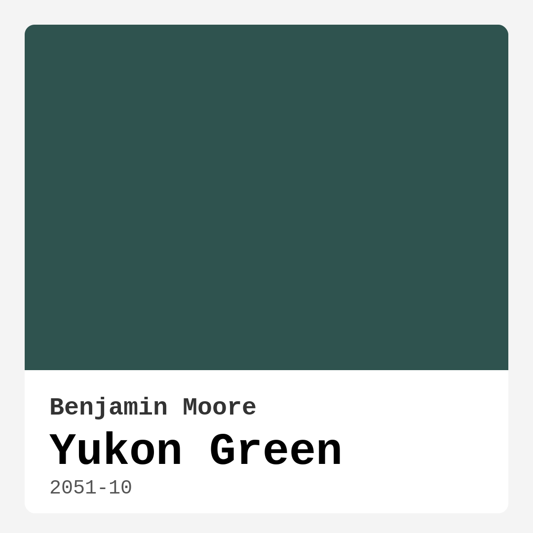
Color Preview & Key Details
| HEX Code | #2F534F |
| RGB | 47, 83, 79 |
| LRV | 8.51% |
| Undertone | Green and Blue |
| Finish Options | Eggshell, Matte, Satin |
If you’re searching for a paint color that brings the serenity of nature indoors while still feeling sophisticated and modern, Benjamin Moore’s Yukon Green (2051-10) might just be your perfect match. This deep, muted green with its subtle blue undertones is like a breath of fresh air—grounding, calming, and effortlessly stylish. Whether you’re looking to transform a living room, bedroom, or home office, this shade has the versatility to adapt to your vision while creating a space that feels both cozy and intentional.
Yukon Green is one of those colors that feels timeless yet fresh. Its LRV (Light Reflectance Value) of 8.51% means it absorbs light rather than reflecting it, making it ideal for creating an intimate, enveloping atmosphere. That said, don’t let its depth intimidate you—this isn’t a harsh or overwhelming dark shade. Instead, it’s a soft, muted green that plays well with natural light, revealing its blue undertones in daylight and taking on a richer, moodier presence in the evening. If you’ve ever wanted a color that shifts subtly throughout the day, this is it.
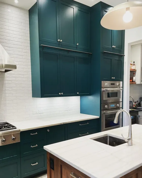
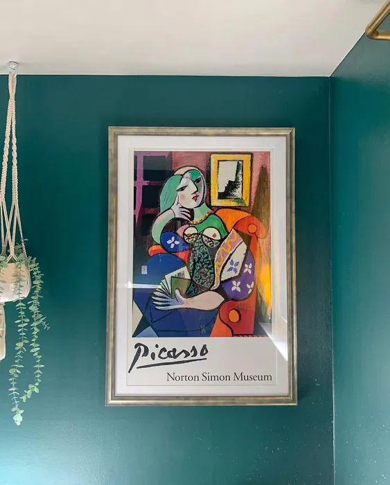
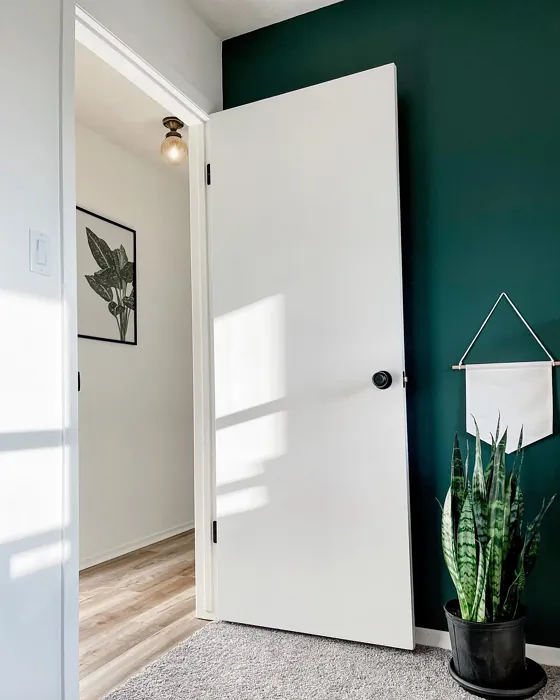
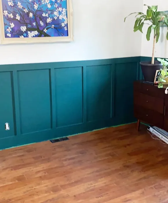
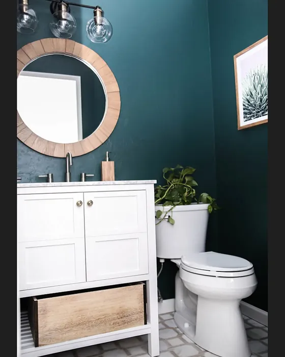
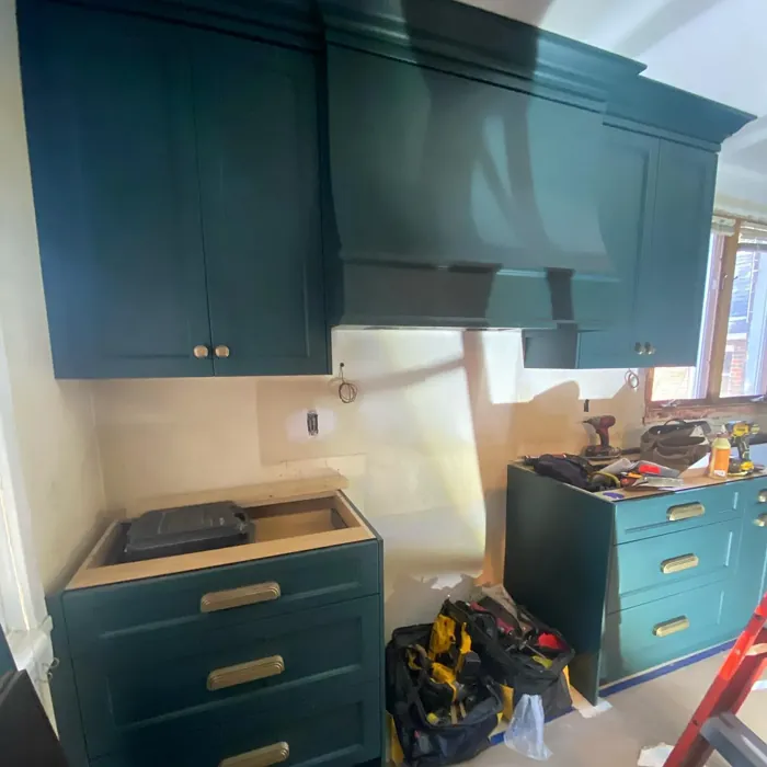
One of the biggest strengths of Yukon Green is its adaptability. It works beautifully in modern, rustic, Scandinavian, and even industrial spaces, proving that a deep green can be just as versatile as a neutral. Pair it with crisp white trim (Benjamin Moore’s White Dove is a classic choice) for a clean, polished look, or let it mingle with natural wood tones and brass fixtures for warmth and texture. If you’re feeling bold, try layering it with deep blues or earthy terracotta accents—the contrast is stunning. And if you’re worried about small spaces, don’t be. While dark colors can sometimes shrink a room, Yukon Green’s muted quality keeps it from feeling oppressive. Use it on an accent wall or balance it with light furniture and airy decor to keep the space feeling open.
Application is a breeze, even if you’re a DIY beginner. The coverage is excellent—you’ll likely only need one or two coats—and it’s touch-up friendly, so minor imperfections won’t be a headache. Plus, it’s available in matte, satin, and eggshell finishes, giving you flexibility depending on the room’s needs. A matte finish will enhance its velvety depth, while satin or eggshell will add a slight sheen, making it easier to clean in high-traffic areas. And speaking of cleaning, this paint is scrubbable and stain-resistant, so it holds up well in dining rooms or home offices where life (and the occasional coffee spill) happens.
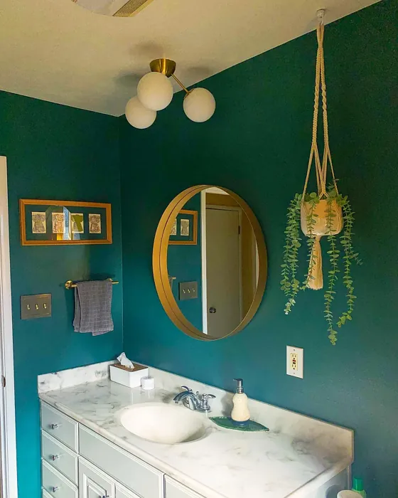
Now, let’s talk mood. Yukon Green isn’t just a color; it’s a feeling. It evokes the quiet calm of a forest, the stillness of a misty morning—perfect for spaces where you want to unwind and recharge. Bedrooms painted in this shade feel like retreats, while living rooms take on a refined, inviting vibe. Home offices benefit from its grounding energy, helping to create focus without feeling sterile. And in a dining room? It sets the stage for intimate dinners and lively conversations, especially when paired with warm wood tones or metallic accents.
Of course, no color is without its considerations. If your room gets very little natural light, Yukon Green will lean into its darker side, so you might want to balance it with plenty of artificial lighting or lighter furnishings. And while the coverage is great, a second coat will ensure the richest, most even finish. Always test a swatch in your space before committing—paint can look different depending on lighting and surrounding colors. But once you see how it transforms your walls, you’ll understand why this shade is such a standout.
For those who love Yukon Green but want something a bit lighter, Benjamin Moore offers softer variations like 2050-20 and 2050-30. And if you’re curious about complementary shades, think creamy whites, warm woods, and even a pop of red (its complementary hue) for a bold contrast. The possibilities are endless.
At the end of the day, Yukon Green is more than just paint—it’s a way to bring depth, character, and tranquility into your home. Whether you’re going for a full-room immersion or just a single statement wall, this color delivers. It’s the kind of shade that makes a space feel thoughtfully designed, effortlessly lived-in, and uniquely yours. So if you’re ready to take the plunge into a darker hue that still feels welcoming, Yukon Green might just be your next favorite color.

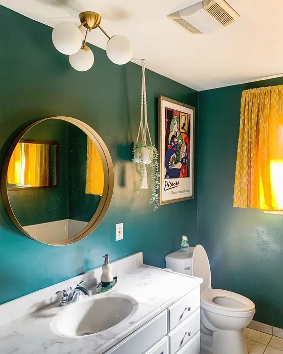
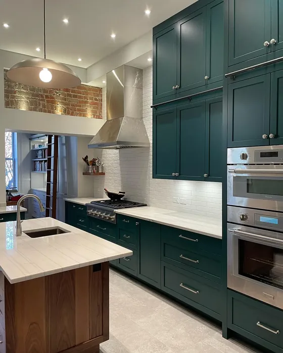
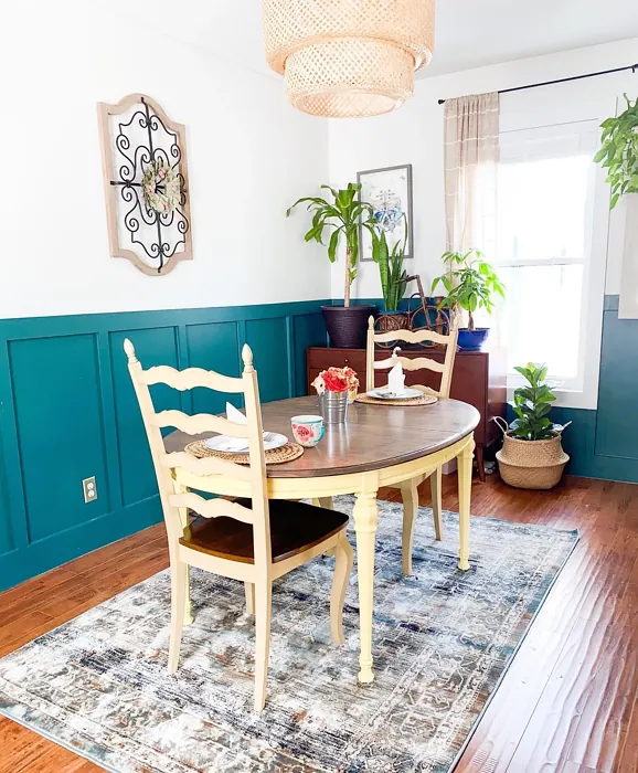
Real Room Photo of Yukon Green 2051-10
Undertones of Yukon Green ?
The undertones of Yukon Green are a key aspect of its character, leaning towards Green and Blue. These subtle underlying hues are what give the color its depth and complexity. For example, a gray with a blue undertone will feel cooler and more modern, while one with a brown undertone will feel warmer and more traditional. It’s essential to test this paint in your home and observe it next to your existing furniture, flooring, and decor to see how these undertones interact and reveal themselves throughout the day.
HEX value: #2F534F
RGB code: 47, 83, 79
Is Yukon Green Cool or Warm?
This color leans more towards the cool spectrum due to its blue undertones, providing a refreshing yet grounded vibe to your space.
Understanding Color Properties and Interior Design Tips
Hue refers to a specific position on the color wheel, measured in degrees from 0 to 360. Each degree represents a different pure color:
- 0° represents red
- 120° represents green
- 240° represents blue
Saturation describes the intensity or purity of a color and is expressed as a percentage:
- At 0%, the color appears completely desaturated—essentially a shade of gray
- At 100%, the color is at its most vivid and vibrant
Lightness indicates how light or dark a color is, also expressed as a percentage:
- 0% lightness results in black
- 100% lightness results in white
Using Warm Colors in Interior Design
Warm hues—such as reds, oranges, yellows, warm beiges, and greiges—are excellent choices for creating inviting and energetic spaces. These colors are particularly well-suited for:
- Kitchens, living rooms, and bathrooms, where warmth enhances comfort and sociability
- Large rooms, where warm tones can help reduce the sense of emptiness and make the space feel more intimate
For example:
- Warm beige shades provide a cozy, inviting atmosphere, ideal for living rooms, bedrooms, and hallways.
- Warm greige (a mix of beige and gray) offers the warmth of beige with the modern appeal of gray, making it a versatile backdrop for dining areas, bedrooms, and living spaces.
However, be mindful when using warm light tones in rooms with limited natural light. These shades may appear muted or even take on an unpleasant yellowish tint. To avoid a dull or flat appearance:
- Add depth by incorporating richer tones like deep greens, charcoal, or chocolate brown
- Use textured elements such as curtains, rugs, or cushions to bring dimension to the space
Pro Tip: Achieving Harmony with Warm and Cool Color Balance
To create a well-balanced and visually interesting interior, mix warm and cool tones strategically. This contrast adds depth and harmony to your design.
- If your walls feature warm hues, introduce cool-colored accents such as blue or green furniture, artwork, or accessories to create contrast.
- For a polished look, consider using a complementary color scheme, which pairs colors opposite each other on the color wheel (e.g., red with green, orange with blue).
This thoughtful mix not only enhances visual appeal but also creates a space that feels both dynamic and cohesive.
Light Temperature Affects on Yukon Green
Natural Light
Natural daylight changes in color temperature as the sun moves across the sky. At sunrise and sunset, the light tends to have a warm, golden tone with a color temperature around 2000 Kelvin (K). As the day progresses and the sun rises higher, the light becomes cooler and more neutral. Around midday, especially when the sky is clear, natural light typically reaches its peak brightness and shifts to a cooler tone, ranging from 5500 to 6500 Kelvin. This midday light is close to what we perceive as pure white or daylight-balanced light.
These shifts in natural light can significantly influence how colors appear in a space, which is why designers often consider both the time of day and the orientation of windows when planning interior color schemes.
Artificial Light
When choosing artificial lighting, pay close attention to the color temperature, measured in Kelvin (K). This determines how warm or cool the light will appear. Lower temperatures, around 2700K, give off a warm, yellow glow often used in living rooms or bedrooms. Higher temperatures, above 5000K, create a cool, bluish light similar to daylight, commonly used in kitchens, offices, or task areas.
Use the slider to see how lighting temperature can affect the appearance of a surface or color throughout a space.


4800K
LRV of Yukon Green
The Light Reflectance Value (LRV) of Yukon Green is 8.51%, which places it in the Dark colors category. This means it does not reflect light. Understanding a paint’s LRV is crucial for predicting how it will look in your space. A higher LRV indicates a lighter color that reflects more light, making rooms feel larger and brighter. A lower LRV signifies a darker color that absorbs more light, creating a cozier, more intimate atmosphere. Always consider the natural and artificial lighting in your room when selecting a paint color based on its LRV.
Detailed Review of Yukon Green
Additional Paint Characteristics
Ideal Rooms
Bedroom, Dining Room, Home Office, Living Room
Decor Styles
Contemporary, Industrial, Modern, Rustic, Scandinavian
Coverage
Good (1–2 Coats), Touch-Up Friendly
Ease of Application
Beginner Friendly, Brush Smooth, Roller-Ready
Washability
Scrubbable, Stain Resistant, Washable
VOC Level
Eco-Certified, Low VOC
Best Use
Accent Wall, Furniture, Interior Walls
Room Suitability
Bedroom, Dining Room, Home Office, Living Room
Tone Tag
Cool, Deep, Earthy, Muted
Finish Type
Matte, Satin
Paint Performance
Easy Touch-Up, High Coverage, Low Odor
Use Cases
Best for Low Light Rooms, Best for Modern Farmhouse, Classic Favorite
Mood
Calm, Cozy, Restful
Trim Pairing
Complements Brass Fixtures, Good with Wood Trim, Pairs with White Dove
Yukon Green is a versatile color that beautifully balances warm and cool undertones, making it suitable for various design aesthetics. Its richness allows it to work wonders in larger spaces, while its muted tone ensures it doesn’t overwhelm small rooms. Whether you’re looking to create an accent wall or envelop an entire room, Yukon Green delivers a sophisticated backdrop that pairs seamlessly with neutral furnishings and natural materials. Additionally, its low reflectivity helps in minimizing imperfections, ensuring a smooth finish. It’s a great choice for those who appreciate depth and character in their interiors, creating a cozy yet modern feel that invites relaxation.
Pros & Cons of 2051-10 Yukon Green
Pros
Cons
Colors that go with Benjamin Moore Yukon Green
FAQ on 2051-10 Yukon Green
Can Yukon Green be used in small spaces?
Absolutely! Yukon Green can work beautifully in small spaces if applied thoughtfully. To avoid making the room feel too dark, consider using it as an accent wall or pairing it with lighter furnishings and decor. The muted tone can add depth without overwhelming the space.
What colors pair well with Yukon Green?
Yukon Green pairs wonderfully with whites and creams for a fresh contrast. It also looks stunning against natural wood tones and complements metallic accents like brass or gold. For a bolder look, consider pairing it with deep blues or earthy terracotta shades.
Comparisons Yukon Green with other colors
Yukon Green 2051-10 vs Dried Thyme SW 6186
| Attribute | Yukon Green 2051-10 | Dried Thyme SW 6186 |
|---|---|---|
| Color Name | Yukon Green 2051-10 | Dried Thyme SW 6186 |
| Color | ||
| Hue | Green | Green |
| Brightness | Dark | Dark |
| RGB | 47, 83, 79 | 123, 128, 112 |
| LRV | 8.51% | 24% |
| Finish Type | Matte, Satin | Eggshell, Satin |
| Finish Options | Eggshell, Matte, Satin | Eggshell, Matte, Satin |
| Ideal Rooms | Bedroom, Dining Room, Home Office, Living Room | Bathroom, Bedroom, Dining Room, Entryway, Home Office, Kitchen, Living Room |
| Decor Styles | Contemporary, Industrial, Modern, Rustic, Scandinavian | Bohemian, Industrial, Minimalist, Modern Farmhouse, Rustic |
| Coverage | Good (1–2 Coats), Touch-Up Friendly | Good (1–2 Coats), Touch-Up Friendly |
| Ease of Application | Beginner Friendly, Brush Smooth, Roller-Ready | Beginner Friendly, Brush Smooth, Roller-Ready |
| Washability | Scrubbable, Stain Resistant, Washable | Washable, Wipeable |
| Room Suitability | Bedroom, Dining Room, Home Office, Living Room | Bathroom, Bedroom, Dining Room, Home Office, Kitchen, Living Room |
| Tone | Cool, Deep, Earthy, Muted | Cool, Earthy, Muted |
| Paint Performance | Easy Touch-Up, High Coverage, Low Odor | Easy Touch-Up, Low Odor, Scuff Resistant |
Yukon Green 2051-10 vs Retreat SW 6207
| Attribute | Yukon Green 2051-10 | Retreat SW 6207 |
|---|---|---|
| Color Name | Yukon Green 2051-10 | Retreat SW 6207 |
| Color | ||
| Hue | Green | Green |
| Brightness | Dark | Dark |
| RGB | 47, 83, 79 | 122, 128, 118 |
| LRV | 8.51% | 30% |
| Finish Type | Matte, Satin | Eggshell, Matte, Satin |
| Finish Options | Eggshell, Matte, Satin | Eggshell, Matte, Satin |
| Ideal Rooms | Bedroom, Dining Room, Home Office, Living Room | Bathroom, Bedroom, Home Office, Kitchen, Living Room |
| Decor Styles | Contemporary, Industrial, Modern, Rustic, Scandinavian | Minimalist, Modern, Rustic, Transitional |
| Coverage | Good (1–2 Coats), Touch-Up Friendly | Good (1–2 Coats), Touch-Up Friendly |
| Ease of Application | Beginner Friendly, Brush Smooth, Roller-Ready | Beginner Friendly, Brush Smooth, Roller-Ready |
| Washability | Scrubbable, Stain Resistant, Washable | Washable, Wipeable |
| Room Suitability | Bedroom, Dining Room, Home Office, Living Room | Bathroom, Bedroom, Home Office, Living Room |
| Tone | Cool, Deep, Earthy, Muted | Cool, Earthy, Muted |
| Paint Performance | Easy Touch-Up, High Coverage, Low Odor | Easy Touch-Up, Low Odor, Scuff Resistant |
Yukon Green 2051-10 vs Rosemary SW 6187
| Attribute | Yukon Green 2051-10 | Rosemary SW 6187 |
|---|---|---|
| Color Name | Yukon Green 2051-10 | Rosemary SW 6187 |
| Color | ||
| Hue | Green | Green |
| Brightness | Dark | Dark |
| RGB | 47, 83, 79 | 100, 105, 92 |
| LRV | 8.51% | 45% |
| Finish Type | Matte, Satin | Eggshell, Matte, Satin |
| Finish Options | Eggshell, Matte, Satin | Eggshell, Matte, Satin |
| Ideal Rooms | Bedroom, Dining Room, Home Office, Living Room | Bedroom, Dining Room, Hallway, Home Office, Living Room |
| Decor Styles | Contemporary, Industrial, Modern, Rustic, Scandinavian | Bohemian, Coastal, Modern Farmhouse, Rustic |
| Coverage | Good (1–2 Coats), Touch-Up Friendly | Good (1–2 Coats), Touch-Up Friendly |
| Ease of Application | Beginner Friendly, Brush Smooth, Roller-Ready | Beginner Friendly, Brush Smooth, Roller-Ready |
| Washability | Scrubbable, Stain Resistant, Washable | Washable, Wipeable |
| Room Suitability | Bedroom, Dining Room, Home Office, Living Room | Bedroom, Dining Room, Home Office, Living Room |
| Tone | Cool, Deep, Earthy, Muted | Earthy, Muted, Warm |
| Paint Performance | Easy Touch-Up, High Coverage, Low Odor | Fade Resistant, Low Odor, Quick Drying, Stain Resistant |
Yukon Green 2051-10 vs Basil SW 6194
| Attribute | Yukon Green 2051-10 | Basil SW 6194 |
|---|---|---|
| Color Name | Yukon Green 2051-10 | Basil SW 6194 |
| Color | ||
| Hue | Green | Green |
| Brightness | Dark | Dark |
| RGB | 47, 83, 79 | 98, 110, 96 |
| LRV | 8.51% | 12% |
| Finish Type | Matte, Satin | Eggshell, Matte, Satin |
| Finish Options | Eggshell, Matte, Satin | Eggshell, Matte, Satin |
| Ideal Rooms | Bedroom, Dining Room, Home Office, Living Room | Bathroom, Bedroom, Dining Room, Home Office, Kitchen, Living Room |
| Decor Styles | Contemporary, Industrial, Modern, Rustic, Scandinavian | Bohemian, Contemporary, Modern Farmhouse, Rustic, Transitional |
| Coverage | Good (1–2 Coats), Touch-Up Friendly | Good (1–2 Coats), Touch-Up Friendly |
| Ease of Application | Beginner Friendly, Brush Smooth, Roller-Ready | Beginner Friendly, Brush Smooth, Fast-Drying, Roller-Ready |
| Washability | Scrubbable, Stain Resistant, Washable | Washable, Wipeable |
| Room Suitability | Bedroom, Dining Room, Home Office, Living Room | Bathroom, Bedroom, Dining Room, Kitchen, Living Room |
| Tone | Cool, Deep, Earthy, Muted | Earthy, Muted, Warm |
| Paint Performance | Easy Touch-Up, High Coverage, Low Odor | Easy Touch-Up, Low Odor, Quick Drying |
Yukon Green 2051-10 vs Artichoke SW 6179
| Attribute | Yukon Green 2051-10 | Artichoke SW 6179 |
|---|---|---|
| Color Name | Yukon Green 2051-10 | Artichoke SW 6179 |
| Color | ||
| Hue | Green | Green |
| Brightness | Dark | Dark |
| RGB | 47, 83, 79 | 127, 130, 102 |
| LRV | 8.51% | 24% |
| Finish Type | Matte, Satin | Eggshell, Matte, Satin |
| Finish Options | Eggshell, Matte, Satin | Eggshell, Matte, Satin |
| Ideal Rooms | Bedroom, Dining Room, Home Office, Living Room | Bedroom, Dining Room, Home Office, Living Room |
| Decor Styles | Contemporary, Industrial, Modern, Rustic, Scandinavian | Eclectic, Modern Farmhouse, Rustic, Transitional |
| Coverage | Good (1–2 Coats), Touch-Up Friendly | Good (1–2 Coats), Touch-Up Friendly |
| Ease of Application | Beginner Friendly, Brush Smooth, Roller-Ready | Beginner Friendly, Brush Smooth, Fast-Drying, Roller-Ready |
| Washability | Scrubbable, Stain Resistant, Washable | Washable, Wipeable |
| Room Suitability | Bedroom, Dining Room, Home Office, Living Room | Bedroom, Dining Room, Home Office, Living Room |
| Tone | Cool, Deep, Earthy, Muted | Earthy, Muted, Warm |
| Paint Performance | Easy Touch-Up, High Coverage, Low Odor | Easy Touch-Up, High Coverage, Low Odor |
Yukon Green 2051-10 vs Shade-Grown SW 6188
| Attribute | Yukon Green 2051-10 | Shade-Grown SW 6188 |
|---|---|---|
| Color Name | Yukon Green 2051-10 | Shade-Grown SW 6188 |
| Color | ||
| Hue | Green | Green |
| Brightness | Dark | Dark |
| RGB | 47, 83, 79 | 78, 81, 71 |
| LRV | 8.51% | 24% |
| Finish Type | Matte, Satin | Eggshell, Satin |
| Finish Options | Eggshell, Matte, Satin | Eggshell, Flat, Satin |
| Ideal Rooms | Bedroom, Dining Room, Home Office, Living Room | Bedroom, Dining Room, Home Office, Living Room |
| Decor Styles | Contemporary, Industrial, Modern, Rustic, Scandinavian | Bohemian, Modern, Rustic, Scandinavian |
| Coverage | Good (1–2 Coats), Touch-Up Friendly | Good (1–2 Coats), Touch-Up Friendly |
| Ease of Application | Beginner Friendly, Brush Smooth, Roller-Ready | Beginner Friendly, Brush Smooth, Fast-Drying, Roller-Ready |
| Washability | Scrubbable, Stain Resistant, Washable | Highly Washable, Washable |
| Room Suitability | Bedroom, Dining Room, Home Office, Living Room | Bedroom, Dining Room, Home Office, Living Room |
| Tone | Cool, Deep, Earthy, Muted | Deep, Earthy, Muted |
| Paint Performance | Easy Touch-Up, High Coverage, Low Odor | Easy Touch-Up, High Coverage, Low Odor, Scuff Resistant |
Yukon Green 2051-10 vs Foxhall Green SW 9184
| Attribute | Yukon Green 2051-10 | Foxhall Green SW 9184 |
|---|---|---|
| Color Name | Yukon Green 2051-10 | Foxhall Green SW 9184 |
| Color | ||
| Hue | Green | Green |
| Brightness | Dark | Dark |
| RGB | 47, 83, 79 | 69, 75, 64 |
| LRV | 8.51% | 12% |
| Finish Type | Matte, Satin | Eggshell, Matte, Satin |
| Finish Options | Eggshell, Matte, Satin | Eggshell, Matte, Satin |
| Ideal Rooms | Bedroom, Dining Room, Home Office, Living Room | Bedroom, Dining Room, Home Office, Living Room |
| Decor Styles | Contemporary, Industrial, Modern, Rustic, Scandinavian | Contemporary, Modern Farmhouse, Rustic, Traditional |
| Coverage | Good (1–2 Coats), Touch-Up Friendly | Good (1–2 Coats), Touch-Up Friendly |
| Ease of Application | Beginner Friendly, Brush Smooth, Roller-Ready | Beginner Friendly, Brush Smooth, Fast-Drying, Roller-Ready |
| Washability | Scrubbable, Stain Resistant, Washable | Washable, Wipeable |
| Room Suitability | Bedroom, Dining Room, Home Office, Living Room | Bedroom, Dining Room, Home Office, Living Room |
| Tone | Cool, Deep, Earthy, Muted | Balanced, Deep, Earthy, Muted |
| Paint Performance | Easy Touch-Up, High Coverage, Low Odor | Easy Touch-Up, Fade Resistant, Low Odor, Quick Drying |
Yukon Green 2051-10 vs Pewter Green SW 6208
| Attribute | Yukon Green 2051-10 | Pewter Green SW 6208 |
|---|---|---|
| Color Name | Yukon Green 2051-10 | Pewter Green SW 6208 |
| Color | ||
| Hue | Green | Green |
| Brightness | Dark | Dark |
| RGB | 47, 83, 79 | 94, 98, 89 |
| LRV | 8.51% | 24% |
| Finish Type | Matte, Satin | Eggshell, Matte, Satin |
| Finish Options | Eggshell, Matte, Satin | Eggshell, Matte, Satin |
| Ideal Rooms | Bedroom, Dining Room, Home Office, Living Room | Bedroom, Dining Room, Entryway, Home Office, Living Room |
| Decor Styles | Contemporary, Industrial, Modern, Rustic, Scandinavian | Contemporary, Modern Farmhouse, Rustic, Scandinavian, Traditional |
| Coverage | Good (1–2 Coats), Touch-Up Friendly | Good (1–2 Coats), Touch-Up Friendly |
| Ease of Application | Beginner Friendly, Brush Smooth, Roller-Ready | Beginner Friendly, Brush Smooth, Fast-Drying, Roller-Ready |
| Washability | Scrubbable, Stain Resistant, Washable | Highly Washable, Washable, Wipeable |
| Room Suitability | Bedroom, Dining Room, Home Office, Living Room | Bathroom, Bedroom, Dining Room, Kitchen, Living Room |
| Tone | Cool, Deep, Earthy, Muted | Balanced, Cool, Earthy, Muted |
| Paint Performance | Easy Touch-Up, High Coverage, Low Odor | Easy Touch-Up, Fade Resistant, Low Odor, Quick Drying |
Yukon Green 2051-10 vs Rookwood Dark Green SW 2816
| Attribute | Yukon Green 2051-10 | Rookwood Dark Green SW 2816 |
|---|---|---|
| Color Name | Yukon Green 2051-10 | Rookwood Dark Green SW 2816 |
| Color | ||
| Hue | Green | Green |
| Brightness | Dark | Dark |
| RGB | 47, 83, 79 | 86, 92, 74 |
| LRV | 8.51% | 6% |
| Finish Type | Matte, Satin | Eggshell, Matte, Satin |
| Finish Options | Eggshell, Matte, Satin | Eggshell, Matte, Satin |
| Ideal Rooms | Bedroom, Dining Room, Home Office, Living Room | Bedroom, Dining Room, Home Office, Kitchen, Living Room |
| Decor Styles | Contemporary, Industrial, Modern, Rustic, Scandinavian | Contemporary, Modern Farmhouse, Rustic, Traditional |
| Coverage | Good (1–2 Coats), Touch-Up Friendly | Good (1–2 Coats), Touch-Up Friendly |
| Ease of Application | Beginner Friendly, Brush Smooth, Roller-Ready | Beginner Friendly, Brush Smooth, Roller-Ready |
| Washability | Scrubbable, Stain Resistant, Washable | Washable, Wipeable |
| Room Suitability | Bedroom, Dining Room, Home Office, Living Room | Bedroom, Dining Room, Home Office, Living Room |
| Tone | Cool, Deep, Earthy, Muted | Deep, Earthy, Warm |
| Paint Performance | Easy Touch-Up, High Coverage, Low Odor | Easy Touch-Up, High Coverage, Low Odor, Scuff Resistant |
Yukon Green 2051-10 vs Ripe Olive SW 6209
| Attribute | Yukon Green 2051-10 | Ripe Olive SW 6209 |
|---|---|---|
| Color Name | Yukon Green 2051-10 | Ripe Olive SW 6209 |
| Color | ||
| Hue | Green | Green |
| Brightness | Dark | Dark |
| RGB | 47, 83, 79 | 68, 72, 61 |
| LRV | 8.51% | 15% |
| Finish Type | Matte, Satin | Eggshell, Matte |
| Finish Options | Eggshell, Matte, Satin | Eggshell, Matte, Satin |
| Ideal Rooms | Bedroom, Dining Room, Home Office, Living Room | Bedroom, Dining Room, Home Office, Living Room |
| Decor Styles | Contemporary, Industrial, Modern, Rustic, Scandinavian | Bohemian, Industrial, Modern Farmhouse, Rustic |
| Coverage | Good (1–2 Coats), Touch-Up Friendly | Good (1–2 Coats) |
| Ease of Application | Beginner Friendly, Brush Smooth, Roller-Ready | Beginner Friendly, Brush Smooth, Roller-Ready |
| Washability | Scrubbable, Stain Resistant, Washable | Highly Washable, Washable |
| Room Suitability | Bedroom, Dining Room, Home Office, Living Room | Bedroom, Dining Room, Home Office, Living Room |
| Tone | Cool, Deep, Earthy, Muted | Deep, Earthy, Muted |
| Paint Performance | Easy Touch-Up, High Coverage, Low Odor | Easy Touch-Up, High Coverage, Low Odor |
Official Page of Benjamin Moore Yukon Green 2051-10