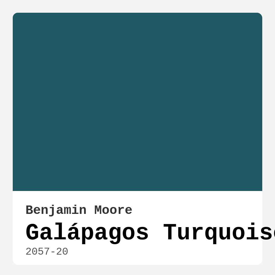
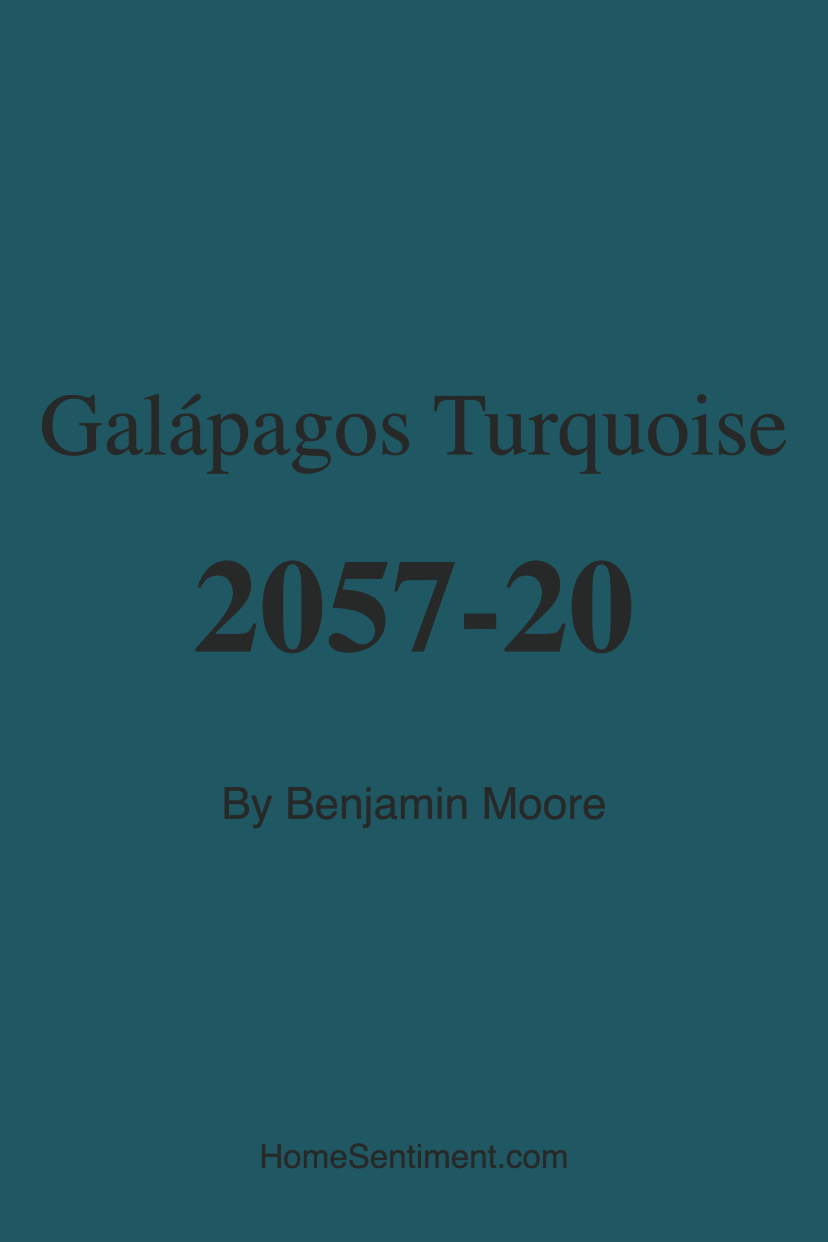
Color Preview & Key Details
| HEX Code | #1F5763 |
| RGB | 31, 87, 99 |
| LRV | 9.45% |
| Undertone | Blue |
| Finish Options | Eggshell, Matte, Satin |
If you’re looking for a paint color that effortlessly blends the tranquility of the ocean with the richness of a tropical paradise, Benjamin Moore’s Galápagos Turquoise (2057-20) might just be your perfect match. This deep, moody blue-green hue is like a breath of fresh air—calming yet full of character, making it an ideal choice for anyone wanting to infuse their space with a sense of serenity and sophistication. Whether you’re dreaming of a coastal-inspired living room, a spa-like bathroom, or a cozy bedroom retreat, this color has the versatility to bring your vision to life.
Galápagos Turquoise is one of those shades that changes with the light, revealing different dimensions throughout the day. In natural sunlight, it feels vibrant and alive, almost as if you’re standing by the water’s edge. But as the light fades, it takes on a deeper, more intimate quality—perfect for creating a snug, inviting atmosphere. With an LRV (Light Reflectance Value) of just 9.45%, this is a dark color that absorbs rather than reflects light, so it works best in rooms with ample natural or artificial lighting. If your space is on the smaller side, don’t let that deter you. Pairing it with crisp white trim or light-colored furniture can keep the room feeling open and airy.
One of the standout features of this paint is its incredible versatility. It plays well with a variety of decor styles—think coastal, modern, bohemian, or even eclectic. If you love the idea of a tropical escape, pair it with rattan furniture, lush greenery, and warm wood tones. For a more contemporary look, combine it with sleek metallic finishes like brass or chrome. And if you’re going for a minimalist vibe, let the color speak for itself by keeping the rest of the decor clean and understated. The blue undertones in Galápagos Turquoise give it a cool, refreshing feel, making it an excellent choice for balancing warmer elements in a room.
When it comes to application, this paint is a dream to work with. It’s beginner-friendly, roller-ready, and brush-smooth, so even if you’re new to DIY painting, you’ll get professional-looking results. Coverage is excellent—one or two coats should do the trick—and it’s touch-up friendly, which is a lifesaver if you have kids or pets. The finish options (matte, eggshell, or satin) give you flexibility depending on the room’s function. Eggshell and satin are particularly great for high-traffic areas like living rooms or hallways because they’re durable and easy to clean. Plus, with low VOC levels, it’s an eco-conscious choice that won’t overwhelm your home with harsh fumes.
Now, let’s talk about pairing. This color shines when complemented with the right accents. White Dove trim is a classic choice that keeps things crisp and fresh, while brass fixtures add a touch of warmth and elegance. If you want to lean into the coastal vibe, seagrass rugs, driftwood decor, and soft linen textiles will enhance the serene feel. For a bolder contrast, consider deep red or coral accents—these complementary hues make the turquoise pop without overwhelming the space. And if you’re not ready to commit to painting an entire room, try using Galápagos Turquoise on an accent wall or even a piece of furniture for a striking focal point.
Of course, no color is without its considerations. Because it’s on the darker side, Galápagos Turquoise can feel a bit heavy in rooms with little natural light. If your space lacks windows, you might want to test a sample first or balance it with plenty of light-reflecting surfaces like mirrors or glossy finishes. And while it’s a versatile shade, you’ll want to be intentional about your decor choices—clashing undertones or overly busy patterns could throw off the harmony. But with a little planning, this color can transform your space into a sanctuary that feels both stylish and soothing.
So, is Galápagos Turquoise right for your home? If you’re drawn to colors that evoke nature, depth, and a sense of calm, then absolutely. It’s a hue that invites relaxation while still making a statement—a rare balance that few colors achieve. Whether you’re refreshing a single room or reimagining your entire home, this shade has the power to create a space that feels uniquely yours. So grab a brush, trust your instincts, and get ready to fall in love with your walls all over again.
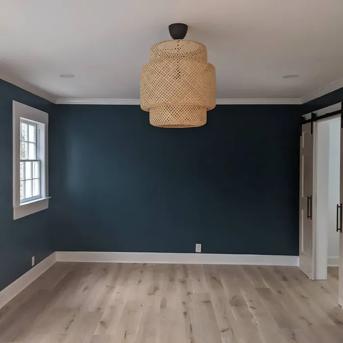
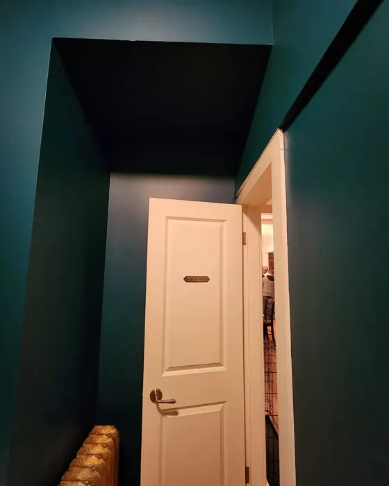
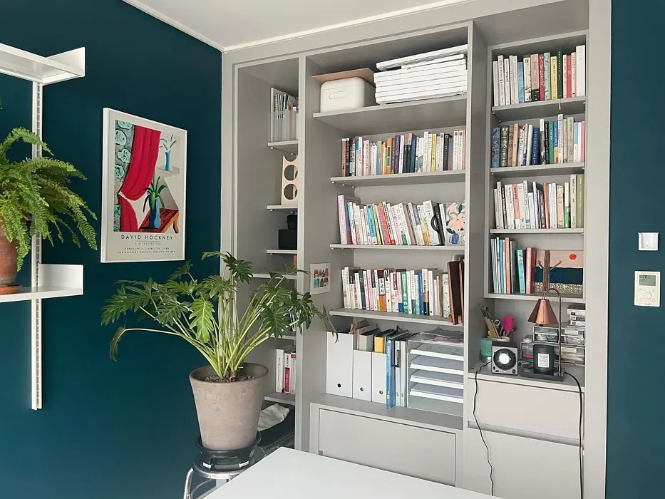
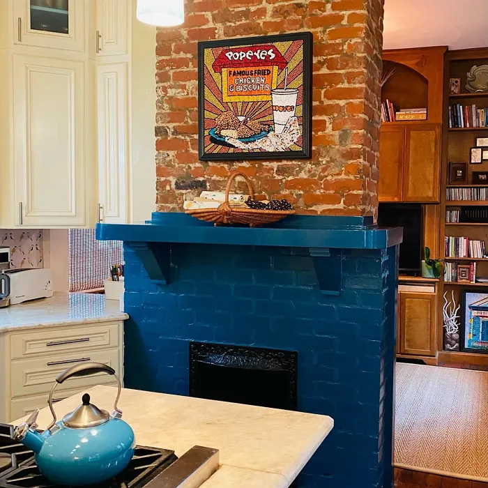
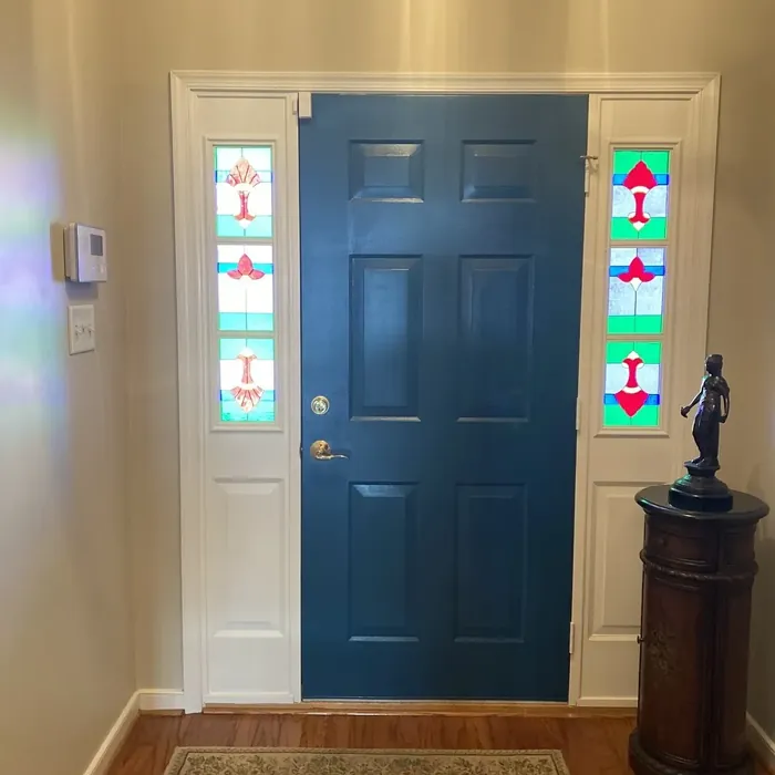
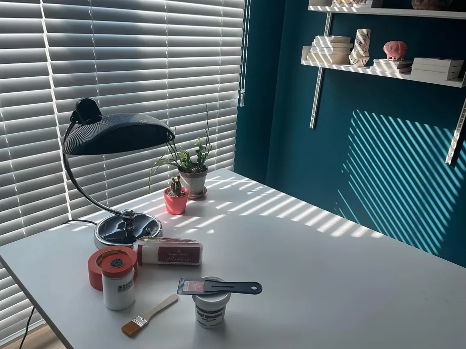
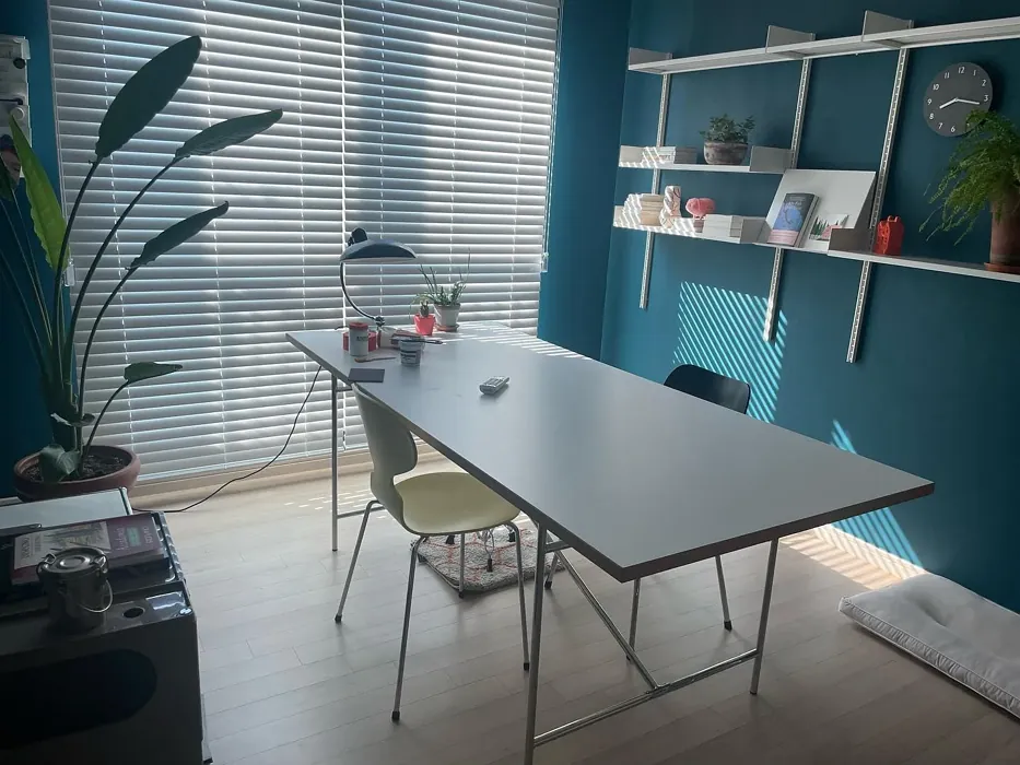
Real Room Photo of Galápagos Turquoise 2057-20
Undertones of Galápagos Turquoise ?
The undertones of Galápagos Turquoise are a key aspect of its character, leaning towards Blue. These subtle underlying hues are what give the color its depth and complexity. For example, a gray with a blue undertone will feel cooler and more modern, while one with a brown undertone will feel warmer and more traditional. It’s essential to test this paint in your home and observe it next to your existing furniture, flooring, and decor to see how these undertones interact and reveal themselves throughout the day.
HEX value: #1F5763
RGB code: 31, 87, 99
Is Galápagos Turquoise Cool or Warm?
Galápagos Turquoise is predominantly a cool color, making it perfect for creating refreshing spaces. The coolness of the hue can balance warmer tones found in furniture or decor, providing a harmonious backdrop that feels both peaceful and invigorating.
Understanding Color Properties and Interior Design Tips
Hue refers to a specific position on the color wheel, measured in degrees from 0 to 360. Each degree represents a different pure color:
- 0° represents red
- 120° represents green
- 240° represents blue
Saturation describes the intensity or purity of a color and is expressed as a percentage:
- At 0%, the color appears completely desaturated—essentially a shade of gray
- At 100%, the color is at its most vivid and vibrant
Lightness indicates how light or dark a color is, also expressed as a percentage:
- 0% lightness results in black
- 100% lightness results in white
Using Warm Colors in Interior Design
Warm hues—such as reds, oranges, yellows, warm beiges, and greiges—are excellent choices for creating inviting and energetic spaces. These colors are particularly well-suited for:
- Kitchens, living rooms, and bathrooms, where warmth enhances comfort and sociability
- Large rooms, where warm tones can help reduce the sense of emptiness and make the space feel more intimate
For example:
- Warm beige shades provide a cozy, inviting atmosphere, ideal for living rooms, bedrooms, and hallways.
- Warm greige (a mix of beige and gray) offers the warmth of beige with the modern appeal of gray, making it a versatile backdrop for dining areas, bedrooms, and living spaces.
However, be mindful when using warm light tones in rooms with limited natural light. These shades may appear muted or even take on an unpleasant yellowish tint. To avoid a dull or flat appearance:
- Add depth by incorporating richer tones like deep greens, charcoal, or chocolate brown
- Use textured elements such as curtains, rugs, or cushions to bring dimension to the space
Pro Tip: Achieving Harmony with Warm and Cool Color Balance
To create a well-balanced and visually interesting interior, mix warm and cool tones strategically. This contrast adds depth and harmony to your design.
- If your walls feature warm hues, introduce cool-colored accents such as blue or green furniture, artwork, or accessories to create contrast.
- For a polished look, consider using a complementary color scheme, which pairs colors opposite each other on the color wheel (e.g., red with green, orange with blue).
This thoughtful mix not only enhances visual appeal but also creates a space that feels both dynamic and cohesive.
Light Temperature Affects on Galápagos Turquoise
Natural Light
Natural daylight changes in color temperature as the sun moves across the sky. At sunrise and sunset, the light tends to have a warm, golden tone with a color temperature around 2000 Kelvin (K). As the day progresses and the sun rises higher, the light becomes cooler and more neutral. Around midday, especially when the sky is clear, natural light typically reaches its peak brightness and shifts to a cooler tone, ranging from 5500 to 6500 Kelvin. This midday light is close to what we perceive as pure white or daylight-balanced light.
These shifts in natural light can significantly influence how colors appear in a space, which is why designers often consider both the time of day and the orientation of windows when planning interior color schemes.
Artificial Light
When choosing artificial lighting, pay close attention to the color temperature, measured in Kelvin (K). This determines how warm or cool the light will appear. Lower temperatures, around 2700K, give off a warm, yellow glow often used in living rooms or bedrooms. Higher temperatures, above 5000K, create a cool, bluish light similar to daylight, commonly used in kitchens, offices, or task areas.
Use the slider to see how lighting temperature can affect the appearance of a surface or color throughout a space.


4800K
LRV of Galápagos Turquoise
The Light Reflectance Value (LRV) of Galápagos Turquoise is 9.45%, which places it in the Dark colors category. This means it does not reflect light. Understanding a paint’s LRV is crucial for predicting how it will look in your space. A higher LRV indicates a lighter color that reflects more light, making rooms feel larger and brighter. A lower LRV signifies a darker color that absorbs more light, creating a cozier, more intimate atmosphere. Always consider the natural and artificial lighting in your room when selecting a paint color based on its LRV.
Detailed Review of Galápagos Turquoise
Additional Paint Characteristics
Ideal Rooms
Bathroom, Bedroom, Home Office, Living Room, Nursery
Decor Styles
Bohemian, Coastal, Eclectic, Modern, Tropical
Coverage
Good (1–2 Coats), Touch-Up Friendly
Ease of Application
Beginner Friendly, Brush Smooth, Roller-Ready
Washability
Highly Washable, Washable
VOC Level
Eco-Certified, Low VOC
Best Use
Accent Wall, Furniture, Interior Walls
Room Suitability
Bathroom, Bedroom, Home Office, Living Room, Nursery
Tone Tag
Cool, Deep, Muted
Finish Type
Eggshell, Satin
Paint Performance
Fade Resistant, Low Odor, Quick Drying, Scuff Resistant
Use Cases
Best for Rentals, Designer Favorite, Trending in 2025
Mood
Calm, Inviting, Restful
Trim Pairing
Complements Brass Fixtures, Good with Wood Trim, Pairs with White Dove
Galápagos Turquoise is more than just a color; it’s an experience. When applied, this paint offers a stunning depth that beautifully complements natural light, creating an inviting and open atmosphere. It works exceptionally well in spaces where you want to evoke calmness, like bedrooms or reading nooks. The rich undertones allow it to pair seamlessly with both lighter and darker furnishings, enhancing the overall aesthetic of your room. Whether you’re aiming for a coastal retreat or a modern sanctuary, this paint is a versatile choice that delivers a sophisticated edge while keeping things relaxed. Its application is a breeze; even beginners will find it manageable, resulting in a professional-looking finish without the fuss.
Pros & Cons of 2057-20 Galápagos Turquoise
Pros
Cons
Colors that go with Benjamin Moore Galápagos Turquoise
FAQ on 2057-20 Galápagos Turquoise
Can Galápagos Turquoise be used in small spaces?
Absolutely! Galápagos Turquoise can actually create an illusion of depth and space, making small rooms feel larger and more airy. Just be mindful of the lighting; natural light will enhance its vibrancy, while dimmer settings may darken the hue. Consider pairing it with lighter accents to maximize its effect.
What finishes work best with Galápagos Turquoise?
For Galápagos Turquoise, finishes like eggshell or satin offer a beautiful sheen that enhances the color’s depth while remaining practical for everyday use. These finishes are easy to clean and maintain, making them perfect for any room, especially high-traffic areas like living rooms or dining spaces.
Comparisons Galápagos Turquoise with other colors
Galápagos Turquoise 2057-20 vs Naval SW 6244
| Attribute | Galápagos Turquoise 2057-20 | Naval SW 6244 |
|---|---|---|
| Color Name | Galápagos Turquoise 2057-20 | Naval SW 6244 |
| Color | ||
| Hue | Blue | Blue |
| Brightness | Dark | Dark |
| RGB | 31, 87, 99 | 47, 61, 76 |
| LRV | 9.45% | 4% |
| Finish Type | Eggshell, Satin | Matte, Satin, Semi-Gloss |
| Finish Options | Eggshell, Matte, Satin | Matte, Satin, Semi-Gloss |
| Ideal Rooms | Bathroom, Bedroom, Home Office, Living Room, Nursery | Bedroom, Dining Room, Hallway, Home Office, Living Room |
| Decor Styles | Bohemian, Coastal, Eclectic, Modern, Tropical | Coastal, Industrial, Minimalist, Modern, Traditional |
| Coverage | Good (1–2 Coats), Touch-Up Friendly | Good (1–2 Coats), Self-Priming |
| Ease of Application | Beginner Friendly, Brush Smooth, Roller-Ready | Beginner Friendly, Brush Smooth, Roller-Ready |
| Washability | Highly Washable, Washable | Highly Washable, Washable |
| Room Suitability | Bathroom, Bedroom, Home Office, Living Room, Nursery | Bedroom, Dining Room, Entryway, Home Office, Living Room |
| Tone | Cool, Deep, Muted | Cool, Deep, Moody |
| Paint Performance | Fade Resistant, Low Odor, Quick Drying, Scuff Resistant | Easy Touch-Up, High Coverage, Low Odor, Scuff Resistant |
Galápagos Turquoise 2057-20 vs Sea Serpent SW 7615
| Attribute | Galápagos Turquoise 2057-20 | Sea Serpent SW 7615 |
|---|---|---|
| Color Name | Galápagos Turquoise 2057-20 | Sea Serpent SW 7615 |
| Color | ||
| Hue | Blue | Blue |
| Brightness | Dark | Dark |
| RGB | 31, 87, 99 | 62, 75, 84 |
| LRV | 9.45% | 12% |
| Finish Type | Eggshell, Satin | Eggshell, Matte, Satin |
| Finish Options | Eggshell, Matte, Satin | Eggshell, Matte, Satin |
| Ideal Rooms | Bathroom, Bedroom, Home Office, Living Room, Nursery | Bathroom, Bedroom, Home Office, Living Room |
| Decor Styles | Bohemian, Coastal, Eclectic, Modern, Tropical | Coastal, Farmhouse, Industrial, Modern |
| Coverage | Good (1–2 Coats), Touch-Up Friendly | Good (1–2 Coats), Touch-Up Friendly |
| Ease of Application | Beginner Friendly, Brush Smooth, Roller-Ready | Beginner Friendly, Brush Smooth, Roller-Ready |
| Washability | Highly Washable, Washable | Highly Washable, Washable |
| Room Suitability | Bathroom, Bedroom, Home Office, Living Room, Nursery | Bathroom, Bedroom, Home Office, Living Room |
| Tone | Cool, Deep, Muted | Cool, Deep, Moody |
| Paint Performance | Fade Resistant, Low Odor, Quick Drying, Scuff Resistant | Easy Touch-Up, High Coverage, Low Odor |
Galápagos Turquoise 2057-20 vs Rain Cloud SW 9639
| Attribute | Galápagos Turquoise 2057-20 | Rain Cloud SW 9639 |
|---|---|---|
| Color Name | Galápagos Turquoise 2057-20 | Rain Cloud SW 9639 |
| Color | ||
| Hue | Blue | Blue |
| Brightness | Dark | Dark |
| RGB | 31, 87, 99 | 83, 97, 104 |
| LRV | 9.45% | 30% |
| Finish Type | Eggshell, Satin | Eggshell, Matte, Satin |
| Finish Options | Eggshell, Matte, Satin | Eggshell, Matte, Satin |
| Ideal Rooms | Bathroom, Bedroom, Home Office, Living Room, Nursery | Bedroom, Dining Room, Home Office, Living Room |
| Decor Styles | Bohemian, Coastal, Eclectic, Modern, Tropical | Coastal, Contemporary, Minimalist, Scandinavian |
| Coverage | Good (1–2 Coats), Touch-Up Friendly | Good (1–2 Coats), Touch-Up Friendly |
| Ease of Application | Beginner Friendly, Brush Smooth, Roller-Ready | Beginner Friendly, Brush Smooth, Roller-Ready |
| Washability | Highly Washable, Washable | Highly Washable, Washable |
| Room Suitability | Bathroom, Bedroom, Home Office, Living Room, Nursery | Bedroom, Home Office, Living Room |
| Tone | Cool, Deep, Muted | Balanced, Cool, Muted |
| Paint Performance | Fade Resistant, Low Odor, Quick Drying, Scuff Resistant | Easy Touch-Up, Fade Resistant, Low Odor |
Galápagos Turquoise 2057-20 vs Indigo Batik SW 7602
| Attribute | Galápagos Turquoise 2057-20 | Indigo Batik SW 7602 |
|---|---|---|
| Color Name | Galápagos Turquoise 2057-20 | Indigo Batik SW 7602 |
| Color | ||
| Hue | Blue | Blue |
| Brightness | Dark | Dark |
| RGB | 31, 87, 99 | 62, 80, 99 |
| LRV | 9.45% | 10% |
| Finish Type | Eggshell, Satin | Matte, Satin |
| Finish Options | Eggshell, Matte, Satin | Eggshell, Flat, Matte, Satin |
| Ideal Rooms | Bathroom, Bedroom, Home Office, Living Room, Nursery | Bedroom, Dining Room, Home Office, Living Room |
| Decor Styles | Bohemian, Coastal, Eclectic, Modern, Tropical | Bohemian, Coastal, Contemporary, Modern |
| Coverage | Good (1–2 Coats), Touch-Up Friendly | Good (1–2 Coats), Touch-Up Friendly |
| Ease of Application | Beginner Friendly, Brush Smooth, Roller-Ready | Brush Smooth, Fast-Drying, Roller-Ready |
| Washability | Highly Washable, Washable | Scrubbable, Washable, Wipeable |
| Room Suitability | Bathroom, Bedroom, Home Office, Living Room, Nursery | Bedroom, Dining Room, Home Office, Living Room |
| Tone | Cool, Deep, Muted | Cool, Deep, Moody |
| Paint Performance | Fade Resistant, Low Odor, Quick Drying, Scuff Resistant | Easy Touch-Up, High Coverage, Low Odor, Quick Drying |
Galápagos Turquoise 2057-20 vs Sea Mariner SW 9640
| Attribute | Galápagos Turquoise 2057-20 | Sea Mariner SW 9640 |
|---|---|---|
| Color Name | Galápagos Turquoise 2057-20 | Sea Mariner SW 9640 |
| Color | ||
| Hue | Blue | Blue |
| Brightness | Dark | Dark |
| RGB | 31, 87, 99 | 67, 74, 84 |
| LRV | 9.45% | 6% |
| Finish Type | Eggshell, Satin | Eggshell, Matte, Satin |
| Finish Options | Eggshell, Matte, Satin | Eggshell, Matte, Satin |
| Ideal Rooms | Bathroom, Bedroom, Home Office, Living Room, Nursery | Bedroom, Dining Room, Hallway, Home Office, Living Room |
| Decor Styles | Bohemian, Coastal, Eclectic, Modern, Tropical | Coastal, Industrial, Minimalist, Modern |
| Coverage | Good (1–2 Coats), Touch-Up Friendly | Good (1–2 Coats) |
| Ease of Application | Beginner Friendly, Brush Smooth, Roller-Ready | Beginner Friendly, Brush Smooth, Roller-Ready |
| Washability | Highly Washable, Washable | Scrubbable, Washable |
| Room Suitability | Bathroom, Bedroom, Home Office, Living Room, Nursery | Bedroom, Dining Room, Home Office, Living Room |
| Tone | Cool, Deep, Muted | Cool, Deep, Moody |
| Paint Performance | Fade Resistant, Low Odor, Quick Drying, Scuff Resistant | Easy Touch-Up, Low Odor, Quick Drying |
Galápagos Turquoise 2057-20 vs Still Water SW 6223
| Attribute | Galápagos Turquoise 2057-20 | Still Water SW 6223 |
|---|---|---|
| Color Name | Galápagos Turquoise 2057-20 | Still Water SW 6223 |
| Color | ||
| Hue | Blue | Blue |
| Brightness | Dark | Dark |
| RGB | 31, 87, 99 | 74, 93, 95 |
| LRV | 9.45% | 48% |
| Finish Type | Eggshell, Satin | Eggshell, Matte, Satin |
| Finish Options | Eggshell, Matte, Satin | Eggshell, Matte, Satin |
| Ideal Rooms | Bathroom, Bedroom, Home Office, Living Room, Nursery | Bedroom, Dining Room, Home Office, Living Room, Nursery |
| Decor Styles | Bohemian, Coastal, Eclectic, Modern, Tropical | Coastal, Contemporary, Farmhouse, Modern, Rustic |
| Coverage | Good (1–2 Coats), Touch-Up Friendly | Good (1–2 Coats), Touch-Up Friendly |
| Ease of Application | Beginner Friendly, Brush Smooth, Roller-Ready | Beginner Friendly, Brush Smooth, Roller-Ready |
| Washability | Highly Washable, Washable | Highly Washable, Washable |
| Room Suitability | Bathroom, Bedroom, Home Office, Living Room, Nursery | Bedroom, Dining Room, Home Office, Living Room |
| Tone | Cool, Deep, Muted | Cool, Earthy, Muted |
| Paint Performance | Fade Resistant, Low Odor, Quick Drying, Scuff Resistant | Easy Touch-Up, Fade Resistant, Low Odor |
Galápagos Turquoise 2057-20 vs Waterloo SW 9141
| Attribute | Galápagos Turquoise 2057-20 | Waterloo SW 9141 |
|---|---|---|
| Color Name | Galápagos Turquoise 2057-20 | Waterloo SW 9141 |
| Color | ||
| Hue | Blue | Blue |
| Brightness | Dark | Dark |
| RGB | 31, 87, 99 | 83, 104, 114 |
| LRV | 9.45% | 12% |
| Finish Type | Eggshell, Satin | Matte, Satin |
| Finish Options | Eggshell, Matte, Satin | Matte, Satin, Semi-Gloss |
| Ideal Rooms | Bathroom, Bedroom, Home Office, Living Room, Nursery | Bedroom, Dining Room, Hallway, Home Office, Living Room |
| Decor Styles | Bohemian, Coastal, Eclectic, Modern, Tropical | Coastal, Industrial, Modern, Rustic |
| Coverage | Good (1–2 Coats), Touch-Up Friendly | Good (1–2 Coats), Touch-Up Friendly |
| Ease of Application | Beginner Friendly, Brush Smooth, Roller-Ready | Brush Smooth, Fast-Drying, Roller-Ready |
| Washability | Highly Washable, Washable | Scrubbable, Washable |
| Room Suitability | Bathroom, Bedroom, Home Office, Living Room, Nursery | Bedroom, Dining Room, Home Office, Living Room |
| Tone | Cool, Deep, Muted | Balanced, Cool, Muted |
| Paint Performance | Fade Resistant, Low Odor, Quick Drying, Scuff Resistant | Easy Touch-Up, Fade Resistant, Low Odor, Quick Drying |
Galápagos Turquoise 2057-20 vs Smoky Blue SW 7604
| Attribute | Galápagos Turquoise 2057-20 | Smoky Blue SW 7604 |
|---|---|---|
| Color Name | Galápagos Turquoise 2057-20 | Smoky Blue SW 7604 |
| Color | ||
| Hue | Blue | Blue |
| Brightness | Dark | Dark |
| RGB | 31, 87, 99 | 89, 110, 121 |
| LRV | 9.45% | 15% |
| Finish Type | Eggshell, Satin | Eggshell, Matte, Satin |
| Finish Options | Eggshell, Matte, Satin | Eggshell, Matte, Satin |
| Ideal Rooms | Bathroom, Bedroom, Home Office, Living Room, Nursery | Bathroom, Bedroom, Home Office, Kitchen, Living Room |
| Decor Styles | Bohemian, Coastal, Eclectic, Modern, Tropical | Coastal, Modern, Scandinavian, Transitional |
| Coverage | Good (1–2 Coats), Touch-Up Friendly | Good (1–2 Coats), Touch-Up Friendly |
| Ease of Application | Beginner Friendly, Brush Smooth, Roller-Ready | Beginner Friendly, Brush Smooth, Roller-Ready |
| Washability | Highly Washable, Washable | Highly Washable, Washable |
| Room Suitability | Bathroom, Bedroom, Home Office, Living Room, Nursery | Bathroom, Bedroom, Home Office, Living Room |
| Tone | Cool, Deep, Muted | Cool, Dusty, Muted |
| Paint Performance | Fade Resistant, Low Odor, Quick Drying, Scuff Resistant | High Coverage, Low Odor, Quick Drying |
Galápagos Turquoise 2057-20 vs Needlepoint Navy SW 0032
| Attribute | Galápagos Turquoise 2057-20 | Needlepoint Navy SW 0032 |
|---|---|---|
| Color Name | Galápagos Turquoise 2057-20 | Needlepoint Navy SW 0032 |
| Color | ||
| Hue | Blue | Blue |
| Brightness | Dark | Dark |
| RGB | 31, 87, 99 | 84, 102, 112 |
| LRV | 9.45% | 4% |
| Finish Type | Eggshell, Satin | Matte, Satin, Semi-Gloss |
| Finish Options | Eggshell, Matte, Satin | Matte, Satin, Semi-Gloss |
| Ideal Rooms | Bathroom, Bedroom, Home Office, Living Room, Nursery | Bedroom, Dining Room, Entryway, Home Office, Living Room |
| Decor Styles | Bohemian, Coastal, Eclectic, Modern, Tropical | Coastal, Contemporary, Modern Farmhouse, Nautical, Traditional |
| Coverage | Good (1–2 Coats), Touch-Up Friendly | Good (1–2 Coats), Touch-Up Friendly |
| Ease of Application | Beginner Friendly, Brush Smooth, Roller-Ready | Beginner Friendly, Brush Smooth, Fast-Drying, Roller-Ready |
| Washability | Highly Washable, Washable | Scrubbable, Washable |
| Room Suitability | Bathroom, Bedroom, Home Office, Living Room, Nursery | Bedroom, Dining Room, Home Office, Living Room |
| Tone | Cool, Deep, Muted | Cool, Deep, Muted |
| Paint Performance | Fade Resistant, Low Odor, Quick Drying, Scuff Resistant | Easy Touch-Up, High Coverage, Low Odor, Quick Drying, Stain Resistant |
Galápagos Turquoise 2057-20 vs Riverway SW 6222
| Attribute | Galápagos Turquoise 2057-20 | Riverway SW 6222 |
|---|---|---|
| Color Name | Galápagos Turquoise 2057-20 | Riverway SW 6222 |
| Color | ||
| Hue | Blue | Blue |
| Brightness | Dark | Dark |
| RGB | 31, 87, 99 | 93, 114, 116 |
| LRV | 9.45% | 24% |
| Finish Type | Eggshell, Satin | Eggshell, Satin |
| Finish Options | Eggshell, Matte, Satin | Eggshell, Matte, Satin |
| Ideal Rooms | Bathroom, Bedroom, Home Office, Living Room, Nursery | Bathroom, Bedroom, Dining Room, Home Office, Living Room |
| Decor Styles | Bohemian, Coastal, Eclectic, Modern, Tropical | Coastal, Contemporary, Eclectic, Modern, Rustic |
| Coverage | Good (1–2 Coats), Touch-Up Friendly | Good (1–2 Coats), Touch-Up Friendly |
| Ease of Application | Beginner Friendly, Brush Smooth, Roller-Ready | Beginner Friendly, Brush Smooth, Fast-Drying, Low Splatter, Roller-Ready |
| Washability | Highly Washable, Washable | Highly Washable, Washable |
| Room Suitability | Bathroom, Bedroom, Home Office, Living Room, Nursery | Bathroom, Bedroom, Home Office, Living Room |
| Tone | Cool, Deep, Muted | Balanced, Cool, Muted |
| Paint Performance | Fade Resistant, Low Odor, Quick Drying, Scuff Resistant | Easy Touch-Up, High Coverage, Low Odor, Quick Drying |
Official Page of Benjamin Moore Galápagos Turquoise 2057-20