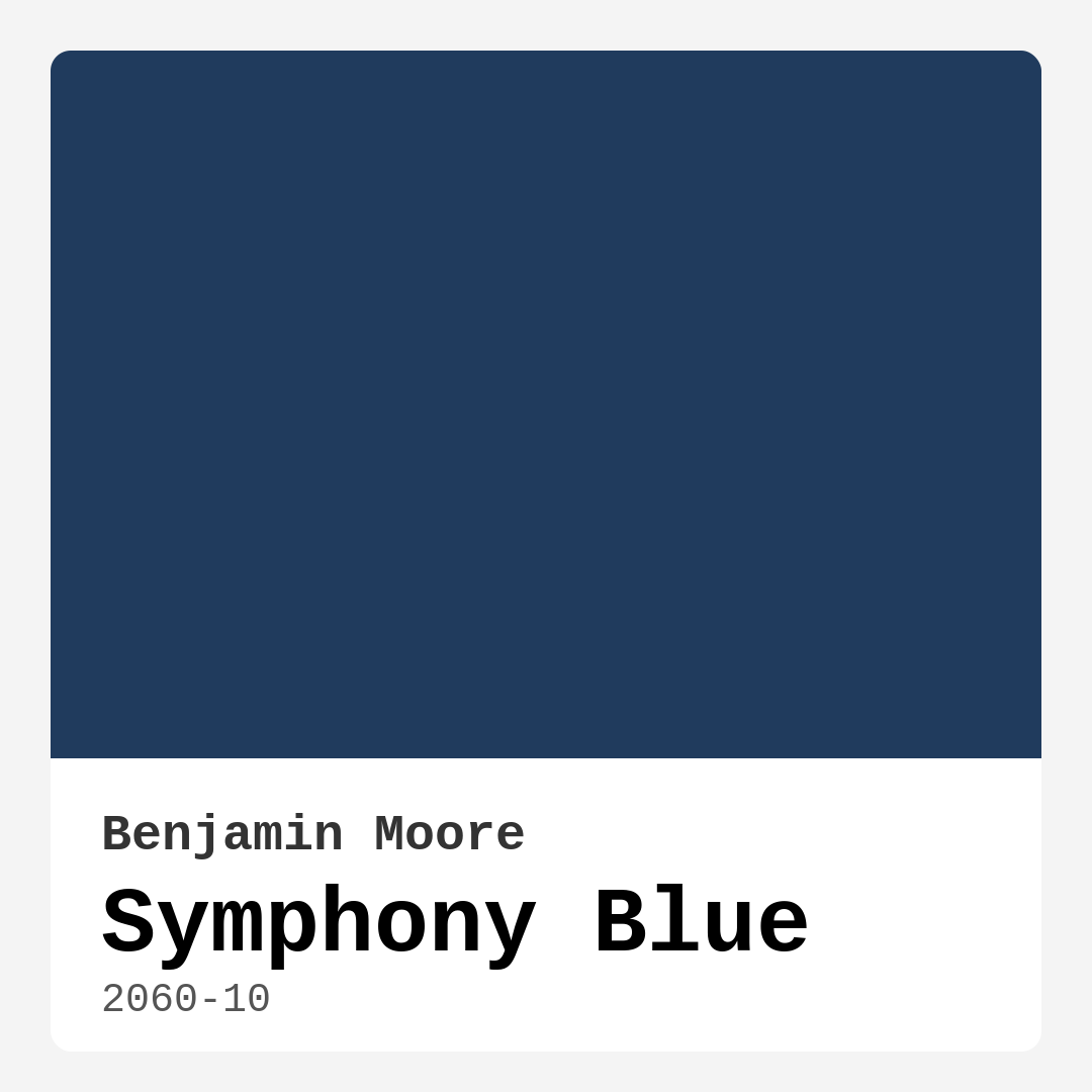
Color Preview & Key Details
| HEX Code | #203B5D |
| RGB | 32, 59, 93 |
| LRV | 6.16% |
| Undertone | Blue |
| Finish Options | Matte, Satin, Semi-Gloss |
If you’re searching for a paint color that effortlessly blends sophistication with serenity, let me introduce you to Benjamin Moore’s Symphony Blue (2060-10). This deep, rich blue is more than just a hue—it’s a mood, a statement, and a transformative tool for your home. Whether you’re dreaming of a cozy bedroom retreat, an elegant dining room, or a home office that inspires focus, Symphony Blue delivers. Its versatility across decor styles—from modern to coastal—makes it a designer favorite, and its performance on walls is just as impressive as its aesthetic appeal.
Symphony Blue is a dark, cool-toned blue with an LRV (Light Reflectance Value) of 6.16%, meaning it absorbs light rather than reflecting it. This gives it a moody, intimate quality that’s perfect for creating a cocoon-like atmosphere. But don’t let the depth intimidate you—when paired with the right lighting and decor, this color can feel surprisingly inviting. In bright daylight, it reveals its vibrant blue character, while in dimmer settings, it takes on a deeper, almost mysterious elegance. That adaptability means it works in nearly any room, whether flooded with natural light or relying on warm artificial fixtures.
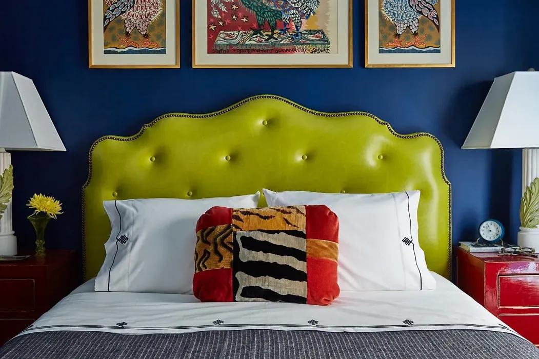
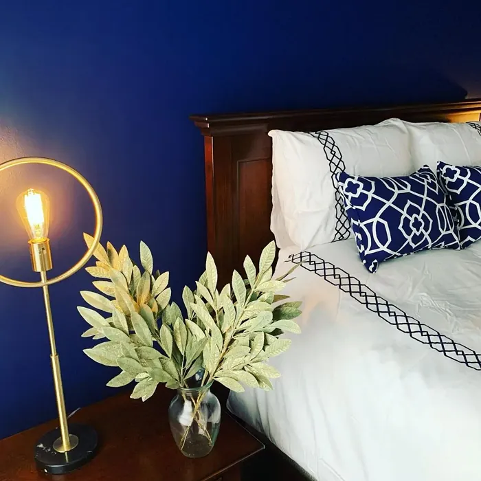
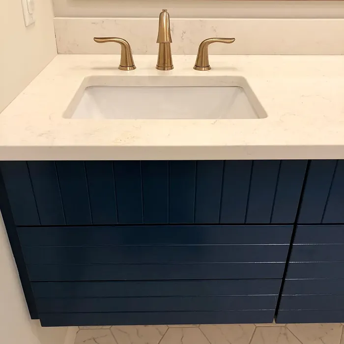
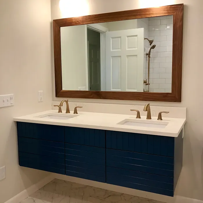
One of the biggest strengths of Symphony Blue is its ability to play well with other colors. Its complementary shade is orange, which means warm, earthy tones like terracotta, mustard, or even soft peach can create a striking contrast. For a more subdued look, pair it with crisp whites like Benjamin Moore’s White Dove for trim—this keeps the space feeling fresh and balanced. If you love a touch of luxury, brass or gold fixtures add a gorgeous warmth against the cool blue backdrop. And if you’re drawn to natural textures, wood trim or woven accents bring in organic depth that softens the color’s intensity.
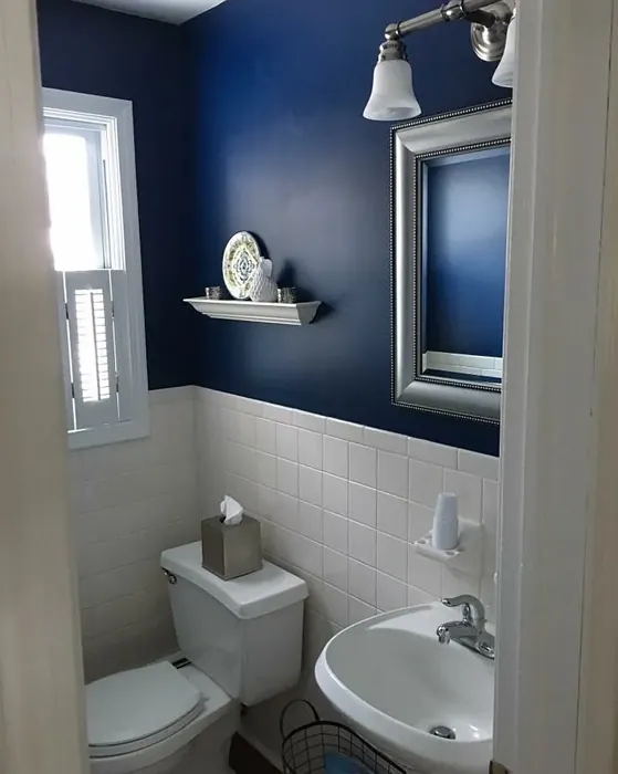
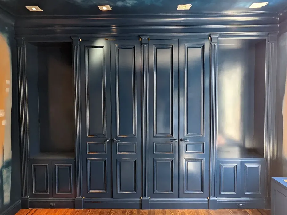
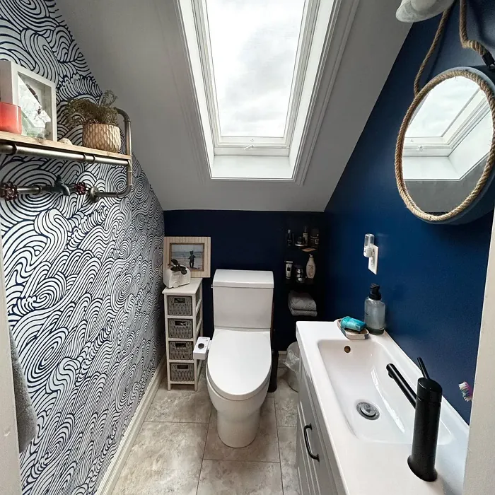
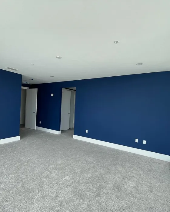
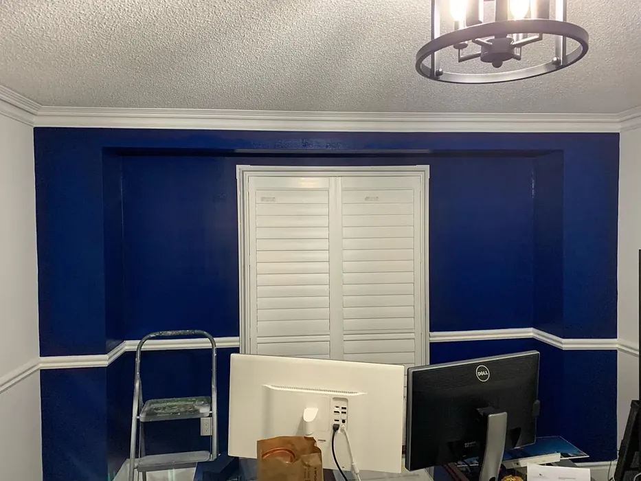
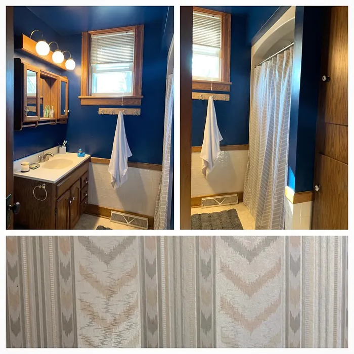
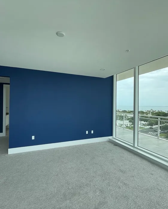
Wondering where to use it? Symphony Blue shines in living rooms, bedrooms, and home offices, where its calming presence fosters relaxation and focus. In a dining room, it sets a dramatic yet refined tone, especially when paired with a statement chandelier and rich wood furniture. Even nurseries can benefit from its soothing vibe—just balance it with lighter furnishings to keep the space airy. If you’re hesitant about committing to all four walls, try it as an accent wall behind a bed or sofa. The color’s depth creates instant dimension without overwhelming the room.
Now, let’s talk application. Symphony Blue is beginner-friendly, with excellent coverage—you’ll likely need just one or two coats for a flawless finish. It’s touch-up friendly, fast-drying, and comes in low-VOC formulas, making it a practical choice for eco-conscious homeowners. As for finishes, satin or semi-gloss will enhance its richness while adding durability, especially in high-traffic areas. Matte finishes work beautifully for a velvety, sophisticated look, but keep in mind they’re less washable.
Of course, no color is without its considerations. In very small rooms, Symphony Blue can feel a bit enveloping if used on every wall. If you love the color but have limited square footage, try painting just the lower half of the walls or using it on built-ins or furniture instead. Lighting is also key—this color thrives in well-lit spaces, so layer in ambient and task lighting to keep it from feeling too dark. And while it’s incredibly versatile, it’s always smart to test a swatch in your space first. Paint a large sample and observe it at different times of day to see how the undertones shift with your lighting.
If you’re drawn to Symphony Blue but want something slightly lighter or darker, Benjamin Moore offers a range of similar shades. For a softer take, consider 2061-20 or 2063-20. If you want to go even deeper, 2059-10 is a stunning option. And if you’re looking for comparable colors from other brands, Hale Navy by Benjamin Moore or Naval by Sherwin-Williams are close cousins.
At the end of the day, Symphony Blue is more than just paint—it’s an experience. It’s the kind of color that makes a room feel intentional, curated, and full of personality. Whether you’re going for a modern farmhouse vibe, a coastal escape, or a timeless traditional look, this shade adapts effortlessly. It’s grounding yet elegant, bold yet serene. So if you’re ready to transform your space into something truly special, grab a brush and let Symphony Blue work its magic. You won’t regret it.
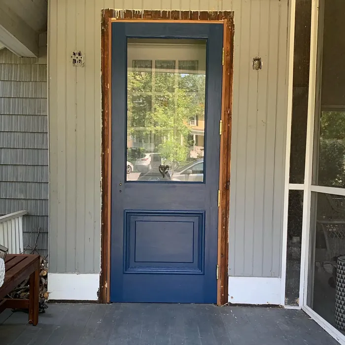
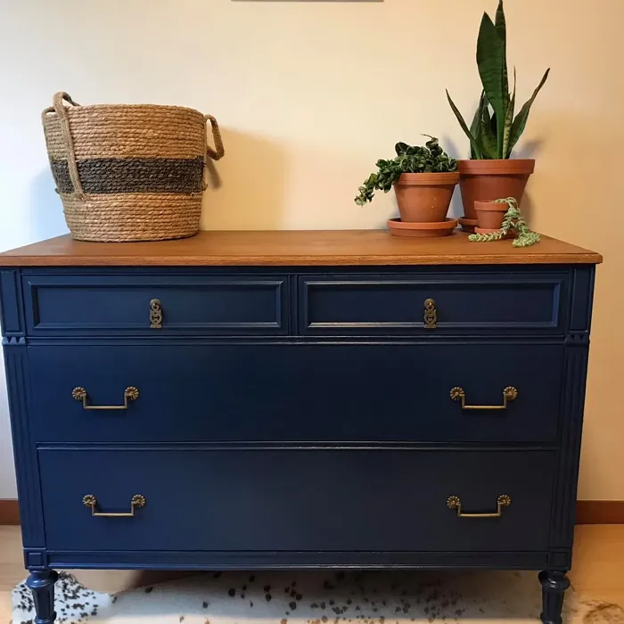
Real Room Photo of Symphony Blue 2060-10


Undertones of Symphony Blue ?
The undertones of Symphony Blue are a key aspect of its character, leaning towards Blue. These subtle underlying hues are what give the color its depth and complexity. For example, a gray with a blue undertone will feel cooler and more modern, while one with a brown undertone will feel warmer and more traditional. It’s essential to test this paint in your home and observe it next to your existing furniture, flooring, and decor to see how these undertones interact and reveal themselves throughout the day.
HEX value: #203B5D
RGB code: 32, 59, 93
Is Symphony Blue Cool or Warm?
This color leans towards the cool spectrum, making it a refreshing choice that evokes a sense of calm and spaciousness. It’s ideal for creating a peaceful ambiance in any room.
Understanding Color Properties and Interior Design Tips
Hue refers to a specific position on the color wheel, measured in degrees from 0 to 360. Each degree represents a different pure color:
- 0° represents red
- 120° represents green
- 240° represents blue
Saturation describes the intensity or purity of a color and is expressed as a percentage:
- At 0%, the color appears completely desaturated—essentially a shade of gray
- At 100%, the color is at its most vivid and vibrant
Lightness indicates how light or dark a color is, also expressed as a percentage:
- 0% lightness results in black
- 100% lightness results in white
Using Warm Colors in Interior Design
Warm hues—such as reds, oranges, yellows, warm beiges, and greiges—are excellent choices for creating inviting and energetic spaces. These colors are particularly well-suited for:
- Kitchens, living rooms, and bathrooms, where warmth enhances comfort and sociability
- Large rooms, where warm tones can help reduce the sense of emptiness and make the space feel more intimate
For example:
- Warm beige shades provide a cozy, inviting atmosphere, ideal for living rooms, bedrooms, and hallways.
- Warm greige (a mix of beige and gray) offers the warmth of beige with the modern appeal of gray, making it a versatile backdrop for dining areas, bedrooms, and living spaces.
However, be mindful when using warm light tones in rooms with limited natural light. These shades may appear muted or even take on an unpleasant yellowish tint. To avoid a dull or flat appearance:
- Add depth by incorporating richer tones like deep greens, charcoal, or chocolate brown
- Use textured elements such as curtains, rugs, or cushions to bring dimension to the space
Pro Tip: Achieving Harmony with Warm and Cool Color Balance
To create a well-balanced and visually interesting interior, mix warm and cool tones strategically. This contrast adds depth and harmony to your design.
- If your walls feature warm hues, introduce cool-colored accents such as blue or green furniture, artwork, or accessories to create contrast.
- For a polished look, consider using a complementary color scheme, which pairs colors opposite each other on the color wheel (e.g., red with green, orange with blue).
This thoughtful mix not only enhances visual appeal but also creates a space that feels both dynamic and cohesive.
Light Temperature Affects on Symphony Blue
Natural Light
Natural daylight changes in color temperature as the sun moves across the sky. At sunrise and sunset, the light tends to have a warm, golden tone with a color temperature around 2000 Kelvin (K). As the day progresses and the sun rises higher, the light becomes cooler and more neutral. Around midday, especially when the sky is clear, natural light typically reaches its peak brightness and shifts to a cooler tone, ranging from 5500 to 6500 Kelvin. This midday light is close to what we perceive as pure white or daylight-balanced light.
These shifts in natural light can significantly influence how colors appear in a space, which is why designers often consider both the time of day and the orientation of windows when planning interior color schemes.
Artificial Light
When choosing artificial lighting, pay close attention to the color temperature, measured in Kelvin (K). This determines how warm or cool the light will appear. Lower temperatures, around 2700K, give off a warm, yellow glow often used in living rooms or bedrooms. Higher temperatures, above 5000K, create a cool, bluish light similar to daylight, commonly used in kitchens, offices, or task areas.
Use the slider to see how lighting temperature can affect the appearance of a surface or color throughout a space.


4800K
LRV of Symphony Blue
The Light Reflectance Value (LRV) of Symphony Blue is 6.16%, which places it in the Dark colors category. This means it does not reflect light. Understanding a paint’s LRV is crucial for predicting how it will look in your space. A higher LRV indicates a lighter color that reflects more light, making rooms feel larger and brighter. A lower LRV signifies a darker color that absorbs more light, creating a cozier, more intimate atmosphere. Always consider the natural and artificial lighting in your room when selecting a paint color based on its LRV.
Detailed Review of Symphony Blue
Additional Paint Characteristics
Ideal Rooms
Bedroom, Dining Room, Home Office, Living Room, Nursery
Decor Styles
Coastal, Contemporary, Modern, Traditional
Coverage
Good (1–2 Coats), High Hide, Touch-Up Friendly
Ease of Application
Beginner Friendly, Brush Smooth, Fast-Drying, Roller-Ready
Washability
Highly Washable, Washable
VOC Level
Eco-Certified, Low VOC
Best Use
Accent Wall, Furniture, Interior Walls
Room Suitability
Bedroom, Dining Room, Home Office, Living Room
Tone Tag
Cool, Deep, Moody
Finish Type
Matte, Satin, Semi-Gloss
Paint Performance
Easy Touch-Up, High Coverage, Low Odor, Quick Drying
Use Cases
Best for Low Light Rooms, Best for Modern Farmhouse, Designer Favorite
Mood
Calm, Grounding, Sophisticated
Trim Pairing
Complements Brass Fixtures, Good with Wood Trim, Pairs with White Dove
Symphony Blue is truly a standout color that adds depth and character to your home. Its versatility allows it to pair well with various decor styles—from coastal to modern—making it a favorite among homeowners and designers alike. The color’s rich undertones create a luxurious feel that can transform a simple room into an elegant retreat. Whether used on an accent wall or throughout an entire space, Symphony Blue invites feelings of serenity and sophistication. Its performance is also commendable; expect good coverage with just one or two coats, making it an efficient choice for your painting project. Plus, its ability to provide a calming backdrop makes it perfect for bedrooms and home offices where tranquility is key.
Pros & Cons of 2060-10 Symphony Blue
Pros
Cons
Colors that go with Benjamin Moore Symphony Blue
FAQ on 2060-10 Symphony Blue
Can Symphony Blue be used in small rooms?
Absolutely! While Symphony Blue is a deep color, it can work beautifully in small rooms when paired with the right lighting and decor. To prevent the space from feeling too enclosed, consider using it as an accent wall or in combination with lighter colors to create balance and depth.
What finishes are best for Symphony Blue?
Symphony Blue shines in various finishes, but for a modern and sophisticated look, satin or semi-gloss finishes are ideal. They not only enhance the color’s depth but also provide durability, making it suitable for high-traffic areas or rooms that require easy cleaning.
Comparisons Symphony Blue with other colors
Symphony Blue 2060-10 vs Naval SW 6244
| Attribute | Symphony Blue 2060-10 | Naval SW 6244 |
|---|---|---|
| Color Name | Symphony Blue 2060-10 | Naval SW 6244 |
| Color | ||
| Hue | Blue | Blue |
| Brightness | Dark | Dark |
| RGB | 32, 59, 93 | 47, 61, 76 |
| LRV | 6.16% | 4% |
| Finish Type | Matte, Satin, Semi-Gloss | Matte, Satin, Semi-Gloss |
| Finish Options | Matte, Satin, Semi-Gloss | Matte, Satin, Semi-Gloss |
| Ideal Rooms | Bedroom, Dining Room, Home Office, Living Room, Nursery | Bedroom, Dining Room, Hallway, Home Office, Living Room |
| Decor Styles | Coastal, Contemporary, Modern, Traditional | Coastal, Industrial, Minimalist, Modern, Traditional |
| Coverage | Good (1–2 Coats), High Hide, Touch-Up Friendly | Good (1–2 Coats), Self-Priming |
| Ease of Application | Beginner Friendly, Brush Smooth, Fast-Drying, Roller-Ready | Beginner Friendly, Brush Smooth, Roller-Ready |
| Washability | Highly Washable, Washable | Highly Washable, Washable |
| Room Suitability | Bedroom, Dining Room, Home Office, Living Room | Bedroom, Dining Room, Entryway, Home Office, Living Room |
| Tone | Cool, Deep, Moody | Cool, Deep, Moody |
| Paint Performance | Easy Touch-Up, High Coverage, Low Odor, Quick Drying | Easy Touch-Up, High Coverage, Low Odor, Scuff Resistant |
Symphony Blue 2060-10 vs Sea Serpent SW 7615
| Attribute | Symphony Blue 2060-10 | Sea Serpent SW 7615 |
|---|---|---|
| Color Name | Symphony Blue 2060-10 | Sea Serpent SW 7615 |
| Color | ||
| Hue | Blue | Blue |
| Brightness | Dark | Dark |
| RGB | 32, 59, 93 | 62, 75, 84 |
| LRV | 6.16% | 12% |
| Finish Type | Matte, Satin, Semi-Gloss | Eggshell, Matte, Satin |
| Finish Options | Matte, Satin, Semi-Gloss | Eggshell, Matte, Satin |
| Ideal Rooms | Bedroom, Dining Room, Home Office, Living Room, Nursery | Bathroom, Bedroom, Home Office, Living Room |
| Decor Styles | Coastal, Contemporary, Modern, Traditional | Coastal, Farmhouse, Industrial, Modern |
| Coverage | Good (1–2 Coats), High Hide, Touch-Up Friendly | Good (1–2 Coats), Touch-Up Friendly |
| Ease of Application | Beginner Friendly, Brush Smooth, Fast-Drying, Roller-Ready | Beginner Friendly, Brush Smooth, Roller-Ready |
| Washability | Highly Washable, Washable | Highly Washable, Washable |
| Room Suitability | Bedroom, Dining Room, Home Office, Living Room | Bathroom, Bedroom, Home Office, Living Room |
| Tone | Cool, Deep, Moody | Cool, Deep, Moody |
| Paint Performance | Easy Touch-Up, High Coverage, Low Odor, Quick Drying | Easy Touch-Up, High Coverage, Low Odor |
Symphony Blue 2060-10 vs Rain Cloud SW 9639
| Attribute | Symphony Blue 2060-10 | Rain Cloud SW 9639 |
|---|---|---|
| Color Name | Symphony Blue 2060-10 | Rain Cloud SW 9639 |
| Color | ||
| Hue | Blue | Blue |
| Brightness | Dark | Dark |
| RGB | 32, 59, 93 | 83, 97, 104 |
| LRV | 6.16% | 30% |
| Finish Type | Matte, Satin, Semi-Gloss | Eggshell, Matte, Satin |
| Finish Options | Matte, Satin, Semi-Gloss | Eggshell, Matte, Satin |
| Ideal Rooms | Bedroom, Dining Room, Home Office, Living Room, Nursery | Bedroom, Dining Room, Home Office, Living Room |
| Decor Styles | Coastal, Contemporary, Modern, Traditional | Coastal, Contemporary, Minimalist, Scandinavian |
| Coverage | Good (1–2 Coats), High Hide, Touch-Up Friendly | Good (1–2 Coats), Touch-Up Friendly |
| Ease of Application | Beginner Friendly, Brush Smooth, Fast-Drying, Roller-Ready | Beginner Friendly, Brush Smooth, Roller-Ready |
| Washability | Highly Washable, Washable | Highly Washable, Washable |
| Room Suitability | Bedroom, Dining Room, Home Office, Living Room | Bedroom, Home Office, Living Room |
| Tone | Cool, Deep, Moody | Balanced, Cool, Muted |
| Paint Performance | Easy Touch-Up, High Coverage, Low Odor, Quick Drying | Easy Touch-Up, Fade Resistant, Low Odor |
Symphony Blue 2060-10 vs Indigo Batik SW 7602
| Attribute | Symphony Blue 2060-10 | Indigo Batik SW 7602 |
|---|---|---|
| Color Name | Symphony Blue 2060-10 | Indigo Batik SW 7602 |
| Color | ||
| Hue | Blue | Blue |
| Brightness | Dark | Dark |
| RGB | 32, 59, 93 | 62, 80, 99 |
| LRV | 6.16% | 10% |
| Finish Type | Matte, Satin, Semi-Gloss | Matte, Satin |
| Finish Options | Matte, Satin, Semi-Gloss | Eggshell, Flat, Matte, Satin |
| Ideal Rooms | Bedroom, Dining Room, Home Office, Living Room, Nursery | Bedroom, Dining Room, Home Office, Living Room |
| Decor Styles | Coastal, Contemporary, Modern, Traditional | Bohemian, Coastal, Contemporary, Modern |
| Coverage | Good (1–2 Coats), High Hide, Touch-Up Friendly | Good (1–2 Coats), Touch-Up Friendly |
| Ease of Application | Beginner Friendly, Brush Smooth, Fast-Drying, Roller-Ready | Brush Smooth, Fast-Drying, Roller-Ready |
| Washability | Highly Washable, Washable | Scrubbable, Washable, Wipeable |
| Room Suitability | Bedroom, Dining Room, Home Office, Living Room | Bedroom, Dining Room, Home Office, Living Room |
| Tone | Cool, Deep, Moody | Cool, Deep, Moody |
| Paint Performance | Easy Touch-Up, High Coverage, Low Odor, Quick Drying | Easy Touch-Up, High Coverage, Low Odor, Quick Drying |
Symphony Blue 2060-10 vs Sea Mariner SW 9640
| Attribute | Symphony Blue 2060-10 | Sea Mariner SW 9640 |
|---|---|---|
| Color Name | Symphony Blue 2060-10 | Sea Mariner SW 9640 |
| Color | ||
| Hue | Blue | Blue |
| Brightness | Dark | Dark |
| RGB | 32, 59, 93 | 67, 74, 84 |
| LRV | 6.16% | 6% |
| Finish Type | Matte, Satin, Semi-Gloss | Eggshell, Matte, Satin |
| Finish Options | Matte, Satin, Semi-Gloss | Eggshell, Matte, Satin |
| Ideal Rooms | Bedroom, Dining Room, Home Office, Living Room, Nursery | Bedroom, Dining Room, Hallway, Home Office, Living Room |
| Decor Styles | Coastal, Contemporary, Modern, Traditional | Coastal, Industrial, Minimalist, Modern |
| Coverage | Good (1–2 Coats), High Hide, Touch-Up Friendly | Good (1–2 Coats) |
| Ease of Application | Beginner Friendly, Brush Smooth, Fast-Drying, Roller-Ready | Beginner Friendly, Brush Smooth, Roller-Ready |
| Washability | Highly Washable, Washable | Scrubbable, Washable |
| Room Suitability | Bedroom, Dining Room, Home Office, Living Room | Bedroom, Dining Room, Home Office, Living Room |
| Tone | Cool, Deep, Moody | Cool, Deep, Moody |
| Paint Performance | Easy Touch-Up, High Coverage, Low Odor, Quick Drying | Easy Touch-Up, Low Odor, Quick Drying |
Symphony Blue 2060-10 vs Still Water SW 6223
| Attribute | Symphony Blue 2060-10 | Still Water SW 6223 |
|---|---|---|
| Color Name | Symphony Blue 2060-10 | Still Water SW 6223 |
| Color | ||
| Hue | Blue | Blue |
| Brightness | Dark | Dark |
| RGB | 32, 59, 93 | 74, 93, 95 |
| LRV | 6.16% | 48% |
| Finish Type | Matte, Satin, Semi-Gloss | Eggshell, Matte, Satin |
| Finish Options | Matte, Satin, Semi-Gloss | Eggshell, Matte, Satin |
| Ideal Rooms | Bedroom, Dining Room, Home Office, Living Room, Nursery | Bedroom, Dining Room, Home Office, Living Room, Nursery |
| Decor Styles | Coastal, Contemporary, Modern, Traditional | Coastal, Contemporary, Farmhouse, Modern, Rustic |
| Coverage | Good (1–2 Coats), High Hide, Touch-Up Friendly | Good (1–2 Coats), Touch-Up Friendly |
| Ease of Application | Beginner Friendly, Brush Smooth, Fast-Drying, Roller-Ready | Beginner Friendly, Brush Smooth, Roller-Ready |
| Washability | Highly Washable, Washable | Highly Washable, Washable |
| Room Suitability | Bedroom, Dining Room, Home Office, Living Room | Bedroom, Dining Room, Home Office, Living Room |
| Tone | Cool, Deep, Moody | Cool, Earthy, Muted |
| Paint Performance | Easy Touch-Up, High Coverage, Low Odor, Quick Drying | Easy Touch-Up, Fade Resistant, Low Odor |
Symphony Blue 2060-10 vs Waterloo SW 9141
| Attribute | Symphony Blue 2060-10 | Waterloo SW 9141 |
|---|---|---|
| Color Name | Symphony Blue 2060-10 | Waterloo SW 9141 |
| Color | ||
| Hue | Blue | Blue |
| Brightness | Dark | Dark |
| RGB | 32, 59, 93 | 83, 104, 114 |
| LRV | 6.16% | 12% |
| Finish Type | Matte, Satin, Semi-Gloss | Matte, Satin |
| Finish Options | Matte, Satin, Semi-Gloss | Matte, Satin, Semi-Gloss |
| Ideal Rooms | Bedroom, Dining Room, Home Office, Living Room, Nursery | Bedroom, Dining Room, Hallway, Home Office, Living Room |
| Decor Styles | Coastal, Contemporary, Modern, Traditional | Coastal, Industrial, Modern, Rustic |
| Coverage | Good (1–2 Coats), High Hide, Touch-Up Friendly | Good (1–2 Coats), Touch-Up Friendly |
| Ease of Application | Beginner Friendly, Brush Smooth, Fast-Drying, Roller-Ready | Brush Smooth, Fast-Drying, Roller-Ready |
| Washability | Highly Washable, Washable | Scrubbable, Washable |
| Room Suitability | Bedroom, Dining Room, Home Office, Living Room | Bedroom, Dining Room, Home Office, Living Room |
| Tone | Cool, Deep, Moody | Balanced, Cool, Muted |
| Paint Performance | Easy Touch-Up, High Coverage, Low Odor, Quick Drying | Easy Touch-Up, Fade Resistant, Low Odor, Quick Drying |
Symphony Blue 2060-10 vs Smoky Blue SW 7604
| Attribute | Symphony Blue 2060-10 | Smoky Blue SW 7604 |
|---|---|---|
| Color Name | Symphony Blue 2060-10 | Smoky Blue SW 7604 |
| Color | ||
| Hue | Blue | Blue |
| Brightness | Dark | Dark |
| RGB | 32, 59, 93 | 89, 110, 121 |
| LRV | 6.16% | 15% |
| Finish Type | Matte, Satin, Semi-Gloss | Eggshell, Matte, Satin |
| Finish Options | Matte, Satin, Semi-Gloss | Eggshell, Matte, Satin |
| Ideal Rooms | Bedroom, Dining Room, Home Office, Living Room, Nursery | Bathroom, Bedroom, Home Office, Kitchen, Living Room |
| Decor Styles | Coastal, Contemporary, Modern, Traditional | Coastal, Modern, Scandinavian, Transitional |
| Coverage | Good (1–2 Coats), High Hide, Touch-Up Friendly | Good (1–2 Coats), Touch-Up Friendly |
| Ease of Application | Beginner Friendly, Brush Smooth, Fast-Drying, Roller-Ready | Beginner Friendly, Brush Smooth, Roller-Ready |
| Washability | Highly Washable, Washable | Highly Washable, Washable |
| Room Suitability | Bedroom, Dining Room, Home Office, Living Room | Bathroom, Bedroom, Home Office, Living Room |
| Tone | Cool, Deep, Moody | Cool, Dusty, Muted |
| Paint Performance | Easy Touch-Up, High Coverage, Low Odor, Quick Drying | High Coverage, Low Odor, Quick Drying |
Symphony Blue 2060-10 vs Needlepoint Navy SW 0032
| Attribute | Symphony Blue 2060-10 | Needlepoint Navy SW 0032 |
|---|---|---|
| Color Name | Symphony Blue 2060-10 | Needlepoint Navy SW 0032 |
| Color | ||
| Hue | Blue | Blue |
| Brightness | Dark | Dark |
| RGB | 32, 59, 93 | 84, 102, 112 |
| LRV | 6.16% | 4% |
| Finish Type | Matte, Satin, Semi-Gloss | Matte, Satin, Semi-Gloss |
| Finish Options | Matte, Satin, Semi-Gloss | Matte, Satin, Semi-Gloss |
| Ideal Rooms | Bedroom, Dining Room, Home Office, Living Room, Nursery | Bedroom, Dining Room, Entryway, Home Office, Living Room |
| Decor Styles | Coastal, Contemporary, Modern, Traditional | Coastal, Contemporary, Modern Farmhouse, Nautical, Traditional |
| Coverage | Good (1–2 Coats), High Hide, Touch-Up Friendly | Good (1–2 Coats), Touch-Up Friendly |
| Ease of Application | Beginner Friendly, Brush Smooth, Fast-Drying, Roller-Ready | Beginner Friendly, Brush Smooth, Fast-Drying, Roller-Ready |
| Washability | Highly Washable, Washable | Scrubbable, Washable |
| Room Suitability | Bedroom, Dining Room, Home Office, Living Room | Bedroom, Dining Room, Home Office, Living Room |
| Tone | Cool, Deep, Moody | Cool, Deep, Muted |
| Paint Performance | Easy Touch-Up, High Coverage, Low Odor, Quick Drying | Easy Touch-Up, High Coverage, Low Odor, Quick Drying, Stain Resistant |
Symphony Blue 2060-10 vs Riverway SW 6222
| Attribute | Symphony Blue 2060-10 | Riverway SW 6222 |
|---|---|---|
| Color Name | Symphony Blue 2060-10 | Riverway SW 6222 |
| Color | ||
| Hue | Blue | Blue |
| Brightness | Dark | Dark |
| RGB | 32, 59, 93 | 93, 114, 116 |
| LRV | 6.16% | 24% |
| Finish Type | Matte, Satin, Semi-Gloss | Eggshell, Satin |
| Finish Options | Matte, Satin, Semi-Gloss | Eggshell, Matte, Satin |
| Ideal Rooms | Bedroom, Dining Room, Home Office, Living Room, Nursery | Bathroom, Bedroom, Dining Room, Home Office, Living Room |
| Decor Styles | Coastal, Contemporary, Modern, Traditional | Coastal, Contemporary, Eclectic, Modern, Rustic |
| Coverage | Good (1–2 Coats), High Hide, Touch-Up Friendly | Good (1–2 Coats), Touch-Up Friendly |
| Ease of Application | Beginner Friendly, Brush Smooth, Fast-Drying, Roller-Ready | Beginner Friendly, Brush Smooth, Fast-Drying, Low Splatter, Roller-Ready |
| Washability | Highly Washable, Washable | Highly Washable, Washable |
| Room Suitability | Bedroom, Dining Room, Home Office, Living Room | Bathroom, Bedroom, Home Office, Living Room |
| Tone | Cool, Deep, Moody | Balanced, Cool, Muted |
| Paint Performance | Easy Touch-Up, High Coverage, Low Odor, Quick Drying | Easy Touch-Up, High Coverage, Low Odor, Quick Drying |
Official Page of Benjamin Moore Symphony Blue 2060-10