
Color Preview & Key Details
| HEX Code | #323A43 |
| RGB | 50, 58, 67 |
| LRV | 5.67% |
| Undertone | Blue |
| Finish Options | Eggshell, Satin, Semi-Gloss |
If you’re searching for a paint color that exudes sophistication while wrapping your space in a sense of calm, Benjamin Moore’s Polo Blue (2062-10) might just be your perfect match. This deep blue-gray is more than just a color—it’s a mood. Imagine walking into a room where the walls feel like a quiet evening sky, rich and enveloping yet effortlessly elegant. That’s the magic of Polo Blue.
One of the first things you’ll notice about this shade is its versatility. Whether your home leans modern, coastal, traditional, or even industrial, Polo Blue adapts seamlessly. It’s the kind of color that plays well with others, pairing beautifully with crisp whites, warm woods, and even bold metallics like brass. Think of it as the quiet anchor in a room, grounding the space without stealing the show.
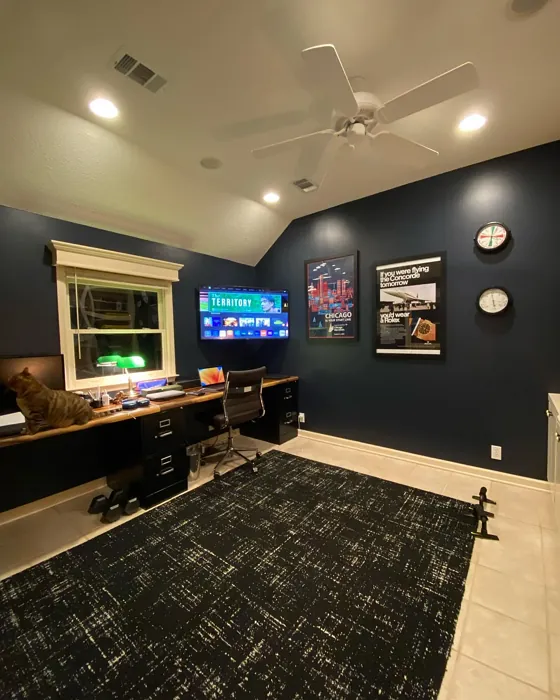
Now, let’s talk about where it shines. Polo Blue is ideal for living rooms, bedrooms, home offices, and dining rooms—anywhere you want to create a serene, inviting atmosphere. In a bedroom, it fosters restfulness, almost like a cozy cocoon. In a home office, it brings a sense of focus and calm, helping to mute distractions. And in a dining room? It sets the stage for intimate dinners, making the space feel both refined and welcoming.
But here’s the thing about dark colors—they can be intimidating. If you’re worried Polo Blue might make a small room feel cramped, don’t be. The trick is balance. Use it on an accent wall to add depth without overwhelming the space. Pair it with lighter furniture, sheer curtains, or a well-placed mirror to bounce light around. And if you’re working with a room that gets tons of natural light, Polo Blue will soften beautifully, revealing its subtle blue undertones in the most delightful way.
Speaking of undertones, that’s where Polo Blue really stands out. Its cool blue-gray base keeps it feeling modern and fresh, but it’s never stark or clinical. Instead, it has a velvety richness that makes walls feel luxurious. Just keep in mind that lighting plays a huge role. In north-facing rooms or spaces with limited light, it’ll appear deeper and moodier. Under warm artificial light, it takes on a cozier, almost smoky quality. That’s why testing a swatch in your actual space is non-negotiable.
When it comes to application, Polo Blue is beginner-friendly. It covers well in one to two coats, and touch-ups are a breeze—no awkward streaks or patchiness. You’ve got finish options, too. Eggshell is my go-to for most rooms because it strikes the perfect balance between matte and sheen, hiding imperfections while still being washable. Satin steps it up with a bit more durability, great for higher-traffic areas. And if you’re using it in a kitchen or bathroom, semi-gloss adds extra protection against moisture and grime.
Now, let’s address the elephant in the room: the LRV, or Light Reflectance Value. At 5.67%, Polo Blue is undeniably dark. That means it absorbs light rather than reflecting it, which is why it works so well in spaces where you want to dial down the brightness and create intimacy. But if your room is already on the darker side, you might want to lean into the moodiness or balance it with plenty of light-colored accents.
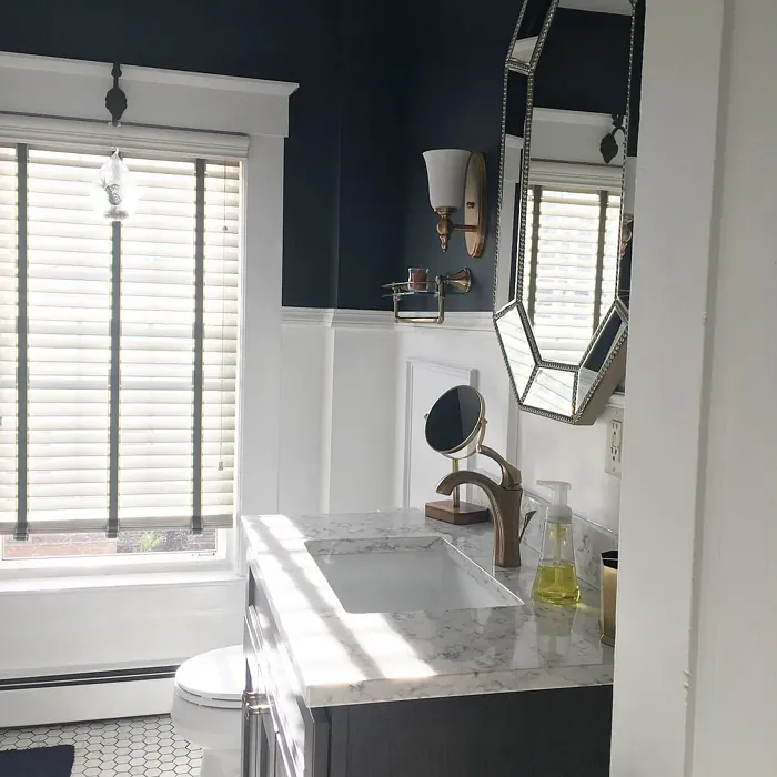
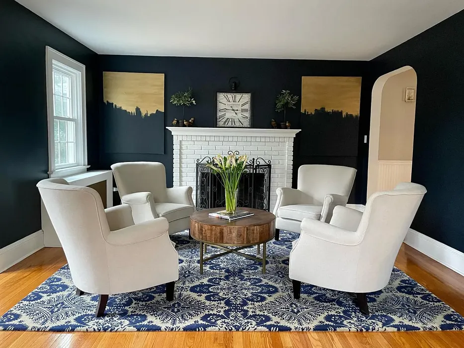
As for pairings, Polo Blue is a dream to work with. Crisp white trim—like Benjamin Moore’s White Dove—creates a classic, high-contrast look. Warm brass fixtures add a touch of glam, while soft creams and taupes keep things cozy. If you’re feeling bold, try pairing it with pops of burnt orange or rust for a striking complementary contrast. And if you love the vibe but need something a tad lighter, check out Hale Navy or Sherwin-Williams’ Naval, which sit in the same color family.
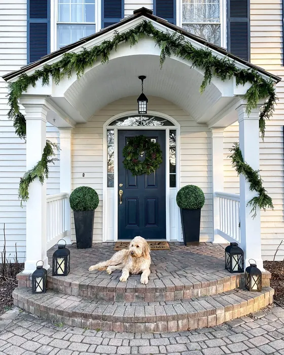
So, is Polo Blue right for you? If you’re drawn to colors that feel timeless yet current, if you want a space that’s calming but never boring, and if you’re ready to embrace the depth and drama of a darker hue, then yes—absolutely. Just remember to test it in your space, play with lighting, and don’t be afraid to let it shine in unexpected ways, like on built-ins or even a front door.
At the end of the day, Polo Blue isn’t just a paint color. It’s an experience. It’s the feeling of walking into a room that instantly makes you exhale. It’s the confidence of knowing your walls look like they were plucked from a designer’s mood board. And most importantly, it’s a reminder that the right color can transform a house into a home. So go ahead—take the plunge. Your dream space is waiting.
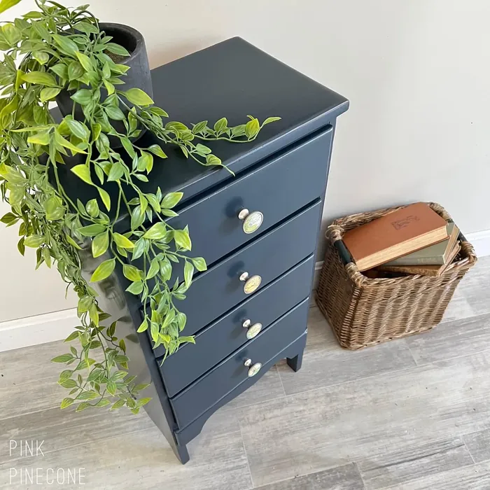
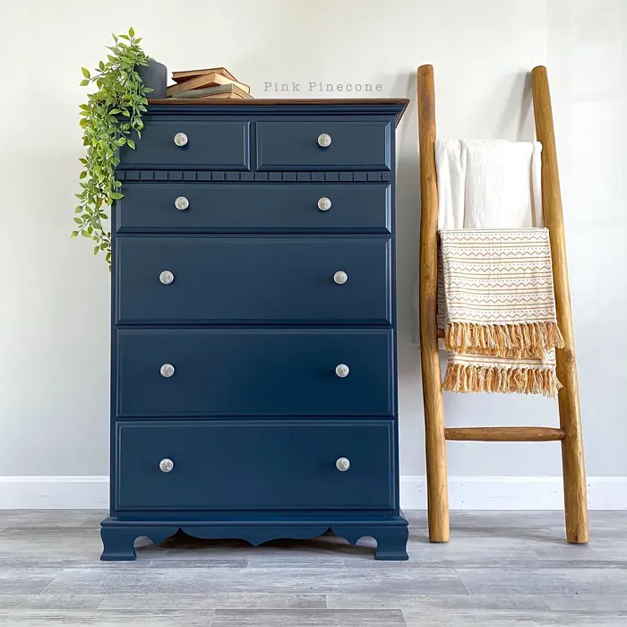
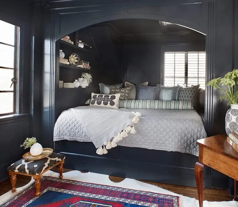
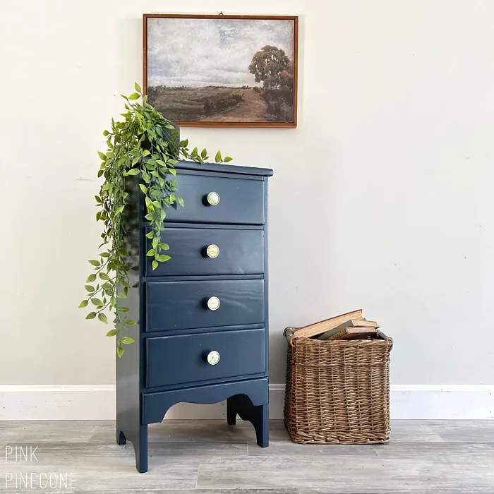
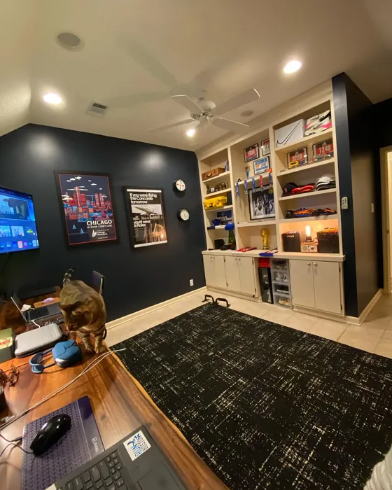
Real Room Photo of Polo Blue 2062-10


Undertones of Polo Blue ?
The undertones of Polo Blue are a key aspect of its character, leaning towards Blue. These subtle underlying hues are what give the color its depth and complexity. For example, a gray with a blue undertone will feel cooler and more modern, while one with a brown undertone will feel warmer and more traditional. It’s essential to test this paint in your home and observe it next to your existing furniture, flooring, and decor to see how these undertones interact and reveal themselves throughout the day.
HEX value: #323A43
RGB code: 50, 58, 67
Is Polo Blue Cool or Warm?
This color leans cool, making it perfect for spaces where you want to evoke a sense of calm and relaxation. Its cool undertones help to balance warmer colors, adding depth and dimension to your overall color scheme.
Understanding Color Properties and Interior Design Tips
Hue refers to a specific position on the color wheel, measured in degrees from 0 to 360. Each degree represents a different pure color:
- 0° represents red
- 120° represents green
- 240° represents blue
Saturation describes the intensity or purity of a color and is expressed as a percentage:
- At 0%, the color appears completely desaturated—essentially a shade of gray
- At 100%, the color is at its most vivid and vibrant
Lightness indicates how light or dark a color is, also expressed as a percentage:
- 0% lightness results in black
- 100% lightness results in white
Using Warm Colors in Interior Design
Warm hues—such as reds, oranges, yellows, warm beiges, and greiges—are excellent choices for creating inviting and energetic spaces. These colors are particularly well-suited for:
- Kitchens, living rooms, and bathrooms, where warmth enhances comfort and sociability
- Large rooms, where warm tones can help reduce the sense of emptiness and make the space feel more intimate
For example:
- Warm beige shades provide a cozy, inviting atmosphere, ideal for living rooms, bedrooms, and hallways.
- Warm greige (a mix of beige and gray) offers the warmth of beige with the modern appeal of gray, making it a versatile backdrop for dining areas, bedrooms, and living spaces.
However, be mindful when using warm light tones in rooms with limited natural light. These shades may appear muted or even take on an unpleasant yellowish tint. To avoid a dull or flat appearance:
- Add depth by incorporating richer tones like deep greens, charcoal, or chocolate brown
- Use textured elements such as curtains, rugs, or cushions to bring dimension to the space
Pro Tip: Achieving Harmony with Warm and Cool Color Balance
To create a well-balanced and visually interesting interior, mix warm and cool tones strategically. This contrast adds depth and harmony to your design.
- If your walls feature warm hues, introduce cool-colored accents such as blue or green furniture, artwork, or accessories to create contrast.
- For a polished look, consider using a complementary color scheme, which pairs colors opposite each other on the color wheel (e.g., red with green, orange with blue).
This thoughtful mix not only enhances visual appeal but also creates a space that feels both dynamic and cohesive.

Light Temperature Affects on Polo Blue
Natural Light
Natural daylight changes in color temperature as the sun moves across the sky. At sunrise and sunset, the light tends to have a warm, golden tone with a color temperature around 2000 Kelvin (K). As the day progresses and the sun rises higher, the light becomes cooler and more neutral. Around midday, especially when the sky is clear, natural light typically reaches its peak brightness and shifts to a cooler tone, ranging from 5500 to 6500 Kelvin. This midday light is close to what we perceive as pure white or daylight-balanced light.
These shifts in natural light can significantly influence how colors appear in a space, which is why designers often consider both the time of day and the orientation of windows when planning interior color schemes.
Artificial Light
When choosing artificial lighting, pay close attention to the color temperature, measured in Kelvin (K). This determines how warm or cool the light will appear. Lower temperatures, around 2700K, give off a warm, yellow glow often used in living rooms or bedrooms. Higher temperatures, above 5000K, create a cool, bluish light similar to daylight, commonly used in kitchens, offices, or task areas.
Use the slider to see how lighting temperature can affect the appearance of a surface or color throughout a space.


4800K
LRV of Polo Blue
The Light Reflectance Value (LRV) of Polo Blue is 5.67%, which places it in the Dark colors category. This means it does not reflect light. Understanding a paint’s LRV is crucial for predicting how it will look in your space. A higher LRV indicates a lighter color that reflects more light, making rooms feel larger and brighter. A lower LRV signifies a darker color that absorbs more light, creating a cozier, more intimate atmosphere. Always consider the natural and artificial lighting in your room when selecting a paint color based on its LRV.
Detailed Review of Polo Blue
Additional Paint Characteristics
Ideal Rooms
Bedroom, Dining Room, Home Office, Living Room
Decor Styles
Coastal, Industrial, Modern, Traditional
Coverage
Good (1–2 Coats), Touch-Up Friendly
Ease of Application
Beginner Friendly, Brush Smooth, Roller-Ready
Washability
Scrubbable, Washable
VOC Level
Eco-Certified, Low VOC
Best Use
Accent Wall, Furniture, Interior Walls
Room Suitability
Bedroom, Dining Room, Home Office, Living Room
Tone Tag
Cool, Deep, Moody
Finish Type
Eggshell, Satin, Semi-Gloss
Paint Performance
Easy Touch-Up, High Coverage, Low Odor
Use Cases
Best for Low Light Rooms, Classic Favorite, Designer Favorite
Mood
Calm, Inviting, Restful
Trim Pairing
Complements Brass Fixtures, Pairs with White Dove, Works with Warm Trim
Polo Blue is a stunning blend of deep blue and cool gray that can transform a space into a peaceful retreat. When applied, it offers a rich, velvety appearance that enhances the room’s elegance. The color is particularly effective in larger spaces, where it can create a striking focal point without overwhelming the senses. Whether you’re looking to set a calming tone in a bedroom or add sophistication to a living room, Polo Blue delivers with grace. Its versatility means it can easily adapt to various design styles, from modern minimalism to cozy coastal vibes. The finish options available, including eggshell and satin, allow you to customize the sheen to suit your taste.
Pros & Cons of 2062-10 Polo Blue
Pros
Cons
Colors that go with Benjamin Moore Polo Blue
FAQ on 2062-10 Polo Blue
Can Polo Blue be used in small rooms?
While Polo Blue is a deep color, it can still work in small rooms if used thoughtfully. Consider applying it to one accent wall to create a focal point, which can add depth without overwhelming the space. Pair it with lighter furnishings and decor to keep the room feeling airy and open.
What finish should I choose for Polo Blue?
The finish you choose depends on the room and desired ambiance. For living rooms and bedrooms, an eggshell or satin finish offers a soft sheen that’s both elegant and easy to clean. If you’re using Polo Blue in a kitchen or bathroom, consider a semi-gloss finish for added durability and washability.
Comparisons Polo Blue with other colors
Polo Blue 2062-10 vs Naval SW 6244
| Attribute | Polo Blue 2062-10 | Naval SW 6244 |
|---|---|---|
| Color Name | Polo Blue 2062-10 | Naval SW 6244 |
| Color | ||
| Hue | Blue | Blue |
| Brightness | Dark | Dark |
| RGB | 50, 58, 67 | 47, 61, 76 |
| LRV | 5.67% | 4% |
| Finish Type | Eggshell, Satin, Semi-Gloss | Matte, Satin, Semi-Gloss |
| Finish Options | Eggshell, Satin, Semi-Gloss | Matte, Satin, Semi-Gloss |
| Ideal Rooms | Bedroom, Dining Room, Home Office, Living Room | Bedroom, Dining Room, Hallway, Home Office, Living Room |
| Decor Styles | Coastal, Industrial, Modern, Traditional | Coastal, Industrial, Minimalist, Modern, Traditional |
| Coverage | Good (1–2 Coats), Touch-Up Friendly | Good (1–2 Coats), Self-Priming |
| Ease of Application | Beginner Friendly, Brush Smooth, Roller-Ready | Beginner Friendly, Brush Smooth, Roller-Ready |
| Washability | Scrubbable, Washable | Highly Washable, Washable |
| Room Suitability | Bedroom, Dining Room, Home Office, Living Room | Bedroom, Dining Room, Entryway, Home Office, Living Room |
| Tone | Cool, Deep, Moody | Cool, Deep, Moody |
| Paint Performance | Easy Touch-Up, High Coverage, Low Odor | Easy Touch-Up, High Coverage, Low Odor, Scuff Resistant |
Polo Blue 2062-10 vs Sea Serpent SW 7615
| Attribute | Polo Blue 2062-10 | Sea Serpent SW 7615 |
|---|---|---|
| Color Name | Polo Blue 2062-10 | Sea Serpent SW 7615 |
| Color | ||
| Hue | Blue | Blue |
| Brightness | Dark | Dark |
| RGB | 50, 58, 67 | 62, 75, 84 |
| LRV | 5.67% | 12% |
| Finish Type | Eggshell, Satin, Semi-Gloss | Eggshell, Matte, Satin |
| Finish Options | Eggshell, Satin, Semi-Gloss | Eggshell, Matte, Satin |
| Ideal Rooms | Bedroom, Dining Room, Home Office, Living Room | Bathroom, Bedroom, Home Office, Living Room |
| Decor Styles | Coastal, Industrial, Modern, Traditional | Coastal, Farmhouse, Industrial, Modern |
| Coverage | Good (1–2 Coats), Touch-Up Friendly | Good (1–2 Coats), Touch-Up Friendly |
| Ease of Application | Beginner Friendly, Brush Smooth, Roller-Ready | Beginner Friendly, Brush Smooth, Roller-Ready |
| Washability | Scrubbable, Washable | Highly Washable, Washable |
| Room Suitability | Bedroom, Dining Room, Home Office, Living Room | Bathroom, Bedroom, Home Office, Living Room |
| Tone | Cool, Deep, Moody | Cool, Deep, Moody |
| Paint Performance | Easy Touch-Up, High Coverage, Low Odor | Easy Touch-Up, High Coverage, Low Odor |
Polo Blue 2062-10 vs Rain Cloud SW 9639
| Attribute | Polo Blue 2062-10 | Rain Cloud SW 9639 |
|---|---|---|
| Color Name | Polo Blue 2062-10 | Rain Cloud SW 9639 |
| Color | ||
| Hue | Blue | Blue |
| Brightness | Dark | Dark |
| RGB | 50, 58, 67 | 83, 97, 104 |
| LRV | 5.67% | 30% |
| Finish Type | Eggshell, Satin, Semi-Gloss | Eggshell, Matte, Satin |
| Finish Options | Eggshell, Satin, Semi-Gloss | Eggshell, Matte, Satin |
| Ideal Rooms | Bedroom, Dining Room, Home Office, Living Room | Bedroom, Dining Room, Home Office, Living Room |
| Decor Styles | Coastal, Industrial, Modern, Traditional | Coastal, Contemporary, Minimalist, Scandinavian |
| Coverage | Good (1–2 Coats), Touch-Up Friendly | Good (1–2 Coats), Touch-Up Friendly |
| Ease of Application | Beginner Friendly, Brush Smooth, Roller-Ready | Beginner Friendly, Brush Smooth, Roller-Ready |
| Washability | Scrubbable, Washable | Highly Washable, Washable |
| Room Suitability | Bedroom, Dining Room, Home Office, Living Room | Bedroom, Home Office, Living Room |
| Tone | Cool, Deep, Moody | Balanced, Cool, Muted |
| Paint Performance | Easy Touch-Up, High Coverage, Low Odor | Easy Touch-Up, Fade Resistant, Low Odor |
Polo Blue 2062-10 vs Indigo Batik SW 7602
| Attribute | Polo Blue 2062-10 | Indigo Batik SW 7602 |
|---|---|---|
| Color Name | Polo Blue 2062-10 | Indigo Batik SW 7602 |
| Color | ||
| Hue | Blue | Blue |
| Brightness | Dark | Dark |
| RGB | 50, 58, 67 | 62, 80, 99 |
| LRV | 5.67% | 10% |
| Finish Type | Eggshell, Satin, Semi-Gloss | Matte, Satin |
| Finish Options | Eggshell, Satin, Semi-Gloss | Eggshell, Flat, Matte, Satin |
| Ideal Rooms | Bedroom, Dining Room, Home Office, Living Room | Bedroom, Dining Room, Home Office, Living Room |
| Decor Styles | Coastal, Industrial, Modern, Traditional | Bohemian, Coastal, Contemporary, Modern |
| Coverage | Good (1–2 Coats), Touch-Up Friendly | Good (1–2 Coats), Touch-Up Friendly |
| Ease of Application | Beginner Friendly, Brush Smooth, Roller-Ready | Brush Smooth, Fast-Drying, Roller-Ready |
| Washability | Scrubbable, Washable | Scrubbable, Washable, Wipeable |
| Room Suitability | Bedroom, Dining Room, Home Office, Living Room | Bedroom, Dining Room, Home Office, Living Room |
| Tone | Cool, Deep, Moody | Cool, Deep, Moody |
| Paint Performance | Easy Touch-Up, High Coverage, Low Odor | Easy Touch-Up, High Coverage, Low Odor, Quick Drying |
Polo Blue 2062-10 vs Sea Mariner SW 9640
| Attribute | Polo Blue 2062-10 | Sea Mariner SW 9640 |
|---|---|---|
| Color Name | Polo Blue 2062-10 | Sea Mariner SW 9640 |
| Color | ||
| Hue | Blue | Blue |
| Brightness | Dark | Dark |
| RGB | 50, 58, 67 | 67, 74, 84 |
| LRV | 5.67% | 6% |
| Finish Type | Eggshell, Satin, Semi-Gloss | Eggshell, Matte, Satin |
| Finish Options | Eggshell, Satin, Semi-Gloss | Eggshell, Matte, Satin |
| Ideal Rooms | Bedroom, Dining Room, Home Office, Living Room | Bedroom, Dining Room, Hallway, Home Office, Living Room |
| Decor Styles | Coastal, Industrial, Modern, Traditional | Coastal, Industrial, Minimalist, Modern |
| Coverage | Good (1–2 Coats), Touch-Up Friendly | Good (1–2 Coats) |
| Ease of Application | Beginner Friendly, Brush Smooth, Roller-Ready | Beginner Friendly, Brush Smooth, Roller-Ready |
| Washability | Scrubbable, Washable | Scrubbable, Washable |
| Room Suitability | Bedroom, Dining Room, Home Office, Living Room | Bedroom, Dining Room, Home Office, Living Room |
| Tone | Cool, Deep, Moody | Cool, Deep, Moody |
| Paint Performance | Easy Touch-Up, High Coverage, Low Odor | Easy Touch-Up, Low Odor, Quick Drying |
Polo Blue 2062-10 vs Still Water SW 6223
| Attribute | Polo Blue 2062-10 | Still Water SW 6223 |
|---|---|---|
| Color Name | Polo Blue 2062-10 | Still Water SW 6223 |
| Color | ||
| Hue | Blue | Blue |
| Brightness | Dark | Dark |
| RGB | 50, 58, 67 | 74, 93, 95 |
| LRV | 5.67% | 48% |
| Finish Type | Eggshell, Satin, Semi-Gloss | Eggshell, Matte, Satin |
| Finish Options | Eggshell, Satin, Semi-Gloss | Eggshell, Matte, Satin |
| Ideal Rooms | Bedroom, Dining Room, Home Office, Living Room | Bedroom, Dining Room, Home Office, Living Room, Nursery |
| Decor Styles | Coastal, Industrial, Modern, Traditional | Coastal, Contemporary, Farmhouse, Modern, Rustic |
| Coverage | Good (1–2 Coats), Touch-Up Friendly | Good (1–2 Coats), Touch-Up Friendly |
| Ease of Application | Beginner Friendly, Brush Smooth, Roller-Ready | Beginner Friendly, Brush Smooth, Roller-Ready |
| Washability | Scrubbable, Washable | Highly Washable, Washable |
| Room Suitability | Bedroom, Dining Room, Home Office, Living Room | Bedroom, Dining Room, Home Office, Living Room |
| Tone | Cool, Deep, Moody | Cool, Earthy, Muted |
| Paint Performance | Easy Touch-Up, High Coverage, Low Odor | Easy Touch-Up, Fade Resistant, Low Odor |
Polo Blue 2062-10 vs Waterloo SW 9141
| Attribute | Polo Blue 2062-10 | Waterloo SW 9141 |
|---|---|---|
| Color Name | Polo Blue 2062-10 | Waterloo SW 9141 |
| Color | ||
| Hue | Blue | Blue |
| Brightness | Dark | Dark |
| RGB | 50, 58, 67 | 83, 104, 114 |
| LRV | 5.67% | 12% |
| Finish Type | Eggshell, Satin, Semi-Gloss | Matte, Satin |
| Finish Options | Eggshell, Satin, Semi-Gloss | Matte, Satin, Semi-Gloss |
| Ideal Rooms | Bedroom, Dining Room, Home Office, Living Room | Bedroom, Dining Room, Hallway, Home Office, Living Room |
| Decor Styles | Coastal, Industrial, Modern, Traditional | Coastal, Industrial, Modern, Rustic |
| Coverage | Good (1–2 Coats), Touch-Up Friendly | Good (1–2 Coats), Touch-Up Friendly |
| Ease of Application | Beginner Friendly, Brush Smooth, Roller-Ready | Brush Smooth, Fast-Drying, Roller-Ready |
| Washability | Scrubbable, Washable | Scrubbable, Washable |
| Room Suitability | Bedroom, Dining Room, Home Office, Living Room | Bedroom, Dining Room, Home Office, Living Room |
| Tone | Cool, Deep, Moody | Balanced, Cool, Muted |
| Paint Performance | Easy Touch-Up, High Coverage, Low Odor | Easy Touch-Up, Fade Resistant, Low Odor, Quick Drying |
Polo Blue 2062-10 vs Smoky Blue SW 7604
| Attribute | Polo Blue 2062-10 | Smoky Blue SW 7604 |
|---|---|---|
| Color Name | Polo Blue 2062-10 | Smoky Blue SW 7604 |
| Color | ||
| Hue | Blue | Blue |
| Brightness | Dark | Dark |
| RGB | 50, 58, 67 | 89, 110, 121 |
| LRV | 5.67% | 15% |
| Finish Type | Eggshell, Satin, Semi-Gloss | Eggshell, Matte, Satin |
| Finish Options | Eggshell, Satin, Semi-Gloss | Eggshell, Matte, Satin |
| Ideal Rooms | Bedroom, Dining Room, Home Office, Living Room | Bathroom, Bedroom, Home Office, Kitchen, Living Room |
| Decor Styles | Coastal, Industrial, Modern, Traditional | Coastal, Modern, Scandinavian, Transitional |
| Coverage | Good (1–2 Coats), Touch-Up Friendly | Good (1–2 Coats), Touch-Up Friendly |
| Ease of Application | Beginner Friendly, Brush Smooth, Roller-Ready | Beginner Friendly, Brush Smooth, Roller-Ready |
| Washability | Scrubbable, Washable | Highly Washable, Washable |
| Room Suitability | Bedroom, Dining Room, Home Office, Living Room | Bathroom, Bedroom, Home Office, Living Room |
| Tone | Cool, Deep, Moody | Cool, Dusty, Muted |
| Paint Performance | Easy Touch-Up, High Coverage, Low Odor | High Coverage, Low Odor, Quick Drying |
Polo Blue 2062-10 vs Needlepoint Navy SW 0032
| Attribute | Polo Blue 2062-10 | Needlepoint Navy SW 0032 |
|---|---|---|
| Color Name | Polo Blue 2062-10 | Needlepoint Navy SW 0032 |
| Color | ||
| Hue | Blue | Blue |
| Brightness | Dark | Dark |
| RGB | 50, 58, 67 | 84, 102, 112 |
| LRV | 5.67% | 4% |
| Finish Type | Eggshell, Satin, Semi-Gloss | Matte, Satin, Semi-Gloss |
| Finish Options | Eggshell, Satin, Semi-Gloss | Matte, Satin, Semi-Gloss |
| Ideal Rooms | Bedroom, Dining Room, Home Office, Living Room | Bedroom, Dining Room, Entryway, Home Office, Living Room |
| Decor Styles | Coastal, Industrial, Modern, Traditional | Coastal, Contemporary, Modern Farmhouse, Nautical, Traditional |
| Coverage | Good (1–2 Coats), Touch-Up Friendly | Good (1–2 Coats), Touch-Up Friendly |
| Ease of Application | Beginner Friendly, Brush Smooth, Roller-Ready | Beginner Friendly, Brush Smooth, Fast-Drying, Roller-Ready |
| Washability | Scrubbable, Washable | Scrubbable, Washable |
| Room Suitability | Bedroom, Dining Room, Home Office, Living Room | Bedroom, Dining Room, Home Office, Living Room |
| Tone | Cool, Deep, Moody | Cool, Deep, Muted |
| Paint Performance | Easy Touch-Up, High Coverage, Low Odor | Easy Touch-Up, High Coverage, Low Odor, Quick Drying, Stain Resistant |
Polo Blue 2062-10 vs Riverway SW 6222
| Attribute | Polo Blue 2062-10 | Riverway SW 6222 |
|---|---|---|
| Color Name | Polo Blue 2062-10 | Riverway SW 6222 |
| Color | ||
| Hue | Blue | Blue |
| Brightness | Dark | Dark |
| RGB | 50, 58, 67 | 93, 114, 116 |
| LRV | 5.67% | 24% |
| Finish Type | Eggshell, Satin, Semi-Gloss | Eggshell, Satin |
| Finish Options | Eggshell, Satin, Semi-Gloss | Eggshell, Matte, Satin |
| Ideal Rooms | Bedroom, Dining Room, Home Office, Living Room | Bathroom, Bedroom, Dining Room, Home Office, Living Room |
| Decor Styles | Coastal, Industrial, Modern, Traditional | Coastal, Contemporary, Eclectic, Modern, Rustic |
| Coverage | Good (1–2 Coats), Touch-Up Friendly | Good (1–2 Coats), Touch-Up Friendly |
| Ease of Application | Beginner Friendly, Brush Smooth, Roller-Ready | Beginner Friendly, Brush Smooth, Fast-Drying, Low Splatter, Roller-Ready |
| Washability | Scrubbable, Washable | Highly Washable, Washable |
| Room Suitability | Bedroom, Dining Room, Home Office, Living Room | Bathroom, Bedroom, Home Office, Living Room |
| Tone | Cool, Deep, Moody | Balanced, Cool, Muted |
| Paint Performance | Easy Touch-Up, High Coverage, Low Odor | Easy Touch-Up, High Coverage, Low Odor, Quick Drying |
Official Page of Benjamin Moore Polo Blue 2062-10