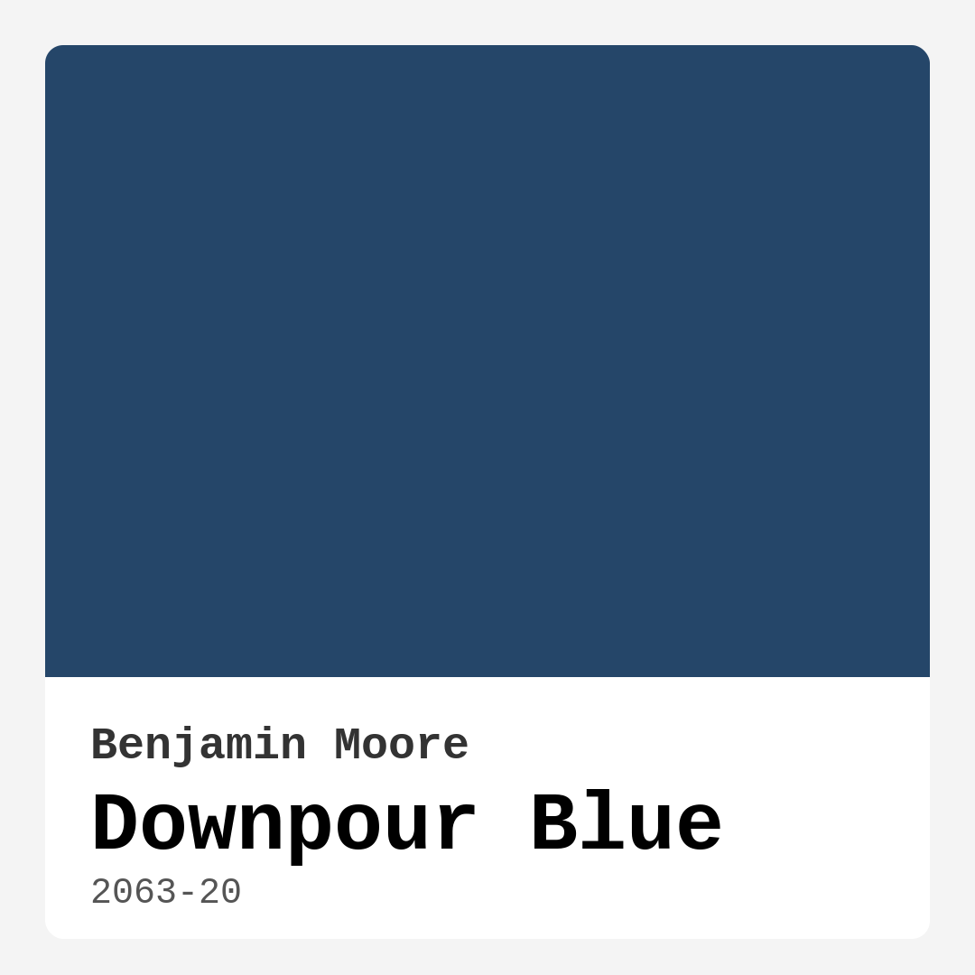
Color Preview & Key Details
| HEX Code | #254669 |
| RGB | 37, 70, 105 |
| LRV | 7.48% |
| Undertone | Blue |
| Finish Options | Matte, Satin, Semi-Gloss |
If you’re searching for a paint color that brings both depth and tranquility to your home, let me introduce you to Benjamin Moore’s Downpour Blue (2063-20). This captivating shade is like a breath of fresh air—literally. Inspired by the serene feeling of a gentle rain, it’s a deep, muted blue that effortlessly transforms any space into a calming retreat. Whether you’re looking to create a cozy bedroom, a sophisticated living room, or a refreshing home office, Downpour Blue has the versatility to make it happen.
One of the first things you’ll notice about this color is its richness. With an LRV (Light Reflectance Value) of just 7.48%, it falls into the dark color category, meaning it absorbs light rather than reflecting it. That might sound intimidating if you’re worried about a room feeling too closed in, but here’s the thing—Downpour Blue has a way of making spaces feel intimate rather than cramped. Pair it with crisp white trim (think Benjamin Moore’s White Dove or Pure White) and some well-placed lighting, and suddenly, the room feels layered and intentional. It’s all about balance.
Speaking of balance, let’s talk undertones. Downpour Blue leans into its blue undertone without any surprises—no hidden greens or grays muddying the waters. This makes it incredibly easy to pair with other colors. If you want to play up its cool, calming vibe, keep the decor minimal with soft neutrals and natural textures. But if you’re craving a little contrast, introduce warm accents like brass fixtures, terracotta pots, or even a burnt orange throw pillow (its complementary hue). The result? A space that feels dynamic yet harmonious.
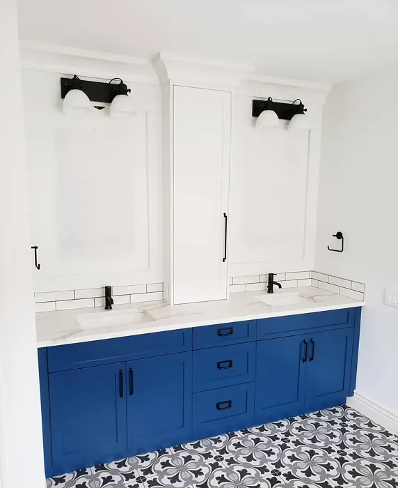
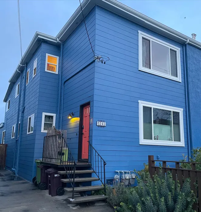
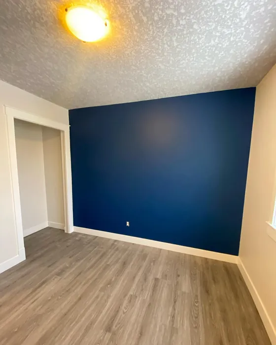
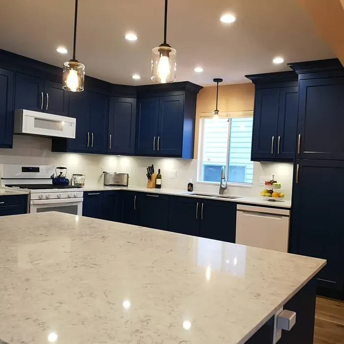
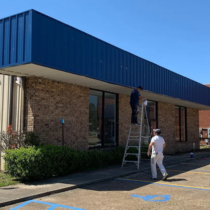
Now, where should you use it? This color shines in bedrooms and home offices, where its restful energy can help you unwind or focus. But don’t overlook it for living rooms or even bathrooms—especially if you opt for a satin or semi-gloss finish that stands up to moisture. In a bathroom, Downpour Blue can feel like a spa-like escape, especially when paired with marble countertops and matte black hardware. And in a living room, it creates an instant focal point, whether you’re painting an accent wall or going all-in on a moody, enveloping look.
Application is a breeze, which is always a win. Downpour Blue has excellent coverage, often needing just one or two coats, and it dries quickly with minimal splatter. It’s beginner-friendly, so if you’re new to DIY painting, this is a great color to start with. Plus, it’s low-VOC, so you won’t have to worry about harsh fumes lingering in your home. Touch-ups are easy, too, though you might need them in high-traffic areas since darker colors tend to show wear a bit more.
Lighting plays a huge role in how this color performs. In natural light, Downpour Blue feels vibrant and refreshing, almost like the sky after a storm. But as the sun sets and artificial lighting takes over, it deepens into something moodier and more intimate. That’s why it’s such a great choice for rooms where you want flexibility—bright and airy by day, cozy and inviting by night. If your space lacks natural light, just be mindful that the color will feel darker, so balance it with plenty of warm lighting and lighter furnishings.
Wondering about decor styles? Downpour Blue is a chameleon. It fits right into modern spaces with clean lines and metallic accents, but it also works beautifully in coastal or Scandinavian-inspired rooms where soft textures and organic materials take center stage. For an industrial vibe, pair it with exposed brick and black steel frames. Or, if you’re going for a modern farmhouse look, combine it with shiplap and rustic wood tones. The possibilities are endless.
As for finishes, you’ve got options. A matte finish gives Downpour Blue a soft, velvety look that’s perfect for bedrooms or low-traffic areas. Satin adds a subtle sheen that’s easy to clean, making it ideal for kitchens or kids’ rooms. And semi-gloss? That’s your go-to for trim, doors, or any surface that needs a little extra durability.
So, is Downpour Blue right for you? If you love colors with depth, if you crave a space that feels both sophisticated and serene, if you’re drawn to blues that aren’t too bold or too washed-out—then yes, absolutely. Test it out with a sample first, observe it at different times of day, and imagine how it’ll work with your furniture and lighting. Because the best paint color isn’t just about what’s trending; it’s about how it makes you feel every time you walk into the room. And Downpour Blue? It feels like coming home to peace.
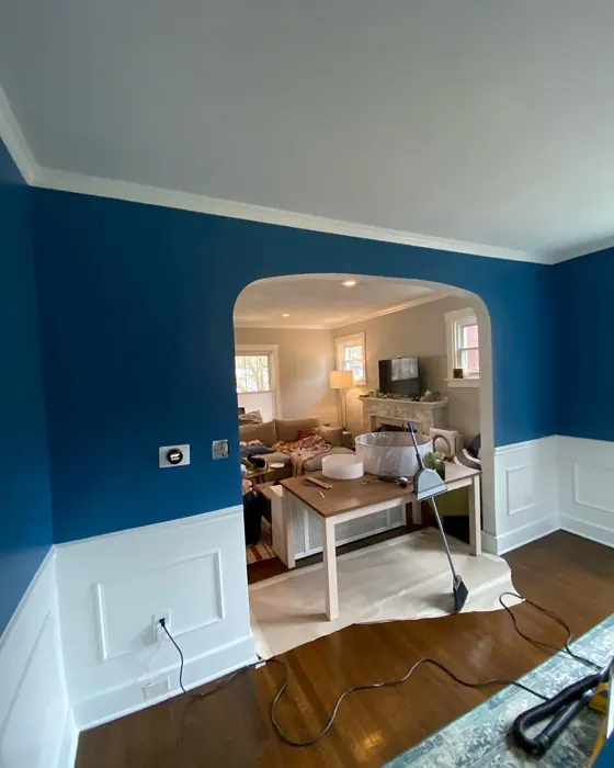
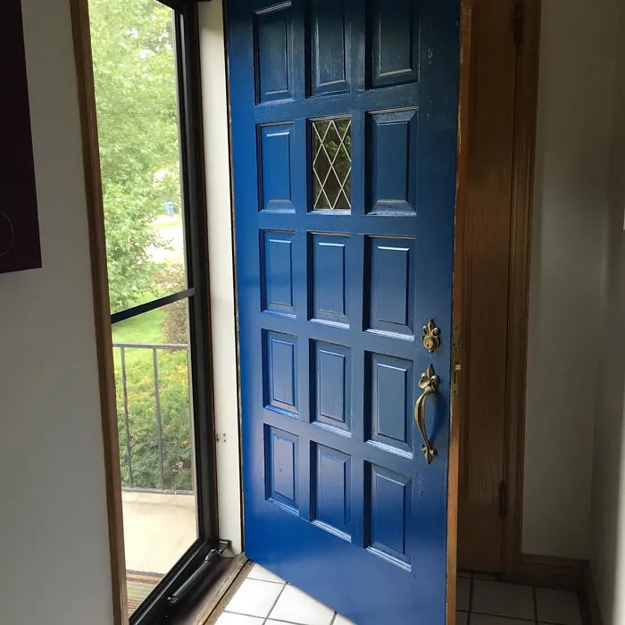
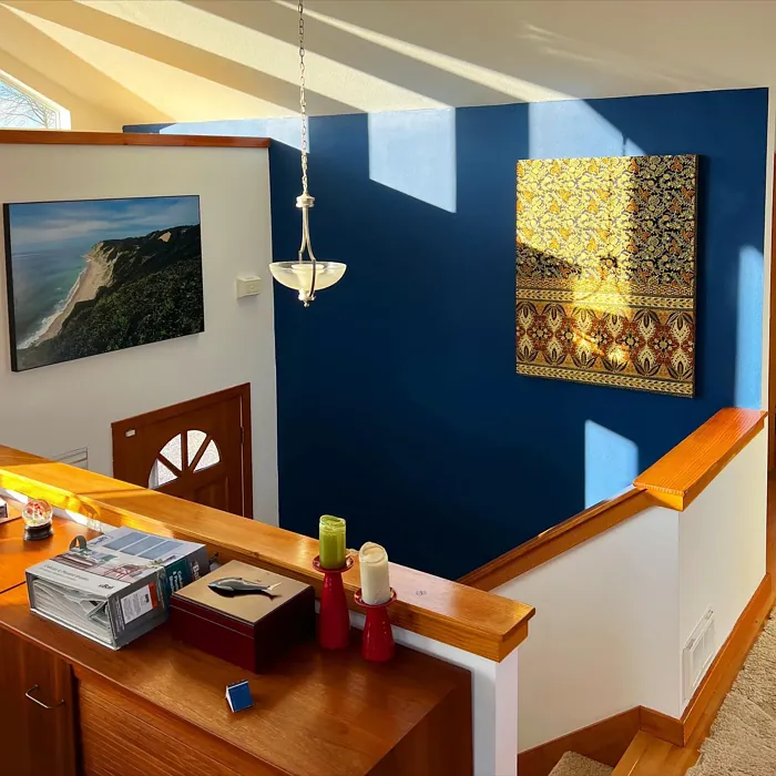
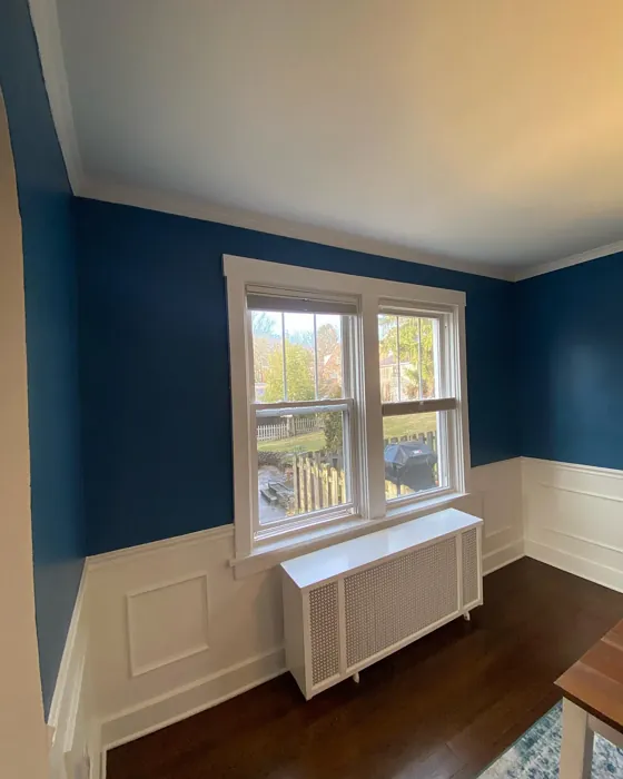
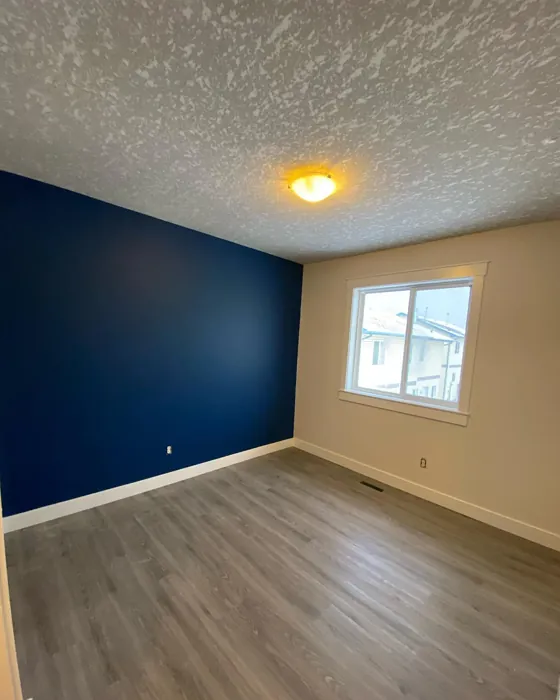
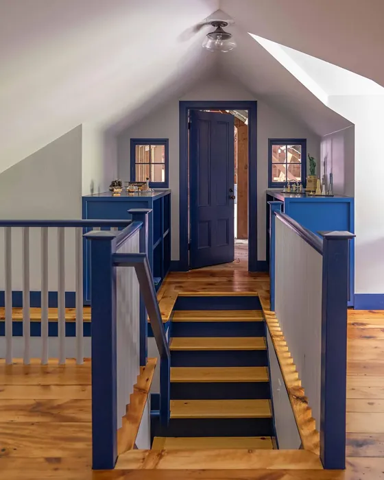
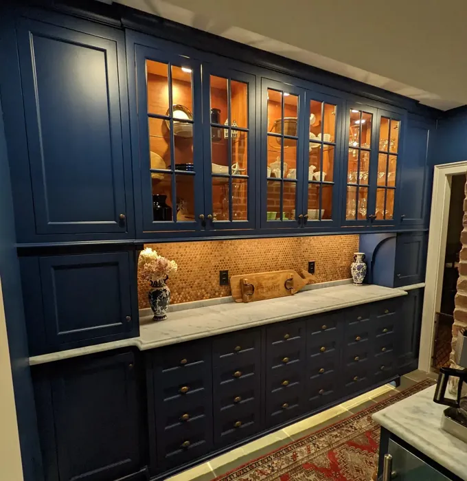
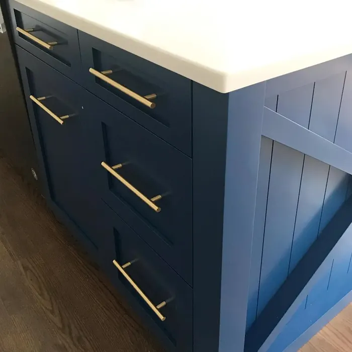
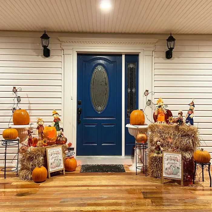
Real Room Photo of Downpour Blue 2063-20

Undertones of Downpour Blue ?
The undertones of Downpour Blue are a key aspect of its character, leaning towards Blue. These subtle underlying hues are what give the color its depth and complexity. For example, a gray with a blue undertone will feel cooler and more modern, while one with a brown undertone will feel warmer and more traditional. It’s essential to test this paint in your home and observe it next to your existing furniture, flooring, and decor to see how these undertones interact and reveal themselves throughout the day.
HEX value: #254669
RGB code: 37, 70, 105
Is Downpour Blue Cool or Warm?
Primarily a cool tone, Downpour Blue can evoke feelings of calm and serenity, perfect for spaces where relaxation is key. However, its depth allows it to harmonize with warmer elements, creating a balanced environment.
Understanding Color Properties and Interior Design Tips
Hue refers to a specific position on the color wheel, measured in degrees from 0 to 360. Each degree represents a different pure color:
- 0° represents red
- 120° represents green
- 240° represents blue
Saturation describes the intensity or purity of a color and is expressed as a percentage:
- At 0%, the color appears completely desaturated—essentially a shade of gray
- At 100%, the color is at its most vivid and vibrant
Lightness indicates how light or dark a color is, also expressed as a percentage:
- 0% lightness results in black
- 100% lightness results in white
Using Warm Colors in Interior Design
Warm hues—such as reds, oranges, yellows, warm beiges, and greiges—are excellent choices for creating inviting and energetic spaces. These colors are particularly well-suited for:
- Kitchens, living rooms, and bathrooms, where warmth enhances comfort and sociability
- Large rooms, where warm tones can help reduce the sense of emptiness and make the space feel more intimate
For example:
- Warm beige shades provide a cozy, inviting atmosphere, ideal for living rooms, bedrooms, and hallways.
- Warm greige (a mix of beige and gray) offers the warmth of beige with the modern appeal of gray, making it a versatile backdrop for dining areas, bedrooms, and living spaces.
However, be mindful when using warm light tones in rooms with limited natural light. These shades may appear muted or even take on an unpleasant yellowish tint. To avoid a dull or flat appearance:
- Add depth by incorporating richer tones like deep greens, charcoal, or chocolate brown
- Use textured elements such as curtains, rugs, or cushions to bring dimension to the space
Pro Tip: Achieving Harmony with Warm and Cool Color Balance
To create a well-balanced and visually interesting interior, mix warm and cool tones strategically. This contrast adds depth and harmony to your design.
- If your walls feature warm hues, introduce cool-colored accents such as blue or green furniture, artwork, or accessories to create contrast.
- For a polished look, consider using a complementary color scheme, which pairs colors opposite each other on the color wheel (e.g., red with green, orange with blue).
This thoughtful mix not only enhances visual appeal but also creates a space that feels both dynamic and cohesive.
Light Temperature Affects on Downpour Blue
Natural Light
Natural daylight changes in color temperature as the sun moves across the sky. At sunrise and sunset, the light tends to have a warm, golden tone with a color temperature around 2000 Kelvin (K). As the day progresses and the sun rises higher, the light becomes cooler and more neutral. Around midday, especially when the sky is clear, natural light typically reaches its peak brightness and shifts to a cooler tone, ranging from 5500 to 6500 Kelvin. This midday light is close to what we perceive as pure white or daylight-balanced light.
These shifts in natural light can significantly influence how colors appear in a space, which is why designers often consider both the time of day and the orientation of windows when planning interior color schemes.
Artificial Light
When choosing artificial lighting, pay close attention to the color temperature, measured in Kelvin (K). This determines how warm or cool the light will appear. Lower temperatures, around 2700K, give off a warm, yellow glow often used in living rooms or bedrooms. Higher temperatures, above 5000K, create a cool, bluish light similar to daylight, commonly used in kitchens, offices, or task areas.
Use the slider to see how lighting temperature can affect the appearance of a surface or color throughout a space.


4800K
LRV of Downpour Blue
The Light Reflectance Value (LRV) of Downpour Blue is 7.48%, which places it in the Dark colors category. This means it does not reflect light. Understanding a paint’s LRV is crucial for predicting how it will look in your space. A higher LRV indicates a lighter color that reflects more light, making rooms feel larger and brighter. A lower LRV signifies a darker color that absorbs more light, creating a cozier, more intimate atmosphere. Always consider the natural and artificial lighting in your room when selecting a paint color based on its LRV.
Detailed Review of Downpour Blue
Additional Paint Characteristics
Ideal Rooms
Bathroom, Bedroom, Home Office, Living Room
Decor Styles
Coastal, Industrial, Modern, Scandinavian
Coverage
Good (1–2 Coats), Touch-Up Friendly
Ease of Application
Beginner Friendly, Brush Smooth, Fast-Drying, Roller-Ready
Washability
Washable, Wipeable
VOC Level
Low VOC, Ultra Low VOC
Best Use
Accent Wall, Furniture, Interior Walls
Room Suitability
Bathroom, Bedroom, Home Office, Living Room
Tone Tag
Cool, Deep, Muted
Finish Type
Matte, Satin, Semi-Gloss
Paint Performance
Easy Touch-Up, High Coverage, Low Odor
Use Cases
Best for Low Light Rooms, Best for Modern Farmhouse, Classic Favorite
Mood
Calm, Inviting, Restful
Trim Pairing
Complements Brass Fixtures, Matches Pure White, Pairs with White Dove
Downpour Blue is a stunning choice for those looking to infuse their space with a touch of tranquility and depth. Its rich hue offers a perfect balance of warmth and coolness, making it easy to pair with various decor elements. When applied, the paint flows smoothly, providing a consistent finish without any patchiness. The color adapts beautifully to different lighting conditions, appearing softer in daylight while deepening at night. Whether you’re accenting a wall or enveloping an entire room, Downpour Blue delivers a sophisticated yet inviting atmosphere. It’s particularly striking against natural wood accents or white trim, enhancing the overall aesthetic of your home.
Pros & Cons of 2063-20 Downpour Blue
Pros
Cons
Colors that go with Benjamin Moore Downpour Blue
FAQ on 2063-20 Downpour Blue
Can Downpour Blue be used in small rooms?
Absolutely! While Downpour Blue is a deep hue, it can work wonderfully in small rooms if balanced with lighter decor and furnishings. Consider pairing it with white trim or light-colored furniture to keep the space feeling open and airy. It’s all about creating contrast that highlights the beauty of this color.
What finishes are best for Downpour Blue?
Downpour Blue looks fantastic in various finishes, but a satin or semi-gloss finish tends to enhance its depth and richness. These finishes are also easier to clean, making them ideal for spaces like kitchens or bathrooms. However, if you’re looking for a more muted look, a matte finish can create a soft, cozy atmosphere.
Comparisons Downpour Blue with other colors
Downpour Blue 2063-20 vs Naval SW 6244
| Attribute | Downpour Blue 2063-20 | Naval SW 6244 |
|---|---|---|
| Color Name | Downpour Blue 2063-20 | Naval SW 6244 |
| Color | ||
| Hue | Blue | Blue |
| Brightness | Dark | Dark |
| RGB | 37, 70, 105 | 47, 61, 76 |
| LRV | 7.48% | 4% |
| Finish Type | Matte, Satin, Semi-Gloss | Matte, Satin, Semi-Gloss |
| Finish Options | Matte, Satin, Semi-Gloss | Matte, Satin, Semi-Gloss |
| Ideal Rooms | Bathroom, Bedroom, Home Office, Living Room | Bedroom, Dining Room, Hallway, Home Office, Living Room |
| Decor Styles | Coastal, Industrial, Modern, Scandinavian | Coastal, Industrial, Minimalist, Modern, Traditional |
| Coverage | Good (1–2 Coats), Touch-Up Friendly | Good (1–2 Coats), Self-Priming |
| Ease of Application | Beginner Friendly, Brush Smooth, Fast-Drying, Roller-Ready | Beginner Friendly, Brush Smooth, Roller-Ready |
| Washability | Washable, Wipeable | Highly Washable, Washable |
| Room Suitability | Bathroom, Bedroom, Home Office, Living Room | Bedroom, Dining Room, Entryway, Home Office, Living Room |
| Tone | Cool, Deep, Muted | Cool, Deep, Moody |
| Paint Performance | Easy Touch-Up, High Coverage, Low Odor | Easy Touch-Up, High Coverage, Low Odor, Scuff Resistant |
Downpour Blue 2063-20 vs Sea Serpent SW 7615
| Attribute | Downpour Blue 2063-20 | Sea Serpent SW 7615 |
|---|---|---|
| Color Name | Downpour Blue 2063-20 | Sea Serpent SW 7615 |
| Color | ||
| Hue | Blue | Blue |
| Brightness | Dark | Dark |
| RGB | 37, 70, 105 | 62, 75, 84 |
| LRV | 7.48% | 12% |
| Finish Type | Matte, Satin, Semi-Gloss | Eggshell, Matte, Satin |
| Finish Options | Matte, Satin, Semi-Gloss | Eggshell, Matte, Satin |
| Ideal Rooms | Bathroom, Bedroom, Home Office, Living Room | Bathroom, Bedroom, Home Office, Living Room |
| Decor Styles | Coastal, Industrial, Modern, Scandinavian | Coastal, Farmhouse, Industrial, Modern |
| Coverage | Good (1–2 Coats), Touch-Up Friendly | Good (1–2 Coats), Touch-Up Friendly |
| Ease of Application | Beginner Friendly, Brush Smooth, Fast-Drying, Roller-Ready | Beginner Friendly, Brush Smooth, Roller-Ready |
| Washability | Washable, Wipeable | Highly Washable, Washable |
| Room Suitability | Bathroom, Bedroom, Home Office, Living Room | Bathroom, Bedroom, Home Office, Living Room |
| Tone | Cool, Deep, Muted | Cool, Deep, Moody |
| Paint Performance | Easy Touch-Up, High Coverage, Low Odor | Easy Touch-Up, High Coverage, Low Odor |
Downpour Blue 2063-20 vs Rain Cloud SW 9639
| Attribute | Downpour Blue 2063-20 | Rain Cloud SW 9639 |
|---|---|---|
| Color Name | Downpour Blue 2063-20 | Rain Cloud SW 9639 |
| Color | ||
| Hue | Blue | Blue |
| Brightness | Dark | Dark |
| RGB | 37, 70, 105 | 83, 97, 104 |
| LRV | 7.48% | 30% |
| Finish Type | Matte, Satin, Semi-Gloss | Eggshell, Matte, Satin |
| Finish Options | Matte, Satin, Semi-Gloss | Eggshell, Matte, Satin |
| Ideal Rooms | Bathroom, Bedroom, Home Office, Living Room | Bedroom, Dining Room, Home Office, Living Room |
| Decor Styles | Coastal, Industrial, Modern, Scandinavian | Coastal, Contemporary, Minimalist, Scandinavian |
| Coverage | Good (1–2 Coats), Touch-Up Friendly | Good (1–2 Coats), Touch-Up Friendly |
| Ease of Application | Beginner Friendly, Brush Smooth, Fast-Drying, Roller-Ready | Beginner Friendly, Brush Smooth, Roller-Ready |
| Washability | Washable, Wipeable | Highly Washable, Washable |
| Room Suitability | Bathroom, Bedroom, Home Office, Living Room | Bedroom, Home Office, Living Room |
| Tone | Cool, Deep, Muted | Balanced, Cool, Muted |
| Paint Performance | Easy Touch-Up, High Coverage, Low Odor | Easy Touch-Up, Fade Resistant, Low Odor |
Downpour Blue 2063-20 vs Indigo Batik SW 7602
| Attribute | Downpour Blue 2063-20 | Indigo Batik SW 7602 |
|---|---|---|
| Color Name | Downpour Blue 2063-20 | Indigo Batik SW 7602 |
| Color | ||
| Hue | Blue | Blue |
| Brightness | Dark | Dark |
| RGB | 37, 70, 105 | 62, 80, 99 |
| LRV | 7.48% | 10% |
| Finish Type | Matte, Satin, Semi-Gloss | Matte, Satin |
| Finish Options | Matte, Satin, Semi-Gloss | Eggshell, Flat, Matte, Satin |
| Ideal Rooms | Bathroom, Bedroom, Home Office, Living Room | Bedroom, Dining Room, Home Office, Living Room |
| Decor Styles | Coastal, Industrial, Modern, Scandinavian | Bohemian, Coastal, Contemporary, Modern |
| Coverage | Good (1–2 Coats), Touch-Up Friendly | Good (1–2 Coats), Touch-Up Friendly |
| Ease of Application | Beginner Friendly, Brush Smooth, Fast-Drying, Roller-Ready | Brush Smooth, Fast-Drying, Roller-Ready |
| Washability | Washable, Wipeable | Scrubbable, Washable, Wipeable |
| Room Suitability | Bathroom, Bedroom, Home Office, Living Room | Bedroom, Dining Room, Home Office, Living Room |
| Tone | Cool, Deep, Muted | Cool, Deep, Moody |
| Paint Performance | Easy Touch-Up, High Coverage, Low Odor | Easy Touch-Up, High Coverage, Low Odor, Quick Drying |
Downpour Blue 2063-20 vs Sea Mariner SW 9640
| Attribute | Downpour Blue 2063-20 | Sea Mariner SW 9640 |
|---|---|---|
| Color Name | Downpour Blue 2063-20 | Sea Mariner SW 9640 |
| Color | ||
| Hue | Blue | Blue |
| Brightness | Dark | Dark |
| RGB | 37, 70, 105 | 67, 74, 84 |
| LRV | 7.48% | 6% |
| Finish Type | Matte, Satin, Semi-Gloss | Eggshell, Matte, Satin |
| Finish Options | Matte, Satin, Semi-Gloss | Eggshell, Matte, Satin |
| Ideal Rooms | Bathroom, Bedroom, Home Office, Living Room | Bedroom, Dining Room, Hallway, Home Office, Living Room |
| Decor Styles | Coastal, Industrial, Modern, Scandinavian | Coastal, Industrial, Minimalist, Modern |
| Coverage | Good (1–2 Coats), Touch-Up Friendly | Good (1–2 Coats) |
| Ease of Application | Beginner Friendly, Brush Smooth, Fast-Drying, Roller-Ready | Beginner Friendly, Brush Smooth, Roller-Ready |
| Washability | Washable, Wipeable | Scrubbable, Washable |
| Room Suitability | Bathroom, Bedroom, Home Office, Living Room | Bedroom, Dining Room, Home Office, Living Room |
| Tone | Cool, Deep, Muted | Cool, Deep, Moody |
| Paint Performance | Easy Touch-Up, High Coverage, Low Odor | Easy Touch-Up, Low Odor, Quick Drying |
Downpour Blue 2063-20 vs Still Water SW 6223
| Attribute | Downpour Blue 2063-20 | Still Water SW 6223 |
|---|---|---|
| Color Name | Downpour Blue 2063-20 | Still Water SW 6223 |
| Color | ||
| Hue | Blue | Blue |
| Brightness | Dark | Dark |
| RGB | 37, 70, 105 | 74, 93, 95 |
| LRV | 7.48% | 48% |
| Finish Type | Matte, Satin, Semi-Gloss | Eggshell, Matte, Satin |
| Finish Options | Matte, Satin, Semi-Gloss | Eggshell, Matte, Satin |
| Ideal Rooms | Bathroom, Bedroom, Home Office, Living Room | Bedroom, Dining Room, Home Office, Living Room, Nursery |
| Decor Styles | Coastal, Industrial, Modern, Scandinavian | Coastal, Contemporary, Farmhouse, Modern, Rustic |
| Coverage | Good (1–2 Coats), Touch-Up Friendly | Good (1–2 Coats), Touch-Up Friendly |
| Ease of Application | Beginner Friendly, Brush Smooth, Fast-Drying, Roller-Ready | Beginner Friendly, Brush Smooth, Roller-Ready |
| Washability | Washable, Wipeable | Highly Washable, Washable |
| Room Suitability | Bathroom, Bedroom, Home Office, Living Room | Bedroom, Dining Room, Home Office, Living Room |
| Tone | Cool, Deep, Muted | Cool, Earthy, Muted |
| Paint Performance | Easy Touch-Up, High Coverage, Low Odor | Easy Touch-Up, Fade Resistant, Low Odor |
Downpour Blue 2063-20 vs Waterloo SW 9141
| Attribute | Downpour Blue 2063-20 | Waterloo SW 9141 |
|---|---|---|
| Color Name | Downpour Blue 2063-20 | Waterloo SW 9141 |
| Color | ||
| Hue | Blue | Blue |
| Brightness | Dark | Dark |
| RGB | 37, 70, 105 | 83, 104, 114 |
| LRV | 7.48% | 12% |
| Finish Type | Matte, Satin, Semi-Gloss | Matte, Satin |
| Finish Options | Matte, Satin, Semi-Gloss | Matte, Satin, Semi-Gloss |
| Ideal Rooms | Bathroom, Bedroom, Home Office, Living Room | Bedroom, Dining Room, Hallway, Home Office, Living Room |
| Decor Styles | Coastal, Industrial, Modern, Scandinavian | Coastal, Industrial, Modern, Rustic |
| Coverage | Good (1–2 Coats), Touch-Up Friendly | Good (1–2 Coats), Touch-Up Friendly |
| Ease of Application | Beginner Friendly, Brush Smooth, Fast-Drying, Roller-Ready | Brush Smooth, Fast-Drying, Roller-Ready |
| Washability | Washable, Wipeable | Scrubbable, Washable |
| Room Suitability | Bathroom, Bedroom, Home Office, Living Room | Bedroom, Dining Room, Home Office, Living Room |
| Tone | Cool, Deep, Muted | Balanced, Cool, Muted |
| Paint Performance | Easy Touch-Up, High Coverage, Low Odor | Easy Touch-Up, Fade Resistant, Low Odor, Quick Drying |
Downpour Blue 2063-20 vs Smoky Blue SW 7604
| Attribute | Downpour Blue 2063-20 | Smoky Blue SW 7604 |
|---|---|---|
| Color Name | Downpour Blue 2063-20 | Smoky Blue SW 7604 |
| Color | ||
| Hue | Blue | Blue |
| Brightness | Dark | Dark |
| RGB | 37, 70, 105 | 89, 110, 121 |
| LRV | 7.48% | 15% |
| Finish Type | Matte, Satin, Semi-Gloss | Eggshell, Matte, Satin |
| Finish Options | Matte, Satin, Semi-Gloss | Eggshell, Matte, Satin |
| Ideal Rooms | Bathroom, Bedroom, Home Office, Living Room | Bathroom, Bedroom, Home Office, Kitchen, Living Room |
| Decor Styles | Coastal, Industrial, Modern, Scandinavian | Coastal, Modern, Scandinavian, Transitional |
| Coverage | Good (1–2 Coats), Touch-Up Friendly | Good (1–2 Coats), Touch-Up Friendly |
| Ease of Application | Beginner Friendly, Brush Smooth, Fast-Drying, Roller-Ready | Beginner Friendly, Brush Smooth, Roller-Ready |
| Washability | Washable, Wipeable | Highly Washable, Washable |
| Room Suitability | Bathroom, Bedroom, Home Office, Living Room | Bathroom, Bedroom, Home Office, Living Room |
| Tone | Cool, Deep, Muted | Cool, Dusty, Muted |
| Paint Performance | Easy Touch-Up, High Coverage, Low Odor | High Coverage, Low Odor, Quick Drying |
Downpour Blue 2063-20 vs Needlepoint Navy SW 0032
| Attribute | Downpour Blue 2063-20 | Needlepoint Navy SW 0032 |
|---|---|---|
| Color Name | Downpour Blue 2063-20 | Needlepoint Navy SW 0032 |
| Color | ||
| Hue | Blue | Blue |
| Brightness | Dark | Dark |
| RGB | 37, 70, 105 | 84, 102, 112 |
| LRV | 7.48% | 4% |
| Finish Type | Matte, Satin, Semi-Gloss | Matte, Satin, Semi-Gloss |
| Finish Options | Matte, Satin, Semi-Gloss | Matte, Satin, Semi-Gloss |
| Ideal Rooms | Bathroom, Bedroom, Home Office, Living Room | Bedroom, Dining Room, Entryway, Home Office, Living Room |
| Decor Styles | Coastal, Industrial, Modern, Scandinavian | Coastal, Contemporary, Modern Farmhouse, Nautical, Traditional |
| Coverage | Good (1–2 Coats), Touch-Up Friendly | Good (1–2 Coats), Touch-Up Friendly |
| Ease of Application | Beginner Friendly, Brush Smooth, Fast-Drying, Roller-Ready | Beginner Friendly, Brush Smooth, Fast-Drying, Roller-Ready |
| Washability | Washable, Wipeable | Scrubbable, Washable |
| Room Suitability | Bathroom, Bedroom, Home Office, Living Room | Bedroom, Dining Room, Home Office, Living Room |
| Tone | Cool, Deep, Muted | Cool, Deep, Muted |
| Paint Performance | Easy Touch-Up, High Coverage, Low Odor | Easy Touch-Up, High Coverage, Low Odor, Quick Drying, Stain Resistant |
Downpour Blue 2063-20 vs Riverway SW 6222
| Attribute | Downpour Blue 2063-20 | Riverway SW 6222 |
|---|---|---|
| Color Name | Downpour Blue 2063-20 | Riverway SW 6222 |
| Color | ||
| Hue | Blue | Blue |
| Brightness | Dark | Dark |
| RGB | 37, 70, 105 | 93, 114, 116 |
| LRV | 7.48% | 24% |
| Finish Type | Matte, Satin, Semi-Gloss | Eggshell, Satin |
| Finish Options | Matte, Satin, Semi-Gloss | Eggshell, Matte, Satin |
| Ideal Rooms | Bathroom, Bedroom, Home Office, Living Room | Bathroom, Bedroom, Dining Room, Home Office, Living Room |
| Decor Styles | Coastal, Industrial, Modern, Scandinavian | Coastal, Contemporary, Eclectic, Modern, Rustic |
| Coverage | Good (1–2 Coats), Touch-Up Friendly | Good (1–2 Coats), Touch-Up Friendly |
| Ease of Application | Beginner Friendly, Brush Smooth, Fast-Drying, Roller-Ready | Beginner Friendly, Brush Smooth, Fast-Drying, Low Splatter, Roller-Ready |
| Washability | Washable, Wipeable | Highly Washable, Washable |
| Room Suitability | Bathroom, Bedroom, Home Office, Living Room | Bathroom, Bedroom, Home Office, Living Room |
| Tone | Cool, Deep, Muted | Balanced, Cool, Muted |
| Paint Performance | Easy Touch-Up, High Coverage, Low Odor | Easy Touch-Up, High Coverage, Low Odor, Quick Drying |
Official Page of Benjamin Moore Downpour Blue 2063-20