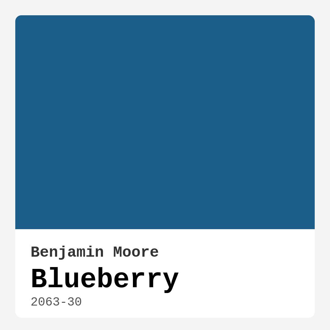
Color Preview & Key Details
| HEX Code | #1A5E89 |
| RGB | 26, 94, 137 |
| LRV | 12.71% |
| Undertone | Blue |
| Finish Options | Eggshell, Matte, Satin |
If you’re looking for a paint color that brings depth, sophistication, and a sense of calm to your home, Benjamin Moore’s Blueberry (2063-30) might just be your perfect match. This deep, rich blue hue is more than just a color—it’s a mood. Whether you’re refreshing a single wall or transforming an entire room, Blueberry has the versatility to work in a variety of spaces, from cozy bedrooms to elegant dining rooms. Let’s dive into what makes this color so special and how you can make it work in your home.
First, let’s talk about the tone. Blueberry is a cool, deep blue with a balanced undertone that leans purely blue—no hidden greens or grays here. This makes it incredibly versatile, as it won’t clash with other colors in your space. Cool tones like this are fantastic for creating a serene, refreshing atmosphere, especially in rooms where you want to unwind. Picture it in a bedroom with crisp white linens or a home office paired with warm wood accents—it instantly adds a layer of sophistication without feeling overwhelming.
One of the standout features of Blueberry is how it plays with light. With an LRV (Light Reflectance Value) of 12.71%, it’s on the darker side, meaning it absorbs more light than it reflects. In natural daylight, the color appears vibrant and full of life, while in the evening or low-light conditions, it deepens into a cozy, almost intimate shade. This makes it ideal for spaces where you want a dynamic yet calming effect. Just keep in mind that in rooms with very little natural light, it might feel darker than expected, so consider balancing it with lighter furniture or decor to keep the space feeling open.
When it comes to application, Blueberry is a dream. It offers excellent coverage, often needing just one or two coats for a flawless finish, and it’s touch-up friendly, so maintaining your walls over time is hassle-free. It’s also beginner-friendly, whether you’re rolling it on or brushing it smooth. The finish options—matte, eggshell, or satin—give you flexibility depending on the room’s function. Eggshell is a great middle ground, offering a soft sheen that enhances the color’s richness, while satin adds durability, making it perfect for high-traffic areas like living rooms or hallways. Matte, on the other hand, creates a velvety, understated look that works beautifully in bedrooms or cozy nooks.
Now, let’s talk pairings. Blueberry is a team player—it plays well with a range of complementary colors. For a classic look, pair it with crisp whites like Benjamin Moore’s White Dove for trim and ceilings. This creates a clean, timeless contrast that lets the blue shine. If you want to add warmth, try accents in creamy beiges or soft taupes. For a bolder approach, introduce touches of coral or mustard yellow, which play off the coolness of the blue beautifully. And if you’re feeling adventurous, deep greens or charcoal grays can create a moody, layered effect that’s perfect for a modern or rustic space.
Wondering where to use it? Blueberry excels in living rooms, where it can anchor a space as an accent wall or set the tone for the entire room. In bedrooms, it creates a restful retreat, especially when paired with soft textiles and warm lighting. Home offices benefit from its calming yet focused energy, and dining rooms take on an elegant, almost nautical charm when painted in this shade. Even smaller rooms can pull it off—just balance it with plenty of light-reflecting elements like mirrors, metallic finishes, or lighter furniture to keep the space from feeling too enclosed.
As for decor styles, Blueberry is a chameleon. It fits seamlessly into modern interiors, adding a punch of color without overwhelming minimalist designs. In coastal-inspired spaces, it evokes the deep blue of the ocean, especially when paired with whites and natural textures. Traditional rooms benefit from its timeless richness, while rustic or farmhouse settings can use it to add depth and contrast against weathered woods and neutral tones.
A few things to keep in mind: Because it’s a darker color, test it in your space before committing. Paint a large swatch and observe it at different times of day to see how it interacts with your lighting. And while it’s low-VOC and eco-friendly, proper ventilation during application is always a good idea.
In the end, Blueberry is more than just a paint color—it’s an experience. It has the power to transform a room from ordinary to extraordinary, creating a space that feels both inviting and refined. Whether you’re going for a bold statement or a subtle backdrop, this shade delivers. So if you’re ready to bring a touch of depth and tranquility into your home, Blueberry might just be the perfect place to start.
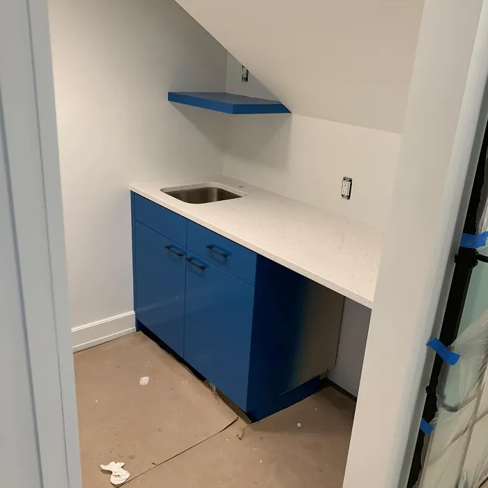
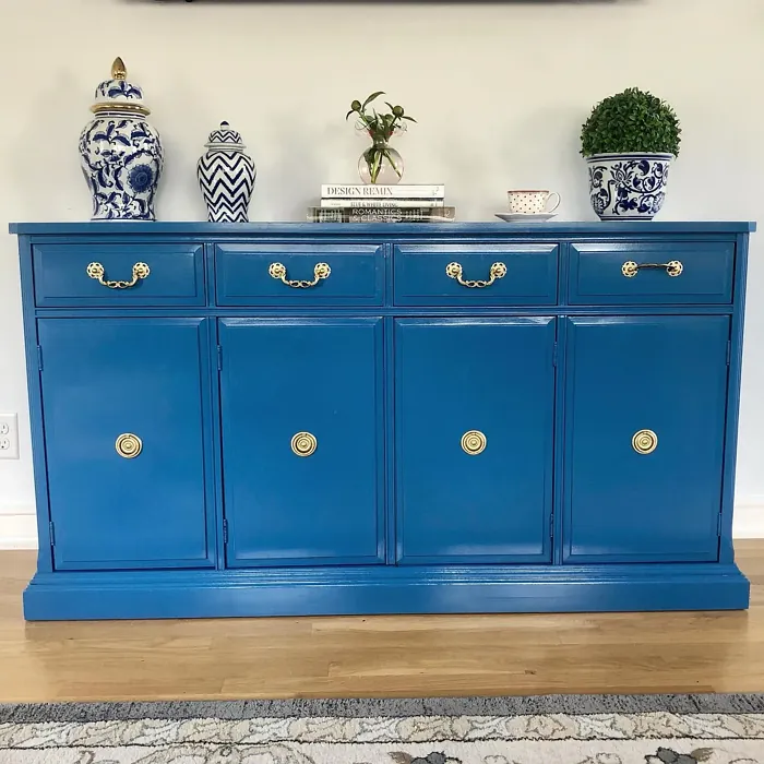
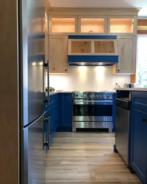
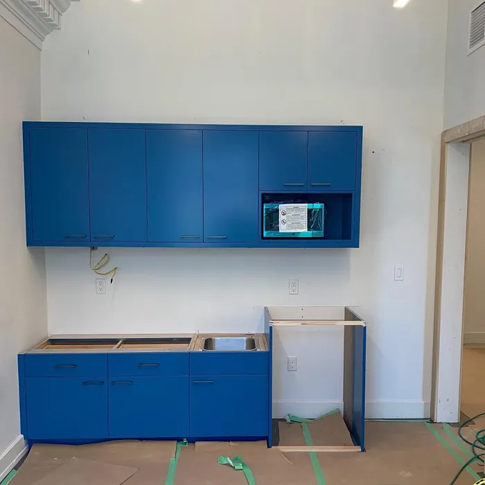
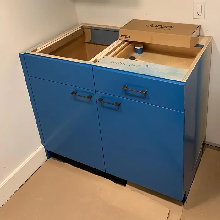
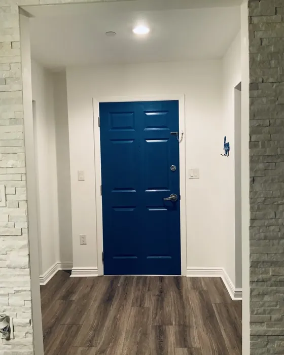
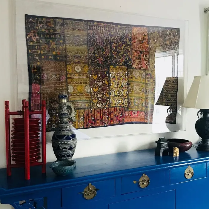
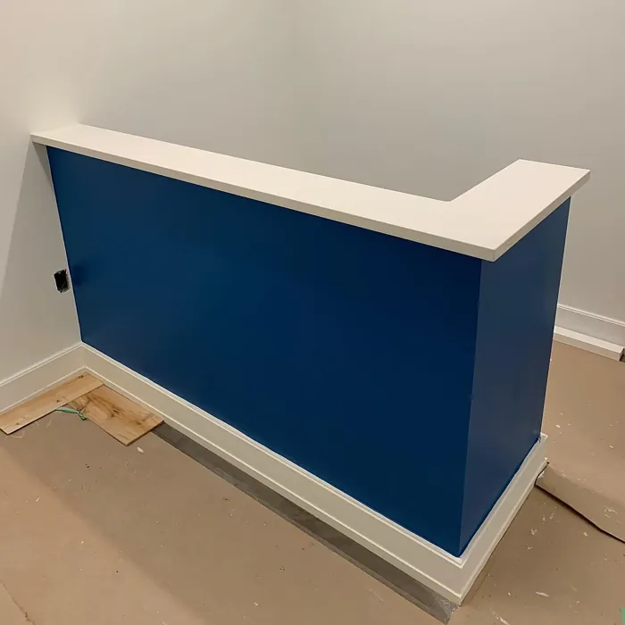
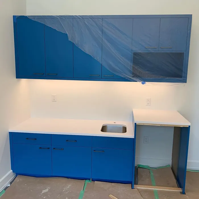
Real Room Photo of Blueberry 2063-30
Undertones of Blueberry ?
The undertones of Blueberry are a key aspect of its character, leaning towards Blue. These subtle underlying hues are what give the color its depth and complexity. For example, a gray with a blue undertone will feel cooler and more modern, while one with a brown undertone will feel warmer and more traditional. It’s essential to test this paint in your home and observe it next to your existing furniture, flooring, and decor to see how these undertones interact and reveal themselves throughout the day.
HEX value: #1A5E89
RGB code: 26, 94, 137
Is Blueberry Cool or Warm?
This color leans towards the cooler side of the spectrum, making it perfect for creating a refreshing atmosphere. It can complement warmer tones in furniture and decor, providing a nice contrast that adds dimension to your space.
Understanding Color Properties and Interior Design Tips
Hue refers to a specific position on the color wheel, measured in degrees from 0 to 360. Each degree represents a different pure color:
- 0° represents red
- 120° represents green
- 240° represents blue
Saturation describes the intensity or purity of a color and is expressed as a percentage:
- At 0%, the color appears completely desaturated—essentially a shade of gray
- At 100%, the color is at its most vivid and vibrant
Lightness indicates how light or dark a color is, also expressed as a percentage:
- 0% lightness results in black
- 100% lightness results in white
Using Warm Colors in Interior Design
Warm hues—such as reds, oranges, yellows, warm beiges, and greiges—are excellent choices for creating inviting and energetic spaces. These colors are particularly well-suited for:
- Kitchens, living rooms, and bathrooms, where warmth enhances comfort and sociability
- Large rooms, where warm tones can help reduce the sense of emptiness and make the space feel more intimate
For example:
- Warm beige shades provide a cozy, inviting atmosphere, ideal for living rooms, bedrooms, and hallways.
- Warm greige (a mix of beige and gray) offers the warmth of beige with the modern appeal of gray, making it a versatile backdrop for dining areas, bedrooms, and living spaces.
However, be mindful when using warm light tones in rooms with limited natural light. These shades may appear muted or even take on an unpleasant yellowish tint. To avoid a dull or flat appearance:
- Add depth by incorporating richer tones like deep greens, charcoal, or chocolate brown
- Use textured elements such as curtains, rugs, or cushions to bring dimension to the space
Pro Tip: Achieving Harmony with Warm and Cool Color Balance
To create a well-balanced and visually interesting interior, mix warm and cool tones strategically. This contrast adds depth and harmony to your design.
- If your walls feature warm hues, introduce cool-colored accents such as blue or green furniture, artwork, or accessories to create contrast.
- For a polished look, consider using a complementary color scheme, which pairs colors opposite each other on the color wheel (e.g., red with green, orange with blue).
This thoughtful mix not only enhances visual appeal but also creates a space that feels both dynamic and cohesive.
Light Temperature Affects on Blueberry
Natural Light
Natural daylight changes in color temperature as the sun moves across the sky. At sunrise and sunset, the light tends to have a warm, golden tone with a color temperature around 2000 Kelvin (K). As the day progresses and the sun rises higher, the light becomes cooler and more neutral. Around midday, especially when the sky is clear, natural light typically reaches its peak brightness and shifts to a cooler tone, ranging from 5500 to 6500 Kelvin. This midday light is close to what we perceive as pure white or daylight-balanced light.
These shifts in natural light can significantly influence how colors appear in a space, which is why designers often consider both the time of day and the orientation of windows when planning interior color schemes.
Artificial Light
When choosing artificial lighting, pay close attention to the color temperature, measured in Kelvin (K). This determines how warm or cool the light will appear. Lower temperatures, around 2700K, give off a warm, yellow glow often used in living rooms or bedrooms. Higher temperatures, above 5000K, create a cool, bluish light similar to daylight, commonly used in kitchens, offices, or task areas.
Use the slider to see how lighting temperature can affect the appearance of a surface or color throughout a space.


4800K
LRV of Blueberry
The Light Reflectance Value (LRV) of Blueberry is 12.71%, which places it in the Medium Dark category. This means it reflects very little light. Understanding a paint’s LRV is crucial for predicting how it will look in your space. A higher LRV indicates a lighter color that reflects more light, making rooms feel larger and brighter. A lower LRV signifies a darker color that absorbs more light, creating a cozier, more intimate atmosphere. Always consider the natural and artificial lighting in your room when selecting a paint color based on its LRV.
Detailed Review of Blueberry
Additional Paint Characteristics
Ideal Rooms
Bedroom, Dining Room, Home Office, Living Room
Decor Styles
Coastal, Modern, Rustic, Traditional
Coverage
Good (1–2 Coats), Touch-Up Friendly
Ease of Application
Beginner Friendly, Brush Smooth, Roller-Ready
Washability
Highly Washable, Washable
VOC Level
Eco-Certified, Low VOC
Best Use
Accent Wall, Furniture, Interior Walls
Room Suitability
Bedroom, Dining Room, Home Office, Living Room
Tone Tag
Balanced, Cool, Deep
Finish Type
Eggshell, Satin
Paint Performance
Easy Touch-Up, High Coverage, Low Odor
Use Cases
Best for Modern Farmhouse, Best for Open Concept, Best for Rentals
Mood
Calm, Inviting, Restful
Trim Pairing
Complements Cool Trim, Pairs with White Dove
Blueberry is a versatile color that can drastically transform your home’s atmosphere. When applied, it offers a rich, vibrant appearance that can make a room feel both inviting and sophisticated. One of the standout features of this paint is its ability to adapt to different lighting conditions; it looks stunning in natural light and creates a cozy vibe in the evenings. Whether you’re painting an accent wall or an entire room, you’ll find that Blueberry provides good coverage, requiring just one to two coats for a flawless finish. It’s also easy to touch up, so maintaining that perfect look over time is a breeze. Overall, Blueberry is a fantastic option for anyone looking to add a touch of elegance and depth to their interiors.
Pros & Cons of 2063-30 Blueberry
Pros
Cons
Colors that go with Benjamin Moore Blueberry
FAQ on 2063-30 Blueberry
Can Blueberry be used in small rooms?
Absolutely! Blueberry can work well in smaller spaces if paired correctly with lighter accents and decor. To prevent it from feeling too dark, consider using it on one accent wall, complemented by lighter furnishings and decor. This way, you can enjoy the rich hue without overwhelming the space.
What finishes are best for Blueberry paint?
For Blueberry, both eggshell and satin finishes work beautifully. Eggshell provides a soft sheen that enhances the color, while satin adds a bit more durability and washability, making it ideal for high-traffic areas. Matte can also be used for a more understated look, especially in bedrooms or cozy spaces.
Comparisons Blueberry with other colors
Blueberry 2063-30 vs Naval SW 6244
| Attribute | Blueberry 2063-30 | Naval SW 6244 |
|---|---|---|
| Color Name | Blueberry 2063-30 | Naval SW 6244 |
| Color | ||
| Hue | Blue | Blue |
| Brightness | Dark | Dark |
| RGB | 26, 94, 137 | 47, 61, 76 |
| LRV | 12.71% | 4% |
| Finish Type | Eggshell, Satin | Matte, Satin, Semi-Gloss |
| Finish Options | Eggshell, Matte, Satin | Matte, Satin, Semi-Gloss |
| Ideal Rooms | Bedroom, Dining Room, Home Office, Living Room | Bedroom, Dining Room, Hallway, Home Office, Living Room |
| Decor Styles | Coastal, Modern, Rustic, Traditional | Coastal, Industrial, Minimalist, Modern, Traditional |
| Coverage | Good (1–2 Coats), Touch-Up Friendly | Good (1–2 Coats), Self-Priming |
| Ease of Application | Beginner Friendly, Brush Smooth, Roller-Ready | Beginner Friendly, Brush Smooth, Roller-Ready |
| Washability | Highly Washable, Washable | Highly Washable, Washable |
| Room Suitability | Bedroom, Dining Room, Home Office, Living Room | Bedroom, Dining Room, Entryway, Home Office, Living Room |
| Tone | Balanced, Cool, Deep | Cool, Deep, Moody |
| Paint Performance | Easy Touch-Up, High Coverage, Low Odor | Easy Touch-Up, High Coverage, Low Odor, Scuff Resistant |
Blueberry 2063-30 vs Sea Serpent SW 7615
| Attribute | Blueberry 2063-30 | Sea Serpent SW 7615 |
|---|---|---|
| Color Name | Blueberry 2063-30 | Sea Serpent SW 7615 |
| Color | ||
| Hue | Blue | Blue |
| Brightness | Dark | Dark |
| RGB | 26, 94, 137 | 62, 75, 84 |
| LRV | 12.71% | 12% |
| Finish Type | Eggshell, Satin | Eggshell, Matte, Satin |
| Finish Options | Eggshell, Matte, Satin | Eggshell, Matte, Satin |
| Ideal Rooms | Bedroom, Dining Room, Home Office, Living Room | Bathroom, Bedroom, Home Office, Living Room |
| Decor Styles | Coastal, Modern, Rustic, Traditional | Coastal, Farmhouse, Industrial, Modern |
| Coverage | Good (1–2 Coats), Touch-Up Friendly | Good (1–2 Coats), Touch-Up Friendly |
| Ease of Application | Beginner Friendly, Brush Smooth, Roller-Ready | Beginner Friendly, Brush Smooth, Roller-Ready |
| Washability | Highly Washable, Washable | Highly Washable, Washable |
| Room Suitability | Bedroom, Dining Room, Home Office, Living Room | Bathroom, Bedroom, Home Office, Living Room |
| Tone | Balanced, Cool, Deep | Cool, Deep, Moody |
| Paint Performance | Easy Touch-Up, High Coverage, Low Odor | Easy Touch-Up, High Coverage, Low Odor |
Blueberry 2063-30 vs Rain Cloud SW 9639
| Attribute | Blueberry 2063-30 | Rain Cloud SW 9639 |
|---|---|---|
| Color Name | Blueberry 2063-30 | Rain Cloud SW 9639 |
| Color | ||
| Hue | Blue | Blue |
| Brightness | Dark | Dark |
| RGB | 26, 94, 137 | 83, 97, 104 |
| LRV | 12.71% | 30% |
| Finish Type | Eggshell, Satin | Eggshell, Matte, Satin |
| Finish Options | Eggshell, Matte, Satin | Eggshell, Matte, Satin |
| Ideal Rooms | Bedroom, Dining Room, Home Office, Living Room | Bedroom, Dining Room, Home Office, Living Room |
| Decor Styles | Coastal, Modern, Rustic, Traditional | Coastal, Contemporary, Minimalist, Scandinavian |
| Coverage | Good (1–2 Coats), Touch-Up Friendly | Good (1–2 Coats), Touch-Up Friendly |
| Ease of Application | Beginner Friendly, Brush Smooth, Roller-Ready | Beginner Friendly, Brush Smooth, Roller-Ready |
| Washability | Highly Washable, Washable | Highly Washable, Washable |
| Room Suitability | Bedroom, Dining Room, Home Office, Living Room | Bedroom, Home Office, Living Room |
| Tone | Balanced, Cool, Deep | Balanced, Cool, Muted |
| Paint Performance | Easy Touch-Up, High Coverage, Low Odor | Easy Touch-Up, Fade Resistant, Low Odor |
Blueberry 2063-30 vs Indigo Batik SW 7602
| Attribute | Blueberry 2063-30 | Indigo Batik SW 7602 |
|---|---|---|
| Color Name | Blueberry 2063-30 | Indigo Batik SW 7602 |
| Color | ||
| Hue | Blue | Blue |
| Brightness | Dark | Dark |
| RGB | 26, 94, 137 | 62, 80, 99 |
| LRV | 12.71% | 10% |
| Finish Type | Eggshell, Satin | Matte, Satin |
| Finish Options | Eggshell, Matte, Satin | Eggshell, Flat, Matte, Satin |
| Ideal Rooms | Bedroom, Dining Room, Home Office, Living Room | Bedroom, Dining Room, Home Office, Living Room |
| Decor Styles | Coastal, Modern, Rustic, Traditional | Bohemian, Coastal, Contemporary, Modern |
| Coverage | Good (1–2 Coats), Touch-Up Friendly | Good (1–2 Coats), Touch-Up Friendly |
| Ease of Application | Beginner Friendly, Brush Smooth, Roller-Ready | Brush Smooth, Fast-Drying, Roller-Ready |
| Washability | Highly Washable, Washable | Scrubbable, Washable, Wipeable |
| Room Suitability | Bedroom, Dining Room, Home Office, Living Room | Bedroom, Dining Room, Home Office, Living Room |
| Tone | Balanced, Cool, Deep | Cool, Deep, Moody |
| Paint Performance | Easy Touch-Up, High Coverage, Low Odor | Easy Touch-Up, High Coverage, Low Odor, Quick Drying |
Blueberry 2063-30 vs Sea Mariner SW 9640
| Attribute | Blueberry 2063-30 | Sea Mariner SW 9640 |
|---|---|---|
| Color Name | Blueberry 2063-30 | Sea Mariner SW 9640 |
| Color | ||
| Hue | Blue | Blue |
| Brightness | Dark | Dark |
| RGB | 26, 94, 137 | 67, 74, 84 |
| LRV | 12.71% | 6% |
| Finish Type | Eggshell, Satin | Eggshell, Matte, Satin |
| Finish Options | Eggshell, Matte, Satin | Eggshell, Matte, Satin |
| Ideal Rooms | Bedroom, Dining Room, Home Office, Living Room | Bedroom, Dining Room, Hallway, Home Office, Living Room |
| Decor Styles | Coastal, Modern, Rustic, Traditional | Coastal, Industrial, Minimalist, Modern |
| Coverage | Good (1–2 Coats), Touch-Up Friendly | Good (1–2 Coats) |
| Ease of Application | Beginner Friendly, Brush Smooth, Roller-Ready | Beginner Friendly, Brush Smooth, Roller-Ready |
| Washability | Highly Washable, Washable | Scrubbable, Washable |
| Room Suitability | Bedroom, Dining Room, Home Office, Living Room | Bedroom, Dining Room, Home Office, Living Room |
| Tone | Balanced, Cool, Deep | Cool, Deep, Moody |
| Paint Performance | Easy Touch-Up, High Coverage, Low Odor | Easy Touch-Up, Low Odor, Quick Drying |
Blueberry 2063-30 vs Still Water SW 6223
| Attribute | Blueberry 2063-30 | Still Water SW 6223 |
|---|---|---|
| Color Name | Blueberry 2063-30 | Still Water SW 6223 |
| Color | ||
| Hue | Blue | Blue |
| Brightness | Dark | Dark |
| RGB | 26, 94, 137 | 74, 93, 95 |
| LRV | 12.71% | 48% |
| Finish Type | Eggshell, Satin | Eggshell, Matte, Satin |
| Finish Options | Eggshell, Matte, Satin | Eggshell, Matte, Satin |
| Ideal Rooms | Bedroom, Dining Room, Home Office, Living Room | Bedroom, Dining Room, Home Office, Living Room, Nursery |
| Decor Styles | Coastal, Modern, Rustic, Traditional | Coastal, Contemporary, Farmhouse, Modern, Rustic |
| Coverage | Good (1–2 Coats), Touch-Up Friendly | Good (1–2 Coats), Touch-Up Friendly |
| Ease of Application | Beginner Friendly, Brush Smooth, Roller-Ready | Beginner Friendly, Brush Smooth, Roller-Ready |
| Washability | Highly Washable, Washable | Highly Washable, Washable |
| Room Suitability | Bedroom, Dining Room, Home Office, Living Room | Bedroom, Dining Room, Home Office, Living Room |
| Tone | Balanced, Cool, Deep | Cool, Earthy, Muted |
| Paint Performance | Easy Touch-Up, High Coverage, Low Odor | Easy Touch-Up, Fade Resistant, Low Odor |
Blueberry 2063-30 vs Waterloo SW 9141
| Attribute | Blueberry 2063-30 | Waterloo SW 9141 |
|---|---|---|
| Color Name | Blueberry 2063-30 | Waterloo SW 9141 |
| Color | ||
| Hue | Blue | Blue |
| Brightness | Dark | Dark |
| RGB | 26, 94, 137 | 83, 104, 114 |
| LRV | 12.71% | 12% |
| Finish Type | Eggshell, Satin | Matte, Satin |
| Finish Options | Eggshell, Matte, Satin | Matte, Satin, Semi-Gloss |
| Ideal Rooms | Bedroom, Dining Room, Home Office, Living Room | Bedroom, Dining Room, Hallway, Home Office, Living Room |
| Decor Styles | Coastal, Modern, Rustic, Traditional | Coastal, Industrial, Modern, Rustic |
| Coverage | Good (1–2 Coats), Touch-Up Friendly | Good (1–2 Coats), Touch-Up Friendly |
| Ease of Application | Beginner Friendly, Brush Smooth, Roller-Ready | Brush Smooth, Fast-Drying, Roller-Ready |
| Washability | Highly Washable, Washable | Scrubbable, Washable |
| Room Suitability | Bedroom, Dining Room, Home Office, Living Room | Bedroom, Dining Room, Home Office, Living Room |
| Tone | Balanced, Cool, Deep | Balanced, Cool, Muted |
| Paint Performance | Easy Touch-Up, High Coverage, Low Odor | Easy Touch-Up, Fade Resistant, Low Odor, Quick Drying |
Blueberry 2063-30 vs Smoky Blue SW 7604
| Attribute | Blueberry 2063-30 | Smoky Blue SW 7604 |
|---|---|---|
| Color Name | Blueberry 2063-30 | Smoky Blue SW 7604 |
| Color | ||
| Hue | Blue | Blue |
| Brightness | Dark | Dark |
| RGB | 26, 94, 137 | 89, 110, 121 |
| LRV | 12.71% | 15% |
| Finish Type | Eggshell, Satin | Eggshell, Matte, Satin |
| Finish Options | Eggshell, Matte, Satin | Eggshell, Matte, Satin |
| Ideal Rooms | Bedroom, Dining Room, Home Office, Living Room | Bathroom, Bedroom, Home Office, Kitchen, Living Room |
| Decor Styles | Coastal, Modern, Rustic, Traditional | Coastal, Modern, Scandinavian, Transitional |
| Coverage | Good (1–2 Coats), Touch-Up Friendly | Good (1–2 Coats), Touch-Up Friendly |
| Ease of Application | Beginner Friendly, Brush Smooth, Roller-Ready | Beginner Friendly, Brush Smooth, Roller-Ready |
| Washability | Highly Washable, Washable | Highly Washable, Washable |
| Room Suitability | Bedroom, Dining Room, Home Office, Living Room | Bathroom, Bedroom, Home Office, Living Room |
| Tone | Balanced, Cool, Deep | Cool, Dusty, Muted |
| Paint Performance | Easy Touch-Up, High Coverage, Low Odor | High Coverage, Low Odor, Quick Drying |
Blueberry 2063-30 vs Needlepoint Navy SW 0032
| Attribute | Blueberry 2063-30 | Needlepoint Navy SW 0032 |
|---|---|---|
| Color Name | Blueberry 2063-30 | Needlepoint Navy SW 0032 |
| Color | ||
| Hue | Blue | Blue |
| Brightness | Dark | Dark |
| RGB | 26, 94, 137 | 84, 102, 112 |
| LRV | 12.71% | 4% |
| Finish Type | Eggshell, Satin | Matte, Satin, Semi-Gloss |
| Finish Options | Eggshell, Matte, Satin | Matte, Satin, Semi-Gloss |
| Ideal Rooms | Bedroom, Dining Room, Home Office, Living Room | Bedroom, Dining Room, Entryway, Home Office, Living Room |
| Decor Styles | Coastal, Modern, Rustic, Traditional | Coastal, Contemporary, Modern Farmhouse, Nautical, Traditional |
| Coverage | Good (1–2 Coats), Touch-Up Friendly | Good (1–2 Coats), Touch-Up Friendly |
| Ease of Application | Beginner Friendly, Brush Smooth, Roller-Ready | Beginner Friendly, Brush Smooth, Fast-Drying, Roller-Ready |
| Washability | Highly Washable, Washable | Scrubbable, Washable |
| Room Suitability | Bedroom, Dining Room, Home Office, Living Room | Bedroom, Dining Room, Home Office, Living Room |
| Tone | Balanced, Cool, Deep | Cool, Deep, Muted |
| Paint Performance | Easy Touch-Up, High Coverage, Low Odor | Easy Touch-Up, High Coverage, Low Odor, Quick Drying, Stain Resistant |
Blueberry 2063-30 vs Riverway SW 6222
| Attribute | Blueberry 2063-30 | Riverway SW 6222 |
|---|---|---|
| Color Name | Blueberry 2063-30 | Riverway SW 6222 |
| Color | ||
| Hue | Blue | Blue |
| Brightness | Dark | Dark |
| RGB | 26, 94, 137 | 93, 114, 116 |
| LRV | 12.71% | 24% |
| Finish Type | Eggshell, Satin | Eggshell, Satin |
| Finish Options | Eggshell, Matte, Satin | Eggshell, Matte, Satin |
| Ideal Rooms | Bedroom, Dining Room, Home Office, Living Room | Bathroom, Bedroom, Dining Room, Home Office, Living Room |
| Decor Styles | Coastal, Modern, Rustic, Traditional | Coastal, Contemporary, Eclectic, Modern, Rustic |
| Coverage | Good (1–2 Coats), Touch-Up Friendly | Good (1–2 Coats), Touch-Up Friendly |
| Ease of Application | Beginner Friendly, Brush Smooth, Roller-Ready | Beginner Friendly, Brush Smooth, Fast-Drying, Low Splatter, Roller-Ready |
| Washability | Highly Washable, Washable | Highly Washable, Washable |
| Room Suitability | Bedroom, Dining Room, Home Office, Living Room | Bathroom, Bedroom, Home Office, Living Room |
| Tone | Balanced, Cool, Deep | Balanced, Cool, Muted |
| Paint Performance | Easy Touch-Up, High Coverage, Low Odor | Easy Touch-Up, High Coverage, Low Odor, Quick Drying |
Official Page of Benjamin Moore Blueberry 2063-30