
Color Preview & Key Details
| HEX Code | #6289C6 |
| RGB | 98, 137, 198 |
| LRV | 27.49% |
| Undertone | Blue |
| Finish Options | Eggshell, Satin, Semi-Gloss |
Imagine walking into a room where the atmosphere instantly calms your mind, as if you’ve stepped into a serene lakeside retreat or gazed up at a clear blue sky. That’s the magic of Blue Lapis, a captivating hue from Benjamin Moore that infuses spaces with tranquility and depth. Its rich, cool blue tone is both refreshing and sophisticated, making it a versatile choice for any home decor project. Let’s dive into why this color could be the perfect fit for your space.
Blue Lapis (2067-40) is more than just a pretty shade; it’s a paint color that genuinely transforms environments. Its medium brightness and moderate light reflectance value (LRV of 27.49%) allow it to reflect just enough light to brighten a room without overwhelming it. Whether you’re painting an accent wall in a cozy corner or covering an entire room, this color glides on smoothly, providing a rich and even finish. You’ll appreciate how it enhances the overall ambiance of your home.
One of the standout features of Blue Lapis is its calming and refreshing effect. The cool undertones make it an ideal candidate for various spaces, from living rooms to bedrooms, home offices, and even nurseries. Imagine a nursery painted in this soothing color, creating a peaceful haven for your little one. It’s perfect for spaces where you want to foster relaxation and tranquility.
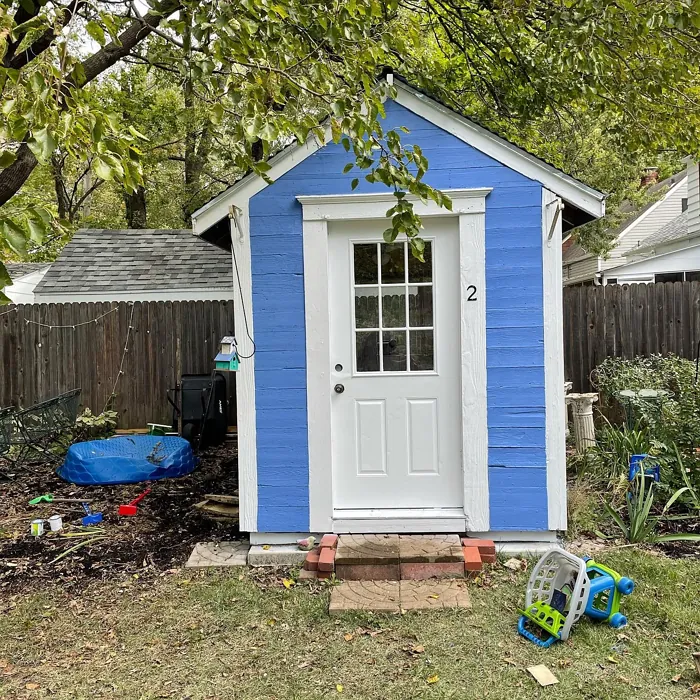
Let’s talk about decor styles. Blue Lapis is incredibly adaptable, fitting beautifully in modern, coastal, bohemian, traditional, and transitional settings. Whether you’re aiming for a laid-back beach vibe or a polished, classic look, this hue can hold its own. Picture it alongside crisp white trim or complemented by warm brass fixtures. The contrast creates a sophisticated and inviting atmosphere that welcomes you home.
Now, you might be wondering how this color performs in different lighting conditions. Blue Lapis shines in natural light, revealing its vibrant blue characteristics that can brighten darker rooms, making them feel more open and airy. Under artificial lighting, the blue tones soften slightly, showcasing its calming properties. This flexibility ensures that it looks its best, whether you’re enjoying the morning sun or winding down in the evening.
Thinking about using Blue Lapis in a small room? Absolutely! Its mid-tone LRV helps to reflect light, creating an illusion of space. You can introduce this refreshing hue into smaller areas without overwhelming them. Just consider the lighting; in darker spaces, it may appear slightly deeper. Pairing it with lighter furnishings or accents can help maintain an airy feel, balancing the rich blue with lighter tones.
Now, let’s get into the nitty-gritty of color pairing. Blue Lapis is versatile when it comes to coordinating with other shades. For a harmonious look, consider complementing it with soft whites or warm neutrals. These colors can create a soothing palette that feels coordinated and inviting. If you want to add a vibrant pop, try pairing it with bright yellows or coral tones. This combination can energize the space while keeping the overall feel sophisticated.
In more modern or sophisticated settings, consider combining Blue Lapis with grays or deep greens. This pairing creates a striking contrast that feels both fresh and elegant. The depth of the blue alongside the neutrality of grays can elevate your decor, making an impactful statement without being too bold.
Let’s not forget about the practical aspects of this paint. Blue Lapis is beginner-friendly, making it an excellent choice for DIY enthusiasts. It applies smoothly whether you’re using a roller or a brush, and it dries quickly, which is a huge plus when you’re eager to see your transformation take shape. Plus, its washability and low VOC levels mean you can feel good about your choice for both the environment and your indoor air quality.
However, like any color, it has its considerations. In low light, Blue Lapis may appear darker, which can change the mood of your room. Proper surface preparation is crucial for the best results, so take the time to prep your walls to ensure that stunning finish you’re aiming for.
Now, let’s talk about how to make the most of this color in your home. Blue Lapis is perfect for accent walls, adding a focal point to your space. Imagine a cozy living room where one wall showcases this beautiful blue, complemented by comfortable furniture and warm accents. Alternatively, consider using it on furniture or trim to add a unique twist to your decor.
When it comes to ongoing trends, Blue Lapis is trending for 2025, making it an excellent choice for a timeless yet contemporary look. Its cool, balanced, and muted tone lends itself beautifully to open concept spaces, allowing for seamless transitions between areas of your home while maintaining a cohesive feel.
As you explore this color, pay attention to its undertones. The blue undertones give Blue Lapis depth and complexity. It’s essential to test this paint in your space, observing how it interacts with your existing furniture, flooring, and decor. The way light changes throughout the day will also affect its appearance, revealing different facets of this versatile shade.
Ultimately, Blue Lapis is a standout choice for anyone looking to create a calm and inviting environment. It balances warmth and coolness beautifully, making it suitable for both contemporary and traditional homes. Coupled with its excellent coverage and ease of application, it’s hard not to fall for this captivating hue. So, as you embark on your decorating journey, consider Blue Lapis not just as a color, but as an essential element in crafting the peaceful, stylish haven you’ve always wanted.
Remember, a well-chosen paint color can be the foundation of your home’s personality. Embrace the beauty and tranquility of Blue Lapis, and watch your space come to life. Happy painting!
Real Room Photo of Blue Lapis 2067-40
Undertones of Blue Lapis ?
The undertones of Blue Lapis are a key aspect of its character, leaning towards Blue. These subtle underlying hues are what give the color its depth and complexity. For example, a gray with a blue undertone will feel cooler and more modern, while one with a brown undertone will feel warmer and more traditional. It’s essential to test this paint in your home and observe it next to your existing furniture, flooring, and decor to see how these undertones interact and reveal themselves throughout the day.
HEX value: #6289C6
RGB code: 98, 137, 198
Is Blue Lapis Cool or Warm?
Blue Lapis is considered a cool paint color. This characteristic plays a huge role in the overall feel of a room. Cool colors, like this one, tend to create a cozy, inviting, and energetic atmosphere, making them great for social spaces like living rooms and dining rooms. In contrast, warm colors often evoke a sense of calm and serenity, which is why they are popular in bedrooms and bathrooms. The coolth of Blue Lapis means it will pair beautifully with corresponding decor elements.
Understanding Color Properties and Interior Design Tips
Hue refers to a specific position on the color wheel, measured in degrees from 0 to 360. Each degree represents a different pure color:
- 0° represents red
- 120° represents green
- 240° represents blue
Saturation describes the intensity or purity of a color and is expressed as a percentage:
- At 0%, the color appears completely desaturated—essentially a shade of gray
- At 100%, the color is at its most vivid and vibrant
Lightness indicates how light or dark a color is, also expressed as a percentage:
- 0% lightness results in black
- 100% lightness results in white
Using Warm Colors in Interior Design
Warm hues—such as reds, oranges, yellows, warm beiges, and greiges—are excellent choices for creating inviting and energetic spaces. These colors are particularly well-suited for:
- Kitchens, living rooms, and bathrooms, where warmth enhances comfort and sociability
- Large rooms, where warm tones can help reduce the sense of emptiness and make the space feel more intimate
For example:
- Warm beige shades provide a cozy, inviting atmosphere, ideal for living rooms, bedrooms, and hallways.
- Warm greige (a mix of beige and gray) offers the warmth of beige with the modern appeal of gray, making it a versatile backdrop for dining areas, bedrooms, and living spaces.
However, be mindful when using warm light tones in rooms with limited natural light. These shades may appear muted or even take on an unpleasant yellowish tint. To avoid a dull or flat appearance:
- Add depth by incorporating richer tones like deep greens, charcoal, or chocolate brown
- Use textured elements such as curtains, rugs, or cushions to bring dimension to the space
Pro Tip: Achieving Harmony with Warm and Cool Color Balance
To create a well-balanced and visually interesting interior, mix warm and cool tones strategically. This contrast adds depth and harmony to your design.
- If your walls feature warm hues, introduce cool-colored accents such as blue or green furniture, artwork, or accessories to create contrast.
- For a polished look, consider using a complementary color scheme, which pairs colors opposite each other on the color wheel (e.g., red with green, orange with blue).
This thoughtful mix not only enhances visual appeal but also creates a space that feels both dynamic and cohesive.
Light Temperature Affects on Blue Lapis
Natural Light
Natural daylight changes in color temperature as the sun moves across the sky. At sunrise and sunset, the light tends to have a warm, golden tone with a color temperature around 2000 Kelvin (K). As the day progresses and the sun rises higher, the light becomes cooler and more neutral. Around midday, especially when the sky is clear, natural light typically reaches its peak brightness and shifts to a cooler tone, ranging from 5500 to 6500 Kelvin. This midday light is close to what we perceive as pure white or daylight-balanced light.
These shifts in natural light can significantly influence how colors appear in a space, which is why designers often consider both the time of day and the orientation of windows when planning interior color schemes.
Artificial Light
When choosing artificial lighting, pay close attention to the color temperature, measured in Kelvin (K). This determines how warm or cool the light will appear. Lower temperatures, around 2700K, give off a warm, yellow glow often used in living rooms or bedrooms. Higher temperatures, above 5000K, create a cool, bluish light similar to daylight, commonly used in kitchens, offices, or task areas.
Use the slider to see how lighting temperature can affect the appearance of a surface or color throughout a space.


4800K
LRV of Blue Lapis
The Light Reflectance Value (LRV) of Blue Lapis is 27.49%, which places it in the Medium colors category. This means it reflect a lot of light. Understanding a paint’s LRV is crucial for predicting how it will look in your space. A higher LRV indicates a lighter color that reflects more light, making rooms feel larger and brighter. A lower LRV signifies a darker color that absorbs more light, creating a cozier, more intimate atmosphere. Always consider the natural and artificial lighting in your room when selecting a paint color based on its LRV.
Detailed Review of Blue Lapis
Additional Paint Characteristics
Ideal Rooms
Bedroom, Home Office, Kitchen, Living Room, Nursery
Decor Styles
Bohemian, Coastal, Modern, Traditional, Transitional
Coverage
Good (1–2 Coats), Touch-Up Friendly
Ease of Application
Beginner Friendly, Brush Smooth, Fast-Drying, Roller-Ready
Washability
Highly Washable, Washable
VOC Level
Eco-Certified, Low VOC
Best Use
Accent Wall, Furniture, Interior Walls, Trim
Room Suitability
Bedroom, Entryway, Home Office, Living Room, Nursery
Tone Tag
Balanced, Cool, Muted
Finish Type
Eggshell, Satin
Paint Performance
Easy Touch-Up, Fade Resistant, High Coverage, Low Odor
Use Cases
Best for Open Concept, Best for Rentals, Trending in 2025
Mood
Calm, Inviting, Sophisticated
Trim Pairing
Complements Brass Fixtures, Matches Pure White, Pairs with White Dove
Blue Lapis is a standout choice for anyone looking to infuse their space with a refreshing and calming atmosphere. The color glides on smoothly, providing a rich and even finish that beautifully reflects light, enhancing the room’s overall ambiance. Whether you’re painting an accent wall or an entire room, this shade works wonders in creating a serene environment. Its versatility allows it to blend seamlessly with various decor styles, from modern to coastal. Users have noted its ability to transform a space, making it feel both inviting and sophisticated. Overall, Blue Lapis is a reliable option that balances warmth and coolness, perfect for both contemporary and traditional homes.
Pros & Cons of 2067-40 Blue Lapis
Pros
Cons
Colors that go with Benjamin Moore Blue Lapis
FAQ on 2067-40 Blue Lapis
Can Blue Lapis be used in small rooms?
Absolutely! Blue Lapis can work beautifully in small rooms, as its mid-tone LRV helps to reflect light and create an illusion of space. It brings a refreshing touch without overwhelming the area. Just be mindful of the lighting; in darker spaces, it may appear slightly deeper, so consider pairing it with lighter furnishings or accents to maintain an airy feel.
How does Blue Lapis pair with other colors?
Blue Lapis pairs wonderfully with a variety of colors. For a harmonious look, consider complementing it with soft whites or warm neutrals. If you’re looking to add a pop of color, it works well with bright yellows or coral tones. In more sophisticated settings, pairing it with grays or deep greens can create a striking contrast that feels both modern and elegant.
Comparisons Blue Lapis with other colors
Blue Lapis 2067-40 vs Dutch Tile Blue SW 0031
| Attribute | Blue Lapis 2067-40 | Dutch Tile Blue SW 0031 |
|---|---|---|
| Color Name | Blue Lapis 2067-40 | Dutch Tile Blue SW 0031 |
| Color | ||
| Hue | Blue | Blue |
| Brightness | Medium | Medium |
| RGB | 98, 137, 198 | 154, 171, 171 |
| LRV | 27.49% | 24% |
| Finish Type | Eggshell, Satin | Eggshell, Matte, Satin |
| Finish Options | Eggshell, Satin, Semi-Gloss | Eggshell, Flat, Matte, Satin |
| Ideal Rooms | Bedroom, Home Office, Kitchen, Living Room, Nursery | Bathroom, Bedroom, Dining Room, Hallway, Home Office, Kitchen, Living Room |
| Decor Styles | Bohemian, Coastal, Modern, Traditional, Transitional | Coastal, Modern Farmhouse, Scandinavian, Traditional, Transitional |
| Coverage | Good (1–2 Coats), Touch-Up Friendly | Good (1–2 Coats) |
| Ease of Application | Beginner Friendly, Brush Smooth, Fast-Drying, Roller-Ready | Beginner Friendly, Brush Smooth, Fast-Drying, Roller-Ready |
| Washability | Highly Washable, Washable | Highly Washable, Washable |
| Room Suitability | Bedroom, Entryway, Home Office, Living Room, Nursery | Bathroom, Bedroom, Dining Room, Kitchen, Living Room |
| Tone | Balanced, Cool, Muted | Balanced, Cool, Muted |
| Paint Performance | Easy Touch-Up, Fade Resistant, High Coverage, Low Odor | Easy Touch-Up, High Coverage, Low Odor, Quick Drying |
Blue Lapis 2067-40 vs Debonair SW 9139
| Attribute | Blue Lapis 2067-40 | Debonair SW 9139 |
|---|---|---|
| Color Name | Blue Lapis 2067-40 | Debonair SW 9139 |
| Color | ||
| Hue | Blue | Blue |
| Brightness | Medium | Medium |
| RGB | 98, 137, 198 | 144, 160, 166 |
| LRV | 27.49% | 30% |
| Finish Type | Eggshell, Satin | Eggshell, Matte, Satin |
| Finish Options | Eggshell, Satin, Semi-Gloss | Eggshell, Matte, Satin |
| Ideal Rooms | Bedroom, Home Office, Kitchen, Living Room, Nursery | Bedroom, Dining Room, Home Office, Living Room |
| Decor Styles | Bohemian, Coastal, Modern, Traditional, Transitional | Coastal, Industrial, Modern, Transitional |
| Coverage | Good (1–2 Coats), Touch-Up Friendly | Good (1–2 Coats) |
| Ease of Application | Beginner Friendly, Brush Smooth, Fast-Drying, Roller-Ready | Beginner Friendly, Brush Smooth, Roller-Ready |
| Washability | Highly Washable, Washable | Washable, Wipeable |
| Room Suitability | Bedroom, Entryway, Home Office, Living Room, Nursery | Bedroom, Dining Room, Home Office, Living Room |
| Tone | Balanced, Cool, Muted | Balanced, Cool, Muted |
| Paint Performance | Easy Touch-Up, Fade Resistant, High Coverage, Low Odor | Easy Touch-Up, Low Odor, Quick Drying |
Blue Lapis 2067-40 vs Stardew SW 9138
| Attribute | Blue Lapis 2067-40 | Stardew SW 9138 |
|---|---|---|
| Color Name | Blue Lapis 2067-40 | Stardew SW 9138 |
| Color | ||
| Hue | Blue | Blue |
| Brightness | Medium | Medium |
| RGB | 98, 137, 198 | 166, 178, 181 |
| LRV | 27.49% | 30% |
| Finish Type | Eggshell, Satin | Eggshell, Satin |
| Finish Options | Eggshell, Satin, Semi-Gloss | Eggshell, Matte, Satin |
| Ideal Rooms | Bedroom, Home Office, Kitchen, Living Room, Nursery | Bathroom, Bedroom, Home Office, Living Room, Nursery |
| Decor Styles | Bohemian, Coastal, Modern, Traditional, Transitional | Coastal, Farmhouse, Modern, Scandinavian |
| Coverage | Good (1–2 Coats), Touch-Up Friendly | Good (1–2 Coats) |
| Ease of Application | Beginner Friendly, Brush Smooth, Fast-Drying, Roller-Ready | Beginner Friendly, Brush Smooth, Roller-Ready |
| Washability | Highly Washable, Washable | Highly Washable, Washable, Wipeable |
| Room Suitability | Bedroom, Entryway, Home Office, Living Room, Nursery | Bathroom, Bedroom, Home Office, Living Room |
| Tone | Balanced, Cool, Muted | Calm, Cool, Muted |
| Paint Performance | Easy Touch-Up, Fade Resistant, High Coverage, Low Odor | Easy Touch-Up, High Coverage, Low Odor |
Blue Lapis 2067-40 vs Niebla Azul SW 9137
| Attribute | Blue Lapis 2067-40 | Niebla Azul SW 9137 |
|---|---|---|
| Color Name | Blue Lapis 2067-40 | Niebla Azul SW 9137 |
| Color | ||
| Hue | Blue | Blue |
| Brightness | Medium | Medium |
| RGB | 98, 137, 198 | 182, 195, 196 |
| LRV | 27.49% | 48% |
| Finish Type | Eggshell, Satin | Eggshell, Matte, Satin |
| Finish Options | Eggshell, Satin, Semi-Gloss | Eggshell, Matte, Satin |
| Ideal Rooms | Bedroom, Home Office, Kitchen, Living Room, Nursery | Bedroom, Home Office, Living Room, Nursery |
| Decor Styles | Bohemian, Coastal, Modern, Traditional, Transitional | Coastal, Modern, Scandinavian, Transitional |
| Coverage | Good (1–2 Coats), Touch-Up Friendly | Good (1–2 Coats), Touch-Up Friendly |
| Ease of Application | Beginner Friendly, Brush Smooth, Fast-Drying, Roller-Ready | Beginner Friendly, Brush Smooth, Roller-Ready |
| Washability | Highly Washable, Washable | Highly Washable, Washable |
| Room Suitability | Bedroom, Entryway, Home Office, Living Room, Nursery | Bedroom, Home Office, Living Room, Nursery |
| Tone | Balanced, Cool, Muted | Airy, Cool, Muted |
| Paint Performance | Easy Touch-Up, Fade Resistant, High Coverage, Low Odor | Easy Touch-Up, Fade Resistant, Low Odor, Scuff Resistant |
Blue Lapis 2067-40 vs Rain SW 6219
| Attribute | Blue Lapis 2067-40 | Rain SW 6219 |
|---|---|---|
| Color Name | Blue Lapis 2067-40 | Rain SW 6219 |
| Color | ||
| Hue | Blue | Blue |
| Brightness | Medium | Medium |
| RGB | 98, 137, 198 | 171, 190, 191 |
| LRV | 27.49% | 50% |
| Finish Type | Eggshell, Satin | Eggshell, Matte, Satin |
| Finish Options | Eggshell, Satin, Semi-Gloss | Eggshell, Matte, Satin |
| Ideal Rooms | Bedroom, Home Office, Kitchen, Living Room, Nursery | Bathroom, Bedroom, Home Office, Living Room, Nursery |
| Decor Styles | Bohemian, Coastal, Modern, Traditional, Transitional | Coastal, Minimalist, Modern, Scandinavian, Transitional |
| Coverage | Good (1–2 Coats), Touch-Up Friendly | Good (1–2 Coats), Touch-Up Friendly |
| Ease of Application | Beginner Friendly, Brush Smooth, Fast-Drying, Roller-Ready | Beginner Friendly, Brush Smooth, Fast-Drying, Roller-Ready |
| Washability | Highly Washable, Washable | Scrubbable, Stain Resistant, Washable |
| Room Suitability | Bedroom, Entryway, Home Office, Living Room, Nursery | Bathroom, Bedroom, Home Office, Living Room, Nursery |
| Tone | Balanced, Cool, Muted | Balanced, Cool, Muted |
| Paint Performance | Easy Touch-Up, Fade Resistant, High Coverage, Low Odor | Easy Touch-Up, Low Odor, Quick Drying, Stain Resistant |
Blue Lapis 2067-40 vs Morning at Sea SW 9634
| Attribute | Blue Lapis 2067-40 | Morning at Sea SW 9634 |
|---|---|---|
| Color Name | Blue Lapis 2067-40 | Morning at Sea SW 9634 |
| Color | ||
| Hue | Blue | Blue |
| Brightness | Medium | Medium |
| RGB | 98, 137, 198 | 130, 151, 155 |
| LRV | 27.49% | 50% |
| Finish Type | Eggshell, Satin | Eggshell, Matte |
| Finish Options | Eggshell, Satin, Semi-Gloss | Eggshell, Matte, Satin |
| Ideal Rooms | Bedroom, Home Office, Kitchen, Living Room, Nursery | Bathroom, Bedroom, Home Office, Living Room |
| Decor Styles | Bohemian, Coastal, Modern, Traditional, Transitional | Coastal, Minimalist, Modern, Scandinavian |
| Coverage | Good (1–2 Coats), Touch-Up Friendly | Good (1–2 Coats), Touch-Up Friendly |
| Ease of Application | Beginner Friendly, Brush Smooth, Fast-Drying, Roller-Ready | Beginner Friendly, Brush Smooth, Roller-Ready |
| Washability | Highly Washable, Washable | Washable, Wipeable |
| Room Suitability | Bedroom, Entryway, Home Office, Living Room, Nursery | Bathroom, Bedroom, Home Office, Living Room |
| Tone | Balanced, Cool, Muted | Airy, Cool, Muted |
| Paint Performance | Easy Touch-Up, Fade Resistant, High Coverage, Low Odor | Easy Touch-Up, Fade Resistant, Low Odor |
Blue Lapis 2067-40 vs Sleepy Blue SW 6225
| Attribute | Blue Lapis 2067-40 | Sleepy Blue SW 6225 |
|---|---|---|
| Color Name | Blue Lapis 2067-40 | Sleepy Blue SW 6225 |
| Color | ||
| Hue | Blue | Blue |
| Brightness | Medium | Medium |
| RGB | 98, 137, 198 | 188, 203, 206 |
| LRV | 27.49% | 50% |
| Finish Type | Eggshell, Satin | Eggshell, Matte, Satin |
| Finish Options | Eggshell, Satin, Semi-Gloss | Eggshell, Matte, Satin |
| Ideal Rooms | Bedroom, Home Office, Kitchen, Living Room, Nursery | Bedroom, Home Office, Living Room, Nursery |
| Decor Styles | Bohemian, Coastal, Modern, Traditional, Transitional | Coastal, Minimalist, Modern Farmhouse, Scandinavian |
| Coverage | Good (1–2 Coats), Touch-Up Friendly | Good (1–2 Coats) |
| Ease of Application | Beginner Friendly, Brush Smooth, Fast-Drying, Roller-Ready | Beginner Friendly, Brush Smooth, Fast-Drying, Roller-Ready |
| Washability | Highly Washable, Washable | Highly Washable, Washable |
| Room Suitability | Bedroom, Entryway, Home Office, Living Room, Nursery | Bedroom, Home Office, Living Room, Nursery |
| Tone | Balanced, Cool, Muted | Airy, Cool, Muted |
| Paint Performance | Easy Touch-Up, Fade Resistant, High Coverage, Low Odor | Easy Touch-Up, Low Odor, Quick Drying, Scuff Resistant |
Blue Lapis 2067-40 vs Lakeside SW 9683
| Attribute | Blue Lapis 2067-40 | Lakeside SW 9683 |
|---|---|---|
| Color Name | Blue Lapis 2067-40 | Lakeside SW 9683 |
| Color | ||
| Hue | Blue | Blue |
| Brightness | Medium | Medium |
| RGB | 98, 137, 198 | 173, 184, 192 |
| LRV | 27.49% | 24% |
| Finish Type | Eggshell, Satin | Eggshell, Matte, Satin |
| Finish Options | Eggshell, Satin, Semi-Gloss | Eggshell, Matte, Satin |
| Ideal Rooms | Bedroom, Home Office, Kitchen, Living Room, Nursery | Bathroom, Bedroom, Home Office, Living Room |
| Decor Styles | Bohemian, Coastal, Modern, Traditional, Transitional | Coastal, Minimalist, Modern, Rustic |
| Coverage | Good (1–2 Coats), Touch-Up Friendly | Good (1–2 Coats) |
| Ease of Application | Beginner Friendly, Brush Smooth, Fast-Drying, Roller-Ready | Beginner Friendly, Brush Smooth, Roller-Ready |
| Washability | Highly Washable, Washable | Scrubbable, Washable |
| Room Suitability | Bedroom, Entryway, Home Office, Living Room, Nursery | Bathroom, Bedroom, Home Office, Living Room |
| Tone | Balanced, Cool, Muted | Balanced, Cool, Muted |
| Paint Performance | Easy Touch-Up, Fade Resistant, High Coverage, Low Odor | Easy Touch-Up, Fade Resistant, High Coverage, Low Odor |
Blue Lapis 2067-40 vs Upward SW 6239
| Attribute | Blue Lapis 2067-40 | Upward SW 6239 |
|---|---|---|
| Color Name | Blue Lapis 2067-40 | Upward SW 6239 |
| Color | ||
| Hue | Blue | Blue |
| Brightness | Medium | Medium |
| RGB | 98, 137, 198 | 191, 201, 208 |
| LRV | 27.49% | 75% |
| Finish Type | Eggshell, Satin | Eggshell, Satin |
| Finish Options | Eggshell, Satin, Semi-Gloss | Eggshell, Flat, Satin |
| Ideal Rooms | Bedroom, Home Office, Kitchen, Living Room, Nursery | Bedroom, Dining Room, Home Office, Living Room, Nursery |
| Decor Styles | Bohemian, Coastal, Modern, Traditional, Transitional | Coastal, Minimalist, Modern, Scandinavian |
| Coverage | Good (1–2 Coats), Touch-Up Friendly | Good (1–2 Coats), Touch-Up Friendly |
| Ease of Application | Beginner Friendly, Brush Smooth, Fast-Drying, Roller-Ready | Beginner Friendly, Brush Smooth, Fast-Drying, Roller-Ready |
| Washability | Highly Washable, Washable | Washable, Wipeable |
| Room Suitability | Bedroom, Entryway, Home Office, Living Room, Nursery | Bedroom, Home Office, Living Room, Nursery |
| Tone | Balanced, Cool, Muted | Cool, Crisp, Muted |
| Paint Performance | Easy Touch-Up, Fade Resistant, High Coverage, Low Odor | High Coverage, Low Odor, Quick Drying |
Blue Lapis 2067-40 vs Aleutian SW 6241
| Attribute | Blue Lapis 2067-40 | Aleutian SW 6241 |
|---|---|---|
| Color Name | Blue Lapis 2067-40 | Aleutian SW 6241 |
| Color | ||
| Hue | Blue | Blue |
| Brightness | Medium | Medium |
| RGB | 98, 137, 198 | 152, 169, 183 |
| LRV | 27.49% | 24% |
| Finish Type | Eggshell, Satin | Eggshell, Matte, Satin |
| Finish Options | Eggshell, Satin, Semi-Gloss | Eggshell, Matte, Satin |
| Ideal Rooms | Bedroom, Home Office, Kitchen, Living Room, Nursery | Bathroom, Bedroom, Home Office, Kitchen, Living Room, Nursery |
| Decor Styles | Bohemian, Coastal, Modern, Traditional, Transitional | Coastal, Minimalist, Modern, Scandinavian, Transitional |
| Coverage | Good (1–2 Coats), Touch-Up Friendly | Good (1–2 Coats), Touch-Up Friendly |
| Ease of Application | Beginner Friendly, Brush Smooth, Fast-Drying, Roller-Ready | Beginner Friendly, Brush Smooth, Fast-Drying, Roller-Ready |
| Washability | Highly Washable, Washable | Scrubbable, Stain Resistant, Washable |
| Room Suitability | Bedroom, Entryway, Home Office, Living Room, Nursery | Bathroom, Bedroom, Home Office, Living Room, Nursery |
| Tone | Balanced, Cool, Muted | Airy, Balanced, Cool, Muted |
| Paint Performance | Easy Touch-Up, Fade Resistant, High Coverage, Low Odor | Easy Touch-Up, Fade Resistant, Low Odor, Quick Drying |
Official Page of Benjamin Moore Blue Lapis 2067-40