
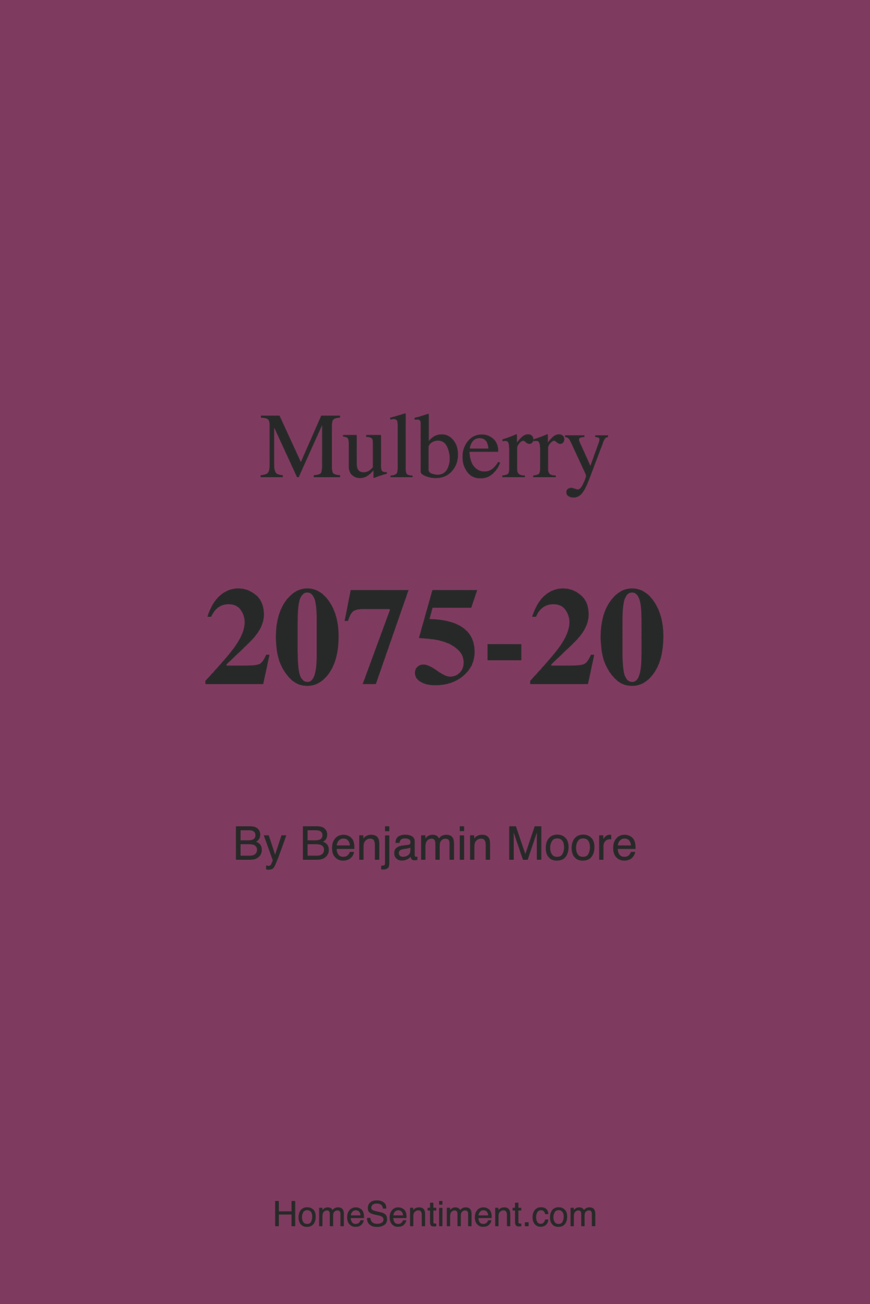
Color Preview & Key Details
| HEX Code | #7F3B5F |
| RGB | 127, 59, 95 |
| LRV | 9.48% |
| Undertone | Red |
| Finish Options | Eggshell, Satin, Semi-Gloss |
If you’re looking for a paint color that exudes luxury, depth, and a touch of romance, Benjamin Moore’s Mulberry (2075-20) might just be your perfect match. This rich, dark hue is like a ripe berry plucked straight from the garden—deeply pigmented, sophisticated, and full of character. It’s a color that doesn’t just sit on your walls; it transforms them, creating an atmosphere that’s both cozy and elegant. Whether you’re designing a bedroom that feels like a retreat or a living room that makes a statement, Mulberry has the versatility to deliver.
One of the first things you’ll notice about Mulberry is its stunning blend of purple and red undertones. This isn’t just a flat, one-note color—it’s dynamic, shifting subtly depending on the light and what surrounds it. In natural daylight, the red undertones come alive, giving it a warm, inviting glow. Under softer, artificial lighting, it leans into its deeper purple side, creating a moody, intimate vibe. That’s the beauty of this shade: it adapts, making it a fantastic choice for rooms where lighting changes throughout the day.
Because of its low Light Reflectance Value (LRV of 9.48%), Mulberry absorbs light rather than reflecting it. This means it won’t brighten up a space, but it will add depth and drama. If you’re working with a smaller room, you’ll want to be strategic. Pair it with plenty of light sources—think layered lighting with sconces, floor lamps, and even a well-placed mirror to bounce light around. Lighter trim, like Benjamin Moore’s White Dove or Chantilly Lace, can also keep the space from feeling too closed in. But if you’re painting a larger room or an accent wall, Mulberry shines (figuratively, of course—it’s not a glossy finish unless you choose semi-gloss!).
Speaking of finishes, Mulberry comes in eggshell, satin, and semi-gloss, so you can tailor it to your needs. Eggshell is a great all-around choice for walls, offering a soft sheen that’s easy to clean. Satin steps it up a notch with a bit more durability, perfect for high-traffic areas. And semi-gloss? That’s your go-to for trim, doors, or even furniture if you’re feeling bold. The paint itself is a dream to work with—high coverage, low splatter, and fast-drying, so you won’t be waiting around forever for your project to come together. Plus, it’s low-VOC and eco-certified, so you can breathe easy knowing it’s safe for your home.
Now, let’s talk pairings. Mulberry is surprisingly versatile when it comes to complementary colors. For a classic, timeless look, crisp whites and creams create a striking contrast that lets the depth of Mulberry take center stage. If you’re after something more glamorous, metallics like gold or brass add a luxe touch—picture gold-framed art or brass hardware against a Mulberry wall. On the cooler side, silvers and soft blues can pull out the purple undertones for a more modern feel. And if you love earthy tones, warm woods or muted greens (think sage or olive) balance the richness beautifully.
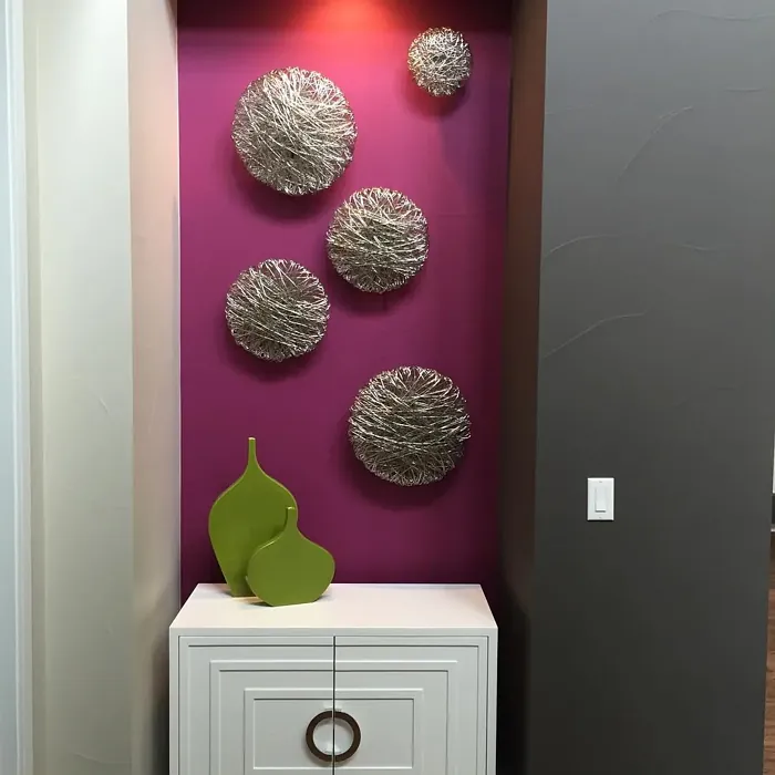
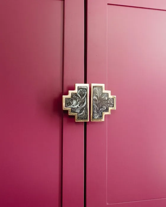
This color isn’t just for walls, either. Imagine a Mulberry-painted bookshelf in a neutral room, or a front door that makes a bold first impression. It’s also a stunning choice for furniture—a dresser or side table in this shade becomes an instant focal point. And because it’s scrubbable and stain-resistant, it holds up well in spaces that see a lot of action.
Of course, no color is without its considerations. Mulberry’s depth means it can feel overwhelming in a room with poor lighting or limited square footage. If you’re hesitant, start with an accent wall or test a small area to see how it plays with your space. And while it’s self-priming, darker colors like this often need two coats for full, even coverage. But trust me, the result is worth it.
So, is Mulberry right for you? If you love colors that make a statement, that feel both bold and inviting, then absolutely. It’s a designer favorite for a reason—it’s sophisticated without being stuffy, romantic without being overly sweet. Whether you’re going for a traditional, Victorian, eclectic, or glam look, Mulberry fits right in. It’s the kind of color that makes a room feel curated, like you’ve put thought into every detail. And isn’t that what great design is all about?
At the end of the day, paint is personal. It’s about how a color makes you feel when you walk into the room. Mulberry has a way of wrapping you in warmth and luxury, like your favorite velvet throw or a glass of red wine by the fire. If that’s the vibe you’re after, grab a sample and see how it looks in your space. You might just fall in love.
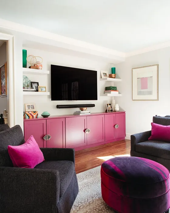
Real Room Photo of Mulberry 2075-20
Undertones of Mulberry ?
The undertones of Mulberry are a key aspect of its character, leaning towards Red. These subtle underlying hues are what give the color its depth and complexity. For example, a gray with a blue undertone will feel cooler and more modern, while one with a brown undertone will feel warmer and more traditional. It’s essential to test this paint in your home and observe it next to your existing furniture, flooring, and decor to see how these undertones interact and reveal themselves throughout the day.
HEX value: #7F3B5F
RGB code: 127, 59, 95
Is Mulberry Cool or Warm?
This color sits comfortably between warm and cool, offering the best of both worlds. It can take on a warmer appearance when paired with golden or brass accents, yet reveals its cooler side when combined with silvers and blues. It’s a versatile choice for anyone looking to bridge the gap between warm and cool decor elements.
Understanding Color Properties and Interior Design Tips
Hue refers to a specific position on the color wheel, measured in degrees from 0 to 360. Each degree represents a different pure color:
- 0° represents red
- 120° represents green
- 240° represents blue
Saturation describes the intensity or purity of a color and is expressed as a percentage:
- At 0%, the color appears completely desaturated—essentially a shade of gray
- At 100%, the color is at its most vivid and vibrant
Lightness indicates how light or dark a color is, also expressed as a percentage:
- 0% lightness results in black
- 100% lightness results in white
Using Warm Colors in Interior Design
Warm hues—such as reds, oranges, yellows, warm beiges, and greiges—are excellent choices for creating inviting and energetic spaces. These colors are particularly well-suited for:
- Kitchens, living rooms, and bathrooms, where warmth enhances comfort and sociability
- Large rooms, where warm tones can help reduce the sense of emptiness and make the space feel more intimate
For example:
- Warm beige shades provide a cozy, inviting atmosphere, ideal for living rooms, bedrooms, and hallways.
- Warm greige (a mix of beige and gray) offers the warmth of beige with the modern appeal of gray, making it a versatile backdrop for dining areas, bedrooms, and living spaces.
However, be mindful when using warm light tones in rooms with limited natural light. These shades may appear muted or even take on an unpleasant yellowish tint. To avoid a dull or flat appearance:
- Add depth by incorporating richer tones like deep greens, charcoal, or chocolate brown
- Use textured elements such as curtains, rugs, or cushions to bring dimension to the space
Pro Tip: Achieving Harmony with Warm and Cool Color Balance
To create a well-balanced and visually interesting interior, mix warm and cool tones strategically. This contrast adds depth and harmony to your design.
- If your walls feature warm hues, introduce cool-colored accents such as blue or green furniture, artwork, or accessories to create contrast.
- For a polished look, consider using a complementary color scheme, which pairs colors opposite each other on the color wheel (e.g., red with green, orange with blue).
This thoughtful mix not only enhances visual appeal but also creates a space that feels both dynamic and cohesive.
Light Temperature Affects on Mulberry
Natural Light
Natural daylight changes in color temperature as the sun moves across the sky. At sunrise and sunset, the light tends to have a warm, golden tone with a color temperature around 2000 Kelvin (K). As the day progresses and the sun rises higher, the light becomes cooler and more neutral. Around midday, especially when the sky is clear, natural light typically reaches its peak brightness and shifts to a cooler tone, ranging from 5500 to 6500 Kelvin. This midday light is close to what we perceive as pure white or daylight-balanced light.
These shifts in natural light can significantly influence how colors appear in a space, which is why designers often consider both the time of day and the orientation of windows when planning interior color schemes.
Artificial Light
When choosing artificial lighting, pay close attention to the color temperature, measured in Kelvin (K). This determines how warm or cool the light will appear. Lower temperatures, around 2700K, give off a warm, yellow glow often used in living rooms or bedrooms. Higher temperatures, above 5000K, create a cool, bluish light similar to daylight, commonly used in kitchens, offices, or task areas.
Use the slider to see how lighting temperature can affect the appearance of a surface or color throughout a space.


4800K
LRV of Mulberry
The Light Reflectance Value (LRV) of Mulberry is 9.48%, which places it in the Dark colors category. This means it does not reflect light. Understanding a paint’s LRV is crucial for predicting how it will look in your space. A higher LRV indicates a lighter color that reflects more light, making rooms feel larger and brighter. A lower LRV signifies a darker color that absorbs more light, creating a cozier, more intimate atmosphere. Always consider the natural and artificial lighting in your room when selecting a paint color based on its LRV.
Detailed Review of Mulberry
Additional Paint Characteristics
Ideal Rooms
Bedroom, Dining Room, Home Office, Living Room
Decor Styles
Eclectic, Glam, Traditional, Victorian
Coverage
Good (1–2 Coats), High Hide, Self-Priming
Ease of Application
Brush Smooth, Fast-Drying, Low Splatter, Roller-Ready
Washability
Scrubbable, Stain Resistant, Washable
VOC Level
Eco-Certified, Low VOC, Odor-Free
Best Use
Accent Wall, Furniture, Interior Walls, Trim
Room Suitability
Bedroom, Dining Room, Living Room
Tone Tag
Deep, Moody, Sophisticated, Warm
Finish Type
Eggshell, Satin, Semi-Gloss
Paint Performance
Easy Touch-Up, Fade Resistant, High Coverage, Low Odor
Use Cases
Best for Low Light Rooms, Best for Small Spaces, Designer Favorite
Mood
Cozy, Inviting, Romantic, Sophisticated
Trim Pairing
Complements Brass Fixtures, Matches Chantilly Lace Trim, Pairs with White Dove
Mulberry is a paint color that commands attention with its deep, rich tones. Perfect for creating a cozy and intimate atmosphere, this color works wonders in bedrooms and living spaces where you want to evoke a sense of comfort and sophistication. Its versatility allows it to pair beautifully with both warm and cool accents, making it a favorite among designers who want to add a touch of elegance to a room. While it may require a couple of coats for full opacity, the result is a stunning, high-end look that can transform any space into a stylish retreat.
Pros & Cons of 2075-20 Mulberry
Pros
Cons
Colors that go with Benjamin Moore Mulberry
FAQ on 2075-20 Mulberry
How does Mulberry perform in small spaces?
While Mulberry is a stunning color that brings warmth and sophistication, it can make small spaces feel even smaller due to its darker tone and low LRV. If you’re considering using it in a compact area, make sure the room is well-lit with either ample natural light or strategically placed artificial lighting. Pairing it with lighter trim and furnishings can also help balance the space, ensuring it feels cozy without being overwhelming.
What colors complement Mulberry?
Mulberry pairs beautifully with a variety of colors, making it a versatile choice for different design palettes. For a classic look, consider pairing it with whites or creams to create a striking contrast that highlights the depth of Mulberry. For a more modern approach, incorporate metallics like gold or silver to add a touch of glamour. If you prefer a more earthy vibe, warm wood tones or muted greens can complement the rich undertones of Mulberry, creating a harmonious and inviting space.
Comparisons Mulberry with other colors
Mulberry 2075-20 vs Exclusive Plum SW 6263
| Attribute | Mulberry 2075-20 | Exclusive Plum SW 6263 |
|---|---|---|
| Color Name | Mulberry 2075-20 | Exclusive Plum SW 6263 |
| Color | ||
| Hue | Purple | Purple |
| Brightness | Dark | Dark |
| RGB | 127, 59, 95 | 115, 111, 120 |
| LRV | 9.48% | 15% |
| Finish Type | Eggshell, Satin, Semi-Gloss | Eggshell, Matte, Satin |
| Finish Options | Eggshell, Satin, Semi-Gloss | Eggshell, Matte, Satin |
| Ideal Rooms | Bedroom, Dining Room, Home Office, Living Room | Bedroom, Dining Room, Home Office, Living Room |
| Decor Styles | Eclectic, Glam, Traditional, Victorian | Contemporary, Eclectic, Modern, Traditional |
| Coverage | Good (1–2 Coats), High Hide, Self-Priming | Good (1–2 Coats), Touch-Up Friendly |
| Ease of Application | Brush Smooth, Fast-Drying, Low Splatter, Roller-Ready | Beginner Friendly, Brush Smooth, Fast-Drying, Roller-Ready |
| Washability | Scrubbable, Stain Resistant, Washable | Washable, Wipeable |
| Room Suitability | Bedroom, Dining Room, Living Room | Bedroom, Dining Room, Home Office, Living Room |
| Tone | Deep, Moody, Sophisticated, Warm | Deep, Dusty, Warm |
| Paint Performance | Easy Touch-Up, Fade Resistant, High Coverage, Low Odor | Easy Touch-Up, High Coverage, Low Odor |
Mulberry 2075-20 vs Blackberry SW 7577
| Attribute | Mulberry 2075-20 | Blackberry SW 7577 |
|---|---|---|
| Color Name | Mulberry 2075-20 | Blackberry SW 7577 |
| Color | ||
| Hue | Purple | Purple |
| Brightness | Dark | Dark |
| RGB | 127, 59, 95 | 83, 54, 64 |
| LRV | 9.48% | 5% |
| Finish Type | Eggshell, Satin, Semi-Gloss | Eggshell, Matte |
| Finish Options | Eggshell, Satin, Semi-Gloss | Eggshell, Matte, Satin |
| Ideal Rooms | Bedroom, Dining Room, Home Office, Living Room | Bedroom, Dining Room, Home Office, Living Room |
| Decor Styles | Eclectic, Glam, Traditional, Victorian | Bohemian, Contemporary, Modern, Rustic |
| Coverage | Good (1–2 Coats), High Hide, Self-Priming | Good (1–2 Coats), Touch-Up Friendly |
| Ease of Application | Brush Smooth, Fast-Drying, Low Splatter, Roller-Ready | Beginner Friendly, Brush Smooth, Roller-Ready |
| Washability | Scrubbable, Stain Resistant, Washable | Washable, Wipeable |
| Room Suitability | Bedroom, Dining Room, Living Room | Bedroom, Dining Room, Home Office, Living Room |
| Tone | Deep, Moody, Sophisticated, Warm | Deep, Moody, Warm |
| Paint Performance | Easy Touch-Up, Fade Resistant, High Coverage, Low Odor | Easy Touch-Up, High Coverage, Low Odor |
Mulberry 2075-20 vs Expressive Plum SW 6271
| Attribute | Mulberry 2075-20 | Expressive Plum SW 6271 |
|---|---|---|
| Color Name | Mulberry 2075-20 | Expressive Plum SW 6271 |
| Color | ||
| Hue | Purple | Purple |
| Brightness | Dark | Dark |
| RGB | 127, 59, 95 | 105, 92, 98 |
| LRV | 9.48% | 15% |
| Finish Type | Eggshell, Satin, Semi-Gloss | Eggshell, Matte, Satin |
| Finish Options | Eggshell, Satin, Semi-Gloss | Eggshell, Matte, Satin |
| Ideal Rooms | Bedroom, Dining Room, Home Office, Living Room | Bedroom, Dining Room, Home Office, Living Room |
| Decor Styles | Eclectic, Glam, Traditional, Victorian | Eclectic, Modern, Traditional, Transitional |
| Coverage | Good (1–2 Coats), High Hide, Self-Priming | Good (1–2 Coats) |
| Ease of Application | Brush Smooth, Fast-Drying, Low Splatter, Roller-Ready | Beginner Friendly, Brush Smooth, Roller-Ready |
| Washability | Scrubbable, Stain Resistant, Washable | Washable, Wipeable |
| Room Suitability | Bedroom, Dining Room, Living Room | Bedroom, Dining Room, Home Office, Living Room |
| Tone | Deep, Moody, Sophisticated, Warm | Deep, Muted, Warm |
| Paint Performance | Easy Touch-Up, Fade Resistant, High Coverage, Low Odor | Easy Touch-Up, High Coverage, Low Odor |
Mulberry 2075-20 vs Plum Brown SW 6272
| Attribute | Mulberry 2075-20 | Plum Brown SW 6272 |
|---|---|---|
| Color Name | Mulberry 2075-20 | Plum Brown SW 6272 |
| Color | ||
| Hue | Purple | Purple |
| Brightness | Dark | Dark |
| RGB | 127, 59, 95 | 78, 66, 71 |
| LRV | 9.48% | 6% |
| Finish Type | Eggshell, Satin, Semi-Gloss | Eggshell, Matte, Satin |
| Finish Options | Eggshell, Satin, Semi-Gloss | Eggshell, Matte, Satin |
| Ideal Rooms | Bedroom, Dining Room, Home Office, Living Room | Bedroom, Dining Room, Home Office, Living Room |
| Decor Styles | Eclectic, Glam, Traditional, Victorian | Eclectic, Modern, Rustic, Traditional |
| Coverage | Good (1–2 Coats), High Hide, Self-Priming | Good (1–2 Coats), Touch-Up Friendly |
| Ease of Application | Brush Smooth, Fast-Drying, Low Splatter, Roller-Ready | Beginner Friendly, Brush Smooth, Roller-Ready |
| Washability | Scrubbable, Stain Resistant, Washable | Washable, Wipeable |
| Room Suitability | Bedroom, Dining Room, Living Room | Bedroom, Dining Room, Home Office, Living Room |
| Tone | Deep, Moody, Sophisticated, Warm | Deep, Earthy, Warm |
| Paint Performance | Easy Touch-Up, Fade Resistant, High Coverage, Low Odor | Easy Touch-Up, High Coverage, Low Odor |
Mulberry 2075-20 vs Soulmate SW 6270
| Attribute | Mulberry 2075-20 | Soulmate SW 6270 |
|---|---|---|
| Color Name | Mulberry 2075-20 | Soulmate SW 6270 |
| Color | ||
| Hue | Purple | Purple |
| Brightness | Dark | Dark |
| RGB | 127, 59, 95 | 133, 119, 123 |
| LRV | 9.48% | 24% |
| Finish Type | Eggshell, Satin, Semi-Gloss | Eggshell, Matte, Satin |
| Finish Options | Eggshell, Satin, Semi-Gloss | Eggshell, Matte, Satin |
| Ideal Rooms | Bedroom, Dining Room, Home Office, Living Room | Bedroom, Hallway, Home Office, Living Room |
| Decor Styles | Eclectic, Glam, Traditional, Victorian | Bohemian, Modern, Rustic, Transitional |
| Coverage | Good (1–2 Coats), High Hide, Self-Priming | Good (1–2 Coats), Touch-Up Friendly |
| Ease of Application | Brush Smooth, Fast-Drying, Low Splatter, Roller-Ready | Beginner Friendly, Brush Smooth, Roller-Ready |
| Washability | Scrubbable, Stain Resistant, Washable | Washable, Wipeable |
| Room Suitability | Bedroom, Dining Room, Living Room | Bedroom, Hallway, Home Office, Living Room |
| Tone | Deep, Moody, Sophisticated, Warm | Earthy, Muted, Warm |
| Paint Performance | Easy Touch-Up, Fade Resistant, High Coverage, Low Odor | Easy Touch-Up, Low Odor, Quick Drying |
Mulberry 2075-20 vs Quixotic Plum SW 6265
| Attribute | Mulberry 2075-20 | Quixotic Plum SW 6265 |
|---|---|---|
| Color Name | Mulberry 2075-20 | Quixotic Plum SW 6265 |
| Color | ||
| Hue | Purple | Purple |
| Brightness | Dark | Dark |
| RGB | 127, 59, 95 | 74, 70, 83 |
| LRV | 9.48% | 12% |
| Finish Type | Eggshell, Satin, Semi-Gloss | Eggshell, Matte, Satin |
| Finish Options | Eggshell, Satin, Semi-Gloss | Eggshell, Matte, Satin |
| Ideal Rooms | Bedroom, Dining Room, Home Office, Living Room | Bedroom, Dining Room, Home Office, Living Room |
| Decor Styles | Eclectic, Glam, Traditional, Victorian | Bohemian, Contemporary, Eclectic, Modern, Traditional |
| Coverage | Good (1–2 Coats), High Hide, Self-Priming | Good (1–2 Coats), Touch-Up Friendly |
| Ease of Application | Brush Smooth, Fast-Drying, Low Splatter, Roller-Ready | Brush Smooth, Fast-Drying, Roller-Ready |
| Washability | Scrubbable, Stain Resistant, Washable | Highly Washable, Washable |
| Room Suitability | Bedroom, Dining Room, Living Room | Bedroom, Dining Room, Home Office, Living Room |
| Tone | Deep, Moody, Sophisticated, Warm | Deep, Moody, Warm |
| Paint Performance | Easy Touch-Up, Fade Resistant, High Coverage, Low Odor | High Coverage, Low Odor, Scuff Resistant |
Mulberry 2075-20 vs Midnight SW 6264
| Attribute | Mulberry 2075-20 | Midnight SW 6264 |
|---|---|---|
| Color Name | Mulberry 2075-20 | Midnight SW 6264 |
| Color | ||
| Hue | Purple | Purple |
| Brightness | Dark | Dark |
| RGB | 127, 59, 95 | 93, 89, 98 |
| LRV | 9.48% | 6% |
| Finish Type | Eggshell, Satin, Semi-Gloss | Eggshell, Matte, Satin |
| Finish Options | Eggshell, Satin, Semi-Gloss | Eggshell, Matte, Satin |
| Ideal Rooms | Bedroom, Dining Room, Home Office, Living Room | Bedroom, Dining Room, Hallway, Home Office, Living Room |
| Decor Styles | Eclectic, Glam, Traditional, Victorian | Bohemian, Contemporary, Industrial, Modern |
| Coverage | Good (1–2 Coats), High Hide, Self-Priming | Good (1–2 Coats), High Hide, Touch-Up Friendly |
| Ease of Application | Brush Smooth, Fast-Drying, Low Splatter, Roller-Ready | Beginner Friendly, Brush Smooth, Roller-Ready |
| Washability | Scrubbable, Stain Resistant, Washable | Scrubbable, Stain Resistant, Washable |
| Room Suitability | Bedroom, Dining Room, Living Room | Bedroom, Dining Room, Home Office, Living Room |
| Tone | Deep, Moody, Sophisticated, Warm | Balanced, Deep, Moody |
| Paint Performance | Easy Touch-Up, Fade Resistant, High Coverage, Low Odor | Easy Touch-Up, Long Lasting, Low Odor, Scuff Resistant |
Mulberry 2075-20 vs Framboise SW 6566
| Attribute | Mulberry 2075-20 | Framboise SW 6566 |
|---|---|---|
| Color Name | Mulberry 2075-20 | Framboise SW 6566 |
| Color | ||
| Hue | Purple | Purple |
| Brightness | Dark | Dark |
| RGB | 127, 59, 95 | 124, 54, 85 |
| LRV | 9.48% | 6% |
| Finish Type | Eggshell, Satin, Semi-Gloss | Matte, Satin, Semi-Gloss |
| Finish Options | Eggshell, Satin, Semi-Gloss | Matte, Satin, Semi-Gloss |
| Ideal Rooms | Bedroom, Dining Room, Home Office, Living Room | Bedroom, Dining Room, Home Office, Living Room |
| Decor Styles | Eclectic, Glam, Traditional, Victorian | Bohemian, Contemporary, Eclectic, Modern |
| Coverage | Good (1–2 Coats), High Hide, Self-Priming | Good (1–2 Coats), Touch-Up Friendly |
| Ease of Application | Brush Smooth, Fast-Drying, Low Splatter, Roller-Ready | Beginner Friendly, Brush Smooth, Fast-Drying, Roller-Ready |
| Washability | Scrubbable, Stain Resistant, Washable | Highly Washable, Washable |
| Room Suitability | Bedroom, Dining Room, Living Room | Bedroom, Dining Room, Home Office, Living Room |
| Tone | Deep, Moody, Sophisticated, Warm | Bold, Deep, Warm |
| Paint Performance | Easy Touch-Up, Fade Resistant, High Coverage, Low Odor | Easy Touch-Up, High Coverage, Low Odor, Quick Drying |
Mulberry 2075-20 vs Poetry Plum SW 6019
| Attribute | Mulberry 2075-20 | Poetry Plum SW 6019 |
|---|---|---|
| Color Name | Mulberry 2075-20 | Poetry Plum SW 6019 |
| Color | ||
| Hue | Purple | Purple |
| Brightness | Dark | Dark |
| RGB | 127, 59, 95 | 111, 92, 95 |
| LRV | 9.48% | 10% |
| Finish Type | Eggshell, Satin, Semi-Gloss | Eggshell, Matte, Satin |
| Finish Options | Eggshell, Satin, Semi-Gloss | Eggshell, Matte, Satin |
| Ideal Rooms | Bedroom, Dining Room, Home Office, Living Room | Bedroom, Dining Room, Home Office, Living Room |
| Decor Styles | Eclectic, Glam, Traditional, Victorian | Bohemian, Modern, Rustic, Transitional |
| Coverage | Good (1–2 Coats), High Hide, Self-Priming | Good (1–2 Coats), Touch-Up Friendly |
| Ease of Application | Brush Smooth, Fast-Drying, Low Splatter, Roller-Ready | Beginner Friendly, Brush Smooth, Roller-Ready |
| Washability | Scrubbable, Stain Resistant, Washable | Highly Washable, Washable |
| Room Suitability | Bedroom, Dining Room, Living Room | Bedroom, Dining Room, Home Office, Living Room |
| Tone | Deep, Moody, Sophisticated, Warm | Deep, Muted, Warm |
| Paint Performance | Easy Touch-Up, Fade Resistant, High Coverage, Low Odor | Easy Touch-Up, High Coverage, Low Odor |
Mulberry 2075-20 vs Mature Grape SW 6286
| Attribute | Mulberry 2075-20 | Mature Grape SW 6286 |
|---|---|---|
| Color Name | Mulberry 2075-20 | Mature Grape SW 6286 |
| Color | ||
| Hue | Purple | Purple |
| Brightness | Dark | Dark |
| RGB | 127, 59, 95 | 95, 63, 84 |
| LRV | 9.48% | 15% |
| Finish Type | Eggshell, Satin, Semi-Gloss | Eggshell, Matte, Satin |
| Finish Options | Eggshell, Satin, Semi-Gloss | Eggshell, Matte, Satin |
| Ideal Rooms | Bedroom, Dining Room, Home Office, Living Room | Bedroom, Dining Room, Home Office, Living Room |
| Decor Styles | Eclectic, Glam, Traditional, Victorian | Art Deco, Bohemian, Modern, Rustic |
| Coverage | Good (1–2 Coats), High Hide, Self-Priming | Good (1–2 Coats), Touch-Up Friendly |
| Ease of Application | Brush Smooth, Fast-Drying, Low Splatter, Roller-Ready | Brush Smooth, Fast-Drying, Roller-Ready |
| Washability | Scrubbable, Stain Resistant, Washable | Stain Resistant, Washable, Wipeable |
| Room Suitability | Bedroom, Dining Room, Living Room | Bedroom, Dining Room, Home Office, Living Room |
| Tone | Deep, Moody, Sophisticated, Warm | Deep, Earthy, Warm |
| Paint Performance | Easy Touch-Up, Fade Resistant, High Coverage, Low Odor | Easy Touch-Up, Low Odor, Stain Resistant |
Official Page of Benjamin Moore Mulberry 2075-20