
Color Preview & Key Details
| HEX Code | #A0365F |
| RGB | 160, 54, 95 |
| LRV | 11.98% |
| Undertone | Red |
| Finish Options | Matte, Satin, Semi-Gloss |
If you’re looking for a paint color that exudes luxury, drama, and a touch of old-world charm, Benjamin Moore’s *Royal Flush* (2076-20) might just be your perfect match. This deep, burgundy hue with its rich red undertones is more than just a paint—it’s a statement. Whether you’re aiming to transform a bedroom into a cozy retreat or elevate a dining room into a sophisticated gathering space, this color delivers. But before you commit, let’s dive into everything you need to know to decide if *Royal Flush* is right for your home.
First, let’s talk about the color itself. *Royal Flush* sits firmly in the purple family, but don’t let that fool you—its dominant red undertone gives it a warm, almost wine-like depth. The hex code (#A0365F) and RGB values (160, 54, 95) reveal a balance of red and purple that feels both bold and refined. With a Light Reflectance Value (LRV) of 11.98%, it’s a medium-dark shade that absorbs more light than it reflects, making it ideal for creating intimate, moody spaces. If you’re worried about it feeling too heavy, don’t—its warmth keeps it inviting rather than oppressive.
One of the biggest strengths of *Royal Flush* is its versatility. It plays well with multiple decor styles, from traditional to modern glam. Picture it in a formal dining room with dark wood furniture and gold accents—pure elegance. Or imagine it in a contemporary living room paired with sleek black leather and brass fixtures for a modern edge. It even works in eclectic spaces where you want a rich backdrop for vibrant artwork or textured fabrics. The key is balance. If you’re going all-in on the walls, keep furnishings and decor lighter to prevent the room from feeling too enclosed.
Now, let’s address the elephant in the room: small spaces. Can *Royal Flush* work in a petite bedroom or cozy home office? Absolutely—but with some strategy. In tight quarters, this color can feel enveloping in the best way, creating a cocoon-like atmosphere perfect for relaxation. To keep it from overwhelming the room, pair it with plenty of light (both natural and artificial) and lighter-colored furniture. An accent wall is another great option if you love the color but don’t want to commit to a full room. And don’t forget about trim—pairing it with a crisp white like *Simply White* can keep things fresh and balanced.
Application-wise, *Royal Flush* is a dream. Benjamin Moore’s formula offers high coverage, often needing just one or two coats for a flawless finish. It’s self-priming, roller-ready, and brush-smooth, though a professional application is recommended for the best results. The finish options—matte, satin, or semi-gloss—give you flexibility depending on the look you’re going for. Matte will emphasize its velvety richness, while semi-gloss can add a touch of sheen for a more polished feel. Plus, it’s low-VOC and odor-free, so you won’t have to deal with harsh fumes during or after painting.
Lighting plays a huge role in how *Royal Flush* performs. In bright, natural light, the red undertones shine, giving it a vibrant, almost jewel-like quality. In dimmer or artificial light, it takes on a moodier, more subdued vibe—perfect for creating a romantic or dramatic ambiance. This duality makes it a fantastic choice for rooms where lighting can be adjusted, like a living room with dimmers or a bedroom with layered lighting. Just be mindful of low-light areas where the color might feel too dark without adequate illumination.
When it comes to pairings, *Royal Flush* loves company. Its complementary hue is green, so think emerald or sage accents for a striking contrast. Metallics like gold and brass elevate its luxurious feel, while warm wood tones keep it grounded. For trim, stick to whites or soft neutrals to let the color take center stage. And if you’re not ready to commit to walls, consider using it on doors or cabinetry for a bold pop that’s easier to change down the line.
As for durability, this paint holds up beautifully. It’s washable, scrubbable, and stain-resistant, making it a practical choice for high-traffic areas like dining rooms or hallways. Fade resistance means it’ll stay rich and vibrant over time, even in sunlit spaces. And because it’s a classic favorite, you won’t have to worry about it feeling dated—this is a color with staying power.
So, is *Royal Flush* right for you? If you’re drawn to deep, warm tones and want a color that adds instant sophistication, the answer is probably yes. It’s perfect for creating cozy, inviting spaces with a touch of drama. Just remember to test it in your home first—paint a large swatch and observe it at different times of day to see how the light plays with its undertones. And if you’re still on the fence, start small with an accent wall or a piece of furniture. Once you see how it transforms a space, you might just fall in love.
At the end of the day, paint is one of the easiest ways to make a big impact in your home. And with *Royal Flush*, that impact is guaranteed to be unforgettable. Whether you’re going for glamorous, traditional, or modern, this color brings depth, warmth, and a whole lot of personality. So grab a brush (or call a pro) and get ready to give your space the royal treatment it deserves.

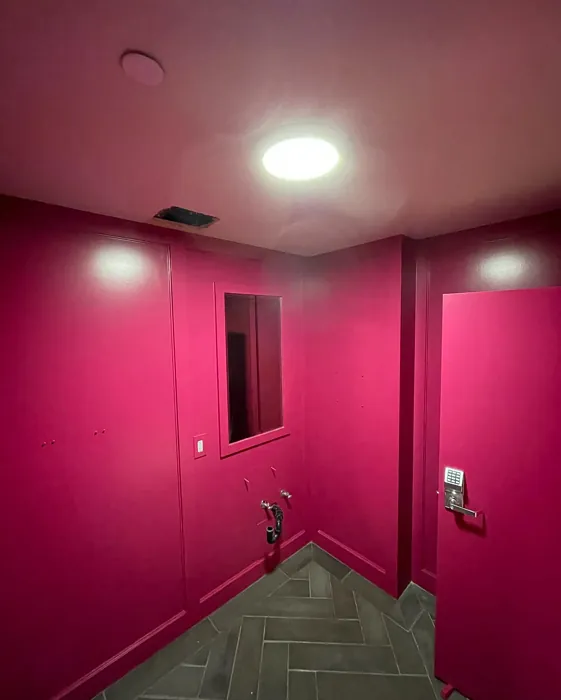
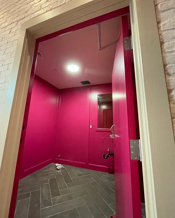
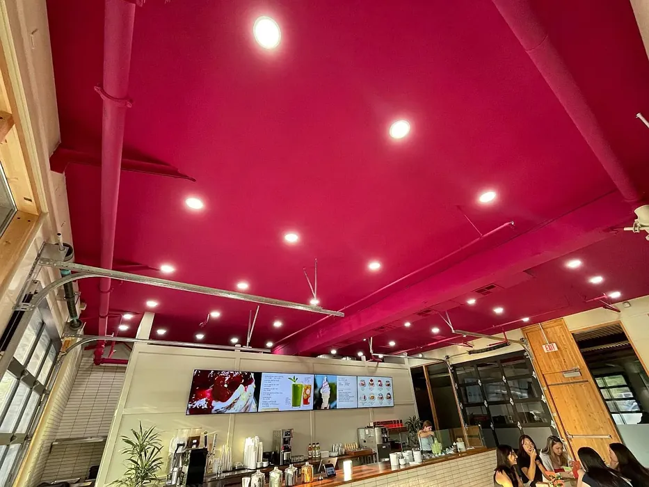
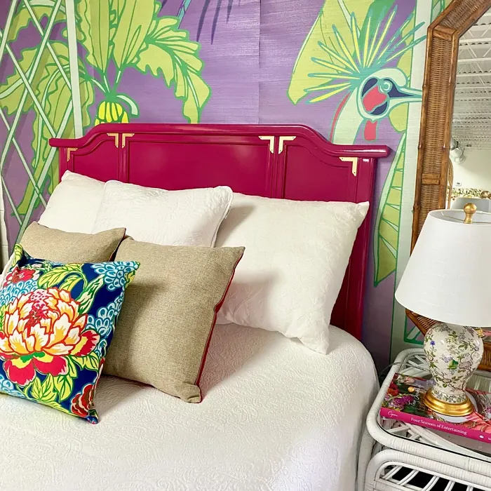
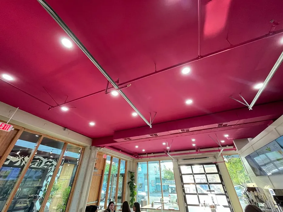
Real Room Photo of Royal Flush 2076-20
Undertones of Royal Flush ?
The undertones of Royal Flush are a key aspect of its character, leaning towards Red. These subtle underlying hues are what give the color its depth and complexity. For example, a gray with a blue undertone will feel cooler and more modern, while one with a brown undertone will feel warmer and more traditional. It’s essential to test this paint in your home and observe it next to your existing furniture, flooring, and decor to see how these undertones interact and reveal themselves throughout the day.
HEX value: #A0365F
RGB code: 160, 54, 95
Is Royal Flush Cool or Warm?
While Royal Flush is predominantly a warm color due to its deep burgundy base, its subtle blue undertone can lend it a cooler aspect. This duality makes the color adaptable to both warm and cool palettes, allowing it to harmonize with a variety of decor styles and elements, from warm wood tones to cooler metal finishes.
Understanding Color Properties and Interior Design Tips
Hue refers to a specific position on the color wheel, measured in degrees from 0 to 360. Each degree represents a different pure color:
- 0° represents red
- 120° represents green
- 240° represents blue
Saturation describes the intensity or purity of a color and is expressed as a percentage:
- At 0%, the color appears completely desaturated—essentially a shade of gray
- At 100%, the color is at its most vivid and vibrant
Lightness indicates how light or dark a color is, also expressed as a percentage:
- 0% lightness results in black
- 100% lightness results in white
Using Warm Colors in Interior Design
Warm hues—such as reds, oranges, yellows, warm beiges, and greiges—are excellent choices for creating inviting and energetic spaces. These colors are particularly well-suited for:
- Kitchens, living rooms, and bathrooms, where warmth enhances comfort and sociability
- Large rooms, where warm tones can help reduce the sense of emptiness and make the space feel more intimate
For example:
- Warm beige shades provide a cozy, inviting atmosphere, ideal for living rooms, bedrooms, and hallways.
- Warm greige (a mix of beige and gray) offers the warmth of beige with the modern appeal of gray, making it a versatile backdrop for dining areas, bedrooms, and living spaces.
However, be mindful when using warm light tones in rooms with limited natural light. These shades may appear muted or even take on an unpleasant yellowish tint. To avoid a dull or flat appearance:
- Add depth by incorporating richer tones like deep greens, charcoal, or chocolate brown
- Use textured elements such as curtains, rugs, or cushions to bring dimension to the space
Pro Tip: Achieving Harmony with Warm and Cool Color Balance
To create a well-balanced and visually interesting interior, mix warm and cool tones strategically. This contrast adds depth and harmony to your design.
- If your walls feature warm hues, introduce cool-colored accents such as blue or green furniture, artwork, or accessories to create contrast.
- For a polished look, consider using a complementary color scheme, which pairs colors opposite each other on the color wheel (e.g., red with green, orange with blue).
This thoughtful mix not only enhances visual appeal but also creates a space that feels both dynamic and cohesive.
Light Temperature Affects on Royal Flush
Natural Light
Natural daylight changes in color temperature as the sun moves across the sky. At sunrise and sunset, the light tends to have a warm, golden tone with a color temperature around 2000 Kelvin (K). As the day progresses and the sun rises higher, the light becomes cooler and more neutral. Around midday, especially when the sky is clear, natural light typically reaches its peak brightness and shifts to a cooler tone, ranging from 5500 to 6500 Kelvin. This midday light is close to what we perceive as pure white or daylight-balanced light.
These shifts in natural light can significantly influence how colors appear in a space, which is why designers often consider both the time of day and the orientation of windows when planning interior color schemes.
Artificial Light
When choosing artificial lighting, pay close attention to the color temperature, measured in Kelvin (K). This determines how warm or cool the light will appear. Lower temperatures, around 2700K, give off a warm, yellow glow often used in living rooms or bedrooms. Higher temperatures, above 5000K, create a cool, bluish light similar to daylight, commonly used in kitchens, offices, or task areas.
Use the slider to see how lighting temperature can affect the appearance of a surface or color throughout a space.


4800K
LRV of Royal Flush
The Light Reflectance Value (LRV) of Royal Flush is 11.98%, which places it in the Medium Dark category. This means it reflects very little light. Understanding a paint’s LRV is crucial for predicting how it will look in your space. A higher LRV indicates a lighter color that reflects more light, making rooms feel larger and brighter. A lower LRV signifies a darker color that absorbs more light, creating a cozier, more intimate atmosphere. Always consider the natural and artificial lighting in your room when selecting a paint color based on its LRV.
Detailed Review of Royal Flush
Additional Paint Characteristics
Ideal Rooms
Bedroom, Dining Room, Home Office, Living Room
Decor Styles
Glamorous, Modern, Traditional
Coverage
Good (1–2 Coats), High Hide, Self-Priming
Ease of Application
Brush Smooth, Professional Application Recommended, Roller-Ready
Washability
Scrubbable, Stain Resistant, Washable
VOC Level
Low VOC, Odor-Free
Best Use
Accent Wall, Doors, Interior Walls
Room Suitability
Bedroom, Dining Room, Living Room
Tone Tag
Deep, Moody, Warm
Finish Type
Matte, Satin, Semi-Gloss
Paint Performance
Fade Resistant, High Coverage, Stain Resistant
Use Cases
Best for High Traffic Areas, Classic Favorite, Designer Favorite
Mood
Cozy, Inviting, Romantic
Trim Pairing
Complements Brass Fixtures, Pairs with Simply White, Works with Warm Trim
Royal Flush is a standout choice for those seeking a bold, sophisticated paint color. With its deep burgundy hue, it offers a sense of luxury and warmth, making it an excellent option for creating an inviting ambiance in living rooms and dining areas. Its rich tone can transform a plain wall into a focal point, adding depth and interest to your decor. The paint’s coverage is impressive, often requiring just one to two coats for a full, even finish. This makes it not only efficient but also cost-effective. Whether you’re aiming for an accent wall or a full-room transformation, Royal Flush can offer the right balance of drama and elegance. Its compatibility with various finishes such as matte and satin allows for flexibility in achieving the desired look. However, it’s worth noting that its intense color may require careful planning in smaller spaces to avoid overwhelming the room.
Pros & Cons of 2076-20 Royal Flush
Pros
Cons
Colors that go with Benjamin Moore Royal Flush
FAQ on 2076-20 Royal Flush
Can Royal Flush be used in small rooms?
Yes, Royal Flush can be used in small rooms, but it’s important to consider the impact of its deep color. In smaller spaces, this shade can make the room feel cozier and more intimate, but it can also make the area appear smaller if not balanced with lighter colors or adequate lighting. To maximize the effect, consider using it on an accent wall or incorporating lighter furnishings and decor to create contrast and prevent the space from feeling too enclosed. Additionally, good lighting can help to bring out the color’s richness without overwhelming the room.
What decor styles pair well with Royal Flush?
Royal Flush pairs beautifully with a variety of decor styles, thanks to its rich and versatile hue. It works exceptionally well in traditional settings, complementing classic furniture and ornate details. In modern spaces, it adds a bold, dramatic touch that can serve as a striking backdrop for sleek, minimalist furnishings. For a glamorous look, pair Royal Flush with metallic accents like gold or brass to enhance its luxurious feel. The color also complements bohemian and eclectic styles, where its depth can anchor vibrant patterns and textures. Overall, its adaptability makes it a fantastic choice for those looking to infuse their home with both color and class.
Comparisons Royal Flush with other colors
Royal Flush 2076-20 vs Exclusive Plum SW 6263
| Attribute | Royal Flush 2076-20 | Exclusive Plum SW 6263 |
|---|---|---|
| Color Name | Royal Flush 2076-20 | Exclusive Plum SW 6263 |
| Color | ||
| Hue | Purple | Purple |
| Brightness | Dark | Dark |
| RGB | 160, 54, 95 | 115, 111, 120 |
| LRV | 11.98% | 15% |
| Finish Type | Matte, Satin, Semi-Gloss | Eggshell, Matte, Satin |
| Finish Options | Matte, Satin, Semi-Gloss | Eggshell, Matte, Satin |
| Ideal Rooms | Bedroom, Dining Room, Home Office, Living Room | Bedroom, Dining Room, Home Office, Living Room |
| Decor Styles | Glamorous, Modern, Traditional | Contemporary, Eclectic, Modern, Traditional |
| Coverage | Good (1–2 Coats), High Hide, Self-Priming | Good (1–2 Coats), Touch-Up Friendly |
| Ease of Application | Brush Smooth, Professional Application Recommended, Roller-Ready | Beginner Friendly, Brush Smooth, Fast-Drying, Roller-Ready |
| Washability | Scrubbable, Stain Resistant, Washable | Washable, Wipeable |
| Room Suitability | Bedroom, Dining Room, Living Room | Bedroom, Dining Room, Home Office, Living Room |
| Tone | Deep, Moody, Warm | Deep, Dusty, Warm |
| Paint Performance | Fade Resistant, High Coverage, Stain Resistant | Easy Touch-Up, High Coverage, Low Odor |
Royal Flush 2076-20 vs Blackberry SW 7577
| Attribute | Royal Flush 2076-20 | Blackberry SW 7577 |
|---|---|---|
| Color Name | Royal Flush 2076-20 | Blackberry SW 7577 |
| Color | ||
| Hue | Purple | Purple |
| Brightness | Dark | Dark |
| RGB | 160, 54, 95 | 83, 54, 64 |
| LRV | 11.98% | 5% |
| Finish Type | Matte, Satin, Semi-Gloss | Eggshell, Matte |
| Finish Options | Matte, Satin, Semi-Gloss | Eggshell, Matte, Satin |
| Ideal Rooms | Bedroom, Dining Room, Home Office, Living Room | Bedroom, Dining Room, Home Office, Living Room |
| Decor Styles | Glamorous, Modern, Traditional | Bohemian, Contemporary, Modern, Rustic |
| Coverage | Good (1–2 Coats), High Hide, Self-Priming | Good (1–2 Coats), Touch-Up Friendly |
| Ease of Application | Brush Smooth, Professional Application Recommended, Roller-Ready | Beginner Friendly, Brush Smooth, Roller-Ready |
| Washability | Scrubbable, Stain Resistant, Washable | Washable, Wipeable |
| Room Suitability | Bedroom, Dining Room, Living Room | Bedroom, Dining Room, Home Office, Living Room |
| Tone | Deep, Moody, Warm | Deep, Moody, Warm |
| Paint Performance | Fade Resistant, High Coverage, Stain Resistant | Easy Touch-Up, High Coverage, Low Odor |
Royal Flush 2076-20 vs Expressive Plum SW 6271
| Attribute | Royal Flush 2076-20 | Expressive Plum SW 6271 |
|---|---|---|
| Color Name | Royal Flush 2076-20 | Expressive Plum SW 6271 |
| Color | ||
| Hue | Purple | Purple |
| Brightness | Dark | Dark |
| RGB | 160, 54, 95 | 105, 92, 98 |
| LRV | 11.98% | 15% |
| Finish Type | Matte, Satin, Semi-Gloss | Eggshell, Matte, Satin |
| Finish Options | Matte, Satin, Semi-Gloss | Eggshell, Matte, Satin |
| Ideal Rooms | Bedroom, Dining Room, Home Office, Living Room | Bedroom, Dining Room, Home Office, Living Room |
| Decor Styles | Glamorous, Modern, Traditional | Eclectic, Modern, Traditional, Transitional |
| Coverage | Good (1–2 Coats), High Hide, Self-Priming | Good (1–2 Coats) |
| Ease of Application | Brush Smooth, Professional Application Recommended, Roller-Ready | Beginner Friendly, Brush Smooth, Roller-Ready |
| Washability | Scrubbable, Stain Resistant, Washable | Washable, Wipeable |
| Room Suitability | Bedroom, Dining Room, Living Room | Bedroom, Dining Room, Home Office, Living Room |
| Tone | Deep, Moody, Warm | Deep, Muted, Warm |
| Paint Performance | Fade Resistant, High Coverage, Stain Resistant | Easy Touch-Up, High Coverage, Low Odor |
Royal Flush 2076-20 vs Plum Brown SW 6272
| Attribute | Royal Flush 2076-20 | Plum Brown SW 6272 |
|---|---|---|
| Color Name | Royal Flush 2076-20 | Plum Brown SW 6272 |
| Color | ||
| Hue | Purple | Purple |
| Brightness | Dark | Dark |
| RGB | 160, 54, 95 | 78, 66, 71 |
| LRV | 11.98% | 6% |
| Finish Type | Matte, Satin, Semi-Gloss | Eggshell, Matte, Satin |
| Finish Options | Matte, Satin, Semi-Gloss | Eggshell, Matte, Satin |
| Ideal Rooms | Bedroom, Dining Room, Home Office, Living Room | Bedroom, Dining Room, Home Office, Living Room |
| Decor Styles | Glamorous, Modern, Traditional | Eclectic, Modern, Rustic, Traditional |
| Coverage | Good (1–2 Coats), High Hide, Self-Priming | Good (1–2 Coats), Touch-Up Friendly |
| Ease of Application | Brush Smooth, Professional Application Recommended, Roller-Ready | Beginner Friendly, Brush Smooth, Roller-Ready |
| Washability | Scrubbable, Stain Resistant, Washable | Washable, Wipeable |
| Room Suitability | Bedroom, Dining Room, Living Room | Bedroom, Dining Room, Home Office, Living Room |
| Tone | Deep, Moody, Warm | Deep, Earthy, Warm |
| Paint Performance | Fade Resistant, High Coverage, Stain Resistant | Easy Touch-Up, High Coverage, Low Odor |
Royal Flush 2076-20 vs Soulmate SW 6270
| Attribute | Royal Flush 2076-20 | Soulmate SW 6270 |
|---|---|---|
| Color Name | Royal Flush 2076-20 | Soulmate SW 6270 |
| Color | ||
| Hue | Purple | Purple |
| Brightness | Dark | Dark |
| RGB | 160, 54, 95 | 133, 119, 123 |
| LRV | 11.98% | 24% |
| Finish Type | Matte, Satin, Semi-Gloss | Eggshell, Matte, Satin |
| Finish Options | Matte, Satin, Semi-Gloss | Eggshell, Matte, Satin |
| Ideal Rooms | Bedroom, Dining Room, Home Office, Living Room | Bedroom, Hallway, Home Office, Living Room |
| Decor Styles | Glamorous, Modern, Traditional | Bohemian, Modern, Rustic, Transitional |
| Coverage | Good (1–2 Coats), High Hide, Self-Priming | Good (1–2 Coats), Touch-Up Friendly |
| Ease of Application | Brush Smooth, Professional Application Recommended, Roller-Ready | Beginner Friendly, Brush Smooth, Roller-Ready |
| Washability | Scrubbable, Stain Resistant, Washable | Washable, Wipeable |
| Room Suitability | Bedroom, Dining Room, Living Room | Bedroom, Hallway, Home Office, Living Room |
| Tone | Deep, Moody, Warm | Earthy, Muted, Warm |
| Paint Performance | Fade Resistant, High Coverage, Stain Resistant | Easy Touch-Up, Low Odor, Quick Drying |
Royal Flush 2076-20 vs Quixotic Plum SW 6265
| Attribute | Royal Flush 2076-20 | Quixotic Plum SW 6265 |
|---|---|---|
| Color Name | Royal Flush 2076-20 | Quixotic Plum SW 6265 |
| Color | ||
| Hue | Purple | Purple |
| Brightness | Dark | Dark |
| RGB | 160, 54, 95 | 74, 70, 83 |
| LRV | 11.98% | 12% |
| Finish Type | Matte, Satin, Semi-Gloss | Eggshell, Matte, Satin |
| Finish Options | Matte, Satin, Semi-Gloss | Eggshell, Matte, Satin |
| Ideal Rooms | Bedroom, Dining Room, Home Office, Living Room | Bedroom, Dining Room, Home Office, Living Room |
| Decor Styles | Glamorous, Modern, Traditional | Bohemian, Contemporary, Eclectic, Modern, Traditional |
| Coverage | Good (1–2 Coats), High Hide, Self-Priming | Good (1–2 Coats), Touch-Up Friendly |
| Ease of Application | Brush Smooth, Professional Application Recommended, Roller-Ready | Brush Smooth, Fast-Drying, Roller-Ready |
| Washability | Scrubbable, Stain Resistant, Washable | Highly Washable, Washable |
| Room Suitability | Bedroom, Dining Room, Living Room | Bedroom, Dining Room, Home Office, Living Room |
| Tone | Deep, Moody, Warm | Deep, Moody, Warm |
| Paint Performance | Fade Resistant, High Coverage, Stain Resistant | High Coverage, Low Odor, Scuff Resistant |
Royal Flush 2076-20 vs Midnight SW 6264
| Attribute | Royal Flush 2076-20 | Midnight SW 6264 |
|---|---|---|
| Color Name | Royal Flush 2076-20 | Midnight SW 6264 |
| Color | ||
| Hue | Purple | Purple |
| Brightness | Dark | Dark |
| RGB | 160, 54, 95 | 93, 89, 98 |
| LRV | 11.98% | 6% |
| Finish Type | Matte, Satin, Semi-Gloss | Eggshell, Matte, Satin |
| Finish Options | Matte, Satin, Semi-Gloss | Eggshell, Matte, Satin |
| Ideal Rooms | Bedroom, Dining Room, Home Office, Living Room | Bedroom, Dining Room, Hallway, Home Office, Living Room |
| Decor Styles | Glamorous, Modern, Traditional | Bohemian, Contemporary, Industrial, Modern |
| Coverage | Good (1–2 Coats), High Hide, Self-Priming | Good (1–2 Coats), High Hide, Touch-Up Friendly |
| Ease of Application | Brush Smooth, Professional Application Recommended, Roller-Ready | Beginner Friendly, Brush Smooth, Roller-Ready |
| Washability | Scrubbable, Stain Resistant, Washable | Scrubbable, Stain Resistant, Washable |
| Room Suitability | Bedroom, Dining Room, Living Room | Bedroom, Dining Room, Home Office, Living Room |
| Tone | Deep, Moody, Warm | Balanced, Deep, Moody |
| Paint Performance | Fade Resistant, High Coverage, Stain Resistant | Easy Touch-Up, Long Lasting, Low Odor, Scuff Resistant |
Royal Flush 2076-20 vs Framboise SW 6566
| Attribute | Royal Flush 2076-20 | Framboise SW 6566 |
|---|---|---|
| Color Name | Royal Flush 2076-20 | Framboise SW 6566 |
| Color | ||
| Hue | Purple | Purple |
| Brightness | Dark | Dark |
| RGB | 160, 54, 95 | 124, 54, 85 |
| LRV | 11.98% | 6% |
| Finish Type | Matte, Satin, Semi-Gloss | Matte, Satin, Semi-Gloss |
| Finish Options | Matte, Satin, Semi-Gloss | Matte, Satin, Semi-Gloss |
| Ideal Rooms | Bedroom, Dining Room, Home Office, Living Room | Bedroom, Dining Room, Home Office, Living Room |
| Decor Styles | Glamorous, Modern, Traditional | Bohemian, Contemporary, Eclectic, Modern |
| Coverage | Good (1–2 Coats), High Hide, Self-Priming | Good (1–2 Coats), Touch-Up Friendly |
| Ease of Application | Brush Smooth, Professional Application Recommended, Roller-Ready | Beginner Friendly, Brush Smooth, Fast-Drying, Roller-Ready |
| Washability | Scrubbable, Stain Resistant, Washable | Highly Washable, Washable |
| Room Suitability | Bedroom, Dining Room, Living Room | Bedroom, Dining Room, Home Office, Living Room |
| Tone | Deep, Moody, Warm | Bold, Deep, Warm |
| Paint Performance | Fade Resistant, High Coverage, Stain Resistant | Easy Touch-Up, High Coverage, Low Odor, Quick Drying |
Royal Flush 2076-20 vs Poetry Plum SW 6019
| Attribute | Royal Flush 2076-20 | Poetry Plum SW 6019 |
|---|---|---|
| Color Name | Royal Flush 2076-20 | Poetry Plum SW 6019 |
| Color | ||
| Hue | Purple | Purple |
| Brightness | Dark | Dark |
| RGB | 160, 54, 95 | 111, 92, 95 |
| LRV | 11.98% | 10% |
| Finish Type | Matte, Satin, Semi-Gloss | Eggshell, Matte, Satin |
| Finish Options | Matte, Satin, Semi-Gloss | Eggshell, Matte, Satin |
| Ideal Rooms | Bedroom, Dining Room, Home Office, Living Room | Bedroom, Dining Room, Home Office, Living Room |
| Decor Styles | Glamorous, Modern, Traditional | Bohemian, Modern, Rustic, Transitional |
| Coverage | Good (1–2 Coats), High Hide, Self-Priming | Good (1–2 Coats), Touch-Up Friendly |
| Ease of Application | Brush Smooth, Professional Application Recommended, Roller-Ready | Beginner Friendly, Brush Smooth, Roller-Ready |
| Washability | Scrubbable, Stain Resistant, Washable | Highly Washable, Washable |
| Room Suitability | Bedroom, Dining Room, Living Room | Bedroom, Dining Room, Home Office, Living Room |
| Tone | Deep, Moody, Warm | Deep, Muted, Warm |
| Paint Performance | Fade Resistant, High Coverage, Stain Resistant | Easy Touch-Up, High Coverage, Low Odor |
Royal Flush 2076-20 vs Mature Grape SW 6286
| Attribute | Royal Flush 2076-20 | Mature Grape SW 6286 |
|---|---|---|
| Color Name | Royal Flush 2076-20 | Mature Grape SW 6286 |
| Color | ||
| Hue | Purple | Purple |
| Brightness | Dark | Dark |
| RGB | 160, 54, 95 | 95, 63, 84 |
| LRV | 11.98% | 15% |
| Finish Type | Matte, Satin, Semi-Gloss | Eggshell, Matte, Satin |
| Finish Options | Matte, Satin, Semi-Gloss | Eggshell, Matte, Satin |
| Ideal Rooms | Bedroom, Dining Room, Home Office, Living Room | Bedroom, Dining Room, Home Office, Living Room |
| Decor Styles | Glamorous, Modern, Traditional | Art Deco, Bohemian, Modern, Rustic |
| Coverage | Good (1–2 Coats), High Hide, Self-Priming | Good (1–2 Coats), Touch-Up Friendly |
| Ease of Application | Brush Smooth, Professional Application Recommended, Roller-Ready | Brush Smooth, Fast-Drying, Roller-Ready |
| Washability | Scrubbable, Stain Resistant, Washable | Stain Resistant, Washable, Wipeable |
| Room Suitability | Bedroom, Dining Room, Living Room | Bedroom, Dining Room, Home Office, Living Room |
| Tone | Deep, Moody, Warm | Deep, Earthy, Warm |
| Paint Performance | Fade Resistant, High Coverage, Stain Resistant | Easy Touch-Up, Low Odor, Stain Resistant |
Official Page of Benjamin Moore Royal Flush 2076-20