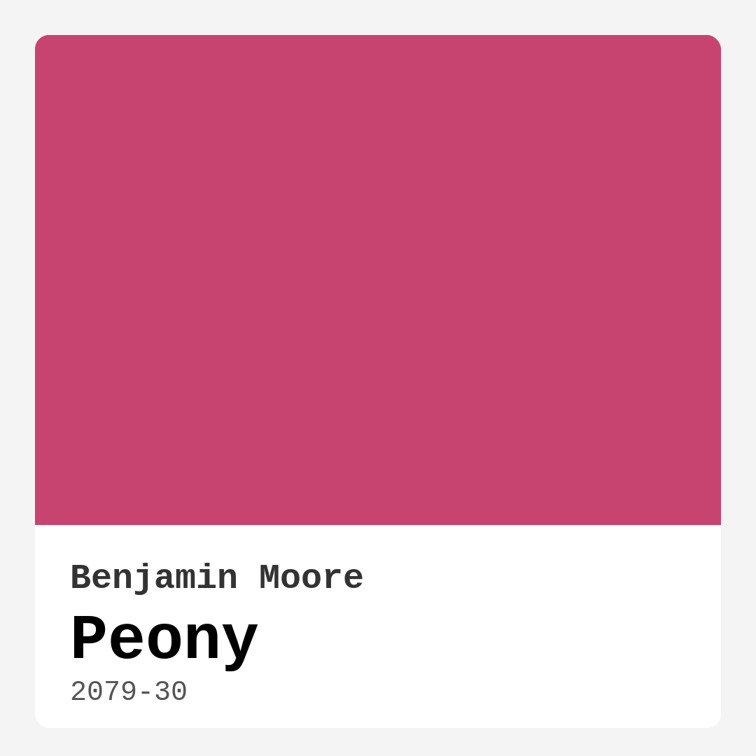
Color Preview & Key Details
| HEX Code | #C84470 |
| RGB | 200, 68, 112 |
| LRV | 18.55% |
| Undertone | Red |
| Finish Options | Eggshell, Matte, Satin, Semi-Gloss |
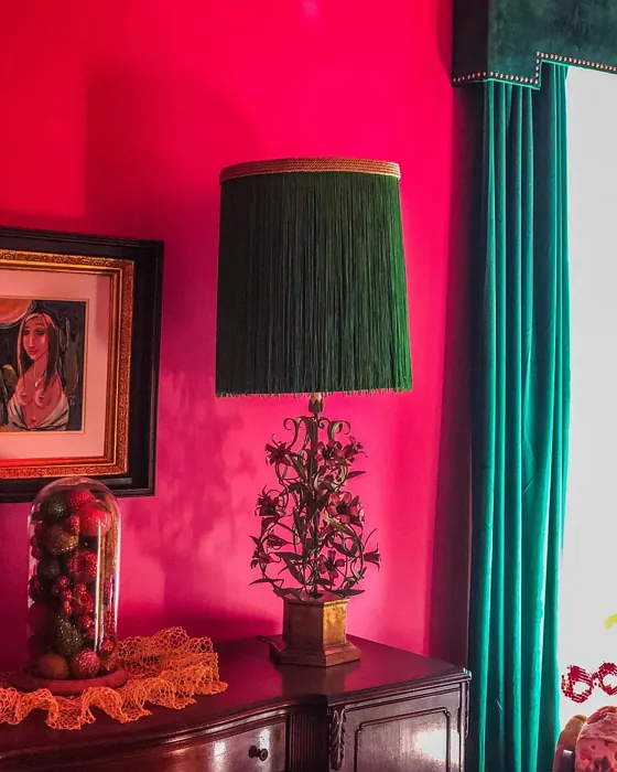
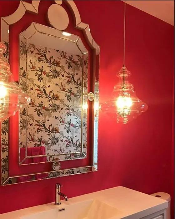
If you’re looking for a paint color that brings energy, warmth, and a touch of drama to your home, Benjamin Moore’s Peony (2079-30) might just be your perfect match. This vibrant, bold pink isn’t your average soft blush—it’s a statement-maker with a rich red undertone that evokes the lush petals of its namesake flower. Whether you’re considering an accent wall or a full-room transformation, Peony has the power to elevate your space with its inviting and playful personality.
One of the first things you’ll notice about Peony is its depth. With an LRV (Light Reflectance Value) of 18.55%, it falls into the medium-dark category, meaning it absorbs more light than it reflects. This makes it a fantastic choice for creating a cozy, intimate atmosphere, especially in bedrooms or dining rooms where you want warmth and vibrancy. But don’t let the “dark” label scare you—Peony still has enough brightness to feel lively rather than heavy, especially in well-lit spaces. If your room gets plenty of natural light, this color will shine beautifully, while in dimmer settings, it takes on a deeper, more romantic tone.
The red undertones in Peony are what set it apart from other pinks. Unlike cooler pinks that lean toward purple or blue, Peony has a warmth that makes it feel inviting and cheerful. This makes it incredibly versatile—it can hold its own in modern, eclectic, bohemian, or even glam interiors. Pair it with crisp white trim (Benjamin Moore’s White Dove is a classic choice) for a fresh, balanced look, or go bold by combining it with brass fixtures and rich textures like velvet or silk. If you love contrast, try incorporating touches of its complementary color—green—through plants, artwork, or upholstery for a dynamic, eye-catching effect.
When it comes to application, Peony is beginner-friendly. It’s self-priming, covers well in one to two coats, and is touch-up friendly, so you won’t have to stress about perfecting every brushstroke. It’s also low-VOC and odor-free, making it a great option if you’re painting a kid’s room or a space where you spend a lot of time. The finish you choose can also influence the final look—matte will give it a soft, velvety feel, while satin or semi-gloss will add a bit of sheen, making it pop even more.
Now, let’s talk about where Peony works best. Bedrooms are a natural fit—its warm, romantic vibe creates a cozy retreat that feels both energizing and soothing. In a living room or dining room, it adds a lively yet sophisticated touch, especially when paired with neutral furniture and metallic accents. Kids’ rooms are another great option—Peony’s playful energy makes it fun without feeling overly juvenile. Even home offices can benefit from its mood-boosting qualities, helping to spark creativity and keep you inspired throughout the day.
Of course, no color is without its considerations. If you’re working with a small or poorly lit space, Peony’s boldness might make the room feel a bit tighter. But if you love the color and still want to use it, try balancing it with plenty of light-reflecting elements like mirrors, light-colored furniture, or sheer curtains. And while its vibrancy is a pro for many, it might be too intense for those who prefer more subdued palettes. If you’re on the fence, testing a sample in your space is a must—observe how it changes throughout the day under different lighting conditions.
If you adore Peony but want something slightly lighter or darker, Benjamin Moore offers a range of similar shades. For a softer take, consider 2084-40 or 1348, while deeper options like 2077-20 or 2076-10 will give you a moodier, more dramatic effect. And if you’re looking for coordinating colors, shades like HC-132 (a warm neutral) or 2122-60 (a soft green) can create a harmonious palette.
At the end of the day, Peony is a color for those who aren’t afraid to embrace bold, personality-filled interiors. It’s warm, inviting, and full of life—perfect for anyone looking to infuse their home with energy and style. Whether you’re painting a single wall or an entire room, this vibrant pink has the power to transform your space into something truly special. So grab a brush, trust your instincts, and let Peony work its magic. Your walls—and your mood—will thank you.
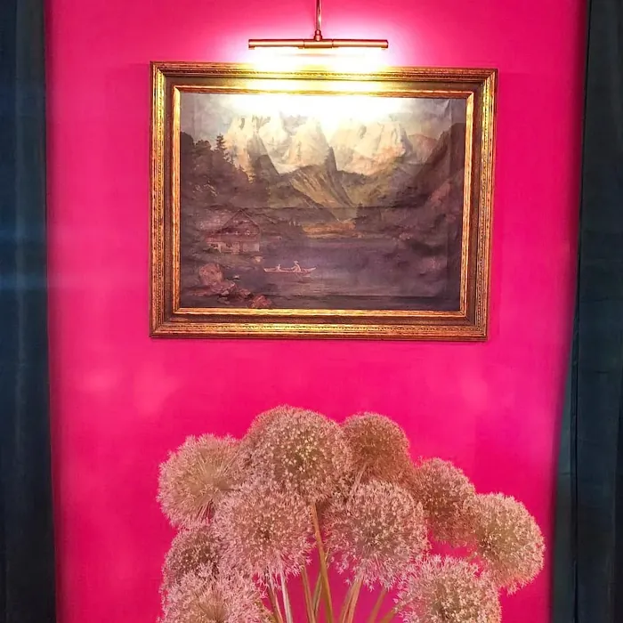
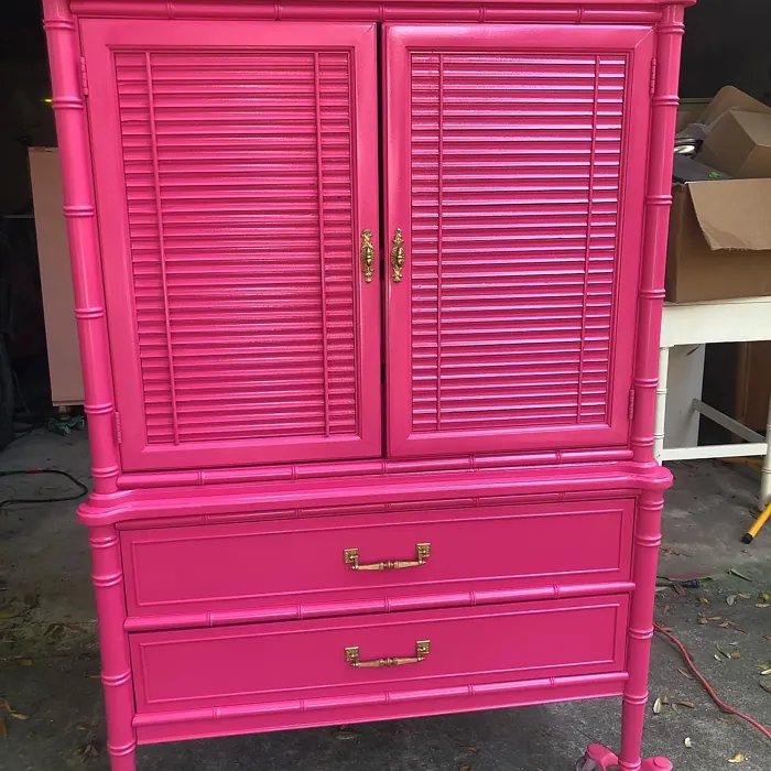
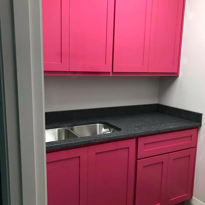
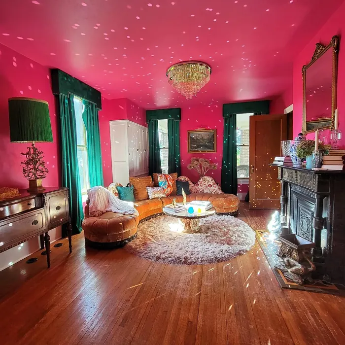
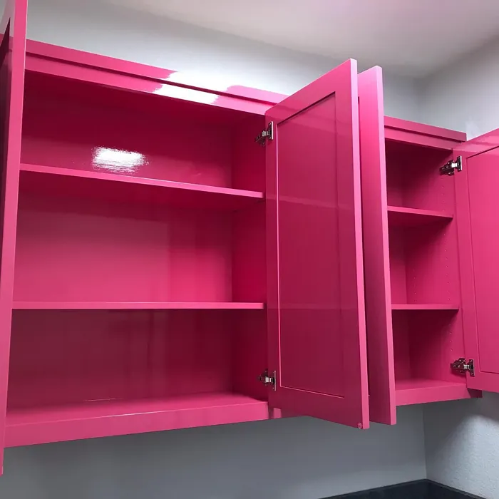
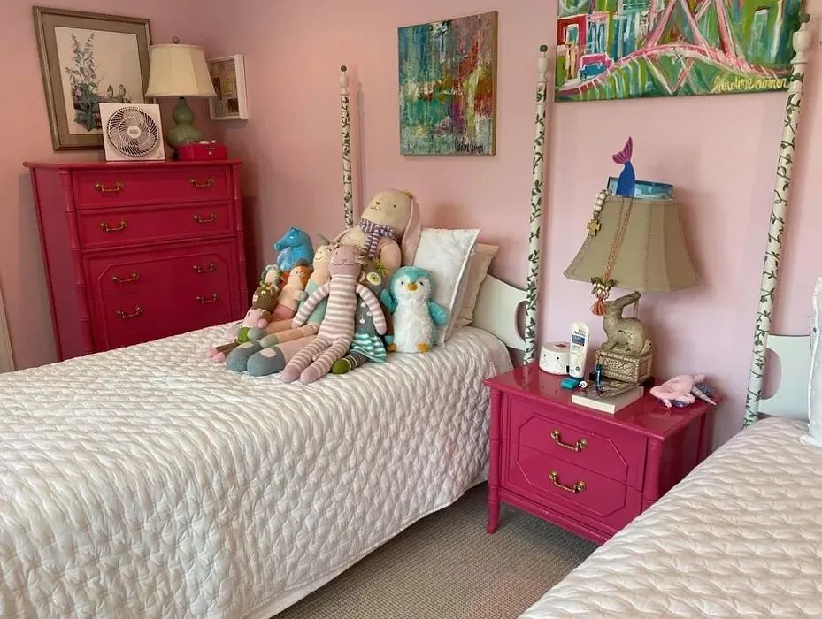
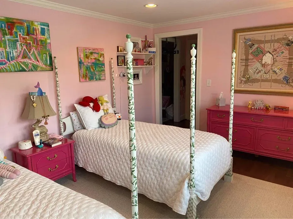
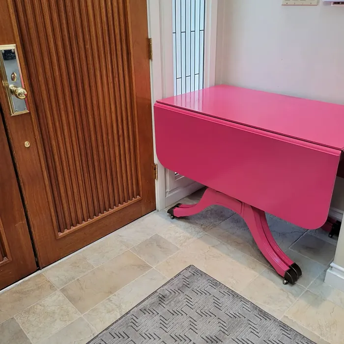
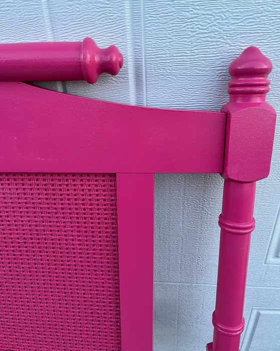
Real Room Photo of Peony 2079-30
Undertones of Peony ?
The undertones of Peony are a key aspect of its character, leaning towards Red. These subtle underlying hues are what give the color its depth and complexity. For example, a gray with a blue undertone will feel cooler and more modern, while one with a brown undertone will feel warmer and more traditional. It’s essential to test this paint in your home and observe it next to your existing furniture, flooring, and decor to see how these undertones interact and reveal themselves throughout the day.
HEX value: #C84470
RGB code: 200, 68, 112
Is Peony Cool or Warm?
Peony is a warm color, thanks to its strong red undertones. This warmth makes it feel inviting and energizing, perfect for spaces where you want to foster comfort and creativity. Warm colors like Peony can make a room feel cozier and more intimate, adding a touch of hospitality and cheerfulness.
Understanding Color Properties and Interior Design Tips
Hue refers to a specific position on the color wheel, measured in degrees from 0 to 360. Each degree represents a different pure color:
- 0° represents red
- 120° represents green
- 240° represents blue
Saturation describes the intensity or purity of a color and is expressed as a percentage:
- At 0%, the color appears completely desaturated—essentially a shade of gray
- At 100%, the color is at its most vivid and vibrant
Lightness indicates how light or dark a color is, also expressed as a percentage:
- 0% lightness results in black
- 100% lightness results in white
Using Warm Colors in Interior Design
Warm hues—such as reds, oranges, yellows, warm beiges, and greiges—are excellent choices for creating inviting and energetic spaces. These colors are particularly well-suited for:
- Kitchens, living rooms, and bathrooms, where warmth enhances comfort and sociability
- Large rooms, where warm tones can help reduce the sense of emptiness and make the space feel more intimate
For example:
- Warm beige shades provide a cozy, inviting atmosphere, ideal for living rooms, bedrooms, and hallways.
- Warm greige (a mix of beige and gray) offers the warmth of beige with the modern appeal of gray, making it a versatile backdrop for dining areas, bedrooms, and living spaces.
However, be mindful when using warm light tones in rooms with limited natural light. These shades may appear muted or even take on an unpleasant yellowish tint. To avoid a dull or flat appearance:
- Add depth by incorporating richer tones like deep greens, charcoal, or chocolate brown
- Use textured elements such as curtains, rugs, or cushions to bring dimension to the space
Pro Tip: Achieving Harmony with Warm and Cool Color Balance
To create a well-balanced and visually interesting interior, mix warm and cool tones strategically. This contrast adds depth and harmony to your design.
- If your walls feature warm hues, introduce cool-colored accents such as blue or green furniture, artwork, or accessories to create contrast.
- For a polished look, consider using a complementary color scheme, which pairs colors opposite each other on the color wheel (e.g., red with green, orange with blue).
This thoughtful mix not only enhances visual appeal but also creates a space that feels both dynamic and cohesive.
Light Temperature Affects on Peony
Natural Light
Natural daylight changes in color temperature as the sun moves across the sky. At sunrise and sunset, the light tends to have a warm, golden tone with a color temperature around 2000 Kelvin (K). As the day progresses and the sun rises higher, the light becomes cooler and more neutral. Around midday, especially when the sky is clear, natural light typically reaches its peak brightness and shifts to a cooler tone, ranging from 5500 to 6500 Kelvin. This midday light is close to what we perceive as pure white or daylight-balanced light.
These shifts in natural light can significantly influence how colors appear in a space, which is why designers often consider both the time of day and the orientation of windows when planning interior color schemes.
Artificial Light
When choosing artificial lighting, pay close attention to the color temperature, measured in Kelvin (K). This determines how warm or cool the light will appear. Lower temperatures, around 2700K, give off a warm, yellow glow often used in living rooms or bedrooms. Higher temperatures, above 5000K, create a cool, bluish light similar to daylight, commonly used in kitchens, offices, or task areas.
Use the slider to see how lighting temperature can affect the appearance of a surface or color throughout a space.


4800K
LRV of Peony
The Light Reflectance Value (LRV) of Peony is 18.55%, which places it in the Medium Dark category. This means it reflects very little light. Understanding a paint’s LRV is crucial for predicting how it will look in your space. A higher LRV indicates a lighter color that reflects more light, making rooms feel larger and brighter. A lower LRV signifies a darker color that absorbs more light, creating a cozier, more intimate atmosphere. Always consider the natural and artificial lighting in your room when selecting a paint color based on its LRV.
Detailed Review of Peony
Additional Paint Characteristics
Ideal Rooms
Bedroom, Dining Room, Home Office, Kids Room, Living Room
Decor Styles
Bohemian, Eclectic, Glam, Modern
Coverage
Good (1–2 Coats), Self-Priming, Touch-Up Friendly
Ease of Application
Beginner Friendly, Brush Smooth, Fast-Drying, Low Splatter, Roller-Ready
Washability
Stain Resistant, Washable, Wipeable
VOC Level
Low VOC, Odor-Free
Best Use
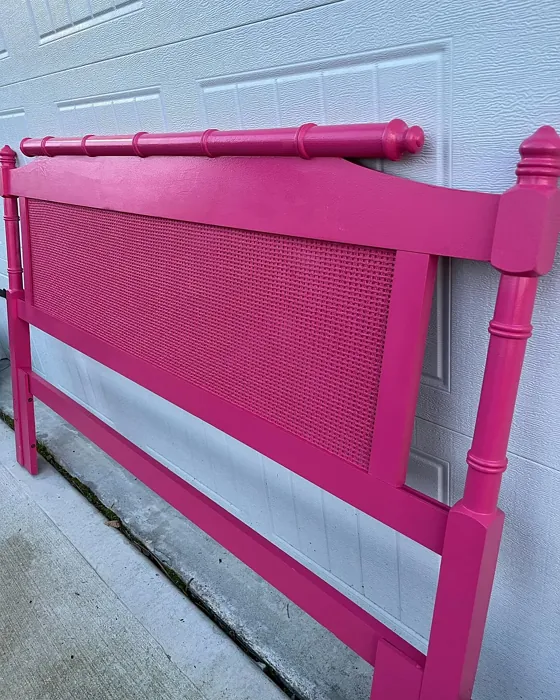
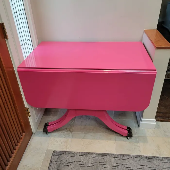
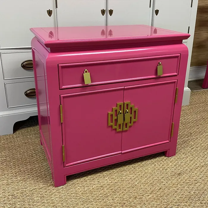
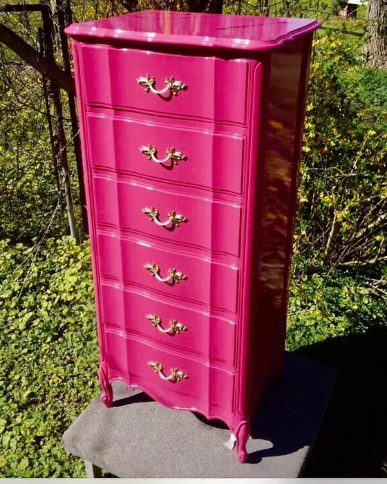
Accent Wall, Furniture, Interior Walls, Large Spaces, Small Spaces
Room Suitability
Bedroom, Dining Room, Kids Room, Living Room
Tone Tag
Bold, Inviting, Warm
Finish Type
Eggshell, Matte, Satin, Semi-Gloss
Paint Performance
Fade Resistant, High Coverage, Low Odor, Quick Drying
Use Cases
Best for Open Concept, Best for Small Spaces, Designer Favorite, Trending in 2025
Mood
Energizing, Inviting, Romantic, Warm
Trim Pairing
Complements Brass Fixtures, Pairs with White Dove, Works with Warm Trim
Peony is a color that demands attention and adds a splash of vibrancy wherever it’s used. This pink hue has a rich intensity that can transform a space from mundane to marvelous. It’s versatile enough to be used as an accent wall or to create a romantic, cozy bedroom atmosphere. The color’s red undertones give it a warmth that makes it particularly inviting and cheerful. Peony pairs well with contemporary and eclectic decor styles, adding a playful yet sophisticated touch. While it may not be for everyone, those who love bold colors will find Peony to be a delightful choice that can single-handedly lift the mood of a room.
Pros & Cons of 2079-30 Peony
Pros
Cons
Colors that go with Benjamin Moore Peony
FAQ on 2079-30 Peony
How does Peony compare to other pinks?
Peony stands out among other pinks due to its rich and vivid tone. Unlike pastel or dusty pinks, Peony is bold and assertive, making it an ideal choice for those who want to make a statement. Its red undertones add depth and warmth, setting it apart from cooler pinks that may lean towards purple or blue hues. If you’re looking for a pink that energizes and inspires, Peony is a fantastic option. It’s perfect for those who appreciate a touch of drama and aren’t afraid to embrace color in their decor.
What decor styles work best with Peony?
Peony is incredibly versatile and can complement several decor styles. It works well in modern settings where bold colors are celebrated, adding a lively contrast to minimalist elements. In eclectic or bohemian spaces, Peony can serve as a vibrant backdrop to a mix of patterns and textures. For a glam aesthetic, pair Peony with metallic accents and luxurious fabrics to create a space that feels opulent and chic. No matter the style, Peony adds a playful yet sophisticated touch that can elevate any room.
Comparisons Peony with other colors
Peony 2079-30 vs Exuberant Pink SW 6840
| Attribute | Peony 2079-30 | Exuberant Pink SW 6840 |
|---|---|---|
| Color Name | Peony 2079-30 | Exuberant Pink SW 6840 |
| Color | ||
| Hue | Pink | Pink |
| Brightness | Dark | Dark |
| RGB | 200, 68, 112 | 181, 77, 127 |
| LRV | 18.55% | 36% |
| Finish Type | Eggshell, Matte, Satin, Semi-Gloss | Matte, Satin, Semi-Gloss |
| Finish Options | Eggshell, Matte, Satin, Semi-Gloss | Matte, Satin, Semi-Gloss |
| Ideal Rooms | Bedroom, Dining Room, Home Office, Kids Room, Living Room | Bedroom, Dining Room, Kids Room, Living Room, Nursery |
| Decor Styles | Bohemian, Eclectic, Glam, Modern | Bohemian, Contemporary, Eclectic, Modern, Vintage |
| Coverage | Good (1–2 Coats), Self-Priming, Touch-Up Friendly | Good (1–2 Coats), Touch-Up Friendly |
| Ease of Application | Beginner Friendly, Brush Smooth, Fast-Drying, Low Splatter, Roller-Ready | Beginner Friendly, Brush Smooth, Fast-Drying, Roller-Ready |
| Washability | Stain Resistant, Washable, Wipeable | Washable, Wipeable |
| Room Suitability | Bedroom, Dining Room, Kids Room, Living Room | Bedroom, Dining Room, Kids Room, Living Room, Nursery |
| Tone | Bold, Inviting, Warm | Bold, Bright, Warm |
| Paint Performance | Fade Resistant, High Coverage, Low Odor, Quick Drying | Easy Touch-Up, Fade Resistant, Low Odor, Quick Drying |
Peony 2079-30 vs Reddened Earth SW 6053
| Attribute | Peony 2079-30 | Reddened Earth SW 6053 |
|---|---|---|
| Color Name | Peony 2079-30 | Reddened Earth SW 6053 |
| Color | ||
| Hue | Pink | Pink |
| Brightness | Dark | Dark |
| RGB | 200, 68, 112 | 156, 110, 99 |
| LRV | 18.55% | 20% |
| Finish Type | Eggshell, Matte, Satin, Semi-Gloss | Eggshell, Flat, Matte |
| Finish Options | Eggshell, Matte, Satin, Semi-Gloss | Eggshell, Flat, Matte, Satin |
| Ideal Rooms | Bedroom, Dining Room, Home Office, Kids Room, Living Room | Bedroom, Dining Room, Home Office, Living Room, Nursery |
| Decor Styles | Bohemian, Eclectic, Glam, Modern | Bohemian, Mid-Century Modern, Modern Farmhouse, Rustic |
| Coverage | Good (1–2 Coats), Self-Priming, Touch-Up Friendly | Good (1–2 Coats), Touch-Up Friendly |
| Ease of Application | Beginner Friendly, Brush Smooth, Fast-Drying, Low Splatter, Roller-Ready | Beginner Friendly, Brush Smooth, Roller-Ready |
| Washability | Stain Resistant, Washable, Wipeable | Washable, Wipeable |
| Room Suitability | Bedroom, Dining Room, Kids Room, Living Room | Bedroom, Dining Room, Home Office, Living Room |
| Tone | Bold, Inviting, Warm | Earthy, Muted, Warm |
| Paint Performance | Fade Resistant, High Coverage, Low Odor, Quick Drying | High Coverage, Low Odor, Quick Drying, Scuff Resistant |
Peony 2079-30 vs Berry Bush SW 6292
| Attribute | Peony 2079-30 | Berry Bush SW 6292 |
|---|---|---|
| Color Name | Peony 2079-30 | Berry Bush SW 6292 |
| Color | ||
| Hue | Pink | Pink |
| Brightness | Dark | Dark |
| RGB | 200, 68, 112 | 141, 88, 105 |
| LRV | 18.55% | 12% |
| Finish Type | Eggshell, Matte, Satin, Semi-Gloss | Matte, Satin, Semi-Gloss |
| Finish Options | Eggshell, Matte, Satin, Semi-Gloss | Matte, Satin, Semi-Gloss |
| Ideal Rooms | Bedroom, Dining Room, Home Office, Kids Room, Living Room | Bedroom, Dining Room, Home Office, Living Room |
| Decor Styles | Bohemian, Eclectic, Glam, Modern | Eclectic, Modern, Rustic, Transitional |
| Coverage | Good (1–2 Coats), Self-Priming, Touch-Up Friendly | Good (1–2 Coats), Touch-Up Friendly |
| Ease of Application | Beginner Friendly, Brush Smooth, Fast-Drying, Low Splatter, Roller-Ready | Brush Smooth, Fast-Drying, Roller-Ready |
| Washability | Stain Resistant, Washable, Wipeable | Washable, Wipeable |
| Room Suitability | Bedroom, Dining Room, Kids Room, Living Room | Bedroom, Dining Room, Home Office, Living Room |
| Tone | Bold, Inviting, Warm | Deep, Muted, Warm |
| Paint Performance | Fade Resistant, High Coverage, Low Odor, Quick Drying | Easy Touch-Up, Low Odor, Quick Drying |
Peony 2079-30 vs Renwick Heather SW 2818
| Attribute | Peony 2079-30 | Renwick Heather SW 2818 |
|---|---|---|
| Color Name | Peony 2079-30 | Renwick Heather SW 2818 |
| Color | ||
| Hue | Pink | Pink |
| Brightness | Dark | Dark |
| RGB | 200, 68, 112 | 139, 125, 123 |
| LRV | 18.55% | 24% |
| Finish Type | Eggshell, Matte, Satin, Semi-Gloss | Eggshell, Satin |
| Finish Options | Eggshell, Matte, Satin, Semi-Gloss | Eggshell, Matte, Satin |
| Ideal Rooms | Bedroom, Dining Room, Home Office, Kids Room, Living Room | Bedroom, Dining Room, Entryway, Home Office, Living Room |
| Decor Styles | Bohemian, Eclectic, Glam, Modern | Bohemian, Contemporary, Modern Farmhouse, Rustic, Transitional |
| Coverage | Good (1–2 Coats), Self-Priming, Touch-Up Friendly | Good (1–2 Coats), Touch-Up Friendly |
| Ease of Application | Beginner Friendly, Brush Smooth, Fast-Drying, Low Splatter, Roller-Ready | Beginner Friendly, Brush Smooth, Roller-Ready |
| Washability | Stain Resistant, Washable, Wipeable | Washable, Wipeable |
| Room Suitability | Bedroom, Dining Room, Kids Room, Living Room | Bedroom, Dining Room, Entryway, Home Office, Living Room |
| Tone | Bold, Inviting, Warm | Earthy, Muted, Warm |
| Paint Performance | Fade Resistant, High Coverage, Low Odor, Quick Drying | Easy Touch-Up, High Coverage, Low Odor |
Peony 2079-30 vs Somerville Red HC-62
| Attribute | Peony 2079-30 | Somerville Red HC-62 |
|---|---|---|
| Color Name | Peony 2079-30 | Somerville Red HC-62 |
| Color | ||
| Hue | Pink | Pink |
| Brightness | Dark | Dark |
| RGB | 200, 68, 112 | 154, 109, 107 |
| LRV | 18.55% | 19.43% |
| Finish Type | Eggshell, Matte, Satin, Semi-Gloss | Eggshell, Satin, Semi-Gloss |
| Finish Options | Eggshell, Matte, Satin, Semi-Gloss | Eggshell, Satin, Semi-Gloss |
| Ideal Rooms | Bedroom, Dining Room, Home Office, Kids Room, Living Room | Bedroom, Dining Room, Home Office, Living Room |
| Decor Styles | Bohemian, Eclectic, Glam, Modern | Industrial, Modern, Rustic, Traditional |
| Coverage | Good (1–2 Coats), Self-Priming, Touch-Up Friendly | Good (1–2 Coats), High Hide |
| Ease of Application | Beginner Friendly, Brush Smooth, Fast-Drying, Low Splatter, Roller-Ready | Beginner Friendly, Brush Smooth, Fast-Drying, Low Splatter, Roller-Ready |
| Washability | Stain Resistant, Washable, Wipeable | Highly Washable, Stain Resistant, Washable |
| Room Suitability | Bedroom, Dining Room, Kids Room, Living Room | Bedroom, Dining Room, Living Room |
| Tone | Bold, Inviting, Warm | Dusty, Earthy, Muted, Warm |
| Paint Performance | Fade Resistant, High Coverage, Low Odor, Quick Drying | Fade Resistant, High Coverage, Low Odor, Quick Drying |
Peony 2079-30 vs Café Ole 2098-40
| Attribute | Peony 2079-30 | Café Ole 2098-40 |
|---|---|---|
| Color Name | Peony 2079-30 | Café Ole 2098-40 |
| Color | ||
| Hue | Pink | Pink |
| Brightness | Dark | Dark |
| RGB | 200, 68, 112 | 155, 125, 115 |
| LRV | 18.55% | 23.78% |
| Finish Type | Eggshell, Matte, Satin, Semi-Gloss | Eggshell, Matte, Satin |
| Finish Options | Eggshell, Matte, Satin, Semi-Gloss | Eggshell, Matte, Satin |
| Ideal Rooms | Bedroom, Dining Room, Home Office, Kids Room, Living Room | Bedroom, Dining Room, Entryway, Home Office, Living Room |
| Decor Styles | Bohemian, Eclectic, Glam, Modern | Bohemian, Modern Farmhouse, Rustic |
| Coverage | Good (1–2 Coats), Self-Priming, Touch-Up Friendly | Good (1–2 Coats), Self-Priming |
| Ease of Application | Beginner Friendly, Brush Smooth, Fast-Drying, Low Splatter, Roller-Ready | Brush Smooth, Fast-Drying, Low Splatter, Roller-Ready |
| Washability | Stain Resistant, Washable, Wipeable | Stain Resistant, Washable, Wipeable |
| Room Suitability | Bedroom, Dining Room, Kids Room, Living Room | Bedroom, Dining Room, Living Room |
| Tone | Bold, Inviting, Warm | Cozy, Earthy, Muted, Warm |
| Paint Performance | Fade Resistant, High Coverage, Low Odor, Quick Drying | High Coverage, Low Odor, Quick Drying, Stain Resistant |
Official Page of Benjamin Moore Peony 2079-30