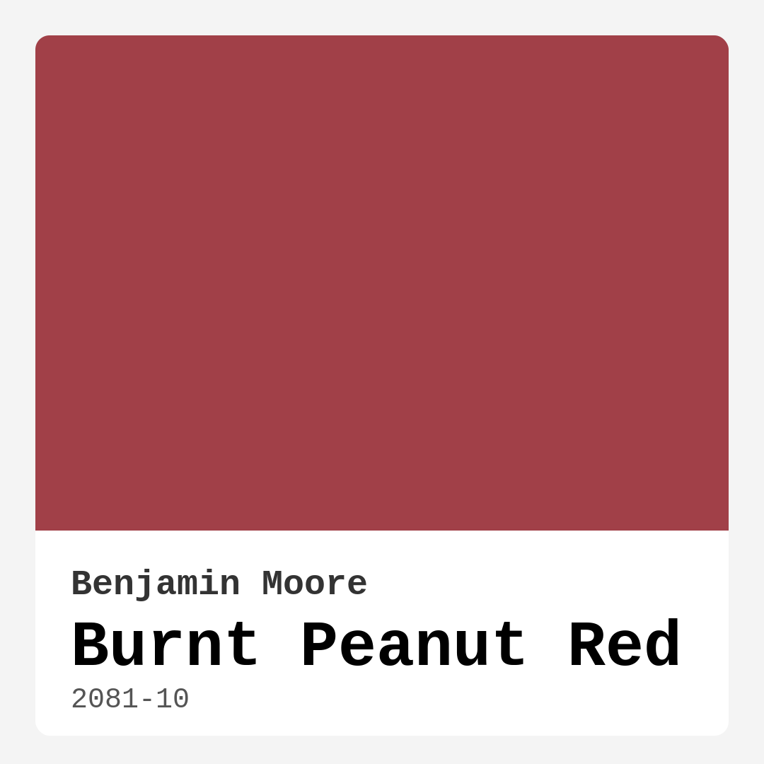
Color Preview & Key Details
| HEX Code | #A14048 |
| RGB | 161, 64, 72 |
| LRV | 12.41% |
| Undertone | Red |
| Finish Options | Eggshell, Matte, Satin |
If you’re looking for a paint color that exudes warmth, depth, and a touch of drama, Benjamin Moore’s Burnt Peanut Red (2081-10) might just be your perfect match. This rich, inviting hue is more than just a deep red—it’s a statement maker, a mood setter, and a versatile choice for anyone who wants to infuse their home with coziness and sophistication. Whether you’re considering an accent wall, a full room makeover, or even a furniture refresh, this color has the power to transform your space into something truly special.
Burnt Peanut Red is a dark, warm red with an LRV (Light Reflectance Value) of 12.41%, meaning it absorbs a lot of light rather than reflecting it. This makes it ideal for creating intimate, enveloping spaces that feel both luxurious and welcoming. It’s not a color for the faint of heart, but if you’re drawn to bold, moody tones, you’ll love how it adds character to a room. The undertones are purely red, giving it a classic, timeless quality that works well in traditional, modern, or eclectic settings.
One of the best things about this paint is its ease of application. It’s beginner-friendly, roller-ready, and has low splatter, so even if you’re a DIY novice, you won’t struggle with messy application. Plus, it’s self-priming and offers high coverage—most projects will only need one or two coats, saving you time and effort. The finish options (matte, eggshell, satin) give you flexibility depending on the look and durability you need. Eggshell is a great middle ground for walls, offering a slight sheen while still hiding imperfections, while satin works well for trim or furniture where a bit more durability is key.
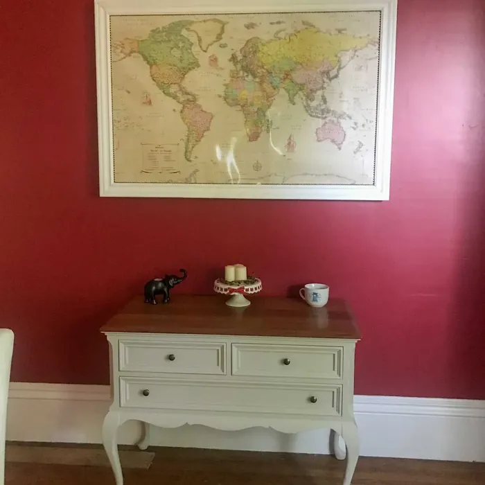
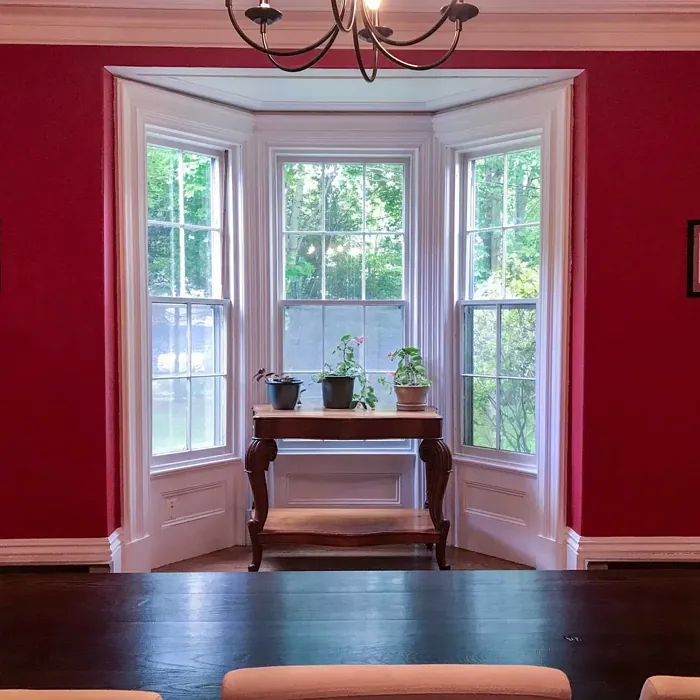
When it comes to choosing the right room for Burnt Peanut Red, think about spaces where you want to cultivate warmth and intimacy. Living rooms and dining rooms are natural fits—this color encourages conversation and connection, making it perfect for gathering areas. In a bedroom, it creates a romantic, cocoon-like atmosphere, especially when paired with soft textiles and warm lighting. If you’re worried about it feeling too heavy in a smaller space, consider using it on a single accent wall or balancing it with lighter neutrals like creamy whites or soft beiges.
Lighting plays a huge role in how this color performs. In natural light, the warmth of Burnt Peanut Red really shines, giving off a rich, inviting glow. Under artificial light, especially warm-toned bulbs, it can deepen even further, leaning into its moodier side. If your room doesn’t get a lot of natural light, test a swatch first to make sure you’re comfortable with how it reads in different conditions.
Pairing this color with the right accents is key to making it work. Since it’s a warm red, complementary shades like deep greens (think emerald or olive) create a striking contrast. For a more harmonious look, try pairing it with other warm neutrals—think caramel leather, brass fixtures, or wood tones with a reddish undertone. White Dove is an excellent trim color to keep things crisp and balanced, preventing the space from feeling too dark.
Durability is another strong suit of Burnt Peanut Red. It’s highly washable and scrubbable, making it practical for high-traffic areas like dining rooms or entryways. Plus, it’s low VOC and eco-certified, so you don’t have to worry about harsh fumes during or after painting. It’s fade-resistant too, meaning it will hold up beautifully over time without losing its richness.
If you’re still on the fence, consider this: Burnt Peanut Red is a designer favorite for a reason. It’s bold without being overwhelming, warm without being overly rustic, and sophisticated without feeling stuffy. It works in open-concept spaces where you want to define zones without closing them off, and it’s even a great choice if you’re staging a home to sell—it adds just enough personality to make a memorable impression.
At the end of the day, the best way to know if this color is right for you is to test it in your space. Grab a sample, paint a large swatch, and live with it for a few days. See how it changes with the light, how it plays with your furniture, and how it makes you feel. Because the right paint color isn’t just about aesthetics—it’s about the mood it creates and the way it makes you feel at home. And if you’re looking for a color that’s equal parts cozy and captivating, Burnt Peanut Red might just be the one.
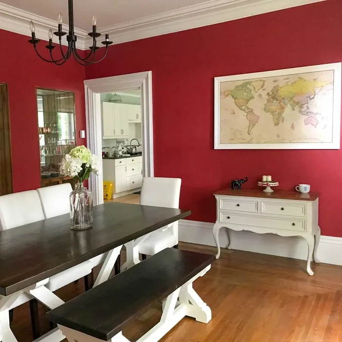
Real Room Photo of Burnt Peanut Red 2081-10
Undertones of Burnt Peanut Red ?
The undertones of Burnt Peanut Red are a key aspect of its character, leaning towards Red. These subtle underlying hues are what give the color its depth and complexity. For example, a gray with a blue undertone will feel cooler and more modern, while one with a brown undertone will feel warmer and more traditional. It’s essential to test this paint in your home and observe it next to your existing furniture, flooring, and decor to see how these undertones interact and reveal themselves throughout the day.
HEX value: #A14048
RGB code: 161, 64, 72
Is Burnt Peanut Red Cool or Warm?
This color leans towards the warm side, offering a sense of comfort and coziness. It’s perfect for spaces where you want to create a welcoming environment. The warmth of Burnt Peanut Red makes it an excellent choice for rooms that receive ample natural light, as it will enhance the cozy vibe without overwhelming the space.
Understanding Color Properties and Interior Design Tips
Hue refers to a specific position on the color wheel, measured in degrees from 0 to 360. Each degree represents a different pure color:
- 0° represents red
- 120° represents green
- 240° represents blue
Saturation describes the intensity or purity of a color and is expressed as a percentage:
- At 0%, the color appears completely desaturated—essentially a shade of gray
- At 100%, the color is at its most vivid and vibrant
Lightness indicates how light or dark a color is, also expressed as a percentage:
- 0% lightness results in black
- 100% lightness results in white
Using Warm Colors in Interior Design
Warm hues—such as reds, oranges, yellows, warm beiges, and greiges—are excellent choices for creating inviting and energetic spaces. These colors are particularly well-suited for:
- Kitchens, living rooms, and bathrooms, where warmth enhances comfort and sociability
- Large rooms, where warm tones can help reduce the sense of emptiness and make the space feel more intimate
For example:
- Warm beige shades provide a cozy, inviting atmosphere, ideal for living rooms, bedrooms, and hallways.
- Warm greige (a mix of beige and gray) offers the warmth of beige with the modern appeal of gray, making it a versatile backdrop for dining areas, bedrooms, and living spaces.
However, be mindful when using warm light tones in rooms with limited natural light. These shades may appear muted or even take on an unpleasant yellowish tint. To avoid a dull or flat appearance:
- Add depth by incorporating richer tones like deep greens, charcoal, or chocolate brown
- Use textured elements such as curtains, rugs, or cushions to bring dimension to the space
Pro Tip: Achieving Harmony with Warm and Cool Color Balance
To create a well-balanced and visually interesting interior, mix warm and cool tones strategically. This contrast adds depth and harmony to your design.
- If your walls feature warm hues, introduce cool-colored accents such as blue or green furniture, artwork, or accessories to create contrast.
- For a polished look, consider using a complementary color scheme, which pairs colors opposite each other on the color wheel (e.g., red with green, orange with blue).
This thoughtful mix not only enhances visual appeal but also creates a space that feels both dynamic and cohesive.
Light Temperature Affects on Burnt Peanut Red
Natural Light
Natural daylight changes in color temperature as the sun moves across the sky. At sunrise and sunset, the light tends to have a warm, golden tone with a color temperature around 2000 Kelvin (K). As the day progresses and the sun rises higher, the light becomes cooler and more neutral. Around midday, especially when the sky is clear, natural light typically reaches its peak brightness and shifts to a cooler tone, ranging from 5500 to 6500 Kelvin. This midday light is close to what we perceive as pure white or daylight-balanced light.
These shifts in natural light can significantly influence how colors appear in a space, which is why designers often consider both the time of day and the orientation of windows when planning interior color schemes.
Artificial Light
When choosing artificial lighting, pay close attention to the color temperature, measured in Kelvin (K). This determines how warm or cool the light will appear. Lower temperatures, around 2700K, give off a warm, yellow glow often used in living rooms or bedrooms. Higher temperatures, above 5000K, create a cool, bluish light similar to daylight, commonly used in kitchens, offices, or task areas.
Use the slider to see how lighting temperature can affect the appearance of a surface or color throughout a space.


4800K
LRV of Burnt Peanut Red
The Light Reflectance Value (LRV) of Burnt Peanut Red is 12.41%, which places it in the Medium Dark category. This means it reflects very little light. Understanding a paint’s LRV is crucial for predicting how it will look in your space. A higher LRV indicates a lighter color that reflects more light, making rooms feel larger and brighter. A lower LRV signifies a darker color that absorbs more light, creating a cozier, more intimate atmosphere. Always consider the natural and artificial lighting in your room when selecting a paint color based on its LRV.
Detailed Review of Burnt Peanut Red
Additional Paint Characteristics
Ideal Rooms
Bedroom, Dining Room, Entryway, Home Office, Living Room
Decor Styles
Bohemian, Eclectic, Modern, Traditional
Coverage
Good (1–2 Coats), High Hide, Self-Priming
Ease of Application
Beginner Friendly, Brush Smooth, Low Splatter, Roller-Ready
Washability
Highly Washable, Scrubbable, Washable
VOC Level
Eco-Certified, Low VOC
Best Use
Accent Wall, Furniture, Interior Walls, Trim
Room Suitability
Bedroom, Dining Room, Living Room
Tone Tag
Deep, Earthy, Moody, Warm
Finish Type
Eggshell, Matte, Satin
Paint Performance
Easy Touch-Up, Fade Resistant, High Coverage, Low Odor
Use Cases
Best for Open Concept, Best for Selling Your Home, Designer Favorite
Mood
Cozy, Inviting, Romantic, Sophisticated
Trim Pairing
Complements Brass Fixtures, Pairs with White Dove, Works with Warm Trim
Burnt Peanut Red is a versatile paint color that brings a dramatic flair to any room. With its deep, warm tones, it’s perfect for creating a cozy and inviting atmosphere. This hue works well in spaces where you want to encourage conversation and relaxation, making it ideal for living rooms and dining areas. The paint has a good coverage, typically requiring just one to two coats, which means less work and more time to enjoy your newly transformed space. Its self-priming feature also adds to its convenience, saving you time and effort during application. Whether you’re looking to make a bold statement or add a touch of elegance, Burnt Peanut Red is sure to deliver.
Pros & Cons of 2081-10 Burnt Peanut Red
Pros
Cons
Colors that go with Benjamin Moore Burnt Peanut Red
FAQ on 2081-10 Burnt Peanut Red
What are the best rooms to use Burnt Peanut Red?
Burnt Peanut Red is an excellent choice for living rooms, dining rooms, and bedrooms. Its warm, rich tones create a welcoming and cozy environment, perfect for spaces where you gather with family and friends. In a living room, it can serve as a striking accent wall that draws attention and adds depth. In a bedroom, it creates a romantic and restful retreat. Be mindful of the room’s size and lighting, as this color can make small or dimly lit spaces feel even smaller. Pair it with lighter, neutral tones to balance the depth and create a harmonious look.
How does Burnt Peanut Red hold up over time?
Burnt Peanut Red is designed to be long-lasting and durable, making it an excellent investment for your home. The paint’s washability and scrubbable nature mean it can withstand regular cleaning without losing its vibrancy or sheen. This makes it a practical choice for high-traffic areas where scuffs and marks are common. Additionally, its low VOC formulation ensures indoor air quality is maintained, even after the paint has dried. With proper application and maintenance, Burnt Peanut Red will continue to look fresh and vibrant for years, offering both beauty and functionality.
Comparisons Burnt Peanut Red with other colors
Burnt Peanut Red 2081-10 vs Cavern Clay SW 7701
| Attribute | Burnt Peanut Red 2081-10 | Cavern Clay SW 7701 |
|---|---|---|
| Color Name | Burnt Peanut Red 2081-10 | Cavern Clay SW 7701 |
| Color | ||
| Hue | Red | Red |
| Brightness | Dark | Dark |
| RGB | 161, 64, 72 | 172, 107, 83 |
| LRV | 12.41% | 30% |
| Finish Type | Eggshell, Matte, Satin | Eggshell, Matte, Satin |
| Finish Options | Eggshell, Matte, Satin | Eggshell, Matte, Satin |
| Ideal Rooms | Bedroom, Dining Room, Entryway, Home Office, Living Room | Bedroom, Dining Room, Home Office, Kitchen, Living Room |
| Decor Styles | Bohemian, Eclectic, Modern, Traditional | Bohemian, Contemporary, Modern Farmhouse, Rustic, Transitional |
| Coverage | Good (1–2 Coats), High Hide, Self-Priming | Good (1–2 Coats), Touch-Up Friendly |
| Ease of Application | Beginner Friendly, Brush Smooth, Low Splatter, Roller-Ready | Beginner Friendly, Brush Smooth, Roller-Ready |
| Washability | Highly Washable, Scrubbable, Washable | Washable, Wipeable |
| Room Suitability | Bedroom, Dining Room, Living Room | Bedroom, Dining Room, Home Office, Kitchen, Living Room |
| Tone | Deep, Earthy, Moody, Warm | Earthy, Muted, Warm |
| Paint Performance | Easy Touch-Up, Fade Resistant, High Coverage, Low Odor | Easy Touch-Up, Low Odor, Scuff Resistant |
Burnt Peanut Red 2081-10 vs Burgundy SW 6300
| Attribute | Burnt Peanut Red 2081-10 | Burgundy SW 6300 |
|---|---|---|
| Color Name | Burnt Peanut Red 2081-10 | Burgundy SW 6300 |
| Color | ||
| Hue | Red | Red |
| Brightness | Dark | Dark |
| RGB | 161, 64, 72 | 99, 51, 62 |
| LRV | 12.41% | 6% |
| Finish Type | Eggshell, Matte, Satin | Eggshell, Matte, Satin |
| Finish Options | Eggshell, Matte, Satin | Eggshell, Matte, Satin |
| Ideal Rooms | Bedroom, Dining Room, Entryway, Home Office, Living Room | Bedroom, Dining Room, Home Office, Living Room |
| Decor Styles | Bohemian, Eclectic, Modern, Traditional | Contemporary, Rustic, Traditional, Vintage |
| Coverage | Good (1–2 Coats), High Hide, Self-Priming | Good (1–2 Coats), Touch-Up Friendly |
| Ease of Application | Beginner Friendly, Brush Smooth, Low Splatter, Roller-Ready | Beginner Friendly, Brush Smooth, Fast-Drying, Roller-Ready |
| Washability | Highly Washable, Scrubbable, Washable | Washable, Wipeable |
| Room Suitability | Bedroom, Dining Room, Living Room | Bedroom, Dining Room, Home Office, Living Room |
| Tone | Deep, Earthy, Moody, Warm | Bold, Deep, Warm |
| Paint Performance | Easy Touch-Up, Fade Resistant, High Coverage, Low Odor | High Coverage, Low Odor, Quick Drying |
Burnt Peanut Red 2081-10 vs Rookwood Red SW 2802
| Attribute | Burnt Peanut Red 2081-10 | Rookwood Red SW 2802 |
|---|---|---|
| Color Name | Burnt Peanut Red 2081-10 | Rookwood Red SW 2802 |
| Color | ||
| Hue | Red | Red |
| Brightness | Dark | Dark |
| RGB | 161, 64, 72 | 98, 47, 45 |
| LRV | 12.41% | 6% |
| Finish Type | Eggshell, Matte, Satin | Eggshell, Matte, Satin |
| Finish Options | Eggshell, Matte, Satin | Eggshell, Matte, Satin |
| Ideal Rooms | Bedroom, Dining Room, Entryway, Home Office, Living Room | Bedroom, Dining Room, Home Office, Living Room |
| Decor Styles | Bohemian, Eclectic, Modern, Traditional | Arts and Crafts, Modern Farmhouse, Rustic, Traditional |
| Coverage | Good (1–2 Coats), High Hide, Self-Priming | Good (1–2 Coats), Touch-Up Friendly |
| Ease of Application | Beginner Friendly, Brush Smooth, Low Splatter, Roller-Ready | Beginner Friendly, Brush Smooth, Fast-Drying, Roller-Ready |
| Washability | Highly Washable, Scrubbable, Washable | Washable, Wipeable |
| Room Suitability | Bedroom, Dining Room, Living Room | Bedroom, Dining Room, Living Room |
| Tone | Deep, Earthy, Moody, Warm | Deep, Earthy, Warm |
| Paint Performance | Easy Touch-Up, Fade Resistant, High Coverage, Low Odor | Easy Touch-Up, High Coverage, Low Odor |
Burnt Peanut Red 2081-10 vs Spiced Cider SW 7702
| Attribute | Burnt Peanut Red 2081-10 | Spiced Cider SW 7702 |
|---|---|---|
| Color Name | Burnt Peanut Red 2081-10 | Spiced Cider SW 7702 |
| Color | ||
| Hue | Red | Red |
| Brightness | Dark | Dark |
| RGB | 161, 64, 72 | 176, 120, 92 |
| LRV | 12.41% | 20% |
| Finish Type | Eggshell, Matte, Satin | Eggshell, Satin |
| Finish Options | Eggshell, Matte, Satin | Eggshell, Satin, Semi-Gloss |
| Ideal Rooms | Bedroom, Dining Room, Entryway, Home Office, Living Room | Bedroom, Dining Room, Kitchen, Living Room |
| Decor Styles | Bohemian, Eclectic, Modern, Traditional | Modern Farmhouse, Rustic, Traditional, Transitional |
| Coverage | Good (1–2 Coats), High Hide, Self-Priming | Good (1–2 Coats), Touch-Up Friendly |
| Ease of Application | Beginner Friendly, Brush Smooth, Low Splatter, Roller-Ready | Beginner Friendly, Brush Smooth, Roller-Ready |
| Washability | Highly Washable, Scrubbable, Washable | Scrubbable, Washable |
| Room Suitability | Bedroom, Dining Room, Living Room | Bedroom, Dining Room, Kitchen, Living Room |
| Tone | Deep, Earthy, Moody, Warm | Earthy, Inviting, Warm |
| Paint Performance | Easy Touch-Up, Fade Resistant, High Coverage, Low Odor | Easy Touch-Up, High Coverage, Low Odor |
Burnt Peanut Red 2081-10 vs Carnelian SW 7580
| Attribute | Burnt Peanut Red 2081-10 | Carnelian SW 7580 |
|---|---|---|
| Color Name | Burnt Peanut Red 2081-10 | Carnelian SW 7580 |
| Color | ||
| Hue | Red | Red |
| Brightness | Dark | Dark |
| RGB | 161, 64, 72 | 87, 62, 62 |
| LRV | 12.41% | 20% |
| Finish Type | Eggshell, Matte, Satin | Eggshell, Satin |
| Finish Options | Eggshell, Matte, Satin | Eggshell, Matte, Satin |
| Ideal Rooms | Bedroom, Dining Room, Entryway, Home Office, Living Room | Bedroom, Dining Room, Hallway, Home Office, Living Room |
| Decor Styles | Bohemian, Eclectic, Modern, Traditional | Bohemian, Modern Farmhouse, Rustic, Traditional |
| Coverage | Good (1–2 Coats), High Hide, Self-Priming | Good (1–2 Coats), Touch-Up Friendly |
| Ease of Application | Beginner Friendly, Brush Smooth, Low Splatter, Roller-Ready | Beginner Friendly, Brush Smooth, Fast-Drying, Roller-Ready |
| Washability | Highly Washable, Scrubbable, Washable | Washable, Wipeable |
| Room Suitability | Bedroom, Dining Room, Living Room | Bedroom, Dining Room, Home Office, Living Room |
| Tone | Deep, Earthy, Moody, Warm | Deep, Earthy, Warm |
| Paint Performance | Easy Touch-Up, Fade Resistant, High Coverage, Low Odor | Easy Touch-Up, Low Odor, Quick Drying |
Burnt Peanut Red 2081-10 vs Sommelier SW 7595
| Attribute | Burnt Peanut Red 2081-10 | Sommelier SW 7595 |
|---|---|---|
| Color Name | Burnt Peanut Red 2081-10 | Sommelier SW 7595 |
| Color | ||
| Hue | Red | Red |
| Brightness | Dark | Dark |
| RGB | 161, 64, 72 | 93, 55, 54 |
| LRV | 12.41% | 6% |
| Finish Type | Eggshell, Matte, Satin | Eggshell, Matte, Satin |
| Finish Options | Eggshell, Matte, Satin | Eggshell, Matte, Satin |
| Ideal Rooms | Bedroom, Dining Room, Entryway, Home Office, Living Room | Bedroom, Dining Room, Home Office, Living Room |
| Decor Styles | Bohemian, Eclectic, Modern, Traditional | Modern, Rustic, Traditional, Transitional |
| Coverage | Good (1–2 Coats), High Hide, Self-Priming | Good (1–2 Coats), Touch-Up Friendly |
| Ease of Application | Beginner Friendly, Brush Smooth, Low Splatter, Roller-Ready | Brush Smooth, Fast-Drying, Low Splatter, Roller-Ready |
| Washability | Highly Washable, Scrubbable, Washable | Washable, Wipeable |
| Room Suitability | Bedroom, Dining Room, Living Room | Bedroom, Dining Room, Home Office, Living Room |
| Tone | Deep, Earthy, Moody, Warm | Deep, Earthy, Warm |
| Paint Performance | Easy Touch-Up, Fade Resistant, High Coverage, Low Odor | Easy Touch-Up, High Coverage, Low Odor, Scuff Resistant |
Burnt Peanut Red 2081-10 vs Sun Dried Tomato SW 7585
| Attribute | Burnt Peanut Red 2081-10 | Sun Dried Tomato SW 7585 |
|---|---|---|
| Color Name | Burnt Peanut Red 2081-10 | Sun Dried Tomato SW 7585 |
| Color | ||
| Hue | Red | Red |
| Brightness | Dark | Dark |
| RGB | 161, 64, 72 | 105, 43, 43 |
| LRV | 12.41% | 20% |
| Finish Type | Eggshell, Matte, Satin | Matte, Satin, Semi-Gloss |
| Finish Options | Eggshell, Matte, Satin | Matte, Satin, Semi-Gloss |
| Ideal Rooms | Bedroom, Dining Room, Entryway, Home Office, Living Room | Dining Room, Home Office, Kitchen, Living Room |
| Decor Styles | Bohemian, Eclectic, Modern, Traditional | Industrial, Mediterranean, Modern Farmhouse, Rustic |
| Coverage | Good (1–2 Coats), High Hide, Self-Priming | Good (1–2 Coats), Touch-Up Friendly |
| Ease of Application | Beginner Friendly, Brush Smooth, Low Splatter, Roller-Ready | Beginner Friendly, Brush Smooth, Roller-Ready |
| Washability | Highly Washable, Scrubbable, Washable | Washable, Wipeable |
| Room Suitability | Bedroom, Dining Room, Living Room | Dining Room, Home Office, Kitchen, Living Room |
| Tone | Deep, Earthy, Moody, Warm | Bold, Earthy, Warm |
| Paint Performance | Easy Touch-Up, Fade Resistant, High Coverage, Low Odor | Easy Touch-Up, High Coverage, Low Odor |
Burnt Peanut Red 2081-10 vs Rustic Red SW 7593
| Attribute | Burnt Peanut Red 2081-10 | Rustic Red SW 7593 |
|---|---|---|
| Color Name | Burnt Peanut Red 2081-10 | Rustic Red SW 7593 |
| Color | ||
| Hue | Red | Red |
| Brightness | Dark | Dark |
| RGB | 161, 64, 72 | 112, 50, 41 |
| LRV | 12.41% | 12% |
| Finish Type | Eggshell, Matte, Satin | Matte, Satin |
| Finish Options | Eggshell, Matte, Satin | Matte, Satin, Semi-Gloss |
| Ideal Rooms | Bedroom, Dining Room, Entryway, Home Office, Living Room | Bedroom, Dining Room, Hallway, Living Room |
| Decor Styles | Bohemian, Eclectic, Modern, Traditional | Country, Farmhouse, Rustic, Traditional |
| Coverage | Good (1–2 Coats), High Hide, Self-Priming | Good (1–2 Coats) |
| Ease of Application | Beginner Friendly, Brush Smooth, Low Splatter, Roller-Ready | Beginner Friendly, Brush Smooth, Fast-Drying, Roller-Ready |
| Washability | Highly Washable, Scrubbable, Washable | Washable, Wipeable |
| Room Suitability | Bedroom, Dining Room, Living Room | Bedroom, Dining Room, Living Room |
| Tone | Deep, Earthy, Moody, Warm | Deep, Earthy, Warm |
| Paint Performance | Easy Touch-Up, Fade Resistant, High Coverage, Low Odor | Easy Touch-Up, Low Odor, Quick Drying |
Burnt Peanut Red 2081-10 vs Roycroft Copper Red SW 2839
| Attribute | Burnt Peanut Red 2081-10 | Roycroft Copper Red SW 2839 |
|---|---|---|
| Color Name | Burnt Peanut Red 2081-10 | Roycroft Copper Red SW 2839 |
| Color | ||
| Hue | Red | Red |
| Brightness | Dark | Dark |
| RGB | 161, 64, 72 | 123, 55, 40 |
| LRV | 12.41% | 12% |
| Finish Type | Eggshell, Matte, Satin | Matte, Satin, Semi-Gloss |
| Finish Options | Eggshell, Matte, Satin | Matte, Satin, Semi-Gloss |
| Ideal Rooms | Bedroom, Dining Room, Entryway, Home Office, Living Room | Bedroom, Dining Room, Entryway, Home Office, Living Room |
| Decor Styles | Bohemian, Eclectic, Modern, Traditional | Arts and Crafts, Eclectic, Farmhouse, Rustic, Traditional |
| Coverage | Good (1–2 Coats), High Hide, Self-Priming | Good (1–2 Coats), Touch-Up Friendly |
| Ease of Application | Beginner Friendly, Brush Smooth, Low Splatter, Roller-Ready | Beginner Friendly, Brush Smooth, Roller-Ready |
| Washability | Highly Washable, Scrubbable, Washable | Stain Resistant, Washable |
| Room Suitability | Bedroom, Dining Room, Living Room | Bedroom, Dining Room, Entryway, Home Office, Living Room |
| Tone | Deep, Earthy, Moody, Warm | Deep, Earthy, Warm |
| Paint Performance | Easy Touch-Up, Fade Resistant, High Coverage, Low Odor | Easy Touch-Up, High Coverage, Low Odor |
Burnt Peanut Red 2081-10 vs Rookwood Dark Red SW 2801
| Attribute | Burnt Peanut Red 2081-10 | Rookwood Dark Red SW 2801 |
|---|---|---|
| Color Name | Burnt Peanut Red 2081-10 | Rookwood Dark Red SW 2801 |
| Color | ||
| Hue | Red | Red |
| Brightness | Dark | Dark |
| RGB | 161, 64, 72 | 75, 41, 41 |
| LRV | 12.41% | 6% |
| Finish Type | Eggshell, Matte, Satin | Matte, Satin, Semi-Gloss |
| Finish Options | Eggshell, Matte, Satin | Matte, Satin, Semi-Gloss |
| Ideal Rooms | Bedroom, Dining Room, Entryway, Home Office, Living Room | Bedroom, Dining Room, Home Office, Living Room |
| Decor Styles | Bohemian, Eclectic, Modern, Traditional | Farmhouse, Modern, Rustic, Traditional |
| Coverage | Good (1–2 Coats), High Hide, Self-Priming | Good (1–2 Coats) |
| Ease of Application | Beginner Friendly, Brush Smooth, Low Splatter, Roller-Ready | Beginner Friendly, Brush Smooth, Roller-Ready |
| Washability | Highly Washable, Scrubbable, Washable | Highly Washable, Washable |
| Room Suitability | Bedroom, Dining Room, Living Room | Bedroom, Dining Room, Home Office, Living Room |
| Tone | Deep, Earthy, Moody, Warm | Deep, Earthy, Warm |
| Paint Performance | Easy Touch-Up, Fade Resistant, High Coverage, Low Odor | Easy Touch-Up, High Coverage, Low Odor |
Official Page of Benjamin Moore Burnt Peanut Red 2081-10