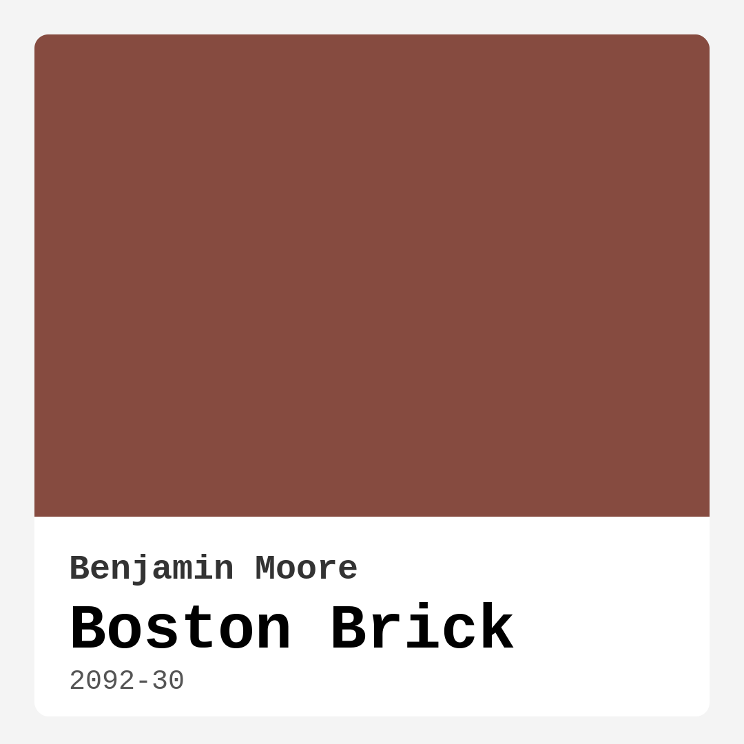
Color Preview & Key Details
| HEX Code | #864B40 |
| RGB | 134, 75, 64 |
| LRV | 11.54% |
| Undertone | Red |
| Finish Options | Matte, Satin, Semi-Gloss |
If you’re looking for a paint color that brings warmth, depth, and timeless elegance to your home, let’s talk about Benjamin Moore’s *Boston Brick* (2092-30). This deep, earthy red is more than just a shade—it’s a statement. Whether you’re aiming for a cozy living room, a moody bedroom, or a sophisticated dining space, this color has the versatility to transform your walls into something extraordinary. But before you grab a brush, let’s dive into everything you need to know to decide if *Boston Brick* is the right choice for your project.
First, let’s talk about the color itself. *Boston Brick* is a rich, dark red with an LRV (Light Reflectance Value) of 11.54%, meaning it absorbs a lot of light rather than reflecting it. That makes it perfect for creating intimate, grounded spaces—think of it like wrapping your room in a warm, earthy hug. Its HEX code (#864B40) and RGB values (134, 75, 64) place it firmly in the terracotta and brick red family, with just enough brown undertone to keep it from feeling too bold or overwhelming. It’s a color that feels both classic and current, working beautifully in rustic, traditional, or even industrial-inspired spaces.
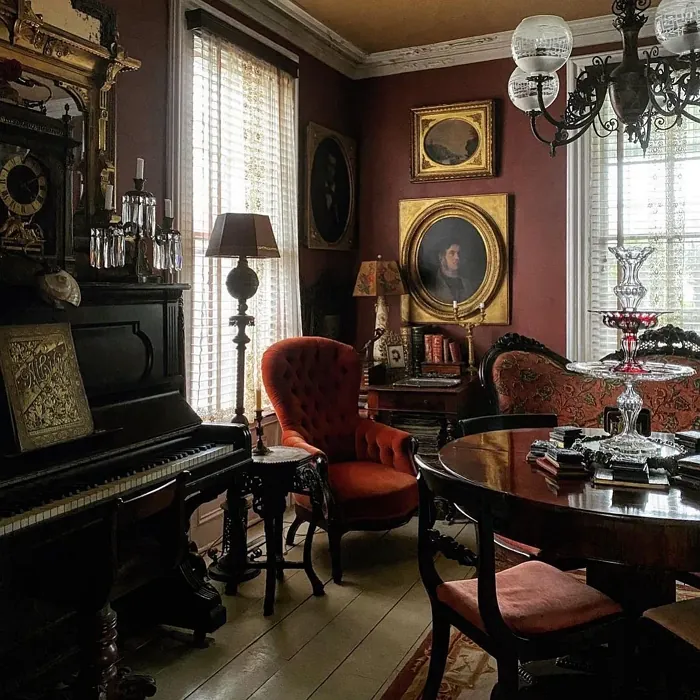
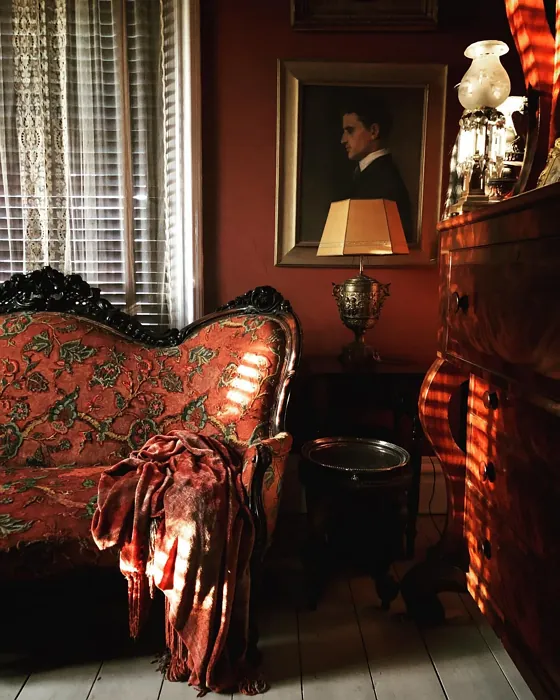
One of the standout qualities of *Boston Brick* is its warmth. This isn’t a cool, modern red—it’s a shade that leans into coziness, making it ideal for rooms where you want to foster a sense of comfort and sophistication. Pair it with creamy whites like *White Dove* for trim, and you’ve got a timeless combination that feels fresh yet rooted in tradition. If you’re feeling adventurous, try it alongside deep greens or navy blues for a dramatic, high-contrast look that still feels harmonious. The key is to balance its intensity with lighter or neutral tones to keep the space from feeling too heavy.
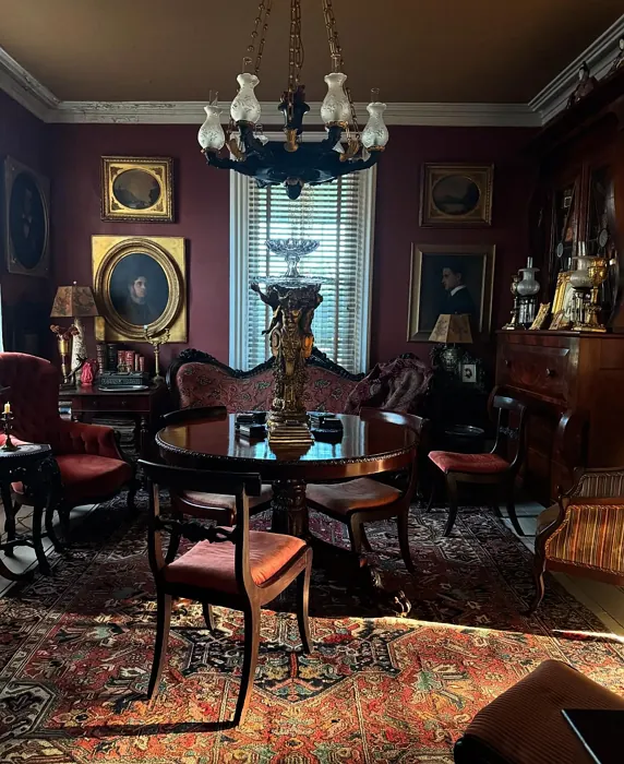
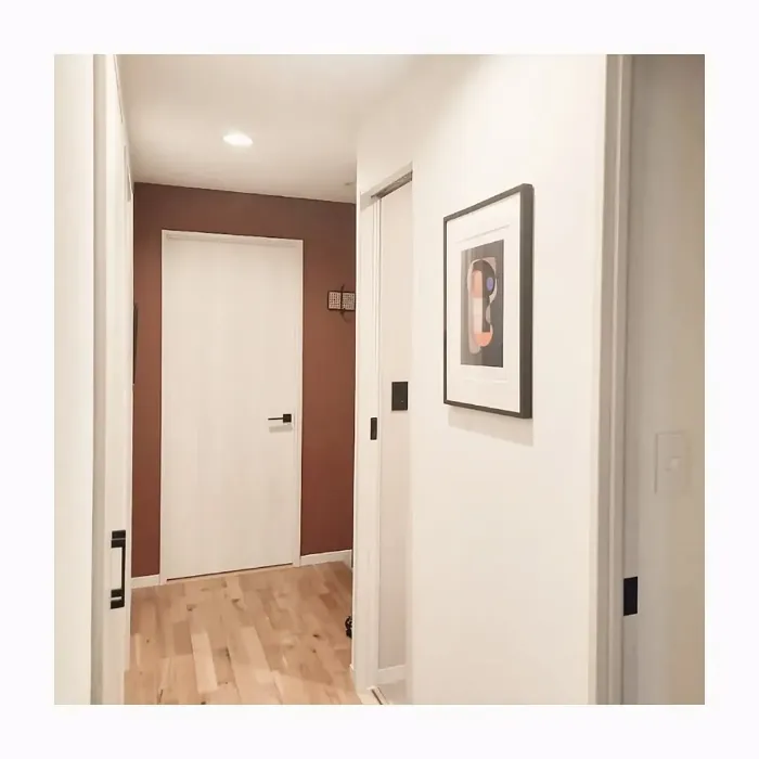
Now, let’s talk about where this color shines. *Boston Brick* is a natural fit for living rooms, especially as an accent wall behind a fireplace or built-in shelves. It brings a sense of heritage and character, much like actual brickwork would. In a bedroom, it creates a moody, enveloping atmosphere—perfect if you love spaces that feel cocoon-like and serene. Dining rooms and home offices also benefit from its sophisticated vibe, especially when paired with warm wood tones and brass or gold fixtures. Just keep in mind that because it’s a darker color, it works best in rooms with plenty of natural light or well-placed artificial lighting. In smaller or dimly lit spaces, it can feel a bit overwhelming, so test it out first with a sample.
Speaking of testing, here’s a pro tip: always observe how *Boston Brick* behaves in your specific lighting. In daylight, its red undertones will be more pronounced, while under warm artificial light, the brown notes come forward, giving it a softer, more muted appearance. This chameleon-like quality is part of what makes it so interesting, but it also means you’ll want to see it in your space at different times of day before committing.
When it comes to application, *Boston Brick* is a dream to work with. Benjamin Moore’s formula offers excellent coverage—often needing just one or two coats—and it’s self-priming, which saves time and effort. It’s also low-VOC and odor-free, so you won’t have to worry about harsh fumes during or after painting. For finishes, you’ve got options: matte for a velvety, modern look, satin for a subtle sheen that’s easy to clean, or semi-gloss for trim and doors if you want a bit of contrast. Just remember, darker colors like this can show application flaws more easily, so if you’re not confident in your painting skills, hiring a pro might be worth it for a flawless finish.
As for durability, *Boston Brick* holds up well in high-traffic areas. It’s washable, scrubbable, and stain-resistant, making it a practical choice for spaces like entryways or dining rooms where spills and scuffs are inevitable. And because it’s fade-resistant, you won’t have to worry about it losing its richness over time, even in sunlit rooms.
If you’re still on the fence, consider this: *Boston Brick* is more than just a paint color—it’s a design tool. Use it to anchor a room, to add depth, or to create a focal point that draws the eye. Pair it with textured fabrics like linen or wool, layer in natural materials like wood and stone, and don’t shy away from metallics. Brass, in particular, complements its warmth beautifully. And if you ever want to lighten things up, Benjamin Moore offers lighter shades in the same family, like *CW-235* or *1210*, which can help soften the overall effect.
So, is *Boston Brick* right for you? If you love colors with soul, if you’re drawn to spaces that feel lived-in and layered, and if you’re not afraid of a little drama, then yes—this could be your perfect shade. Just be sure to sample it, live with it for a few days, and see how it makes you feel. After all, the best paint colors aren’t just about trends; they’re about creating a home that reflects your personality. And *Boston Brick*? It’s got personality in spades.
Real Room Photo of Boston Brick 2092-30
Undertones of Boston Brick ?
The undertones of Boston Brick are a key aspect of its character, leaning towards Red. These subtle underlying hues are what give the color its depth and complexity. For example, a gray with a blue undertone will feel cooler and more modern, while one with a brown undertone will feel warmer and more traditional. It’s essential to test this paint in your home and observe it next to your existing furniture, flooring, and decor to see how these undertones interact and reveal themselves throughout the day.
HEX value: #864B40
RGB code: 134, 75, 64
Is Boston Brick Cool or Warm?
This color leans towards the warm side of the spectrum, thanks to its reddish-brown base. Boston Brick’s warmth can create a cozy and inviting atmosphere, making it suitable for personal spaces like living rooms and bedrooms. Its warmth also helps balance cooler elements in a room, such as metallics or blues, bringing harmony to your decor.
Understanding Color Properties and Interior Design Tips
Hue refers to a specific position on the color wheel, measured in degrees from 0 to 360. Each degree represents a different pure color:
- 0° represents red
- 120° represents green
- 240° represents blue
Saturation describes the intensity or purity of a color and is expressed as a percentage:
- At 0%, the color appears completely desaturated—essentially a shade of gray
- At 100%, the color is at its most vivid and vibrant
Lightness indicates how light or dark a color is, also expressed as a percentage:
- 0% lightness results in black
- 100% lightness results in white
Using Warm Colors in Interior Design
Warm hues—such as reds, oranges, yellows, warm beiges, and greiges—are excellent choices for creating inviting and energetic spaces. These colors are particularly well-suited for:
- Kitchens, living rooms, and bathrooms, where warmth enhances comfort and sociability
- Large rooms, where warm tones can help reduce the sense of emptiness and make the space feel more intimate
For example:
- Warm beige shades provide a cozy, inviting atmosphere, ideal for living rooms, bedrooms, and hallways.
- Warm greige (a mix of beige and gray) offers the warmth of beige with the modern appeal of gray, making it a versatile backdrop for dining areas, bedrooms, and living spaces.
However, be mindful when using warm light tones in rooms with limited natural light. These shades may appear muted or even take on an unpleasant yellowish tint. To avoid a dull or flat appearance:
- Add depth by incorporating richer tones like deep greens, charcoal, or chocolate brown
- Use textured elements such as curtains, rugs, or cushions to bring dimension to the space
Pro Tip: Achieving Harmony with Warm and Cool Color Balance
To create a well-balanced and visually interesting interior, mix warm and cool tones strategically. This contrast adds depth and harmony to your design.
- If your walls feature warm hues, introduce cool-colored accents such as blue or green furniture, artwork, or accessories to create contrast.
- For a polished look, consider using a complementary color scheme, which pairs colors opposite each other on the color wheel (e.g., red with green, orange with blue).
This thoughtful mix not only enhances visual appeal but also creates a space that feels both dynamic and cohesive.
Light Temperature Affects on Boston Brick
Natural Light
Natural daylight changes in color temperature as the sun moves across the sky. At sunrise and sunset, the light tends to have a warm, golden tone with a color temperature around 2000 Kelvin (K). As the day progresses and the sun rises higher, the light becomes cooler and more neutral. Around midday, especially when the sky is clear, natural light typically reaches its peak brightness and shifts to a cooler tone, ranging from 5500 to 6500 Kelvin. This midday light is close to what we perceive as pure white or daylight-balanced light.
These shifts in natural light can significantly influence how colors appear in a space, which is why designers often consider both the time of day and the orientation of windows when planning interior color schemes.
Artificial Light
When choosing artificial lighting, pay close attention to the color temperature, measured in Kelvin (K). This determines how warm or cool the light will appear. Lower temperatures, around 2700K, give off a warm, yellow glow often used in living rooms or bedrooms. Higher temperatures, above 5000K, create a cool, bluish light similar to daylight, commonly used in kitchens, offices, or task areas.
Use the slider to see how lighting temperature can affect the appearance of a surface or color throughout a space.


4800K
LRV of Boston Brick
The Light Reflectance Value (LRV) of Boston Brick is 11.54%, which places it in the Medium Dark category. This means it reflects very little light. Understanding a paint’s LRV is crucial for predicting how it will look in your space. A higher LRV indicates a lighter color that reflects more light, making rooms feel larger and brighter. A lower LRV signifies a darker color that absorbs more light, creating a cozier, more intimate atmosphere. Always consider the natural and artificial lighting in your room when selecting a paint color based on its LRV.
Detailed Review of Boston Brick
Additional Paint Characteristics
Ideal Rooms
Bedroom, Dining Room, Entryway, Home Office, Living Room
Decor Styles
Industrial, Modern Farmhouse, Rustic, Traditional
Coverage
Good (1–2 Coats), High Hide, Self-Priming
Ease of Application
Brush Smooth, Low Splatter, Professional Application Recommended, Roller-Ready
Washability
Scrubbable, Stain Resistant, Washable
VOC Level
Low VOC, Odor-Free
Best Use
Accent Wall, Doors, Interior Walls, Trim
Room Suitability
Bedroom, Dining Room, Home Office, Living Room
Tone Tag
Deep, Earthy, Moody, Warm
Finish Type
Matte, Satin, Semi-Gloss
Paint Performance
Easy Touch-Up, Fade Resistant, High Coverage, Long Lasting
Use Cases
Best for High Traffic Areas, Best for Modern Farmhouse, Best for Open Concept, Classic Favorite
Mood
Cozy, Grounding, Inviting, Sophisticated
Trim Pairing
Complements Brass Fixtures, Pairs with White Dove, Works with Warm Trim
Boston Brick is a striking shade that brings the classic appeal of brickwork into your home. Its HEX code, #864B40, translates to a rich, earthy red with deep undertones. This color is perfect for creating an accent wall in a living room or adding a touch of sophistication to a dining area. The versatility of Boston Brick allows it to pair seamlessly with various decor styles, from rustic and traditional to industrial and modern farmhouse. With good coverage and high hide, this paint ensures a smooth, even finish that lasts. Whether you’re looking to make a bold statement or subtly enhance your space, Boston Brick is a dependable choice.
Pros & Cons of 2092-30 Boston Brick
Pros
Cons
Colors that go with Benjamin Moore Boston Brick
FAQ on 2092-30 Boston Brick
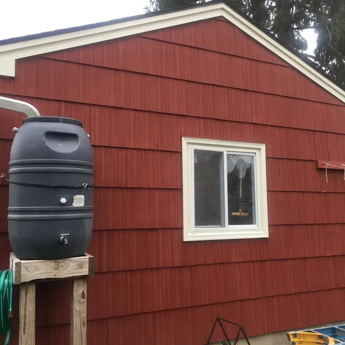
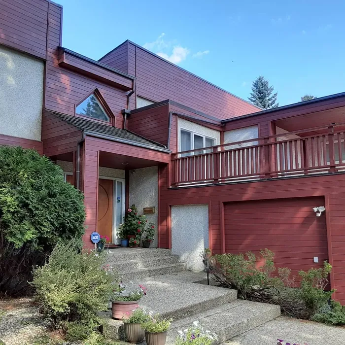
Is Boston Brick suitable for exterior use?
Yes, Boston Brick can be used for exterior applications. Its rich, earthy tone is ideal for adding character to exterior walls, especially in traditional or rustic settings. When used outside, it can beautifully complement natural landscapes and architectural details. However, it’s crucial to ensure that the paint formulation you choose is designed for outdoor use, providing weather resistance and durability against the elements.
How can I pair Boston Brick with other colors?
Boston Brick pairs well with a variety of colors, thanks to its warm and earthy undertones. For a classic look, consider pairing it with whites or creams for a clean and balanced contrast. If you prefer a more dramatic effect, deep greens or navy blues can create a stunning combination. For a softer approach, muted grays or taupes can enhance its warmth without overpowering the space. Experiment with different shades to find the perfect balance for your decor.
Comparisons Boston Brick with other colors
Boston Brick 2092-30 vs Cavern Clay SW 7701
| Attribute | Boston Brick 2092-30 | Cavern Clay SW 7701 |
|---|---|---|
| Color Name | Boston Brick 2092-30 | Cavern Clay SW 7701 |
| Color | ||
| Hue | Red | Red |
| Brightness | Dark | Dark |
| RGB | 134, 75, 64 | 172, 107, 83 |
| LRV | 11.54% | 30% |
| Finish Type | Matte, Satin, Semi-Gloss | Eggshell, Matte, Satin |
| Finish Options | Matte, Satin, Semi-Gloss | Eggshell, Matte, Satin |
| Ideal Rooms | Bedroom, Dining Room, Entryway, Home Office, Living Room | Bedroom, Dining Room, Home Office, Kitchen, Living Room |
| Decor Styles | Industrial, Modern Farmhouse, Rustic, Traditional | Bohemian, Contemporary, Modern Farmhouse, Rustic, Transitional |
| Coverage | Good (1–2 Coats), High Hide, Self-Priming | Good (1–2 Coats), Touch-Up Friendly |
| Ease of Application | Brush Smooth, Low Splatter, Professional Application Recommended, Roller-Ready | Beginner Friendly, Brush Smooth, Roller-Ready |
| Washability | Scrubbable, Stain Resistant, Washable | Washable, Wipeable |
| Room Suitability | Bedroom, Dining Room, Home Office, Living Room | Bedroom, Dining Room, Home Office, Kitchen, Living Room |
| Tone | Deep, Earthy, Moody, Warm | Earthy, Muted, Warm |
| Paint Performance | Easy Touch-Up, Fade Resistant, High Coverage, Long Lasting | Easy Touch-Up, Low Odor, Scuff Resistant |
Boston Brick 2092-30 vs Burgundy SW 6300
| Attribute | Boston Brick 2092-30 | Burgundy SW 6300 |
|---|---|---|
| Color Name | Boston Brick 2092-30 | Burgundy SW 6300 |
| Color | ||
| Hue | Red | Red |
| Brightness | Dark | Dark |
| RGB | 134, 75, 64 | 99, 51, 62 |
| LRV | 11.54% | 6% |
| Finish Type | Matte, Satin, Semi-Gloss | Eggshell, Matte, Satin |
| Finish Options | Matte, Satin, Semi-Gloss | Eggshell, Matte, Satin |
| Ideal Rooms | Bedroom, Dining Room, Entryway, Home Office, Living Room | Bedroom, Dining Room, Home Office, Living Room |
| Decor Styles | Industrial, Modern Farmhouse, Rustic, Traditional | Contemporary, Rustic, Traditional, Vintage |
| Coverage | Good (1–2 Coats), High Hide, Self-Priming | Good (1–2 Coats), Touch-Up Friendly |
| Ease of Application | Brush Smooth, Low Splatter, Professional Application Recommended, Roller-Ready | Beginner Friendly, Brush Smooth, Fast-Drying, Roller-Ready |
| Washability | Scrubbable, Stain Resistant, Washable | Washable, Wipeable |
| Room Suitability | Bedroom, Dining Room, Home Office, Living Room | Bedroom, Dining Room, Home Office, Living Room |
| Tone | Deep, Earthy, Moody, Warm | Bold, Deep, Warm |
| Paint Performance | Easy Touch-Up, Fade Resistant, High Coverage, Long Lasting | High Coverage, Low Odor, Quick Drying |
Boston Brick 2092-30 vs Rookwood Red SW 2802
| Attribute | Boston Brick 2092-30 | Rookwood Red SW 2802 |
|---|---|---|
| Color Name | Boston Brick 2092-30 | Rookwood Red SW 2802 |
| Color | ||
| Hue | Red | Red |
| Brightness | Dark | Dark |
| RGB | 134, 75, 64 | 98, 47, 45 |
| LRV | 11.54% | 6% |
| Finish Type | Matte, Satin, Semi-Gloss | Eggshell, Matte, Satin |
| Finish Options | Matte, Satin, Semi-Gloss | Eggshell, Matte, Satin |
| Ideal Rooms | Bedroom, Dining Room, Entryway, Home Office, Living Room | Bedroom, Dining Room, Home Office, Living Room |
| Decor Styles | Industrial, Modern Farmhouse, Rustic, Traditional | Arts and Crafts, Modern Farmhouse, Rustic, Traditional |
| Coverage | Good (1–2 Coats), High Hide, Self-Priming | Good (1–2 Coats), Touch-Up Friendly |
| Ease of Application | Brush Smooth, Low Splatter, Professional Application Recommended, Roller-Ready | Beginner Friendly, Brush Smooth, Fast-Drying, Roller-Ready |
| Washability | Scrubbable, Stain Resistant, Washable | Washable, Wipeable |
| Room Suitability | Bedroom, Dining Room, Home Office, Living Room | Bedroom, Dining Room, Living Room |
| Tone | Deep, Earthy, Moody, Warm | Deep, Earthy, Warm |
| Paint Performance | Easy Touch-Up, Fade Resistant, High Coverage, Long Lasting | Easy Touch-Up, High Coverage, Low Odor |
Boston Brick 2092-30 vs Spiced Cider SW 7702
| Attribute | Boston Brick 2092-30 | Spiced Cider SW 7702 |
|---|---|---|
| Color Name | Boston Brick 2092-30 | Spiced Cider SW 7702 |
| Color | ||
| Hue | Red | Red |
| Brightness | Dark | Dark |
| RGB | 134, 75, 64 | 176, 120, 92 |
| LRV | 11.54% | 20% |
| Finish Type | Matte, Satin, Semi-Gloss | Eggshell, Satin |
| Finish Options | Matte, Satin, Semi-Gloss | Eggshell, Satin, Semi-Gloss |
| Ideal Rooms | Bedroom, Dining Room, Entryway, Home Office, Living Room | Bedroom, Dining Room, Kitchen, Living Room |
| Decor Styles | Industrial, Modern Farmhouse, Rustic, Traditional | Modern Farmhouse, Rustic, Traditional, Transitional |
| Coverage | Good (1–2 Coats), High Hide, Self-Priming | Good (1–2 Coats), Touch-Up Friendly |
| Ease of Application | Brush Smooth, Low Splatter, Professional Application Recommended, Roller-Ready | Beginner Friendly, Brush Smooth, Roller-Ready |
| Washability | Scrubbable, Stain Resistant, Washable | Scrubbable, Washable |
| Room Suitability | Bedroom, Dining Room, Home Office, Living Room | Bedroom, Dining Room, Kitchen, Living Room |
| Tone | Deep, Earthy, Moody, Warm | Earthy, Inviting, Warm |
| Paint Performance | Easy Touch-Up, Fade Resistant, High Coverage, Long Lasting | Easy Touch-Up, High Coverage, Low Odor |
Boston Brick 2092-30 vs Carnelian SW 7580
| Attribute | Boston Brick 2092-30 | Carnelian SW 7580 |
|---|---|---|
| Color Name | Boston Brick 2092-30 | Carnelian SW 7580 |
| Color | ||
| Hue | Red | Red |
| Brightness | Dark | Dark |
| RGB | 134, 75, 64 | 87, 62, 62 |
| LRV | 11.54% | 20% |
| Finish Type | Matte, Satin, Semi-Gloss | Eggshell, Satin |
| Finish Options | Matte, Satin, Semi-Gloss | Eggshell, Matte, Satin |
| Ideal Rooms | Bedroom, Dining Room, Entryway, Home Office, Living Room | Bedroom, Dining Room, Hallway, Home Office, Living Room |
| Decor Styles | Industrial, Modern Farmhouse, Rustic, Traditional | Bohemian, Modern Farmhouse, Rustic, Traditional |
| Coverage | Good (1–2 Coats), High Hide, Self-Priming | Good (1–2 Coats), Touch-Up Friendly |
| Ease of Application | Brush Smooth, Low Splatter, Professional Application Recommended, Roller-Ready | Beginner Friendly, Brush Smooth, Fast-Drying, Roller-Ready |
| Washability | Scrubbable, Stain Resistant, Washable | Washable, Wipeable |
| Room Suitability | Bedroom, Dining Room, Home Office, Living Room | Bedroom, Dining Room, Home Office, Living Room |
| Tone | Deep, Earthy, Moody, Warm | Deep, Earthy, Warm |
| Paint Performance | Easy Touch-Up, Fade Resistant, High Coverage, Long Lasting | Easy Touch-Up, Low Odor, Quick Drying |
Boston Brick 2092-30 vs Sommelier SW 7595
| Attribute | Boston Brick 2092-30 | Sommelier SW 7595 |
|---|---|---|
| Color Name | Boston Brick 2092-30 | Sommelier SW 7595 |
| Color | ||
| Hue | Red | Red |
| Brightness | Dark | Dark |
| RGB | 134, 75, 64 | 93, 55, 54 |
| LRV | 11.54% | 6% |
| Finish Type | Matte, Satin, Semi-Gloss | Eggshell, Matte, Satin |
| Finish Options | Matte, Satin, Semi-Gloss | Eggshell, Matte, Satin |
| Ideal Rooms | Bedroom, Dining Room, Entryway, Home Office, Living Room | Bedroom, Dining Room, Home Office, Living Room |
| Decor Styles | Industrial, Modern Farmhouse, Rustic, Traditional | Modern, Rustic, Traditional, Transitional |
| Coverage | Good (1–2 Coats), High Hide, Self-Priming | Good (1–2 Coats), Touch-Up Friendly |
| Ease of Application | Brush Smooth, Low Splatter, Professional Application Recommended, Roller-Ready | Brush Smooth, Fast-Drying, Low Splatter, Roller-Ready |
| Washability | Scrubbable, Stain Resistant, Washable | Washable, Wipeable |
| Room Suitability | Bedroom, Dining Room, Home Office, Living Room | Bedroom, Dining Room, Home Office, Living Room |
| Tone | Deep, Earthy, Moody, Warm | Deep, Earthy, Warm |
| Paint Performance | Easy Touch-Up, Fade Resistant, High Coverage, Long Lasting | Easy Touch-Up, High Coverage, Low Odor, Scuff Resistant |
Boston Brick 2092-30 vs Sun Dried Tomato SW 7585
| Attribute | Boston Brick 2092-30 | Sun Dried Tomato SW 7585 |
|---|---|---|
| Color Name | Boston Brick 2092-30 | Sun Dried Tomato SW 7585 |
| Color | ||
| Hue | Red | Red |
| Brightness | Dark | Dark |
| RGB | 134, 75, 64 | 105, 43, 43 |
| LRV | 11.54% | 20% |
| Finish Type | Matte, Satin, Semi-Gloss | Matte, Satin, Semi-Gloss |
| Finish Options | Matte, Satin, Semi-Gloss | Matte, Satin, Semi-Gloss |
| Ideal Rooms | Bedroom, Dining Room, Entryway, Home Office, Living Room | Dining Room, Home Office, Kitchen, Living Room |
| Decor Styles | Industrial, Modern Farmhouse, Rustic, Traditional | Industrial, Mediterranean, Modern Farmhouse, Rustic |
| Coverage | Good (1–2 Coats), High Hide, Self-Priming | Good (1–2 Coats), Touch-Up Friendly |
| Ease of Application | Brush Smooth, Low Splatter, Professional Application Recommended, Roller-Ready | Beginner Friendly, Brush Smooth, Roller-Ready |
| Washability | Scrubbable, Stain Resistant, Washable | Washable, Wipeable |
| Room Suitability | Bedroom, Dining Room, Home Office, Living Room | Dining Room, Home Office, Kitchen, Living Room |
| Tone | Deep, Earthy, Moody, Warm | Bold, Earthy, Warm |
| Paint Performance | Easy Touch-Up, Fade Resistant, High Coverage, Long Lasting | Easy Touch-Up, High Coverage, Low Odor |
Boston Brick 2092-30 vs Rustic Red SW 7593
| Attribute | Boston Brick 2092-30 | Rustic Red SW 7593 |
|---|---|---|
| Color Name | Boston Brick 2092-30 | Rustic Red SW 7593 |
| Color | ||
| Hue | Red | Red |
| Brightness | Dark | Dark |
| RGB | 134, 75, 64 | 112, 50, 41 |
| LRV | 11.54% | 12% |
| Finish Type | Matte, Satin, Semi-Gloss | Matte, Satin |
| Finish Options | Matte, Satin, Semi-Gloss | Matte, Satin, Semi-Gloss |
| Ideal Rooms | Bedroom, Dining Room, Entryway, Home Office, Living Room | Bedroom, Dining Room, Hallway, Living Room |
| Decor Styles | Industrial, Modern Farmhouse, Rustic, Traditional | Country, Farmhouse, Rustic, Traditional |
| Coverage | Good (1–2 Coats), High Hide, Self-Priming | Good (1–2 Coats) |
| Ease of Application | Brush Smooth, Low Splatter, Professional Application Recommended, Roller-Ready | Beginner Friendly, Brush Smooth, Fast-Drying, Roller-Ready |
| Washability | Scrubbable, Stain Resistant, Washable | Washable, Wipeable |
| Room Suitability | Bedroom, Dining Room, Home Office, Living Room | Bedroom, Dining Room, Living Room |
| Tone | Deep, Earthy, Moody, Warm | Deep, Earthy, Warm |
| Paint Performance | Easy Touch-Up, Fade Resistant, High Coverage, Long Lasting | Easy Touch-Up, Low Odor, Quick Drying |
Boston Brick 2092-30 vs Roycroft Copper Red SW 2839
| Attribute | Boston Brick 2092-30 | Roycroft Copper Red SW 2839 |
|---|---|---|
| Color Name | Boston Brick 2092-30 | Roycroft Copper Red SW 2839 |
| Color | ||
| Hue | Red | Red |
| Brightness | Dark | Dark |
| RGB | 134, 75, 64 | 123, 55, 40 |
| LRV | 11.54% | 12% |
| Finish Type | Matte, Satin, Semi-Gloss | Matte, Satin, Semi-Gloss |
| Finish Options | Matte, Satin, Semi-Gloss | Matte, Satin, Semi-Gloss |
| Ideal Rooms | Bedroom, Dining Room, Entryway, Home Office, Living Room | Bedroom, Dining Room, Entryway, Home Office, Living Room |
| Decor Styles | Industrial, Modern Farmhouse, Rustic, Traditional | Arts and Crafts, Eclectic, Farmhouse, Rustic, Traditional |
| Coverage | Good (1–2 Coats), High Hide, Self-Priming | Good (1–2 Coats), Touch-Up Friendly |
| Ease of Application | Brush Smooth, Low Splatter, Professional Application Recommended, Roller-Ready | Beginner Friendly, Brush Smooth, Roller-Ready |
| Washability | Scrubbable, Stain Resistant, Washable | Stain Resistant, Washable |
| Room Suitability | Bedroom, Dining Room, Home Office, Living Room | Bedroom, Dining Room, Entryway, Home Office, Living Room |
| Tone | Deep, Earthy, Moody, Warm | Deep, Earthy, Warm |
| Paint Performance | Easy Touch-Up, Fade Resistant, High Coverage, Long Lasting | Easy Touch-Up, High Coverage, Low Odor |
Boston Brick 2092-30 vs Rookwood Dark Red SW 2801
| Attribute | Boston Brick 2092-30 | Rookwood Dark Red SW 2801 |
|---|---|---|
| Color Name | Boston Brick 2092-30 | Rookwood Dark Red SW 2801 |
| Color | ||
| Hue | Red | Red |
| Brightness | Dark | Dark |
| RGB | 134, 75, 64 | 75, 41, 41 |
| LRV | 11.54% | 6% |
| Finish Type | Matte, Satin, Semi-Gloss | Matte, Satin, Semi-Gloss |
| Finish Options | Matte, Satin, Semi-Gloss | Matte, Satin, Semi-Gloss |
| Ideal Rooms | Bedroom, Dining Room, Entryway, Home Office, Living Room | Bedroom, Dining Room, Home Office, Living Room |
| Decor Styles | Industrial, Modern Farmhouse, Rustic, Traditional | Farmhouse, Modern, Rustic, Traditional |
| Coverage | Good (1–2 Coats), High Hide, Self-Priming | Good (1–2 Coats) |
| Ease of Application | Brush Smooth, Low Splatter, Professional Application Recommended, Roller-Ready | Beginner Friendly, Brush Smooth, Roller-Ready |
| Washability | Scrubbable, Stain Resistant, Washable | Highly Washable, Washable |
| Room Suitability | Bedroom, Dining Room, Home Office, Living Room | Bedroom, Dining Room, Home Office, Living Room |
| Tone | Deep, Earthy, Moody, Warm | Deep, Earthy, Warm |
| Paint Performance | Easy Touch-Up, Fade Resistant, High Coverage, Long Lasting | Easy Touch-Up, High Coverage, Low Odor |
Official Page of Benjamin Moore Boston Brick 2092-30