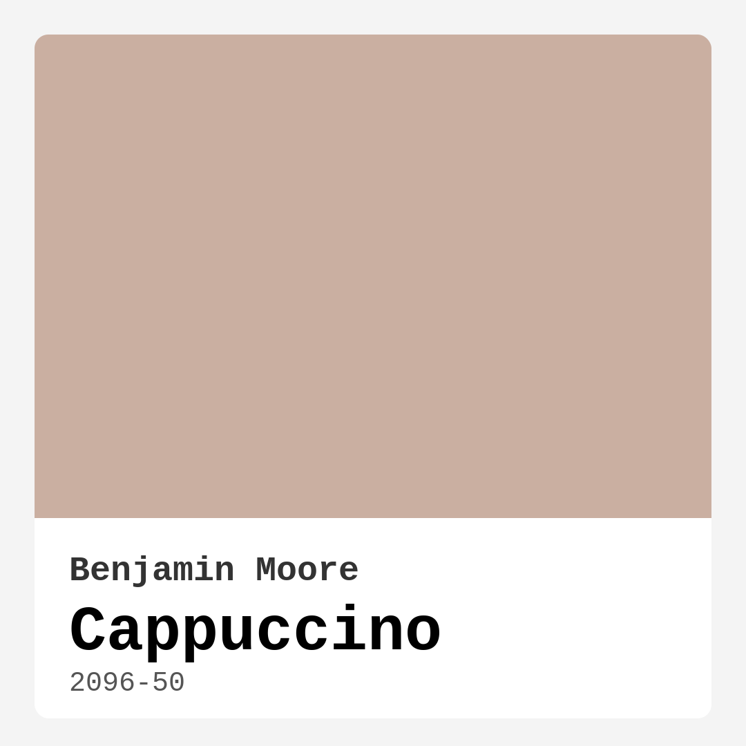
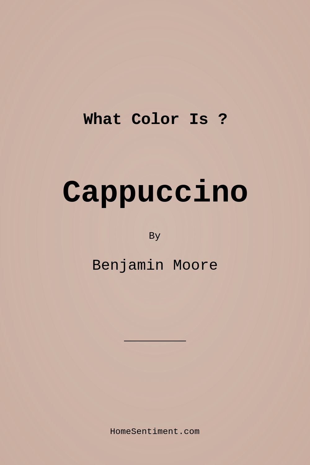
Color Preview & Key Details
| HEX Code | #CAAFA1 |
| RGB | 202, 175, 161 |
| LRV | 44.81% |
| Undertone | Red |
| Finish Options | Eggshell, Matte, Satin |
Imagine walking into a room that instantly wraps you in comfort, where the walls feel like a warm hug, and you’re drawn to sit back and savor a moment of tranquility. That’s the magic of a color like Cappuccino from Benjamin Moore. This lovely hue, with its warm undertones and soft appeal, is more than just a shade—it’s an invitation to create a space where you can truly unwind.
Cappuccino, with the color code 2096-50, falls under the pink hue category, and it boasts a medium brightness that perfectly balances warmth and sophistication. The hex code #CAAFA1 showcases a gentle blend of rich, earthy tones, making it a versatile choice for various decor styles, from Modern to Transitional, Farmhouse to Bohemian. Its subtle elegance makes it suitable for any room in your home, whether it’s a cozy living room, a serene bedroom, a welcoming kitchen, or a stylish dining room.
One of the first things you’ll notice about Cappuccino is its inviting nature. This paint color is reminiscent of a creamy coffee blend, instantly adding a comforting vibe to your space. It reflects about 44.81% of light, which places it in the light medium color category. This means it can brighten up a room while still maintaining that snug, intimate feel that’s perfect for family gatherings or quiet evenings.
If you’re contemplating how this color will play in your particular space, consider the light in the room. Cappuccino captures light beautifully, offering a soft glow that enhances the warmth throughout the day. In bright sunlight, it radiates a creamy quality, while in the evening, it transforms into a cozy backdrop that encourages relaxation. This dynamic quality makes it essential to test the color in your home before committing. Observe how it interacts with your existing furniture and decor, especially during different times of the day.
The undertones of Cappuccino are particularly interesting. With a red undertone, this shade brings depth and warmth to your decor. Understanding undertones is crucial, as they can dramatically alter how a color appears in different lighting conditions. For instance, while some colors may feel cooler or more modern, Cappuccino offers a welcoming warmth that suits traditional and contemporary spaces alike.
When it comes to application, Cappuccino is a dream for DIYers. It’s beginner-friendly, rolling on smoothly and allowing for easy touch-ups. For the best results, use a high-quality roller for larger surfaces and a brush for corners and trim. If you’re covering a darker color, a coat of primer may be necessary. Typically, one to two coats will yield excellent coverage, so you can achieve that beautiful finish without spending all day painting. Plus, with options like Matte, Eggshell, and Satin finishes, you can choose the look that suits your style and needs best.
Cappuccino also has practical advantages. It’s wipeable and washable, making it a great fit for high-traffic areas like kitchens and dining rooms. However, remember that it can show fingerprints or smudges if not properly finished, so opting for a durable finish is recommended.
Now, if you’re thinking about where to incorporate this lovely shade, I can assure you it shines in various settings. In a living room, Cappuccino creates an inviting space for family gatherings or entertaining guests. In the bedroom, it fosters a restful environment, ideal for winding down after a long day. The kitchen benefits from its warmth, making it a welcoming gathering spot, and the dining room becomes a cozy yet elegant area for shared meals.
For those concerned about using Cappuccino in smaller spaces, it’s worth noting that while this color can create a cozy atmosphere, it may darken if applied in a tight area without ample natural light. To counter this, consider balancing it with lighter accents or decor. Pairing it with whites, like Benjamin Moore’s White Dove or Pure White, can brighten the space and create a fresh contrast that keeps the overall feel light and airy.
As for complementary hues, Cappuccino matches beautifully with a range of colors. Think of soft greens, muted blues, or even brass fixtures for a touch of sophistication. These combinations can elevate your design, adding layers of interest while allowing Cappuccino to remain the star of the show.
When you’re ready to make a decision, consider your home’s overall mood. Cappuccino offers a cozy, inviting feel that encourages relaxation and connection. It can be a classic favorite for those preparing to sell their home, as it appeals to a wide range of buyers looking for warmth and comfort.
For those renting or looking for a change, Cappuccino translates beautifully across various styles, making it an excellent transitional choice. Imagine stepping into a rented space and instantly feeling at home, simply because of the soft, welcoming walls that embrace you.
In conclusion, Cappuccino isn’t just a paint color; it’s a mood enhancer, a conversation starter, and an essential part of your home’s personality. It stands out without overwhelming, offering versatility and charm that works in any room. So, why not invite this warm, inviting hue into your home? You might just find that it transforms your space into the cozy haven you’ve always dreamed of. Whether you’re updating a single room or planning a more extensive renovation, Cappuccino is a color that will make your walls sing with warmth and sophistication.
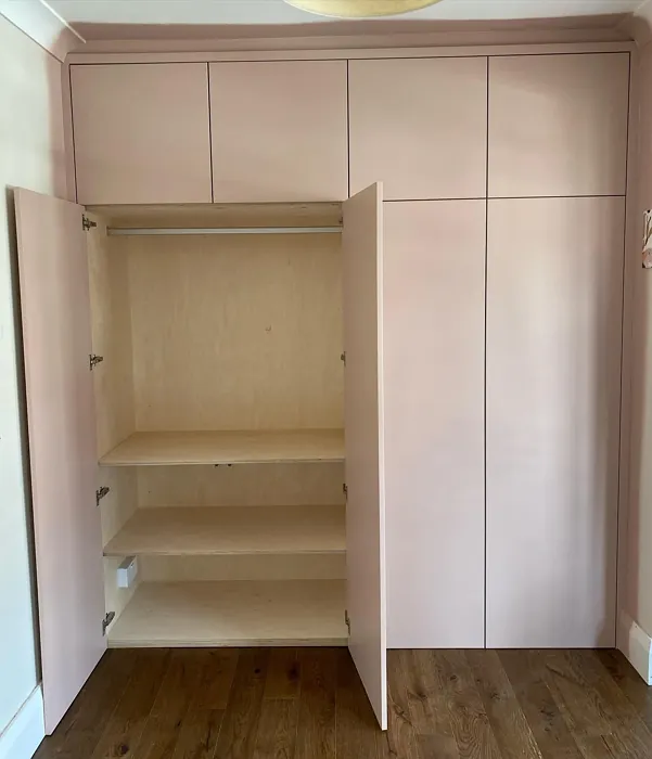
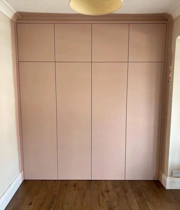
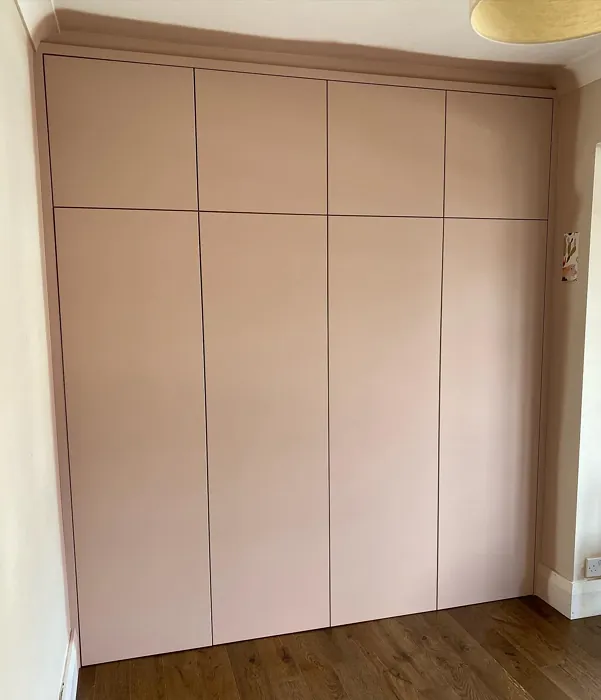
Real Room Photo of Cappuccino 2096-50
Undertones of Cappuccino ?
The undertones of Cappuccino are a key aspect of its character, leaning towards Red. These subtle underlying hues are what give the color its depth and complexity. For example, a gray with a blue undertone will feel cooler and more modern, while one with a brown undertone will feel warmer and more traditional. It’s essential to test this paint in your home and observe it next to your existing furniture, flooring, and decor to see how these undertones interact and reveal themselves throughout the day.
HEX value: #CAAFA1
RGB code: 202, 175, 161
Is Cappuccino Cool or Warm?
Cappuccino is considered a warm paint color. This characteristic plays a huge role in the overall feel of a room. Warm colors, like this one, tend to create a cozy, inviting, and energetic atmosphere, making them great for social spaces like living rooms and dining rooms. In contrast, cool colors often evoke a sense of calm and serenity, which is why they are popular in bedrooms and bathrooms. The warmth of Cappuccino means it will pair beautifully with corresponding decor elements.
Understanding Color Properties and Interior Design Tips
Hue refers to a specific position on the color wheel, measured in degrees from 0 to 360. Each degree represents a different pure color:
- 0° represents red
- 120° represents green
- 240° represents blue
Saturation describes the intensity or purity of a color and is expressed as a percentage:
- At 0%, the color appears completely desaturated—essentially a shade of gray
- At 100%, the color is at its most vivid and vibrant
Lightness indicates how light or dark a color is, also expressed as a percentage:
- 0% lightness results in black
- 100% lightness results in white
Using Warm Colors in Interior Design
Warm hues—such as reds, oranges, yellows, warm beiges, and greiges—are excellent choices for creating inviting and energetic spaces. These colors are particularly well-suited for:
- Kitchens, living rooms, and bathrooms, where warmth enhances comfort and sociability
- Large rooms, where warm tones can help reduce the sense of emptiness and make the space feel more intimate
For example:
- Warm beige shades provide a cozy, inviting atmosphere, ideal for living rooms, bedrooms, and hallways.
- Warm greige (a mix of beige and gray) offers the warmth of beige with the modern appeal of gray, making it a versatile backdrop for dining areas, bedrooms, and living spaces.
However, be mindful when using warm light tones in rooms with limited natural light. These shades may appear muted or even take on an unpleasant yellowish tint. To avoid a dull or flat appearance:
- Add depth by incorporating richer tones like deep greens, charcoal, or chocolate brown
- Use textured elements such as curtains, rugs, or cushions to bring dimension to the space
Pro Tip: Achieving Harmony with Warm and Cool Color Balance
To create a well-balanced and visually interesting interior, mix warm and cool tones strategically. This contrast adds depth and harmony to your design.
- If your walls feature warm hues, introduce cool-colored accents such as blue or green furniture, artwork, or accessories to create contrast.
- For a polished look, consider using a complementary color scheme, which pairs colors opposite each other on the color wheel (e.g., red with green, orange with blue).
This thoughtful mix not only enhances visual appeal but also creates a space that feels both dynamic and cohesive.
Light Temperature Affects on Cappuccino
Natural Light
Natural daylight changes in color temperature as the sun moves across the sky. At sunrise and sunset, the light tends to have a warm, golden tone with a color temperature around 2000 Kelvin (K). As the day progresses and the sun rises higher, the light becomes cooler and more neutral. Around midday, especially when the sky is clear, natural light typically reaches its peak brightness and shifts to a cooler tone, ranging from 5500 to 6500 Kelvin. This midday light is close to what we perceive as pure white or daylight-balanced light.
These shifts in natural light can significantly influence how colors appear in a space, which is why designers often consider both the time of day and the orientation of windows when planning interior color schemes.
Artificial Light
When choosing artificial lighting, pay close attention to the color temperature, measured in Kelvin (K). This determines how warm or cool the light will appear. Lower temperatures, around 2700K, give off a warm, yellow glow often used in living rooms or bedrooms. Higher temperatures, above 5000K, create a cool, bluish light similar to daylight, commonly used in kitchens, offices, or task areas.
Use the slider to see how lighting temperature can affect the appearance of a surface or color throughout a space.


4800K
LRV of Cappuccino
The Light Reflectance Value (LRV) of Cappuccino is 44.81%, which places it in the Light Medium colors category. This means it reflect half of the incident light. Understanding a paint’s LRV is crucial for predicting how it will look in your space. A higher LRV indicates a lighter color that reflects more light, making rooms feel larger and brighter. A lower LRV signifies a darker color that absorbs more light, creating a cozier, more intimate atmosphere. Always consider the natural and artificial lighting in your room when selecting a paint color based on its LRV.
Detailed Review of Cappuccino
Additional Paint Characteristics
Ideal Rooms
Bedroom, Dining Room, Hallway, Kitchen, Living Room
Decor Styles
Bohemian, Farmhouse, Modern, Transitional
Coverage
Good (1–2 Coats), Touch-Up Friendly
Ease of Application
Beginner Friendly, Brush Smooth, Roller-Ready
Washability
Washable, Wipeable
VOC Level
Low VOC
Best Use
Accent Wall, Interior Walls, Trim
Room Suitability
Bedroom, Dining Room, Kitchen, Living Room
Tone Tag
Earthy, Muted, Warm
Finish Type
Eggshell, Matte, Satin
Paint Performance
Easy Touch-Up, Low Odor, Scuff Resistant
Use Cases
Best for Rentals, Best for Selling Your Home, Classic Favorite
Mood
Cozy, Inviting, Restful
Trim Pairing
Complements Brass Fixtures, Matches Pure White, Pairs with White Dove
Cappuccino is more than just a paint color; it’s a mood enhancer. This shade works wonders in creating a warm, welcoming atmosphere, perfect for entertaining or relaxing. When applied, it spreads evenly and covers well, often requiring just one to two coats, which is a major plus for DIYers. The color adapts beautifully to different lighting, making it a versatile choice for various rooms. Whether it’s paired with bold accents or kept simple with neutral decor, Cappuccino stands out without overwhelming the space. If you’re looking to make a statement without being too flashy, this is your go-to shade.
Pros & Cons of 2096-50 Cappuccino
Pros
Cons
Colors that go with Benjamin Moore Cappuccino
FAQ on 2096-50 Cappuccino
What is the best way to apply Cappuccino paint?
For best results with Cappuccino, use a high-quality roller for large areas and a brush for corners and trim. Start with a clean, primed surface if you’re covering a darker color, and apply at least one coat of primer if needed. Make sure to follow with a second coat to achieve an even finish. This paint is beginner-friendly and rolls on smoothly, making it a great choice for DIY projects.
Can Cappuccino paint be used in high-moisture areas?
While Cappuccino can work in areas like kitchens and bathrooms, it’s essential to use a washable finish, such as eggshell or satin, to ensure durability against moisture. Proper ventilation will also help maintain the color’s integrity in these spaces. Consider using a mildew-resistant formula for added protection.
Comparisons Cappuccino with other colors
Cappuccino 2096-50 vs Realist Beige SW 6078
| Attribute | Cappuccino 2096-50 | Realist Beige SW 6078 |
|---|---|---|
| Color Name | Cappuccino 2096-50 | Realist Beige SW 6078 |
| Color | ||
| Hue | Pink | Pink |
| Brightness | Medium | Medium |
| RGB | 202, 175, 161 | 211, 200, 189 |
| LRV | 44.81% | 34% |
| Finish Type | Eggshell, Matte, Satin | Eggshell, Matte, Satin |
| Finish Options | Eggshell, Matte, Satin | Eggshell, Matte, Satin |
| Ideal Rooms | Bedroom, Dining Room, Hallway, Kitchen, Living Room | Bedroom, Dining Room, Entryway, Home Office, Kitchen, Living Room |
| Decor Styles | Bohemian, Farmhouse, Modern, Transitional | Contemporary, Minimalist, Modern Farmhouse, Rustic, Traditional |
| Coverage | Good (1–2 Coats), Touch-Up Friendly | Good (1–2 Coats), Touch-Up Friendly |
| Ease of Application | Beginner Friendly, Brush Smooth, Roller-Ready | Beginner Friendly, Brush Smooth, Fast-Drying, Roller-Ready |
| Washability | Washable, Wipeable | Washable, Wipeable |
| Room Suitability | Bedroom, Dining Room, Kitchen, Living Room | Bedroom, Dining Room, Home Office, Kitchen, Living Room |
| Tone | Earthy, Muted, Warm | Earthy, Neutral, Warm |
| Paint Performance | Easy Touch-Up, Low Odor, Scuff Resistant | High Coverage, Low Odor, Quick Drying |
Cappuccino 2096-50 vs Rosaline Pearl SW 9077
| Attribute | Cappuccino 2096-50 | Rosaline Pearl SW 9077 |
|---|---|---|
| Color Name | Cappuccino 2096-50 | Rosaline Pearl SW 9077 |
| Color | ||
| Hue | Pink | Pink |
| Brightness | Medium | Medium |
| RGB | 202, 175, 161 | 163, 136, 135 |
| LRV | 44.81% | 69% |
| Finish Type | Eggshell, Matte, Satin | Eggshell, Matte |
| Finish Options | Eggshell, Matte, Satin | Eggshell, Matte, Satin |
| Ideal Rooms | Bedroom, Dining Room, Hallway, Kitchen, Living Room | Bedroom, Dining Room, Home Office, Living Room |
| Decor Styles | Bohemian, Farmhouse, Modern, Transitional | Bohemian, Contemporary, Modern, Transitional |
| Coverage | Good (1–2 Coats), Touch-Up Friendly | Good (1–2 Coats) |
| Ease of Application | Beginner Friendly, Brush Smooth, Roller-Ready | Beginner Friendly, Brush Smooth, Fast-Drying, Roller-Ready |
| Washability | Washable, Wipeable | Washable, Wipeable |
| Room Suitability | Bedroom, Dining Room, Kitchen, Living Room | Bedroom, Dining Room, Home Office, Living Room |
| Tone | Earthy, Muted, Warm | Dusty, Muted, Warm |
| Paint Performance | Easy Touch-Up, Low Odor, Scuff Resistant | Easy Touch-Up, Fade Resistant, Low Odor |
Cappuccino 2096-50 vs Cabbage Rose SW 0003
| Attribute | Cappuccino 2096-50 | Cabbage Rose SW 0003 |
|---|---|---|
| Color Name | Cappuccino 2096-50 | Cabbage Rose SW 0003 |
| Color | ||
| Hue | Pink | Pink |
| Brightness | Medium | Medium |
| RGB | 202, 175, 161 | 197, 159, 145 |
| LRV | 44.81% | 15% |
| Finish Type | Eggshell, Matte, Satin | Eggshell, Matte, Satin |
| Finish Options | Eggshell, Matte, Satin | Eggshell, Matte, Satin |
| Ideal Rooms | Bedroom, Dining Room, Hallway, Kitchen, Living Room | Bedroom, Dining Room, Hallway, Living Room, Nursery |
| Decor Styles | Bohemian, Farmhouse, Modern, Transitional | Cottage, Modern Farmhouse, Romantic, Shabby Chic, Vintage |
| Coverage | Good (1–2 Coats), Touch-Up Friendly | Good (1–2 Coats), Touch-Up Friendly |
| Ease of Application | Beginner Friendly, Brush Smooth, Roller-Ready | Beginner Friendly, Brush Smooth, Roller-Ready |
| Washability | Washable, Wipeable | Washable, Wipeable |
| Room Suitability | Bedroom, Dining Room, Kitchen, Living Room | Bedroom, Dining Room, Hallway, Living Room, Nursery |
| Tone | Earthy, Muted, Warm | Earthy, Muted, Warm |
| Paint Performance | Easy Touch-Up, Low Odor, Scuff Resistant | Easy Touch-Up, Low Odor |
Cappuccino 2096-50 vs Sashay Sand SW 6051
| Attribute | Cappuccino 2096-50 | Sashay Sand SW 6051 |
|---|---|---|
| Color Name | Cappuccino 2096-50 | Sashay Sand SW 6051 |
| Color | ||
| Hue | Pink | Pink |
| Brightness | Medium | Medium |
| RGB | 202, 175, 161 | 207, 180, 168 |
| LRV | 44.81% | 64% |
| Finish Type | Eggshell, Matte, Satin | Eggshell, Matte, Satin |
| Finish Options | Eggshell, Matte, Satin | Eggshell, Matte, Satin |
| Ideal Rooms | Bedroom, Dining Room, Hallway, Kitchen, Living Room | Bedroom, Dining Room, Home Office, Kitchen, Living Room |
| Decor Styles | Bohemian, Farmhouse, Modern, Transitional | Bohemian, Contemporary, Modern Farmhouse, Scandinavian, Transitional |
| Coverage | Good (1–2 Coats), Touch-Up Friendly | Good (1–2 Coats), Touch-Up Friendly |
| Ease of Application | Beginner Friendly, Brush Smooth, Roller-Ready | Beginner Friendly, Fast-Drying, Roller-Ready |
| Washability | Washable, Wipeable | Highly Washable, Washable |
| Room Suitability | Bedroom, Dining Room, Kitchen, Living Room | Bedroom, Dining Room, Home Office, Kitchen, Living Room |
| Tone | Earthy, Muted, Warm | Earthy, Muted, Warm |
| Paint Performance | Easy Touch-Up, Low Odor, Scuff Resistant | Easy Touch-Up, Low Odor, Quick Drying, Scuff Resistant |
Cappuccino 2096-50 vs Touch of Sand SW 9085
| Attribute | Cappuccino 2096-50 | Touch of Sand SW 9085 |
|---|---|---|
| Color Name | Cappuccino 2096-50 | Touch of Sand SW 9085 |
| Color | ||
| Hue | Pink | Pink |
| Brightness | Medium | Medium |
| RGB | 202, 175, 161 | 213, 199, 186 |
| LRV | 44.81% | 66% |
| Finish Type | Eggshell, Matte, Satin | Eggshell, Matte, Satin |
| Finish Options | Eggshell, Matte, Satin | Eggshell, Matte, Satin |
| Ideal Rooms | Bedroom, Dining Room, Hallway, Kitchen, Living Room | Bathroom, Bedroom, Dining Room, Home Office, Kitchen, Living Room |
| Decor Styles | Bohemian, Farmhouse, Modern, Transitional | Bohemian, Coastal, Contemporary, Modern Farmhouse, Rustic |
| Coverage | Good (1–2 Coats), Touch-Up Friendly | Good (1–2 Coats), Touch-Up Friendly |
| Ease of Application | Beginner Friendly, Brush Smooth, Roller-Ready | Beginner Friendly, Brush Smooth, Fast-Drying, Roller-Ready |
| Washability | Washable, Wipeable | Washable, Wipeable |
| Room Suitability | Bedroom, Dining Room, Kitchen, Living Room | Bathroom, Bedroom, Dining Room, Home Office, Kitchen, Living Room |
| Tone | Earthy, Muted, Warm | Earthy, Muted, Neutral, Warm |
| Paint Performance | Easy Touch-Up, Low Odor, Scuff Resistant | Easy Touch-Up, Low Odor, Quick Drying, Scuff Resistant |
Cappuccino 2096-50 vs Pink Shadow SW 0070
| Attribute | Cappuccino 2096-50 | Pink Shadow SW 0070 |
|---|---|---|
| Color Name | Cappuccino 2096-50 | Pink Shadow SW 0070 |
| Color | ||
| Hue | Pink | Pink |
| Brightness | Medium | Medium |
| RGB | 202, 175, 161 | 222, 195, 185 |
| LRV | 44.81% | 45% |
| Finish Type | Eggshell, Matte, Satin | Eggshell, Matte, Satin |
| Finish Options | Eggshell, Matte, Satin | Eggshell, Matte, Satin |
| Ideal Rooms | Bedroom, Dining Room, Hallway, Kitchen, Living Room | Bedroom, Dining Room, Home Office, Living Room, Nursery |
| Decor Styles | Bohemian, Farmhouse, Modern, Transitional | Bohemian, Minimalist, Modern Farmhouse, Scandinavian, Traditional |
| Coverage | Good (1–2 Coats), Touch-Up Friendly | Good (1–2 Coats) |
| Ease of Application | Beginner Friendly, Brush Smooth, Roller-Ready | Beginner Friendly, Brush Smooth, Fast-Drying, Roller-Ready |
| Washability | Washable, Wipeable | Washable, Wipeable |
| Room Suitability | Bedroom, Dining Room, Kitchen, Living Room | Bedroom, Dining Room, Living Room, Nursery |
| Tone | Earthy, Muted, Warm | Muted, Pastel, Warm |
| Paint Performance | Easy Touch-Up, Low Odor, Scuff Resistant | Easy Touch-Up, High Coverage, Low Odor |
Cappuccino 2096-50 vs Hushed Auburn SW 9080
| Attribute | Cappuccino 2096-50 | Hushed Auburn SW 9080 |
|---|---|---|
| Color Name | Cappuccino 2096-50 | Hushed Auburn SW 9080 |
| Color | ||
| Hue | Pink | Pink |
| Brightness | Medium | Medium |
| RGB | 202, 175, 161 | 168, 133, 122 |
| LRV | 44.81% | 12% |
| Finish Type | Eggshell, Matte, Satin | Eggshell, Matte, Satin |
| Finish Options | Eggshell, Matte, Satin | Eggshell, Matte, Satin |
| Ideal Rooms | Bedroom, Dining Room, Hallway, Kitchen, Living Room | Bedroom, Dining Room, Home Office, Living Room |
| Decor Styles | Bohemian, Farmhouse, Modern, Transitional | Contemporary, Modern Farmhouse, Rustic, Transitional |
| Coverage | Good (1–2 Coats), Touch-Up Friendly | Good (1–2 Coats), Touch-Up Friendly |
| Ease of Application | Beginner Friendly, Brush Smooth, Roller-Ready | Beginner Friendly, Brush Smooth, Fast-Drying, Roller-Ready |
| Washability | Washable, Wipeable | Washable, Wipeable |
| Room Suitability | Bedroom, Dining Room, Kitchen, Living Room | Bedroom, Dining Room, Home Office, Living Room |
| Tone | Earthy, Muted, Warm | Earthy, Muted, Warm |
| Paint Performance | Easy Touch-Up, Low Odor, Scuff Resistant | Easy Touch-Up, High Coverage, Low Odor |
Cappuccino 2096-50 vs Likeable Sand SW 6058
| Attribute | Cappuccino 2096-50 | Likeable Sand SW 6058 |
|---|---|---|
| Color Name | Cappuccino 2096-50 | Likeable Sand SW 6058 |
| Color | ||
| Hue | Pink | Pink |
| Brightness | Medium | Medium |
| RGB | 202, 175, 161 | 209, 183, 168 |
| LRV | 44.81% | 61% |
| Finish Type | Eggshell, Matte, Satin | Eggshell, Matte, Satin |
| Finish Options | Eggshell, Matte, Satin | Eggshell, Matte, Satin |
| Ideal Rooms | Bedroom, Dining Room, Hallway, Kitchen, Living Room | Bedroom, Dining Room, Home Office, Kitchen, Living Room |
| Decor Styles | Bohemian, Farmhouse, Modern, Transitional | Bohemian, Coastal, Contemporary, Modern Farmhouse, Rustic |
| Coverage | Good (1–2 Coats), Touch-Up Friendly | Good (1–2 Coats), Touch-Up Friendly |
| Ease of Application | Beginner Friendly, Brush Smooth, Roller-Ready | Beginner Friendly, Brush Smooth, Fast-Drying, Roller-Ready |
| Washability | Washable, Wipeable | Washable, Wipeable |
| Room Suitability | Bedroom, Dining Room, Kitchen, Living Room | Bedroom, Dining Room, Home Office, Kitchen, Living Room |
| Tone | Earthy, Muted, Warm | Earthy, Muted, Warm |
| Paint Performance | Easy Touch-Up, Low Odor, Scuff Resistant | Easy Touch-Up, Low Odor, Quick Drying |
Cappuccino 2096-50 vs Glamour SW 6031
| Attribute | Cappuccino 2096-50 | Glamour SW 6031 |
|---|---|---|
| Color Name | Cappuccino 2096-50 | Glamour SW 6031 |
| Color | ||
| Hue | Pink | Pink |
| Brightness | Medium | Medium |
| RGB | 202, 175, 161 | 182, 160, 154 |
| LRV | 44.81% | 30% |
| Finish Type | Eggshell, Matte, Satin | Eggshell, Matte, Satin |
| Finish Options | Eggshell, Matte, Satin | Eggshell, Matte, Satin |
| Ideal Rooms | Bedroom, Dining Room, Hallway, Kitchen, Living Room | Bedroom, Dining Room, Home Office, Living Room |
| Decor Styles | Bohemian, Farmhouse, Modern, Transitional | Bohemian, Classic, Modern, Transitional |
| Coverage | Good (1–2 Coats), Touch-Up Friendly | Good (1–2 Coats) |
| Ease of Application | Beginner Friendly, Brush Smooth, Roller-Ready | Beginner Friendly, Brush Smooth, Fast-Drying, Roller-Ready |
| Washability | Washable, Wipeable | Scrubbable, Washable |
| Room Suitability | Bedroom, Dining Room, Kitchen, Living Room | Bedroom, Dining Room, Home Office, Living Room |
| Tone | Earthy, Muted, Warm | Balanced, Neutral, Warm |
| Paint Performance | Easy Touch-Up, Low Odor, Scuff Resistant | Easy Touch-Up, Low Odor, Quick Drying |
Cappuccino 2096-50 vs Temperate Taupe SW 6037
| Attribute | Cappuccino 2096-50 | Temperate Taupe SW 6037 |
|---|---|---|
| Color Name | Cappuccino 2096-50 | Temperate Taupe SW 6037 |
| Color | ||
| Hue | Pink | Pink |
| Brightness | Medium | Medium |
| RGB | 202, 175, 161 | 191, 177, 170 |
| LRV | 44.81% | 34% |
| Finish Type | Eggshell, Matte, Satin | Eggshell, Matte, Satin |
| Finish Options | Eggshell, Matte, Satin | Eggshell, Matte, Satin |
| Ideal Rooms | Bedroom, Dining Room, Hallway, Kitchen, Living Room | Bedroom, Dining Room, Home Office, Kitchen, Living Room |
| Decor Styles | Bohemian, Farmhouse, Modern, Transitional | Bohemian, Modern Farmhouse, Rustic, Transitional |
| Coverage | Good (1–2 Coats), Touch-Up Friendly | Good (1–2 Coats), Touch-Up Friendly |
| Ease of Application | Beginner Friendly, Brush Smooth, Roller-Ready | Beginner Friendly, Brush Smooth, Fast-Drying, Roller-Ready |
| Washability | Washable, Wipeable | Highly Washable, Washable |
| Room Suitability | Bedroom, Dining Room, Kitchen, Living Room | Bedroom, Dining Room, Home Office, Living Room |
| Tone | Earthy, Muted, Warm | Earthy, Neutral, Warm |
| Paint Performance | Easy Touch-Up, Low Odor, Scuff Resistant | Long Lasting, Low Odor, Quick Drying, Scuff Resistant |
Official Page of Benjamin Moore Cappuccino 2096-50