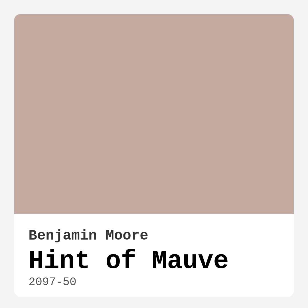
Color Preview & Key Details
| HEX Code | #C3AAA1 |
| RGB | 195, 170, 161 |
| LRV | 42.34% |
| Undertone | Red |
| Finish Options | Eggshell, Matte, Satin |
Imagine stepping into a space that feels both warm and inviting, where the color on the walls wraps around you like a comforting blanket. That’s the magic of Hint of Mauve by Benjamin Moore. This delicate, muted pink isn’t just a color; it’s an experience. It’s one of those shades that can transform a room from ordinary to extraordinary, creating an atmosphere that’s both serene and stylish.
Whether you’re decorating a cozy bedroom or refreshing your living room, Hint of Mauve brings a gentle elegance that can adapt to a variety of design styles, from modern to farmhouse. With its soft pink tones, this color speaks to the heart, evoking feelings of calm and comfort. It’s a versatile hue that can easily complement other decor elements, making it a favorite among designers and homeowners alike.
When you first glance at Hint of Mauve, you’ll notice its warm undertones, leaning subtly towards red. This warmth is essential; it’s what makes the color feel inviting rather than overwhelming. If you’ve ever walked into a room painted in a cooler tone and felt a chill, you’ll appreciate how Hint of Mauve transforms that dynamic. It creates a cozy space, perfect for gathering, relaxing, or simply enjoying quiet moments. Think about your living room or a nursery—places where warmth is essential—and you begin to see the possibilities this color offers.
One of the best features of Hint of Mauve is its adaptability. It effortlessly fits into various decor styles, whether you’re leaning towards modern minimalism or classic charm. You might find it harmonizing beautifully with white trim like Benjamin Moore’s White Dove, which offers a crisp contrast that enhances the softness of the mauve. If you want to add a touch of rustic charm, pairing it with warm wood tones will create an inviting and homey feel. For a bolder approach, black windows or trim can create a striking visual impact, grounding the soft hue of mauve with a contemporary edge.
When considering the application of Hint of Mauve, you’ll find it’s incredibly user-friendly. Whether you’re a seasoned DIYer or a beginner tackling your first paint project, this color goes on smoothly with rollers or brushes, minimizing the need for multiple coats. With good coverage from just one or two applications, you’ll be amazed at how quickly you can refresh a room. Plus, its washability means that everyday scuffs and marks can be easily wiped away, making it a practical choice for homes with kids or pets.
A crucial aspect of any paint color is how it interacts with light. Hint of Mauve shines in natural light, revealing its delicate tones and brightening up your space. However, in dimmer or artificial lighting, it may take on a more subdued character, which is something to keep in mind when choosing the perfect room. The paint has a Light Reflectance Value (LRV) of 42.34%, which puts it in the light-medium category. This means it reflects about half of the incident light, creating a balance between brightness and warmth.
Now, let’s talk about where to use Hint of Mauve. This color shines in a variety of spaces, from bedrooms where you want a tranquil retreat to home offices that benefit from a warm, inviting atmosphere. It works beautifully in dining rooms and living areas too, creating a nurturing environment for family and friends to gather. Even in small spaces, this shade can work wonders by giving the illusion of openness and warmth, making it a perfect choice for cozy nooks or compact rooms.
When it comes to choosing complementary colors, you’ve got options. Soft greens or muted blues can provide a stunning contrast, enhancing the warmth of Hint of Mauve while introducing a refreshing balance. If you’re drawn to deeper shades, consider pairing it with complementary hues like the richer tones found in 2136-40 or 1625. Experimenting with various accent colors can give your space depth and character without overwhelming the delicate beauty of mauve.
If you’re still on the fence about whether this color is right for you, it’s always wise to test it in your home. Paint a small swatch on your wall and observe how it changes throughout the day. Pay attention to how the color interacts with your furniture, flooring, and decor. This is key to understanding how the undertones reveal themselves in different lighting conditions, helping you visualize the overall aesthetic before making a commitment.
Of course, like any color, Hint of Mauve has its considerations. In poorly lit spaces, it might appear darker than intended, so be mindful of the natural light in your chosen room. For areas with high foot traffic, you might want to think about additional protective measures to keep the paint looking fresh. Despite these small drawbacks, the warmth and versatility of Hint of Mauve often outweigh any potential downsides.
To wrap it all up, if you’re looking to create a cozy and inviting atmosphere in your home, Hint of Mauve is definitely worth considering. Its combination of warmth, versatility, and ease of application makes it a fantastic choice for a variety of spaces. With its beautiful undertones and adaptability to different decor styles, this color can help you craft a space that feels uniquely yours.
So, are you ready to bring that hint of mauve into your home? Whether you choose to paint an entire room or just an accent wall, this lovely hue will undoubtedly enhance the beauty and comfort of your space. Remember, creating a home is about expressing who you are, and with Hint of Mauve, you’re well on your way to achieving a look that’s both stylish and inviting. Happy decorating!
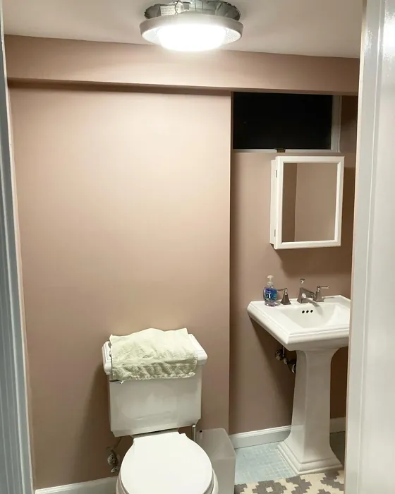
Real Room Photo of Hint of Mauve 2097-50
Undertones of Hint of Mauve ?
The undertones of Hint of Mauve are a key aspect of its character, leaning towards Red. These subtle underlying hues are what give the color its depth and complexity. For example, a gray with a blue undertone will feel cooler and more modern, while one with a brown undertone will feel warmer and more traditional. It’s essential to test this paint in your home and observe it next to your existing furniture, flooring, and decor to see how these undertones interact and reveal themselves throughout the day.
HEX value: #C3AAA1
RGB code: 195, 170, 161
Is Hint of Mauve Cool or Warm?
Hint of Mauve is considered a warm paint color. This characteristic plays a huge role in the overall feel of a room. Warm colors, like this one, tend to create a cozy, inviting, and energetic atmosphere, making them great for social spaces like living rooms and dining rooms. In contrast, cool colors often evoke a sense of calm and serenity, which is why they are popular in bedrooms and bathrooms. The warmth of Hint of Mauve means it will pair beautifully with corresponding decor elements.
Understanding Color Properties and Interior Design Tips
Hue refers to a specific position on the color wheel, measured in degrees from 0 to 360. Each degree represents a different pure color:
- 0° represents red
- 120° represents green
- 240° represents blue
Saturation describes the intensity or purity of a color and is expressed as a percentage:
- At 0%, the color appears completely desaturated—essentially a shade of gray
- At 100%, the color is at its most vivid and vibrant
Lightness indicates how light or dark a color is, also expressed as a percentage:
- 0% lightness results in black
- 100% lightness results in white
Using Warm Colors in Interior Design
Warm hues—such as reds, oranges, yellows, warm beiges, and greiges—are excellent choices for creating inviting and energetic spaces. These colors are particularly well-suited for:
- Kitchens, living rooms, and bathrooms, where warmth enhances comfort and sociability
- Large rooms, where warm tones can help reduce the sense of emptiness and make the space feel more intimate
For example:
- Warm beige shades provide a cozy, inviting atmosphere, ideal for living rooms, bedrooms, and hallways.
- Warm greige (a mix of beige and gray) offers the warmth of beige with the modern appeal of gray, making it a versatile backdrop for dining areas, bedrooms, and living spaces.
However, be mindful when using warm light tones in rooms with limited natural light. These shades may appear muted or even take on an unpleasant yellowish tint. To avoid a dull or flat appearance:
- Add depth by incorporating richer tones like deep greens, charcoal, or chocolate brown
- Use textured elements such as curtains, rugs, or cushions to bring dimension to the space
Pro Tip: Achieving Harmony with Warm and Cool Color Balance
To create a well-balanced and visually interesting interior, mix warm and cool tones strategically. This contrast adds depth and harmony to your design.
- If your walls feature warm hues, introduce cool-colored accents such as blue or green furniture, artwork, or accessories to create contrast.
- For a polished look, consider using a complementary color scheme, which pairs colors opposite each other on the color wheel (e.g., red with green, orange with blue).
This thoughtful mix not only enhances visual appeal but also creates a space that feels both dynamic and cohesive.
Light Temperature Affects on Hint of Mauve
Natural Light
Natural daylight changes in color temperature as the sun moves across the sky. At sunrise and sunset, the light tends to have a warm, golden tone with a color temperature around 2000 Kelvin (K). As the day progresses and the sun rises higher, the light becomes cooler and more neutral. Around midday, especially when the sky is clear, natural light typically reaches its peak brightness and shifts to a cooler tone, ranging from 5500 to 6500 Kelvin. This midday light is close to what we perceive as pure white or daylight-balanced light.
These shifts in natural light can significantly influence how colors appear in a space, which is why designers often consider both the time of day and the orientation of windows when planning interior color schemes.
Artificial Light
When choosing artificial lighting, pay close attention to the color temperature, measured in Kelvin (K). This determines how warm or cool the light will appear. Lower temperatures, around 2700K, give off a warm, yellow glow often used in living rooms or bedrooms. Higher temperatures, above 5000K, create a cool, bluish light similar to daylight, commonly used in kitchens, offices, or task areas.
Use the slider to see how lighting temperature can affect the appearance of a surface or color throughout a space.


4800K
LRV of Hint of Mauve
The Light Reflectance Value (LRV) of Hint of Mauve is 42.34%, which places it in the Light Medium colors category. This means it reflect half of the incident light. Understanding a paint’s LRV is crucial for predicting how it will look in your space. A higher LRV indicates a lighter color that reflects more light, making rooms feel larger and brighter. A lower LRV signifies a darker color that absorbs more light, creating a cozier, more intimate atmosphere. Always consider the natural and artificial lighting in your room when selecting a paint color based on its LRV.
Detailed Review of Hint of Mauve
Additional Paint Characteristics
Ideal Rooms
Bedroom, Dining Room, Home Office, Living Room, Nursery
Decor Styles
Bohemian, Classic, Farmhouse, Modern, Transitional
Coverage
Good (1–2 Coats), Touch-Up Friendly
Ease of Application
Beginner Friendly, Brush Smooth, Roller-Ready
Washability
Washable, Wipeable
VOC Level
Low VOC, Ultra Low VOC
Best Use
Accent Wall, Interior Walls, Small Spaces
Room Suitability
Bedroom, Dining Room, Home Office, Living Room, Nursery
Tone Tag
Dusty, Muted, Warm
Finish Type
Eggshell, Matte, Satin
Paint Performance
Easy Touch-Up, Low Odor, Scuff Resistant
Use Cases
Best for Rentals, Best for Small Spaces, Designer Favorite
Mood
Calm, Cozy, Inviting
Trim Pairing
Complements Warm Trim, Matches Black Windows, Pairs with White Dove
Hint of Mauve is a beautifully understated color that can transform your space into a tranquil oasis. Its soft pink tones evoke feelings of calm and comfort, making it perfect for bedrooms or cozy living areas. With a versatile finish, it adapts well to both modern and traditional decor styles. The application process is smooth, with a good level of coverage that minimizes the need for multiple coats. It pairs beautifully with both warm and cool accents, allowing you to play with various decor elements without overwhelming the space. Overall, it’s a fantastic choice if you’re looking to add a subtle touch of warmth to your home.
Pros & Cons of 2097-50 Hint of Mauve
Pros
Cons
Colors that go with Benjamin Moore Hint of Mauve
FAQ on 2097-50 Hint of Mauve
Can Hint of Mauve be used in small spaces?
Absolutely! Hint of Mauve works wonderfully in small spaces, as its soft, warm tones can create an illusion of openness and warmth. When used in smaller rooms, it encourages a cozy atmosphere without overwhelming the senses. Just be mindful of lighting, as it may appear darker in areas with limited natural light.
What trim colors work best with Hint of Mauve?
Hint of Mauve pairs beautifully with a range of trim colors. White Dove or Simply White offers a crisp contrast, while warm wood tones bring a rustic charm. If you prefer a bolder look, black windows or cool trim can create a striking visual impact that enhances the overall aesthetic of your space.
Comparisons Hint of Mauve with other colors
Hint of Mauve 2097-50 vs Realist Beige SW 6078
| Attribute | Hint of Mauve 2097-50 | Realist Beige SW 6078 |
|---|---|---|
| Color Name | Hint of Mauve 2097-50 | Realist Beige SW 6078 |
| Color | ||
| Hue | Pink | Pink |
| Brightness | Medium | Medium |
| RGB | 195, 170, 161 | 211, 200, 189 |
| LRV | 42.34% | 34% |
| Finish Type | Eggshell, Matte, Satin | Eggshell, Matte, Satin |
| Finish Options | Eggshell, Matte, Satin | Eggshell, Matte, Satin |
| Ideal Rooms | Bedroom, Dining Room, Home Office, Living Room, Nursery | Bedroom, Dining Room, Entryway, Home Office, Kitchen, Living Room |
| Decor Styles | Bohemian, Classic, Farmhouse, Modern, Transitional | Contemporary, Minimalist, Modern Farmhouse, Rustic, Traditional |
| Coverage | Good (1–2 Coats), Touch-Up Friendly | Good (1–2 Coats), Touch-Up Friendly |
| Ease of Application | Beginner Friendly, Brush Smooth, Roller-Ready | Beginner Friendly, Brush Smooth, Fast-Drying, Roller-Ready |
| Washability | Washable, Wipeable | Washable, Wipeable |
| Room Suitability | Bedroom, Dining Room, Home Office, Living Room, Nursery | Bedroom, Dining Room, Home Office, Kitchen, Living Room |
| Tone | Dusty, Muted, Warm | Earthy, Neutral, Warm |
| Paint Performance | Easy Touch-Up, Low Odor, Scuff Resistant | High Coverage, Low Odor, Quick Drying |
Hint of Mauve 2097-50 vs Rosaline Pearl SW 9077
| Attribute | Hint of Mauve 2097-50 | Rosaline Pearl SW 9077 |
|---|---|---|
| Color Name | Hint of Mauve 2097-50 | Rosaline Pearl SW 9077 |
| Color | ||
| Hue | Pink | Pink |
| Brightness | Medium | Medium |
| RGB | 195, 170, 161 | 163, 136, 135 |
| LRV | 42.34% | 69% |
| Finish Type | Eggshell, Matte, Satin | Eggshell, Matte |
| Finish Options | Eggshell, Matte, Satin | Eggshell, Matte, Satin |
| Ideal Rooms | Bedroom, Dining Room, Home Office, Living Room, Nursery | Bedroom, Dining Room, Home Office, Living Room |
| Decor Styles | Bohemian, Classic, Farmhouse, Modern, Transitional | Bohemian, Contemporary, Modern, Transitional |
| Coverage | Good (1–2 Coats), Touch-Up Friendly | Good (1–2 Coats) |
| Ease of Application | Beginner Friendly, Brush Smooth, Roller-Ready | Beginner Friendly, Brush Smooth, Fast-Drying, Roller-Ready |
| Washability | Washable, Wipeable | Washable, Wipeable |
| Room Suitability | Bedroom, Dining Room, Home Office, Living Room, Nursery | Bedroom, Dining Room, Home Office, Living Room |
| Tone | Dusty, Muted, Warm | Dusty, Muted, Warm |
| Paint Performance | Easy Touch-Up, Low Odor, Scuff Resistant | Easy Touch-Up, Fade Resistant, Low Odor |
Hint of Mauve 2097-50 vs Cabbage Rose SW 0003
| Attribute | Hint of Mauve 2097-50 | Cabbage Rose SW 0003 |
|---|---|---|
| Color Name | Hint of Mauve 2097-50 | Cabbage Rose SW 0003 |
| Color | ||
| Hue | Pink | Pink |
| Brightness | Medium | Medium |
| RGB | 195, 170, 161 | 197, 159, 145 |
| LRV | 42.34% | 15% |
| Finish Type | Eggshell, Matte, Satin | Eggshell, Matte, Satin |
| Finish Options | Eggshell, Matte, Satin | Eggshell, Matte, Satin |
| Ideal Rooms | Bedroom, Dining Room, Home Office, Living Room, Nursery | Bedroom, Dining Room, Hallway, Living Room, Nursery |
| Decor Styles | Bohemian, Classic, Farmhouse, Modern, Transitional | Cottage, Modern Farmhouse, Romantic, Shabby Chic, Vintage |
| Coverage | Good (1–2 Coats), Touch-Up Friendly | Good (1–2 Coats), Touch-Up Friendly |
| Ease of Application | Beginner Friendly, Brush Smooth, Roller-Ready | Beginner Friendly, Brush Smooth, Roller-Ready |
| Washability | Washable, Wipeable | Washable, Wipeable |
| Room Suitability | Bedroom, Dining Room, Home Office, Living Room, Nursery | Bedroom, Dining Room, Hallway, Living Room, Nursery |
| Tone | Dusty, Muted, Warm | Earthy, Muted, Warm |
| Paint Performance | Easy Touch-Up, Low Odor, Scuff Resistant | Easy Touch-Up, Low Odor |
Hint of Mauve 2097-50 vs Sashay Sand SW 6051
| Attribute | Hint of Mauve 2097-50 | Sashay Sand SW 6051 |
|---|---|---|
| Color Name | Hint of Mauve 2097-50 | Sashay Sand SW 6051 |
| Color | ||
| Hue | Pink | Pink |
| Brightness | Medium | Medium |
| RGB | 195, 170, 161 | 207, 180, 168 |
| LRV | 42.34% | 64% |
| Finish Type | Eggshell, Matte, Satin | Eggshell, Matte, Satin |
| Finish Options | Eggshell, Matte, Satin | Eggshell, Matte, Satin |
| Ideal Rooms | Bedroom, Dining Room, Home Office, Living Room, Nursery | Bedroom, Dining Room, Home Office, Kitchen, Living Room |
| Decor Styles | Bohemian, Classic, Farmhouse, Modern, Transitional | Bohemian, Contemporary, Modern Farmhouse, Scandinavian, Transitional |
| Coverage | Good (1–2 Coats), Touch-Up Friendly | Good (1–2 Coats), Touch-Up Friendly |
| Ease of Application | Beginner Friendly, Brush Smooth, Roller-Ready | Beginner Friendly, Fast-Drying, Roller-Ready |
| Washability | Washable, Wipeable | Highly Washable, Washable |
| Room Suitability | Bedroom, Dining Room, Home Office, Living Room, Nursery | Bedroom, Dining Room, Home Office, Kitchen, Living Room |
| Tone | Dusty, Muted, Warm | Earthy, Muted, Warm |
| Paint Performance | Easy Touch-Up, Low Odor, Scuff Resistant | Easy Touch-Up, Low Odor, Quick Drying, Scuff Resistant |
Hint of Mauve 2097-50 vs Touch of Sand SW 9085
| Attribute | Hint of Mauve 2097-50 | Touch of Sand SW 9085 |
|---|---|---|
| Color Name | Hint of Mauve 2097-50 | Touch of Sand SW 9085 |
| Color | ||
| Hue | Pink | Pink |
| Brightness | Medium | Medium |
| RGB | 195, 170, 161 | 213, 199, 186 |
| LRV | 42.34% | 66% |
| Finish Type | Eggshell, Matte, Satin | Eggshell, Matte, Satin |
| Finish Options | Eggshell, Matte, Satin | Eggshell, Matte, Satin |
| Ideal Rooms | Bedroom, Dining Room, Home Office, Living Room, Nursery | Bathroom, Bedroom, Dining Room, Home Office, Kitchen, Living Room |
| Decor Styles | Bohemian, Classic, Farmhouse, Modern, Transitional | Bohemian, Coastal, Contemporary, Modern Farmhouse, Rustic |
| Coverage | Good (1–2 Coats), Touch-Up Friendly | Good (1–2 Coats), Touch-Up Friendly |
| Ease of Application | Beginner Friendly, Brush Smooth, Roller-Ready | Beginner Friendly, Brush Smooth, Fast-Drying, Roller-Ready |
| Washability | Washable, Wipeable | Washable, Wipeable |
| Room Suitability | Bedroom, Dining Room, Home Office, Living Room, Nursery | Bathroom, Bedroom, Dining Room, Home Office, Kitchen, Living Room |
| Tone | Dusty, Muted, Warm | Earthy, Muted, Neutral, Warm |
| Paint Performance | Easy Touch-Up, Low Odor, Scuff Resistant | Easy Touch-Up, Low Odor, Quick Drying, Scuff Resistant |
Hint of Mauve 2097-50 vs Pink Shadow SW 0070
| Attribute | Hint of Mauve 2097-50 | Pink Shadow SW 0070 |
|---|---|---|
| Color Name | Hint of Mauve 2097-50 | Pink Shadow SW 0070 |
| Color | ||
| Hue | Pink | Pink |
| Brightness | Medium | Medium |
| RGB | 195, 170, 161 | 222, 195, 185 |
| LRV | 42.34% | 45% |
| Finish Type | Eggshell, Matte, Satin | Eggshell, Matte, Satin |
| Finish Options | Eggshell, Matte, Satin | Eggshell, Matte, Satin |
| Ideal Rooms | Bedroom, Dining Room, Home Office, Living Room, Nursery | Bedroom, Dining Room, Home Office, Living Room, Nursery |
| Decor Styles | Bohemian, Classic, Farmhouse, Modern, Transitional | Bohemian, Minimalist, Modern Farmhouse, Scandinavian, Traditional |
| Coverage | Good (1–2 Coats), Touch-Up Friendly | Good (1–2 Coats) |
| Ease of Application | Beginner Friendly, Brush Smooth, Roller-Ready | Beginner Friendly, Brush Smooth, Fast-Drying, Roller-Ready |
| Washability | Washable, Wipeable | Washable, Wipeable |
| Room Suitability | Bedroom, Dining Room, Home Office, Living Room, Nursery | Bedroom, Dining Room, Living Room, Nursery |
| Tone | Dusty, Muted, Warm | Muted, Pastel, Warm |
| Paint Performance | Easy Touch-Up, Low Odor, Scuff Resistant | Easy Touch-Up, High Coverage, Low Odor |
Hint of Mauve 2097-50 vs Hushed Auburn SW 9080
| Attribute | Hint of Mauve 2097-50 | Hushed Auburn SW 9080 |
|---|---|---|
| Color Name | Hint of Mauve 2097-50 | Hushed Auburn SW 9080 |
| Color | ||
| Hue | Pink | Pink |
| Brightness | Medium | Medium |
| RGB | 195, 170, 161 | 168, 133, 122 |
| LRV | 42.34% | 12% |
| Finish Type | Eggshell, Matte, Satin | Eggshell, Matte, Satin |
| Finish Options | Eggshell, Matte, Satin | Eggshell, Matte, Satin |
| Ideal Rooms | Bedroom, Dining Room, Home Office, Living Room, Nursery | Bedroom, Dining Room, Home Office, Living Room |
| Decor Styles | Bohemian, Classic, Farmhouse, Modern, Transitional | Contemporary, Modern Farmhouse, Rustic, Transitional |
| Coverage | Good (1–2 Coats), Touch-Up Friendly | Good (1–2 Coats), Touch-Up Friendly |
| Ease of Application | Beginner Friendly, Brush Smooth, Roller-Ready | Beginner Friendly, Brush Smooth, Fast-Drying, Roller-Ready |
| Washability | Washable, Wipeable | Washable, Wipeable |
| Room Suitability | Bedroom, Dining Room, Home Office, Living Room, Nursery | Bedroom, Dining Room, Home Office, Living Room |
| Tone | Dusty, Muted, Warm | Earthy, Muted, Warm |
| Paint Performance | Easy Touch-Up, Low Odor, Scuff Resistant | Easy Touch-Up, High Coverage, Low Odor |
Hint of Mauve 2097-50 vs Likeable Sand SW 6058
| Attribute | Hint of Mauve 2097-50 | Likeable Sand SW 6058 |
|---|---|---|
| Color Name | Hint of Mauve 2097-50 | Likeable Sand SW 6058 |
| Color | ||
| Hue | Pink | Pink |
| Brightness | Medium | Medium |
| RGB | 195, 170, 161 | 209, 183, 168 |
| LRV | 42.34% | 61% |
| Finish Type | Eggshell, Matte, Satin | Eggshell, Matte, Satin |
| Finish Options | Eggshell, Matte, Satin | Eggshell, Matte, Satin |
| Ideal Rooms | Bedroom, Dining Room, Home Office, Living Room, Nursery | Bedroom, Dining Room, Home Office, Kitchen, Living Room |
| Decor Styles | Bohemian, Classic, Farmhouse, Modern, Transitional | Bohemian, Coastal, Contemporary, Modern Farmhouse, Rustic |
| Coverage | Good (1–2 Coats), Touch-Up Friendly | Good (1–2 Coats), Touch-Up Friendly |
| Ease of Application | Beginner Friendly, Brush Smooth, Roller-Ready | Beginner Friendly, Brush Smooth, Fast-Drying, Roller-Ready |
| Washability | Washable, Wipeable | Washable, Wipeable |
| Room Suitability | Bedroom, Dining Room, Home Office, Living Room, Nursery | Bedroom, Dining Room, Home Office, Kitchen, Living Room |
| Tone | Dusty, Muted, Warm | Earthy, Muted, Warm |
| Paint Performance | Easy Touch-Up, Low Odor, Scuff Resistant | Easy Touch-Up, Low Odor, Quick Drying |
Hint of Mauve 2097-50 vs Glamour SW 6031
| Attribute | Hint of Mauve 2097-50 | Glamour SW 6031 |
|---|---|---|
| Color Name | Hint of Mauve 2097-50 | Glamour SW 6031 |
| Color | ||
| Hue | Pink | Pink |
| Brightness | Medium | Medium |
| RGB | 195, 170, 161 | 182, 160, 154 |
| LRV | 42.34% | 30% |
| Finish Type | Eggshell, Matte, Satin | Eggshell, Matte, Satin |
| Finish Options | Eggshell, Matte, Satin | Eggshell, Matte, Satin |
| Ideal Rooms | Bedroom, Dining Room, Home Office, Living Room, Nursery | Bedroom, Dining Room, Home Office, Living Room |
| Decor Styles | Bohemian, Classic, Farmhouse, Modern, Transitional | Bohemian, Classic, Modern, Transitional |
| Coverage | Good (1–2 Coats), Touch-Up Friendly | Good (1–2 Coats) |
| Ease of Application | Beginner Friendly, Brush Smooth, Roller-Ready | Beginner Friendly, Brush Smooth, Fast-Drying, Roller-Ready |
| Washability | Washable, Wipeable | Scrubbable, Washable |
| Room Suitability | Bedroom, Dining Room, Home Office, Living Room, Nursery | Bedroom, Dining Room, Home Office, Living Room |
| Tone | Dusty, Muted, Warm | Balanced, Neutral, Warm |
| Paint Performance | Easy Touch-Up, Low Odor, Scuff Resistant | Easy Touch-Up, Low Odor, Quick Drying |
Hint of Mauve 2097-50 vs Temperate Taupe SW 6037
| Attribute | Hint of Mauve 2097-50 | Temperate Taupe SW 6037 |
|---|---|---|
| Color Name | Hint of Mauve 2097-50 | Temperate Taupe SW 6037 |
| Color | ||
| Hue | Pink | Pink |
| Brightness | Medium | Medium |
| RGB | 195, 170, 161 | 191, 177, 170 |
| LRV | 42.34% | 34% |
| Finish Type | Eggshell, Matte, Satin | Eggshell, Matte, Satin |
| Finish Options | Eggshell, Matte, Satin | Eggshell, Matte, Satin |
| Ideal Rooms | Bedroom, Dining Room, Home Office, Living Room, Nursery | Bedroom, Dining Room, Home Office, Kitchen, Living Room |
| Decor Styles | Bohemian, Classic, Farmhouse, Modern, Transitional | Bohemian, Modern Farmhouse, Rustic, Transitional |
| Coverage | Good (1–2 Coats), Touch-Up Friendly | Good (1–2 Coats), Touch-Up Friendly |
| Ease of Application | Beginner Friendly, Brush Smooth, Roller-Ready | Beginner Friendly, Brush Smooth, Fast-Drying, Roller-Ready |
| Washability | Washable, Wipeable | Highly Washable, Washable |
| Room Suitability | Bedroom, Dining Room, Home Office, Living Room, Nursery | Bedroom, Dining Room, Home Office, Living Room |
| Tone | Dusty, Muted, Warm | Earthy, Neutral, Warm |
| Paint Performance | Easy Touch-Up, Low Odor, Scuff Resistant | Long Lasting, Low Odor, Quick Drying, Scuff Resistant |
Official Page of Benjamin Moore Hint of Mauve 2097-50