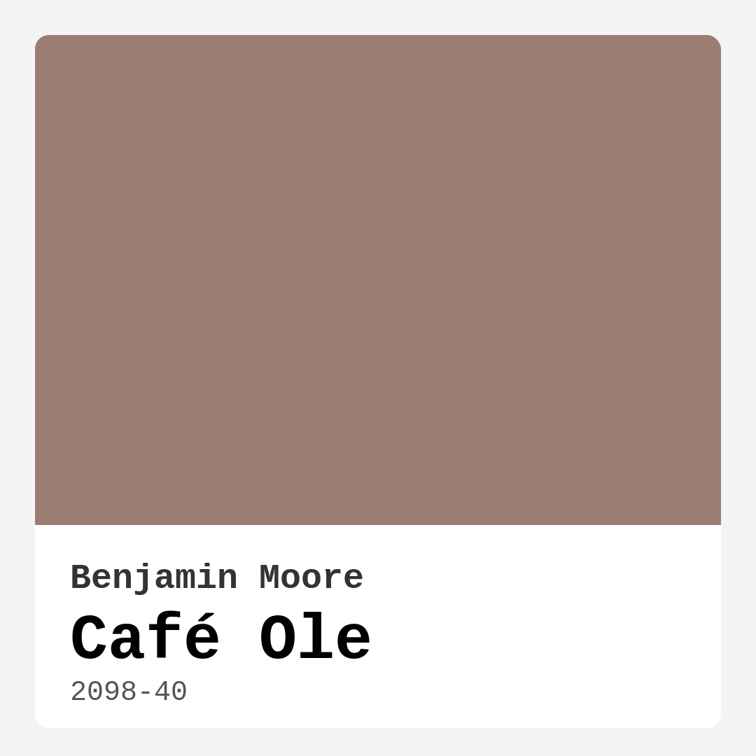
Color Preview & Key Details
| HEX Code | #9B7D73 |
| RGB | 155, 125, 115 |
| LRV | 23.78% |
| Undertone | Red |
| Finish Options | Eggshell, Matte, Satin |
If you’re searching for a paint color that wraps a room in warmth and sophistication, Benjamin Moore’s Café Ole (2098-40) might just be your perfect match. This rich, latte-inspired hue sits comfortably in the medium color range with an LRV of 23.78%, meaning it reflects a good amount of light while still offering that cozy, enveloping feel. Its earthy undertones—leaning slightly red—give it depth and versatility, making it a standout choice for everything from modern farmhouse living rooms to rustic bedrooms.
Café Ole is the kind of color that makes a space feel lived-in and welcoming the moment you walk in. Picture it on your walls: a soft, muted backdrop that doesn’t demand attention but effortlessly ties your decor together. It’s warm without being overwhelming, sophisticated without feeling stuffy. Whether you’re painting an open-concept living area or a snug bedroom, this shade adapts beautifully, especially in rooms where you want to encourage relaxation and connection.
One of the biggest perks of Café Ole is its practicality. It covers well—often in just one or two coats—and it’s self-priming, which means less prep work for you. The finish options (matte, eggshell, or satin) give you flexibility depending on the room’s use. Eggshell and satin are great for high-traffic areas like living rooms or hallways because they’re wipeable and stain-resistant, while matte lends a velvety, refined look perfect for bedrooms. And since it’s low-VOC and odor-free, you won’t have to worry about harsh fumes during or after application.
Lighting plays a big role in how Café Ole shows up. In natural daylight, it’s a soft, warm neutral that feels airy and inviting. Under artificial light, it deepens slightly, amplifying its cozy vibe. If your room lacks natural light, this color can actually work in your favor—it adds warmth so the space doesn’t feel cold or sterile. Just keep in mind that in very small rooms, it might make the walls feel a bit closer. If that’s a concern, try using it on an accent wall paired with lighter trim (Simply White is a classic choice) or balance it with plenty of mirrors and lighting.
When it comes to decor, Café Ole is a team player. It pairs beautifully with natural wood tones, brass fixtures, and textiles in creamy whites or deep greens (its complementary hue). For a modern farmhouse look, layer it with shiplap and woven baskets. In a bohemian space, mix it with terracotta pots and patterned rugs. Even in a more minimalist setting, it grounds the room with warmth without clashing with clean lines. And if you love the idea of a neutral but don’t want another gray or beige, this is a refreshing alternative—it’s neutral with personality.
A few things to consider: Café Ole might not be the best fit if you’re going for a ultra-modern, high-contrast aesthetic. Its warmth leans traditional, so it’s more at home in styles that embrace earthy, organic elements. And while it’s versatile, testing a sample in your space is non-negotiable. Paint it on a large swatch, observe it at different times of day, and see how it interacts with your furniture and flooring. Colors can shift dramatically depending on their surroundings, and you want to be sure those red undertones play nicely with your existing palette.
At the end of the day, Café Ole is a color that feels like a hug. It’s inviting, grounding, and just interesting enough to keep your walls from feeling bland. Whether you’re refreshing a single room or reimagining your entire home, this shade has the warmth and flexibility to make your space feel like yours. So grab a sample, picture it in your home, and get ready to fall in love with a color that’s as comforting as your favorite coffee shop corner.
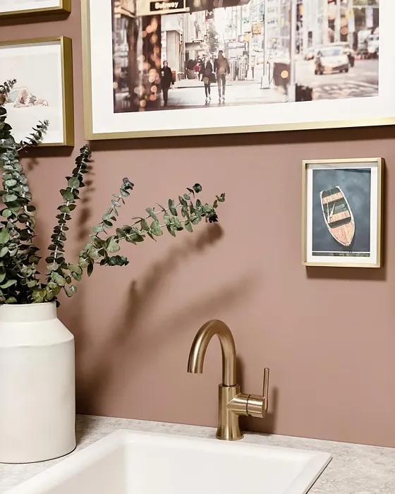
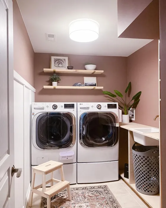
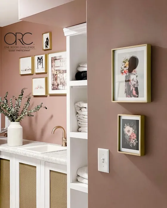
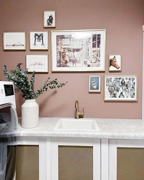
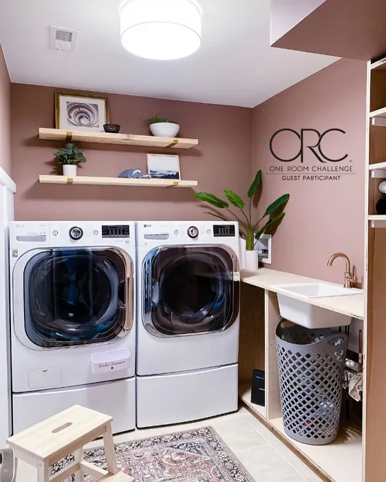
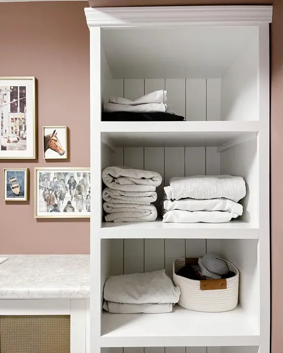
Real Room Photo of Café Ole 2098-40
Undertones of Café Ole ?
The undertones of Café Ole are a key aspect of its character, leaning towards Red. These subtle underlying hues are what give the color its depth and complexity. For example, a gray with a blue undertone will feel cooler and more modern, while one with a brown undertone will feel warmer and more traditional. It’s essential to test this paint in your home and observe it next to your existing furniture, flooring, and decor to see how these undertones interact and reveal themselves throughout the day.
HEX value: #9B7D73
RGB code: 155, 125, 115
Is Café Ole Cool or Warm?
Café Ole is undoubtedly a warm color. Its rich, latte-inspired hue gives off a sense of warmth and coziness, making it perfect for creating inviting spaces. Warm colors like Café Ole can make large rooms feel more intimate and cozy, while also adding a touch of sophistication to any area. This warmth makes it particularly suited for living rooms, bedrooms, and dining areas where you want to encourage relaxation and conversation. If you’re looking to create a space that feels like a warm embrace, Café Ole is an excellent choice.
Understanding Color Properties and Interior Design Tips
Hue refers to a specific position on the color wheel, measured in degrees from 0 to 360. Each degree represents a different pure color:
- 0° represents red
- 120° represents green
- 240° represents blue
Saturation describes the intensity or purity of a color and is expressed as a percentage:
- At 0%, the color appears completely desaturated—essentially a shade of gray
- At 100%, the color is at its most vivid and vibrant
Lightness indicates how light or dark a color is, also expressed as a percentage:
- 0% lightness results in black
- 100% lightness results in white
Using Warm Colors in Interior Design
Warm hues—such as reds, oranges, yellows, warm beiges, and greiges—are excellent choices for creating inviting and energetic spaces. These colors are particularly well-suited for:
- Kitchens, living rooms, and bathrooms, where warmth enhances comfort and sociability
- Large rooms, where warm tones can help reduce the sense of emptiness and make the space feel more intimate
For example:
- Warm beige shades provide a cozy, inviting atmosphere, ideal for living rooms, bedrooms, and hallways.
- Warm greige (a mix of beige and gray) offers the warmth of beige with the modern appeal of gray, making it a versatile backdrop for dining areas, bedrooms, and living spaces.
However, be mindful when using warm light tones in rooms with limited natural light. These shades may appear muted or even take on an unpleasant yellowish tint. To avoid a dull or flat appearance:
- Add depth by incorporating richer tones like deep greens, charcoal, or chocolate brown
- Use textured elements such as curtains, rugs, or cushions to bring dimension to the space
Pro Tip: Achieving Harmony with Warm and Cool Color Balance
To create a well-balanced and visually interesting interior, mix warm and cool tones strategically. This contrast adds depth and harmony to your design.
- If your walls feature warm hues, introduce cool-colored accents such as blue or green furniture, artwork, or accessories to create contrast.
- For a polished look, consider using a complementary color scheme, which pairs colors opposite each other on the color wheel (e.g., red with green, orange with blue).
This thoughtful mix not only enhances visual appeal but also creates a space that feels both dynamic and cohesive.
Light Temperature Affects on Café Ole
Natural Light
Natural daylight changes in color temperature as the sun moves across the sky. At sunrise and sunset, the light tends to have a warm, golden tone with a color temperature around 2000 Kelvin (K). As the day progresses and the sun rises higher, the light becomes cooler and more neutral. Around midday, especially when the sky is clear, natural light typically reaches its peak brightness and shifts to a cooler tone, ranging from 5500 to 6500 Kelvin. This midday light is close to what we perceive as pure white or daylight-balanced light.
These shifts in natural light can significantly influence how colors appear in a space, which is why designers often consider both the time of day and the orientation of windows when planning interior color schemes.
Artificial Light
When choosing artificial lighting, pay close attention to the color temperature, measured in Kelvin (K). This determines how warm or cool the light will appear. Lower temperatures, around 2700K, give off a warm, yellow glow often used in living rooms or bedrooms. Higher temperatures, above 5000K, create a cool, bluish light similar to daylight, commonly used in kitchens, offices, or task areas.
Use the slider to see how lighting temperature can affect the appearance of a surface or color throughout a space.


4800K
LRV of Café Ole
The Light Reflectance Value (LRV) of Café Ole is 23.78%, which places it in the Medium colors category. This means it reflect a lot of light. Understanding a paint’s LRV is crucial for predicting how it will look in your space. A higher LRV indicates a lighter color that reflects more light, making rooms feel larger and brighter. A lower LRV signifies a darker color that absorbs more light, creating a cozier, more intimate atmosphere. Always consider the natural and artificial lighting in your room when selecting a paint color based on its LRV.
Detailed Review of Café Ole
Additional Paint Characteristics
Ideal Rooms
Bedroom, Dining Room, Entryway, Home Office, Living Room
Decor Styles
Bohemian, Modern Farmhouse, Rustic
Coverage
Good (1–2 Coats), Self-Priming
Ease of Application
Brush Smooth, Fast-Drying, Low Splatter, Roller-Ready
Washability
Stain Resistant, Washable, Wipeable
VOC Level
Eco-Certified, Low VOC, Odor-Free
Best Use
Accent Wall, Interior Walls, Large Spaces, Open Concept Spaces
Room Suitability
Bedroom, Dining Room, Living Room
Tone Tag
Cozy, Earthy, Muted, Warm
Finish Type
Eggshell, Matte, Satin
Paint Performance
High Coverage, Low Odor, Quick Drying, Stain Resistant
Use Cases
Best for High Traffic Areas, Best for Open Concept, Classic Favorite, Designer Favorite
Mood
Cozy, Grounding, Inviting, Sophisticated, Warm
Trim Pairing
Complements Brass Fixtures, Good with Wood Trim, Pairs with Simply White
Café Ole is a color that exudes warmth and comfort, making it a fantastic choice for any room where you want to create a welcoming atmosphere. Its soft, earthy tone is perfect for living rooms where you entertain guests or bedrooms where you unwind. With its muted brown notes, Café Ole can easily blend into various decor styles, from rustic to modern farmhouse and even a touch of bohemian flair. When applied, this paint covers well — typically needing just one to two coats for full coverage. It’s self-priming, which can save you time and effort during the painting process. Plus, the color adapts well to different lighting, maintaining its cozy warmth in both natural and artificial light. It’s a great option for open spaces, providing a cohesive look without overpowering the room’s decor.
Pros & Cons of 2098-40 Café Ole
Pros
Cons
Colors that go with Benjamin Moore Café Ole
FAQ on 2098-40 Café Ole
Is Café Ole suitable for small rooms?
Café Ole can definitely be used in small rooms, but with a few considerations. Its warm and inviting nature can make a small room feel cozy and intimate. However, because it is a medium tone, it might absorb more light, making the space feel smaller if not balanced with adequate lighting. To counteract this, you might want to ensure there is ample natural or artificial lighting or pair it with lighter accents or trim to keep the room feeling open and airy. Consider using it on an accent wall if you’re concerned about the room feeling too enclosed.
How does Café Ole perform in different lighting conditions?
Café Ole performs beautifully across various lighting conditions, maintaining its rich, earthy warmth. In natural daylight, it has a soft, muted quality that is both inviting and sophisticated. Under artificial lighting, it takes on a slightly deeper tone, enhancing its cozy and enveloping characteristics. If your space has ample natural light, Café Ole will maintain its true color, providing a warm backdrop that’s perfect for relaxation. In dimmer settings, the warmth of the color can help prevent the room from feeling too stark or cold, making it a great choice for spaces where you want to create an intimate atmosphere.
Comparisons Café Ole with other colors
Café Ole 2098-40 vs Exuberant Pink SW 6840
| Attribute | Café Ole 2098-40 | Exuberant Pink SW 6840 |
|---|---|---|
| Color Name | Café Ole 2098-40 | Exuberant Pink SW 6840 |
| Color | ||
| Hue | Pink | Pink |
| Brightness | Dark | Dark |
| RGB | 155, 125, 115 | 181, 77, 127 |
| LRV | 23.78% | 36% |
| Finish Type | Eggshell, Matte, Satin | Matte, Satin, Semi-Gloss |
| Finish Options | Eggshell, Matte, Satin | Matte, Satin, Semi-Gloss |
| Ideal Rooms | Bedroom, Dining Room, Entryway, Home Office, Living Room | Bedroom, Dining Room, Kids Room, Living Room, Nursery |
| Decor Styles | Bohemian, Modern Farmhouse, Rustic | Bohemian, Contemporary, Eclectic, Modern, Vintage |
| Coverage | Good (1–2 Coats), Self-Priming | Good (1–2 Coats), Touch-Up Friendly |
| Ease of Application | Brush Smooth, Fast-Drying, Low Splatter, Roller-Ready | Beginner Friendly, Brush Smooth, Fast-Drying, Roller-Ready |
| Washability | Stain Resistant, Washable, Wipeable | Washable, Wipeable |
| Room Suitability | Bedroom, Dining Room, Living Room | Bedroom, Dining Room, Kids Room, Living Room, Nursery |
| Tone | Cozy, Earthy, Muted, Warm | Bold, Bright, Warm |
| Paint Performance | High Coverage, Low Odor, Quick Drying, Stain Resistant | Easy Touch-Up, Fade Resistant, Low Odor, Quick Drying |
Café Ole 2098-40 vs Reddened Earth SW 6053
| Attribute | Café Ole 2098-40 | Reddened Earth SW 6053 |
|---|---|---|
| Color Name | Café Ole 2098-40 | Reddened Earth SW 6053 |
| Color | ||
| Hue | Pink | Pink |
| Brightness | Dark | Dark |
| RGB | 155, 125, 115 | 156, 110, 99 |
| LRV | 23.78% | 20% |
| Finish Type | Eggshell, Matte, Satin | Eggshell, Flat, Matte |
| Finish Options | Eggshell, Matte, Satin | Eggshell, Flat, Matte, Satin |
| Ideal Rooms | Bedroom, Dining Room, Entryway, Home Office, Living Room | Bedroom, Dining Room, Home Office, Living Room, Nursery |
| Decor Styles | Bohemian, Modern Farmhouse, Rustic | Bohemian, Mid-Century Modern, Modern Farmhouse, Rustic |
| Coverage | Good (1–2 Coats), Self-Priming | Good (1–2 Coats), Touch-Up Friendly |
| Ease of Application | Brush Smooth, Fast-Drying, Low Splatter, Roller-Ready | Beginner Friendly, Brush Smooth, Roller-Ready |
| Washability | Stain Resistant, Washable, Wipeable | Washable, Wipeable |
| Room Suitability | Bedroom, Dining Room, Living Room | Bedroom, Dining Room, Home Office, Living Room |
| Tone | Cozy, Earthy, Muted, Warm | Earthy, Muted, Warm |
| Paint Performance | High Coverage, Low Odor, Quick Drying, Stain Resistant | High Coverage, Low Odor, Quick Drying, Scuff Resistant |
Café Ole 2098-40 vs Berry Bush SW 6292
| Attribute | Café Ole 2098-40 | Berry Bush SW 6292 |
|---|---|---|
| Color Name | Café Ole 2098-40 | Berry Bush SW 6292 |
| Color | ||
| Hue | Pink | Pink |
| Brightness | Dark | Dark |
| RGB | 155, 125, 115 | 141, 88, 105 |
| LRV | 23.78% | 12% |
| Finish Type | Eggshell, Matte, Satin | Matte, Satin, Semi-Gloss |
| Finish Options | Eggshell, Matte, Satin | Matte, Satin, Semi-Gloss |
| Ideal Rooms | Bedroom, Dining Room, Entryway, Home Office, Living Room | Bedroom, Dining Room, Home Office, Living Room |
| Decor Styles | Bohemian, Modern Farmhouse, Rustic | Eclectic, Modern, Rustic, Transitional |
| Coverage | Good (1–2 Coats), Self-Priming | Good (1–2 Coats), Touch-Up Friendly |
| Ease of Application | Brush Smooth, Fast-Drying, Low Splatter, Roller-Ready | Brush Smooth, Fast-Drying, Roller-Ready |
| Washability | Stain Resistant, Washable, Wipeable | Washable, Wipeable |
| Room Suitability | Bedroom, Dining Room, Living Room | Bedroom, Dining Room, Home Office, Living Room |
| Tone | Cozy, Earthy, Muted, Warm | Deep, Muted, Warm |
| Paint Performance | High Coverage, Low Odor, Quick Drying, Stain Resistant | Easy Touch-Up, Low Odor, Quick Drying |
Café Ole 2098-40 vs Renwick Heather SW 2818
| Attribute | Café Ole 2098-40 | Renwick Heather SW 2818 |
|---|---|---|
| Color Name | Café Ole 2098-40 | Renwick Heather SW 2818 |
| Color | ||
| Hue | Pink | Pink |
| Brightness | Dark | Dark |
| RGB | 155, 125, 115 | 139, 125, 123 |
| LRV | 23.78% | 24% |
| Finish Type | Eggshell, Matte, Satin | Eggshell, Satin |
| Finish Options | Eggshell, Matte, Satin | Eggshell, Matte, Satin |
| Ideal Rooms | Bedroom, Dining Room, Entryway, Home Office, Living Room | Bedroom, Dining Room, Entryway, Home Office, Living Room |
| Decor Styles | Bohemian, Modern Farmhouse, Rustic | Bohemian, Contemporary, Modern Farmhouse, Rustic, Transitional |
| Coverage | Good (1–2 Coats), Self-Priming | Good (1–2 Coats), Touch-Up Friendly |
| Ease of Application | Brush Smooth, Fast-Drying, Low Splatter, Roller-Ready | Beginner Friendly, Brush Smooth, Roller-Ready |
| Washability | Stain Resistant, Washable, Wipeable | Washable, Wipeable |
| Room Suitability | Bedroom, Dining Room, Living Room | Bedroom, Dining Room, Entryway, Home Office, Living Room |
| Tone | Cozy, Earthy, Muted, Warm | Earthy, Muted, Warm |
| Paint Performance | High Coverage, Low Odor, Quick Drying, Stain Resistant | Easy Touch-Up, High Coverage, Low Odor |
Café Ole 2098-40 vs Somerville Red HC-62
| Attribute | Café Ole 2098-40 | Somerville Red HC-62 |
|---|---|---|
| Color Name | Café Ole 2098-40 | Somerville Red HC-62 |
| Color | ||
| Hue | Pink | Pink |
| Brightness | Dark | Dark |
| RGB | 155, 125, 115 | 154, 109, 107 |
| LRV | 23.78% | 19.43% |
| Finish Type | Eggshell, Matte, Satin | Eggshell, Satin, Semi-Gloss |
| Finish Options | Eggshell, Matte, Satin | Eggshell, Satin, Semi-Gloss |
| Ideal Rooms | Bedroom, Dining Room, Entryway, Home Office, Living Room | Bedroom, Dining Room, Home Office, Living Room |
| Decor Styles | Bohemian, Modern Farmhouse, Rustic | Industrial, Modern, Rustic, Traditional |
| Coverage | Good (1–2 Coats), Self-Priming | Good (1–2 Coats), High Hide |
| Ease of Application | Brush Smooth, Fast-Drying, Low Splatter, Roller-Ready | Beginner Friendly, Brush Smooth, Fast-Drying, Low Splatter, Roller-Ready |
| Washability | Stain Resistant, Washable, Wipeable | Highly Washable, Stain Resistant, Washable |
| Room Suitability | Bedroom, Dining Room, Living Room | Bedroom, Dining Room, Living Room |
| Tone | Cozy, Earthy, Muted, Warm | Dusty, Earthy, Muted, Warm |
| Paint Performance | High Coverage, Low Odor, Quick Drying, Stain Resistant | Fade Resistant, High Coverage, Low Odor, Quick Drying |
Café Ole 2098-40 vs Peony 2079-30
| Attribute | Café Ole 2098-40 | Peony 2079-30 |
|---|---|---|
| Color Name | Café Ole 2098-40 | Peony 2079-30 |
| Color | ||
| Hue | Pink | Pink |
| Brightness | Dark | Dark |
| RGB | 155, 125, 115 | 200, 68, 112 |
| LRV | 23.78% | 18.55% |
| Finish Type | Eggshell, Matte, Satin | Eggshell, Matte, Satin, Semi-Gloss |
| Finish Options | Eggshell, Matte, Satin | Eggshell, Matte, Satin, Semi-Gloss |
| Ideal Rooms | Bedroom, Dining Room, Entryway, Home Office, Living Room | Bedroom, Dining Room, Home Office, Kids Room, Living Room |
| Decor Styles | Bohemian, Modern Farmhouse, Rustic | Bohemian, Eclectic, Glam, Modern |
| Coverage | Good (1–2 Coats), Self-Priming | Good (1–2 Coats), Self-Priming, Touch-Up Friendly |
| Ease of Application | Brush Smooth, Fast-Drying, Low Splatter, Roller-Ready | Beginner Friendly, Brush Smooth, Fast-Drying, Low Splatter, Roller-Ready |
| Washability | Stain Resistant, Washable, Wipeable | Stain Resistant, Washable, Wipeable |
| Room Suitability | Bedroom, Dining Room, Living Room | Bedroom, Dining Room, Kids Room, Living Room |
| Tone | Cozy, Earthy, Muted, Warm | Bold, Inviting, Warm |
| Paint Performance | High Coverage, Low Odor, Quick Drying, Stain Resistant | Fade Resistant, High Coverage, Low Odor, Quick Drying |
Official Page of Benjamin Moore Café Ole 2098-40