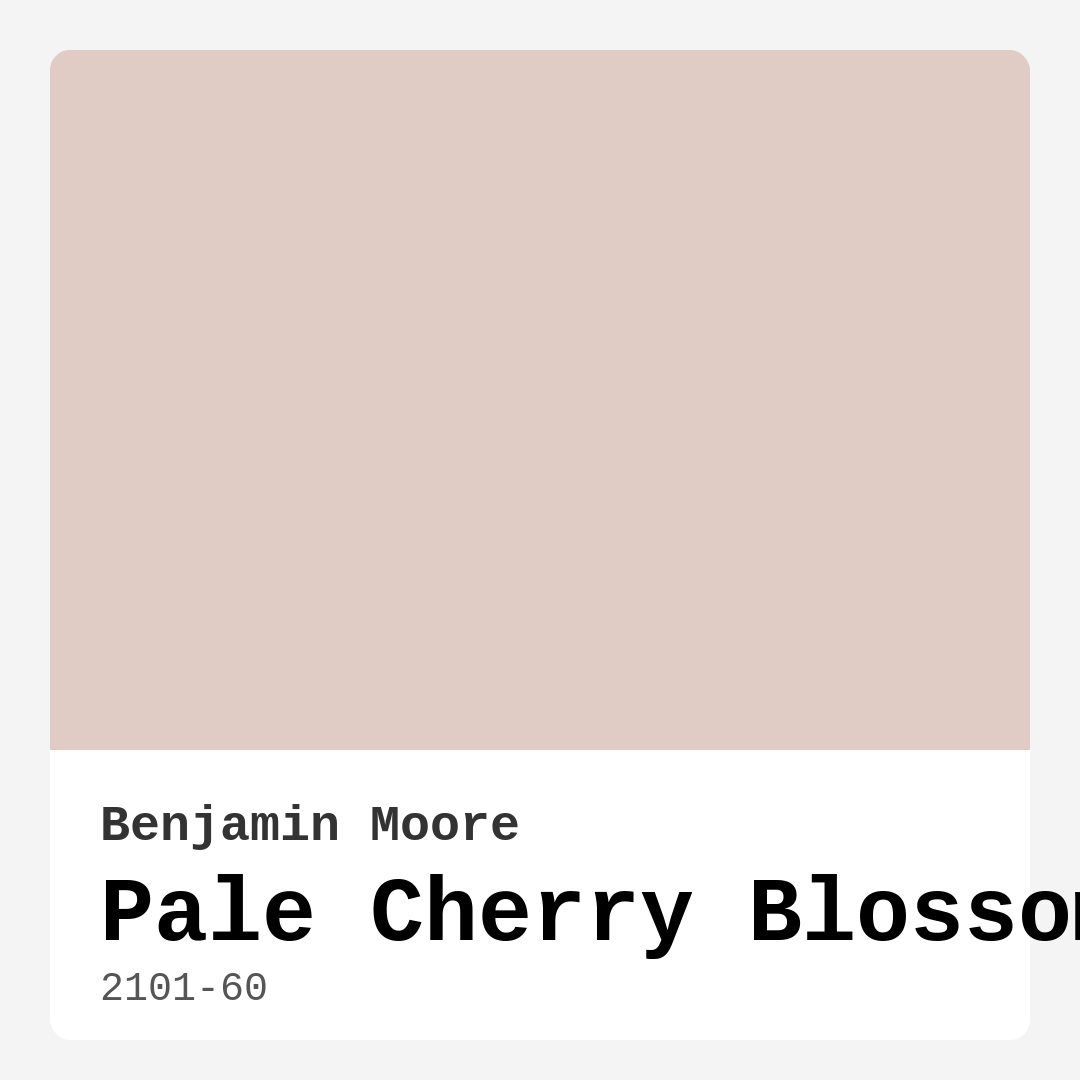
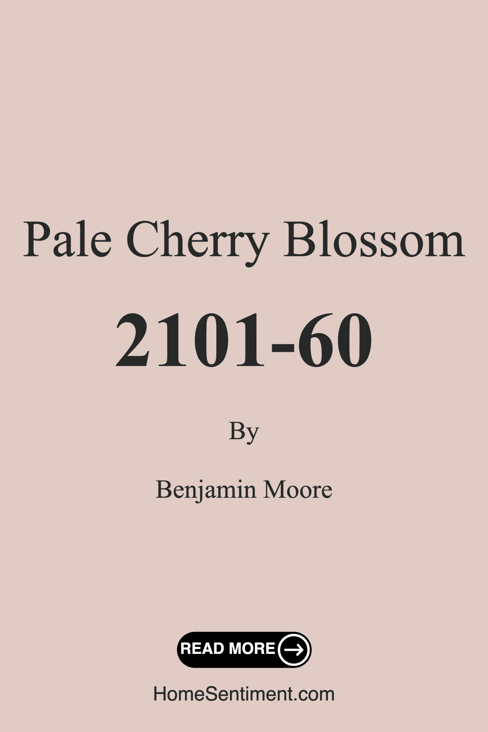
Color Preview & Key Details
| HEX Code | #E0CBC5 |
| RGB | 224, 203, 197 |
| LRV | 61.45% |
| Undertone | Red |
| Finish Options | Eggshell, Satin, Semi-Gloss |
Imagine walking into a room that instantly makes you feel at ease—soft, warm, and just a little bit dreamy. That’s the magic of Benjamin Moore’s Pale Cherry Blossom (2101-60). This delicate pink hue isn’t just another pastel; it’s a whisper of springtime, a gentle nod to nature that brings serenity to any space. Whether you’re refreshing a bedroom, designing a nursery, or giving your home office a cozy upgrade, this color might be the perfect fit. But how do you know if it’s right for your project? Let’s dive in.
Pale Cherry Blossom is a light, muted pink with subtle red undertones, giving it a warmth that feels inviting without being overpowering. Its LRV (Light Reflectance Value) of 61.45% means it reflects plenty of light, making rooms feel airy and bright—ideal for smaller spaces or areas with limited natural light. But don’t mistake “light” for “bland.” This shade has depth, thanks to those underlying hints of red that add richness, especially as the light changes throughout the day. In the morning sun, it’s fresh and uplifting; by evening lamplight, it softens into a soothing, almost blush-like glow.
One of the best things about this color is its versatility. It plays well with modern, Scandinavian, cottage, and even bohemian decor styles. Pair it with crisp whites like Benjamin Moore’s White Dove for a clean, timeless look, or layer it with soft greens and muted browns for an earthy, organic vibe. If you’re feeling bold, try it alongside deep navy or charcoal—the contrast adds sophistication without losing that calming essence. And because it’s a warm-toned paint, it harmonizes beautifully with both cool and warm trim, so you won’t have to stress about clashing baseboards or crown molding.
Application is a breeze, even if you’re a DIY beginner. The coverage is excellent—most rooms will need just one or two coats—and the finish is smooth, whether you choose eggshell for a subtle sheen or satin for a bit more durability. It’s also touch-up friendly, so accidental scuffs or marks won’t turn into a full repaint project. Plus, with low VOCs and eco-friendly certification, you can breathe easy knowing it’s a safe choice for your home (and the planet).
Now, let’s talk about where this color shines. Bedrooms? Absolutely. Pale Cherry Blossom creates a restful retreat, especially when paired with linen bedding and natural wood accents. Nurseries? It’s soft enough for a baby’s room but sophisticated enough to grow with them. Home offices? The warm undertones make it feel cozy without sacrificing productivity. And living rooms? It’s a winner, especially if you want a space that feels both elegant and approachable.
Of course, no color is perfect for every situation. In rooms with very little natural light, Pale Cherry Blossom can appear lighter and slightly washed out, so consider supplementing with warm artificial lighting to keep its richness intact. And while it’s a forgiving shade, those red undertones mean you’ll want to test it alongside your existing furniture and flooring to ensure it doesn’t clash with unexpected hues in your space.
If you’re on the fence, here’s a pro tip: grab a sample pot and paint a large swatch on your wall. Live with it for a few days, observing how it changes from dawn to dusk. You might be surprised how this quiet, understated color can transform a room—not with drama, but with quiet confidence. Pale Cherry Blossom isn’t just a paint color; it’s a mood. And if you’re craving a space that feels calm, inviting, and effortlessly stylish, it might just be the perfect choice.
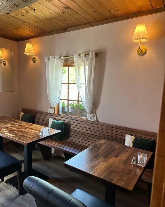
Real Room Photo of Pale Cherry Blossom 2101-60
Undertones of Pale Cherry Blossom ?
The undertones of Pale Cherry Blossom are a key aspect of its character, leaning towards Red. These subtle underlying hues are what give the color its depth and complexity. For example, a gray with a blue undertone will feel cooler and more modern, while one with a brown undertone will feel warmer and more traditional. It’s essential to test this paint in your home and observe it next to your existing furniture, flooring, and decor to see how these undertones interact and reveal themselves throughout the day.
HEX value: #E0CBC5
RGB code: 224, 203, 197
Is Pale Cherry Blossom Cool or Warm?
Pale Cherry Blossom leans slightly warm, thanks to its pink and peach undertones. This warmth creates a cozy environment, making spaces feel more inviting and comfortable, perfect for creating a relaxing atmosphere.
Understanding Color Properties and Interior Design Tips
Hue refers to a specific position on the color wheel, measured in degrees from 0 to 360. Each degree represents a different pure color:
- 0° represents red
- 120° represents green
- 240° represents blue
Saturation describes the intensity or purity of a color and is expressed as a percentage:
- At 0%, the color appears completely desaturated—essentially a shade of gray
- At 100%, the color is at its most vivid and vibrant
Lightness indicates how light or dark a color is, also expressed as a percentage:
- 0% lightness results in black
- 100% lightness results in white
Using Warm Colors in Interior Design
Warm hues—such as reds, oranges, yellows, warm beiges, and greiges—are excellent choices for creating inviting and energetic spaces. These colors are particularly well-suited for:
- Kitchens, living rooms, and bathrooms, where warmth enhances comfort and sociability
- Large rooms, where warm tones can help reduce the sense of emptiness and make the space feel more intimate
For example:
- Warm beige shades provide a cozy, inviting atmosphere, ideal for living rooms, bedrooms, and hallways.
- Warm greige (a mix of beige and gray) offers the warmth of beige with the modern appeal of gray, making it a versatile backdrop for dining areas, bedrooms, and living spaces.
However, be mindful when using warm light tones in rooms with limited natural light. These shades may appear muted or even take on an unpleasant yellowish tint. To avoid a dull or flat appearance:
- Add depth by incorporating richer tones like deep greens, charcoal, or chocolate brown
- Use textured elements such as curtains, rugs, or cushions to bring dimension to the space
Pro Tip: Achieving Harmony with Warm and Cool Color Balance
To create a well-balanced and visually interesting interior, mix warm and cool tones strategically. This contrast adds depth and harmony to your design.
- If your walls feature warm hues, introduce cool-colored accents such as blue or green furniture, artwork, or accessories to create contrast.
- For a polished look, consider using a complementary color scheme, which pairs colors opposite each other on the color wheel (e.g., red with green, orange with blue).
This thoughtful mix not only enhances visual appeal but also creates a space that feels both dynamic and cohesive.
Light Temperature Affects on Pale Cherry Blossom
Natural Light
Natural daylight changes in color temperature as the sun moves across the sky. At sunrise and sunset, the light tends to have a warm, golden tone with a color temperature around 2000 Kelvin (K). As the day progresses and the sun rises higher, the light becomes cooler and more neutral. Around midday, especially when the sky is clear, natural light typically reaches its peak brightness and shifts to a cooler tone, ranging from 5500 to 6500 Kelvin. This midday light is close to what we perceive as pure white or daylight-balanced light.
These shifts in natural light can significantly influence how colors appear in a space, which is why designers often consider both the time of day and the orientation of windows when planning interior color schemes.
Artificial Light
When choosing artificial lighting, pay close attention to the color temperature, measured in Kelvin (K). This determines how warm or cool the light will appear. Lower temperatures, around 2700K, give off a warm, yellow glow often used in living rooms or bedrooms. Higher temperatures, above 5000K, create a cool, bluish light similar to daylight, commonly used in kitchens, offices, or task areas.
Use the slider to see how lighting temperature can affect the appearance of a surface or color throughout a space.


4800K
LRV of Pale Cherry Blossom
The Light Reflectance Value (LRV) of Pale Cherry Blossom is 61.45%, which places it in the Light colors category. This means it reflect most of the incident light. Understanding a paint’s LRV is crucial for predicting how it will look in your space. A higher LRV indicates a lighter color that reflects more light, making rooms feel larger and brighter. A lower LRV signifies a darker color that absorbs more light, creating a cozier, more intimate atmosphere. Always consider the natural and artificial lighting in your room when selecting a paint color based on its LRV.
Detailed Review of Pale Cherry Blossom
Additional Paint Characteristics
Ideal Rooms
Bedroom, Home Office, Living Room, Nursery
Decor Styles
Bohemian, Cottage, Modern, Scandinavian
Coverage
Good (1–2 Coats), Touch-Up Friendly
Ease of Application
Beginner Friendly, Brush Smooth, Roller-Ready
Washability
Washable, Wipeable
VOC Level
Eco-Certified, Low VOC
Best Use
Accent Wall, Bedroom, Interior Walls, Nursery
Room Suitability
Bedroom, Home Office, Living Room, Nursery
Tone Tag
Muted, Pastel, Warm
Finish Type
Eggshell, Satin
Paint Performance
Easy Touch-Up, Fade Resistant, Low Odor
Use Cases
Best for Rentals, Best for Small Spaces, Designer Favorite
Mood
Calm, Cozy, Inviting
Trim Pairing
Complements Cool Trim, Pairs with White Dove, Works with Warm Trim
Pale Cherry Blossom is a delightful choice for anyone looking to add a subtle touch of color to their space. Its soft, pinkish hue works well in both contemporary and traditional settings, making it a versatile option. When applied, it has a smooth finish that reflects light beautifully, enhancing the overall ambiance of the room. The paint goes on evenly, with a good coverage that typically requires just one or two coats for a flawless finish. Plus, it pairs wonderfully with both warm and cool tones, allowing for endless design possibilities.
Pros & Cons of 2101-60 Pale Cherry Blossom
Pros
Cons
Colors that go with Benjamin Moore Pale Cherry Blossom
FAQ on 2101-60 Pale Cherry Blossom
Can Pale Cherry Blossom work in small rooms?
Absolutely! Pale Cherry Blossom is an excellent choice for small spaces. Its light and airy quality can make a room feel more expansive. Just be mindful of the lighting; in areas with limited natural light, it may appear a bit softer, but overall, it adds a cozy charm to smaller rooms.
What colors pair well with Pale Cherry Blossom?
You can pair Pale Cherry Blossom with a variety of colors. Whites and creams like White Dove or Simply White create a crisp contrast. For a more earthy feel, consider soft greens or muted browns. If you’re after a bolder look, navy or deep charcoal can add sophistication.
Comparisons Pale Cherry Blossom with other colors
Pale Cherry Blossom 2101-60 vs Malted Milk SW 6057
| Attribute | Pale Cherry Blossom 2101-60 | Malted Milk SW 6057 |
|---|---|---|
| Color Name | Pale Cherry Blossom 2101-60 | Malted Milk SW 6057 |
| Color | ||
| Hue | Pink | Pink |
| Brightness | Light | Light |
| RGB | 224, 203, 197 | 222, 202, 189 |
| LRV | 61.45% | 74% |
| Finish Type | Eggshell, Satin | Eggshell, Satin |
| Finish Options | Eggshell, Satin, Semi-Gloss | Eggshell, Matte, Satin |
| Ideal Rooms | Bedroom, Home Office, Living Room, Nursery | Bedroom, Dining Room, Kitchen, Living Room, Nursery |
| Decor Styles | Bohemian, Cottage, Modern, Scandinavian | Coastal, Farmhouse, Modern, Scandinavian, Transitional |
| Coverage | Good (1–2 Coats), Touch-Up Friendly | Good (1–2 Coats), Touch-Up Friendly |
| Ease of Application | Beginner Friendly, Brush Smooth, Roller-Ready | Beginner Friendly, Brush Smooth, Fast-Drying, Roller-Ready |
| Washability | Washable, Wipeable | Washable, Wipeable |
| Room Suitability | Bedroom, Home Office, Living Room, Nursery | Bedroom, Dining Room, Kitchen, Living Room, Nursery |
| Tone | Muted, Pastel, Warm | Creamy, Neutral, Warm |
| Paint Performance | Easy Touch-Up, Fade Resistant, Low Odor | High Coverage, Low Odor, Quick Drying |
Pale Cherry Blossom 2101-60 vs Intimate White SW 6322
| Attribute | Pale Cherry Blossom 2101-60 | Intimate White SW 6322 |
|---|---|---|
| Color Name | Pale Cherry Blossom 2101-60 | Intimate White SW 6322 |
| Color | ||
| Hue | Pink | Pink |
| Brightness | Light | Light |
| RGB | 224, 203, 197 | 240, 225, 216 |
| LRV | 61.45% | 75% |
| Finish Type | Eggshell, Satin | Eggshell, Matte, Satin |
| Finish Options | Eggshell, Satin, Semi-Gloss | Eggshell, Matte, Satin |
| Ideal Rooms | Bedroom, Home Office, Living Room, Nursery | Bedroom, Hallway, Home Office, Living Room, Nursery |
| Decor Styles | Bohemian, Cottage, Modern, Scandinavian | Farmhouse, Minimalist, Modern, Traditional |
| Coverage | Good (1–2 Coats), Touch-Up Friendly | Good (1–2 Coats) |
| Ease of Application | Beginner Friendly, Brush Smooth, Roller-Ready | Beginner Friendly, Brush Smooth, Roller-Ready |
| Washability | Washable, Wipeable | Highly Washable, Washable |
| Room Suitability | Bedroom, Home Office, Living Room, Nursery | Bedroom, Hallway, Living Room, Nursery |
| Tone | Muted, Pastel, Warm | Creamy, Muted, Warm |
| Paint Performance | Easy Touch-Up, Fade Resistant, Low Odor | Easy Touch-Up, Fade Resistant, Low Odor |
Pale Cherry Blossom 2101-60 vs Abalone Shell SW 6050
| Attribute | Pale Cherry Blossom 2101-60 | Abalone Shell SW 6050 |
|---|---|---|
| Color Name | Pale Cherry Blossom 2101-60 | Abalone Shell SW 6050 |
| Color | ||
| Hue | Pink | Pink |
| Brightness | Light | Light |
| RGB | 224, 203, 197 | 219, 199, 189 |
| LRV | 61.45% | 30% |
| Finish Type | Eggshell, Satin | Eggshell, Matte, Satin |
| Finish Options | Eggshell, Satin, Semi-Gloss | Eggshell, Matte, Satin |
| Ideal Rooms | Bedroom, Home Office, Living Room, Nursery | Bedroom, Dining Room, Home Office, Living Room |
| Decor Styles | Bohemian, Cottage, Modern, Scandinavian | Coastal, Farmhouse, Minimalist, Modern, Traditional |
| Coverage | Good (1–2 Coats), Touch-Up Friendly | Good (1–2 Coats), Touch-Up Friendly |
| Ease of Application | Beginner Friendly, Brush Smooth, Roller-Ready | Beginner Friendly, Brush Smooth, Fast-Drying, Roller-Ready |
| Washability | Washable, Wipeable | Washable, Wipeable |
| Room Suitability | Bedroom, Home Office, Living Room, Nursery | Bedroom, Dining Room, Home Office, Living Room |
| Tone | Muted, Pastel, Warm | Balanced, Muted, Warm |
| Paint Performance | Easy Touch-Up, Fade Resistant, Low Odor | Easy Touch-Up, Fade Resistant, Low Odor, Quick Drying |
Pale Cherry Blossom 2101-60 vs White Truffle SW 6029
| Attribute | Pale Cherry Blossom 2101-60 | White Truffle SW 6029 |
|---|---|---|
| Color Name | Pale Cherry Blossom 2101-60 | White Truffle SW 6029 |
| Color | ||
| Hue | Pink | Pink |
| Brightness | Light | Light |
| RGB | 224, 203, 197 | 215, 200, 194 |
| LRV | 61.45% | 48% |
| Finish Type | Eggshell, Satin | Eggshell, Satin |
| Finish Options | Eggshell, Satin, Semi-Gloss | Eggshell, Flat, Matte, Satin |
| Ideal Rooms | Bedroom, Home Office, Living Room, Nursery | Bedroom, Dining Room, Hallway, Kitchen, Living Room |
| Decor Styles | Bohemian, Cottage, Modern, Scandinavian | Eclectic, Farmhouse, Modern, Traditional |
| Coverage | Good (1–2 Coats), Touch-Up Friendly | Good (1–2 Coats), Touch-Up Friendly |
| Ease of Application | Beginner Friendly, Brush Smooth, Roller-Ready | Beginner Friendly, Brush Smooth, Roller-Ready |
| Washability | Washable, Wipeable | Washable, Wipeable |
| Room Suitability | Bedroom, Home Office, Living Room, Nursery | Bedroom, Dining Room, Hallway, Living Room |
| Tone | Muted, Pastel, Warm | Earthy, Neutral, Warm |
| Paint Performance | Easy Touch-Up, Fade Resistant, Low Odor | Easy Touch-Up, Low Odor, Scuff Resistant |
Pale Cherry Blossom 2101-60 vs Faint Coral SW 6329
| Attribute | Pale Cherry Blossom 2101-60 | Faint Coral SW 6329 |
|---|---|---|
| Color Name | Pale Cherry Blossom 2101-60 | Faint Coral SW 6329 |
| Color | ||
| Hue | Pink | Pink |
| Brightness | Light | Light |
| RGB | 224, 203, 197 | 238, 222, 213 |
| LRV | 61.45% | 66% |
| Finish Type | Eggshell, Satin | Eggshell, Matte, Satin |
| Finish Options | Eggshell, Satin, Semi-Gloss | Eggshell, Matte, Satin |
| Ideal Rooms | Bedroom, Home Office, Living Room, Nursery | Bedroom, Dining Room, Hallway, Living Room, Nursery |
| Decor Styles | Bohemian, Cottage, Modern, Scandinavian | Bohemian, Coastal, Modern Farmhouse, Scandinavian, Vintage |
| Coverage | Good (1–2 Coats), Touch-Up Friendly | Good (1–2 Coats), Touch-Up Friendly |
| Ease of Application | Beginner Friendly, Brush Smooth, Roller-Ready | Beginner Friendly, Brush Smooth, Fast-Drying, Roller-Ready |
| Washability | Washable, Wipeable | Washable, Wipeable |
| Room Suitability | Bedroom, Home Office, Living Room, Nursery | Bedroom, Dining Room, Hallway, Living Room, Nursery |
| Tone | Muted, Pastel, Warm | Airy, Muted, Pastel, Warm |
| Paint Performance | Easy Touch-Up, Fade Resistant, Low Odor | Easy Touch-Up, Low Odor, Quick Drying |
Pale Cherry Blossom 2101-60 vs Romance SW 6323
| Attribute | Pale Cherry Blossom 2101-60 | Romance SW 6323 |
|---|---|---|
| Color Name | Pale Cherry Blossom 2101-60 | Romance SW 6323 |
| Color | ||
| Hue | Pink | Pink |
| Brightness | Light | Light |
| RGB | 224, 203, 197 | 235, 207, 195 |
| LRV | 61.45% | 69% |
| Finish Type | Eggshell, Satin | Eggshell, Matte |
| Finish Options | Eggshell, Satin, Semi-Gloss | Eggshell, Flat, Matte, Satin |
| Ideal Rooms | Bedroom, Home Office, Living Room, Nursery | Bedroom, Dining Room, Living Room, Nursery |
| Decor Styles | Bohemian, Cottage, Modern, Scandinavian | Bohemian, Modern, Shabby Chic, Vintage |
| Coverage | Good (1–2 Coats), Touch-Up Friendly | Good (1–2 Coats), Touch-Up Friendly |
| Ease of Application | Beginner Friendly, Brush Smooth, Roller-Ready | Beginner Friendly, Brush Smooth, Fast-Drying, Roller-Ready |
| Washability | Washable, Wipeable | Washable, Wipeable |
| Room Suitability | Bedroom, Home Office, Living Room, Nursery | Bedroom, Dining Room, Living Room, Nursery |
| Tone | Muted, Pastel, Warm | Pastel, Soft, Warm |
| Paint Performance | Easy Touch-Up, Fade Resistant, Low Odor | Easy Touch-Up, Low Odor, Quick Drying |
Pale Cherry Blossom 2101-60 vs Innocence SW 6302
| Attribute | Pale Cherry Blossom 2101-60 | Innocence SW 6302 |
|---|---|---|
| Color Name | Pale Cherry Blossom 2101-60 | Innocence SW 6302 |
| Color | ||
| Hue | Pink | Pink |
| Brightness | Light | Light |
| RGB | 224, 203, 197 | 235, 209, 207 |
| LRV | 61.45% | 75% |
| Finish Type | Eggshell, Satin | Eggshell, Matte |
| Finish Options | Eggshell, Satin, Semi-Gloss | Eggshell, Matte, Satin |
| Ideal Rooms | Bedroom, Home Office, Living Room, Nursery | Bedroom, Dining Room, Living Room, Nursery |
| Decor Styles | Bohemian, Cottage, Modern, Scandinavian | Bohemian, Modern Farmhouse, Scandinavian, Shabby Chic |
| Coverage | Good (1–2 Coats), Touch-Up Friendly | Good (1–2 Coats), Touch-Up Friendly |
| Ease of Application | Beginner Friendly, Brush Smooth, Roller-Ready | Beginner Friendly, Brush Smooth, Roller-Ready |
| Washability | Washable, Wipeable | Washable, Wipeable |
| Room Suitability | Bedroom, Home Office, Living Room, Nursery | Bedroom, Dining Room, Living Room, Nursery |
| Tone | Muted, Pastel, Warm | Pastel, Soft, Warm |
| Paint Performance | Easy Touch-Up, Fade Resistant, Low Odor | Easy Touch-Up, Fade Resistant, Low Odor |
Pale Cherry Blossom 2101-60 vs Angelic SW 6602
| Attribute | Pale Cherry Blossom 2101-60 | Angelic SW 6602 |
|---|---|---|
| Color Name | Pale Cherry Blossom 2101-60 | Angelic SW 6602 |
| Color | ||
| Hue | Pink | Pink |
| Brightness | Light | Light |
| RGB | 224, 203, 197 | 242, 220, 215 |
| LRV | 61.45% | 75% |
| Finish Type | Eggshell, Satin | Eggshell, Satin |
| Finish Options | Eggshell, Satin, Semi-Gloss | Eggshell, Flat, Matte, Satin |
| Ideal Rooms | Bedroom, Home Office, Living Room, Nursery | Bedroom, Dining Room, Home Office, Living Room, Nursery |
| Decor Styles | Bohemian, Cottage, Modern, Scandinavian | Bohemian, Farmhouse, Modern, Transitional |
| Coverage | Good (1–2 Coats), Touch-Up Friendly | Good (1–2 Coats), Touch-Up Friendly |
| Ease of Application | Beginner Friendly, Brush Smooth, Roller-Ready | Beginner Friendly, Brush Smooth, Roller-Ready |
| Washability | Washable, Wipeable | Washable, Wipeable |
| Room Suitability | Bedroom, Home Office, Living Room, Nursery | Bedroom, Home Office, Living Room, Nursery |
| Tone | Muted, Pastel, Warm | Airy, Pastel, Warm |
| Paint Performance | Easy Touch-Up, Fade Resistant, Low Odor | Easy Touch-Up, Fade Resistant, Low Odor |
Pale Cherry Blossom 2101-60 vs Rosy Outlook SW 6316
| Attribute | Pale Cherry Blossom 2101-60 | Rosy Outlook SW 6316 |
|---|---|---|
| Color Name | Pale Cherry Blossom 2101-60 | Rosy Outlook SW 6316 |
| Color | ||
| Hue | Pink | Pink |
| Brightness | Light | Light |
| RGB | 224, 203, 197 | 235, 206, 203 |
| LRV | 61.45% | 45% |
| Finish Type | Eggshell, Satin | Eggshell, Matte, Satin |
| Finish Options | Eggshell, Satin, Semi-Gloss | Eggshell, Matte, Satin |
| Ideal Rooms | Bedroom, Home Office, Living Room, Nursery | Bedroom, Home Office, Living Room, Nursery |
| Decor Styles | Bohemian, Cottage, Modern, Scandinavian | Bohemian, Cottage, Modern, Traditional |
| Coverage | Good (1–2 Coats), Touch-Up Friendly | Good (1–2 Coats), Touch-Up Friendly |
| Ease of Application | Beginner Friendly, Brush Smooth, Roller-Ready | Beginner Friendly, Brush Smooth, Roller-Ready |
| Washability | Washable, Wipeable | Scuff Resistant, Washable, Wipeable |
| Room Suitability | Bedroom, Home Office, Living Room, Nursery | Bedroom, Home Office, Living Room, Nursery |
| Tone | Muted, Pastel, Warm | Muted, Pastel, Warm |
| Paint Performance | Easy Touch-Up, Fade Resistant, Low Odor | High Coverage, Low Odor, Quick Drying |
Pale Cherry Blossom 2101-60 vs Demure SW 6295
| Attribute | Pale Cherry Blossom 2101-60 | Demure SW 6295 |
|---|---|---|
| Color Name | Pale Cherry Blossom 2101-60 | Demure SW 6295 |
| Color | ||
| Hue | Pink | Pink |
| Brightness | Light | Light |
| RGB | 224, 203, 197 | 232, 212, 213 |
| LRV | 61.45% | 50% |
| Finish Type | Eggshell, Satin | Eggshell, Matte |
| Finish Options | Eggshell, Satin, Semi-Gloss | Eggshell, Matte, Satin |
| Ideal Rooms | Bedroom, Home Office, Living Room, Nursery | Bedroom, Home Office, Living Room, Nursery |
| Decor Styles | Bohemian, Cottage, Modern, Scandinavian | Minimalist, Modern, Shabby Chic, Transitional |
| Coverage | Good (1–2 Coats), Touch-Up Friendly | Good (1–2 Coats), Touch-Up Friendly |
| Ease of Application | Beginner Friendly, Brush Smooth, Roller-Ready | Beginner Friendly, Brush Smooth, Roller-Ready |
| Washability | Washable, Wipeable | Washable, Wipeable |
| Room Suitability | Bedroom, Home Office, Living Room, Nursery | Bedroom, Home Office, Living Room, Nursery |
| Tone | Muted, Pastel, Warm | Muted, Pastel, Warm |
| Paint Performance | Easy Touch-Up, Fade Resistant, Low Odor | Easy Touch-Up, Low Odor, Quick Drying |
Official Page of Benjamin Moore Pale Cherry Blossom 2101-60