
Color Preview & Key Details
| HEX Code | #CAABA6 |
| RGB | 202, 171, 166 |
| LRV | 44.08% |
| Undertone | Red |
| Finish Options | Eggshell, Matte, Satin |
Imagine walking into a room that instantly wraps you in warmth and serenity, a space that feels like a gentle hug. That’s the magic of Rose Bisque, a stunning paint color from Benjamin Moore that can transform your home into a calming oasis. If you’re contemplating a new color for your walls, let’s dive into this beautiful shade together and see if it’s the perfect fit for your project.
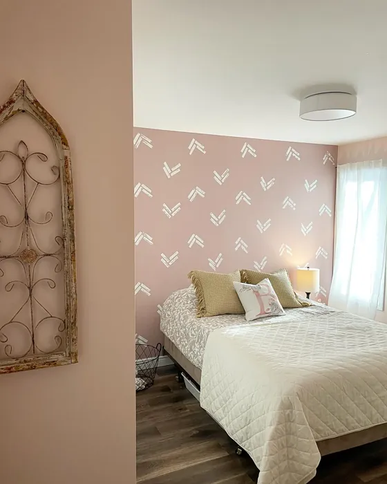
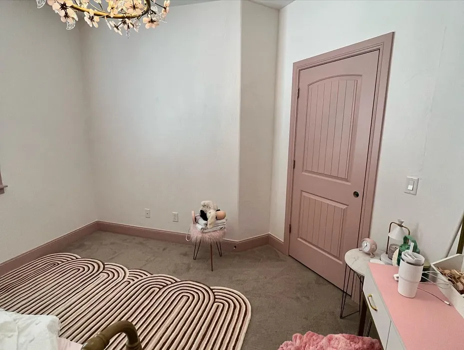
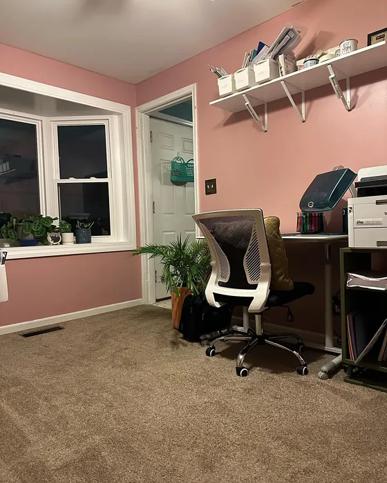
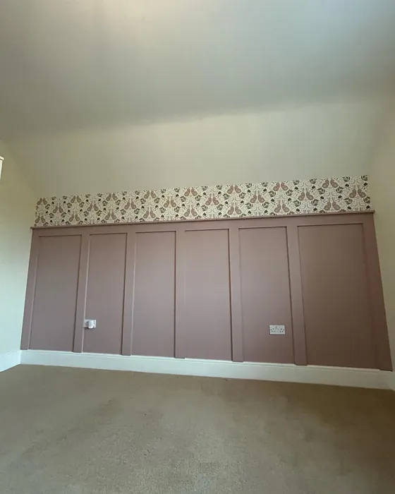
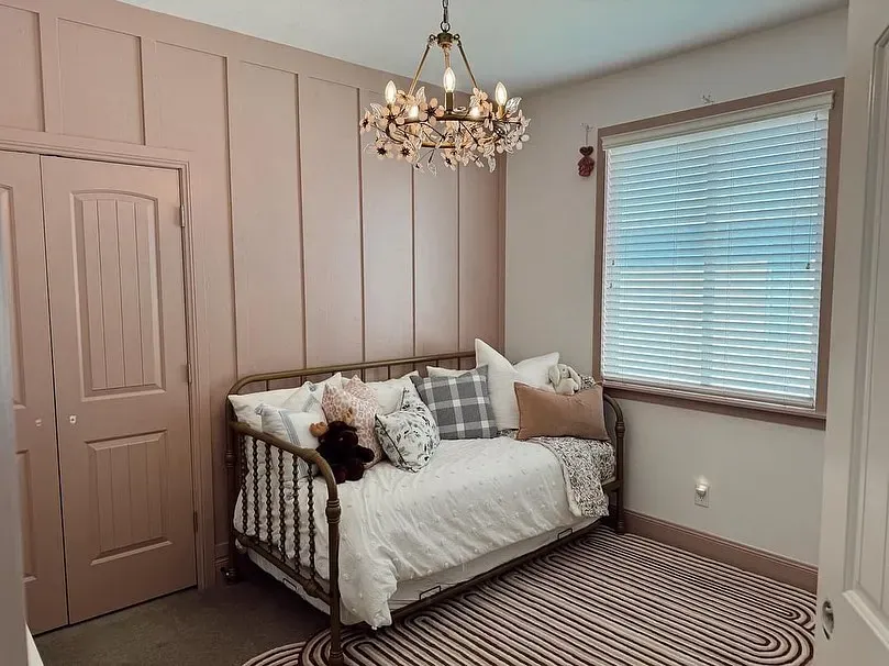
Rose Bisque, with the color code 2102-50, is a delightful blend of warm pink and beige tones. It’s reminiscent of soft, sun-kissed rose petals, exuding a subtle sophistication that can elevate any space. The moment you apply it, you’ll notice that it brings a cozy and inviting atmosphere, making it ideal for creating a serene backdrop in various rooms, like the living room, bedroom, dining room, or home office.
One of the standout features of Rose Bisque is its versatility. This color effortlessly complements a range of decor styles, from bohemian and shabby chic to modern farmhouse and transitional designs. Its warm undertones give it the ability to harmonize beautifully with both warm and cool accents, so whether you’ve got rustic wooden furniture or sleek metal fixtures, Rose Bisque can tie everything together seamlessly.
When it comes to lighting, Rose Bisque shines brightly. In natural light, it appears soft and warm, making your space feel larger and more inviting. Counterintuitively, in dim lighting, it holds onto its charm, though it may appear slightly muted. But be cautious; in rooms with very yellow or overly cool artificial light, the color can shift a bit, so testing it out in your own space is crucial.
The Light Reflectance Value (LRV) of Rose Bisque is 44.08%, which places it in the light medium colors category. This means it reflects roughly half of the incident light. Understanding LRV is essential, as it helps predict how a color will behave in your specific environment. A higher LRV means a color that can help rooms feel more expansive and bright, while a lower LRV creates a cozier atmosphere.
If you’re considering this color for a small space, you’re making a great choice. Rose Bisque’s warm undertones can create a cozy yet open feel, making cramped areas feel more expansive while still being inviting. Pair it with lighter furniture or decor to keep the space from feeling too closed in, and watch how it transforms the room.
Applying Rose Bisque is a breeze, making it beginner-friendly. It dries quickly, and you’ll love how smoothly it goes on, whether you’re using a roller or a brush. Just keep in mind that you might need two coats for optimal coverage, especially if you’re transitioning from a darker shade. But don’t worry, it’s touch-up friendly, so maintaining that perfect finish is easy.
Now, let’s talk about the mood this color sets. Rose Bisque has a calming effect that’s perfect for spaces meant for relaxation or unwinding, such as your living room or bedroom. It creates a restful environment where you can truly escape the hustle and bustle of daily life. Imagine curling up with a book in a softly painted room, surrounded by the warmth of this lovely hue.
While Rose Bisque offers many benefits, there are a couple of things to consider. It may not be the best option for high-traffic areas, as it can be a softer color and might show wear more quickly than darker shades. However, it’s wipeable and washable, so you can keep your walls looking fresh with minimal effort.
When it comes to pairing Rose Bisque with other colors, you’ve got plenty of options. It beautifully complements shades like White Dove, a soft white that brings out the warmth in Rose Bisque, and it works well with brass fixtures, adding a touch of elegance. If you’re looking to create a more dynamic space, consider using it alongside deeper, contrasting hues or even playful accents in green to create a striking visual.
If you’re still pondering whether this shade might clash with your existing decor, remember that the undertones are key. The subtle red undertones of Rose Bisque give it depth, making it a complex color that can shift with light. Testing the paint against your current furniture, flooring, and decor will help you see how it interacts throughout the day.
As a designer, I can assure you that one of the most enjoyable aspects of this color is its adaptability. You can use it as a main wall color, an accent wall, or even on your ceiling to create a unique, inviting space. Whether you want to achieve a cozy nook in your home office or a warm dining room that fosters conversation, Rose Bisque can deliver.
When you step back and admire the finished product, you’ll appreciate how Rose Bisque enhances natural light, creating a bright yet warm ambiance. The color is fundamentally neutral, allowing it to serve as a backdrop that supports your decor choices rather than competing with them.
In summary, Rose Bisque is more than just a beautiful color; it’s a versatile choice that can infuse warmth and sophistication into any room. Its soft, muted tone provides a calming atmosphere, while its ability to adapt to various decor styles makes it a designer favorite. So, if you’re on the fence, grab a sample and see how it turns your space into a delightful sanctuary. You just might find that Rose Bisque is the perfect hue to turn your house into the home you’ve always dreamed of.

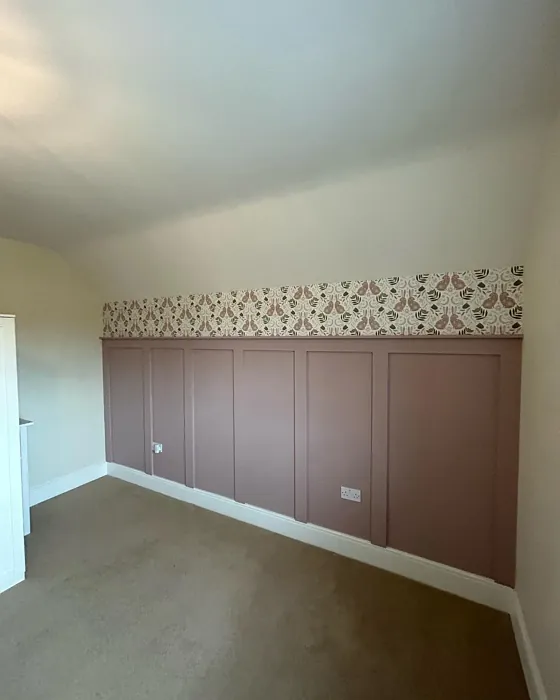
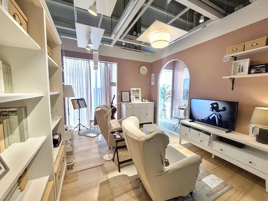
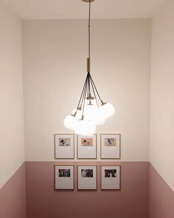
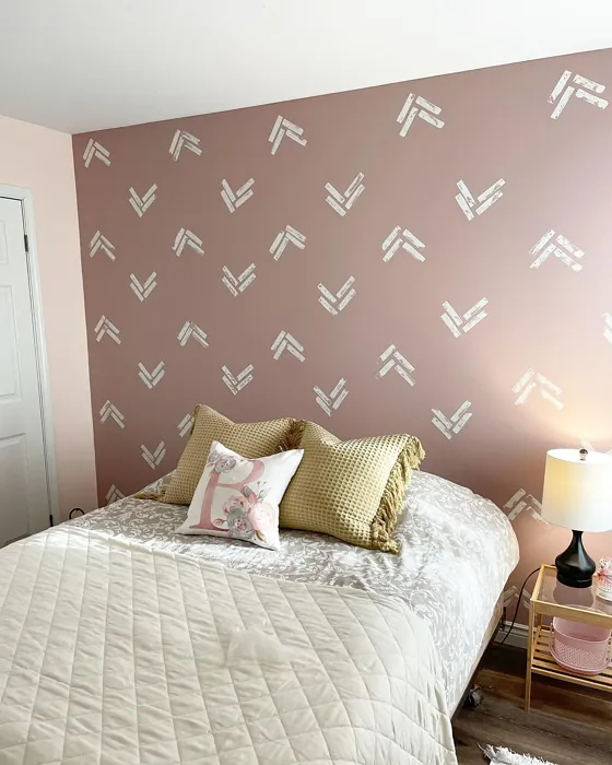
Real Room Photo of Rose Bisque 2102-50
Undertones of Rose Bisque ?
The undertones of Rose Bisque are a key aspect of its character, leaning towards Red. These subtle underlying hues are what give the color its depth and complexity. For example, a gray with a blue undertone will feel cooler and more modern, while one with a brown undertone will feel warmer and more traditional. It’s essential to test this paint in your home and observe it next to your existing furniture, flooring, and decor to see how these undertones interact and reveal themselves throughout the day.
HEX value: #CAABA6
RGB code: 202, 171, 166
Is Rose Bisque Cool or Warm?
This color leans warm but has a balanced quality, making it versatile enough to complement cooler accents without clashing.
Understanding Color Properties and Interior Design Tips
Hue refers to a specific position on the color wheel, measured in degrees from 0 to 360. Each degree represents a different pure color:
- 0° represents red
- 120° represents green
- 240° represents blue
Saturation describes the intensity or purity of a color and is expressed as a percentage:
- At 0%, the color appears completely desaturated—essentially a shade of gray
- At 100%, the color is at its most vivid and vibrant
Lightness indicates how light or dark a color is, also expressed as a percentage:
- 0% lightness results in black
- 100% lightness results in white
Using Warm Colors in Interior Design
Warm hues—such as reds, oranges, yellows, warm beiges, and greiges—are excellent choices for creating inviting and energetic spaces. These colors are particularly well-suited for:
- Kitchens, living rooms, and bathrooms, where warmth enhances comfort and sociability
- Large rooms, where warm tones can help reduce the sense of emptiness and make the space feel more intimate
For example:
- Warm beige shades provide a cozy, inviting atmosphere, ideal for living rooms, bedrooms, and hallways.
- Warm greige (a mix of beige and gray) offers the warmth of beige with the modern appeal of gray, making it a versatile backdrop for dining areas, bedrooms, and living spaces.
However, be mindful when using warm light tones in rooms with limited natural light. These shades may appear muted or even take on an unpleasant yellowish tint. To avoid a dull or flat appearance:
- Add depth by incorporating richer tones like deep greens, charcoal, or chocolate brown
- Use textured elements such as curtains, rugs, or cushions to bring dimension to the space
Pro Tip: Achieving Harmony with Warm and Cool Color Balance
To create a well-balanced and visually interesting interior, mix warm and cool tones strategically. This contrast adds depth and harmony to your design.
- If your walls feature warm hues, introduce cool-colored accents such as blue or green furniture, artwork, or accessories to create contrast.
- For a polished look, consider using a complementary color scheme, which pairs colors opposite each other on the color wheel (e.g., red with green, orange with blue).
This thoughtful mix not only enhances visual appeal but also creates a space that feels both dynamic and cohesive.
Light Temperature Affects on Rose Bisque
Natural Light
Natural daylight changes in color temperature as the sun moves across the sky. At sunrise and sunset, the light tends to have a warm, golden tone with a color temperature around 2000 Kelvin (K). As the day progresses and the sun rises higher, the light becomes cooler and more neutral. Around midday, especially when the sky is clear, natural light typically reaches its peak brightness and shifts to a cooler tone, ranging from 5500 to 6500 Kelvin. This midday light is close to what we perceive as pure white or daylight-balanced light.
These shifts in natural light can significantly influence how colors appear in a space, which is why designers often consider both the time of day and the orientation of windows when planning interior color schemes.
Artificial Light
When choosing artificial lighting, pay close attention to the color temperature, measured in Kelvin (K). This determines how warm or cool the light will appear. Lower temperatures, around 2700K, give off a warm, yellow glow often used in living rooms or bedrooms. Higher temperatures, above 5000K, create a cool, bluish light similar to daylight, commonly used in kitchens, offices, or task areas.
Use the slider to see how lighting temperature can affect the appearance of a surface or color throughout a space.


4800K
LRV of Rose Bisque
The Light Reflectance Value (LRV) of Rose Bisque is 44.08%, which places it in the Light Medium colors category. This means it reflect half of the incident light. Understanding a paint’s LRV is crucial for predicting how it will look in your space. A higher LRV indicates a lighter color that reflects more light, making rooms feel larger and brighter. A lower LRV signifies a darker color that absorbs more light, creating a cozier, more intimate atmosphere. Always consider the natural and artificial lighting in your room when selecting a paint color based on its LRV.
Detailed Review of Rose Bisque
Additional Paint Characteristics
Ideal Rooms
Bedroom, Dining Room, Hallway, Home Office, Living Room
Decor Styles
Bohemian, Modern Farmhouse, Shabby Chic, Transitional
Coverage
Good (1–2 Coats), Touch-Up Friendly
Ease of Application
Beginner Friendly, Brush Smooth, Fast-Drying, Roller-Ready
Washability
Washable, Wipeable
VOC Level
Eco-Certified, Low VOC
Best Use
Accent Wall, Ceiling, Interior Walls
Room Suitability
Bedroom, Dining Room, Home Office, Living Room
Tone Tag
Dusty, Muted, Warm
Finish Type
Eggshell, Matte
Paint Performance
Easy Touch-Up, Low Odor, Quick Drying
Use Cases
Best for Rentals, Best for Small Spaces, Designer Favorite
Mood
Cozy, Inviting, Restful
Trim Pairing
Complements Brass Fixtures, Good with Wood Trim, Pairs with White Dove
Applying Rose Bisque is like wrapping your space in a gentle embrace. Its soft, muted hue works beautifully with a variety of decor styles, from rustic farmhouse to modern chic. The color has a calming effect, making it perfect for spaces where you want to relax or unwind. If you’re worried about the color being too bold, fear not! It maintains a lovely balance that can brighten a room without overwhelming it. Whether used as an accent or a main wall color, Rose Bisque enhances the natural light in your home, creating a warm and inviting atmosphere. Just be prepared to apply two coats for optimal coverage, especially if you’re covering a darker color.
Pros & Cons of 2102-50 Rose Bisque
Pros
Cons
Colors that go with Benjamin Moore Rose Bisque
FAQ on 2102-50 Rose Bisque
How does Rose Bisque perform in different lighting?
Rose Bisque shines in natural light, appearing soft and warm, which can make spaces feel larger and more inviting. In dim lighting, it retains its charm, though it may appear slightly muted. For spaces with artificial lighting, the color tends to maintain its warmth, but be cautious about using it in rooms with very yellow or overly cool light, as this might change its perceived hue.
Is Rose Bisque suitable for small spaces?
Absolutely! Rose Bisque is ideal for small spaces as its warm undertones can create a cozy yet open feel. It can help make cramped areas feel more expansive while still being inviting. Just remember to pair it with lighter furniture or decor to keep the space from feeling too closed in.
Comparisons Rose Bisque with other colors
Rose Bisque 2102-50 vs Realist Beige SW 6078
| Attribute | Rose Bisque 2102-50 | Realist Beige SW 6078 |
|---|---|---|
| Color Name | Rose Bisque 2102-50 | Realist Beige SW 6078 |
| Color | ||
| Hue | Pink | Pink |
| Brightness | Medium | Medium |
| RGB | 202, 171, 166 | 211, 200, 189 |
| LRV | 44.08% | 34% |
| Finish Type | Eggshell, Matte | Eggshell, Matte, Satin |
| Finish Options | Eggshell, Matte, Satin | Eggshell, Matte, Satin |
| Ideal Rooms | Bedroom, Dining Room, Hallway, Home Office, Living Room | Bedroom, Dining Room, Entryway, Home Office, Kitchen, Living Room |
| Decor Styles | Bohemian, Modern Farmhouse, Shabby Chic, Transitional | Contemporary, Minimalist, Modern Farmhouse, Rustic, Traditional |
| Coverage | Good (1–2 Coats), Touch-Up Friendly | Good (1–2 Coats), Touch-Up Friendly |
| Ease of Application | Beginner Friendly, Brush Smooth, Fast-Drying, Roller-Ready | Beginner Friendly, Brush Smooth, Fast-Drying, Roller-Ready |
| Washability | Washable, Wipeable | Washable, Wipeable |
| Room Suitability | Bedroom, Dining Room, Home Office, Living Room | Bedroom, Dining Room, Home Office, Kitchen, Living Room |
| Tone | Dusty, Muted, Warm | Earthy, Neutral, Warm |
| Paint Performance | Easy Touch-Up, Low Odor, Quick Drying | High Coverage, Low Odor, Quick Drying |
Rose Bisque 2102-50 vs Rosaline Pearl SW 9077
| Attribute | Rose Bisque 2102-50 | Rosaline Pearl SW 9077 |
|---|---|---|
| Color Name | Rose Bisque 2102-50 | Rosaline Pearl SW 9077 |
| Color | ||
| Hue | Pink | Pink |
| Brightness | Medium | Medium |
| RGB | 202, 171, 166 | 163, 136, 135 |
| LRV | 44.08% | 69% |
| Finish Type | Eggshell, Matte | Eggshell, Matte |
| Finish Options | Eggshell, Matte, Satin | Eggshell, Matte, Satin |
| Ideal Rooms | Bedroom, Dining Room, Hallway, Home Office, Living Room | Bedroom, Dining Room, Home Office, Living Room |
| Decor Styles | Bohemian, Modern Farmhouse, Shabby Chic, Transitional | Bohemian, Contemporary, Modern, Transitional |
| Coverage | Good (1–2 Coats), Touch-Up Friendly | Good (1–2 Coats) |
| Ease of Application | Beginner Friendly, Brush Smooth, Fast-Drying, Roller-Ready | Beginner Friendly, Brush Smooth, Fast-Drying, Roller-Ready |
| Washability | Washable, Wipeable | Washable, Wipeable |
| Room Suitability | Bedroom, Dining Room, Home Office, Living Room | Bedroom, Dining Room, Home Office, Living Room |
| Tone | Dusty, Muted, Warm | Dusty, Muted, Warm |
| Paint Performance | Easy Touch-Up, Low Odor, Quick Drying | Easy Touch-Up, Fade Resistant, Low Odor |
Rose Bisque 2102-50 vs Cabbage Rose SW 0003
| Attribute | Rose Bisque 2102-50 | Cabbage Rose SW 0003 |
|---|---|---|
| Color Name | Rose Bisque 2102-50 | Cabbage Rose SW 0003 |
| Color | ||
| Hue | Pink | Pink |
| Brightness | Medium | Medium |
| RGB | 202, 171, 166 | 197, 159, 145 |
| LRV | 44.08% | 15% |
| Finish Type | Eggshell, Matte | Eggshell, Matte, Satin |
| Finish Options | Eggshell, Matte, Satin | Eggshell, Matte, Satin |
| Ideal Rooms | Bedroom, Dining Room, Hallway, Home Office, Living Room | Bedroom, Dining Room, Hallway, Living Room, Nursery |
| Decor Styles | Bohemian, Modern Farmhouse, Shabby Chic, Transitional | Cottage, Modern Farmhouse, Romantic, Shabby Chic, Vintage |
| Coverage | Good (1–2 Coats), Touch-Up Friendly | Good (1–2 Coats), Touch-Up Friendly |
| Ease of Application | Beginner Friendly, Brush Smooth, Fast-Drying, Roller-Ready | Beginner Friendly, Brush Smooth, Roller-Ready |
| Washability | Washable, Wipeable | Washable, Wipeable |
| Room Suitability | Bedroom, Dining Room, Home Office, Living Room | Bedroom, Dining Room, Hallway, Living Room, Nursery |
| Tone | Dusty, Muted, Warm | Earthy, Muted, Warm |
| Paint Performance | Easy Touch-Up, Low Odor, Quick Drying | Easy Touch-Up, Low Odor |
Rose Bisque 2102-50 vs Sashay Sand SW 6051
| Attribute | Rose Bisque 2102-50 | Sashay Sand SW 6051 |
|---|---|---|
| Color Name | Rose Bisque 2102-50 | Sashay Sand SW 6051 |
| Color | ||
| Hue | Pink | Pink |
| Brightness | Medium | Medium |
| RGB | 202, 171, 166 | 207, 180, 168 |
| LRV | 44.08% | 64% |
| Finish Type | Eggshell, Matte | Eggshell, Matte, Satin |
| Finish Options | Eggshell, Matte, Satin | Eggshell, Matte, Satin |
| Ideal Rooms | Bedroom, Dining Room, Hallway, Home Office, Living Room | Bedroom, Dining Room, Home Office, Kitchen, Living Room |
| Decor Styles | Bohemian, Modern Farmhouse, Shabby Chic, Transitional | Bohemian, Contemporary, Modern Farmhouse, Scandinavian, Transitional |
| Coverage | Good (1–2 Coats), Touch-Up Friendly | Good (1–2 Coats), Touch-Up Friendly |
| Ease of Application | Beginner Friendly, Brush Smooth, Fast-Drying, Roller-Ready | Beginner Friendly, Fast-Drying, Roller-Ready |
| Washability | Washable, Wipeable | Highly Washable, Washable |
| Room Suitability | Bedroom, Dining Room, Home Office, Living Room | Bedroom, Dining Room, Home Office, Kitchen, Living Room |
| Tone | Dusty, Muted, Warm | Earthy, Muted, Warm |
| Paint Performance | Easy Touch-Up, Low Odor, Quick Drying | Easy Touch-Up, Low Odor, Quick Drying, Scuff Resistant |
Rose Bisque 2102-50 vs Touch of Sand SW 9085
| Attribute | Rose Bisque 2102-50 | Touch of Sand SW 9085 |
|---|---|---|
| Color Name | Rose Bisque 2102-50 | Touch of Sand SW 9085 |
| Color | ||
| Hue | Pink | Pink |
| Brightness | Medium | Medium |
| RGB | 202, 171, 166 | 213, 199, 186 |
| LRV | 44.08% | 66% |
| Finish Type | Eggshell, Matte | Eggshell, Matte, Satin |
| Finish Options | Eggshell, Matte, Satin | Eggshell, Matte, Satin |
| Ideal Rooms | Bedroom, Dining Room, Hallway, Home Office, Living Room | Bathroom, Bedroom, Dining Room, Home Office, Kitchen, Living Room |
| Decor Styles | Bohemian, Modern Farmhouse, Shabby Chic, Transitional | Bohemian, Coastal, Contemporary, Modern Farmhouse, Rustic |
| Coverage | Good (1–2 Coats), Touch-Up Friendly | Good (1–2 Coats), Touch-Up Friendly |
| Ease of Application | Beginner Friendly, Brush Smooth, Fast-Drying, Roller-Ready | Beginner Friendly, Brush Smooth, Fast-Drying, Roller-Ready |
| Washability | Washable, Wipeable | Washable, Wipeable |
| Room Suitability | Bedroom, Dining Room, Home Office, Living Room | Bathroom, Bedroom, Dining Room, Home Office, Kitchen, Living Room |
| Tone | Dusty, Muted, Warm | Earthy, Muted, Neutral, Warm |
| Paint Performance | Easy Touch-Up, Low Odor, Quick Drying | Easy Touch-Up, Low Odor, Quick Drying, Scuff Resistant |
Rose Bisque 2102-50 vs Pink Shadow SW 0070
| Attribute | Rose Bisque 2102-50 | Pink Shadow SW 0070 |
|---|---|---|
| Color Name | Rose Bisque 2102-50 | Pink Shadow SW 0070 |
| Color | ||
| Hue | Pink | Pink |
| Brightness | Medium | Medium |
| RGB | 202, 171, 166 | 222, 195, 185 |
| LRV | 44.08% | 45% |
| Finish Type | Eggshell, Matte | Eggshell, Matte, Satin |
| Finish Options | Eggshell, Matte, Satin | Eggshell, Matte, Satin |
| Ideal Rooms | Bedroom, Dining Room, Hallway, Home Office, Living Room | Bedroom, Dining Room, Home Office, Living Room, Nursery |
| Decor Styles | Bohemian, Modern Farmhouse, Shabby Chic, Transitional | Bohemian, Minimalist, Modern Farmhouse, Scandinavian, Traditional |
| Coverage | Good (1–2 Coats), Touch-Up Friendly | Good (1–2 Coats) |
| Ease of Application | Beginner Friendly, Brush Smooth, Fast-Drying, Roller-Ready | Beginner Friendly, Brush Smooth, Fast-Drying, Roller-Ready |
| Washability | Washable, Wipeable | Washable, Wipeable |
| Room Suitability | Bedroom, Dining Room, Home Office, Living Room | Bedroom, Dining Room, Living Room, Nursery |
| Tone | Dusty, Muted, Warm | Muted, Pastel, Warm |
| Paint Performance | Easy Touch-Up, Low Odor, Quick Drying | Easy Touch-Up, High Coverage, Low Odor |
Rose Bisque 2102-50 vs Hushed Auburn SW 9080
| Attribute | Rose Bisque 2102-50 | Hushed Auburn SW 9080 |
|---|---|---|
| Color Name | Rose Bisque 2102-50 | Hushed Auburn SW 9080 |
| Color | ||
| Hue | Pink | Pink |
| Brightness | Medium | Medium |
| RGB | 202, 171, 166 | 168, 133, 122 |
| LRV | 44.08% | 12% |
| Finish Type | Eggshell, Matte | Eggshell, Matte, Satin |
| Finish Options | Eggshell, Matte, Satin | Eggshell, Matte, Satin |
| Ideal Rooms | Bedroom, Dining Room, Hallway, Home Office, Living Room | Bedroom, Dining Room, Home Office, Living Room |
| Decor Styles | Bohemian, Modern Farmhouse, Shabby Chic, Transitional | Contemporary, Modern Farmhouse, Rustic, Transitional |
| Coverage | Good (1–2 Coats), Touch-Up Friendly | Good (1–2 Coats), Touch-Up Friendly |
| Ease of Application | Beginner Friendly, Brush Smooth, Fast-Drying, Roller-Ready | Beginner Friendly, Brush Smooth, Fast-Drying, Roller-Ready |
| Washability | Washable, Wipeable | Washable, Wipeable |
| Room Suitability | Bedroom, Dining Room, Home Office, Living Room | Bedroom, Dining Room, Home Office, Living Room |
| Tone | Dusty, Muted, Warm | Earthy, Muted, Warm |
| Paint Performance | Easy Touch-Up, Low Odor, Quick Drying | Easy Touch-Up, High Coverage, Low Odor |
Rose Bisque 2102-50 vs Likeable Sand SW 6058
| Attribute | Rose Bisque 2102-50 | Likeable Sand SW 6058 |
|---|---|---|
| Color Name | Rose Bisque 2102-50 | Likeable Sand SW 6058 |
| Color | ||
| Hue | Pink | Pink |
| Brightness | Medium | Medium |
| RGB | 202, 171, 166 | 209, 183, 168 |
| LRV | 44.08% | 61% |
| Finish Type | Eggshell, Matte | Eggshell, Matte, Satin |
| Finish Options | Eggshell, Matte, Satin | Eggshell, Matte, Satin |
| Ideal Rooms | Bedroom, Dining Room, Hallway, Home Office, Living Room | Bedroom, Dining Room, Home Office, Kitchen, Living Room |
| Decor Styles | Bohemian, Modern Farmhouse, Shabby Chic, Transitional | Bohemian, Coastal, Contemporary, Modern Farmhouse, Rustic |
| Coverage | Good (1–2 Coats), Touch-Up Friendly | Good (1–2 Coats), Touch-Up Friendly |
| Ease of Application | Beginner Friendly, Brush Smooth, Fast-Drying, Roller-Ready | Beginner Friendly, Brush Smooth, Fast-Drying, Roller-Ready |
| Washability | Washable, Wipeable | Washable, Wipeable |
| Room Suitability | Bedroom, Dining Room, Home Office, Living Room | Bedroom, Dining Room, Home Office, Kitchen, Living Room |
| Tone | Dusty, Muted, Warm | Earthy, Muted, Warm |
| Paint Performance | Easy Touch-Up, Low Odor, Quick Drying | Easy Touch-Up, Low Odor, Quick Drying |
Rose Bisque 2102-50 vs Glamour SW 6031
| Attribute | Rose Bisque 2102-50 | Glamour SW 6031 |
|---|---|---|
| Color Name | Rose Bisque 2102-50 | Glamour SW 6031 |
| Color | ||
| Hue | Pink | Pink |
| Brightness | Medium | Medium |
| RGB | 202, 171, 166 | 182, 160, 154 |
| LRV | 44.08% | 30% |
| Finish Type | Eggshell, Matte | Eggshell, Matte, Satin |
| Finish Options | Eggshell, Matte, Satin | Eggshell, Matte, Satin |
| Ideal Rooms | Bedroom, Dining Room, Hallway, Home Office, Living Room | Bedroom, Dining Room, Home Office, Living Room |
| Decor Styles | Bohemian, Modern Farmhouse, Shabby Chic, Transitional | Bohemian, Classic, Modern, Transitional |
| Coverage | Good (1–2 Coats), Touch-Up Friendly | Good (1–2 Coats) |
| Ease of Application | Beginner Friendly, Brush Smooth, Fast-Drying, Roller-Ready | Beginner Friendly, Brush Smooth, Fast-Drying, Roller-Ready |
| Washability | Washable, Wipeable | Scrubbable, Washable |
| Room Suitability | Bedroom, Dining Room, Home Office, Living Room | Bedroom, Dining Room, Home Office, Living Room |
| Tone | Dusty, Muted, Warm | Balanced, Neutral, Warm |
| Paint Performance | Easy Touch-Up, Low Odor, Quick Drying | Easy Touch-Up, Low Odor, Quick Drying |
Rose Bisque 2102-50 vs Temperate Taupe SW 6037
| Attribute | Rose Bisque 2102-50 | Temperate Taupe SW 6037 |
|---|---|---|
| Color Name | Rose Bisque 2102-50 | Temperate Taupe SW 6037 |
| Color | ||
| Hue | Pink | Pink |
| Brightness | Medium | Medium |
| RGB | 202, 171, 166 | 191, 177, 170 |
| LRV | 44.08% | 34% |
| Finish Type | Eggshell, Matte | Eggshell, Matte, Satin |
| Finish Options | Eggshell, Matte, Satin | Eggshell, Matte, Satin |
| Ideal Rooms | Bedroom, Dining Room, Hallway, Home Office, Living Room | Bedroom, Dining Room, Home Office, Kitchen, Living Room |
| Decor Styles | Bohemian, Modern Farmhouse, Shabby Chic, Transitional | Bohemian, Modern Farmhouse, Rustic, Transitional |
| Coverage | Good (1–2 Coats), Touch-Up Friendly | Good (1–2 Coats), Touch-Up Friendly |
| Ease of Application | Beginner Friendly, Brush Smooth, Fast-Drying, Roller-Ready | Beginner Friendly, Brush Smooth, Fast-Drying, Roller-Ready |
| Washability | Washable, Wipeable | Highly Washable, Washable |
| Room Suitability | Bedroom, Dining Room, Home Office, Living Room | Bedroom, Dining Room, Home Office, Living Room |
| Tone | Dusty, Muted, Warm | Earthy, Neutral, Warm |
| Paint Performance | Easy Touch-Up, Low Odor, Quick Drying | Long Lasting, Low Odor, Quick Drying, Scuff Resistant |
Official Page of Benjamin Moore Rose Bisque 2102-50