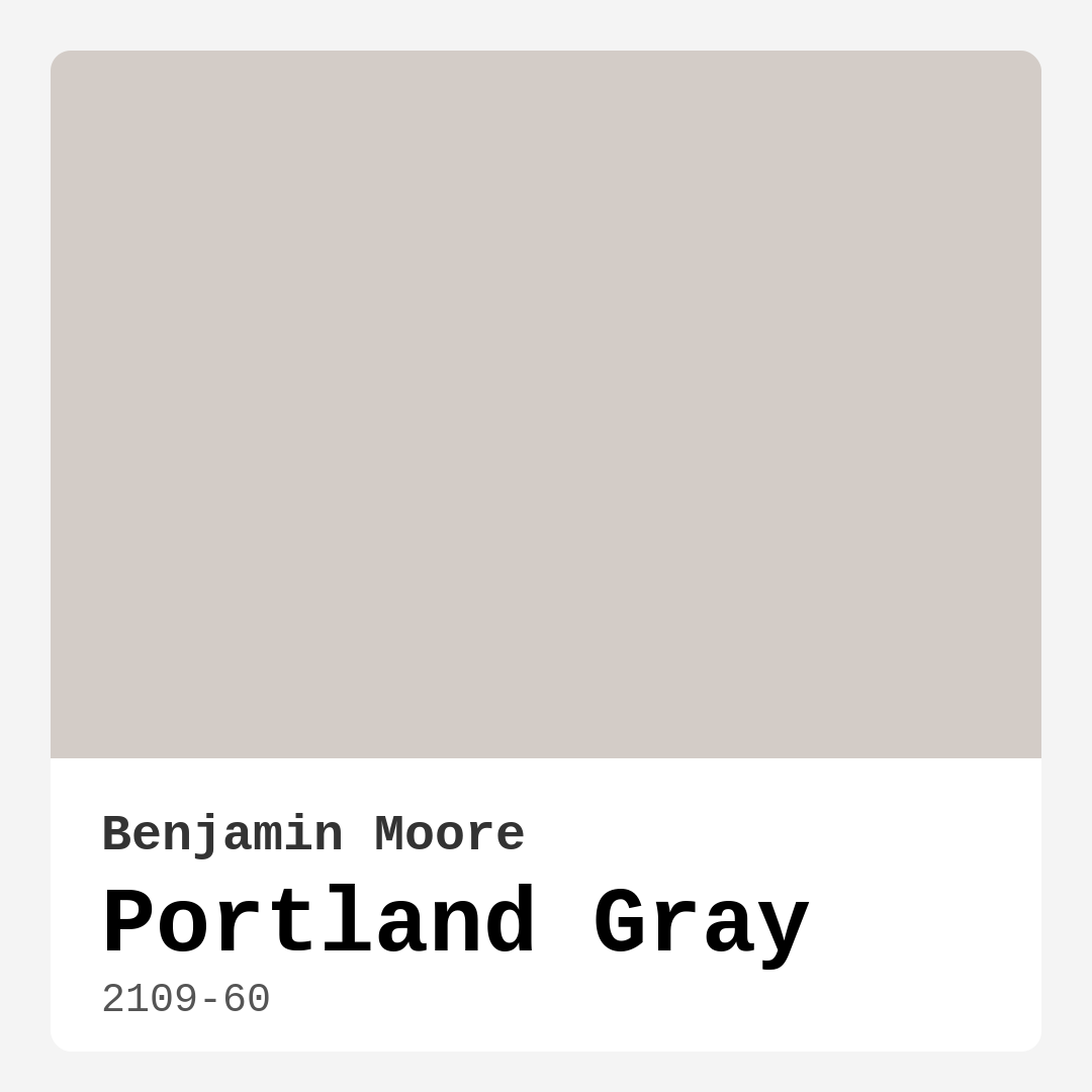
Color Preview & Key Details
| HEX Code | #D3CCC7 |
| RGB | 211, 204, 199 |
| LRV | 60.21% |
| Undertone | Red |
| Finish Options | Eggshell, Matte, Satin |
—
Imagine walking into a room that instantly makes you exhale—soft, soothing, and effortlessly stylish. That’s the magic of Benjamin Moore’s Portland Gray (2109-60). It’s one of those colors that doesn’t shout for attention but quietly elevates everything around it. Whether you’re refreshing a tired living room, creating a serene bedroom retreat, or designing a home office that sparks focus, this shade might just be your perfect match. Let’s dive into why Portland Gray could be the hero your space needs.
First, let’s talk about what makes this color special. Portland Gray is a light, warm gray with subtle red undertones, giving it a gentle pink hue that adds depth without overwhelming. Its LRV (Light Reflectance Value) of 60.21% means it reflects plenty of light, making rooms feel airy and bright—ideal for smaller spaces or areas with limited natural light. But don’t mistake “light” for “bland.” This color has a quiet sophistication that adapts to your decor, whether you’re leaning modern, Scandinavian, farmhouse, or even industrial.
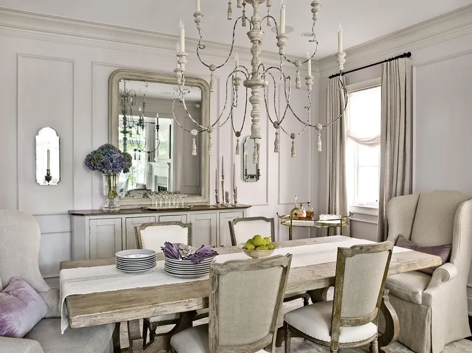
One of the biggest wins with Portland Gray is its versatility. It plays well with almost any style. Pair it with crisp white trim like Benjamin Moore’s White Dove for a clean, classic look. Or, if you’re feeling bold, contrast it with deeper greens or blues for a striking accent wall. The red undertones mean it harmonizes beautifully with warm woods, leather furniture, and earthy textiles, creating a cozy yet polished vibe. And because it’s so balanced, it won’t clash with your existing pieces—making it a safe bet if you’re not ready to overhaul your entire decor.
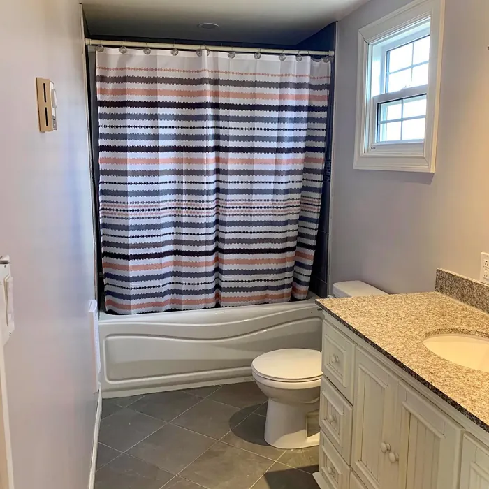
Application is a breeze, even if you’re a DIY beginner. Portland Gray offers excellent coverage, often needing just one or two coats for a flawless finish. It’s roller-ready, brushes on smoothly, and dries quickly, so you won’t be waiting around forever to admire your handiwork. Choose a matte finish for a velvety, low-sheen look in bedrooms or home offices, or opt for eggshell or satin in high-traffic areas like living rooms and hallways for added durability and washability.
Now, let’s address the elephant in the room: lighting. Like any paint color, Portland Gray can shift slightly depending on your light sources. In sun-drenched rooms, it’ll feel fresh and luminous, with those warm undertones adding just a hint of softness. In spaces with less natural light or cooler artificial lighting, it may appear a touch deeper and more muted—still inviting, but cozier. Always test a swatch on your walls and observe it at different times of day. Trust me, this step saves so much regret later.
Worried about small spaces? Don’t be. Portland Gray is a champion for making cramped rooms feel larger. Its light-reflecting properties open up walls, while the warm undertones keep the space from feeling sterile. Just avoid pairing it with overly dark furniture or heavy drapes in tight areas; instead, lean into light, airy fabrics and minimalist decor to maximize the effect.
As for maintenance, this paint is a dream. It’s scrubbable, touch-up friendly, and has low VOCs, so you won’t be dealing with harsh fumes during or after painting. It’s a practical choice for busy households, rentals, or anyone who wants a timeless color that won’t demand constant upkeep.
If you’re still on the fence, consider its close cousins: Benjamin Moore’s Gray Owl or Sherwin-Williams’ Repose Gray. These similar shades can help you compare undertones and find your perfect fit. But Portland Gray’s unique blend of warmth and neutrality gives it an edge for creating spaces that feel both current and enduring.
So, is Portland Gray right for you? If you crave a color that’s calming but not cold, versatile but not vague, and stylish but not trendy, the answer is probably yes. It’s the kind of shade that grows with your home, adapting to new furniture, seasons, and even your evolving tastes. Whether you’re painting a single room or your entire house, this understated hue has the power to transform your space into a sanctuary—one brushstroke at a time.
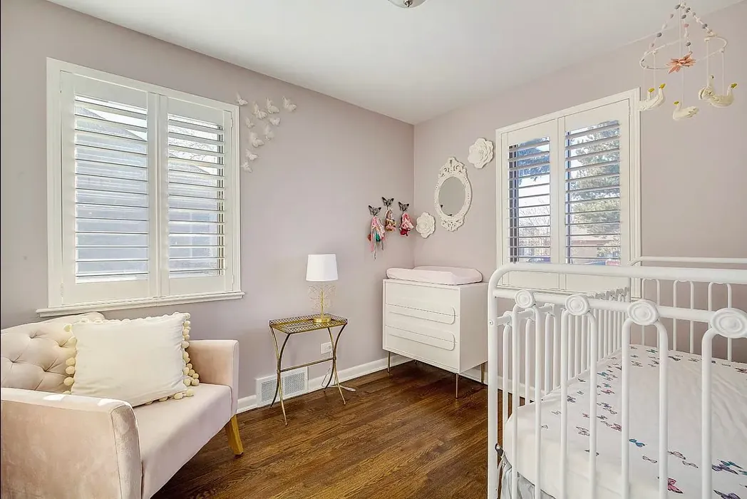
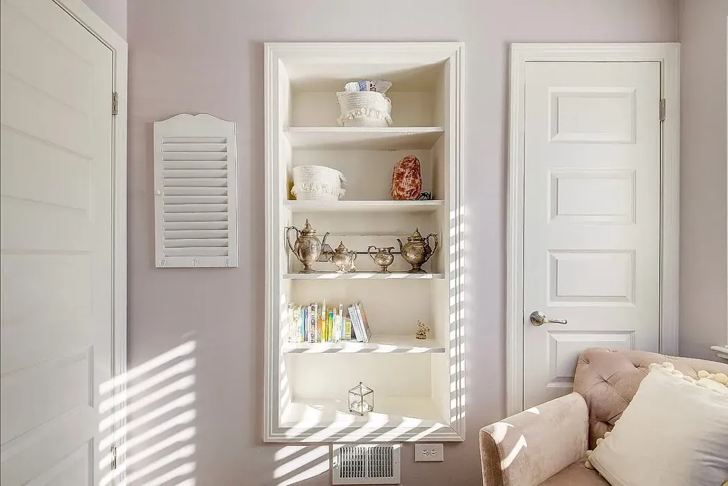
Real Room Photo of Portland Gray 2109-60
Undertones of Portland Gray ?
The undertones of Portland Gray are a key aspect of its character, leaning towards Red. These subtle underlying hues are what give the color its depth and complexity. For example, a gray with a blue undertone will feel cooler and more modern, while one with a brown undertone will feel warmer and more traditional. It’s essential to test this paint in your home and observe it next to your existing furniture, flooring, and decor to see how these undertones interact and reveal themselves throughout the day.
HEX value: #D3CCC7
RGB code: 211, 204, 199
Is Portland Gray Cool or Warm?
This color leans towards the warm end of the spectrum, thanks to its gentle beige undertones. However, it maintains a balanced appearance that allows it to adapt to various lighting conditions. You’ll notice that it can appear cooler in bright light but retains a warm essence in softer lighting.
Understanding Color Properties and Interior Design Tips
Hue refers to a specific position on the color wheel, measured in degrees from 0 to 360. Each degree represents a different pure color:
- 0° represents red
- 120° represents green
- 240° represents blue
Saturation describes the intensity or purity of a color and is expressed as a percentage:
- At 0%, the color appears completely desaturated—essentially a shade of gray
- At 100%, the color is at its most vivid and vibrant
Lightness indicates how light or dark a color is, also expressed as a percentage:
- 0% lightness results in black
- 100% lightness results in white
Using Warm Colors in Interior Design
Warm hues—such as reds, oranges, yellows, warm beiges, and greiges—are excellent choices for creating inviting and energetic spaces. These colors are particularly well-suited for:
- Kitchens, living rooms, and bathrooms, where warmth enhances comfort and sociability
- Large rooms, where warm tones can help reduce the sense of emptiness and make the space feel more intimate
For example:
- Warm beige shades provide a cozy, inviting atmosphere, ideal for living rooms, bedrooms, and hallways.
- Warm greige (a mix of beige and gray) offers the warmth of beige with the modern appeal of gray, making it a versatile backdrop for dining areas, bedrooms, and living spaces.
However, be mindful when using warm light tones in rooms with limited natural light. These shades may appear muted or even take on an unpleasant yellowish tint. To avoid a dull or flat appearance:
- Add depth by incorporating richer tones like deep greens, charcoal, or chocolate brown
- Use textured elements such as curtains, rugs, or cushions to bring dimension to the space
Pro Tip: Achieving Harmony with Warm and Cool Color Balance
To create a well-balanced and visually interesting interior, mix warm and cool tones strategically. This contrast adds depth and harmony to your design.
- If your walls feature warm hues, introduce cool-colored accents such as blue or green furniture, artwork, or accessories to create contrast.
- For a polished look, consider using a complementary color scheme, which pairs colors opposite each other on the color wheel (e.g., red with green, orange with blue).
This thoughtful mix not only enhances visual appeal but also creates a space that feels both dynamic and cohesive.
Light Temperature Affects on Portland Gray
Natural Light
Natural daylight changes in color temperature as the sun moves across the sky. At sunrise and sunset, the light tends to have a warm, golden tone with a color temperature around 2000 Kelvin (K). As the day progresses and the sun rises higher, the light becomes cooler and more neutral. Around midday, especially when the sky is clear, natural light typically reaches its peak brightness and shifts to a cooler tone, ranging from 5500 to 6500 Kelvin. This midday light is close to what we perceive as pure white or daylight-balanced light.
These shifts in natural light can significantly influence how colors appear in a space, which is why designers often consider both the time of day and the orientation of windows when planning interior color schemes.
Artificial Light
When choosing artificial lighting, pay close attention to the color temperature, measured in Kelvin (K). This determines how warm or cool the light will appear. Lower temperatures, around 2700K, give off a warm, yellow glow often used in living rooms or bedrooms. Higher temperatures, above 5000K, create a cool, bluish light similar to daylight, commonly used in kitchens, offices, or task areas.
Use the slider to see how lighting temperature can affect the appearance of a surface or color throughout a space.


4800K
LRV of Portland Gray
The Light Reflectance Value (LRV) of Portland Gray is 60.21%, which places it in the Light colors category. This means it reflect most of the incident light. Understanding a paint’s LRV is crucial for predicting how it will look in your space. A higher LRV indicates a lighter color that reflects more light, making rooms feel larger and brighter. A lower LRV signifies a darker color that absorbs more light, creating a cozier, more intimate atmosphere. Always consider the natural and artificial lighting in your room when selecting a paint color based on its LRV.
Detailed Review of Portland Gray
Additional Paint Characteristics
Ideal Rooms
Bedroom, Hallway, Home Office, Kitchen, Living Room
Decor Styles
Farmhouse, Industrial, Modern, Scandinavian
Coverage
Good (1–2 Coats), Touch-Up Friendly
Ease of Application
Beginner Friendly, Brush Smooth, Fast-Drying, Roller-Ready
Washability
Scrubbable, Washable
VOC Level
Low VOC
Best Use
Accent Wall, Interior Walls, Trim
Room Suitability
Bedroom, Hallway, Home Office, Living Room
Tone Tag
Balanced, Muted, Warm
Finish Type
Eggshell, Matte, Satin
Paint Performance
Easy Touch-Up, Low Odor, Quick Drying
Use Cases
Best for Rentals, Best for Small Spaces, Classic Favorite
Mood
Calm, Cozy, Inviting
Trim Pairing
Complements Cool Trim, Matches Pure White, Pairs with White Dove
Portland Gray stands out for its versatility and understated elegance. The color strikes a perfect balance between warm and cool tones, making it a suitable backdrop for both bright and muted decor. It works beautifully in well-lit spaces, enhancing natural light while still providing a sense of warmth. Its soft appearance helps to create an inviting atmosphere, making it ideal for gathering areas like living rooms and bedrooms.
When applying Portland Gray, you’ll find it easy to work with, gliding on smoothly whether you choose a brush or roller. The excellent coverage provided by this paint means that you may only need one or two coats to achieve a uniform finish, saving you time and effort. Its subtlety allows it to pair well with a variety of trim colors, making it a flexible choice for any home renovation project. Overall, Portland Gray is a stylish and functional choice that can enhance your home’s aesthetic effortlessly.
Pros & Cons of 2109-60 Portland Gray
Pros
Cons
Colors that go with Benjamin Moore Portland Gray
FAQ on 2109-60 Portland Gray
What type of finish should I choose for Portland Gray?
When selecting a finish for Portland Gray, you’ll want to consider the room’s function and desired look. Matte finishes offer a soft, sophisticated look ideal for low-traffic areas. Eggshell or satin finishes provide a slight sheen, making them perfect for living rooms and kitchens where durability and washability are important. Choose what best suits your style and needs!
Can Portland Gray work in small spaces?
Absolutely! Portland Gray is a fantastic choice for small spaces. Its light-reflective properties help to make areas feel larger and more open. Plus, its warm undertones add depth without making the space feel cramped. Just ensure you use good lighting to highlight its beauty!
Comparisons Portland Gray with other colors
Portland Gray 2109-60 vs Malted Milk SW 6057
| Attribute | Portland Gray 2109-60 | Malted Milk SW 6057 |
|---|---|---|
| Color Name | Portland Gray 2109-60 | Malted Milk SW 6057 |
| Color | ||
| Hue | Pink | Pink |
| Brightness | Light | Light |
| RGB | 211, 204, 199 | 222, 202, 189 |
| LRV | 60.21% | 74% |
| Finish Type | Eggshell, Matte, Satin | Eggshell, Satin |
| Finish Options | Eggshell, Matte, Satin | Eggshell, Matte, Satin |
| Ideal Rooms | Bedroom, Hallway, Home Office, Kitchen, Living Room | Bedroom, Dining Room, Kitchen, Living Room, Nursery |
| Decor Styles | Farmhouse, Industrial, Modern, Scandinavian | Coastal, Farmhouse, Modern, Scandinavian, Transitional |
| Coverage | Good (1–2 Coats), Touch-Up Friendly | Good (1–2 Coats), Touch-Up Friendly |
| Ease of Application | Beginner Friendly, Brush Smooth, Fast-Drying, Roller-Ready | Beginner Friendly, Brush Smooth, Fast-Drying, Roller-Ready |
| Washability | Scrubbable, Washable | Washable, Wipeable |
| Room Suitability | Bedroom, Hallway, Home Office, Living Room | Bedroom, Dining Room, Kitchen, Living Room, Nursery |
| Tone | Balanced, Muted, Warm | Creamy, Neutral, Warm |
| Paint Performance | Easy Touch-Up, Low Odor, Quick Drying | High Coverage, Low Odor, Quick Drying |
Portland Gray 2109-60 vs Intimate White SW 6322
| Attribute | Portland Gray 2109-60 | Intimate White SW 6322 |
|---|---|---|
| Color Name | Portland Gray 2109-60 | Intimate White SW 6322 |
| Color | ||
| Hue | Pink | Pink |
| Brightness | Light | Light |
| RGB | 211, 204, 199 | 240, 225, 216 |
| LRV | 60.21% | 75% |
| Finish Type | Eggshell, Matte, Satin | Eggshell, Matte, Satin |
| Finish Options | Eggshell, Matte, Satin | Eggshell, Matte, Satin |
| Ideal Rooms | Bedroom, Hallway, Home Office, Kitchen, Living Room | Bedroom, Hallway, Home Office, Living Room, Nursery |
| Decor Styles | Farmhouse, Industrial, Modern, Scandinavian | Farmhouse, Minimalist, Modern, Traditional |
| Coverage | Good (1–2 Coats), Touch-Up Friendly | Good (1–2 Coats) |
| Ease of Application | Beginner Friendly, Brush Smooth, Fast-Drying, Roller-Ready | Beginner Friendly, Brush Smooth, Roller-Ready |
| Washability | Scrubbable, Washable | Highly Washable, Washable |
| Room Suitability | Bedroom, Hallway, Home Office, Living Room | Bedroom, Hallway, Living Room, Nursery |
| Tone | Balanced, Muted, Warm | Creamy, Muted, Warm |
| Paint Performance | Easy Touch-Up, Low Odor, Quick Drying | Easy Touch-Up, Fade Resistant, Low Odor |
Portland Gray 2109-60 vs Abalone Shell SW 6050
| Attribute | Portland Gray 2109-60 | Abalone Shell SW 6050 |
|---|---|---|
| Color Name | Portland Gray 2109-60 | Abalone Shell SW 6050 |
| Color | ||
| Hue | Pink | Pink |
| Brightness | Light | Light |
| RGB | 211, 204, 199 | 219, 199, 189 |
| LRV | 60.21% | 30% |
| Finish Type | Eggshell, Matte, Satin | Eggshell, Matte, Satin |
| Finish Options | Eggshell, Matte, Satin | Eggshell, Matte, Satin |
| Ideal Rooms | Bedroom, Hallway, Home Office, Kitchen, Living Room | Bedroom, Dining Room, Home Office, Living Room |
| Decor Styles | Farmhouse, Industrial, Modern, Scandinavian | Coastal, Farmhouse, Minimalist, Modern, Traditional |
| Coverage | Good (1–2 Coats), Touch-Up Friendly | Good (1–2 Coats), Touch-Up Friendly |
| Ease of Application | Beginner Friendly, Brush Smooth, Fast-Drying, Roller-Ready | Beginner Friendly, Brush Smooth, Fast-Drying, Roller-Ready |
| Washability | Scrubbable, Washable | Washable, Wipeable |
| Room Suitability | Bedroom, Hallway, Home Office, Living Room | Bedroom, Dining Room, Home Office, Living Room |
| Tone | Balanced, Muted, Warm | Balanced, Muted, Warm |
| Paint Performance | Easy Touch-Up, Low Odor, Quick Drying | Easy Touch-Up, Fade Resistant, Low Odor, Quick Drying |
Portland Gray 2109-60 vs White Truffle SW 6029
| Attribute | Portland Gray 2109-60 | White Truffle SW 6029 |
|---|---|---|
| Color Name | Portland Gray 2109-60 | White Truffle SW 6029 |
| Color | ||
| Hue | Pink | Pink |
| Brightness | Light | Light |
| RGB | 211, 204, 199 | 215, 200, 194 |
| LRV | 60.21% | 48% |
| Finish Type | Eggshell, Matte, Satin | Eggshell, Satin |
| Finish Options | Eggshell, Matte, Satin | Eggshell, Flat, Matte, Satin |
| Ideal Rooms | Bedroom, Hallway, Home Office, Kitchen, Living Room | Bedroom, Dining Room, Hallway, Kitchen, Living Room |
| Decor Styles | Farmhouse, Industrial, Modern, Scandinavian | Eclectic, Farmhouse, Modern, Traditional |
| Coverage | Good (1–2 Coats), Touch-Up Friendly | Good (1–2 Coats), Touch-Up Friendly |
| Ease of Application | Beginner Friendly, Brush Smooth, Fast-Drying, Roller-Ready | Beginner Friendly, Brush Smooth, Roller-Ready |
| Washability | Scrubbable, Washable | Washable, Wipeable |
| Room Suitability | Bedroom, Hallway, Home Office, Living Room | Bedroom, Dining Room, Hallway, Living Room |
| Tone | Balanced, Muted, Warm | Earthy, Neutral, Warm |
| Paint Performance | Easy Touch-Up, Low Odor, Quick Drying | Easy Touch-Up, Low Odor, Scuff Resistant |
Portland Gray 2109-60 vs Faint Coral SW 6329
| Attribute | Portland Gray 2109-60 | Faint Coral SW 6329 |
|---|---|---|
| Color Name | Portland Gray 2109-60 | Faint Coral SW 6329 |
| Color | ||
| Hue | Pink | Pink |
| Brightness | Light | Light |
| RGB | 211, 204, 199 | 238, 222, 213 |
| LRV | 60.21% | 66% |
| Finish Type | Eggshell, Matte, Satin | Eggshell, Matte, Satin |
| Finish Options | Eggshell, Matte, Satin | Eggshell, Matte, Satin |
| Ideal Rooms | Bedroom, Hallway, Home Office, Kitchen, Living Room | Bedroom, Dining Room, Hallway, Living Room, Nursery |
| Decor Styles | Farmhouse, Industrial, Modern, Scandinavian | Bohemian, Coastal, Modern Farmhouse, Scandinavian, Vintage |
| Coverage | Good (1–2 Coats), Touch-Up Friendly | Good (1–2 Coats), Touch-Up Friendly |
| Ease of Application | Beginner Friendly, Brush Smooth, Fast-Drying, Roller-Ready | Beginner Friendly, Brush Smooth, Fast-Drying, Roller-Ready |
| Washability | Scrubbable, Washable | Washable, Wipeable |
| Room Suitability | Bedroom, Hallway, Home Office, Living Room | Bedroom, Dining Room, Hallway, Living Room, Nursery |
| Tone | Balanced, Muted, Warm | Airy, Muted, Pastel, Warm |
| Paint Performance | Easy Touch-Up, Low Odor, Quick Drying | Easy Touch-Up, Low Odor, Quick Drying |
Portland Gray 2109-60 vs Romance SW 6323
| Attribute | Portland Gray 2109-60 | Romance SW 6323 |
|---|---|---|
| Color Name | Portland Gray 2109-60 | Romance SW 6323 |
| Color | ||
| Hue | Pink | Pink |
| Brightness | Light | Light |
| RGB | 211, 204, 199 | 235, 207, 195 |
| LRV | 60.21% | 69% |
| Finish Type | Eggshell, Matte, Satin | Eggshell, Matte |
| Finish Options | Eggshell, Matte, Satin | Eggshell, Flat, Matte, Satin |
| Ideal Rooms | Bedroom, Hallway, Home Office, Kitchen, Living Room | Bedroom, Dining Room, Living Room, Nursery |
| Decor Styles | Farmhouse, Industrial, Modern, Scandinavian | Bohemian, Modern, Shabby Chic, Vintage |
| Coverage | Good (1–2 Coats), Touch-Up Friendly | Good (1–2 Coats), Touch-Up Friendly |
| Ease of Application | Beginner Friendly, Brush Smooth, Fast-Drying, Roller-Ready | Beginner Friendly, Brush Smooth, Fast-Drying, Roller-Ready |
| Washability | Scrubbable, Washable | Washable, Wipeable |
| Room Suitability | Bedroom, Hallway, Home Office, Living Room | Bedroom, Dining Room, Living Room, Nursery |
| Tone | Balanced, Muted, Warm | Pastel, Soft, Warm |
| Paint Performance | Easy Touch-Up, Low Odor, Quick Drying | Easy Touch-Up, Low Odor, Quick Drying |
Portland Gray 2109-60 vs Innocence SW 6302
| Attribute | Portland Gray 2109-60 | Innocence SW 6302 |
|---|---|---|
| Color Name | Portland Gray 2109-60 | Innocence SW 6302 |
| Color | ||
| Hue | Pink | Pink |
| Brightness | Light | Light |
| RGB | 211, 204, 199 | 235, 209, 207 |
| LRV | 60.21% | 75% |
| Finish Type | Eggshell, Matte, Satin | Eggshell, Matte |
| Finish Options | Eggshell, Matte, Satin | Eggshell, Matte, Satin |
| Ideal Rooms | Bedroom, Hallway, Home Office, Kitchen, Living Room | Bedroom, Dining Room, Living Room, Nursery |
| Decor Styles | Farmhouse, Industrial, Modern, Scandinavian | Bohemian, Modern Farmhouse, Scandinavian, Shabby Chic |
| Coverage | Good (1–2 Coats), Touch-Up Friendly | Good (1–2 Coats), Touch-Up Friendly |
| Ease of Application | Beginner Friendly, Brush Smooth, Fast-Drying, Roller-Ready | Beginner Friendly, Brush Smooth, Roller-Ready |
| Washability | Scrubbable, Washable | Washable, Wipeable |
| Room Suitability | Bedroom, Hallway, Home Office, Living Room | Bedroom, Dining Room, Living Room, Nursery |
| Tone | Balanced, Muted, Warm | Pastel, Soft, Warm |
| Paint Performance | Easy Touch-Up, Low Odor, Quick Drying | Easy Touch-Up, Fade Resistant, Low Odor |
Portland Gray 2109-60 vs Angelic SW 6602
| Attribute | Portland Gray 2109-60 | Angelic SW 6602 |
|---|---|---|
| Color Name | Portland Gray 2109-60 | Angelic SW 6602 |
| Color | ||
| Hue | Pink | Pink |
| Brightness | Light | Light |
| RGB | 211, 204, 199 | 242, 220, 215 |
| LRV | 60.21% | 75% |
| Finish Type | Eggshell, Matte, Satin | Eggshell, Satin |
| Finish Options | Eggshell, Matte, Satin | Eggshell, Flat, Matte, Satin |
| Ideal Rooms | Bedroom, Hallway, Home Office, Kitchen, Living Room | Bedroom, Dining Room, Home Office, Living Room, Nursery |
| Decor Styles | Farmhouse, Industrial, Modern, Scandinavian | Bohemian, Farmhouse, Modern, Transitional |
| Coverage | Good (1–2 Coats), Touch-Up Friendly | Good (1–2 Coats), Touch-Up Friendly |
| Ease of Application | Beginner Friendly, Brush Smooth, Fast-Drying, Roller-Ready | Beginner Friendly, Brush Smooth, Roller-Ready |
| Washability | Scrubbable, Washable | Washable, Wipeable |
| Room Suitability | Bedroom, Hallway, Home Office, Living Room | Bedroom, Home Office, Living Room, Nursery |
| Tone | Balanced, Muted, Warm | Airy, Pastel, Warm |
| Paint Performance | Easy Touch-Up, Low Odor, Quick Drying | Easy Touch-Up, Fade Resistant, Low Odor |
Portland Gray 2109-60 vs Rosy Outlook SW 6316
| Attribute | Portland Gray 2109-60 | Rosy Outlook SW 6316 |
|---|---|---|
| Color Name | Portland Gray 2109-60 | Rosy Outlook SW 6316 |
| Color | ||
| Hue | Pink | Pink |
| Brightness | Light | Light |
| RGB | 211, 204, 199 | 235, 206, 203 |
| LRV | 60.21% | 45% |
| Finish Type | Eggshell, Matte, Satin | Eggshell, Matte, Satin |
| Finish Options | Eggshell, Matte, Satin | Eggshell, Matte, Satin |
| Ideal Rooms | Bedroom, Hallway, Home Office, Kitchen, Living Room | Bedroom, Home Office, Living Room, Nursery |
| Decor Styles | Farmhouse, Industrial, Modern, Scandinavian | Bohemian, Cottage, Modern, Traditional |
| Coverage | Good (1–2 Coats), Touch-Up Friendly | Good (1–2 Coats), Touch-Up Friendly |
| Ease of Application | Beginner Friendly, Brush Smooth, Fast-Drying, Roller-Ready | Beginner Friendly, Brush Smooth, Roller-Ready |
| Washability | Scrubbable, Washable | Scuff Resistant, Washable, Wipeable |
| Room Suitability | Bedroom, Hallway, Home Office, Living Room | Bedroom, Home Office, Living Room, Nursery |
| Tone | Balanced, Muted, Warm | Muted, Pastel, Warm |
| Paint Performance | Easy Touch-Up, Low Odor, Quick Drying | High Coverage, Low Odor, Quick Drying |
Portland Gray 2109-60 vs Demure SW 6295
| Attribute | Portland Gray 2109-60 | Demure SW 6295 |
|---|---|---|
| Color Name | Portland Gray 2109-60 | Demure SW 6295 |
| Color | ||
| Hue | Pink | Pink |
| Brightness | Light | Light |
| RGB | 211, 204, 199 | 232, 212, 213 |
| LRV | 60.21% | 50% |
| Finish Type | Eggshell, Matte, Satin | Eggshell, Matte |
| Finish Options | Eggshell, Matte, Satin | Eggshell, Matte, Satin |
| Ideal Rooms | Bedroom, Hallway, Home Office, Kitchen, Living Room | Bedroom, Home Office, Living Room, Nursery |
| Decor Styles | Farmhouse, Industrial, Modern, Scandinavian | Minimalist, Modern, Shabby Chic, Transitional |
| Coverage | Good (1–2 Coats), Touch-Up Friendly | Good (1–2 Coats), Touch-Up Friendly |
| Ease of Application | Beginner Friendly, Brush Smooth, Fast-Drying, Roller-Ready | Beginner Friendly, Brush Smooth, Roller-Ready |
| Washability | Scrubbable, Washable | Washable, Wipeable |
| Room Suitability | Bedroom, Hallway, Home Office, Living Room | Bedroom, Home Office, Living Room, Nursery |
| Tone | Balanced, Muted, Warm | Muted, Pastel, Warm |
| Paint Performance | Easy Touch-Up, Low Odor, Quick Drying | Easy Touch-Up, Low Odor, Quick Drying |
Official Page of Benjamin Moore Portland Gray 2109-60